


Imagine a sunset where the sky blooms with shades of orange, casting a warm glow that invites peace and creativity. Selecting the perfect color to complement orange in a space often captures this serene yet vibrant essence, affecting mood and aesthetics profoundly.
We delve deep into the magical synergy between orange and its best color partners. From the subtle grays that balance its zest to the bold blues that enhance its vibrancy, each combination opens new realms of design possibilities.
Whether accenting a home or styling a wardrobe, understanding these pairs is key.
This article promises a journey through various color palettes where orange leads the narrative. You’ll discover how seasonal trends influence choices and how colors can transform perceptions and spaces.
By the end, an informed palette of possibilities will equip you to make sophisticated decisions in color matching, especially focusing on the impact in interior design and visual arts.
What Color Goes With Orange
| Color Complement | Fashion | Home Decor | Design | Notes |
|---|---|---|---|---|
| Blue | Navy blazer with orange tie | Orange cushions on a navy sofa | Cool blue and orange logos | Direct complement on color wheel |
| Gray | Charcoal suit with orange shirt | Orange decorative accents in a gray room | Orange accents on gray backgrounds | Neutral that balances orange’s vibrancy |
| White | White dress with orange accessories | White walls with orange furnishings | White and orange in minimalistic designs | Provides a clean, crisp contrast |
| Green | Olive pants with orange top | Earthy green and orange rustic theme | Nature-themed graphics | Analogous and natural-looking |
| Black | Black evening dress with orange accessories | Black furniture with orange throws | Black websites with orange CTA buttons | Sharp and sophisticated contrast |
What color goes with orange? Let’s dive into the subject
Orange is by far the biggest taboo in interior design.
Nevertheless, it remains one of the warmest and most personal colors that can impress everyone.
The orange color palette ranges from soft peaches to a deep tangerine orange color. It can be used to give a soft, warm color to a home, or to create an interesting feature wall.

Have you ever wondered what colors make orange? Orange consists of red and yellow, ideally mixed in equal quantities. Therefore both yellow and red are colors that go with orange.
You are free to adjust the content from absolute red to bright tangerine and choose cute cherry or sunset nuances. Orange can be used in pastels or bold colors such as mango. Blue provides excellent contrasting colors.
Traditionally, orange has been used in rooms that lack energy, in order to stimulate activity and socialization. Orange colors can be used both as a muted background which would warm up the entire space, or an unexpected accent that would add interest.
Orange color schemes and how to use them

Orange is a combination of two primary colors, namely red and yellow.
It is exactly the power of these warm shades that attract the eye towards orange, but that’s not where the attractiveness of this color ends – the wide range of depths, shades, and tones make orange suitable for many of the counterparts used at home.
Orange combines the daring and flirty charm of red, and the sunny and cheerful side of yellow, and depending on how you’ve balanced the two, it can be just as jubilant and eccentric for contemporary interiors as it is quiet in traditional and formal ones.
Basically, you can tweak it enough to reach every mood the color wheel can produce. What it takes is a bit of general knowledge on how to match paint colors, in particular, to pick color compliments that go with orange.
What colors go with orange?
- Creamsicle + white + pale blue
- Golden and brownish-orange scenarios
- Orange and white
- A focal orange wall
- Aqua – orange pairings
- Rusty & retro scenarios
- Dark Chocolate with cayenne
- Mediterranean Riviera themes
- Hunters Orange with gray and weathered woodsy tones
- Orange in naturally toned and rustic living rooms
- Creamy orange and floral bouquets
- Orange with earthy tones and terracotta blue
- Apricot with white and black
- Sunny yellows for a positive mood
- Persimmon with light wood and blue
- Twin tones
- Burnt orange with warm white and turf green
- Hot fuchsia for a summer wedding theme
- Tangerine with ebony and cream
- Carrot orange with white and gray
- Peachy orange in pastel combos
- Orange in lively dining rooms
- Sunset orange with desert sand and brown tones
Now let’s look at them in detail.
Despite what you think, there are many colors that go with orange. Read our suggestions on how to match paint colors, and choose the best combination for your home.
Creamsicle + white + pale blue

Predominantly formal and neutral bedrooms can indeed benefit from the sweet sherbet tones and light-hearted cheer orange can provide.
Orange is, before anything else, a fruity shade that would look amazingly sweet on a bed-foot bench or throw pillows.
Ideally, you should take advantage of the light pigments that dominate this color and make it focal in the room.
When it comes to paint matching, you should use the colors that go with a light orange color because of similar light tones, including soft lilac and paint blue.
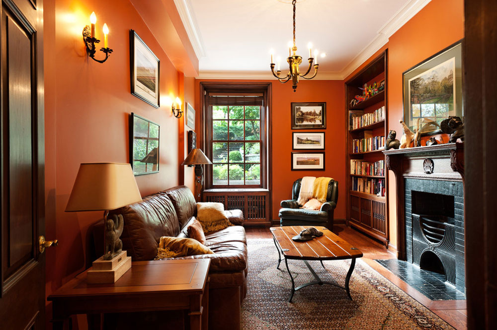
Golden and brownish-orange scenarios

If you want to make your orange interior richer, use more red than yellow. For an even better effect, think of welcoming colors that go well with orange, including shiny gold like this one and chocolate brown.
An orange and brown living room offers a fun 70s vibe while orange and red make warm and vibrant living spaces. is the shortest and easiest way to turn your place into a warm home.
Orange and white

Completely orange walls can be just as overwhelming as lime green ones or banana yellow. In order to avoid an annoyingly vibrant effect, push orange into a more neutral scenario, or complement it with white paint.
Believe it or not, these are paint colors that go together, and that can be easily seen on orange carpets softened with white details, or classy woodwork and cornicing applied on white walls.
Another great idea is to paint an orange accent wall, and place a plain white cabinet like these in front of it.
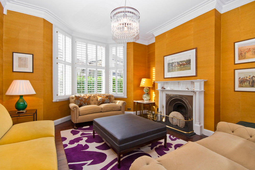
A focal orange wall


You can use orange’s playful spirit to revive a neutral living room, even in cases where you’ve predominantly used black and gray hues. An orange and blue color palette will add interest to a gray or neutral room.
A focal orange wall will look stunning supporting your elegant fireplace or catchy artwork collection. You can create an orange wall with paint, or simply by buying a wallpaper like these.
Aqua – orange pairings

Despite the obvious, direct contrast, aqua blue provides a great answer to the question “What color goes well with orange?” A blue and orange color scheme uses contrasting colors to create a vibrant and attractive room.
Even turquoise can be used to create a funky, retro vibe in your living room, kitchen, or youthful guest bedroom.
Rusty & retro scenarios

Orange is the key asset for retro decorations. For a more ‘vintage look, combine orange with pale oak and grayish mauve, but if you dislike these colors, make the setting more rustic with Welsh cottage wall themes in pale tan, manila beige, or plain white, and use natural oak as the main wood stain.
Dark Chocolate with cayenne

We all know how good chocolate and hot spices work together in cuisine, but few would dare to replicate the same delicious concoction in interior décor. A burnt orange living room with spicy accents creates a warm gathering space for family and friends.
Reddish orange accents against brownish walls is one of the most attractive orange color combinations. Add the same powerful combination on small details such as drapery, upholstery, pillows, and carpets to complete the look
The ideal cool finish for such an ambiance is beige and creamy white.
Mediterranean Riviera themes
Fans of Mediterranean culture and cuisine will easily get inspired by an orange palette, adding modest doses of zesty chartreuse and cobalt blue to depict and visualize some of Southern France’s flavor. Orange and blue décor works perfectly in Mediterranean color schemes.
These combinations work perfectly even in modern kitchens, where stone-inspired and pastel yellow hues and dark walnut wood stain have already prepared a good background for your bold choices.
An accent orange, olive, or cobalt wall is not a bad idea either.
Hunters Orange with gray and weathered woodsy tones

Masculine rooms with weathered woodsy walls and clean-lined furniture certainly deserve a bold orange accent, which can spring up on your striped rugs, curtains, and linens. Enhance this atmosphere of flannel shirt coziness by displaying warm grey accessories.
Orange in naturally toned and rustic living rooms


Orange can provide the desired subdued color output in naturally-toned and rustic living rooms, and reinforce the welcoming effect with floral rugs and deep carrot armchairs.
Creamy orange and floral bouquets
It is difficult to decide what color matches orange in a multi-toned room and still avoid an overwhelming and over-energized scenario.
Best practices show that dusty rose and orange shades play off each other, which is why we recommend you to pull together a bouquet of orange ranunculus, pink tulips, and orange/red roses. You could look at nature photography for other good color pairs.
Playful combinations of fabrics are always welcomed to revive the monochrome scheme of soft orange tones, in particular, creamy linens and taupe walls.
Orange with earthy tones and terracotta blue


Contrasting orange with blue is, as we discussed before, one of the easiest and most appealing complementary combinations which you could also use as your starter combo for Tuscan color scenarios.
Orange is traditionally affined with warm and earthy colors, but the real magic happens when you coordinate this scenario with royal blue tones, French blue, or cobalt.
For further variations of the earthy palette, replace orange with reddish or yellowish colors, including ochre, or burnt or raw sienna.
As for the walls, try to stick to creamy or beige, misty blue or soft terracotta. The ideal wood stain is rustic pine, oak, or any darker brown. This will complement your blue and orange room. To enhance this Mediterranean feel, add soft cotton blankets or woven baskets to your blue and orange bedrooms.
Apricot with white and black
Swathing apricot and black is the most cost-effective way to give your traditional living area a contemporary flair, but also a brave paint solution that requires attention.
Orange will naturally dominate this scenario, as creamy lampshades and wingback chairs, and black-and-white patterns on the pillows and the print rugs let bolder colors take over quite easily.
Sunny yellows for a positive mood

Decorating with yellow and orange is a natural process since the later is completely dependent on the first. Put together, these colors spread a positive and welcoming vibe, which turns them into designers’ favorite pick for happy guest rooms.
Persimmon with light wood and blue

If your kitchen is white, you’re able to use literally every color as the accent edge.
If you’re on the hunt for something vivid and contemporary for your finishes and cabinets, however, you should look no further than persimmon islands complemented with azure bar stools. The warm orange tones will add vibrancy to your neutral space.
Twin tones


Orange doesn’t always have to be the accent color in your room. Instead, you can use it alongside its parent-colors (yellows and reds), choosing nuances that are well coordinated.
For instance, a burnt red ceiling will be softened by mid-orange walls, while a yellow one could use a bolder accent wall reminiscent of the complimenting upholstery on your furniture.
Burnt orange with warm white and turf green
Ever wondered why orange-green themes are perfectly complemented with wooden furniture? Mix these two colors, and the product will be warm brown!
This inspired us to suggest a slightly more dominant dining room, where instead of letting plain white walls and brown furniture bore users, you can unify them with bold orange – green pops on decorative accents (for example, pumpkin orange shelving and grass green Roman shades).
An orange creative zone
Offices are among the rooms that could use a strong flow of creative juices, and orange can inspire creativity.
For instance, you can bring inside a sunny orange countertop, or secure even more energy with an oversized sofa in orange and gold.
Even a single burnt-orange décor item element will be enough to boost your inspiration.
Hot fuchsia for a summer wedding theme
There are several pinkish versions of orange that can make a summer wedding fabulous. For instance, we recommend you to use deep tones of it combined with leafy greens and pale, fuchsia pinks.
The softer and chalkier your pink backdrop is, the more striking orange tone you should use, or instead balance it with deep greens to attract even more attention. Pink and orange mixed with green will bring a luxurious feel to your day.
Choose dark hardwoods for the furniture, and chalky sage green or pale pink for the walls.
Tangerine with ebony and cream


Plain elegance may be a timeless choice for a sophisticated bedroom, but that shouldn’t restrict the creative souls out there from adding their personal touch to it.
They can still part from the dullness of their monochromatic bedrooms with bold and exotic patterns, such as a vivid orange wallpaper patterned with white flowers and branches.
Since there will be a single accent wall, the energizing spirit of orange will remain in the shadows, and priority will be given to creamy walls and black furniture and accessories.
Cool orange kitchens


Orange settings come somehow natural in contemporary kitchens, usually set against silver kitchenware and gray appliances, and plain white furnishing. These are colors that go well with orange.
In the best scenario, the back areas and tilling will all be splashed in orange, and there will be few shelves or cabinet spotlights to redirect attention towards them.
In a picture such as this one, there is no room for accessories other than sunny orange ones.
Carrot orange with white and gray


We bet you’ve seen at least one similar bedroom setting! Orange bedroom walls are popular, but if you’d prefer to use orange as an accent color, there are a range of great color combinations to choose from.
Orange, white, and gray are a hot trend in interior design, where the warm mixture of red and yellow is used to defocus viewers from the gray walls and white furniture, and applied on accent elements such as bedside tables, statement bed frames, or heirloom quilts.
Try different nuances of the color of orange until you’ve discovered the one you can use deliberately, without worrying how it would affect the overall scheme of your room.
Winter sunrises


Another elegant combination you must give a thought to is orange and green.
Seafoam green colors duck egg tints look breathtaking next to soft apricot and reddish browns, which is how some popular designers like to describe the perfectly balanced living room.
The browner you decide to go, the more vivid the room will become, which makes this combination suitable for social areas as well. All it takes is to make the palette slightly warmer.
Cooling down the sunrise scenario can be executed by replacing greenish sea glass with saturated samples of aqua and tint. The backdrop should consequently be pale, somewhere between warm white and apricot. The perfect wood stain is antique mahogany.
Peachy orange in pastel combos
Peachy orange is one of the most frequently used wall backdrops around the world, which speaks in favor of its ability to integrate with multiple colors, tones, and accessories.
You can further apply it on quilts, floral patterns, fabrics, or artwork, in combination with pale blue that supports or strong red that contrasts the soothing effect of the walls.
This is hardly a rule – as long as you can link colors and patterns in cohesive harmony, you’ll be able to create a great color scheme. If you’re seeking further inspiration, create a Pinterest board ‘what colors match orange’ or ‘what colors go with peach walls’ and collect a range of pins until you find a combo you love.
Orange in lively dining rooms

A dark, wood-based dining combo and buffet may be the elegant, mansion-style retreat you’ve always desired, but it won’t be thick enough without refreshing accessories.
Orange handles this task extremely well, in particular when pumpkin tones are displayed on walls reflected by a sunburst mirror that can echo their positive vibes across the room.
For increased reflections, add neutral glass accessories across the room. This way your burnt orange color palette will add vibrancy to your room.
Sunset orange with desert sand and brown tones


So, what color goes with orange walls? How about a room nook where you will welcome evenings embraced with sunset orange tones, red and dusty desert sands? Orange and yellow mixed together will create a vibrant and earthy space to enjoy when the sun goes down.
Golden orange is perfect for a relaxing area, in particular when you’ve used it to balance the spectrum of tones and to create a bridge between your brighter accessories and your brown furniture.
FAQ On What Color Goes With Orange
What color perfectly complements orange in decor?
Orange truly springs to life when paired with teal. This color isn’t just a straightforward complement on the color wheel; it brings a refreshing contrast that highlights orange’s warmth, making any room feel more vibrant yet balanced.
Can grey go well with orange?
Absolutely, grey is a superb match for orange. It provides a neutral backdrop that allows orange to stand out without overpowering the space. This combination is ideal for those looking for a sophisticated yet warm aesthetic in their home decor.
What are the best accent colors for orange in fashion design?
In fashion design, deep blues and rich greens make fantastic accent colors for orange. These hues create a bold, eye-catching look that’s perfect for those who like to make a statement with their style.
How do seasonal trends affect color choices with orange?
Seasonal trends heavily influence color pairings with orange. For instance, during the fall, earthy tones such as olive green and mustard complement orange, reflecting the season’s natural palette. In spring, pastel blues and pinks offer a fresh, cheerful contrast.
What colors should be avoided with orange?
Steering clear of overly bright colors like neon green can be wise as they can clash with orange, creating a jarring effect. Instead, opt for colors that can either contrast or smoothly blend without competing for attention.
How does color psychology impact the use of orange in spaces?
Orange is often associated with enthusiasm and creativity. Using it in spaces where energy and productivity need a boost, like in a home office, can be quite effective. Color psychology suggests pairing it with calming blues or greens to balance the energy.
What are subtle ways to incorporate orange into a color scheme?
Start with small doses. Consider accessories like cushions, art, or a single accent wall. These allow for a punch of orange without overwhelming the space. It’s a cautious yet striking way to introduce orange into your interior design.
How does orange interact with metallic colors?
Orange and metallics like gold or copper are simply stunning together. They share a warmth and sheen that can elevate a space or attire with a luxurious feel. Ideal for anyone looking to add a touch of opulence.
What are innovative uses of orange in contemporary design?
Contemporary design often uses orange in unexpected ways, such as in minimalist art or as neon accents in technological gadgets. Combining orange with muted tones or sleek metallics can create a modern look that’s both stylish and impactful.
How best to match orange in a natural outdoor setting?
For outdoor settings, pairing orange with green offers a vibrant yet natural look that echoes the outdoors. It’s especially striking in gardens or patios where green is predominant, allowing the orange elements to stand out brilliantly against a lush backdrop.
Conclusion
Embarking on a journey to explore what color goes with orange has unfolded a palette of possibilities that blend, contrast, and enhance this vibrant hue. Whether infusing life into a room with teal and gray tones or accessorizing an outfit with deep blues and rich greens, orange offers versatility across design spectrums.
From understanding the influence of seasonal trends in pairing colors to exploiting the subtle psychological impacts of orange in various spaces, this article has aimed to equip you with a clearer vision. Incorporating orange doesn’t just add a splash of color; it invites energy, creativity, and a touch of sophistication.
Remember, in the realm of colors, exploration rewards the bold. So, whether it’s through plush cushions, a statement wall, or an elegant art piece, let orange inspire your next design venture. After all, every color has a story, and orange is no exception—a dynamic protagonist waiting to brighten up your narrative space.