Home Decor
Great Kitchen Color Schemes with White Cabinets

Two cabinet whites can look nothing alike once they’re on the door.
Benjamin Moore Chantilly Lace OC-65 has a light reflectance value (LRV) of 90.04. Sherwin-Williams Alabaster SW 7008 sits at 82.22 (brand color data, 2026).
That gap of almost eight points, along with a warmer or cooler undertone, ends up deciding which wall color, countertop and hardware finish suit the cabinets. Most kitchen color schemes with white cabinets succeed or fail on that one choice.
White is one of five cabinet colors compared side by side in our guide to kitchen color schemes.
Which color schemes work with white cabinets?

White stays put while everything around it changes, so the schemes are really defined by the surroundings. Tonal all-white, warm neutral, cool gray and blue, green with natural wood, and navy or black for contrast are the ones that hold up.
| Scheme | Walls, counters and backsplash | Hardware | Best for |
|---|---|---|---|
| Tonal all-white | Soft white walls, white quartz, white tile | Brushed nickel | Bright kitchens with strong daylight |
| Warm neutral | Greige or beige walls, butcher block, cream-veined stone | Brass | Traditional and transitional kitchens |
| Cool gray and blue | Gray or pale blue walls, gray-veined quartz | Chrome or nickel | Modern kitchens |
| Green and wood | Sage walls, wood counters, subway tile | Brass or matte black | Warm, organic kitchens |
| High contrast | Navy island, charcoal or dark stone counters | Matte black or brass | Large kitchens with ample light |
White isn’t the automatic first pick anymore. In Houzz’s 2026 Kitchen Trends Study, wood reached 29% of renovated kitchens (up 6 points), edging past white at 28%.
So the scheme around the white carries more of the design than it used to.
Choose by light and kitchen size first, and style second. A color scheme generator for rooms is handy for previewing a palette before you buy paint, and it can save you a few sample pots.
Choosing the cabinet white: undertone and LRV

Every white carries a faint undertone (yellow, beige, gray or blue) that only shows up next to counters and floors. LRV is a separate thing. It’s a 0 to 100 scale for brightness, with black at 0 and pure white at 100.
Pick the undertone first and check LRV second.
Benjamin Moore and Sherwin-Williams publish these values on their own color pages. Swatch sites often round or recalculate them, so go with the brand’s number.
- Benjamin Moore Chantilly Lace OC-65 has an LRV of 90.04 and reads as a clean, neutral white.
- Benjamin Moore Simply White OC-117 comes in at 89.52, with the slightest hint of warmth.
- Sherwin-Williams Pure White SW 7005 is a soft white at 83.96, a little warm in cast.
- Alabaster SW 7008 from the same brand, at 82.22, is a creamy warm white.
The Benjamin Moore whites here run roughly 6 to 8 points brighter than the Sherwin-Williams ones. That’s enough to change how a small kitchen feels in weak light.
Undertone behaves the way basic color theory for interior design predicts. A warm cast reads yellow beside cool gray, and a cool cast looks sterile beside wood.
The simplest rule is to keep the wall, the countertop veining and the hardware finish in the same undertone family as the cabinet white.
Warm whites versus cool whites
Simply White and Alabaster sit at the warm end, and they look right with brass, oak and butcher block. Chantilly Lace is neutral to cool, which is why nickel, chrome and gray-veined quartz look better beside it.
Alabaster is pickier about wall partners than most whites. Its creamy base turns dingy next to cool grays, so the shades that go with Alabaster tend to be warm greige or beige. Soft green works too.
Light makes both mismatches worse.
How natural light and bulb temperature change white cabinets
Window direction shifts a white, and bulb color temperature shifts it again on top of that. Test the cabinet white under both before committing.
A north-facing kitchen gets cool, bluish daylight, so stark whites can look clinical and gray-leaning ones go flat. South light is stronger and warmer, which turns creamy whites buttery (a neutral white holds its tone better there). East and west are the awkward ones because the cast changes through the day, warm early on for east windows and golden late for west.
In a dim kitchen, LRV gives you brightness, but undertone decides whether that brightness looks warm or clinical. Worth choosing both on purpose.
How light works in interior design counts for more than the paint code in a white kitchen.
Westinghouse Lighting classes 2700K and 3000K bulbs as warm white and 5000K as cool daylight. The first two feel cozy and welcoming. 5000K is crisp and leans blue.
A 5000K bulb makes Simply White or Alabaster read cooler than the chip suggested. Stay at 2700K to 3000K with warm whites.
Labels differ by maker, since some retailers call 3000K soft white. Read the Kelvin number on the box.
What wall colors go best with white cabinets?
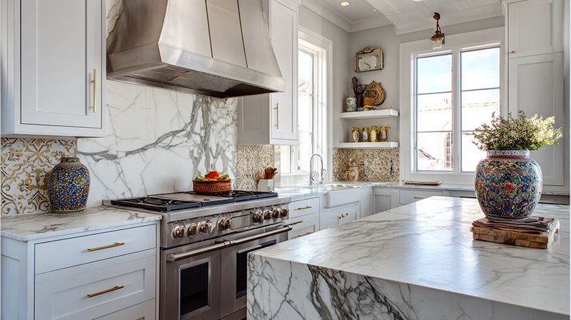
The safe walls are greige and warm gray. Soft green and pale blue bring color without fighting the cabinets. Navy and charcoal are for people who want contrast and have the daylight to carry it.
Whichever you pick, match the wall’s undertone to the cabinet white and most of the decision is made.
Gray and greige walls
Sherwin-Williams lists Agreeable Gray SW 7029 at an LRV of 60.39. Benjamin Moore puts Revere Pewter HC-172 at 55.05.
Revere Pewter is the deeper, browner one, so it leans warmer next to a creamy white.
Low contrast keeps the cabinets calm, and the warm undertone suits brass, oak and butcher block. The LRV stays moderate, so the room doesn’t get heavy.
A cool gray beside a warm white reads dingy, though, and both of these can go flat in a dim north-facing kitchen.
A longer list of shades that pair with Agreeable Gray covers trim and the rooms that open onto the kitchen.
Green and blue walls

Sea Salt SW 6204 from Sherwin-Williams is a popular green-gray wall for white cabinets, with an LRV of 63.23.
It adds calm color without competing with the cabinets, and it sits well with wood and brass. The downside is that it shifts between green, gray and blue with the light, so two walls can look like two different colors.
Pale blue gives the same calm on a cooler base, so it needs a neutral or cool white to hold together.
Dark and saturated walls

Benjamin Moore Hale Navy HC-154 has an LRV of 8.36, about as far from a cabinet white as the scale allows.
That gap is what makes the cabinets look crisp. The same contrast principles used in interior design apply here, and the bigger the difference in value, the sharper the edge.
The result is dramatic and tailored, with the sharpest cabinet edges of any scheme. It also absorbs light, so it needs real daylight to work, and it closes in a small kitchen fast.
Countertop, backsplash and island colors that pair with white cabinets
The countertop stays inside the cabinet white’s undertone and the backsplash stays quiet. The island gets the bold color, which puts the loudest color on a single surface.
Countertops
White or soft gray quartz is the low-contrast option, and its veining should match the cabinet undertone. Butcher block brings warm contrast and suits warm whites.
Dark stone is the one I’d be careful with. It’s the highest-contrast option and it exposes an undertone mismatch faster than anything else.
Pairing gray countertops with white cabinets works best when the white is neutral rather than creamy.
Backsplash
Subway tile is still the classic backsplash for white cabinets.
Match the tile white to the cabinet’s undertone and keep the grout in the same family. Sage or pale blue tile works when the walls stay neutral.
Island and two-tone layouts
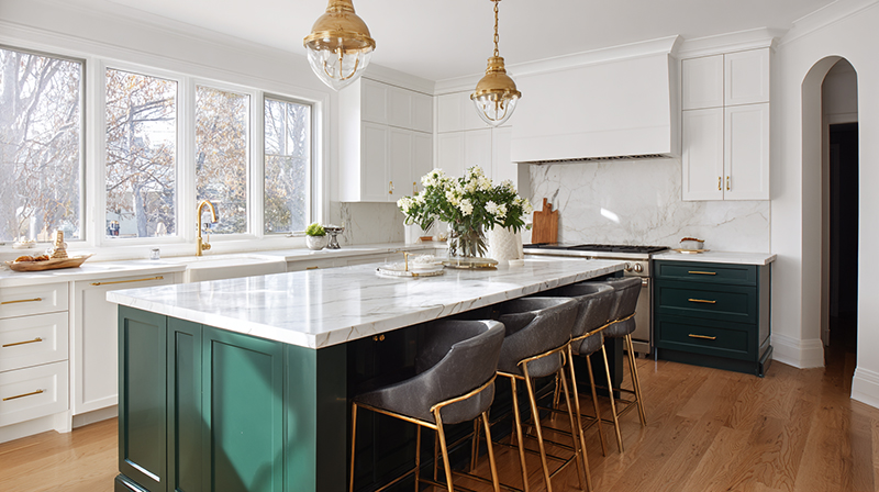
Houzz’s 2026 study found wood is now the top countertop choice on kitchen islands finished in a different color from the main cabinets, up 12 points to 39%, ahead of white at 19%.
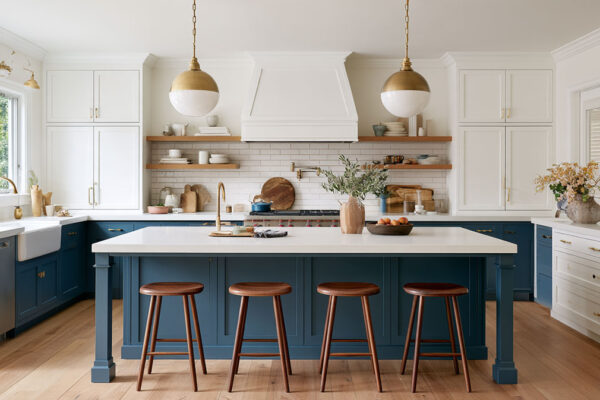
Painted islands are the other route. White perimeter cabinets with a blue island is the classic way to bring in navy, and Hale Navy HC-154 (LRV 8.36) gives the island real weight against the white.
KraftMaid’s own showcase pairs Dove White perimeter cabinets with a Cannon Grey island.
Which hardware finish and floor tone suit white cabinets?
Brushed nickel is the safe default. Brass warms a creamy white, matte black adds contrast, and a mid-tone wood floor works with any of them. Pick one primary hardware finish and allow a second at most.
Hardware finishes
Brushed nickel led Houzz’s 2026 finish results at 28%, ahead of black at 18% and brushed gold at 12%.
Brushed nickel is neutral and forgiving. It also hides fingerprints and everyday wear better than smoother satin nickel, according to Apartment Therapy (2026).
Brass or brushed gold warms creamy whites and fits traditional and transitional kitchens. Matte black is the high-contrast option, and it looks strongest on white or neutral cabinets. Chrome is sleek and cool, and it matches neutral whites.
A second metal on the island, matched to the faucet, looks intentional. By the third metal it starts to look accidental.
Flooring and wood tones

Wood tones suit white cabinets because they add the warm mid-tone the white lacks.
Floor Trends magazine, reporting on Houzz’s 2025 kitchen study, puts wood tones at 46% of flooring color choices, with rich browns at 15% and grays at 10%.
Houzz’s 2026 wood-floor forecast points the same way, with homeowners moving away from cool gray palettes and toward warm earth tones.
Light floors keep a scheme low in contrast, while dark floors raise it, which is why color schemes built around dark kitchen floors keep the walls light.
A gray floor is already cool, so it works best with a neutral white and a warm wood accent. Kitchen color schemes with grey floors cover the pairings in more detail.
Open wood shelving repeats the floor tone and breaks up a long run of white.
How to split colors across a white kitchen with the 60-30-10 rule
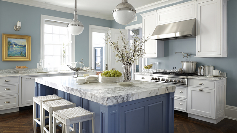
With the 60-30-10 rule, a base color takes 60 percent of the room, a secondary color takes 30 and an accent gets the last 10. White cabinets set the base.
| Share | Role | Surfaces |
|---|---|---|
| 60% | Base | White cabinets, light walls |
| 30% | Secondary | Island, floor, backsplash |
| 10% | Accent | Hardware, stools, decor |
Sources disagree on which surface counts as the dominant 60. Ideal Home quotes designer Martin Waller starting with the walls, while Country and Town House puts the dominant color on cabinets and worktops.
With white cabinets and light walls the disagreement disappears, because both carry the same base.
The rule does break down in a monochromatic all-white kitchen, since there’s no secondary color to spend. Ideal Home quotes Michael from The Paint Shed putting white at the 60 in that case, with the 30 and the 10 coming from wood and stone, plus the metal finishes.
South African Homeowner makes a cost argument, which is to keep the expensive surfaces neutral and put bolder color on things that are cheap to swap. In a white kitchen that makes the 10 the cheapest place to experiment.
When does a white cabinet color scheme fail?
A white scheme tends to break when daylight is weak, the kitchen is small, there are no windows, or everything is white with no material contrast to separate it. None of those means giving up the white.
| Condition | What fails | Fix |
|---|---|---|
| Weak daylight | Mid-to-dark walls, cool gray | Lighter walls, warm greige or soft green |
| Small footprint | Navy or charcoal on the walls | Dark color on the island only |
| No windows | Dark counters plus mid-tone walls | Light walls, one dark surface, more fixtures |
| All-white palette | White on white with one texture | Add wood, stone or metal contrast |
North-facing and low-light kitchens
Sherwin-Williams’ color guidance states that a color can’t add light to a room, only reflect what’s already there. For a darker room it recommends a higher LRV.
The reverse holds too. A bright room that should feel cozier benefits from a lower LRV, which is why a deep island color suits a sun-filled kitchen.
When daylight is thin, the fix is more light as well as lighter paint. A calculator for LED light requirements estimates how much light the room needs.
Small kitchens

In a small kitchen, keep the walls light and give the dark color to one surface only.
That surface can be the island, if there is one, or the lower cabinets. Dark hardware counts too and costs the least.
Colors that make a room look bigger mostly come down to staying light and keeping the contrast low.
How to test a color scheme in your own kitchen

Test the scheme as a set instead of color by color. Cabinet white, wall color, hardware and tile all go together, viewed from morning to night under the bulbs you’ll actually use.
Benjamin Moore’s sampling guidance recommends brushing sample paint on a white foam core board that moves around the room. Sherwin-Williams sells Peel and Stick Samples that adhere to walls, cabinets and woodwork without affecting existing paint.
- Shortlist two or three cabinet whites and two or three wall colors.
- Paint two coats on a board with a white border, or order peel-and-stick samples.
- Hold the white sample against a cabinet door, next to the real countertop and floor.
- Move the wall sample across walls that get different light.
- Check it in the morning, at midday, in the evening and under the installed bulbs at night.
- Hold hardware and backsplash tile samples against the paint, not apart from it.
- Leave the set up for several days and drop any combination that turns dingy or clinical.
Once the winning set is clear, a room paint calculator gives the wall quantity before anyone opens a can.
FAQ About Kitchen Color Schemes with White Cabinets
Is white a neutral that goes with every color?
Mostly yes, though not equally well with everything. Each cabinet white has a warm or cool undertone, and walls, counters and hardware read best when they share it.
Which paint sheen works on white cabinets and kitchen walls?
Satin or semi-gloss for the cabinets, eggshell for walls that rarely get scuffed. Benjamin Moore lists semi-gloss among the best finishes for kitchen cabinets.
A higher sheen also makes the same color read lighter.
What trim and ceiling color goes with white cabinets?
Match the trim to the cabinet white, which The Color Concierge calls common practice. Paint the ceiling the same white as the trim, or one slightly cooler.
Don’t go darker on the ceiling than the walls or trim.
Are white kitchen cabinets still in style?
Yes. White ranked second among cabinet colors in Houzz’s 2026 study, just behind wood, and it remains the leading choice for upper cabinets in two-tone kitchens.
What to Lock In First in a White Kitchen
For kitchen color schemes with white cabinets, settle the cabinet white first and the hardware last, because the white fixes the undertone every other surface has to match.
The order that costs least to fix is simple. Cabinet white and its undertone go first. Walls, counters and floor come next, and hardware, stools and decor can wait until the end.
It makes for a slower start, since the white needs several days of sample viewing before anything else gets bought. Still cheaper than repainting every cabinet door.
As of October 2026, white trails wood by one point in Houzz’s cabinet results. If wood widens that lead, the better starting point becomes the color schemes built around wood cabinets.
More Kitchen Color Guides
- White cabinets and brown countertops
- White cabinets with brown granite countertops
- White cabinets with grey countertops
- White cabinets with butcher block countertops
- All kitchen color schemes by cabinet color

- Shoji White vs Alabaster: Which Soft White Wins? - October 25, 2026
- Color Combinations for 32 Colors and 10 Wood Tones - October 22, 2026
- Kitchen Color Schemes by Cabinet Color: What Pairs Well - October 19, 2026