Home Decor
Beautiful Kitchen Color Schemes with Wood Cabinets

Paint chips are the wrong place to start in a kitchen with wood cabinets. The wood already made the biggest color decision, and it did that years ago. What’s left is reading its undertone (orange, red, yellow, or neutral) and how deep the stain runs, then deciding whether the walls, countertop, backsplash, and hardware should agree with that cast or contrast it on purpose.
Designers have been drifting toward the less orange end of the range. In the National Kitchen and Bath Association’s 2025 Kitchen Trends Report, 59% of 523 industry professionals named white oak their preferred wood finish, ahead of walnut at 16% and oak at 10%.
White oak leans yellow-beige, not orange, so wall colors chosen for honey oak need rechecking.
Our kitchen color schemes guide compares wood with green, grey, blue and white cabinets.
Which Color Schemes Suit Oak, Maple, Cherry, Walnut, and Hickory Cabinets?

Start from the undertone. Orange and red woods get along with creamy neutrals and muted greens. Brown woods can handle clean contrast. Busy grain is its own thing and needs a quiet room around it.
| Wood | Undertone | Wall colors | Counters and hardware |
|---|---|---|---|
| Oak | Orange to pink-red (white oak leans yellow-beige) | Warm white, beige, sage or olive green | Cream quartz, brushed nickel or bronze |
| Maple | Pale and creamy | Warm gray, muted green, soft blue | White or gray quartz, black or nickel |
| Cherry | Red, deepens with age | Sage green, warm sienna, or a deliberate pale blue | Dark stone or white quartz, nickel or black |
| Walnut | Brown, from milk chocolate to espresso | Creamy white, warm gray, deep green | Creamy white counters, brass or black |
| Hickory | Varied, light tan to reddish brown | Quiet neutrals that let the grain carry | Plain one-color quartz, matte black or nickel |
Oak gives people the most grief, mostly because that orange cast fights cool grays. If yours is red or honey, the wall colors that flatter oak cabinets lean warm or green.
Cherry is a different problem. The red deepens over the years, so palettes built around cherry cabinets start from that red instead of fighting it.
Hickory does its own decorating. Knots, streaks, and board-to-board color shifts mean everything around it should stay plain.
How to Read the Undertone and Stain Depth of Your Wood Cabinets
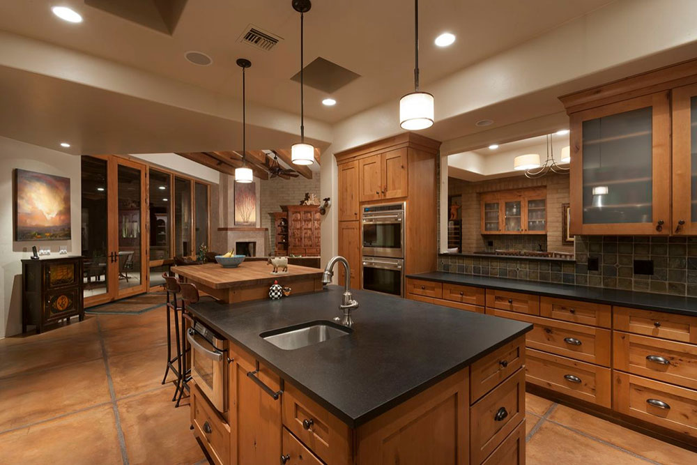
Hold a sheet of plain white paper against a cabinet door in daylight and the cast shows up fast. That cast is the undertone, the color sitting under the main brown.
Stain depth is a separate question. It sets how light or dark the wood reads, and that decides how much contrast the walls need.
Undertone by Species

- Red oak runs pink to red-orange.
- White oak is yellow-beige.
- Maple is pale and creamy.
- Cherry starts red and darkens with age.
- Walnut is brown, anywhere from cool to rich chocolate.
- Hickory changes from board to board, tan on one and reddish brown on the next.
Stain shifts the cast. Honey and golden finishes push oak toward orange, so test wall colors for honey oak cabinets on a sample board before buying gallons.
The usual failure is an undertone clash. A cool gray wall beside orange oak makes the oak louder.
What Stain Depth Changes

Wood overtook white as the most popular cabinet color in renovated kitchens, 29% to 28%, and medium tones lead the wood group at 15%, ahead of light at 11% and dark at 3% (Houzz, 2026 U.S. Kitchen Trends Study, 1,780 homeowners surveyed in July 2025).
So most people with wood cabinets are working around a medium stain, roughly half of all wood cabinets. That’s the tricky depth, because it sits close to the mid-tone greiges and greens people reach for first.
Light stain wants deeper walls. With medium stain, go clearly lighter or clearly darker than the wood, never close. Dark stain does best with light, warm walls.
How Much Contrast Should Walls Have Against Wood Cabinets?
Aim for 30 to 40 LRV points between wall and wood for visible contrast, and 45 or more for strong contrast. That’s a rule of thumb from the color consultancy Kylie M Interiors, written for painted cabinets. It isn’t a published standard.
LRV (light reflectance value) runs from 0 for black to 100 for white. Wood has no printed number, so borrow one. Hold a few paint chips against the door, pick the chip closest in depth, and use its LRV as the wood’s stand-in.
Benjamin Moore prints LRVs for its colors, which gives you handy reference points. White Dove, a warm white, sits at 83.16. Revere Pewter, a greige, is 55.05. Saybrook Sage, a muted green, is 45.46, and Hale Navy, a deep navy, drops to 8.36.
Say a medium oak door matches a chip near LRV 45. White Dove walls sit about 38 points above it, inside the visible-contrast range.
Revere Pewter sits only about 10 points above that same door, so wall and wood read as one mid-tone mass.
Light wood takes mid-value walls. Dark wood takes high-LRV walls, because a dark wall behind dark wood closes the room in.
One catch. The gap measures lightness and nothing else, so a wide gap does not rescue a cool wall beside orange oak. Undertone clashes survive any amount of value contrast.
Designers treat contrast as one tool among several. The basics of contrast in interior design show how temperature and value work together.
Wall Paint Colors That Work With Wood Cabinets

If the wood runs warm, warm whites, beige, greige, and muted greens are the safe lane. Blue and gray work too, but only when you want the contrast and the room gets strong light.
For wall colors across the whole kitchen, not only beside wood, the best colors for kitchen walls cover a wider range.
Sources don’t agree on warm versus cool. Home blogger Julie Blanner kept her orange oak cabinets in a makeover, found that cool tones made the orange louder, and went with warm undertones such as Benjamin Moore White Dove. A wall-color roundup on roomdsign.com goes the other way and recommends cool undertones like powder blue for golden, honey, and red oak.
The split comes down to intent. Warm walls lower the contrast with the wood, while cool walls create it on purpose.
Cool only holds up when the oak isn’t already the loudest thing in the room. For a honey-orange door in a small kitchen, go warm.
Whites, Creams, and Beiges

Warm white is the lowest-risk wall for any wood.
Benjamin Moore describes White Dove as a clean, classic white, and Blanner calls it a soft warm white with a hint of greige. Pure white walls sharpen the wood and make it the only focus in the room.
Paint also dries darker than it looks wet (Blanner makes that point too), so judge the color the next day.
Greens and Blues
Green sits opposite red on the color wheel, which is basic color theory at work. That’s why Hunker’s cherry-cabinet guide uses green to set off the red.
Gray-cooled greens like Saybrook Sage stay quiet beside oak.
Blue is the gamble. Hunker pairs a pale icy blue with cherry, but the same blue next to honey oak pushes the wood toward orange.
Grays and Greiges

Cool gray beside orange or red wood turns the wood louder. Greige shares the wood’s warmth, so it blends instead of clashing.
Benjamin Moore calls Revere Pewter a bridge between warm and cool tones, which explains why it keeps showing up beside oak.
Deep and Dark Walls

Dark walls work when the wood is light or medium and the kitchen has real daylight. Hale Navy and charcoal both land well behind pale maple.
Skip them on dark wood in a small kitchen. Use one accent wall instead of four.
Countertop, Backsplash, and Hardware Pairings for Wood Cabinets

Choose by undertone first and style second. A set that shares the wood’s warmth, or contrasts it cleanly, looks planned.
Countertops
Quartz is the most popular countertop material overall in Houzz’s 2026 study, and it keeps steady color from slab to slab, which helps next to wood that doesn’t.
Granite is the riskier pick, since busy veining competes with strong grain. Soapstone is dark and matte, so light wood gets strong contrast from it.
Butcher block repeats the cabinet tone. Match the undertone, or go a clear step lighter or darker.
Walnut is the clearest case. Creamy white counters flatter it because they share its warm undertone, and a clean white gets more useful the deeper the stain runs, according to the Block Renovation walnut guide.
Backsplash
The backsplash bridges counter and wall, so keep it quieter than the wood.
Plain white or cream subway tile is the safe default. Dark wood cabinets especially want a lighter backsplash to bounce light back into the work area.
Black granite counters need more thought, since the tile has to relieve a dark slab without fighting the grain. Some backsplash options that suit black granite work just as well beside wood.
Hardware Finish

Brushed nickel leads at 28%, ahead of black at 18% and brushed gold at 12% (Houzz 2026 kitchen study).
Nickel stays neutral and hides fingerprints, as one designer told Apartment Therapy. Black adds contrast on light and medium wood. Brass and gold warm up oak and walnut.
Black pulls read best where the wood is light enough to contrast with them. To see how that plays out, look at how black hardware looks on wood kitchen cabinets, then check how little shows against a dark stain.
How Kitchen Lighting Changes Wood and Paint Colors
Warm bulbs pull out the orange and honey in wood and soften brass, while cool bulbs make gray paint and white tile look sharper. A scheme that works under one bulb can look wrong under another, so settle the lighting before the paint.
Color Temperature
The Department of Energy puts warm light at 2700K to 3000K and cool light at 3600K to 5500K, and recommends 2700K to 3600K for most general and task lighting.
The warm range deepens oak, cherry, and walnut and flatters brass hardware. The cool range flattens warm wood and brings out blue and green undertones in paint.
Pick one Kelvin number and hold it across the ambient lighting layer and the task lights over the counters. Kichler’s lighting guide makes a similar point: the same color temperature throughout a room gives a clean, even feel, and it suggests 2700K where brown woods or warm colors are present.
Brightness comes first, though. You can calculate how much LED light the kitchen needs before the Kelvin number even matters.
Color Rendering (CRI)
The Department of Energy says a color rendering index (CRI) of 80 or higher is acceptable for most indoor residential use, and that color rendition matters more than color temperature. The California Energy Commission asks for more. The JA8 appendix of Title 24 (2022 cycle) requires CRI of 90 or above and an R9 of 50 or above for high-efficacy residential light sources.
The gap is scope. The Department of Energy writes general guidance, while California writes code for permitted residential work.
R9 scores how well a bulb renders red, and wood is mostly reds and oranges. For cherry or red oak, buy 90+ CRI with a healthy R9 and stop worrying about the 80 floor.
Natural Light
Direction and time of day shift undertones, and no bulb fixes that.
Benjamin Moore’s Sharon Grech lists the direction sunlight travels and the time of day among the factors that change how a paint color reads. North-facing rooms get cooler, indirect light that flattens warm wood. West-facing rooms get strong, warm evening light that deepens it.
Applying the 60-30-10 Rule When Cabinets Are Wood
The 60-30-10 rule splits a room’s color into 60% dominant, 30% secondary, and 10% accent. With wood cabinets, the wood takes either the 60 or the 30, depending on how much of the room it covers.
Sources split on which one. Country and Town House starts the kitchen’s dominant color on cabinets and worktops, while Ideal Home quotes designers who begin with the walls because walls dominate a space.
Here’s a simple way to settle it. If cabinets run along two or more walls, wood is the 60 and the walls take the 30. With a single cabinet run, the walls take the 60.
| Share | Surface | Example with medium oak |
|---|---|---|
| 60% | Wood cabinets, or walls when cabinets are one run | Oak doors, or warm white walls |
| 30% | Walls, countertop, backsplash | Warm white walls, cream quartz |
| 10% | Hardware, stools, pendants, textiles | Brass pulls, one sage accent |
Before you buy paint, let a color scheme generator for the room mock up the split. It takes ten minutes and catches the obvious misses.
Painted Island or Two-Tone Cabinets
In two-tone kitchens, wood leads the lower cabinets at 37%, ahead of blue at 19% and green at 14% (Houzz’s 2026 study, as reported by the National Association of Realtors).
So a wood perimeter with one painted piece is the safe split. A dark green kitchen island against oak cabinets uses the green as the accent without repainting a single door.
The reverse works too, with painted perimeter cabinets and a wood island that carries the 30.
How to Test a Wood Cabinet Color Scheme Before Painting
Test on movable boards, in the room’s real light, over a few days. Hold them against the cabinet door, a countertop sample, and the backsplash tile.
- Cut the list to 2 to 4 wall colors with different undertones.
- Install the final bulbs first, because lighting changes how a sample reads, per CertaPro’s sampling guide.
- Brush two coats onto white foam core or poster board instead of the wall. Benjamin Moore recommends foam core for moving samples around the room.
- Set each board beside the cabinet door, the countertop sample, and the backsplash tile.
- Check morning, afternoon, and evening, with the lights on and off.
- Leave the boards up for a few days before deciding.
- Read each chip’s printed LRV against your stand-in chip for the wood.
Skipping the board is the common mistake. The existing wall color can alter how the sample reads, according to Catalina Paint Store.
Once one color survives, estimate the gallons with a paint calculator for the room so the order matches the walls.
When Does a Wall-and-Accent Scheme Not Fix Wood Cabinets?
It fails when the wood itself is the problem. Walls and accents shift the balance of a room, but they can’t change what the door looks like.
Cases Where Walls Cannot Compensate
Heavy orange or red oak in a small, dark kitchen is the obvious one. Light walls help, but the wood still owns the room.
Cabinets and floor in different woods are another. Two undertones compete, and wall color can’t referee.
Then there’s dark cabinets over a dark floor. Nothing separates them, so the counters and walls carry all the contrast.
That last case is the hardest, and palettes built around kitchen palettes for dark floors show how much weight the lighter surfaces take on.
Keep, Paint, or Replace
| Option | Fits when | Watch for |
|---|---|---|
| Keep the wood and restyle | Undertone is workable and the finish is sound | An orange or red you cannot live with |
| Repaint the cabinets | The wood is dated or the room is small and dark | Prep, primer, and several coats on a grease-heavy surface |
| Refinish or replace | Doors are damaged or the layout fails | The cost and the weeks without a kitchen |
If repainting feels like too much, you can cover kitchen cabinets without painting them. It’s a halfway option when the wood is the problem but the budget is tight.
FAQ About Kitchen Color Schemes With Wood Cabinets
What paint sheen works best on kitchen walls with wood cabinets?
Satin is the usual choice. It wipes down better than flat paint, and Benjamin Moore notes that flat finishes reflect no light and can read darker, while glossier sheens reflect more of it.
Can you mix wood tones in the same kitchen?

Yes, when the undertones agree or the gap in depth is obvious. Let one wood lead, usually the cabinets, and keep the second a clear step lighter or darker. Near-matches read as a mistake.
Which flooring goes with wood cabinets?
A floor clearly lighter or darker than the cabinets, in the same warm or cool family. An exact match flattens the room, and an opposite undertone fights the doors.
Do stainless steel appliances go with wood cabinets?
Yes. Stainless is neutral and suits every wood tone, and its cool gray balances warm oak and cherry.
Black appliances sit best against dark wood. White ones suit pale maple.
Why does white paint look yellow next to wood cabinets?
White reflects the light and color around it, so warm wood and warm bulbs push a cream-based white toward yellow. Switch to a white with a greige base, or move the bulbs from 2700K toward 3000K.
Are gray walls outdated with wood cabinets?
Cool gray looks dated beside orange or red wood because it turns the wood louder. Warm greige holds up, since it shares the wood’s undertone.
What to Change First in a Wood Cabinet Kitchen
Kitchen color schemes with wood cabinets improve fastest when the lighting changes first, the wall paint second, and the hardware last. Bulbs cost the least and alter how every later sample reads.
Pick one Kelvin number and a high CRI, then sample paint under those bulbs, then choose hardware once the wall color settles.
Walls rank second because they cover the most area and repaint easily. Hardware ranks last because the right finish depends on the wood and wall already in place.
The trade-off is a kitchen that looks half-finished for a few weeks, since brass or black pulls wait on the paint decision.
This order was checked in October 2026. It changes only when the cabinet doors are damaged, which moves refinishing ahead of all three steps.
More Kitchen Color Guides
- Green cabinets with black countertops
- Green cabinets with white countertops
- Green cabinets with grey countertops
- Green cabinets with brown countertops
- All kitchen color schemes by cabinet color

- Kitchen Color Schemes by Cabinet Color: What Pairs Well - October 19, 2026
- Curtain Colors for Every Wall Color: Safe vs Bold Picks - October 18, 2026
- Interior Design Styles: Find Your Primary and Secondary - October 14, 2026