Home Decor
Red Interior Design Decorating Ideas To Try
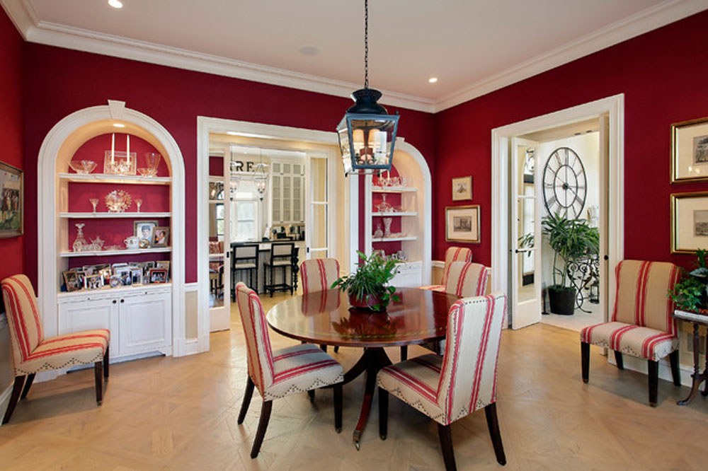
Most red interior design decorating ideas go wrong the same way. Someone picks a chip, paints a whole room, and only then sees what the afternoon light does to it. Brick, terracotta and burgundy behave very differently from crimson and cherry, so one wall color can feel enclosing in a north-facing room and loud in a sunlit one. How much of the room the red covers matters too.
The mood effect is narrower than most guides claim. In a 2023 Royal Society Open Science study of 60 participants, skin conductance rose more in red virtual rooms than in blue ones, but only at some saturation and lightness combinations.
Which Red Shade Suits Your Room?
Bright reds tend to energize a room and deep reds tend to close it in. The earthy ones sit in a more relaxed spot. Undertone then decides how the red behaves next to wood, white trim and gray.
| Shade family | Undertone | Mood | Suits |
|---|---|---|---|
| Crimson, cherry, scarlet | Clean, saturated | Energetic, youthful | Kitchens, offices, accents |
| Brick, rust, terracotta | Orange-leaning, warm | Relaxed, earthy | Living and dining rooms |
| Burgundy, maroon, oxblood | Brown or purple-leaning | Formal, enveloping | Bedrooms, dining rooms, snugs |
Bright, clean reds
Sherwin-Williams lists Real Red (SW 6868) at a light reflectance value of 13.2, on a scale where 0 is black and 100 is white.
The color looks loud but absorbs most of the light that reaches it. Give it a room with generous windows.
Mylands pairs brighter reds with white in kitchens for a modern look. Primary reds also read as playful, which is why they show up in children’s rooms and playrooms.
If you’ve never used red before, Bensons for Beds warns that a full scarlet room feels overwhelming. Its advice is to start with a single feature wall.
Earthy reds
Livingetc names brick and wood as materials that temper red’s boldness, and says rust gives a living room a laid-back feel. Mylands recommends burnt terracotta for dining rooms, next to plum and berry shades.
Benjamin Moore named Caliente AF-290 its Color of the Year 2018, and the brand’s own page gives it an LRV of 8.82. That sits below Real Red, so it reads deeper in the same room.
Deep reds
Deep reds suit rooms that should feel enclosed rather than energized.
Farrow & Ball calls Incarnadine (No. 248) its richest crimson. It pairs with Tanner’s Brown on hall woodwork, or with bright white for a graphic look.
Rectory Red (No. 217) is a blackened, aged version of Blazer, according to the same maker, and it intensifies in a small space. Its listed complementary white is Strong White.
Burgundy and maroon sit even closer to brown and purple, so they follow different pairing rules than bright reds. A guide to what pairs well with burgundy covers those in detail.
As of October 2026, Farrow & Ball lists Rectory Red in its Archive range, which means made to order and non-returnable. Both paints call for the brand’s Dark Tones primer.
How Much Red Is Enough?
About 10 percent of the room works for an accent. Red only makes sense as the 60 percent base when you want an immersive scheme.
The 60-30-10 rule splits a room into 60 percent dominant color, 30 percent secondary and 10 percent accent, as Bob Vila’s guide lays out. Walls (and often large rugs or furniture) usually carry the 60. Upholstery and curtains take the 30, and cushions, art or accessories fill the 10.
| Commitment | Upside | Downside |
|---|---|---|
| Red accessories (about 10%) | Cheap to swap, low risk | Looks random without repetition |
| One red wall or large piece | Clear focal point | Wrong wall splits the room |
| Color drenching (60% or more) | Fully immersive, cozy | Darkens low-light rooms |
Starting small
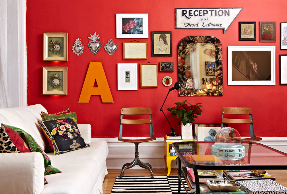
Designers Bob and Cortney Novogratz say cushions and throws come first, with a patterned rug alongside them. Red furniture or rugs also work in overlooked spots like hallways, staircases, powder rooms and a study.
Keep the furnishings around any red wall neutral.
Mylands advises painting the one thing you want noticed. A single red wall works as a focal point in the room, and the neutrals around it do the supporting work.
Going all in
Wall-to-wall red is a decision about light as much as color.
Homes & Gardens shows red carried over joinery as well as walls, which brings drama and still feels cozy. Contrasting colors temper the effect.
It can still go wrong. Mylands notes that an entirely red hallway turns very dark, and its fix is deep red on the lower wall and woodwork with a light neutral above.
What Colors Go With Red?
White, black, gray and warm neutrals let red lead the room. Green, navy, gold and pink change its character instead.
Neutral pairings
White keeps brighter reds crisp, and Homes & Gardens suggests white bedding with red on the ceiling and woodwork. Black and white together make a neutral base that lets a red velvet sofa carry the room, as in a design by Corine Maggio.
Mylands says sumptuous reds sit well beside gray and stone. Farrow & Ball goes a different way and contrasts Rectory Red with Joa’s White, a red-based neutral.
Color pairings
Green sits opposite red on the wheel, which is why sage works against a bold red in Livingetc’s living room examples. Understanding how the color wheel works explains the pull. Navy and burgundy give a moodier room, per Fabrics and Papers.
Dark, sumptuous reds sit best with gold metallic touches and dark wood, according to Neptune’s head of interior design. Rosy walls balance red tones, as Hunker’s bedroom roundup shows.
To test a palette before buying paint, a room color scheme generator lets you swap red against each of these.
Where to Use Red, Room by Room
Dining rooms and living rooms take red most easily. Bedrooms and kitchens take it in measured doses, and hallways, bathrooms and offices suit a contained statement.
Living Room
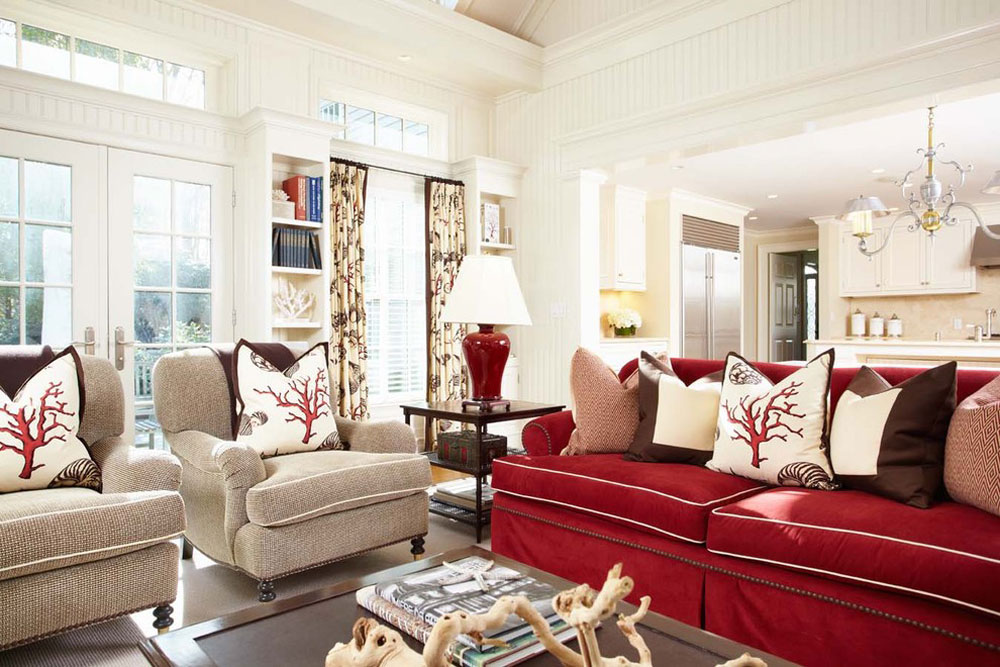
Designer Phillip Thomas tells clients not to be timid with color here, as Homes & Gardens reports.
Red is one of several accent wall colors that suit a living room, and neutral furniture keeps the wall from competing with everything else.
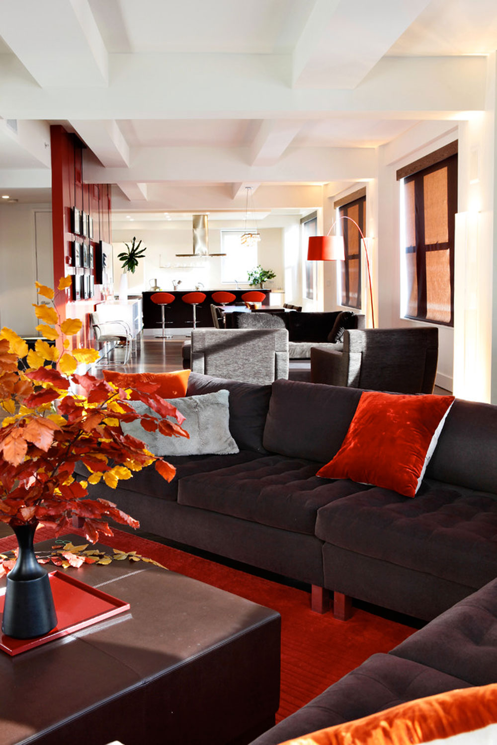
- A red velvet sofa warms a cool gray and white scheme
- Red armchairs look good against black, white and a dark floor
- Doors painted matt red can lift an otherwise neutral room
Dining Room
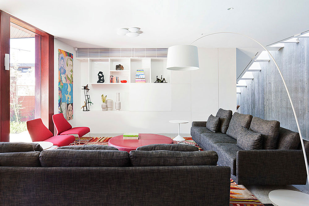
Dining rooms are where deep red earns its reputation. Plum, berry and burnt terracotta warm the room and look good by candlelight, per Mylands.
Brighter reds add energy instead and push conversation along in entertaining spaces.
Bedroom
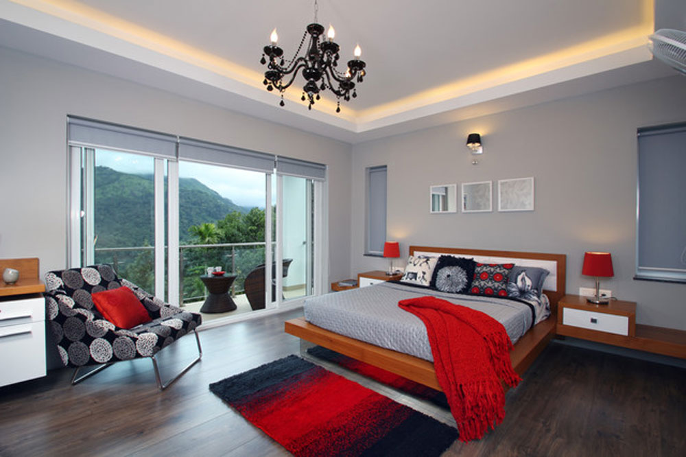
Start with textiles. Bedding and a red rug are easy to replace, and Hunker recommends the rug for the hesitant.
Red absorbs light, so Bensons for Beds says the lamp setup matters and lampshades should not be too opaque. Dark walls are a separate call. Mylands says burgundy or maroon cocoons a room built for rest, though pops of red used sparingly are safer, since too much overwhelms.
Kitchen
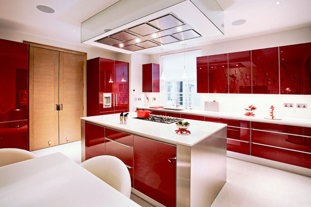
Mylands compares red in a kitchen to seasoning. A little adds warmth, too much takes over.
Deep reds pair with gold fittings, while brighter reds look modern next to white. Red tile or brick behind white cabinets does the same job without paint, so white cabinets with a red brick backsplash are worth sampling.
Bathroom, Home Office and Hallway
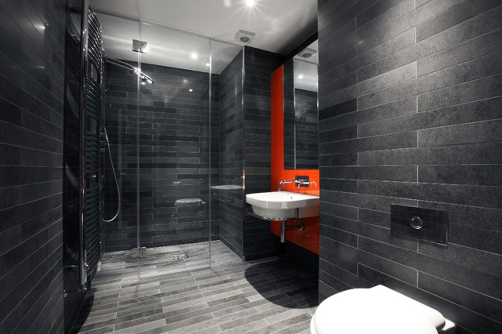
Hallways take deep red on the lower wall and woodwork with a light neutral above, which also masks scuffs.
Powder rooms and staircases suit a single red piece, such as a patterned runner or a small wallcovering feature. Home offices gain energy from brighter reds, per Mylands.
Materials and Finishes That Carry Red Well
Use matt or eggshell on walls, satin where hands touch the surface, and gloss only on doors and cabinetry. Fabric, paper and rugs then repeat the red in different textures.
Paint finish
Matt or flat paint hides uneven or textured walls, per Sherwin-Williams. Farrow & Ball’s Modern Emulsion is a matt finish at 7% sheen that resists scuffs.
The Boston Globe points to eggshell for living rooms and bedrooms, and to satin for high-traffic walls, kitchens and bathrooms. Gloss belongs on cabinets and doors only, since it can glare like a mirror in a bright room, the Boston Globe reported in 2022.
Gloss reds have history. Farrow & Ball compares Incarnadine to the deep glossy red David Hicks used at Barons Court in the 1970s.
Fabric and texture
Homes & Gardens shows a red velvet sofa on a black and white base, with a geometric curtain fabric adding pattern.
Leather changes the read. A dark brown leather sofa grounds deep red walls in another Homes & Gardens room.
Wallpaper, rugs, cabinetry and trim
Red wallpaper works best as a feature wall, as in an attic renovation shown by Fabrics and Papers. Measure first with a wallpaper calculator so you order the right number of rolls.
A red rug is the easiest way in, and Cyrus Rugs notes that traditional Oriental rugs come mostly in reds such as burgundy and maroon. Check dimensions with a rug size calculator before buying.
Satin or semi-gloss finishes on kitchen cabinets are trending, per the Boston Globe. Red walls carried over woodwork add drama and keep the room cozy.
How Light Changes Red
Direction, time of day and bulb type each shift how a red reads, so judge it in the room where it will live. A number on a swatch cannot do that job.
Natural light
Farrow & Ball’s guide to light and color sorts the four aspects like this, and it adds that even the time of year changes what you see.
| Aspect | Light behavior | Red approach |
|---|---|---|
| North | Cool, indirect light | Go deep and accept the cool cast |
| South | Warm light from dawn to dusk | Easiest aspect, bright or deep |
| East | Bright morning sun, cooler evenings | Bright reds by day, deep reds by night |
| West | Cooler mornings, warm afternoons | Warm reds peak late in the day |
The same pattern applies to every surface in the room. A broader look at how light works in interior design covers the rest.
Artificial light
Halogen and incandescent bulbs give off a yellow light that warms wall colors, so red drifts toward orange. Cool white bulbs go the other way, with bluer light that gives paint a cooler cast. Neutral white bulbs come closest to daylight, according to Farrow & Ball.
Test a swatch under the bulbs you already own, then again under a neutral white one.
When swatch numbers disagree
Third-party color databases list conflicting light reflectance values for the same red, and a maker’s own page does not always list one.
Treat any LRV for a red as a rough guide. The sample board settles it.
Which Design Styles Use Red Best?
Art deco, chinoiserie and maximalism treat red as a lead color. Mid-century modern uses it as a single accent.
Styles That Use Red Heavily
Art Deco
Livingetc describes the classic palettes as bold, rich and luxurious, with black grounding the scheme and jewel tones carrying the drama. Paint maker Tikkurila calls a bright crimson quintessentially art deco, and says some people save rich reds for the walls before adding black furniture and gold accents.
The full Art Deco color palette shows where red sits among greens, golds and creams.
The short version is red walls, black furniture and gold accents.
Chinoiserie
The V&A dates the European trade in Chinese wallpaper to the 1690s, with the fashion lasting into the early 19th century. The museum calls the style a fanciful Chinese look invented by Europeans.
Red lacquered cabinets, settees and panels carry it onto furniture, as antique dealers’ catalogues show.
Maximalism
Maximalist rooms hold together through a color thread.
Olive et Oriel’s guide says one or two colors should repeat across the wallpaper, the art, the cushions and at least one piece of furniture. Red works as that thread, and Little Greene pitches red-side wallpapers to maximalist homes.
Patterns all at the same scale read as relentless, the same guide warns.
Styles That Use Red as an Accent
Mid-century modern builds on ochres, browns, soft whites and warm neutrals, and Benjamin Moore calls red its signature spike. A red accent wall acts as a contemporary counterpart to the organic materials, per the same palette page.
The mid-century modern color palette guide lists the neutrals and woods that sit around that red.
In the heavy red styles, red is the point of the room and everything else supports it. In mid-century it’s the exception, so the rest of the room stays neutral and warm.
Does a Red Room Change How You Feel?
In controlled studies, red rooms raise physiological arousal. Much of that evidence comes from virtual reality, video, screens or short viewings, though, and the studies disagree on the details.
What the studies measured
- 60 participants sat in red and blue virtual rooms, and skin conductance rose more in red (Weijs and colleagues, Royal Society Open Science, 2023).
- 62 participants viewed colors on an LED panel for 30 seconds each, and arousal rose from blue and green to red (Wilms and Oberfeld, Psychological Research, 2018).
- 180 participants watched short videos of a 3D living room model, 60 of them seeing the red version, and the red room drew disgust and happiness as its most stated emotions (Gunes and Olgunturk, Color Research and Application, 2020).
- Kuller, Mikellides and Janssens (2009) compared colored rooms across 3 experiments, and red produced a more excited brain state, sometimes with a paradoxical slowing of the heart rate.
Where the studies disagree
AL-Ayash and colleagues (Color Research and Application, 2016) recorded heart rate rising in red and yellow conditions and falling in blue. Others found the opposite. Wilms and Oberfeld report that Kuller’s team saw heart rate higher in a blue room than in a red one, and Weijs and colleagues found the red-blue gap only at some saturation and lightness combinations.
Lightness cuts both ways. Wilms and Oberfeld tie higher arousal to saturated, bright colors, while Weijs and colleagues found darker rooms raised arousal whatever the hue.
Ratings point the same direction as the red findings. A 2011 Perceptual and Motor Skills study rated warm-colored living rooms as more exciting and stimulating, and cool ones as more restful and spacious.
What this means for a room
The Royal Society authors say much more work is needed before these results transfer to interior design.
I’d use the studies as a reason for restraint in rooms meant for rest, not as a rule. Kuller’s team also found that introverted people and those already in a negative mood reacted more strongly.
How to Test and Apply Red Paint
Sample two coats on large boards, watch them through a full day, prime with a gray-tinted primer, then roll the finish coats with a wet edge.
- Paint two coats of each red candidate on large sheets of card, letting each dry.
- Move the boards around the room and check them in morning, afternoon and evening light.
- Hold each board against white paper, then against floor, trim and fabric, so neighboring colors do not skew the read.
- Buy a gray-tinted primer, because red is naturally translucent and can turn pink over light walls.
- Prime the wall, then roll the first coat of red.
- Keep a wet edge and add a second coat, since roller and brush marks stay visible when red dries.
Sources split on boards versus the wall. Benjamin Moore says either works, a white board you can carry around the room or a patch brushed straight onto the wall, while some designers argue that a board never saturates the way paint on a wall does.
Bob Vila’s guide says the paint store can name the right gray for a given red chip. Work out the volume with a room paint calculator before you buy, because a deep red needs more coats than a pale neutral.
When Red Is the Wrong Choice
Skip red walls in small or dark rooms, in rooms built for sleep, and anywhere you cannot repaint. Red accessories deliver most of the effect in all those cases.
Designer Nishtha Vashist told Livingetc that very dark colors on walls and ceiling make a space feel smaller, and she warns against deep red walls under a black ceiling.
Bedrooms are a split decision. Mylands recommends dark burgundy and maroon for a cocooning bedroom, while Resene warns that too much red can raise your pulse and disturb sleep, and suggests confining it to a feature wall or headboard. The split follows shade. Deep, dark reds read as enclosing and bright reds as energetic, which fits the lightness and saturation pattern in the room-color studies.
Rentals are the plainest case. Red takes extra coats to apply, per Bob Vila, so a lease that demands repainting turns the walls into a project.
If red feels like too much for a bedroom, calming bedroom colors give a quieter base, and red can stay on the bedding.
The Daily Star adds that red advances toward the viewer, which shrinks a room visually. In a small space, the best colors for small rooms start lighter, and a single red rug or chair does the work.
Red Interior Design Ideas FAQ
What is Pompeian red?
The name comes from the wall paintings at Pompeii, and it usually means a deep ochre-red wall color. It points to a decorative tradition, not one exact pigment, since the Romans used cinnabar, sinopis and red ochre.
Pigment analysis also found that some walls that look red today were originally yellow.
Does red increase appetite in a kitchen or dining room?
The evidence is split. Research reported from the journal Appetite found people ate less from red plates, while Journal of Consumer Psychology work found red restaurant walls nudged diners toward unhealthy menu items.
None of the room-color studies cited in this article measured appetite. They measured arousal.
How do you cover dark red walls with a lighter color?
Prime first. Dark red shows through light paint, so use a high-hiding primer and plan on extra finish coats instead of one.
Paint stores can tint a primer for the job.
What trim color suits red walls?
A white matched to the red’s undertone. Farrow & Ball assigns each of its colors a complementary white chosen by undertone, which takes the guesswork out of trim.
What does red mean in feng shui?
In Chinese culture and feng shui, red is associated with luck, health and prosperity. The red front door is the most familiar way to apply the idea, and it lets you try red without repainting a room.
Choosing a First Red Move You Can Undo
Red interior design ideas carry the least risk when the first move is a movable piece. A rejected rug or chair leaves in an afternoon, while a rejected wall needs a repaint.
Escalate slowly:
- Red textiles, then one rug or chair
- A sampled board, then one wall
- Full color drenching, last
The sequence follows undo cost, which climbs from the price of a single item to the price of a primed and recoated room.
Small pieces do deliver less immersion, so the room reads as accented rather than red. That’s the trade.
As of October 2026, the arousal research leans heavily on virtual rooms, screens and short viewings. Studies in real homes would change how much weight mood deserves in this choice.

- Kitchen Color Schemes by Cabinet Color: What Pairs Well - October 19, 2026
- Curtain Colors for Every Wall Color: Safe vs Bold Picks - October 18, 2026
- Interior Design Styles: Find Your Primary and Secondary - October 14, 2026