Color Combinations
What colors go with blue? Blue paint ideas for your interiors

Most advice on colors that go with blue treats every blue as the same color, and that’s where it falls apart. How dark the blue is and which undertone it carries decide most of the pairing. Daylight changes both, so a navy wall that looks rich at noon can read flat and cold by evening.
Blue also turns up a lot in two-tone kitchens. Houzz (2026) found it on 19% of contrasting lower cabinets, behind wood at 37% and ahead of green at 14%. Those shares come from the 24% of renovating homeowners who chose contrasting upper and lower cabinets, in a survey of 1,780 homeowners.
Our color scheme guide for interiors puts blue side by side with every other color we cover.
Our color coordination guide puts blue side by side with every other color we cover.
Which colors go well with blue?

Neutrals are the safest choice, and warm oranges give the most contrast. Beyond that, walnut, brass, mustard, blush, green, teal and violet all sit well next to blue, and so do other blues.
| Pairing family | Colors | Effect in the room | Strongest blue shade |
|---|---|---|---|
| Neutrals | White, cream, gray, beige | Clean and calm | Navy, sky blue |
| Wood and metal | Walnut, oak, brass | Warm and settled | Navy, slate |
| Warm contrast | Rust, terracotta, mustard, blush | Lively, high contrast | Navy, cobalt |
| Cool neighbors | Sage, teal, lavender-gray | Layered and restful | Navy, denim |
| Other blues | Pale blue, powder blue, indigo | Tonal and quiet | Any, in light, mid and dark values |
Designers sort these pairings with color theory for interiors, and the vocabulary is short.
Complementary colors sit opposite blue on the wheel, which means orange and its family, including rust, terracotta and coral. Analogous colors are the neighbors, like green and teal and violet. A monochromatic room sticks with blue and only changes the value, such as pale blue walls with navy trim.
Blue and orange is the standard complementary pair.
Unsure where to start? Pick one neutral and one warm accent, then stop.
Neutrals that work with blue

White, cream, gray and beige all work with blue without much fuss. Black does too, in small doses.
- White gives the clearest contrast, and Design Cafe recommends white moldings, cornices and baseboards on blue walls.
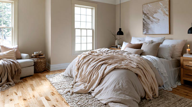
- Cream does much of what white does with less glare, so it suits pale and powder blues.
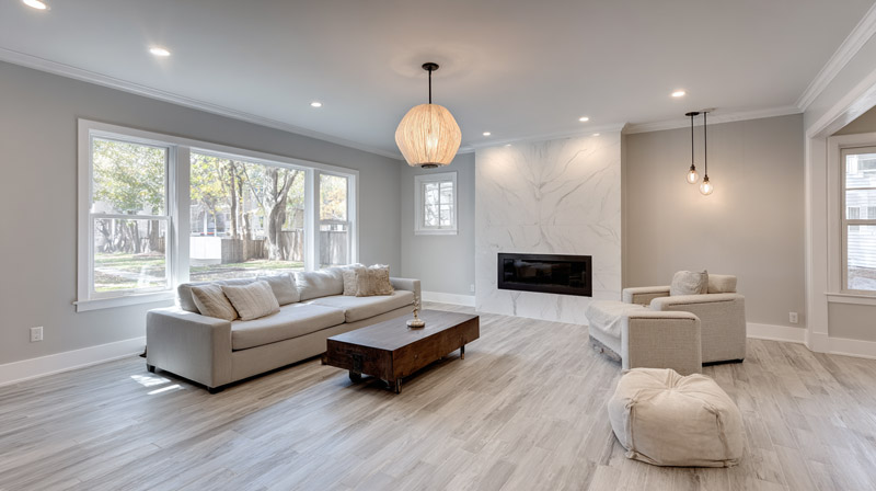
- Gray stays quiet. It works with every depth of blue.
- Beige and taupe run warmer, and Homes & Gardens includes navy and beige among its combinations.
- Black adds the most contrast, though navy next to black reads as one dark mass unless a light color sits between them.
Gray is the most flexible of the five, and the shades that pair well with gray run well beyond blue. Homes & Gardens calls navy and gray a classic combination.
The numbers show how much contrast a white gives. Benjamin Moore lists White Dove (OC-17) at a light reflectance value (LRV) of 83.16 and Hale Navy (HC-154) at 8.36, on a scale where 100 is the whitest white. That gap of about 75 points is the contrast a white trim gives a navy wall.
Farrow & Ball does some of the matching for you. Its color pages suggest a complementary white for each blue, such as Wevet for Hague Blue and Ammonite for Stiffkey Blue.
A cool gray beside a cool blue gives a chilly room. Cream, sand, natural wood or brass fixes that.
Wood tones and metals that suit blue

Walnut and brass are the strongest materials for navy, because both add warmth to a cool color. Silver and chrome suit the lighter, icier blues.
Wood choices shift with how dark the blue is.
- Navy walls with walnut or dark brown furniture read as classic and formal.
- Oak and ash are lighter and calmer, a better match for pale blue.
- Rattan and cane add texture without adding much color.
Livingetc calls navy a faux neutral, and says earthy browns are what ground it.
Walnut already in the room? The colors that suit walnut wood narrow the palette further.
Brass, gold and bronze brighten navy, teal and slate, and navy cabinets fitted with brass hardware are the common kitchen version. Silver, chrome and nickel suit powder blue, ice blue and gray-leaning blues.
Unlacquered brass changes color. Suffolk Latch Company notes that bare brass reacts to air, moisture and handling and gradually develops a patina. Lacquered brass stays more consistent until the lacquer wears, after which the metal can darken unevenly.
Paint finish counts too. Livingetc warns that matte paint can look one-dimensional and heavy on a color as deep as navy.
A satin or eggshell sheen gives the wall some depth, and it’s what I’d reach for on navy.
How to use orange, yellow and pink with blue
Warm colors work best as accents against blue, in their earthy versions. That means rust or terracotta for orange, mustard for yellow and blush for pink. A small amount of warmth against a large area of blue gives the strongest contrast.
Orange and rust

Orange sits directly opposite blue on the color wheel, which gives the highest contrast of any pairing.
Advice on using it is cautious. Livingetc’s navy living room guide warns that blending complementary colors isn’t always a solid plan.
The fix is a muted orange at small scale. Livingetc pairs navy walls with rust accents.
If burnt orange grows from an accent into a main color, check the colors that pair with burnt orange before adding a third hue.
Yellow and mustard

Livingetc suggests a mustard sofa to brighten a navy living room. A mustard sofa against navy walls is the obvious version. Smaller ones work too, like a single yellow chair beside pale blue walls, or ochre cushions on a denim or slate blue sofa.
Design Cafe suggests yellow accessories as small patches of bright color against blue walls.
One or two yellow pieces is the limit. A yellow wall next to a blue wall competes instead of contrasting.
Pink, blush and burgundy

Pink is the softer way to bring warmth into a blue room. Blush and rose make a gentler partner for navy walls, and Graham & Brown pairs navy with rose pink. Powder blue works in a bedroom with pink bedding against blue curtains. Burgundy is a darker, wine-toned step from pink, and Apartment Therapy lists it as a blue pairing.
Design Cafe pitches pink and blue to people who like an eclectic mix, so keep the rest of the room quiet.
Pairing blue with green, teal and violet
Green, teal and violet sit beside blue on the color wheel, so they form an analogous scheme that reads calm and layered. Clare’s paint guide lists sage green, teal and lavender-gray as its analogous partners for blue.
Analogous pairings

Green is the easiest neighbor. Livingetc says navy goes well with olive green, and reports that designers are coming around to blue and green together.
Sage keeps the pairing relaxed. If sage is already in the room, a guide to what sits well beside sage green shows which third color to add.
Teal is the bolder neighbor. Graham & Brown says a pop of teal breaks up the dark mood of navy and adds a contemporary touch to a traditional room.
Violet is the quietest option when it is grayed. Lavender-gray is the version Clare lists as an analogous partner for blue, and cream keeps it restful.
A monochromatic blue room
Monochromatic rooms stay with blue and change only the value, light to dark. Clare’s paint guide gives pale blue walls with navy trim as one example, along with denim blue cabinets and icy blue accents, or slate blue upholstery with soft powder blue textiles.
Blues of the same value flatten the room, so vary them. A blue-gray sectional, cerulean pillows and varied blues in the wall art against crisp white walls shows the idea.
How the shade of blue changes what pairs with it

Dark blues pair best with warm colors. Pale blues want soft neutrals, and saturated ones do better with plain white or metal. Livingetc likewise calls dark blue tricky when choosing accent tones.
| Shade of blue | Undertone and depth | Strongest partners | Pairing to skip |
|---|---|---|---|
| Navy | Cool, dark | Warm white, brass, mustard, blush | Black without a light color between |
| Sky and powder blue | Cool, light | Cream, taupe, soft gray | Cool gray, which turns the room chilly |
| Cobalt and royal blue | Cool, saturated | Bright white, gold | A second saturated hue at full strength |
| Teal, slate and denim | Green or gray lean | Coral, rust, cream | Other mid-value blue-greens |
Navy is the most flexible of the four, and the colors that suit navy cover more ground than this table shows.
Pale blues need less contrast. What pairs with light blue skews toward cream, taupe and soft gray.
Depth shows in the numbers. Sherwin-Williams lists Naval (SW 6244) at an LRV of about 4, and Benjamin Moore lists Palladian Blue (HC-144), a soft blue-green, at 60.4.
A navy that dark needs light partners to read as anything but one block. Palladian Blue reflects most of the light it gets, so its partners can sit at mid-tone.
So match the partner to the blue. A dark blue needs a light partner so the walls don’t read as one dark mass. A green-leaning blue wants warm cream or wood to keep the green soft, and a saturated blue stays with white or metal.
How to split a blue palette with the 60-30-10 rule
In a 60-30-10 split, a dominant color takes 60% of the room, a secondary color takes 30% and an accent takes 10%. Blue can fill any of those slots, and the slot decides what the other two colors have to do.
Benjamin Moore’s decorating guide puts the dominant color on the walls and solid furniture, and the second color in furniture, curtains, rugs and bedding. When the dominant color is blue, it advises using several shades of blue inside that 60 percent.
- Pick the blue and its slot: walls and large furniture for the 60, a sofa or curtains for the 30, cushions or art for the 10.
- Choose the second color from the neutral or wood families.
- Add one accent, usually a warm color such as rust, mustard or blush.
- Vary the values inside the blue slot (pale, mid, dark) instead of adding new hues.
- Check the result in daylight and in lamp light, then adjust.
With blue as the 30, try warm white walls, a navy sofa and curtains, and rust cushions.
With blue as the 60, two shades of mid blue on the walls work well, along with cream and walnut furniture, a brass lamp and a mustard throw.
A room color scheme generator tests these splits before any paint is bought.
If blue takes the 60, a room paint calculator turns the wall dimensions into a paint quantity.
Benjamin Moore puts the dominant color at 60%, usually walls and large furniture, and the secondary color at 30%, in upholstery, curtains and rugs. Livingetc places the 10% accent in cushions, art and small objects, and Homes & Gardens allows 3 colors per room with many tones of each.
Treat the rule as a guideline. Benjamin Moore says it needs no compass and ruler, and Homes & Gardens suggests newer decorators add extra accents one at a time.
Best blue pairings by room
Bedrooms and bathrooms take soft blues with quiet partners, while kitchens and living rooms carry deeper blues with warm contrast. Each room’s light and use set how deep the blue can go.
Bedroom

The Sleep Foundation says little research directly links bedroom color to sleep, though one survey found that people with blue bedrooms slept longest on average.
It lists green and white beside blue among the colors that calm a bedroom, and it flags orange and yellow as stimulating. Keep both to the accent share.
Living room
Decide whether blue lives on the walls or on the sofa.
With blue walls, keep the upholstery warm or neutral so the room has a light surface to sit against. With a blue sofa, keep the walls pale. Hillarys shows a blue sofa with mixed cushions against a white wall.
One large blue surface is enough.
Kitchen

Soft blue suits a calm, light kitchen, while darker blues that read almost black go the other way. An inky blue works as a statement color when it’s paired with crisp white for contrast.
Wood is the usual warm counterweight on the countertop, and blue cabinets over wood countertops are easy to picture in finished kitchens.
Bathroom and home office

Tile does the work in a bathroom. Homes & Gardens shows a shower room with navy and green tiles against a wooden vanity.
Home offices lean navy. Pantone’s 2020 Color of the Year statement credits Classic Blue with aiding concentration and bringing clarity, which is a claim from the color forecaster and not a measured result.
Why does a blue room look cold or heavy, and how do you fix it?
A blue room turns cold when cool daylight, cool partner colors and a low LRV stack up, and heavy when a dark blue gets too little light. Warm partners, a lighter second color and warm bulbs fix both.
Earthborn Paints describes how each room direction shifts blue.
- North rooms get cooler, darker light, which makes blue feel colder.
- South light is warm and sunny, so any blue works and cool blues balance the intensity.
- East rooms get yellow morning light that turns cooler as the day goes on.
- West rooms start with cool light that turns warmer toward evening.
Daylight is one part of light in interior design, and it moves the same blue from hour to hour.
Sources split on blue in north light. The Paint Shed recommends dark blues such as navy, midnight blue or smoky indigo there, with warm accents, and Clare says soft northern light deepens moody colors even though it calls blue risky in that room.
The Color Concierge advises against blue-gray paint and blue-undertone neutrals in north light, unless you want a light blue, because cool light makes blue bluer.
The disagreement tracks depth. Dark inky blues absorb the cool light and read rich, while gray-blues and pale cool blues pick it up and read icy.
At the light end, Benjamin Moore’s Woodlawn Blue (HC-147), a pale blue-green, has an LRV of 60.65. It reflects about 60 percent of the light it gets, so it stays light in a room with limited daylight.
Dark blue goes wrong in a small, dim room, where the walls absorb most of the light the room gets. Cool blue, cool gray and cool bulbs in the same room do it too, and so does icy or bright blue in north light, which the Paint Shed warns can feel stark.
A small room compounds the problem, and lighter picks are the usual answer. Colors that work in small rooms covers them.
The Paint Shed pairs dark blue with brass, natural wood and soft textiles. Rawlins Paints recommends warm white bulbs over cool white to offset cool natural light.
Common Questions About Colors That Go With Blue
What color trim goes with blue walls?
White is the standard trim color. A crisp, cool white sharpens the blue, while a soft or warm white takes the chill off the same wall.
Which curtains look best against blue walls?
White or cream curtains are the safe pick. For more color, see these curtain colors that suit blue walls: a deeper or paler blue keeps the room tonal, and rust or mustard adds contrast.
What color rug goes with a blue sofa?
A neutral rug in cream, sand or soft gray works, and a pattern with a rust or mustard thread adds warmth. The full set of rug colors for a blue couch is wider.
Skip a rug in the same blue value as the sofa, because the two flatten each other.
Do pastel colors go with navy?
Yes. Homes & Gardens states that all pastel colors go with navy. Blush, mint and lavender-gray are the easiest to place, and the pastel stays the lighter partner so the navy keeps its depth.
Does red go with blue?
Yes, as an accent. Deep reds such as burgundy are the easiest to place against navy, and both Livingetc and Apartment Therapy list burgundy as a color that goes with blue. A bright red tends to compete with a saturated blue.
How to Test a Blue Pairing Before Painting
Sample pots tested on the wall, by the window and under lamp light show how colors that go with blue behave in one specific room, before any paint or furniture is bought. Benjamin Moore’s color pages state that screen colors differ from the painted wall and tell shoppers to test with samples.
Order matters, because the blue’s undertone shifts with the light and every other color is judged against the blue as it actually looks.
- Paint the blue first, on two walls.
- Set the 30% color beside it, starting with the largest piece.
- Add the accent last, at cushion scale.
Time is the real cost, since each sample needs a full day of changing light on the wall before the verdict. Once you’ve settled on a pairing, professional painters such as Euro-Men Painting can help with surface preparation and consistent paint application, especially when working with deep blues that make uneven coverage more noticeable.
Once the pairing holds up, a paint calculator converts the wall area into the quantity to buy.

- Kitchen Color Schemes by Cabinet Color: What Pairs Well - October 19, 2026
- Curtain Colors for Every Wall Color: Safe vs Bold Picks - October 18, 2026
- Interior Design Styles: Find Your Primary and Secondary - October 14, 2026