Color Combinations
Colors That Go With Kendall Charcoal When Decorating

Kendall Charcoal has so little color of its own that whatever sits beside it ends up doing most of the talking. Warm whites, lighter pewter and greige walls, and muted accents like navy and sage are the safe bets.
HC-166 comes from the Historical Colors collection at Benjamin Moore. People paint walls and cabinets with it, and sometimes a door.
Benjamin Moore lists its light reflectance value at 14.61 (benjaminmoore.com, 2026). Heather’s Nest gives 12.96, so go with the manufacturer’s number.
Sources describe the undertone as green, brown or yellow, depending on who you ask. That disagreement is the reason the colors next to it matter so much.
To see how Kendall Charcoal compares with the partners other colors take, browse our roundup of safe and bold color pairings.
To see how Kendall Charcoal compares with the partners other colors take, browse our color combinations hub.
What Colors Go With Kendall Charcoal?
Warm whites do the most for it. Lighter greige and taupe neutrals, muted accents and natural materials follow, mostly because the paint sits close to neutral and takes its direction from its neighbors.
- White Dove and Swiss Coffee give a soft edge, while Simply White and Chantilly Lace give a sharper one
- Pewter, greige and taupe work on adjoining walls
- Navy and sage hold up well as accents, and so do blush, rust and a soft yellow
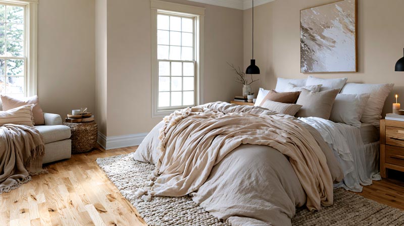
- Brass and light wood look good against it, along with rattan, jute and cognac leather
Havenly’s designers sum it up as leaning into the warmth and then adding a splash of bright white.
Benjamin Moore’s own combination sets for HC-166 pair it with Hawthorne Yellow and Simply White in one, and with Harbor Haze and Snow White in the other (benjaminmoore.com, October 2026).
Pairing rules for charcoal grays in general carry over to this paint, and this look at which colors suit charcoal gray in general covers the shared ground.
What Are Kendall Charcoal’s Undertone and LRV?
Kendall Charcoal sits at an LRV of 14.61, which makes it a dark, near-neutral gray. The undertone is faint and drifts between green and brown depending on what surrounds it.
- HC-166, from the Historical Colors collection
- LRV of 14.61 per Benjamin Moore (benjaminmoore.com, 2026)
- Heather’s Nest lists 12.96 and Jenna Kate at Home lists 13
- On Benjamin Moore’s scale, 0 is absolute black and 100 is pure white
LRV: Why the Numbers Differ by Source
Benjamin Moore publishes 14.61, and that’s the figure to work from.
The two blog values sit about 1.6 points lower and neither one explains the gap.
For pairing purposes the exact decimal matters less than the distance to the neighbors. At this depth the wall reflects only a small share of the light in the room, so the colors beside it carry most of the brightness.
Undertone: Green, Brown or Yellow?
Four sources, four slightly different descriptions.
- Love Remodeled calls it green and black
- Havenly describes a subtle warmth with a slight green tint
- Heather’s Nest sees a mild green, sometimes leaning brown
- The Paint Color Consultants database lists a very weak yellow and calls it near neutral
What they share is weakness. That database entry puts saturation at 3 percent.
A cast that faint gets pushed around. Heather’s Nest notes it reads cooler beside cool paint colors and warmer beside warm ones.
The working rule follows from that. Brick & Batten advises warm partners when the fixed elements nearby (floors, cabinets, fixtures) run warm.
Which White Trim Goes Best With Kendall Charcoal?

White Dove is the safest default for most rooms. Simply White suits a crisper look, and Chantilly Lace delivers the hardest contrast.
| White | Code | Effect next to Kendall Charcoal | Pick it when |
|---|---|---|---|
| White Dove | OC-17 | Soft edge, slight warmth | You want a quiet room with warm materials |
| Simply White | OC-117 | Clean and crisp, a hint of warmth | You want clarity without a cold edge |
| Chantilly Lace | OC-65 | Brightest, cooler contrast | You want a graphic, modern outline |
| Swiss Coffee | OC-45 | Creamy, warmer than the others | Wood, brass and leather carry the room |
Benjamin Moore’s own pages back this up. The White Dove page lists Kendall Charcoal in a combination set, and the Kendall Charcoal page lists Simply White in another (benjaminmoore.com, October 2026).
Against 14.61, these whites run from 81.91 (Swiss Coffee) up to 90.04 (Chantilly Lace). That’s a spread of roughly 67 to 75 points.
A gap that wide turns trim into an outline, which is a clear case of how contrast works in a room. Contrast shows up whichever white you pick, so the real decision is about tone.
Cream and ivory are where people slip. Kylie M Interiors notes that cream trim or cabinets won’t always make Kendall Charcoal look updated.
Chantilly Lace is the popular pick, but I’d sample White Dove first. Jenna Kate at Home keeps the other three walls in a slightly warm white like White Dove when charcoal is the accent wall.
Which Lighter Neutrals Pair With Kendall Charcoal on Walls?

Pewter, greige and taupe tones pair best. They share its warm-leaning neutral base and sit far enough lighter that they don’t compete with it.
- Revere Pewter HC-172 bridges warm and cool tones, at LRV 55.05 (Benjamin Moore, 2026)
- Pale Oak OC-20 has warm gray undertones and sits lighter again
- Light Pewter 1464 is a greige balanced between warm and cool
- Cement Gray 2112-60, a cool gray at LRV 59.96, gives a clean step up in lightness for a cooler look
Brick & Batten lists Revere Pewter and Pale Oak among the partners worth testing. Paint Color Consultants names Manchester Tan alongside White Dove for lightening trim and ceilings.
If Revere Pewter is already on a neighboring wall, this guide to the colors that work around Revere Pewter covers the rest of that room.
Benjamin Moore’s shade strip for HC-166 also lists Cement Gray, Nightingale, Storm, Secret, Amherst Gray and Ashwood Moss. One of them is a trap.
Amherst Gray HC-167 has an LRV of 18.8, about 4 points above Kendall Charcoal. It reads as a shade of the same color and not as a partner, so skip it if you want contrast.
Which Accent Colors Work With Kendall Charcoal?
Muted navy, sage green, terra cotta and rust, soft yellow and blush all hold up against it. Saturated brights are much harder to pull off.
Brick & Batten makes the same point about muted yellow, maroon and pale pink, saying less is more with brighter colors. Treat the accent as the smallest slice of a 60-30-10 split.
Before buying samples, run a few combinations through a generator that builds color schemes for a room. A physical chip still beats any screen, though.
Blues and Greens

Hale Navy HC-154 has an LRV of 8.36 (Benjamin Moore, 2026), so it reads darker than Kendall Charcoal and not lighter.
FacadeColorizer’s take is that in adjoining rooms the navy becomes the bold color and the charcoal turns into the quiet anchor. Use it on a smaller surface for depth.
Saybrook Sage HC-114 is a soothing green cooled with gray. Love Remodeled adds Healing Aloe, a blue-green that Benjamin Moore pairs with it.
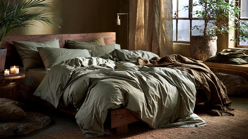
Havenly’s bedroom example puts the green in sage bedding against a warm wood frame. Textiles are the lower-risk way to try it.
Warm Earthy Tones
Havenly pairs the paint with terra cotta and shows rust drapery in a charcoal living room. Hawthorne Yellow HC-4 shows up in Benjamin Moore’s own combination set for HC-166, and Brick & Batten lists maroon with the same warning about restraint.
Keep these to cushions and a rug border, or one chair. A full wall in any of them is asking a lot.
Soft Pinks

Blush is the gentlest contrast here.
Hunker’s roundup of charcoal gray pairings features a living room where pale blush chairs stand out against a charcoal accent wall, and Brick & Batten lists pale pink too.
A blush wall and a charcoal wall in the same room split attention. Use blush on one piece at a time, like upholstery, bedding or a framed print.
Which Wood Tones, Metals and Textures Suit Kendall Charcoal?

Warm woods, brass and natural-fiber textures suit it best, because they throw warmth back onto a wall whose undertone is faint.
On wood, FacadeColorizer points to warm oak and walnut while Havenly leans on light wood tones. The sources split on depth and agree on warmth, so warmth is the rule and depth is your call.
Brass is the repeat pick for metal. Havenly’s designers call brass accents with a rattan pendant light a foolproof pairing, and Hunker shows brass hardware beside a beige sink against charcoal gray walls in an Amber Lewis powder room.
For texture, Havenly names jute and sisal along with wicker, FacadeColorizer likes natural linen, and Hunker shows camel leather over weathered wood floors in a Leanne Ford living room.
Hunker notes that charcoal gray can come off flat, and that natural textiles and wood furniture add interest against it. The wider logic is covered in this look at how texture shapes a room.
Hunker’s advice to offset charcoal’s coolness with wood is written for charcoal grays in general. This paint already leans warm, so wood adds to the warmth here instead of correcting for cool.
Cool gray-washed floors work against it. FacadeColorizer says they amplify the green.
How Does Light Change Kendall Charcoal and the Colors Beside It?
Light changes the charcoal and its partners at the same time. South light warms the wall and north light cools it, so the pairing fix is to follow the light with your whites, crisper where the sun is strong and warmer where it isn’t.
How Exposure Changes the Read
In south-facing rooms the warm light shows the brown side of the paint. Benjamin Moore’s Spain site recommends Chantilly Lace for trim and ceilings there, with a matte or eggshell sheen on trim to cut reflection (2023).
North-facing rooms get three different descriptions. Heather’s Nest says it reads blue-gray, FacadeColorizer says sage-charcoal, and Kylie M Interiors says it stays a plain gray base with no warmth.
The sources don’t settle why. Kylie M Interiors points to the amount of light and not only its direction, and Benjamin Moore’s Helen Shaw, quoted in Homes & Gardens, says direction matters little when window treatments cover the glass most of the day.
For the whites, Shaw’s advice for north rooms is warm undertones to soften shadows. That’s one more reason White Dove is the safer first sample there.
Bulbs matter as much as windows after sunset, and the basics are covered in this guide to how light behaves in interior design.
FacadeColorizer reports that 2700K bulbs make the paint read deep and cozy, while 4000K bulbs push the green forward.
How to Test a Palette in Your Own Room
Benjamin Moore advises observing samples in your own light, natural and artificial. The sequence below follows its guidance and FacadeColorizer’s.
- Order a brush-on or peel-and-stick sample of Kendall Charcoal, plus chips of your trim white and one accent.
- Paint two coats on a 12-by-12-inch board (Benjamin Moore suggests a foam poster board).
- Tape it to two different walls, one of them in the darkest corner.
- Check it mid-morning and mid-afternoon, then again at night under your normal bulbs.
- Watch the shaded corners for the green surge FacadeColorizer describes.
- Lay the white and accent chips against the board before deciding.
Where in the Home Do These Pairings Work Best?

Living rooms with plenty of natural light, dining rooms with crisp white wainscoting, studies, kitchen cabinets and the inside of doors are the placements with documented results.
- Havenly keeps the rest of a living room neutral, with a tonal gray sofa and white curtains plus natural wood
- In a dining room, Havenly pairs it with crisp white wainscoting and a crystal chandelier
- FacadeColorizer suggests a study or library with walls, trim and ceiling all in one color
- For a bedroom, Havenly uses natural olive, a light gray rug and woven wall art
Young House Love’s 2014 showhouse used it in a dining room with white trim and linear wainscoting. The mudroom got the same color, and the white built-ins and two big doors kept it from feeling too dark.
Cabinets, Islands and Doors

Kylie M Interiors calls it an awesome cabinet color for kitchen cabinets, lower cabinets, islands and bathroom vanities. She adds that it coordinates with some granite countertops popular in the early 2000s.
Hunker shows the usual recipe in a kitchen. Warm white uppers sit over charcoal lowers, tied together by brass hardware.
Charcoal cabinets behave like any gray cabinets, with the wall, counter and backsplash setting the mood, and this guide to colors that go with gray cabinets covers that side.
Dark paint needs two coats over primer for full depth, per FacadeColorizer, so work out the quantity with a room paint calculator before buying.
Doors work too. A reader planning to paint the inside of a front door in a small condo, with Sherwin-Williams Pure White trim, got Kylie M Interiors’ go-ahead in March 2024.
Accent Wall, Two-Tone or Full Drench
A full drench means walls, trim and ceiling in one color. FacadeColorizer says a matching ceiling looks luxe and continuous, and a warm white ceiling gives lift if the room feels closed in.
Two-tone with a chair rail is the other route. One reader painted the lower half charcoal and the upper half Swiss Coffee in a living room that gets little light, then found it boring.
Kylie M Interiors replied in January 2025 that soft taupes can fall flat in a darker room, so white above the rail may be the right call. Her other suggestion was to add interest with artwork.
When Does Kendall Charcoal Fall Short, and What Are the Alternatives?
It struggles in small, dim rooms where it turns murky or near-black, and anywhere you actually want a true black or a lighter gray. A different charcoal does the job better in those cases.
Rooms Where It Struggles
A small, dim, north-facing room with no warm light source can go murky sage-gray instead of dramatic, according to FacadeColorizer.
Kylie M Interiors says a room with too little light, or with small or no windows, makes it look almost black, a heavy soft black.
She also says that in a dark room where you want a quiet partner, taupes fall flat and white is the better call.
If the room is both small and dim, sample a lighter charcoal before committing.
What to Choose Instead
Choose by depth first, then by undertone.
| Color | LRV | Character | Choose it when |
|---|---|---|---|
| Chelsea Gray HC-168 (Benjamin Moore) | 23.33 | Gray with the slightest hint of brown | The room is small or dim and needs a lighter charcoal |
| Peppercorn SW 7674 | 9.681 | Neutral dark gray, no green | You want a dark gray that stays gray |
| Iron Ore SW 7069 | 5.55 | Soft black, a touch warmer than Wrought Iron | The green undertone is a dealbreaker |
| Wrought Iron 2124-10 (Benjamin Moore) | 8.17 | Soft near-black | You want drama on cabinets, doors or a bold wall |
LRV sources: Benjamin Moore (2026) for Chelsea Gray and Wrought Iron, Sherwin-Williams for Peppercorn and Iron Ore.
The sources disagree on Wrought Iron. Benjamin Moore lists 8.17, FacadeColorizer’s comparison guide gives about 6, and the same site calls the undertone slightly blue in one guide and green-leaning in another.
Treat the manufacturer figure as the reference and sample both. Each swap also changes the undertone, so re-sample the trim white and the accents against the new color instead of carrying the old pairings over.
Common Questions About Kendall Charcoal Color Pairings
How does Kendall Charcoal look in east- and west-facing rooms?
West light deepens it to a soft near-black with the brown warmth showing, according to FacadeColorizer. East light keeps it warm in the morning and turns it greener and grayer by afternoon.
Kylie M Interiors says the result depends on how much light the room gets, not only its direction.
Is there a Sherwin-Williams equivalent to Kendall Charcoal?
No exact match exists. Kylie M Interiors says Kendall Charcoal is unusual enough that Sherwin-Williams options shift the undertone or temperature.
Her closest suggestions are Grizzle Gray, a green-gray, and Roycroft Pewter, a dark gray with a flexible blend of undertones. Sample each beside the Benjamin Moore original before choosing.
What sofa and upholstery colors work against Kendall Charcoal walls?
A tonal gray sofa with white curtains and natural wood is Havenly’s neutral recipe, and cognac leather adds warmth to it.
Hunker shows camel leather chairs against charcoal walls, and FacadeColorizer lists natural linen among the fabrics that bring out the paint’s brown side.
Which Kendall Charcoal Pairing to Lock In First
Settle the trim white before anything else, because the white sets the contrast the rest of the palette gets judged against.
After that, pick the wall neutral with the white in view, and buy accents and textiles once the furniture arrives. The order follows cost of change. Paint is expensive to redo, while pillows, bedding and rugs swap out cheaply.
Benjamin Moore’s figures place the four trim whites about 67 to 75 LRV points above the paint, so any of them gives strong contrast. The choice among them changes warmth, not whether contrast exists.
The trade-off is range. An early white narrows the wall neutrals that sit well beside it.
Position verified against Benjamin Moore’s color pages on October 14, 2026.

- Kitchen Color Schemes by Cabinet Color: What Pairs Well - October 19, 2026
- Curtain Colors for Every Wall Color: Safe vs Bold Picks - October 18, 2026
- Interior Design Styles: Find Your Primary and Secondary - October 14, 2026