Color Combinations
Trendy Colors That Go With Peach In Interior Design

Before you look at partner colors, look at the peach itself. It covers a lot of ground, from pale blush to near-coral, and a color that flatters one end of that range can look off on the other. Cream, warm white, warm gray, navy, sage, olive, teal and terracotta are the best colors that go with peach in interior design, and which one wins depends on the undertone and depth of your particular shade.
Benjamin Moore’s peach-named paints show how wide the range gets. Peaches ‘n Cream sits at an LRV of 30.88, while Sun Kissed Peach reaches 85.41 (Benjamin Moore, 2026).
LRV stands for light reflectance value. On its 0 to 100 scale, the number tells you what percentage of light a surface bounces back.
A deep peach needs lighter partners. A pale one can carry navy or charcoal. So the partner list shifts with the shade and with where the color goes, whether that’s walls, upholstery or accents.
To see how peach compares with the partners other colors take, browse our interior color combinations guide.
To see how peach compares with the partners other colors take, browse our color pairing chart.
Which colors go with peach, depending on its undertone?
Golden, yellow-leaning peach gets along with cream, olive, walnut and navy. Pink-leaning peach is happier with warm gray or sage, and a deep blue works too. Coral-leaning peach wants teal and forest green.
Peach sits between pink and orange. Pantone described Peach Fuzz (13-1023) that way when it named the shade its 2024 Color of the Year in December 2023.
Where a given peach leans inside that gap decides which partners look right.
| Undertone | Best partners | Weak partners | Mood |
|---|---|---|---|
| Yellow-leaning (apricot, golden) | Cream, olive, walnut, navy | Cool blue-gray | Warm, vintage |
| Pink-leaning (blush, dusty) | Warm gray, sage, deep blue | Yellow-based cream | Soft, modern |
| Coral-leaning | Teal, forest green, crisp white | Muddy beige | Bold, lively |
To find out which camp your peach belongs to, hold the paint chip against plain white paper. A yellow cast means golden peach. A rosy cast points to pink-leaning, and a red-orange cast to coral-leaning.
Farrow & Ball’s Setting Plaster is a good example of the warm, yellow-touched side. The brand describes it as a pink softened by yellow pigment and suggests it as a backdrop for antique furniture or next to Mahogany.
Dulux files its Warm Peach under golden shades. It recommends deep brown or walnut, brass with amber, and navy or forest green alongside it.
Which neutrals work best with peach?
Cream, warm white and beige keep contrast low, which lets peach read as a soft color. Gray and charcoal raise the contrast and push the room toward a modern look.
Soft neutrals

- Cream is the closest match for golden peach, with almost no contrast.
- Warm white is the usual choice for trim and ceilings against peach walls.
- Beige adds depth through sofas and rugs without competing with the wall.
Bricknbolt’s wall guide suggests light furniture in white or soft wood to keep a peach room airy.
Gray and dark neutrals
Warm gray is the better gray for peach. A cool, blue-based gray makes golden peach look dull.
Gray flooring or a gray sofa already in the room? Check which colors sit well with grey before you commit to a peach shade.
- Warm gray reads soft and modern.
- Charcoal grounds the room, though I’d keep it to cushions and joinery.
- Black is graphic and works best in small doses.
HomeLane’s living room advice pairs matte peach walls with charcoal cushions, gray ceramic planters and textured throws. Hunker shows the loud version in a peach, black and white bathroom by Black Lacquer Design.
How do navy, sage, olive, teal and burgundy change a peach room?

Navy and teal add contrast, sage and olive calm things down, and burgundy brings weight. Each one carries a risk, and the table below flags it.
| Accent | What it adds | Watch out for |
|---|---|---|
| Navy | Strong contrast, peach glows | Heavy in small rooms |
| Sage | Calm, natural, low contrast | Dull if gray-leaning |
| Olive | Earthy, suits golden peach | Dark olive shrinks a room |
| Teal | Lively complementary contrast | Weak in cool north light |
| Burgundy | Drama, rich depth | Heavy beyond accent use |
Hunker’s roundup shows the navy route in a Moroccan-inspired bedroom by Faith Blakeney. Building from a navy sofa instead of the wall? The colors that go with navy blue cover more ground than peach alone.
Sources split on teal. It appears in many peach pairing lists, yet Ideal Home’s north-facing bathroom guide says cooler greens and teal work less well in north-facing spaces. Its recommendation there is olive and sage, plus soft peach or apricot for warmth.
If sage is the color you already own, see the colors that go with sage green for the rest of the palette.
- Asian Paints notes that burgundy adds drama to a peach room.
- Powder or dusty blue suits nurseries and bedrooms.
How do analogous and complementary schemes work with peach?
Analogous schemes borrow from the neighbors of peach (coral, terracotta, soft yellow, orange, gold) and give a warm, low-contrast room. Complementary schemes go to the opposite side of the wheel, blue-green and teal, for contrast.
Most designers work from Johannes Itten’s wheel, a twelve-part version he built at the Bauhaus from 3 primary, 3 secondary and 6 tertiary colors (Artists Network). Basic color theory in interior design rests on that wheel.
Munsell’s system adds the vocabulary for depth. Britannica describes it as measured scales of hue, value and chroma. Peach scores high on value (light) with modest chroma (soft), so its partners can be much deeper without a clash.
Analogous schemes

- Coral is the closest neighbor on the pink side, and the colors that go with coral help if the room leans that way.
- Terracotta grounds the wall. Sherwin-Williams lists the clay-toned Cavern Clay (SW 7701) at an LRV of about 20 on its 0 to 100 scale.
- Asian Paints says yellow is the brighter partner, with peach balancing its vividness.
- Orange and gold are sunny in accessories, and gold suits bedrooms.
All of these stay in one temperature zone, so the room reads cohesive. The weak spot is flatness, which a deeper terracotta or a white ceiling fixes.
Complementary and triadic schemes
The opposite of peach sits in the blue-green zone, so teal and soft aqua give the cleanest contrast. Blue-violet accents contrast too, one step off.
A triadic scheme spaces three hues four steps apart on Itten’s wheel. Peach (orange), sage (green) and lavender (violet) make one, and it stays calm only while saturation stays low.
Which peach combinations suit the bedroom, living room, kitchen, bathroom, nursery and home office?

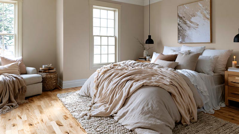
Bedrooms take peach with neutral bedding. Living rooms pair it with charcoal, navy or olive, and kitchens with white cabinets and a blue island. Bathrooms favor soft peach or apricot, and nurseries and home offices lean on powder blue, mint and warm wood.
| Room | Peach role | Best partners | Reason |
|---|---|---|---|
| Bedroom | Walls | Cream, warm gray, white ceiling | Low contrast, calm |
| Living room | Walls or accent wall | Charcoal, navy, olive, brass | Grounds a light wall |
| Kitchen | Walls | White cabinets, blue island | One cool block |
| Bathroom | Walls or tile | Terracotta, taupe, brass | Warms cool light |
| Nursery | Walls or bedding | Powder blue, mint, cream | Soft and open |
| Home office | Feature wall | Walnut, navy, forest green | Warm but focused |
In a bedroom, keep peach on the walls and everything else quiet. Palettes built from calming bedroom colors stay low in contrast, which suits peach with neutral bedding.
Bricknbolt’s kitchen formula is peach walls, white cabinets and blue accents on the island or bar stools. With white cabinets and a blue island, blue ends up as the only cool block in the room.
Ideal Home lists soft peach or apricot among its warming picks for a north-facing bathroom. Asian Paints recommends peach combinations for study spaces and living rooms as well.
How does lighting change peach and the colors around it?
Light direction and bulb temperature both shift peach, and the effects stack. North light cools and calms it, south light warms it, and warm bulbs push it further the same way after dark.
Direction comes first.
- North light is indirect and cool. Benjamin Moore says it dulls colors with gray, blue or lavender undertones, so gray-based partners go flat next to peach first.
- South light is warm and turns intense at midday, per Benjamin Moore. Farrow & Ball suggests soft, pale tones here to maximize the feeling of light and space.
- East light is bright and warm in the morning, then fades to cool blue by late afternoon.
- West light is cooler in the morning, then brighter and golden late in the afternoon. Farrow & Ball names warm tones such as Setting Plaster as good options for making the most of that golden light.
Earthborn names Maybe Maggie, a warm neutral with a yellowy-pink undertone, as one that counters cool north-facing light.
Bulbs add a second layer. Farrow & Ball’s light guide says halogen and incandescent bulbs give off yellow light that warms wall colors, while cool white bulbs cast a bluer one.
Consumer Reports defined color temperature in Kelvin in its 2015 bulb label guide. Around 2700K gives a warm yellow light, similar to an incandescent, and most Energy Star qualified bulbs land between 2700K and 3000K. Bluer-white light sits at 5000K to 6500K.
Read together, the two guides give a working rule. Bulbs in the 2700K to 3000K band keep peach warm after dark, and anything at 5000K or above turns it cool and flat.
Color rendering index (CRI) matters too, because Consumer Reports describes it as how accurately colors appear under a bulb.
Daylight and bulbs work as one system, and the role of light in interior design goes further into layering the two.
Which materials and finishes go with peach?
Brass, walnut, linen and velvet pair most reliably with peach, and eggshell or matte paint suits peach walls better than gloss. Each material does a different job, whether warming, grounding, softening or adding depth.
| Material | Effect with peach | Where it goes |
|---|---|---|
| Brass or gold | Adds warm shine | Lamps, mirrors, hardware |
| Walnut or oak | Grounds a light wall | Furniture, floors |
| Linen | Softens, adds texture | Curtains, bedding |
| Velvet | Adds depth, richness | Chairs, cushions, headboards |
| Terracotta | Echoes the warmth | Planters, tiles |
Berger Paints pairs a deeper peach wall with textured wood panelling, lists peach with off-white for living rooms, and suggests layering metallic elements and textured cushions.
If walnut is already in the room, the colors that go with walnut wood show where peach fits among them.
Velvet holds a sheen while linen absorbs light, so the same peach reads as two different tones across them. How texture in interior design shifts a palette is worth a look before you pick fabrics.
Kelly Wearstler’s Dahlia cocktail lounge in the Downtown LA Proper hotel shows what texture does. Its blush Roman clay plaster walls carry peach undertones and rich depth, and that kind of finish gives a pale warm color a depth flat paint does not.
Finish counts too, and the right one for peach walls depends on the room.
- Eggshell is Benjamin Moore’s top choice for bedrooms and living rooms, because its low sheen casts a gentle glow on color.
- Matte gives the deepest color and hides surface flaws, but it washes less well.
- Satin suits kitchen and bathroom walls where wipeability matters.
- Semi-gloss belongs on trim and cabinets only, since gloss reflects light and shows every blemish.
When do peach color pairings fail?
Peach pairings go wrong in a few predictable places, and most of them are easy to spot before any paint goes on.
- A pink-leaning peach next to a yellow-based partner turns chalky or muddy. Test the peach beside the partner, never alone.
- A saturated warm color in a west-facing room can turn intensely vivid in the late afternoon. A saturated peach does the same, so go softer and more muted in strong afternoon light.
- Peach, orange, gold, terracotta, brass and walnut all together leave the eye no place to rest. Give one third of the room to a cool or neutral color.
- Peach with pale yellow and mint reads as a nursery. Add navy, charcoal or olive as the deep accent.
Deep peach in a small, dim room has its own problem. It absorbs light, so the room shrinks, and a lighter shade fixes it.
Most of these repairs come down to matching the contrast level to the light in the room, and contrast in interior design covers how far to push it.
How to build a peach palette for your room, step by step

Start with the undertone, then the neutral base, the secondary color and the accent, and leave bulbs and samples for last. That final step is where most peach rooms go wrong.
A room color scheme generator can preview the whole split before you buy a single sample pot.
- Fix the undertone. Hold the chip against white paper and sort it as golden, pink-leaning or coral-leaning.
- Pick the 60 percent. The 60-30-10 rule gives 60 percent to the feature color, usually on the walls, per Country and Town House. If you are unsure of the shade, peach at 30 percent on upholstery or one wall costs less to correct than four peach walls.
- Choose the 30 percent. Navy, sage, olive or charcoal on the sofa, curtains and rug.
- Add the 10 percent. Brass, burgundy or terracotta in cushions, lamps and trims.
- Buy the bulbs first. Have the room’s bulbs in place before you buy test pots, because light changes how a sample reads.
- Sample big. Brush two coats on white foam core board, per Benjamin Moore’s advice, and move it around the room. Crown recommends living with samples for at least three full days, checked in morning light and lamplight, beside the sofa, rug and curtains (open and closed).
Once the shade is final, a room paint calculator gives the quantity so you buy the right amount once.
Colors That Go With Peach FAQ
What color furniture goes with peach walls?
Navy or charcoal gives contrast. White or light wood keeps the room airy, and walnut or oak adds warmth.
A sofa in the same peach as the wall disappears, so go a tone deeper or switch hue.
Which curtain colors suit peach walls?
Cream or warm white keeps a peach room light. Navy, olive or burgundy drapes add depth.
Pick a curtain tone clearly different from the wall, since a near match reads as a mistake.
How is peach different from coral and salmon?
Peach is the lightest and softest of the three, sitting between pink and orange. Coral leans red-orange and salmon leans pink-orange, and both carry more saturation.
A coral-leaning peach is the bridge between them.
Is peach still in style?
Yes. Pantone named Peach Fuzz its 2024 Color of the Year and picked the white Cloud Dancer for 2026 (announced December 2025), yet designers still list muted orange and blush shades among 2026 favorites.
For a lighter, warm option, try Sherwin-Williams Aristocrat Peach (SW 0027, LRV about 65), which suits living rooms and bedrooms.
Which peach paint shades should I sample first?
Start with one mid-depth and one pale peach. Sherwin-Williams Sumptuous Peach (SW 6345, LRV about 54) and Benjamin Moore Peach Nectar (2168-60, LRV about 78) cover both.
Sample both beside your trim and furniture before you buy a gallon.
Choosing the Right Peach Palette for Your Room
Let light direction and room size decide first and taste second. Daylight determines which undertone and which partners hold their color.
Order the decisions by what costs most to reverse. Undertone and light direction get settled first. The neutral base and large furniture come next, and accents, bulbs and textiles can wait.
Walls and sofas cost the most to correct, so they get decided while the palette is still on paper.
Limiting the palette to peach, a warm neutral and one deep partner keeps the room safe, at the price of the layered look a fourth hue adds.
As verified in October 2026, Pantone’s December announcement (Peach Fuzz in 2023, Cloud Dancer in 2025) moves which shades brands promote, while undertone and light keep governing the result.
Styling ideas for peach interior design, room by room, are the next step.

- Kitchen Color Schemes by Cabinet Color: What Pairs Well - October 19, 2026
- Curtain Colors for Every Wall Color: Safe vs Bold Picks - October 18, 2026
- Interior Design Styles: Find Your Primary and Secondary - October 14, 2026