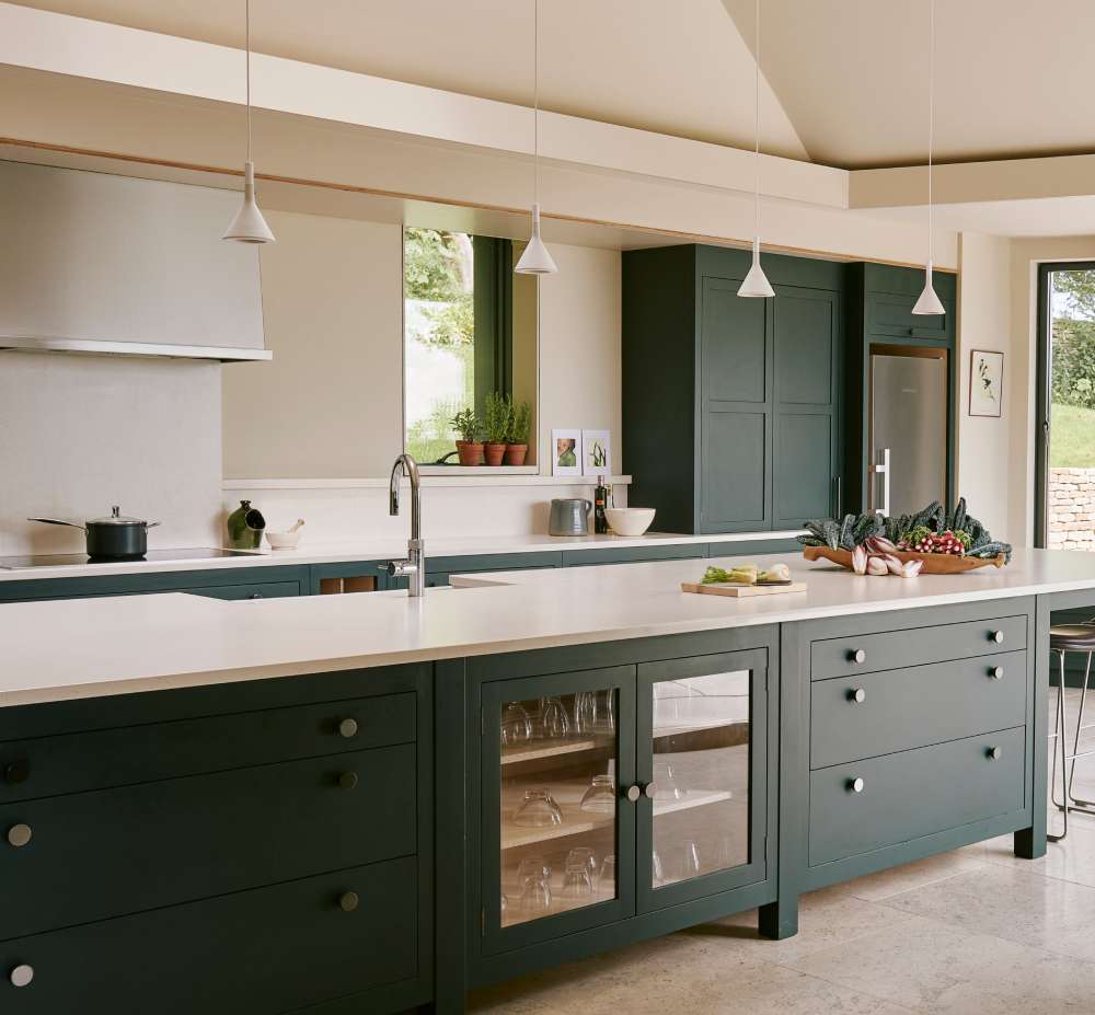
A blue kitchen island does more with one design decision than most full kitchen renovations manage with ten.
The right shade, countertop pairing, and hardware finish turn a standard island into the defining element of the entire space. The wrong combination just adds a painted box to the middle of your kitchen.
Blue remains the top contrasting island color among renovating homeowners, holding 25% of the market for island-specific cabinet colors, according to the 2024 Houzz Kitchen Trends Study.
This guide covers everything from navy and powder blue shade selection to countertop pairings, hardware finishes, lighting placement, and how to paint a kitchen island correctly without the finish failing within a year.
What Is a Blue Kitchen Island?
A blue kitchen island is a freestanding or built-in island unit finished in any shade of blue, used as a deliberate color contrast against the main cabinetry. It functions as a focal point in interior design, drawing the eye without requiring a full kitchen color overhaul.
Unlike a matching cabinet setup, the blue island introduces contrast in interior design through a single painted or lacquered piece. The island body is typically MDF or solid wood, finished in alkyd enamel or water-based enamel paint, with a countertop in quartz, marble, butcher block, or granite.
Blue islands work across kitchen styles: modern kitchens with handle-free cabinetry, farmhouse kitchens with shaker-style doors, and coastal kitchens with natural wood accents. The shade of blue determines how it reads in each context.
According to the 2024 Houzz Kitchen Trends Study, blue remains the top choice for contrasting island cabinets at 25%, even as its presence as a primary cabinet color has slightly dipped. That split tells you something: homeowners want the blue, but they want it focused.
The island’s role has also expanded. As the NKBA reported in 2024, designers now treat islands as multi-function hubs for dining, food prep, socializing, and even remote work. A blue painted island in that context becomes both a practical workspace and a defining design statement.
What Shades of Blue Work Best for a Kitchen Island?

Image source: >Riegler Photography
The right shade of blue depends on 3 factors: your kitchen’s existing cabinetry color, the natural light available, and the finish you choose. Shade selection is where most painted island projects go wrong.
Undertones shift dramatically under kitchen lighting. A blue that reads as clean and crisp in a showroom can pull green or grey under warm LED strips at home. Always test with a large swatch (at least A4 size) under your actual kitchen lighting before committing.
| Shade | Best Kitchen Pairing | Light Requirement |
|---|---|---|
| Navy blue | White or off-white upper cabinets | Strong natural or overhead light |
| Powder blue | Natural wood tones, warm whites | Works in low and high light |
| Teal | Eclectic, coastal, or bohemian kitchens | Good in both warm and cool light |
| Slate/grey-blue | Transitional, modern, or industrial | Most forgiving across light conditions |
| Cobalt | Large kitchens with bold design intent | Requires strong natural light |
Navy Blue Kitchen Islands
Highest-contrast option. Navy blue creates the sharpest visual separation from white or cream upper cabinets. It reads as sophisticated rather than playful.
Farrow and Ball’s Hague Blue (No. 30) is the most-pinned navy island color across design platforms. Sherwin-Williams Naval (SW 6244) is the American equivalent, a deep warm navy that photographs well and holds its depth in both matte and eggshell finishes.
Navy works across kitchen styles, from modern two-tone kitchens to traditional shaker setups. It pairs with brass, matte black, and polished nickel hardware without competing.
Powder Blue Kitchen Islands

Image source: KLYNS STUDIO LLC
Powder blue sits at the quieter end of the blue spectrum. It reduces visual weight in the kitchen, making it the better choice for smaller spaces where navy would feel heavy.
Benjamin Moore Newburyport Blue (HC-155) is the most referenced powder blue for island cabinetry. It shifts slightly warmer in incandescent light and cooler under daylight, which actually gives it good versatility across kitchen exposures.
This shade pairs naturally with butcher block countertops and natural oak flooring. The warmth of the wood keeps the blue from reading as cold or clinical.
Teal Kitchen Islands
Teal bridges blue and green, which makes it one of the more versatile island colors. It works in coastal interior design setups, eclectic kitchens, and spaces that already carry warm wood tones.
- Benjamin Moore Aegean Teal (2136-40): the most widely used teal for kitchen islands
- Annie Sloan Duck Egg Blue: popular for chalk-painted farmhouse islands
- Pairs well with rattan pendant lighting and open shelving
One honest note: teal is harder to resell. If you plan to list your home within 3 years, powder blue or navy carries broader buyer appeal.
Slate and Grey-Blue Kitchen Islands

Image source: Sustainable Kitchens
Slate blue is the most forgiving shade in the entire category. It does not shift dramatically under different light conditions, which makes it the safest choice for kitchens with mixed lighting.
Best use case: transitional kitchens where you want color without full commitment to a deep navy. Also works in Scandinavian interior design kitchens, where the restrained palette suits the overall aesthetic.
Which Blue Kitchen Island Ideas Work in Small Kitchens?
A blue island in a small kitchen works when the shade, scale, and clearance are all calibrated correctly. Get any one of those wrong and the island makes the space feel cramped rather than considered.
The 2025 Houzz Kitchen Trends Study found that midsize kitchens (100 to 199 sq ft) account for 34% of renovated kitchens in the U.S. That is a lot of homeowners working with limited space. The good news is that a correctly sized island in a soft blue shade reads lighter than the floor plan would suggest.
Scale and Clearance Rules for Small Kitchens
Minimum clearance on all sides: 42 inches. Below that and the island blocks movement, especially when oven doors and dishwashers are open. For kitchens under 150 sq ft, consider an island no wider than 36 inches.
- Slim-profile islands with open shelving below reduce visual bulk
- Portable rolling islands (such as the IKEA VADHOLMA) add function without permanent commitment
- Avoid navy in kitchens under 150 sq ft without strong overhead lighting
The Crosley Furniture line offers several ready-to-finish portable island units that paint well with water-based enamel, making them a lower-cost entry point for the painted blue island look.
Best Blue Shades for Small Kitchens

Powder blue and pale slate blue are the two shades that consistently work in smaller kitchen footprints. Both reflect more light than navy and maintain visual openness without disappearing into the walls.
Scale and proportion in interior design matter here more than anywhere else in the kitchen. An island that is slightly too large dominates the room; one that is correctly sized becomes part of the harmony in interior design that makes a small kitchen feel intentional rather than crowded.
What Blue Kitchen Island Ideas Suit a Modern Kitchen?
Modern kitchen design pairs best with navy or slate blue islands in matte or satin finishes. Gloss finishes show every fingerprint in a high-use kitchen and age faster visually. Matte holds its look longer and reads more current.
According to NKBA’s 2024 kitchen design report, 78% of designers named the island as their top build priority. Modern kitchens are designed around the island as a statement piece, which makes the blue island choice especially relevant in this style context.
Two-Tone Modern Kitchen With Blue Island
The most common modern configuration: white or off-white upper cabinets paired with a navy or slate blue island. This setup uses balance in interior design to distribute visual weight, keeping the perimeter light while grounding the center of the room.
Hardware choice matters here. Matte black pulls on a navy island create sharp contrast and stay within a modern vocabulary. Brushed brass softens the look slightly and adds warmth to what can otherwise feel like a cold palette.
- Handle-free push-to-open doors: cleanest modern look, no hardware visual noise
- Waterfall quartz countertop: the standard modern island countertop treatment
- Integrated appliance drawers within the island body keep the surface uncluttered
Lighting Over a Modern Blue Island

Image source: Randolph Stewart
Pendant lighting is the detail that completes a modern blue island. The 2024 NKBA report found that 85% of designers recommend layered ambient lighting in kitchens, with task lighting directly over island work surfaces as a baseline requirement.
For a navy island in a modern kitchen, 2 to 3 pendant lights in matte black or brushed brass, hung 30 to 36 inches above the countertop surface, give the right proportion. Spacing between pendants should be roughly 24 to 30 inches center-to-center.
Bria Hammel Interiors, based in Minneapolis, regularly uses navy island and pendant combinations in modern transitional kitchens, demonstrating that the pairing holds up at the higher end of the market.
What Blue Kitchen Island Ideas Suit a Farmhouse or Traditional Kitchen?
Farmhouse and traditional interior design kitchens use blue differently than modern ones. The shade is typically softer, the finish is eggshell or flat, and the hardware leans toward cup pulls and bin pulls in warm metal tones.
Dusty navy and soft powder blue are the two shades that read most naturally in farmhouse kitchens. Cobalt or bright teal looks out of place in a space built around aged wood, natural stone, and handcrafted details.
Key Design Elements for Farmhouse Blue Islands

Butcher block countertop: the most natural pairing for a blue painted island in a farmhouse kitchen. The warm wood grain offsets the coolness of the blue and ties the island back to any existing wood elements in the space.
Shaker-style doors: the standard cabinet door profile for farmhouse kitchens. They hold painted finishes well and provide enough visual detail to avoid looking flat, even in solid blue.
- Oil-rubbed bronze or unlacquered brass cup pulls for hardware
- Beadboard panel detailing on island sides for added farmhouse texture
- Open lower shelving combined with closed upper cabinet doors for visual layering
- Apron-front or farmhouse sink integrated into the island when space allows
This approach directly connects to texture in interior design, layering painted, wood, and metal surfaces to keep the island from reading as flat or overly uniform.
Traditional Kitchen Blue Island Pairings
In a more formal traditional kitchen, the blue island works best in deeper shades with raised-panel doors and more elaborate hardware profiles. Think polished nickel bin pulls and a marble or honed granite countertop.
Traditional kitchen design depends on visual weight being distributed across multiple elements, and a deep blue island anchors the room without competing with crown molding, glass-front upper cabinets, or decorative range hoods.
What Blue Kitchen Island Ideas Work With Wood Tones?

Image source: Moss Building & Design
Blue and wood is one of the strongest kitchen combinations available. The contrast between a cool painted surface and warm natural grain creates visual depth that neither element achieves on its own.
The 2025 Houzz Kitchen Trends Study noted that wood cabinetry has been increasing year over year, with 25% of homeowners now choosing wood tones for their main cabinets. A blue island against wood perimeter cabinets is a direct response to this: wood provides warmth, blue provides definition.
Navy Island With Light Oak Cabinets
Navy blue against light oak creates a high-contrast two-tone kitchen without the sharpness of a navy-and-white combination. The warm amber tones in the oak soften the navy and keep the kitchen from reading as cold.
This is the combination most associated with mid-century modern interior design. The pairing works especially well with a butcher block or walnut countertop on the island itself, using wood to tie the island back to the cabinet finish.
Powder Blue Island With Walnut
Best mid-century pairing available in a kitchen. Walnut’s chocolate-brown tones and powder blue’s soft grey-blue undertones complement each other without competing. The result reads as warm, considered, and slightly vintage without being retro.
- Brushed brass hardware is the natural finish choice here
- Warm white walls (not cool white) keep the palette cohesive
- Avoid grey or cool-toned countertops: they fight the warmth of the walnut
Teal Island With Reclaimed Wood

Teal and reclaimed or raw pine creates a more casual, eclectic result. This combination is common in rustic interior design and bohemian kitchen setups where the mix of textures and imperfection is intentional rather than avoided.
The key is keeping the countertop warm: butcher block or raw-edged live-edge wood slabs work better here than polished marble, which would read as too refined for the overall direction.
Reclaimed wood surfaces also introduce rhythm in interior design through their natural grain variation, giving the eye something to move across rather than settling on a single flat surface.
What Countertop Colors Go With a Blue Kitchen Island?
The countertop choice on a blue island either grounds the color or fights it. Most countertop failures come from mismatched undertones, not the color itself. A cool-toned blue island with a warm cream countertop will look unresolved regardless of how nice both materials are individually.
According to FOTILE’s 2025 kitchen renovation data, countertops are the most updated element in kitchen renovations at 91%. That means most homeowners are already replacing them, which gives a real opportunity to coordinate the countertop directly with a blue island rather than inheriting an existing mismatch.
White Marble and Quartz Countertops
White marble or white quartz is the default pairing for blue kitchen islands because it works across all shades. The cool white surface reinforces the blue without introducing competing color information.
Calacatta quartz on a navy island is the most widely photographed combination in this category. The grey veining in Calacatta reads as a bridge between the white surface and the dark blue base, tying both together visually.
For the countertop on the kitchen island with waterfall edge, white quartz is the most practical choice: it does not require sealing, resists staining better than marble, and the continuous surface emphasizes the island’s form rather than breaking it up.
Butcher Block Countertops

Butcher block introduces warmth that white quartz does not. On a navy or powder blue island, a maple or walnut butcher block countertop shifts the entire read of the island from modern to transitional or farmhouse.
- Best pairing: powder blue island and maple butcher block
- Second best: navy island and walnut butcher block
- Requires annual oiling to maintain the wood surface
Blue kitchen cabinets with butcher block countertops consistently perform well in design-led kitchens because the combination reads as intentional rather than default, which matters when a blue island is already making a statement.
Black Granite and Black Quartz Countertops
Black countertops on a blue island create the highest overall contrast in the kitchen. This combination works best with powder blue, where the black anchors the lighter shade and prevents it from reading as pastel or timid.
Avoid black countertops on navy islands in kitchens with limited natural light. The combination of two dark elements can make the kitchen feel heavy, and overhead lighting alone rarely compensates for the absence of daylight.
Blue kitchen cabinets with black countertops work best in large kitchens with strong daylight from south or west-facing windows, where the high contrast reads as dramatic rather than oppressive.
Grey Concrete Countertops

Image source: Marcia Moore Design
Concrete countertops on a slate blue island create a cohesive, low-contrast combination that suits industrial and contemporary kitchen styles. Both surfaces share cool undertones, and the material texture of concrete adds the visual interest that the limited color contrast cannot.
This pairing connects directly to contemporary interior design principles, where restraint in color is balanced by richness in material and surface treatment.
What Lighting Works Over a Blue Kitchen Island?
Lighting over a blue kitchen island does two jobs: it provides task illumination for food prep and it frames the island as the visual centerpiece of the room. Getting this wrong is expensive to fix after the fact.
The 2024 NKBA report found 85% of designers recommend layered ambient lighting in kitchens, with 80% noting that kitchens have become spaces for showcasing decorative statement lighting. A blue island with poorly chosen pendants reads as an afterthought. The right fixture makes the color sing.
Pendant Height and Spacing
The standard hanging height for pendant lighting over a kitchen island is 30 to 36 inches from the bottom of the fixture to the countertop surface, per Studio McGee’s published fixture guide.
For standard 8-foot ceilings, aim for the lower end of that range. Add 2 to 3 inches per additional foot of ceiling height above 8 feet.
- Space pendants 24 to 30 inches apart, center to center
- Leave at least 6 inches between the end of the island and the first pendant
- 2 pendants for islands under 7 feet; 3 pendants for islands 8 feet and longer
Lightopia’s 2024 installation guide notes that pendant diameter should be proportionate to island width: 10 to 16 inches for small islands, 16 to 20 inches for larger ones.
Hardware Finish Pairings for Blue Islands

Image source: Marie Flanigan Interiors
Brushed brass over navy blue is the strongest pairing in this category. The warm gold tones offset the cool depth of navy and create a high-end kitchen look without requiring any other design moves.
Matte black pendants work better over powder blue or pale slate blue, where the dark fixture adds contrast that the lighter island shade needs.
| Island Shade | Pendant Finish | Effect |
|---|---|---|
| Navy blue | Brushed brass or satin brass | Warm contrast, luxurious |
| Powder blue | Matte black or rattan | Sharp contrast or casual texture |
| Teal | Rattan or woven natural fiber | Coastal, relaxed |
| Slate blue | Brushed nickel or satin chrome | Restrained, transitional |
Under-Island and Task Lighting
LED strip lighting under the island overhang adds a secondary light layer that eliminates shadows on the work surface, particularly useful in kitchens where the overhead pendants are primarily decorative.
Warm white (2700K-3000K) LED strips work better over blue islands than cool white, which can pull the blue toward grey and create a clinical atmosphere. Warm-toned light keeps the island color looking rich rather than flat.
This connects directly to how light in interior design affects perceived color: the same navy blue island reads differently under warm incandescent, cool LED, and natural daylight, which is why layering light sources gives more control over the final result.
What Hardware Finishes Pair With a Blue Kitchen Island?

Image source: Countryside Kitchens
Hardware is the detail that finishes a painted island or exposes a weak color choice. The wrong finish on a great blue makes the island look cheap. The right finish on a simple blue makes it look considered.
Prime Cabinetry’s 2025 hardware trend report identifies satin brass, matte black, brushed gold, and satin nickel as the 4 dominant cabinet hardware finishes in current kitchen design. All 4 work with blue islands, but each serves a different context.
Brushed Brass on Blue Islands
Brushed brass is the warmest hardware option and the strongest pairing for navy and deep blue islands. The golden tone directly counterbalances the cool saturation of the blue and adds perceived luxury without requiring premium materials elsewhere.
- Works across navy, slate blue, and teal
- Satin brass holds its finish better than unlacquered brass, which develops a patina over time
- Pair with warm-toned countertops (butcher block, warm white quartz) for a cohesive palette
Hapny Home’s 2025 hardware trend data confirms satin brass as the dominant warm finish choice, preferred by designers over unlacquered brass for its consistency and lower maintenance.
Matte Black on Blue Islands

Image source: Haven Interior Design LLC
Sharpest-contrast option. Matte black on a powder blue or light blue island creates a high-contrast, graphic result that reads as modern and intentional. The non-reflective finish also hides fingerprints, which makes it a practical choice for a high-use surface.
It suits modern interior design and industrial interior design kitchen styles. On a dark navy island, matte black pulls disappear rather than contrast, so the pairing is less effective there.
Polished Nickel and Satin Chrome
Polished nickel is the classic hardware choice for traditional navy islands with raised-panel doors. It reads as formal and works in kitchens with marble countertops, glass-front upper cabinets, and ornate molding details.
Satin chrome is the neutral option: it does not compete with the blue and does not add warmth or contrast. Good for kitchens where the blue island is meant to carry the design alone without hardware adding a second statement.
How Do You Paint a Kitchen Island Blue?
Painting a kitchen island blue is a viable DIY project when prep and product selection are done correctly. Most painted island failures trace back to skipped primer, wrong paint type, or returning the island to service before the paint has fully cured.
According to Benjamin Moore’s professional application guide, cabinet surfaces require the complete cure time per product instructions. Curing is not the same as drying. Paint can be dry to the touch in hours but require 30 days to reach full hardness on a cabinet surface.
Choosing the Right Blue Paint for a Kitchen Island

Waterborne alkyd enamel is the correct paint type for a kitchen island. It combines the durability of oil-based paint with water cleanup and low VOC levels.
The 2 most recommended options by professional painters and independent DIY reviewers:
- Benjamin Moore Advance Waterborne Alkyd: superior self-leveling, hides brush marks, available in satin, semi-gloss, and high gloss
- Sherwin-Williams Emerald Urethane Trim Enamel: faster recoat time (2 hours vs. 16 hours for Advance), slightly more forgiving of application errors
Family Handyman’s 2024 cabinet paint review tested 20+ paint products and named Benjamin Moore Advance as the top pick for cabinet-grade finish quality.
Prep and Priming Steps
Surface prep is where most DIY island paint jobs fail. Without it, even a premium alkyd enamel will chip within 12 months on a high-use kitchen surface.
Degreasing first: kitchen surfaces accumulate grease over time, and paint does not adhere to a greasy surface regardless of how well it looks initially. Clean with a TSP substitute or degreaser before sanding.
Sanding: 120-grit to scuff the existing finish, then 220-grit before each coat. Lightly sand between coats to remove any raised grain or dust nibs.
Primer: Benjamin Moore Stix Waterborne Bonding Primer is the professional recommendation for maximum adhesion on previously painted or factory-finished surfaces.
Application and Curing

Image source: Traci Connell Interiors
Apply 2 thin coats of finish paint, not 1 thick coat. Thin coats level better and dry faster.
Full curing timeline for waterborne alkyd enamel:
- Dry to touch: 1-2 hours
- Recoatable: 16 hours (Advance) or 2 hours (SW Emerald Urethane)
- Full cure hardness: 21-30 days
Do not reinstall hardware or place heavy items on the island until the 7-day mark at minimum. Full hardness takes 30 days. Returning the surface to heavy use before then is the single most common cause of paint failure on DIY kitchen island projects.
What Are the Most Popular Blue Kitchen Island Colors in 2025?
Blue kitchen island popularity is no longer dominated by a single shade. Plain & Fancy Cabinetry’s 2025 trend report noted an uptick in both light and dark blue shades, from sky blue to deep azure, continuing the momentum of tranquil blue-green tones that defined 2024.
The 2024 Havenly paint trend analysis found “blue kitchen” recorded 715,200 Google searches in 12 months, placing it third after white and green in kitchen color searches worldwide.
Navy and Deep Blue

Sherwin-Williams Naval (SW 6244) remains the most widely used deep navy for kitchen islands in the U.S. It was Sherwin-Williams’ Color of the Year in 2020 and has maintained consistent use since. Naval has warm violet undertones that prevent it from reading as cold or harsh under kitchen lighting.
Farrow and Ball Hague Blue (No. 30) is the European-market equivalent: a deep blue-green with complex undertones that shifts throughout the day under natural light. It pairs with brass hardware and natural stone countertops more naturally than most American navies.
For the darkest end of the spectrum, Benjamin Moore Hale Navy (HC-154) and Benjamin Moore Blue Note (2129-30) deliver near-black saturation with enough blue depth to read as intentional rather than simply dark.
Mid-Range and Soft Blues
Benjamin Moore Newburyport Blue (HC-155) is the standard soft blue island recommendation. Accessible, versatile, and widely available as a sample swatch, it works in kitchens across style categories without requiring strong natural light to look good.
- Sherwin-Williams Blustery Sky: medium blue with green-gray balance, works in coastal and transitional kitchens
- Benjamin Moore Van Deusen Blue (HC-156): muted navy with gray undertones, suits transitional kitchens where traditional and modern elements meet
- Farrow and Ball Lulworth Blue (No. 89): calm, airy light blue suited to coastal interior design kitchens
Teal and Blue-Green
Benjamin Moore Aegean Teal (2136-40) remains the most recognized teal island color following its time as Benjamin Moore’s Color of the Year in 2021. It has not faded from the market as trend colors typically do, which signals genuine staying power.
Farrow and Ball Cook’s Blue is a whimsical blue-green that suits farmhouse and cottage-style kitchens specifically. Annie Sloan Duck Egg Blue (chalk paint) is the most popular choice for painted farmhouse islands where the hand-applied, slightly textured finish is part of the design intent rather than something to minimize.
These teal and blue-green options sit at the intersection of color in interior design theory and practical kitchen application, using the psychological calm associated with blue-green tones to make a kitchen feel more relaxed as a gathering space.
What Are Common Mistakes With Blue Kitchen Islands?

Image source: Natural Stone Design Gallery
Most blue kitchen island projects that end in disappointment trace back to 5 specific mistakes. None require a full redo to avoid. All are avoidable at the planning stage.
The 2025 Houzz Kitchen Trends Study found that 84% of homeowners love their kitchen more after a remodel. The 16% who do not are disproportionately those who rushed the color or material decision.
Choosing a Shade Without Testing Under Kitchen Lighting
This is the most common and most avoidable mistake. Blue paint shifts dramatically under different light sources. A shade that looks clean and balanced in the paint store reads green under warm LED strips or grey under cool daylight in a north-facing kitchen.
Test rule: apply a minimum A4-size swatch directly to the island surface and observe it at 3 times of day: morning daylight, afternoon light, and evening under your kitchen’s overhead and task lighting. Do this before ordering any paint in volume.
Mismatched Undertones Across the Kitchen
A blue island with warm brown undertones next to cool-grey cabinetry creates visible tension. Both elements may be individually attractive. Together they fight.
Undertone matching is a basic principle of color theory in interior design. Blue paint undertones fall into 3 groups: warm (violet, red), neutral, and cool (green, grey). All elements in the kitchen palette should share the same undertone direction or be deliberately contrasted at high saturation.
Using Gloss Finish on an Imperfect Surface
Gloss finish amplifies surface imperfections. Every dent, brush mark, and grain raise becomes visible. On a factory-finished or previously painted island with minor wear, gloss will show everything.
- Satin: best general choice, hides minor imperfections, easy to clean
- Semi-gloss: for kitchens with strong natural light where sheen is intentional
- Gloss: only for professional spray application on a perfectly prepared surface
Skipping Primer
Bare wood and MDF absorb paint unevenly without primer, resulting in blotchy coverage and poor adhesion. Even on a previously painted island, a bonding primer applied over a scuffed surface doubles paint longevity.
Paint adhesion failure on a kitchen island typically shows up at the highest-traffic points first: around hardware pulls, along the top edges, and at corners. All of these are where the surface is touched most and where prep cuts were made.
Oversizing the Island for the Space
A blue island that dominates the kitchen floor plan does not read as bold. It reads as obstructive. The minimum clearance on all sides is 42 inches. Below that, standard oven door opening and two people passing simultaneously become problems.
The 2024 Houzz Kitchen Trends Study found that 42% of renovating homeowners now choose islands 7 feet or longer, up 10 points since 2020. That trend assumes sufficient floor space. In kitchens under 150 square feet, an island under 36 inches wide with seating on one side only is the correct proportional choice.
Getting island sizing right connects directly to space planning in interior design, where the relationship between the island and the surrounding clearances determines whether a kitchen functions well or simply looks good in photographs.
FAQ on Blue Kitchen Island Ideas
What shade of blue works best for a kitchen island?
Navy blue, powder blue, and slate blue are the most reliable choices. Navy suits white cabinets. Powder blue works in low-light kitchens. Slate blue is the most forgiving shade across different lighting conditions and kitchen styles.
Does a blue kitchen island add resale value?
A painted island in a neutral blue shade, such as navy or powder blue, adds broad buyer appeal. Cobalt or teal narrows your buyer pool. Minor kitchen updates return up to 96% ROI, per Remodeling Magazine’s 2024 Cost vs. Value Report.
What countertop goes best with a blue kitchen island?
White quartz or marble works with every blue shade. Butcher block adds warmth to navy and powder blue. Black granite pairs best with lighter blues. Avoid beige or cream countertops with teal due to clashing undertones.
What hardware finish suits a blue kitchen island?
Brushed brass is the strongest pairing for navy and deep blue islands. Matte black works better on powder blue. Polished nickel suits traditional shaker-style islands. Satin chrome is the neutral option when hardware should not compete with the island color.
Can a blue island work in a small kitchen?
Yes, with the right shade and scale. Powder blue and pale slate blue reduce visual weight in tight spaces. Keep the island under 36 inches wide, maintain 42-inch clearance on all sides, and avoid navy without strong overhead lighting.
What paint should I use to paint a kitchen island blue?
Waterborne alkyd enamel is the correct paint type. Benjamin Moore Advance and Sherwin-Williams Emerald Urethane Trim Enamel are the two most recommended options. Both cure to a hard, durable finish suited to a high-use kitchen surface.
How long does painted kitchen island finish take to cure?
Waterborne alkyd enamel is dry to the touch within 2 hours but requires 21 to 30 days for full hardness. Returning the island to heavy use before the 7-day mark is the most common cause of paint chipping on DIY kitchen island projects.
What pendant lights work over a blue kitchen island?
Hang pendants 30 to 36 inches above the countertop, spaced 24 to 30 inches apart. Brass pendants suit navy islands. Matte black or rattan fixtures work over powder blue and teal. Use 2 pendants for islands under 7 feet, 3 for longer ones.
Which blue kitchen island paint colors are most popular in 2025?
Sherwin-Williams Naval, Farrow and Ball Hague Blue, and Benjamin Moore Newburyport Blue lead the market. Benjamin Moore Aegean Teal remains the most used teal. Plain and Fancy Cabinetry’s 2025 report confirms both light and dark blues are trending upward.
What are the most common mistakes with a blue kitchen island?
Choosing a shade without testing under kitchen lighting. Mismatched undertones between the island and cabinetry. Skipping primer on bare wood or MDF. Using gloss finish on an imperfect surface. Oversizing the island without meeting the 42-inch clearance minimum on all sides.
Conclusion
This conclusion is for an article presenting blue kitchen island ideas, and the core takeaway is simple: shade selection, surface prep, and hardware finish determine whether a painted island looks intentional or accidental.
Navy pairs with white cabinets and brushed brass hardware. Powder blue works in smaller kitchens and low-light spaces. Teal suits coastal and eclectic setups where wood tones are already present.
Countertop choice matters as much as color. White quartz, butcher block, and black granite each shift how the island reads across the whole kitchen.
Get the paint type right. Waterborne alkyd enamel, proper priming, and a full cure cycle are what separate a lasting finish from one that chips within a season.

- Paint Colors That Go with Gray Floors - August 20, 2026
- What Color Bedding Goes with Dark Wood Furniture - August 18, 2026
- What Color Walls Go with Oak Floors - August 16, 2026