

Maroon gets overlooked. Too dark, too dated, too difficult to match.
But finding colors that go with maroon in interior design is simpler than most people think. This deep brownish-red pairs beautifully with neutrals, bold jewel tones, and metallic accents.
The challenge is knowing which combinations work for your specific room and style.
This guide covers maroon color palettes for every space in your home. You will learn which wall colors support maroon furniture, how to balance this rich hue with lighter tones, and which color pairings create the most striking results.
Whether you are working with a maroon sofa or planning an accent wall, these combinations deliver.
What Colors Go With Maroon
Maroon is a dark brownish-red color that pairs with neutrals like cream, beige, and gray, metallics like gold and brass, and complementary tones including teal, navy blue, and sage green.
This deep red shade sits between burgundy and brown on the color spectrum. It carries warm undertones that make it surprisingly flexible in interior spaces.
Most color palettes built around maroon succeed because they balance its visual weight with lighter or cooler tones.
How Maroon Works in Color Theory
On the color wheel, maroon falls within the red family but leans toward brown due to its muted saturation. Understanding color theory in interior design helps explain why certain pairings work.
Complementary colors sit opposite each other on the wheel. For maroon, that means teal and blue-green tones create the strongest contrast.
Analogous schemes use neighbors on the wheel. Think burnt orange, burgundy, and deep plum.
Neutral pairings let maroon act as the dominant accent without competition.
Neutral Colors That Pair With Maroon
Neutrals give maroon room to breathe. They absorb its intensity while creating visual harmony throughout a space.
Cream and Ivory With Maroon
Cream softens maroon’s depth without washing it out. Ivory walls with maroon furniture create a warm, inviting living room.
This pairing works in traditional and transitional spaces.
Beige and Taupe With Maroon
Beige shares maroon’s warm undertones, making them natural partners. Taupe adds sophistication with its gray-brown blend.
Use beige as your base wall color and layer in maroon through textiles and accent pieces.
Gray Tones With Maroon
Cool gray tones create striking contrast against maroon’s warmth. Light gray walls make maroon furniture pop.
Charcoal gray paired with maroon feels moody and dramatic.
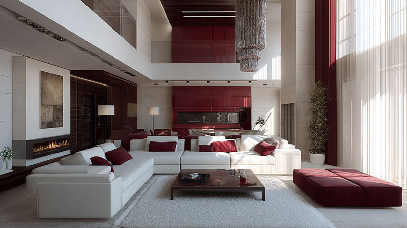
White With Maroon
Crisp white delivers maximum contrast. It keeps maroon from feeling heavy or dated.
Best for modern interior design schemes where clean lines dominate.
Bold Colors That Complement Maroon
Maroon holds its own against other saturated hues. The key is choosing colors that create intentional balance rather than visual chaos.
Navy Blue and Maroon
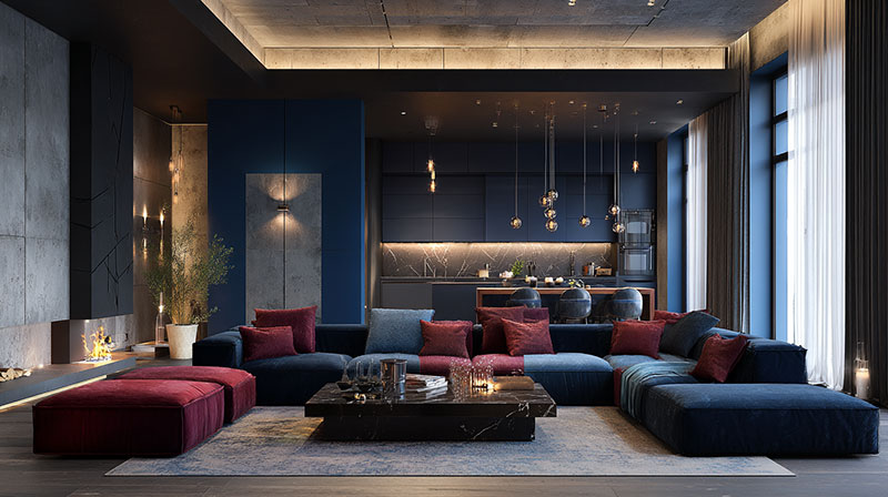
Navy blue and maroon share similar depth, creating a rich jewel-tone palette. Both colors feel sophisticated without competing.
Try navy walls with maroon velvet upholstery.
Teal and Maroon
Teal sits opposite red tones on the color wheel. This complementary pairing delivers bold contrast that still feels cohesive.
Use teal as an accent color against maroon’s dominance.
Forest Green and Maroon

Dark green and maroon evoke classic library aesthetics. Think leather chairs, wood paneling, botanical prints.
This combination suits traditional interior design and home offices.
Mustard Yellow and Maroon
Mustard brings energy to maroon’s seriousness. Both colors share warm undertones, so they blend rather than clash.
Works well in bohemian interior design spaces with layered textiles.
Metallic Accents With Maroon
Metallics add luminosity to maroon-based schemes. They catch light and prevent rooms from feeling too dark or enclosed.
Gold With Maroon
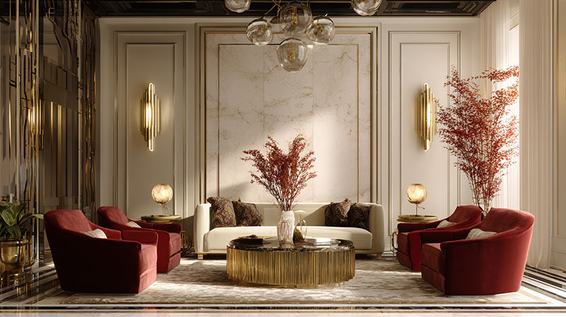
Gold accents and maroon create an opulent, luxury interior design feel. Think brass hardware, gold-framed mirrors, metallic throw pillows.
This pairing has roots in Victorian and Art Deco periods.
Brass With Maroon
Brass hardware offers a warmer alternative to gold. Cabinet pulls, light fixtures, and curtain rods in brushed brass complement maroon cabinetry or walls.
Popular in kitchens and bathrooms with maroon accents.
Copper With Maroon
Copper shares maroon’s reddish undertones. Industrial interior design spaces use this combination with exposed elements.
Copper pendant lights over maroon bar stools create a cohesive look.
Maroon Color Combinations by Room
Each room demands different maroon applications based on function, natural light, and space planning considerations.
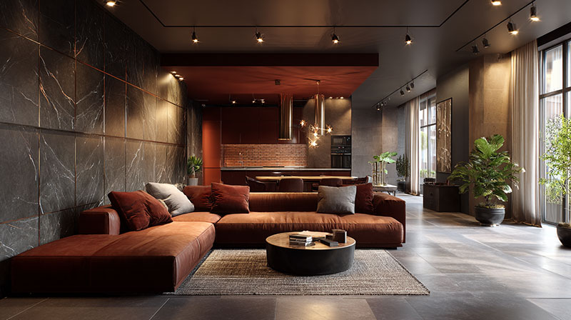
Living Room Color Schemes With Maroon

Maroon works as a focal point through sofas, accent walls, or large area rugs.
Pair with cream walls and tan leather for warmth. Add decorative pillows in complementary tones.
Bedroom Color Palettes Featuring Maroon
Maroon bedding against soft gray or taupe walls creates a cozy retreat. Keep lighting warm with ambient fixtures.
Layer throw pillows on your bed mixing maroon with blush and ivory.
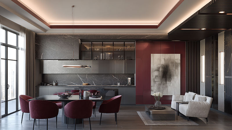
Dining Room Combinations With Maroon
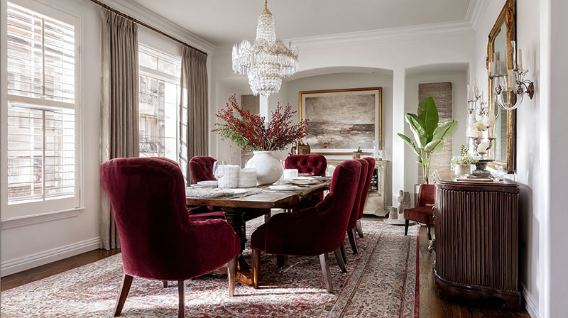
Maroon dining chairs or window treatments add formality without overwhelming the space.
Ground the room with a rug under the dining table in neutral tones.
Kitchen Accent Colors With Maroon
Small doses work best here. Maroon bar stools, pendant lights, or backsplash tiles against white cabinetry.
Brown wood cabinets pair naturally with maroon accessories.
Maroon in Different Design Styles
Maroon adapts across multiple interior design styles, though application methods vary significantly.
Traditional Interiors With Maroon

Maroon belongs in traditional spaces. Velvet upholstery, damask patterns, mahogany furniture.
Layer with burgundy and forest green for depth.
Modern Spaces Using Maroon
Contemporary design uses maroon sparingly. Single statement piece against minimal backgrounds.
Clean lines and geometric forms balance maroon’s richness.
Bohemian Rooms With Maroon

Maroon thrives in eclectic spaces with layered textiles, global patterns, and mixed finishes.
Combine with burnt orange, pink, and turquoise for warmth.
Minimalist Design With Maroon Accents
Minimalist interiors benefit from one maroon element as a color anchor. A single armchair or artwork.
White and gray dominate; maroon punctuates.
How to Balance Maroon in a Color Scheme
Maroon’s intensity requires careful distribution. Too much feels oppressive; too little gets lost.
Ratio of Maroon to Other Colors
Follow the 60-30-10 rule: 60% neutral base, 30% secondary color, 10% maroon accent.
Larger maroon pieces need more neutral surroundings for visual unity.
Wall Colors That Support Maroon Furniture
Light walls let maroon furniture command attention. Cream, light gray, soft white.
Gray walls with maroon seating create sophisticated contrast. Beige walls offer warmth.
Accent Pieces in Maroon
Start small: throw pillows, vases, lampshades, picture frames. Build from there based on how the room feels.
Pillow combinations mixing maroon with cream and gold add instant richness.
Textures and Materials That Work With Maroon
Texture affects how maroon reads in a space. Matte absorbs light; shiny reflects it.
Fabrics That Pair With Maroon
- Velvet – deepens maroon’s richness, ideal for sofas and curtains
- Linen – softens intensity, works for casual spaces
- Leather – adds sophistication, perfect for traditional rooms
- Cotton – versatile for bedding and lighter applications
Wood Tones That Complement Maroon
Walnut and mahogany share maroon’s warm undertones. Oak provides lighter contrast.
Cherry wood floors create a cohesive warm palette. Maple wood offers balance.
Stone and Tile Options With Maroon
White marble counters balance maroon cabinetry. Gray slate flooring grounds maroon textiles.
Avoid red-toned stones that compete with maroon’s hue.
Common Mistakes When Using Maroon
Avoid these pitfalls:
- Using too much maroon – overwhelming rooms with dark saturation
- Pairing with clashing reds – cherry red and maroon fight each other
- Ignoring lighting – maroon darkens significantly in low-light rooms
- Forgetting scale – small rooms need smaller maroon doses
- Matching exactly – slight variations in maroon tones look intentional; exact matches look forced
Test paint samples and fabric swatches in your actual space before committing. Natural and artificial accent lighting changes how maroon appears throughout the day.
Consider scale and proportion when selecting maroon pieces. Large maroon sofas need spacious rooms with high ceilings.
FAQ on Colors That Go With Maroon In Interior Design
What is the best color to pair with maroon?
Cream is the safest choice. It softens maroon’s intensity while letting it remain the focal point. Navy blue and gold also rank high for creating sophisticated, balanced color schemes in living rooms and bedrooms.
Does gray go with maroon?
Yes. Cool gray tones create striking contrast against maroon’s warmth. Light gray walls make maroon furniture stand out. Charcoal gray paired with maroon delivers a moody, dramatic atmosphere perfect for dens and home offices.
What neutral colors complement maroon?
Cream, ivory, beige, taupe, white, and gray all work. These neutrals provide visual rest and let maroon command attention. Warm neutrals like beige blend smoothly; cool neutrals like gray create more design contrast.
Can you use maroon in a small room?
Yes, but sparingly. Use maroon as an accent through pillows, artwork, or a single chair. Pair with light walls and adequate lighting. Avoid maroon walls in compact spaces since they absorb light and shrink the room visually.
What colors should you avoid with maroon?
Avoid bright red, cherry red, and orange-red tones. They clash with maroon’s muted depth. Neon colors and overly saturated hues also compete awkwardly. Stick to muted, deep, or neutral tones for cohesive results.
Does maroon work in modern interiors?
Absolutely. Use one maroon statement piece against minimal white or gray backgrounds. Clean lines and simple furniture shapes balance the color’s richness. Mid-century modern spaces handle maroon accent chairs particularly well.
What metal finishes pair with maroon?
Gold and brass create opulent warmth. Copper shares maroon’s reddish undertones. Brushed nickel and chrome offer cooler contrast for contemporary spaces. Matte black hardware works in minimalist or industrial settings.
Is maroon a warm or cool color?
Maroon is a warm color. It contains red and brown undertones that radiate warmth. This makes it pair naturally with other warm tones like cream, gold, and olive green, while cool colors provide contrast.
What wall color works best with a maroon sofa?
Light gray, cream, or soft white walls let a maroon sofa shine. These backgrounds prevent the room from feeling too dark. Beige walls create a warmer, cozier effect for transitional living spaces.
How do you brighten a room with maroon furniture?
Add white and cream textiles. Use mirrors to bounce light. Choose recessed lighting or bright pendant fixtures. Layer in metallic gold accents. Keep walls light and floors neutral to offset maroon’s visual weight.
Conclusion
Finding colors that go with maroon comes down to understanding tonal balance. Neutrals like cream and gray provide safe foundations. Bold pairings with navy, teal, and forest green deliver more dramatic results.
Metallics add the finishing touch. Gold and brass warm things up; copper creates cohesion.
Your room’s size and natural light determine how much maroon to use. Small spaces need restraint. Larger rooms can handle maroon walls or oversized furniture pieces.
Start with one maroon element and build from there. Test swatches in your actual space. Pay attention to how details like wood tones, fabric textures, and hardware finishes interact with your chosen palette.
Maroon rewards thoughtful placement.

- The Best Colors for Small Rooms to Open Up the Space - July 17, 2026
- What Color Walls Go with Brown Furniture - July 15, 2026
- What Color Furniture Goes with Light Wood Floors - June 22, 2026


