Color Combinations
Colors That Go With Mauve: Interior Design Ideas

Cream or warm white, sage green, navy, charcoal and terracotta all work with mauve, and that’s roughly the order of how little can go wrong. Cream or warm white, sage green, navy, charcoal and terracotta are the ones to try first.
Mauve is a grayed purple that leans pink, which makes it behave like a soft neutral. Its undertone (pink, brown, gray or blue) then pushes it warm or cool.
Designers seem to agree it’s worth using. 16 percent of those polled by 1stDibs in 2025 said they plan to use mauve in 2026.
Mauve is one of 32 colors in our handbook for combining colors at home, each listed with its safe and bold partners.
Mauve is one of 32 colors in our color coordination guide, each listed with its safe and bold partners.
Which colors go best with mauve?

Cream or warm white is the easiest call, followed by sage green, navy, charcoal and terracotta. Brass is the safest metal to add on top of any of them.
Designer Alexandra Kaehler told Homes & Gardens she treats mauve as a soft neutral with a hint of color, which keeps it from reading as sweet.
| Partner | Effect | Mauve it suits | Best room |
|---|---|---|---|
| Cream or warm white | Keeps the wall soft | Pink or brown bias | Bedroom |
| Sage green | Calm, natural balance | Gray bias | Bedroom, living room |
| Navy | Depth and weight | Gray or blue bias | Dining room, study |
| Charcoal | Structure, more contrast | Any | Living room |
| Terracotta | Earthy warmth | Pink or brown bias | Kitchen, dining room |
That ranking assumes you haven’t worked out your shade’s undertone yet. Once you have, the order shifts.
How does mauve’s undertone decide what pairs with it?
Every mauve has a hidden bias underneath, pink, brown, gray or blue, and whatever you put next to it either agrees with that bias or fights it. Warm partners go with the pink and brown ones. Gray and blue leaners want cool partners.
On the color wheel, mauve is a muted purple sitting between violet and pink. Each individual shade adds its own bias on top of that spot.
How far a shade drifts toward violet or rose, and how much gray it carries, follows the logic in this primer on how color theory works in a room.
Sources don’t agree on this. Johnstone’s calls its mauve-toned 2025 Colour of the Year, Acai Berry, a warm hue, while Homes & Gardens quotes designer Justyna Korczynska grouping mauve with cool, restful colors beside blue and green.
Benjamin Moore’s own copy shows why. As of October 2026, it credits Deep Mauve (1265) with warmth from a brown undertone and describes Mauve Hint (878) as carrying a crisp hint of pink.
One name covers shades that lean brown, pink, gray and blue, so the swatch tells you more than the name does.
Pink and brown undertones

Cream, warm white, terracotta, olive, brass and walnut all sit well with these shades. Cool steel gray and icy white trim don’t. Benjamin Moore’s Deep Mauve is a typical brown-leaning example.
Little Greene creative director Ruth Mottershead describes this year’s earthy mauves as having a mud-red undertone with real depth (Homes & Gardens, 2026).
Shades like that take warm partners without argument.
Gray and blue undertones
Gray-leaning mauve is the version sage green and navy suit best.
Composite Paint notes that sage shares mauve’s grayish softness, and it pairs navy with mauve for depth. Farrow & Ball’s Peignoir is a good example, and designer Sophie Pringle says its muted gray undertone keeps the pink from turning sugary (Livingetc).
Sage green and navy are the best fit here, dusty blue is close behind, and warm charcoal adds structure. Cool steely grays need care, since they pull the wall toward lavender.
Neutrals and trim colors for mauve walls

Cream, warm white, greige and taupe make the safest base, and charcoal joins them when a room needs structure.
A designer quoted by Homes & Gardens says mauve has the softness and warmth of beige, plus a plum-red undertone that adds depth. So the neutral beside it should stay quiet and let that undertone show.
Trim and ceiling colors
Trim marks the edge of the wall color, so a wrong white shows at once.
Composite Paint keeps trim in cool white or soft cream so the walls look sharp. Farrow & Ball colour curator Joa Studholme took the other side back in 2019, advising against clean whites beside its powdery Sulking Room Pink. She preferred School House White or Peignoir on woodwork and ceilings.
The split follows the shade. Powdery, low-chroma mauves look dull beside a bright white, while deeper ones hold their edge. For anything powdery I’d go with the softer approach.
Benjamin Moore lists Cloud White among the coordinating colors for Deep Mauve (1265). Test the white against the real wall before buying a gallon.
Gray and charcoal with mauve

A warm gray with a taupe lean keeps mauve soft. Cool, steely gray flattens it and pulls it toward lavender, and Composite Paint calls that the biggest trap in mauve schemes. Deep charcoal goes the other direction, adding structure so the mauve looks deliberate.
Charcoal belongs on furniture and lamp bases more than on walls, and picture frames work too. Black behaves the same way in smaller doses, as a sharper accent.
Accent colors for mauve: greens, blues and earth tones
Sage and olive green make the strongest accents. Navy and dusty blue bring depth, and terracotta or ochre brings warmth, though you should pick by the mauve’s undertone and not by taste alone.
Muted walls need a counterweight or they read as faded, which comes down to how contrast works in a room.
Complementary greens

Mauve is a red-purple, so its opposite on the color wheel is yellow-green. Homes & Gardens makes the same point: green and purple sit opposite one another, which is why soft greens bring harmony to a mauve room.
Sage green shares mauve’s grayish softness, so it suits gray-leaning shades best. Olive and moss are earthier and do better when the mauve leans purple.
In one Homes & Gardens project, a mauve sofa was balanced with pale green wallpaper and curtains. The designer said the green added a natural, organic feel.
Blues
Navy adds a grown-up weight to mauve. Dusty blue is the lighter option and keeps the room airy.
Composite Paint pairs navy and teal with mauve for depth and a little drama. Hunker adds that mauve warms cool colors such as teal, which suits living rooms and offices.
Navy tends to work as a velvet chair or curtains, and dusty blue as bedding or a rug.
Warm earth tones
Terracotta comes from the same dusty, earthy family as mauve, so the pair feels sun-warmed and Mediterranean (Composite Paint).
Hunker shows a mauve ceiling above an ochre sofa, with neutral walls between. Stay with ochre, because a sharp mustard fights the dusty tone.
Tonal and analogous schemes

Tonal schemes are the lowest-risk way to use more color. Blush pink, dusty rose, lilac and a deeper mauve are the usual picks.
Livingetc (2024) reports that mauve looks best beside the pinks and reds adjacent to it on the wheel. Designer Gaia Guidi Filippi of Gaia G Interiors prefers to drench a whole room in it.
Composite Paint’s bedroom palettes save deep plum for the headboard wall or the bedding, not all four walls.
Which metals and materials go with mauve?

Brass and warm gold come out on top for metals, and walnut and honey tones do the same for wood. Velvet and linen are the fabrics to look at. Cool finishes only suit gray-leaning mauve.
Brass warms pink-leaning mauve in hardware, lamps and frames. Gold and rose gold match the pinkish glow, according to Composite Paint. Brushed nickel works only with cool, gray-leaning shades.
Composite Paint’s mauve palettes use honey or walnut wood to warm soft mauve walls. Before you choose a rug or curtain, check the colors that suit walnut itself.
Composite Paint also warns that deep mauve on all four walls can feel heavy in a small or dim room. Dark wood adds to that weight, so keep the wood light there.
Fabric does much of the work. Velvet adds depth, and Homes & Gardens points to muted mauve in velvet as one of fall 2026’s fresher moves.
Linen keeps the palette light, which is the idea behind texture in a room.
Marble belongs on surfaces, not accents. Honed warm-white slabs suit pink-leaning mauve, and cooler stone sits better with gray-leaning shades.
How to apply the 60-30-10 rule to a mauve room

Mauve gets 60% of the room when it’s on the walls. On furniture and textiles it’s closer to 30%, and as a pure accent it drops to 10%. Molly Freshwater of Secret Linen Store describes the rule to Country & Town House as a split into dominant, secondary and accent color.
Mauve usually takes the 60 or the 30, because a muted color needs surface area to register.
| Room | 60% | 30% | 10% |
|---|---|---|---|
| Bedroom | Mauve walls and ceiling | Warm linen bedding, curtains | Brass lamp, sage cushions |
| Living room | Greige walls | Mauve sofa, curtains | Olive throw, brass frames |
| Dining room | Deep mauve walls | Wood table, cream chairs | Gold lighting |
Freshwater’s bedroom formula puts the dominant color on walls or bedding, the secondary on curtains and throws, and the accent on cushions and trims. The table follows that logic.
Promain’s Ben Thomson tells Ideal Home the 30% can be a slightly stronger shade of the dominant color. In a mauve room that means a deeper mauve or plum on the curtains.
Katerina Tchevytchalova of K’Arte Design tells Homebuilding she recommends treating the rule as a point of reference rather than a strict rule, so don’t sweat the exact numbers.
To test a split before you paint, a room color scheme generator shows the proportions at a glance.
How light and reflectance change mauve
Mauve shifts with the direction a room faces and the bulbs in it, and the paint’s own LRV sets the starting point.
What LRV tells you
Benjamin Moore defines LRV as the percentage of light a surface reflects, from 0 for absolute black to 100 for pure white.
Mauve Hint (878) has an LRV of 76.6 and reads as a light pink tint. Mauve Mist (1264) sits at 36.4, a smoky mid-tone with pink and gray. Deep Mauve (1265) comes in at 19.88, dark and rich.
These are Benjamin Moore’s own figures as of October 2026. Third-party color databases list slightly different values for the same chip, so take the number from the manufacturer’s page.
North-facing and south-facing rooms
Benjamin Moore describes north light as indirect, cool and blue-toned, and says it dulls colors with gray, blue or lavender undertones (Benjamin Moore UK). Helen Shaw of the brand says it highlights cool undertones, so gray is the one to avoid if you want a brighter room (Livingetc).
Farrow & Ball goes the other way. Its advice is to stop fighting the cool light and embrace it with dark walls, which gives a cocooning feel (Farrow & Ball’s light guide).
For mauve, the split gives a clear rule. Pick a brown- or pink-leaning shade to brighten a north room, or go deep to cocoon it.
A mid-tone gray-lavender mauve is the one to skip there. Mauve Mist carries gray beside its pink, so sample it twice in north light.
South light is warm and can turn intense at midday. Benjamin Moore UK notes that cooler, grayer tones calm such rooms, which suits gray-leaning mauve.
Bulbs and color temperature
Warm bulbs keep the pink in mauve alive, and cool white ones push it toward gray.
Farrow & Ball’s guide says halogen and incandescent bulbs make wall colors look warmer, while cool white bulbs give paint a cooler cast. ENERGY STAR’s 2020 bulb guide puts soft and warm white at 2200K to 3000K, with neutral white starting at 3500K.
Lamp placement matters as much as bulb color, and how light works in a room is worth a read before you fix the fixtures.
How to sample before you commit
- Paint two large squares on different walls, one near the window and one in a dim corner.
- Check both in morning, afternoon and evening light.
- Check them again after dark under your actual lamp bulbs.
- Hold trim, fabric and wood samples beside the squares, since undertone clashes show up there.
- Compare the chip’s LRV on the manufacturer’s page with how dark the wall reads.
Benjamin Moore UK gives the same advice on large squares across different walls. Once the shade passes, a room paint calculator tells you how many gallons the walls need.
Mauve pairings room by room
Match the undertone to the room’s job. Havenly’s designers point to brown-leaning shades for both a moody bedroom (Deep Mauve) and a cozy living room (Almond Beige).
Bedroom

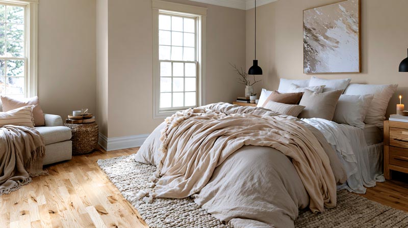
Composite Paint’s palettes call mauve one of the most restful bedroom colors. Homes & Gardens shows a bedroom with color-drenched mauve walls that reads as just as calm.
For other quiet options, see these calming bedroom colors.
Living room

Painting the walls a brown-leaning mauve gives a living room a rich, warm quality (Havenly). The other way in is furniture, and Homes & Gardens shows a vintage curved mauve sofa on neutral walls adding warmth and contrast.
The furniture route costs less to undo.
Dining room
Go darker here.
Homes & Gardens recommends a moodier mauve for dining rooms, where richness and depth matter more than lightness. Its example pairs dark mauve walls with a large dark wood table and a neutral rug.
Kitchen and bathroom

Designer Michael Abrams of Abrams Valenti used mauve as the starting point for a powder room in a 100-year-old lakeside cottage that was fully restored in 2024, since mauve was a popular tile color a century ago (Homes & Gardens).
In a bathroom, keeping tile and paint in the same family is the simpler way to go. For the kitchen, Apartment Therapy suggests mauve as a backsplash or accent color, with warm woods, whites, grays and blacks nearby.
By style

Homes & Gardens says mauve lends softness and sits at home with traditional decorating. Mid-century modern calls for a clean-lined sofa covered in mauve velvet, as Apartment Therapy shows. Art Deco leans on metallic finishes, and mauve works as the softer base behind them.
For the mid-century case, there’s more in this guide to the mid-century modern color palette.
Which mauve pairings should you avoid?
Most failures come down to bright pink with bright blue, dated styling cues, an all-muted scheme, and buying by paint name.
| Trap | Why it fails | Fix |
|---|---|---|
| Bright pink and bright blue | Clean primaries make a soft palette loud | Dusty blue or navy, tonal pinks |
| Dated cues | Reads as 80s without modern details | Warm wood, modern shapes |
| All-muted scheme | Walls look like one flat block | Greige or oat, one dark note |
| Buying by name | Brands file mauve in different families | Compare chips and LRV |
Composite Paint warns against combining mauve with bright pink and bright blue, especially the clean, primary versions.
Homes & Gardens calls mauve ’80s-coded. It says warm woods, modern silhouettes and fresh palettes keep it moody and refined.
Composite Paint’s own palettes use soft whites, greige and oat tones so the walls do not read as one block of color.
As of October 2026, Benjamin Moore lists Mauve Hint, Mauve Mist and Deep Mauve in its Red family. Sherwin-Williams files Mauve Finery and Chaise Mauve under Purple.
Same word, different families. Judge the chip, not the name.
Mauve FAQ
Is mauve too feminine for a whole room?
Not when the shade is dusty rather than pink. Composite Paint notes that muted mauve with warm gray and deep charcoal reads modern and calm instead of girly.
Save the pink-leaning versions for bedding and cushions.
What is the difference between mauve, lavender and dusty rose?
Lavender is a lighter, bluer purple and dusty rose is a muted pink. Mauve lands between them, grayer than the first and more purple than the second.
Homes & Gardens notes that a very pale mauve can read close to gray, with more blue in it.
Why is the color called mauve?
The name comes from the French word for the mallow flower. William Henry Perkin made the first mauve dye in 1856 while trying to synthesize quinine, according to the Science Museum Group.
Queen Victoria wore mauve to a royal wedding in January 1858.
Is mauve still in style in 2026?
Yes. Havenly named earthy mauve a 2025 paint trend, and Homes & Gardens calls the 2026 direction muddier and chalkier, closer to clay or faded red than to pastel.
Expect dusty, brown-leaning shades more than candy pinks.
Where to start with a mauve scheme
Start with the movable pieces, not the walls. A mauve sofa, curtains or cushions cost less to reverse than a painted room, and they show how the shade behaves in your own light.
One mauve textile plus one partner color is enough to begin. Then put two wall swatches up in different light, and paint last, once both hold up at night.
Paint is the costliest step to undo, which is why it goes last. Furniture-first has a trade-off too: the room reads as neutral with mauve accents until the walls follow.
North-facing bedrooms are the one exception. A calm bedroom invites a gray-leaning mauve, but north light dulls gray, so choose pink- or brown-leaning mauve.
Once sage green is the partner, the colors that suit sage green itself help settle the fabrics.

- Kitchen Color Schemes by Cabinet Color: What Pairs Well - October 19, 2026
- Curtain Colors for Every Wall Color: Safe vs Bold Picks - October 18, 2026
- Interior Design Styles: Find Your Primary and Secondary - October 14, 2026