Color Combinations
Paint Colors That Go with Stone Fireplace
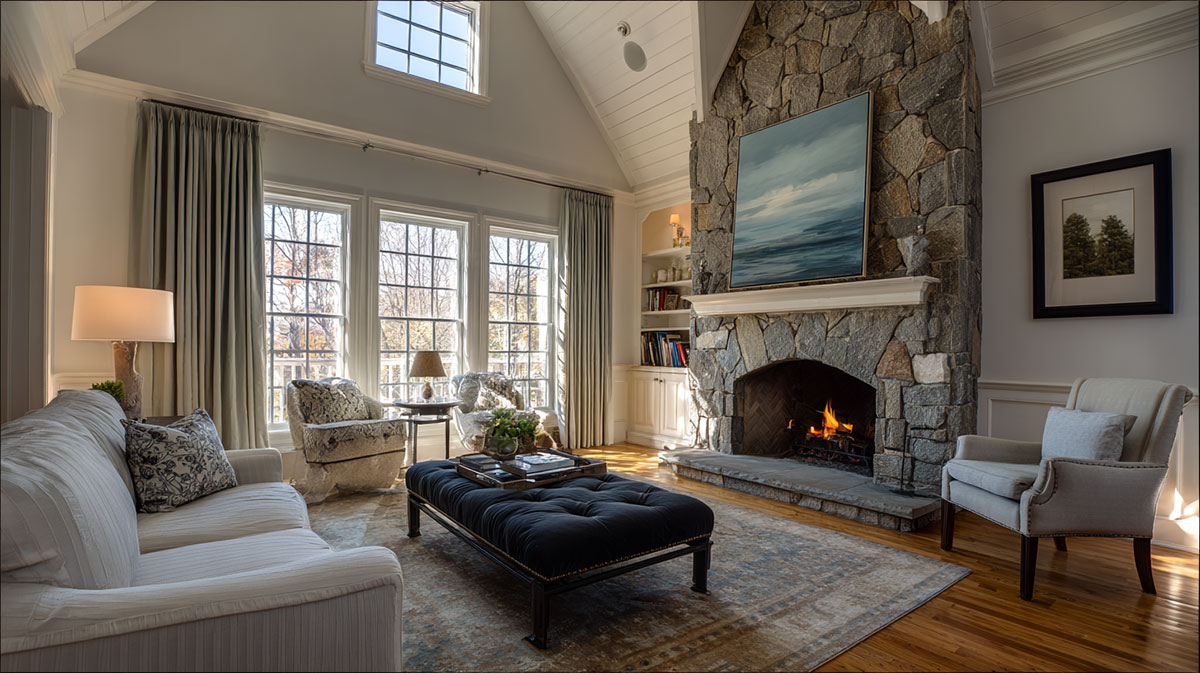
The stone in your fireplace is not a suggestion. It is the room’s most fixed element, and every paint color decision you make works around it.
Getting the wall color wrong next to natural stone is one of the most common and costly interior paint mistakes. The undertone clash shows immediately, and repainting fixes nothing if the root problem is temperature mismatch.
This guide covers the exact paint colors that go with a stone fireplace across every stone type, from cool gray slate and quartzite to warm fieldstone and limestone. You will also find guidance on paint finish, ceiling color, trim, and how to test samples correctly before committing.
Fixed surfaces set the starting point; our guide to what goes with what covers the colors you layer on top.
What Stone Fireplace Tones Actually Determine Your Paint Color
The stone in your fireplace is a fixed finish. It does not change. Every paint color decision in that room works around it, not the other way around.
Stone undertones fall into 3 categories: warm (tan, beige, rust, gold veining), cool (gray, blue-gray, charcoal, white quartz), and neutral (mixed or balanced). Getting this wrong is the single most common paint color mistake in fireplace rooms.
A color psychology study by Sherwin-Williams found that 62% of Americans favor blue as their top paint pick, yet warm-stone fireplace rooms are among the most frequent cases where blue wall paint clashes and needs repainting (Sherwin-Williams, 2024).
According to Fixr.com’s 2024 Paint and Color Trends Report, 48% of interior design experts selected warm white as the most popular interior paint color, which aligns directly with how most stone fireplaces are best handled.
How to Identify Warm vs. Cool vs. Neutral Stone Undertones
Hold a plain white sheet of paper against your stone. The contrast will reveal the undertone clearly.
- Warm undertone: Stone looks beige, tan, brown, or gold next to the white paper
- Cool undertone: Stone looks gray, blue-gray, or silvery next to the white paper
- Neutral undertone: Stone shows a mix, with no single direction pulling strongly
This test works because the white paper removes surrounding color noise. Without it, ambient light and furnishing colors distort your read.
Warm tones might include tans, browns, and red or orange tints. Cool tones carry a subtle tint of blue or green in the gray range. If you see a fireplace with pink-beige and gold tones mixed with purple veining, that stone is warm despite the complexity.
Why Stone Type Changes the Color Matching Rules
Stone type shifts the undertone range and texture density. Both affect how paint color interacts with the wall surface.
| Stone Type | Dominant Undertone | Paint Color Direction |
| Fieldstone | Warm brown / tan / rust | Warm whites, rich greige, earthy terracottas |
| Limestone | Warm cream / buff / pale yellow | Warm off-whites, soft sage green, warm greige |
| River rock | Neutral to cool rounded gray / blue | Warm gray, cool white, soft historic navy |
| Stacked slate | Cool jagged gray / charcoal / blue | Crisp whites, deep dramatic navy, forest green |
| Quartzite | Cool shimmering silver / icy white | Bright white, pale blue-gray, high-contrast darks |
Stacked slate, for example, has a hard, linear texture. It reads differently than the rounded mass of river rock. Smooth quartzite reflects light; irregular fieldstone absorbs it. That texture behavior changes how much visual contrast your wall color needs to provide.
The stone fireplace functions as the room’s focal point, and every paint color decision should support that hierarchy rather than compete with it. Understanding color in interior design at this level, specifically how fixed architectural elements dictate a palette, is what separates good results from expensive repaints.
What Paint Colors Go With a Gray Stone Fireplace?
Gray stone fireplaces are the most common type in new builds from the 2010s onward. They dominate transitional, contemporary, and modern homes.
The rule: pair cool gray stone with warm-undertone walls, not cool ones. Doubling down on cool gives the room a flat, cold read with no visual relief.
White and Off-White Paint Colors for Gray Stone Fireplaces
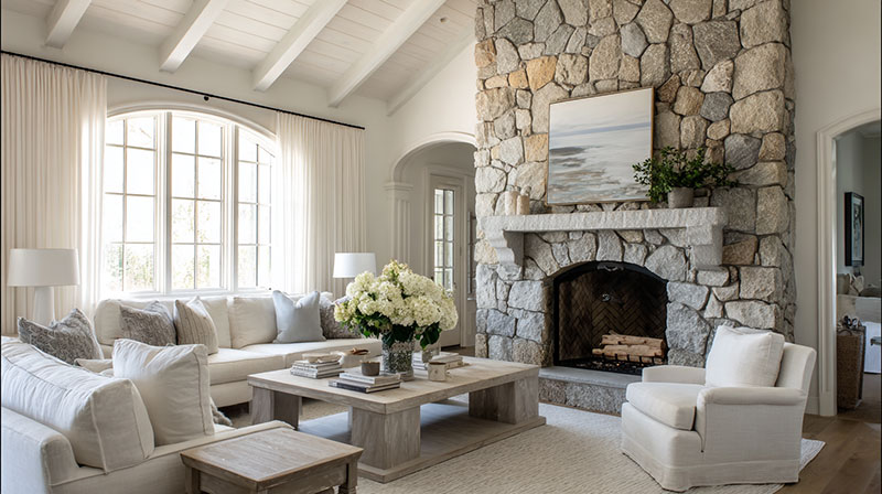
Warm whites beat pure whites here. Every time.
Pure white next to cool gray stone pulls the stone even cooler. The result looks clinical, not clean. Warm off-whites counterbalance the stone’s cool temperature and make both surfaces look intentional.
Top picks with LRV data:
- Benjamin Moore Chantilly Lace OC-17 (LRV 92.2) – Bright but not icy, slight warm lean
- Sherwin-Williams Alabaster SW 7008 (LRV 82) – Cream base, works with most gray stone
- Sherwin-Williams Creamy SW 7012 (LRV 81) – Noticeably warm, best for blue-gray stone
Agreeable Gray (LRV 60) functions as a greige option for rooms where you want a mid-tone, not a light wall. Sherwin-Williams describes it as a “warm gray with a stony undertone,” which pairs directly with cool gray stone by bridging both temperatures.
Accent and Moody Colors That Work With Gray Stone
Gray stone handles contrast well. It is one of the few stone types that looks good against deep, saturated wall colors.
Navy blue (Benjamin Moore Hale Navy HC-154) sits at LRV 6.6, which is very dark. Use it on the fireplace wall only, not all 4 walls, unless the room has strong natural light.
Forest green with cool undertones reads as sophisticated next to gray stone. Charcoal (same temperature family) works as a tone-on-tone accent that adds depth without fighting the stone.
Colors to avoid with gray stone: yellow-based creams, orange-toned wood panel paints, warm beige. These make gray stone look dirty rather than purposeful. Contrast in interior design requires compatible temperatures first, then value difference second.
What Paint Colors Go With a Beige or Tan Stone Fireplace?
Warm-toned stone is the more demanding of the two major categories. It limits your range more than gray stone does, but the results, when matched correctly, are richer and cozier.
Warm whites, greige, and earthy mid-tones are the core options. The palette runs from very light to medium depth. Deep jewel tones rarely work here unless the stone has strong enough contrast in its own coloring.
Neutral and Greige Walls With Beige Stone
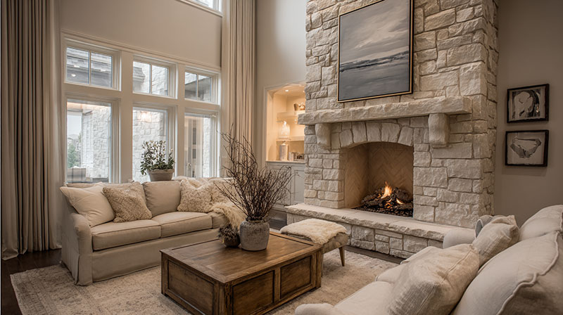
Warm whites and greige are the most consistent performers with beige and tan stone.
Benjamin Moore White Dove OC-17 (LRV 83.2) is a go-to. It has a soft, creamy undertone that relates directly to tan stone without being too close in value to lose the wall-to-stone distinction. Edgecomb Gray (LRV 63) sits in the yellow-green to yellow undertone range, which is why designers use it so often with natural stone and varied wood tones.
Greige, defined as any color in the gray-to-beige range, is reliable here because it carries both warm and neutral qualities. The earthy color palette that dominated both the 2024 and 2025 interior design seasons aligns directly with how warm stone fireplaces are best handled.
Earthy and Saturated Options for Warm Stone Fireplaces
Searches for terracotta rose 5,000% between 2023 and 2024, according to Google Trends data reported by Livingetc. That tells you the direction homeowners are moving.
For warm stone, saturated earthy tones can work as accent wall colors, but not as whole-room wall colors. The reason: warm stone plus warm saturated walls removes all color contrast from the room. Everything reads as one mass.
- Sage green (muted, not bright) introduces a natural bridge without competing with tan stone
- Terracotta walls work only when the stone is brown-heavy, not beige-heavy
- Mustard as an accent (pillow, art, rug) rather than a wall color
Avoid: icy blue, stark cool gray, lavender. These create a temperature clash with warm tan stone that no amount of furniture layering corrects. Understanding the color theory behind warm-cool temperature matching prevents this specific mistake.
What Paint Colors Go With a White or Cream Stone Fireplace?
White stone fireplaces give you the widest color range. That is both the opportunity and the risk. Without enough contrast between wall and stone, the fireplace disappears into the room.
Light stone needs a wall color with enough LRV difference to define it. The fireplace has to remain the visual anchor, not blend into the background.
Deep Contrast Colors That Define White Stone
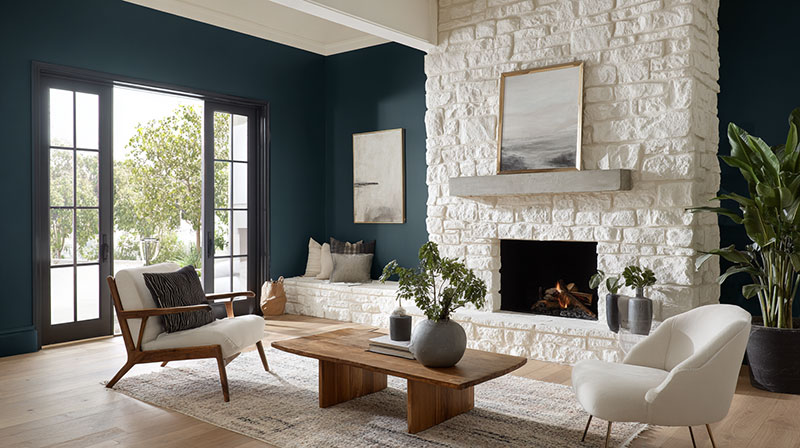
Deep colors work because they give white stone something to push against.
Benjamin Moore Hale Navy HC-154 behind a white stone fireplace creates one of the most reliable contrast combinations in residential design. The navy recedes, the white stone advances. The emphasis lands exactly where it should.
Forest green with a dark LRV functions the same way. So does deep charcoal. The principle is consistent: low-LRV wall behind high-LRV stone creates visual definition without needing additional decorative work on the mantel.
Soft Tonal Approaches for White Stone
Not every room wants contrast. Tonal approaches work when the goal is calm and cohesion rather than drama.
| Approach | Wall Color Direction | LRV Target |
| Pale blue-gray | Cool, soft, receding | 65–75 |
| Warm linen | Cream-adjacent, grounding, soft | 70–80 |
| Greige | Neutral bridge, versatile balance | 55–65 |
All-white rooms with white stone fireplaces need texture contrast, not color contrast. The fireplace has to differentiate through material and form. If the walls, ceiling, and stone are all flat white, the room reads as empty rather than refined. The ceiling color, even a slightly warmer white than the walls, can restore enough differentiation to make the stone read as a separate surface.
What Paint Colors Go With a Dark or Black Stone Fireplace?
Dark and near-black stone is the most dramatic of the 4 categories. It operates on different contrast logic than the others.
Light walls work. Medium-value walls disappear. The gap in LRV between the stone and the wall has to be large enough to register visually, or the room reads as heavy and unresolved.
Light Walls Against Dark Stone
Crisp whites and light warm grays are the most consistent performers with charcoal and near-black stone.
Benjamin Moore Wrought Iron AF-55 (LRV 6) and Sherwin-Williams Caviar SW 6990 (LRV 3.5) are reference points for what dark stone actually looks like in value terms. Walls at LRV 70 or above provide the LRV gap needed for visual separation.
Why warm whites specifically? Cool whites next to dark stone create a stark, industrial read. Warm whites soften the contrast enough to stay livable. The room still has drama, but it does not feel like a gallery or commercial space.
Bold Walls That Also Work With Dark Stone
Dark stone is one of the few cases where deep jewel tones on walls are worth considering. The logic: dark stone does not compete with dark walls the same way light stone does. Instead, depth against depth creates atmosphere.
- Deep navy (Benjamin Moore Hale Navy HC-154) works with charcoal stone when natural light is strong
- Forest green at low LRV creates a moody, cabin-like combination
- Oxblood or deep burgundy reads as intentionally dramatic next to black stone
Medium-value walls (mid-gray, taupe, warm tan) are the problem zone. They create no meaningful contrast with dark stone, and both surfaces compete for the same visual territory. The fireplace loses its status as the room’s focal point. Natural light level is a deciding factor here: north-facing rooms with dark stone need lighter walls. South-facing rooms with strong light can handle bolder, deeper wall colors.
The principles of balance in interior design directly govern this decision. Dark stone on one wall already creates visual weight. The remaining 3 walls need to counterbalance it, not add to it.
What Paint Finish Works Best Around a Stone Fireplace?
Paint finish is the most skipped variable in fireplace room decisions. Most people pick a color and default to whatever finish the painter recommends. That default is often wrong.
The US house painting market reached $24.4 billion in 2024 and is projected to grow 5.3% in 2025 (Vanderfolk Painting Industry Report, 2025). Despite that volume, finish selection specific to fireplace rooms is rarely addressed in standard design consultations.
Matte vs. Eggshell on Fireplace Walls
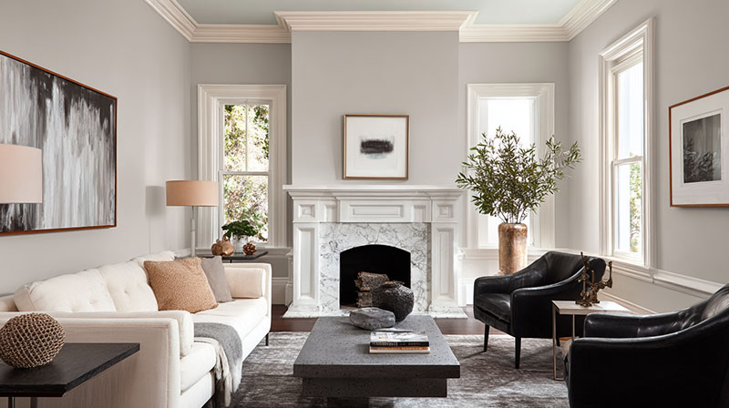
Flat/matte finish reduces visual competition with stone texture.
Stone has its own surface complexity. Joints, color variation, depth, shadow. A high-sheen wall surface adds its own reflective layer on top of that. The two textures fight each other.
Matte finish on walls next to stone lets the stone read as the dominant texture in the room. This is correct. Eggshell is acceptable for rooms with children or high traffic where wipe-ability matters. Satin is workable but starts to introduce enough sheen to create surface competition with the stone.
How Sheen Affects Color Appearance Near Textured Stone
This is where finish choice gets tricky. Matte and high-sheen versions of the same paint color look measurably different on the wall.
- Matte finish: color appears slightly deeper, more muted, less saturated
- Eggshell: slight brightening effect, closer to swatch card appearance
- Satin: noticeably brighter, color shifts toward its lightest value
If you chose a paint color by swatch and the wall looks lighter than expected, sheen level is usually part of the explanation. Test your chosen color in both matte and eggshell on a large board (at least 12×12 inches) placed directly against the stone before committing. The paint color and the stone are both fixed once applied. The texture in interior design relationship between stone and painted wall surface is set by these 2 variables together, not color alone.
How Room Size and Natural Light Change the Paint Color Decision
The same paint color behaves differently in a 300-square-foot room versus a 600-square-foot one. And it behaves differently at 8 AM versus 8 PM. These are not minor variables.
Research published in the ECS Transactions journal confirms that color has a measurable impact on both the appearance of a room and the emotional experience of occupants (ECS Transactions, 2024). Room size and light conditions are the delivery system for that impact.
Small Rooms With Stone Fireplaces
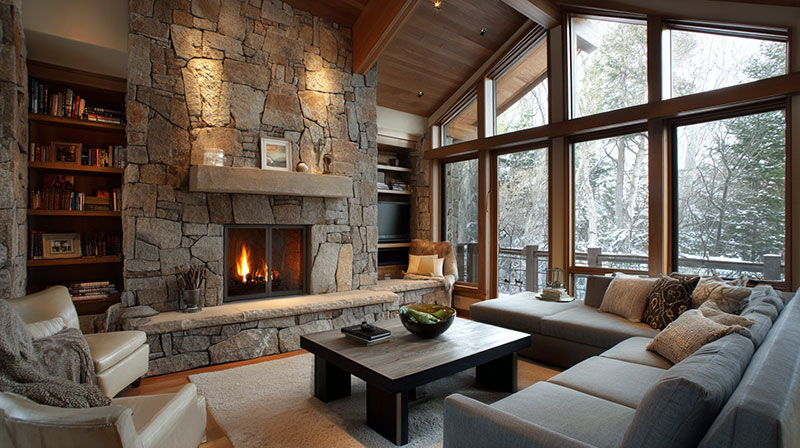
Small rooms need careful LRV management around a stone fireplace, more so than large ones.
Stone already adds visual mass. A small room with a large stone fireplace and dark walls reads as heavy. Lighter walls do not automatically solve this: the right move is a wall color with an LRV high enough to keep the room from closing in, but with enough connection to the stone undertone to hold the room together.
Mid-tone greige (LRV 55-65) is the most workable zone for small fireplace rooms. It is neither so light that contrast is lost nor so dark that mass compounds. The concept of space in interior design governs this directly: perceived spatial volume is shaped by value, not just physical dimensions.
North-Facing vs. South-Facing Rooms
Compass orientation changes which colors are safe.
| Orientation | Light Quality | Paint Direction |
| North-facing | Cool, flat, blue-cast | Warm undertones only; avoid cool grays completely |
| South-facing | Warm, intense, shifting | Can handle cooler, counterbalancing color depths |
| East-facing | Warm morning, cool afternoon | Neutral undertones perform most consistently |
| West-facing | Cool morning, intense warm PM | Test at both ends of the day before deciding finality |
North-facing rooms with cool stone fireplaces are the trickiest combination. The room’s natural light pushes the stone cooler. A cool gray wall color on top compounds that. The result is a room that reads as cold regardless of how warm the furnishings are. Warm-undertone greige or warm whites are the correct move, not more gray.
Artificial Lighting Color Temperature
Bulb color temperature shifts paint color appearance significantly.
2700K bulbs (warm white) pull wall colors warmer, which helps in north-facing rooms and with cool stone. 4000K bulbs (cool white) shift wall colors toward their cool undertone, which can make a gray stone fireplace room feel stark after 6 PM.
Most open-plan living rooms use 2700K lighting for general ambiance. If the stone fireplace wall has recessed lighting or accent fixtures, confirm their color temperature before finalizing the paint color. A color that looks right under natural light at noon can look noticeably different under the actual artificial lighting used in the evening. The way light in interior design interacts with both painted surfaces and stone texture is its own variable, separate from the paint color itself.
What Ceiling and Trim Colors Pair With Stone Fireplace Rooms?
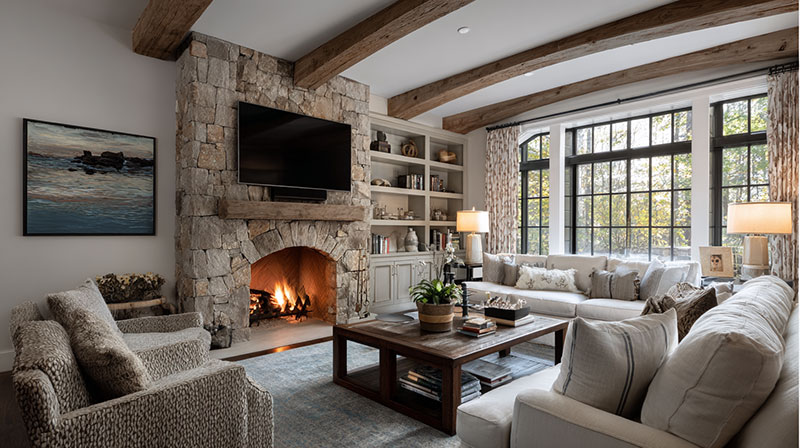
Most homeowners finalize wall color and stop there. Ceiling and trim are treated as afterthoughts. That is where the room falls apart.
According to Angi data, 8% of homeowners tackling smaller painting projects are specifically looking to paint their fireplace area, which means the surrounding color scheme decisions matter far more than a single wall (Angi, 2024).
The mantel, the ceiling, and the trim each carry their own color signal. Together, they either reinforce the room’s unity or break it.
Mantel Paint Color Options by Stone Type
The mantel is an architectural element, not a piece of furniture. It should be treated the same as your baseboard and window trim, not as a separate decorative surface.
Trim color = mantel color. Sherwin-Williams’ own color guidance states clearly: the mantel and trim are part of the same architectural detail and should match throughout the space.
| Stone Type | Mantel Direction | Why It Works |
| Gray / Cool Stone | Bright white or warm white | Crisp contrast defines the stone edge cleanly |
| Beige / Tan Stone | Warm white or matching wall color | Reduces visual competition, lets the stone lead |
| Dark / Black Stone | Crisp white or matching wall color | A light mantel separates the stone weight from the wall |
| White / Cream Stone | Match stone or go slightly deeper | A tonal approach keeps the architectural focal point cohesive |
One exception: if you want a moody, cosseted room, painting the mantel to match a deep wall color can work. The risk is that the fireplace loses its definition entirely.
When to Use an Accent Wall on the Fireplace Wall
The fireplace wall is the most natural accent wall candidate in any living room. The stone itself already creates the differentiation.
An accent wall color on the fireplace wall works when the rest of the room is a light neutral. It does not work when all 4 walls are already mid-to-dark tones, because the fireplace wall then reads as just another wall with a fireplace on it.
- Navy accent wall + warm off-white remaining walls + warm white trim: works for gray stone
- Warm greige accent wall + lighter cream remaining walls: works for tan stone
- Matching color on all walls + fireplace wall same color: works when stone has strong visual contrast on its own
Designer Krane (featured in Bob Vila, 2024) used Benjamin Moore Odessa Pink drenched across walls, trim, and ceiling in a country living room with a large stone fireplace. She chose matte for walls and flat for the ceiling. Color-drenching around stone is viable when the stone itself has enough visual complexity to serve as the room’s contrast element.
Ceiling Color in a Stone Fireplace Room
The ceiling should align with the wall’s undertone, not just default to white. A cool white ceiling above warm-undertone walls creates a lid effect: the ceiling floats visually above the room instead of belonging to it.
Practical rule: if walls are warm white or greige, use a ceiling color one step lighter in the same paint family. If walls are a deep color, a white ceiling provides the necessary relief. If the room is tall (10 feet or above), a slightly warmer or slightly tinted ceiling reads as correct. Below 9 feet, strict white ceilings work best to preserve perceived height.
What Colors to Avoid With a Stone Fireplace?
Knowing what not to use is as useful as any list of recommendations. The wrong color does not just look off. It makes the stone look dirty, dated, or unintentional.
According to color designer Maria Killam’s published guidance, the most common mistake homeowners make with stone fireplaces is choosing a wall color based on what they want rather than what the stone needs. The stone always wins (Killam Colour System, 2023).
Competing Undertone Combinations
Temperature clash is the main failure mode. These specific pairings consistently produce poor results:
- Warm tan stone + cool gray wall: the gray reads as cold and the stone looks orange by contrast
- Cool gray stone + yellow-based cream wall: the cream pulls the stone toward purple
- Cool quartzite + warm greige wall: the quartzite loses its silver quality and looks dirty
- Fieldstone with red veining + any green wall: red and green sit opposite each other on the color wheel; the combination reads as holiday decor year-round
The pattern is consistent: when wall color undertone and stone undertone sit on opposite sides of the warm-cool divide, both surfaces look worse than they would in isolation.
High-Saturation Walls With Any Textured Stone
Highly saturated walls fight textured stone surfaces. Always.
Saturated color on a wall has high visual weight. Textured stone also has high visual weight. Two competing visual-weight elements in the same room create fatigue, not atmosphere. The room has nowhere for the eye to rest.
The test: if you squint at the room and the wall color is pulling your attention away from the fireplace, the saturation is too high. The fireplace should win that competition every time. This is a direct rhythm issue: the room needs a dominant and a subordinate surface, not 2 competing equals.
Colors That Make Stone Look Dirty or Dated
Dirty-looking combinations are specific and predictable.
Certain greens with beige stone: yellow-green walls next to tan or buff limestone make the stone appear stained rather than natural. This is because yellow-green amplifies the gold undertones in warm stone past the point of looking intentional.
Pure cool white with warm-veined stone (tan stone with gold or rust veining) is the other common problem. The cold white makes the stone’s warm veining look like aging or water damage rather than a natural material variation.
Trendy colors fail more often with stone than with plain drywall rooms because stone is a fixed material with its own strong undertone. A trending color that works beautifully in a minimal all-white room can be completely incompatible with the undertone in a specific stone type. The stone does not flex. The color choice has to.
How to Test Paint Colors Against Your Stone Before Committing
Swatch cards are almost useless for stone fireplace rooms. The card is 2 inches wide. The stone surface is massive. The visual relationship between those 2 things does not scale.
Five professional painters and designers interviewed by Family Handyman (2024) all agreed: painting directly on the wall or on large boards is the only reliable testing method. Smaller swatches do not reproduce how color saturates at full scale.
Why Small Swatches Fail Next to Stone
Stone texture creates shadows within the surface. Those shadows affect how surrounding color reads. A 2-inch paint card has no ability to show that interaction.
Minimum test board size: 12×12 inches. Larger is better. A 2-foot by 2-foot board placed directly against the stone gives the most accurate read before committing to a full wall.
The board needs to be placed at actual wall height, not held at chest level. Color shifts based on viewing angle and distance from the stone surface. Test it where the paint will actually live.
Testing at Multiple Times of Day
The same color can look like 3 different paints depending on when you look at it.
Test at:
- 8-10 AM (morning natural light, often warm or neutral)
- 12-2 PM (midday light, most accurate read of true color)
- Evening under the actual artificial lighting used in the room
The evening test is the one most people skip. It is also the most revealing. A warm gray that looks sophisticated at noon can look lavender under cool 4000K recessed lighting at 9 PM. The room’s artificial light color temperature is as important as daylight when evaluating a paint color against stone. How ambient lighting interacts with both the painted wall surface and the stone texture determines the final result.
Reading the Sample Correctly
A paint swatch card is the lightest, most saturated version of a color. The actual painted wall will look slightly different.
Swatch behavior patterns:
- Matte finish: color appears slightly deeper than the swatch card
- Eggshell: closest match to swatch card appearance
- Undertone shift: colors often show their undertone more clearly at full scale (a greige that looks neutral on a card can lean strongly warm or cool on a full wall next to stone)
Benjamin Moore’s peel-and-stick samples are a useful starting point, but they are still small. Use them to narrow to 2-3 candidates, then paint large test boards for the final decision. That 20-minute extra step prevents a room repaint.
Given that the US residential painting market reached $24.4 billion in 2024 and individual room paint jobs average several hundred dollars in materials alone (Vanderfolk Painting Industry Report, 2025), the cost of testing properly versus repainting is not a close comparison.
The most important part of the whole process: check the sample against the stone at the same time of day you spend the most time in that room. Your living room at 7 PM is where the color actually lives. That is where it needs to work. For a more structured approach to interior design principles around color coordination, including how fixed architectural elements govern a room’s palette from the ground up, the underlying framework applies directly to every stone fireplace color decision covered here.
FAQ on Paint Colors That Go With Stone Fireplace
What is the best paint color for a gray stone fireplace?
Warm off-whites work best. Sherwin-Williams Alabaster SW 7008 (LRV 82) and Benjamin Moore Chantilly Lace OC-17 counterbalance cool gray stone without going clinical. Avoid yellow-based creams, which make gray stone look dirty.
What wall color goes with a beige stone fireplace?
Warm whites and greige are the most reliable options. Benjamin Moore White Dove OC-17 and Edgecomb Gray both carry yellow-green undertones that relate directly to tan and buff stone. Cool grays will clash.
Should walls be lighter or darker than the stone fireplace?
It depends on the stone color. Light stone needs darker walls for contrast. Dark stone, like charcoal or near-black, needs lighter walls. LRV difference between stone and wall should be large enough to register visually.
What paint colors go with a dark or black stone fireplace?
Crisp whites and light warm grays create the contrast dark stone needs. Medium-value walls disappear next to dark stone and make the fireplace lose its definition. Deep jewel tones also work in well-lit rooms.
Can you use navy blue walls with a stone fireplace?
Yes, with cool or white stone. Benjamin Moore Hale Navy HC-154 (LRV 6.6) works well on the fireplace accent wall. Use it against white or cream stone for strong contrast. Avoid navy with warm tan stone.
What paint finish should I use near a stone fireplace?
Matte or flat finish is best. It reduces visual competition with the stone’s natural texture. Eggshell works for high-traffic rooms. Satin introduces enough sheen to fight the stone surface, so use it only when durability is a priority.
Does room orientation affect paint color choice with stone?
Yes. North-facing rooms with cool stone need warm-undertone walls to avoid a cold, flat read. South-facing rooms can handle cooler wall colors. Always test your chosen color at multiple times of day before committing.
What color should I paint the mantel on a stone fireplace?
Match the mantel to your existing trim color. Sherwin-Williams guidance confirms the mantel is an architectural element, not a decorative surface. White or warm white trim colors work across all stone types without creating conflict.
What colors should I avoid with a stone fireplace?
Avoid competing undertones. Warm tan stone clashes with cool gray walls. Cool quartzite fights yellow-based creams. High-saturation wall colors compete with stone texture for visual dominance. Pure cool white next to warm-veined stone reads as cold and unflattering.
How do I test paint colors against my stone fireplace?
Use a sample board at least 12×12 inches, placed directly against the stone. Test at morning, midday, and evening under your actual artificial lighting. Small swatch cards are too limited to show how color interacts with stone texture at full scale.
Conclusion
This conclusion is for an article presenting paint colors that go with stone fireplace, and the core takeaway is straightforward: stone undertone drives every decision.
Whether you are working with warm fieldstone, cool stacked slate, or neutral river rock, the wall color has to match the stone’s temperature first and your personal preference second.
Greige, warm white, and earthy mid-tones cover the widest range of stone types. Specific picks like Sherwin-Williams Repose Gray SW 7015 or Benjamin Moore White Dove OC-17 perform consistently across varying light conditions.
Test on large boards. Check at night under your actual bulbs. Match your mantel to your trim.
Get those 3 things right, and the fireplace wall color takes care of itself.

- Kitchen Color Schemes by Cabinet Color: What Pairs Well - October 19, 2026
- Curtain Colors for Every Wall Color: Safe vs Bold Picks - October 18, 2026
- Interior Design Styles: Find Your Primary and Secondary - October 14, 2026