Color Combinations
What Color Bedding Goes with Dark Wood Furniture
Dark wood furniture is one of the most striking choices you can make for a bedroom. But the wrong bedding color can make walnut, espresso, or mahogany look heavy, dim, and visually closed in.
Knowing what color bedding goes with dark wood furniture comes down to 3 things: contrast, undertone, and how your wall color shifts the entire equation.
This guide covers every major bedding color category, from crisp whites and warm neutrals to sage green, dusty blue, and deep moody tones, with specific guidance on which shades work with which wood finishes and why.
Rugs, bedding and sofas are one layer of our full list of color pairings.
What Makes Bedding Colors Work With Dark Wood Furniture
Dark wood furniture — walnut, espresso, mahogany, ebony — absorbs light and pulls visual weight toward the floor.
Bedding is the largest color surface in a bedroom. Its tone either balances or intensifies the heaviness of dark wood. Getting this wrong means a room that feels dim and closed in, even with perfectly good furniture.
3 factors determine whether a bedding color actually works with dark wood:
- Contrast: the difference in light value between the bedding and the wood tone
- Saturation: how vivid or muted the bedding color is relative to the depth of the wood
- Undertone: whether the wood and bedding share warm, cool, or neutral temperature
A 2024-2025 survey of 2,674 Americans found that 38% reported improved sleep quality after changing their bedroom to a more calming hue (BedroomZZ and Houszed.com).
That number matters here. Bedding color is not just a visual decision. It directly affects how restful the room feels at night.
| Dark Wood Type | Undertone | Best Bedding Temperature |
|---|---|---|
| Walnut | Warm, golden-brown | Warm neutrals, earth tones, and soft sage create a balanced, inviting look. |
| Espresso | Neutral to cool brown | Cool neutrals, dusty blue, and greige complement its deeper, cooler appearance. |
| Mahogany | Warm with red undertones | Cream, ivory, and deep teal enhance its rich, reddish warmth. |
| Ebony | Very dark, near-neutral | Crisp whites, charcoal, and navy provide striking contrast while maintaining a sophisticated feel. |
Warm-toned woods respond differently to cool-toned bedding than neutral-toned woods do. Mahogany with a cool gray duvet, for instance, pulls the red undertones of the wood forward in a way that feels unintentional.
High-contrast pairings create clear visual separation between the bed and the frame. Low-contrast pairings blend the room into one tone, which can work in a moody, intentional space, but usually just looks flat.
Understanding color theory in interior design makes these decisions easier to get right the first time.
Which White and Off-White Bedding Tones Work With Dark Wood
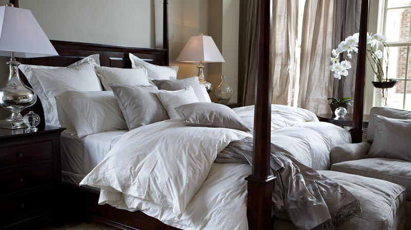
White bedding against dark wood is the most common pairing, and also the most frequently mishandled.
Not all whites behave the same way. Bright, stark white creates a sharp contrast against espresso and ebony and works well in rooms with strong natural light. In low-light bedrooms, that same stark white can look harsh or clinical.
Bright White vs. Warm White: Which One Pairs Better
Bright white against mahogany pulls the pink and red undertones of the wood forward. Most of the time, that is not the intended effect.
Cream and ivory sit in the middle ground. They soften the contrast enough to feel considered without losing the visual separation between light bedding and dark furniture. These are the most universally compatible options in this color family across walnut, espresso, mahogany, and ebony.
A Behr survey found that 65% of Americans associate dark rooms with feeling bold, and 56% find them stylish. The right white bedding keeps that boldness intact while giving the eye somewhere to rest.
| White Tone | Best With | Avoid When |
|---|---|---|
| Bright White | Ebony, espresso, and rooms with abundant natural light | Pairing with mahogany or other red-toned woods, where it can emphasize red undertones. |
| Off-White / Linen White | Walnut, chestnut, and other warm wood tones | Using with very dark ebony furniture in low-light rooms, where the contrast may appear muted. |
| Cream / Ivory | All dark wood types, especially in traditional or transitional interiors | Creating an ultra-modern, high-contrast design, where a crisp white is usually a better choice. |
Fabric matters as much as color. Matte textures like washed linen absorb light and soften the contrast intensity. Sateen and percale cotton reflect light and read crisper and brighter against dark wood frames.
The thread count and fabric finish affect how white registers. A glossy sateen in bright white against an espresso bed frame reads very differently from the same shade in a matte stonewashed cotton.
What Neutral and Greige Bedding Colors Do With Dark Wood Tones
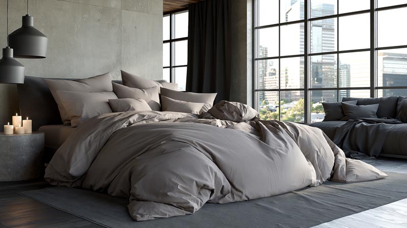
Greige, the blend of gray and beige, is one of the most reliable bedding tones for dark wood rooms. It sits close in temperature to most dark wood undertones, which creates a tonal, layered look rather than a sharp split.
The Sleep Foundation notes that 60% of people prefer neutral bedding for its relaxing effect on the mind, making this category the most broadly preferred across bedroom styles.
When Neutrals Work and When They Fall Flat
True gray bedding reads cooler against warm woods. Against walnut or chestnut, gray creates a slightly modern, almost industrial feel. That can be intentional, but it is worth knowing before committing.
Taupe and sand work well with walnut and teak but can wash out against very dark ebony finishes, where there is not enough contrast to prevent the two from blending into a muddy combination.
The main risk with neutrals: when the bedding and wood share similar undertones without any contrast elsewhere in the room, the result is visually flat. A rug, wall color, or throw in a contrasting tone solves this quickly.
The 2024 home textile color palette from Southshore Fine Linens highlighted cyberspace (dark gray) and stardew (lighter gray) as two of the year’s top textile tones, both of which pair cleanly with dark wood furniture when undertones are matched.
How Earthy and Warm-Toned Bedding Pairs With Dark Wood
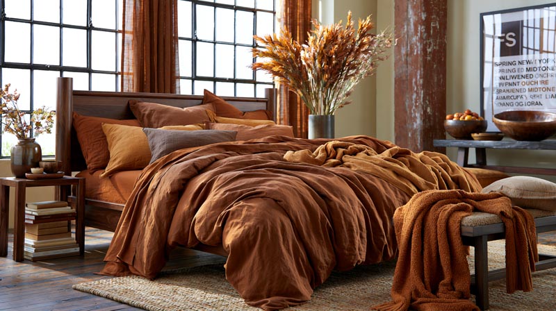
Terracotta, rust, ochre, and caramel bedding work particularly well with warm-toned dark woods.
Trend forecasting from FS (New York) predicted that spring and summer 2025 palettes would anchor around what they called “Enlivened Midtones,” including terra cotta, burnt ochre, and artichoke. These are exactly the tones that perform best against walnut and chestnut wood finishes.
Which Earth Tones Work and Which Add Too Much Weight
Terracotta and rust echo the red undertones in mahogany and cherry wood, creating a rich, cohesive look that reads as warm and intentional.
Ochre and caramel pair well with walnut specifically without competing for visual dominance. The warmth of the wood and the warmth of the bedding sit at the same temperature, and the slight value difference keeps them distinct.
The risk with earth tones: if the walls are also dark or warm, the room can feel heavy and dim. These tones perform best when light walls, white trim, or strong natural light offset the warmth of both the furniture and the bedding.
- Washed cotton carries earthy tones well without adding visual weight
- Stonewashed linen in terracotta or rust reads as relaxed and organic
- Bouclé weaves in caramel tones work especially well against walnut frames
Bed Threads’ 2025 trend report noted that “dark timbers are being paired with softer, organic elements and muted palettes” as the dominant approach for the year, which aligns precisely with this earth-tone category.
The earthy color palette connects naturally to broader earthy color approaches in interior design, where warm neutrals and natural materials work together as a system.
What Cool and Blue-Toned Bedding Does in a Room With Dark Wood
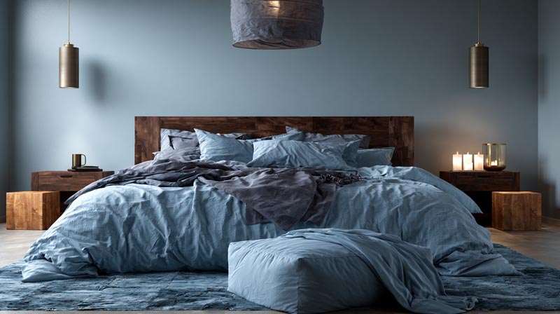
Blue is the most studied color in bedroom design. People in blue bedrooms average 7 hours and 52 minutes of sleep per night, the highest of any bedroom color tested (Travelodge, 2013).
That context matters when pairing blue bedding with dark wood furniture. Blue is not just a design choice here. It carries a measurable effect on rest.
Navy Bedding With Dark Wood: When It Works and When It Overpowers
Navy against dark wood creates high-drama contrast. It works in rooms designed around a bold, moody aesthetic, but only when walls are light enough to prevent the room from collapsing into one dark mass.
Dusty blue and slate blue are the most versatile options in this category. They are compatible with walnut, espresso, and ebony without requiring particularly bright walls to keep them from feeling heavy.
Teal introduces both blue and green undertones. Against red-based woods like mahogany, teal reads as a complementary contrast that is almost analogous to traditional color pairing logic. Against neutral espresso, the result is cooler and more contemporary.
Pale sky blue against very dark wood risks looking cold or sterile without warm accent elements nearby. A brass lamp, a warm-toned rug, or a wooden nightstand in a lighter tone counteracts this.
Cool tones also expand a room visually. Against heavy dark wood furniture, blue bedding pushes the walls out perceptually, which is useful in smaller bedrooms where the furniture already takes up significant visual real estate. This connects directly to how color in interior design affects the perception of space and proportion.
Which Green and Sage Bedding Tones Complement Dark Wood
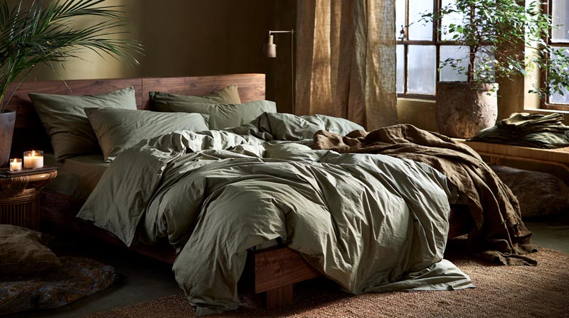
Sage green has become one of the strongest performers against dark wood, particularly walnut. The reason is straightforward: both share natural, organic undertones that feel consistent rather than forced.
According to the Sleep Foundation, green bedrooms are linked to feelings of security and calm, making green one of the more psychologically grounded choices for a bedroom alongside blue.
How Different Green Shades Read Against Specific Wood Tones
Sage green works best with walnut and medium dark woods. The gray-green tone stays muted enough to not compete with the richness of the wood.
Deep forest green against ebony or espresso creates a tone-on-tone result that reads as editorial and intentional. It requires light walls and good natural light to avoid the room feeling like a closed box.
Olive green carries yellow undertones that align particularly well with warm-toned dark wood: teak, chestnut, golden walnut. The yellow in olive responds to the yellow in the wood’s warm undertone.
Mint and bright greens are a different category entirely. They introduce too much contrast and often look jarring rather than balanced against the depth of dark wood furniture.
Green bedding lands best when other room elements reinforce the organic palette. Rattan accessories, stone surfaces, linen curtains, and indoor plants all extend the natural material quality that makes green-and-dark-wood work. This is a space where biophilic interior design principles apply directly, connecting organic textures and natural tones into a coherent system.
A 2024 interior design trends report noted that jewel tones, including deep greens, grew 30% in popularity over the previous year (Sheet Story, 2025), which reflects the broader shift toward richer, more intentional bedroom color choices.
How Light Pink, Blush, and Soft Mauve Bedding Work With Dark Wood
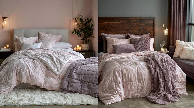
Blush pink against dark walnut or espresso is one of the more underused pairings in bedroom design. The soft, warm tone of blush creates high contrast without the starkness of white, and the result reads as layered rather than simple.
A 2024-2025 survey found that soft blues and muted greens consistently linked to lower blood pressure, but pink-adjacent tones like blush and mauve produce their own calming effect through warmth rather than cool tones (BedroomZZ / Houszed.com).
Blush vs. Mauve: How Each Tone Behaves Against Dark Wood
Blush pink reads warmer and creates a cleaner contrast against espresso or ebony. It works especially well in rooms that lean toward a softer aesthetic with brass or gold hardware.
Dusty mauve sits in a more muted, sophisticated register. It aligns better with cool-toned dark woods and in rooms where the overall palette tends toward gray rather than warm brown.
Warm blush against mahogany is worth handling carefully. The red undertones in mahogany and the pink in blush can reinforce each other, amplifying warmth in a way that feels intentional only if the rest of the room is deliberately warm.
- Deep wine and plum pair with dark wood for a rich, dramatic result
- Bright or saturated pinks dilute the room’s visual coherence against most dark wood tones
- Dusty mauve with an espresso frame and sage green throw is one of the stronger three-tone combinations in this category
LINKED: [colors that go with mauve provide a broader palette reference for building out a room around these softer tones.]
What Dark and Moody Bedding Colors Do in a Room With Dark Wood Furniture
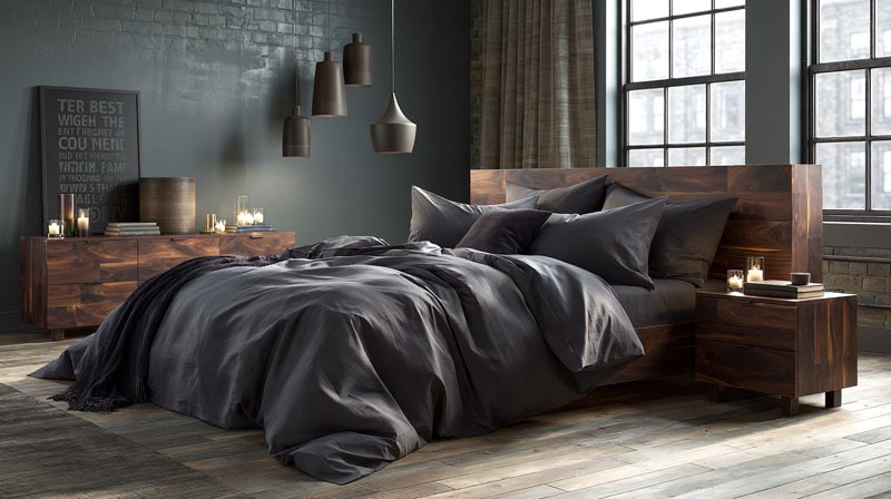
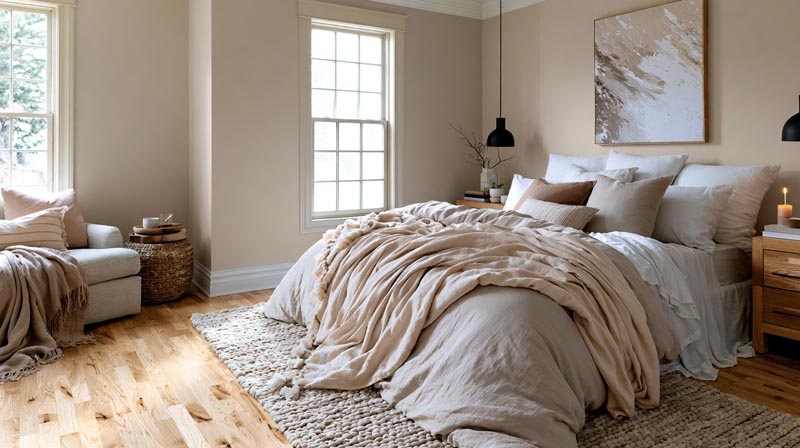
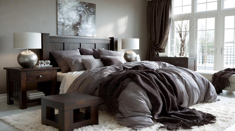
Dark bedding against dark wood is the most mishandled pairing in bedroom design. Done wrong, the room reads as one flat, heavy mass. Done right, it creates a layered, intentional look that is genuinely hard to achieve with lighter options.
Decorilla’s 2024 trend report noted a clear shift toward “deep midnight blues, rich burgundies, and charcoal grays” as accent choices, reflecting growing consumer comfort with darker bedroom palettes.
| Dark Bedding Tone | Best Wood Pairing | Room Requirement |
|---|---|---|
| Charcoal | Espresso, ebony | Pairs best with white or pale walls and ample natural or artificial lighting. |
| Black Linen | Ebony, dark walnut | Works best with very light walls and high ceilings to prevent the room from feeling too dark. |
| Deep Burgundy | Cherry, mahogany | Looks best with mid-tone walls and warm lighting that enhances the wood’s rich undertones. |
| Navy | Walnut, espresso | Complements light-colored walls and is enhanced by natural wood or brass accents. |
When Dark Bedding Works With Dark Furniture (and When It Collapses)
Texture becomes the deciding factor when using dark bedding with dark wood. Matte against matte at the same value level disappears into one undifferentiated surface.
Mixing textures rescues the combination. A matte stonewashed linen duvet against a lacquered ebony frame creates a material contrast that substitutes for color contrast.
Pinterest identified “Western Gothic” as a top interior design trend for 2024, a style that leans directly into dark bedding against dark natural wood furniture, with velvet, brass, and warm lighting doing the visual separation work.
Black linen bedding against ebony furniture works only in rooms with white or very light walls. The walls carry the contrast burden so the bedding does not have to.
- Deep burgundy or wine against dark cherry creates a tonal, layered richness when the room goal is warm and dramatic
- Large bedrooms with high ceilings handle this approach better than compact rooms where the weight becomes claustrophobic
The bedroom linen segment dominates the home textile market at 37.8% share in 2024, with premium, texture-forward options driving the growth (Market Data Forecast, 2025). This supports the practical reality that consumers are buying more differentiated textures, which is exactly what dark-on-dark bedding requires to succeed.
How Bedding Patterns and Prints Interact With Dark Wood
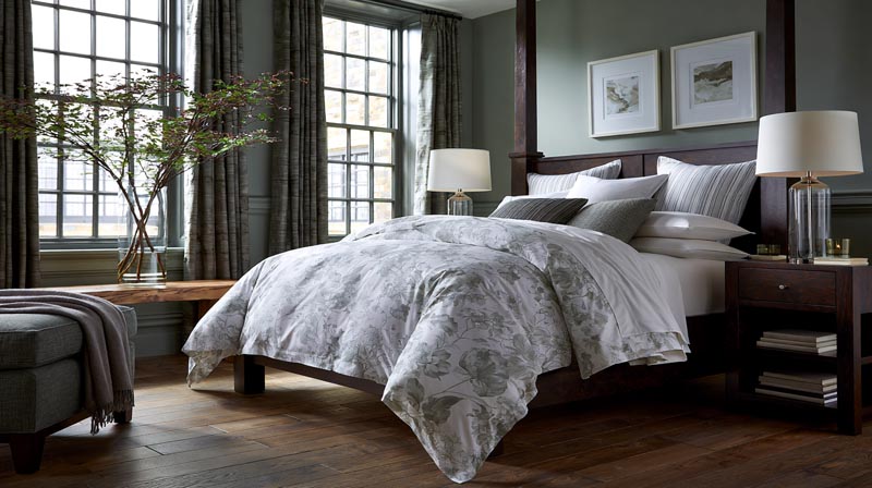
Pattern adds complexity to a bedding-and-furniture pairing that solid colors alone cannot replicate. The key variable is not whether to use pattern, but which pattern scale and color distribution to choose.
Schweitzerlinen’s 2024 trend analysis noted that “stripes, dots, and geometric shapes are making a strong return,” directly replacing plain solids in bedrooms where the furniture is already providing significant visual depth.
Which Pattern Types Work Against Dark Wood
Large-scale patterns with a light base maintain the contrast function of solid light bedding while adding visual interest. A white ground with a large botanical print reads as light bedding from across the room.
Small, dense patterns against dark wood create visual noise. The eye cannot resolve the competing details of a busy small-scale print against the grain and depth of dark furniture at the same time.
Stripes in a light-and-dark combination are one of the safest pattern choices. The alternating light value in the stripe functions like solid light bedding while the dark value connects to the furniture tone.
Recent textile research found that beds with 3 or 4 different textures are perceived as around 40% more luxurious than single-texture arrangements (interior design trend research, 2023). Pattern contributes to that textural variety when it introduces visual weight variation across the surface.
Pattern Scale Matched to Room Size
Room scale determines which pattern size works.
- Large rooms with high ceilings handle oversized florals and bold geometrics without the pattern dominating
- Smaller bedrooms need restraint: medium-scale stripes or subtle woven textures over busy prints
- Geometric patterns in high-contrast colorways (navy and white, black and white) pair cleanly with espresso and ebony
Studio McGee’s design approach recommends pairing a large-scale pattern with a smaller, subtler secondary pattern to prevent visual chaos while adding dimension. Against dark wood furniture, where the frame itself is already a dominant visual element, keeping at least one of those pattern layers subtle prevents overload.
Understanding pattern in interior design more broadly helps with knowing when pattern adds depth and when it competes with existing room elements.
What Role Bedding Texture Plays When Pairing With Dark Wood
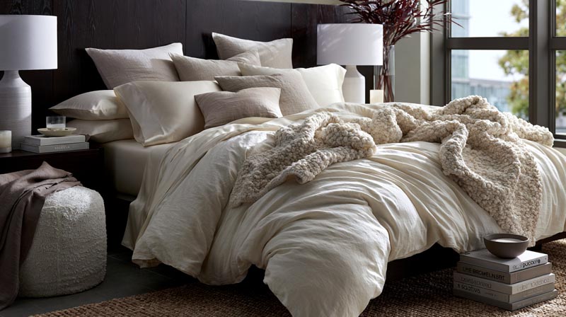
Texture affects how a color reads. The same cream shade in sateen and stonewashed linen behaves as two different tones against dark wood because one reflects light and the other absorbs it.
Saatva’s 2025 design analysis found that searches for “bouclé bed” grew 35% in a single year, with “white bouclé bed” up 7,800%, pointing to a major consumer shift toward textured bedding specifically in neutral and light tones.
How Fabric Finish Changes Color Perception Against Dark Wood
Matte textures (washed linen, stonewashed cotton) absorb light, soften color, and reduce the contrast intensity between bedding and dark wood.
Shiny textures (sateen, satin, silk) reflect light and amplify both light and dark colors. Bright white sateen against ebony reads far more sharply than the same white in percale cotton.
Chunky knit and bouclé textures add tactile depth that is most effective in neutral and earth tones. Combining a bold color with a heavy texture against dark furniture risks visual overload.
Mixing Textures Within a Single Bedding Set
A single bedding layer in one texture reads flat against dark wood. Layering changes this.
- Smooth duvet + textured throw
- Percale sheets + linen shams
- Velvet cushions + matte cotton duvet
Homes and Gardens 2026 trend reporting confirmed that interior designers now recommend “mixing finishes like sateen sheets with relaxed linen or a matelasse coverlet” even within a restrained color palette, specifically because texture variation replaces pattern as a depth mechanism. This is how you make a simple white or cream bedding set look considered rather than default.
The relationship between material weight, surface finish, and visual tone connects directly to how texture in interior design shapes the atmosphere of a room beyond just color choices.
How Wall Color Affects Which Bedding Works With Dark Wood
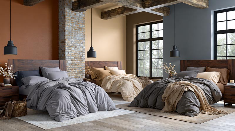
Wall color is not a separate decision from bedding color. The three-way relationship between wall, bedding, and dark wood furniture determines whether any individual pairing succeeds or fails.
Research published in DEPARCH Journal (Yildirim et al., 2024) examining bedroom wall color effects confirmed that warm, cool, and neutral wall tones produce measurably different perceptual outcomes in identical room layouts, regardless of furniture color.
How Wall Tone Changes Bedding Behavior
Light walls (white, off-white, pale gray) give any bedding color room to work because they provide the contrast buffer between bedding and wood. This is the most forgiving wall choice with dark wood furniture.
Dark or saturated walls with dark wood furniture require light bedding to prevent the room from becoming visually oppressive. There is no other option here. The bedding has to carry the lightness.
Warm-toned walls (terracotta, warm beige) make cool-toned bedding more effective against dark wood because the wall already handles the warmth requirement. A dusty blue duvet against a warm beige wall and walnut bed frame creates a three-tone palette that works as a system.
The Most Common Wall-Bedding Mistake
Choosing bedding color without accounting for wall tone.
A sage green duvet that looks balanced against a white wall in a showroom can read completely differently against a mid-tone gray wall at home. The wall shifts the apparent color temperature of everything in the room.
Mid-tone walls (sage green, dusty blue, warm gray) function like a large piece of bedding. They should be treated as part of the palette rather than as neutral background. This is where the 60-30-10 rule, widely used in professional bedroom color design, becomes practical: 60% dominant wall and furniture tone, 30% bedding, 10% accent.
A 2024-2025 survey of 2,674 Americans found that 38% reported improved sleep quality after changing their bedroom color (BedroomZZ / Houszed.com). Wall color is part of that change, not just bedding. Both elements work together to create the room’s overall tone.
Getting wall color right with dark wood is covered in detail in the guide to what color walls go with dark wood floors, which applies the same logic to flooring-and-wall combinations.
What Accent Colors to Layer Over Bedding With Dark Wood Furniture
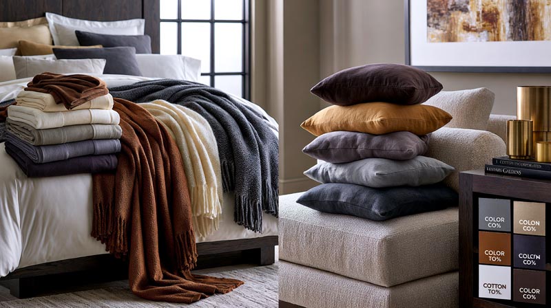
The bedding color is the foundation. Accent colors from throws, pillows, and layered textiles are what turn a functional color choice into a complete bedroom palette.
87% of consumers recognize the link between quality bedding and better sleep (Cotton Incorporated Home Textiles Survey, 2023), which reinforces why layered textiles are not just aesthetic. Comfort and bedroom design work together.
How to Build an Accent Layer Over Dark Wood Bedding
The 60-30-10 rule applies directly here. The dark wood furniture and walls occupy the 60% dominant share. Bedding fills the 30% secondary share. Accent pieces, throws, and cushions handle the remaining 10%.
A throw in a contrasting color extends the palette without changing the primary bedding. This is the single most efficient way to test a new color combination before committing to new bedding.
Interior design research found that people perceive mixed bedding combinations as looking better 62% of the time even when components come from entirely different collections (Heniemo, 2025), which shows that thoughtful layering reads as intentional rather than mismatched.
Accent Colors That Bridge Bedding and Dark Wood
Metallic accents (brass, gold, bronze) in pillow trim or nearby decor are one of the most reliable bridges between warm-toned dark wood and cool-toned bedding. They carry warmth without introducing another color.
Pillow covers in 2 complementary accent tones are more effective than matching everything to a single color. Two accents create a palette. One accent reads as an afterthought.
- Deep wood furniture works best when at least one textile in the room carries a warm undertone
- Accent colors should tie into at least one other room element (rug, curtain, artwork) to register as deliberate rather than random
- A single bolster cushion in an accent color reads cleaner than a pillow pile, per current 2026 designer direction (Homes and Gardens)
Liz Williams of Liz Williams Interiors confirmed the shift: “crisp white bedding paired with beautiful custom pillows will always be a classic, but there is a refreshing move toward introducing color at the foundation.”
The accent layer question connects to the broader palette decisions covered in the guide to colors that go with walnut wood, where the same warm-undertone logic applies across the entire room.
FAQ on What Color Bedding Goes With Dark Wood Furniture
What is the best bedding color for dark wood furniture?
Cream and ivory are the most universally compatible choices. They soften contrast without losing visual separation between light bedding and dark wood. White linen and off-white cotton also work well across walnut, espresso, and mahogany finishes.
Does white bedding work with dark wood furniture?
Yes, but the specific white matters. Bright white suits espresso and ebony in well-lit rooms. Off-white and warm white are better fits for mahogany and walnut, where stark white can amplify unwanted red or pink undertones.
What color bedding goes with a walnut bed frame?
Sage green, warm cream, caramel, and dusty blue all pair well with walnut. The wood’s warm golden-brown undertone responds best to bedding in similar warm temperatures or soft cool tones that contrast without clashing.
Can you use dark bedding with dark wood furniture?
Yes, with the right conditions. Light walls and strong lighting are required. Texture variation between the bedding and the wood frame is what prevents the room from reading as one flat, heavy mass. Charcoal linen against ebony works well this way.
What color bedding works with an espresso bed frame?
Greige, dusty blue, slate, and crisp white all pair cleanly with espresso. The neutral-to-cool undertone of espresso wood is compatible with a wide range of bedding tones, making it one of the more versatile dark wood finishes to style around.
Does navy bedding work with dark wood?
Navy works against dark wood when walls are pale and the room has enough natural light. Against walnut or espresso with light walls, navy creates intentional high contrast. In darker rooms, navy can collapse the visual space significantly.
What colors should you avoid with dark wood bedroom furniture?
Avoid bedding in a similar tone and undertone to the wood without added contrast elsewhere. Muddy mid-tone browns against walnut, and warm taupes against mahogany, are the most common pairings that flatten a bedroom’s visual balance and color harmony.
Does sage green bedding go with dark wood furniture?
Sage green is one of the strongest performers against dark wood, especially walnut. The shared organic, natural undertone between sage and warm dark wood creates a cohesive bedroom color palette without requiring high contrast to feel considered and balanced.
How does wall color affect bedding choice with dark wood furniture?
Significantly. Light walls give any bedding tone room to work by providing contrast buffer. Dark walls with dark wood require light bedding to prevent visual heaviness. Wall undertone also shifts how bedding color reads against the furniture.
What bedding fabric works best with dark wood furniture?
Washed linen and stonewashed cotton suit most dark wood pairings because matte textures soften contrast and feel relaxed. Sateen amplifies color and sharpens contrast. For dark-on-dark combinations, mixing fabric textures creates the visual separation that color alone cannot provide.
Conclusion
Choosing what color bedding goes with dark wood furniture is less about following rules and more about understanding how undertone, saturation, and visual balance work together in a bedroom.
Cream and ivory remain the safest starting point. Sage green, dusty blue, and warm earth tones are the strongest choices when you want more personality without losing bedroom color harmony.
Wall color shifts everything. So does fabric texture. A stonewashed linen duvet in the same shade as a sateen reads as two completely different tones against an espresso or mahogany bed frame.
Get the contrast ratio right between your bedding, wood tone, and walls, and the rest falls into place naturally.

- Kitchen Color Schemes by Cabinet Color: What Pairs Well - October 19, 2026
- Curtain Colors for Every Wall Color: Safe vs Bold Picks - October 18, 2026
- Interior Design Styles: Find Your Primary and Secondary - October 14, 2026