Color Combinations
Colors That Go with Pine Wood: Fresh & Stylish Ideas
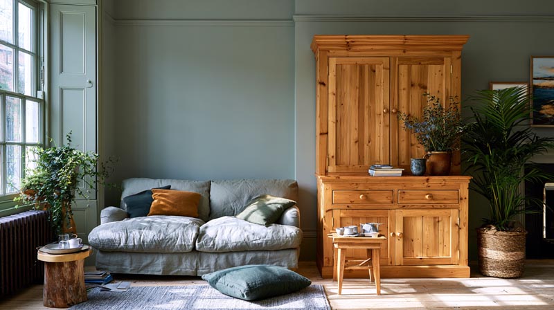
Pine wood has a way of making color decisions harder than they need to be.
Its warm yellow-to-honey tone with amber undertones reacts differently to paint colors depending on the finish, the room’s light, and the stain. Pick the wrong wall color and the wood looks orange. Pick the right one and the whole room feels grounded.
Understanding which colors go with pine wood comes down to one thing: undertones. Warm neutrals, earthy greens, and deep contrasting tones work. Cool grays and stark whites fight it.
This guide covers every room and scenario, from pine wood flooring and kitchen cabinets to bedroom palettes and accent decor, with specific paint colors, hardware finishes, and lighting conditions included throughout.
What Does Pine Wood Look Like as a Color?
Pine wood sits in a warm yellow-to-honey range with amber and golden undertones. That warm base is the whole reason choosing colors for pine feels tricky. Get it wrong and the wood looks orange. Get it right and the room feels grounded and natural.
The finish matters a lot. Raw pine is pale straw. An oil-based finish pulls pine into golden amber territory, the same shift you’d see with an Early American stain on pine floors. A matte finish keeps it lighter; a satin or gloss finish deepens the warmth significantly.
Pine also changes over time. Natural light causes it to yellow and shift toward orange, especially in south-facing rooms. This is worth knowing before you commit to any wall color, because a paint that looks perfect in the store might fight the pine once it’s been living in sunlight for six months.
Two main categories:
- Light pine: pale straw to honey, reads almost Scandinavian in tone
- Dark or stained pine: honey pine, golden pine, antique pine, each pulling more orange or amber as the stain deepens
Understanding which category your pine falls into is the starting point. Every color recommendation below depends on it.
What Colors Go With Pine Wood in a Living Room?
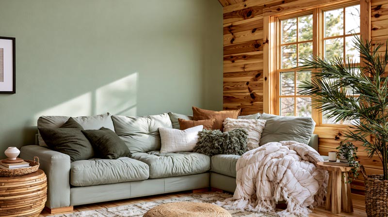
Sage green, warm whites, and earthy neutrals are the most reliable wall colors for pine wood in a living room. They work because they share pine’s warm undertone without amplifying the yellow-orange in the wood. Greens especially are the safe bet. According to Apartment Therapy’s 2024 analysis of Google search data, green is the most popular living room color in the US with over 61,600 monthly searches, and sage green in particular dominated paint brand selections as Color of the Year picks across 6 major brands.
That popularity makes sense when you see it next to pine. Sage sits at the intersection of warm and cool in a way that softens pine’s amber without washing it out.
Warm Neutrals That Work With Pine
Benjamin Moore Linen White and Farrow & Ball Pointing are the 2 most-cited warm whites in professional design circles for wood-heavy interiors. Both have a creamy undertone that aligns with pine’s warmth instead of pulling against it.
Pure white is the one to avoid. It amplifies the yellow in pine and makes the wood read more orange, especially in rooms without cool north light.
Best warm neutral options for pine living rooms:
- Creamy off-whites (Benjamin Moore Linen White, Sherwin-Williams Alabaster)
- Greige with warm undertones, not cool-leaning greiges like Repose Gray
- Soft clay and warm taupe tones
According to Fixr.com’s 2024 Paint Color Trends Report, 81% of design professionals recommend warm neutrals for interiors, and 48% named warm white as the top interior paint color of the year. That is not a coincidence in rooms with natural wood.
Accent Colors That Pull Out Pine’s Warmth
Terracotta is the standout here. It sits in the same warm family as pine but adds depth rather than competing. Rust and burnt orange work the same way as accent colors on cushions, rugs, or a single feature wall.
Deep navy and forest green work differently. They create contrast rather than harmony. A deep navy or forest green accent wall behind pine furniture is one of those combinations that just works. The contrast brings the wood grain forward.
Contrast vs. harmony breakdown:
| Color | Effect With Pine | Best Use |
|---|---|---|
| Sage Green | Harmonizes with pine and softens its natural amber undertones. | Suitable for all walls to create a calm, balanced space. |
| Terracotta | Complements pine by adding warmth and visual depth. | Best used on an accent wall or through accessories and décor. |
| Deep Navy | Creates strong contrast that highlights the wood grain and adds sophistication. | Ideal for a single feature wall or focal area. |
| Forest Green | Provides rich contrast while grounding the room and enhancing pine’s natural warmth. | Works well on a feature wall, cabinetry, or built-in shelving. |
| Cool Gray | Conflicts with pine’s warm undertones, often making the wood appear more orange. | Generally best avoided, especially as the primary wall color. |
The role of color in interior design goes beyond aesthetics. It directly shapes how materials like pine wood read visually in a space, which is why the undertone conversation matters as much as the color itself.
What Colors Go With Pine Wood in a Bedroom?
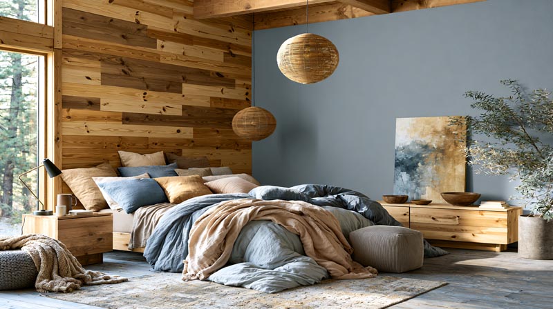
Dusty blue, warm blush, and greige are the 3 color families that work consistently well with pine wood in bedrooms. Bedrooms usually need to feel calm, and pine’s warm undertone already does some of that work. The wall color just needs to support it rather than compete.
Dusty Blue and Muted Teal
Dusty blue is probably the most used color next to pine in Scandinavian-style bedrooms, and for good reason.
It balances the warmth without going cold. The key is muted, not bright. A clear, saturated blue pulls pine toward orange. A dusty, grayed blue creates calm and makes the honey tones in pine look intentional.
Muted teal works similarly, especially in bedrooms with less natural light. It adds color without heat.
Worth noting: in a north-facing bedroom with limited sunlight, pine can read cooler than it does elsewhere. In that case, lean toward slightly warmer versions of dusty blue to stop the room from feeling flat.
Blush, Warm Pink, and Greige
Pale blush and warm pink tones sit naturally alongside pine’s amber base. They share warmth without amplifying yellow. This is a combination that reads as soft and deliberate rather than sweet or heavy.
Greige, particularly those versions that lean more beige than gray, works in bedrooms as a neutral anchor. The problem is picking the wrong greige. Cool-leaning greige paint like Sherwin-Williams Repose Gray clashes with warm wood floors and walls because its gray undertone fights the amber in pine. Stick to versions with genuine beige warmth, not just a gray-beige hybrid that tips cool.
According to Fixr.com’s 2024 design expert survey, 28% of professionals named taupe, the warm neutral between beige and gray, as one of their top color picks for homes that year, reflecting this broader move toward wood-friendly warmth.
What Colors Go With Pine Wood Flooring?
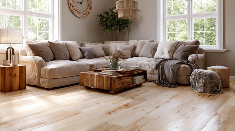
Pine wood flooring covers large surface areas, which amplifies its yellow-amber tone across the whole room. Wall colors need to account for this. A color that looks fine next to a pine side table looks very different when pine is underfoot across 400 square feet.
California Flooring and Design noted in their 2024 flooring trend analysis that pale pine floors specifically pair well with a range of decor styles from organic modern to minimalist, but the wall color decision is where most homeowners run into problems.
Wall Colors for Light Pine Floors
Dark charcoal and deep green on walls ground light pine floors effectively. The contrast keeps the floors from looking washed out or yellowy. This is one case where going dark on the walls is actually the right call.
Warm white and soft clay wall colors are the more common choice. They stay consistent with pine’s warm base and keep the room feeling cohesive without much visual drama.
The 60-30-10 color rule is worth applying directly here: 60% of the room (walls, large furniture) in the dominant tone, 30% in a secondary, 10% in an accent. With pine flooring as the wildcard, treat it as part of your 60% and choose walls that either harmonize or deliberately contrast, but not both at once.
Furniture Colors That Work Against Pine Flooring
Three furniture colors that consistently work against pine floors:
- White and cream, which create clean contrast without temperature conflict
- Black, which grounds the space and pulls the eye away from the floor’s warmth
- Natural linen and undyed fabrics, which sit neutrally in the warm palette
Dark walnut furniture against light pine flooring is a combination that keeps appearing in professional residential projects. The tonal gap is wide enough to feel intentional. This is the same principle behind wood kitchen cabinets paired with black countertops, where contrast between warm wood and dark surfaces creates definition rather than confusion.
What Colors Go With Pine Wood Kitchen Cabinets?
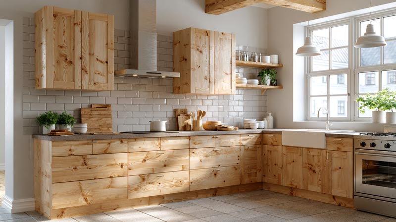
Pine kitchen cabinets are warm, yellow-toned, and carry strong grain character. The 3 most reliable color strategies are: white or cream backsplash tile, dark or neutral countertops for contrast, and wall paint in warm white or green.
Fixr.com’s 2024 Paint Trends Report found that 71% of design professionals say natural materials are dominating furniture trends. Pine cabinets fit squarely into that direction, but they need the right surrounding colors or they overwhelm a kitchen space.
Backsplash and Tile Colors for Pine Cabinets
White and cream subway tile is the most common choice. It works because it reflects light back into the cabinet faces without introducing a competing undertone.
Terracotta tile is the bolder option. Against pine, the orange-red of terracotta tiles draws out the warm amber in the wood and creates a cohesive earthy palette. It is the kind of combination that comes across as intentional and distinctive in a kitchen.
According to Homes and Gardens’ 2024 reporting, designers note a visible shift toward earthier, warmer color combinations for kitchens, away from the cool-white dominant palette that dominated earlier in the decade. Terracotta tiles are a direct example of this shift in kitchen surfaces.
Countertop Colors That Pair With Pine
3 countertop directions that work with pine cabinets:
- White marble or quartz: high contrast, keeps the kitchen light and legible
- Black granite: strong contrast, makes pine read richer and deeper
- Concrete gray: middle ground, cooler tone that offsets pine’s warmth without fighting it
Butcher block is the one to avoid pairing with pine cabinets. Two warm wood surfaces side by side with no contrast between them creates visual noise. The kitchen reads as one big block of warm yellow-brown with no focal point.
Wall Paint and Hardware for Pine Kitchens
Sherwin-Williams Alabaster on the walls is a frequent professional recommendation for pine cabinet kitchens. It is warm white without being cream, which keeps the kitchen bright while staying within pine’s tonal family.
Farrow & Ball Mizzle, a warm olive-green, is the bolder but equally valid alternative for kitchens that want more color depth.
Hardware finishes ranked by compatibility with pine:
- Brushed brass: echoes pine’s warm undertone directly
- Matte black: creates clean contrast, widely used
- Oil-rubbed bronze: sits between warm and dark, works well with antique pine stains
- Chrome or brushed nickel: cool metal tones fight pine’s warmth
What Paint Colors Go With Pine Wood Furniture?
When painting a room around existing pine furniture, muted green-gray tones and deep teals are the 2 color families that consistently work best. They create enough contrast to make the pine stand out as a feature rather than blend into the walls.
Farrow & Ball Mole’s Breath is probably the most well-known recommendation in this space. It is a warm mid-gray with enough depth to contrast pine without pulling cool. Purbeck Stone sits in similar territory, slightly lighter and more neutral.
Specific Paint Colors That Work
Farrow & Ball Mole’s Breath is a consistently reliable choice for rooms with pine furniture. It is warm enough not to fight the amber undertones, dark enough to create contrast, and sits in a neutral range that does not date.
Farrow & Ball Purbeck Stone reads lighter and warmer. Good for bedrooms or rooms where Mole’s Breath feels too heavy.
Sherwin-Williams Alabaster is the safe warm white. Works in any room, keeps pine looking deliberate rather than leftover.
The Orange Effect: When Paint Colors Fight Pine
Cool undertone paints are the main problem. When you paint walls in a color with blue or gray undertones and set pine furniture against them, the pine’s warm yellow base shifts visually toward orange. The wood looks unintentional.
This happens most with Sherwin-Williams Repose Gray, Benjamin Moore Gray Owl, and most of the popular cool-gray neutrals that dominated interiors for years. They are genuinely good paints in other contexts. Next to pine, they are the wrong choice.
The same principle explains color theory in interior design: complementary undertones work together, opposing ones create visual tension rather than intentional contrast.
| Paint Color | Brand | Effect With Pine | Best Room |
|---|---|---|---|
| Mole’s Breath | Farrow & Ball | Provides warm contrast that enhances the natural grain and character of pine. | Living room, study, or library. |
| Purbeck Stone | Farrow & Ball | A soft warm neutral that blends naturally with pine’s golden undertones. | Bedroom or other relaxing spaces. |
| Alabaster | Sherwin-Williams | A warm white that brightens the room while complementing pine’s warmth. | Kitchen, living room, or open-concept spaces. |
| Repose Gray | Sherwin-Williams | Its cool gray undertones can make pine appear noticeably more orange. | Generally best avoided in rooms with prominent pine wood. |
What Colors Go With Light Pine vs. Dark Pine Wood?
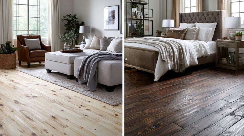
Light pine and dark pine sit in different tonal families and need different color strategies. Treating them the same is where most color mistakes happen.
According to California Flooring and Design’s 2024 flooring trends analysis, pale pine continues gaining popularity in Scandinavian-inspired and minimalist interiors. Dark and antique pine stains, meanwhile, are seeing renewed interest as part of the broader move toward warmer, more expressive decorating, a direction confirmed by Hardwood Floors Magazine’s 2024 color trends report from the NWFA.
Colors for Light Pine
Light pine reads close to Scandinavian blond wood. It suits cooler-leaning neutrals better than dark pine does.
Dusty blue, soft sage, and cool whites all work well. The lightness of the pine does not demand warm contrast the way darker wood does, so there is more flexibility with cooler tones here than anywhere else in the pine color conversation.
Pale pine flooring specifically pairs well with deep charcoal or forest green walls, which is a contrast approach that works precisely because the floor is light enough to hold its own against a dark wall color.
Colors for Dark Pine and Stained Pine
Dark or stained pine: richer tones are needed. The amber and orange notes in honey pine, golden pine, or antique pine stains are more pronounced, and wall colors need to account for that depth.
Best wall colors for dark pine:
- Rust and ochre in small doses as accent colors
- Deep green (Farrow & Ball Mizzle or similar olive greens)
- Warm mid-brown tones, particularly in a dining room context
- Terracotta as an accent wall behind dark pine furniture
How Finish Type Affects Color Pairings
A matte finish keeps pine looking raw and natural. Wall colors can go lighter because the wood surface absorbs rather than reflects.
A satin or lacquered finish adds sheen, which makes pine’s amber tones more vivid and warm. In that case, wall colors need to be slightly more deliberate because the wood is doing more visual work. Deep greens and charcoals absorb that extra warmth without conflict.
The way finish interacts with natural and artificial light directly connects to how light behaves in interior spaces. A highly reflective pine surface in a south-facing room behaves completely differently from matte pine in a north-facing one, and the wall color has to respond accordingly.
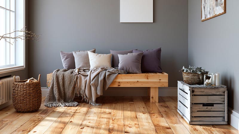
3 color families consistently cause problems with pine: cool grays, pure bright white, and purple-leaning tones. Each one conflicts with pine’s warm yellow-amber base in a different way.
The broader industry context backs this up. According to California Flooring and Design’s 2024 flooring trend analysis, the interior design industry is actively moving away from cool grays and toward earthy and warm neutral tones. Rooms with pine wood were part of the reason those cool grays never sat quite right.
Cool Grays and Blue-Grays
This is the most common mistake.
Cool grays carry blue or violet undertones. When they sit next to pine’s warm yellow base, the wood’s undertone shifts toward orange, not honey. The result is a room where the pine looks accidental rather than intentional.
Specific paints to avoid next to pine:
- Sherwin-Williams Repose Gray
- Benjamin Moore Gray Owl
- Most blue-gray neutrals popular in the 2015-2022 design cycle
The undertone conflict is documented clearly by color consultant Kylie M Interiors, whose research notes that cool gray paints often reveal unexpected purple-blue undertones under residential lighting, making warm wood finishes like pine and honey oak read as orange by comparison.
Pure Bright White
Stark, cool white amplifies pine’s yellow undertone rather than neutralizing it.
The effect is specific to light conditions. In a south-facing room with strong afternoon sun, Little Greene’s design guidance notes that warmer whites already appear more cream, so pure white pushed even further into that yellow-amplifying territory. Against pine in those conditions, it creates a washed-out, yellow-heavy result.
Warm whites like Benjamin Moore Linen White or Sherwin-Williams Alabaster work because they share pine’s warmth rather than exposing it.
Purple and Lilac
Lilac and purple tones sit on the opposite side of the warm-cool divide from pine. Used in combination, they create tension rather than contrast. Homes and Gardens color specialists note that lilac specifically can leave a room feeling cold and unwelcoming when not paired with warmer undertones, which is exactly what pine cannot provide on its own.
The fix is simple: if you want purple in a room with pine, keep it to small accents like cushions or ceramics and anchor the walls in a warm neutral instead.
How to Test Before Committing
Paint a 30cm square swatch directly on the wall next to the pine surface. View it at 3 different times of day: morning, midday, and evening under artificial light.
If the pine looks more orange at any point, the paint has a cool undertone that is fighting the wood. Switch to a warmer variation of the same hue. This test costs one paint sample. Repainting a room costs considerably more. The paint calculator can help estimate full room quantities before you commit to any final color.
How Does Room Lighting Affect Color Pairings With Pine Wood?
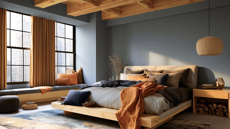
Lighting is the most underestimated variable in pine color pairing. The same wall color next to pine in a north-facing room looks completely different from that exact color in a south-facing one.
According to Sherwin-Williams’ room orientation guide, north-facing rooms receive the least direct light throughout the day, and the quality of that light tends to be cool, gray, and flat. South-facing rooms get warm, golden, progressively more yellow light as the afternoon progresses. Both affect how pine reads.
North-Facing Rooms With Pine
Pine reads cooler and more muted without direct sun. The honey-amber tone pulls back and the wood can look almost gray-green in a north-facing room with limited windows.
Wall color strategy: lean warmer than you think you need to. Colors that look balanced on a paint chip will appear cooler than expected in north light. Benjamin Moore’s paint guidance for north-facing rooms specifically recommends warm undertone neutrals with hints of gold and sand to counteract the cool, muted quality of northern light.
Warm greige and creamy off-whites perform better here than anywhere else in the pine color conversation. They borrow back the warmth that north light takes away.
South-Facing Rooms With Pine
South-facing rooms get strong, warm, yellow light in the afternoon. Pine in these conditions becomes very vivid in its amber tone. Warm wall colors can tip the whole room into an overwhelming yellow-orange palette.
2 reliable strategies for south-facing rooms with pine:
- Use cooler-leaning versions of your chosen color (a slightly cooler sage or dusty blue works as a counterbalance)
- Test paint samples specifically in afternoon light, not morning, since that is when the room is at its warmest
Little Greene’s color guide confirms that south-facing rooms make warmer whites appear cream-toned, which means a paint that looks neutral in the store can read as distinctly yellow once afternoon sun hits it next to pine.
Artificial Lighting and Kelvin Temperature
Warm LED bulbs (2700K-3000K) deepen pine’s amber tones and make the wood feel richer. This is the right choice for living rooms and bedrooms with pine.
Cool LED bulbs (4000K and above) neutralize pine’s warmth and can make it read flat or yellowish under artificial light. According to PROLIGHTING’s lighting guide, homes with natural hardwood floors, wood cabinets, and warm wood furniture are specifically suited to 2700K-3000K warm white LEDs.
Key rule: do not mix Kelvin temperatures across connected open-plan spaces. If the living room is 2700K and the kitchen adjacent to it is 4000K, pine surfaces visible from both areas will appear to change color depending on which light source is closer. The behavior of light in interior spaces and how it interacts with natural materials is one of the most practical areas to understand before finalizing any color scheme with pine wood.
| Room Type | Light Condition | Pine Effect | Wall Color Approach |
|---|---|---|---|
| North-Facing | Cool, flat, indirect natural light | Pine appears more muted with less noticeable amber warmth. | Choose wall colors that are slightly warmer than usual to maintain balance. |
| South-Facing | Warm, golden, direct natural light | Pine’s amber and golden tones become more vivid and pronounced. | Select a slightly cooler version of your preferred wall color to offset the added warmth. |
| Warm LEDs (2700K) | Warm amber artificial light | Enhances pine’s richness, creating a deeper and cozier appearance. | Warm color palettes work especially well and maintain a harmonious look. |
| Cool LEDs (4000K+) | Neutral to cool white artificial light | Can make pine look flatter and emphasize yellow tones. | Generally avoid cool lighting in living spaces with pine, or balance it with warm wall colors. |
What Accent and Decor Colors Work With Pine Wood?
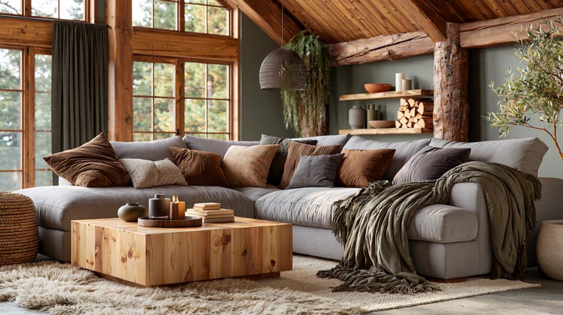
Wall color gets most of the attention, but the palette that surrounds pine on a daily basis is mostly textiles, hardware, and decor. Getting those right matters as much as the paint.
Earthy color palettes are seeing strong renewed interest across the industry. Spacejoy’s 2025 interior design analysis confirms that earth tones like terracotta, ochre, and olive green are being positioned as the dominant color direction for warm-material interiors, driven by a documented shift away from the cool grays that dominated the previous decade. Pine fits squarely into this direction.
Textile Colors That Work With Pine
Rust, burnt orange, olive, and mustard are the 4 textile colors that consistently appear alongside pine in professional residential projects. They share pine’s warm undertone family without matching it too closely, which creates visual cohesion rather than monotony.
Linen in its natural undyed state is probably the most versatile textile pairing with pine. No color conflict, and the texture contrast between woven linen and wood grain reads as layered and intentional.
Earthy tone rug trends from ProCare’s 2024 rug trend report confirm that warm terracotta, moss green, and sandy neutral rugs are among the most in-demand rug colors for exactly these natural-material interior settings.
Rug Colors That Ground Pine Floors
A rug under pine flooring needs to create contrast without color conflict. Too close in tone to the pine and the floor disappears. Too far in the opposite direction and the rug fights the wood.
3 rug directions that work:
- Deep charcoal or slate gray (creates ground-level contrast, anchors light pine)
- Terracotta and rust tones (warm palette harmony, draws out pine’s amber)
- Muted olive or sage green (earthy bridge between floor and wall)
A rug size calculator helps get the proportions right before purchasing. Getting the color right on a rug that is too small for the space is a wasted decision.
Metal Accent Finishes With Pine
Brushed brass and copper are the 2 metal finishes that echo pine’s warmth directly. They belong in the same tonal family and reinforce the amber quality of the wood.
Matte black contrasts pine rather than harmonizing with it, which is equally valid. Black hardware against pine cabinets or furniture creates definition and stops the warm tones from feeling unchecked.
Chrome and brushed nickel are the finishes to avoid. Both read cool against pine’s warmth and create the same temperature conflict as cool gray paint.
Plants and Greenery as a Neutral Pairing
Living plants are one of the few decor elements that work universally alongside pine regardless of the room’s color scheme. The green of foliage sits naturally within the warm earthy palette, and the visual contrast between organic plant texture and wood grain reads as intentional in almost any setting.
This is part of a broader design movement toward biophilic interior design, which uses natural elements to create spaces that feel connected to the outdoor environment. Pine wood is already a natural material with strong biophilic credentials. Adding living greenery deepens that quality rather than competing with it. According to the 2024 interior design trend analysis from Andrea Rose Design Co., biophilic design principles prioritize earthy tones, natural materials, and plant life as complementary elements, all of which align directly with pine’s color palette and character.
FAQ on Colors That Go With Pine Wood
What wall colors go best with pine wood?
Warm whites, sage green, and earthy neutrals are the most reliable choices. They share pine’s warm undertone without amplifying its yellow base. Farrow & Ball Pointing, Sherwin-Williams Alabaster, and muted olive greens all perform consistently well across different room types.
Does gray go with pine wood?
Cool gray fights pine wood. Its blue or violet undertones make pine read more orange than honey. Warm greige works. True cool gray, including popular shades like Repose Gray, creates undertone conflict and should be avoided in rooms with pine as a dominant material.
What color goes with pine wood floors?
Dark charcoal, forest green, and warm white wall colors all work well against pine flooring. Pale pine floors specifically suit deep contrast walls. Warm clay and creamy off-whites are the safer all-room option, keeping the palette cohesive without introducing temperature conflict.
What paint color goes with pine wood kitchen cabinets?
Sherwin-Williams Alabaster on the walls is a widely used professional choice. For bolder rooms, Farrow & Ball Mizzle, a warm olive-green, works well. Brushed brass hardware suits pine cabinets better than chrome, which reads too cool against the wood’s amber tone.
Does navy blue go with pine wood?
Yes. Deep navy creates strong contrast against pine’s warm honey tone, which makes the wood grain read forward rather than blending into the background. Use navy on a single feature wall rather than all four walls to avoid the room feeling heavy.
What colors should you avoid with pine wood?
Avoid cool gray, pure bright white, and purple or lilac tones. All three conflict with pine’s warm yellow-amber undertone. Cool grays trigger the orange effect. Stark white amplifies yellow. Purple and lilac sit on the opposing side of the color wheel and create visual tension.
Does white go with pine wood?
Warm white works. Pure or cool white does not. Creamy off-whites like Benjamin Moore Linen White share pine’s warmth and sit comfortably alongside it. Stark, blue-toned whites amplify pine’s yellow undertone and make the wood appear more orange, especially in south-facing rooms.
What accent colors work with pine wood furniture?
Rust, burnt orange, mustard, and olive are the 4 accent colors that consistently complement pine wood furniture. They sit within the same earthy color palette without matching too closely. Natural linen textiles and brushed brass metal accents reinforce the warm interior tone effectively.
How does room lighting affect colors paired with pine wood?
North-facing rooms make pine read cooler and more muted, so wall colors need to lean warmer. South-facing rooms intensify pine’s amber tone, requiring slightly cooler wall color choices. Warm LED bulbs at 2700K-3000K deepen pine’s natural warmth and suit living rooms and bedrooms best.
Does green go with pine wood?
Sage green and olive green are among the best colors for rooms with pine wood. Both share warm undertones that align with pine’s amber base. Deeper forest greens work well as contrast on feature walls. Avoid cool blue-green tones, which conflict with pine’s warmth similarly to cool gray.
Conclusion
This conclusion is for an article presenting the full picture of pine wood color combinations, from wall paint and flooring to kitchen cabinets, textiles, and lighting.
The core principle stays the same throughout: pine’s golden undertone is the starting point for every decision.
Warm neutrals, olive and sage greens, deep navy, and earthy accent tones like terracotta and rust all sit within a compatible color scheme. Cool grays, stark whites, and purple-leaning paints work against pine’s natural warmth rather than with it.
Room orientation and LED color temperature shift how pine reads on any given day, so testing paint samples in your actual space remains the most reliable step before committing.
Get the undertone right, and the rest of the rustic color palette follows.

- Kitchen Color Schemes by Cabinet Color: What Pairs Well - October 19, 2026
- Curtain Colors for Every Wall Color: Safe vs Bold Picks - October 18, 2026
- Interior Design Styles: Find Your Primary and Secondary - October 14, 2026