Color Combinations
The Best Colors for Small Rooms to Open Up the Space
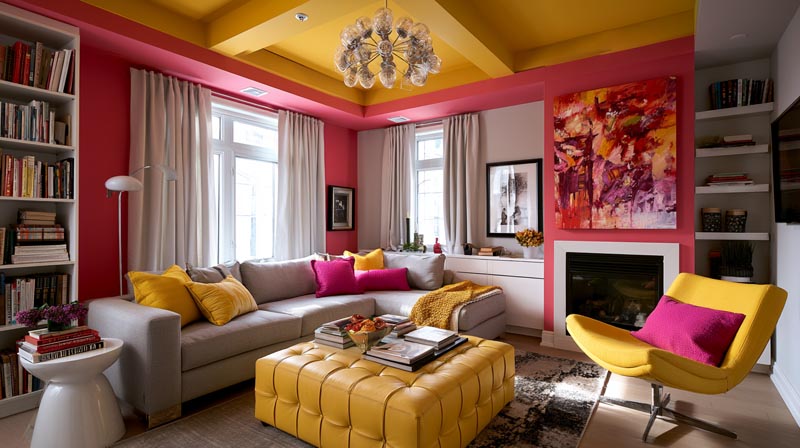
The paint color you choose does more work in a small room than any piece of furniture ever will.
Wall color controls how much light bounces back into the space, how far away surfaces appear, and whether a compact room feels intentional or just tight. The best colors for small rooms are not simply the lightest ones available. The right choice depends on Light Reflectance Value, undertones, finish, and the specific light conditions of each space.
This guide covers exactly which colors work, why they work, and how to test them before you commit to a full room.
What Makes a Color Work in a Small Room?
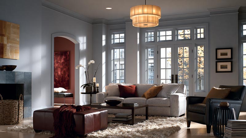
A color works in a small room when it reduces visual friction between surfaces, bounces light efficiently, and keeps the eye moving rather than stopping at boundaries. Light Reflectance Value (LRV), hue, saturation, and paint finish all contribute, but in different ways.
LRV measures how much light a color reflects on a scale of 0 to 100. Pure black sits at 0. Pure white sits at 100. Most usable wall colors land somewhere between 40 and 92. According to homesidekick.com, walls with an LRV of 60 or higher make rooms feel more open and airy by bouncing significant light back into the space.
But LRV alone does not explain everything. A color can have a high LRV and still feel wrong if its undertones clash with the light quality in the room. A pink-undertoned white under warm incandescent light looks orange. A cool gray-white in a north-facing room can look clinical. Context matters as much as the number on the data sheet.
Understanding color in interior design means thinking about three variables at once: the LRV of the paint, the color temperature of the light hitting it, and the tonal relationship between the walls, ceiling, floor, and furniture.
How LRV, Hue, and Saturation Each Affect Perceived Room Size
These three properties do different jobs.
LRV controls brightness. Higher LRV means more light reflected back, which reduces shadow contrast between surfaces and makes boundaries feel less defined.
Hue controls temperature perception. Cool hues (blue, green, blue-gray) visually recede. Warm hues (red, orange, yellow) visually advance. In a small room, cool hues push walls back. Warm hues pull them forward.
Saturation controls intensity. A highly saturated color, even if pale, will draw attention to the walls and make the room feel more enclosed. Muted, desaturated tones disappear into the background, expanding perceived space.
The most effective small room colors combine a high LRV with a cool or neutral hue and low saturation. That combination is why soft whites, pale blue-grays, and muted sage greens consistently outperform more vivid options in compact spaces.
Why Paint Finish Changes How a Color Reads in a Small Room
Same color, different finish, completely different result.
Eggshell finish reflects 10 to 25 percent of light, adding subtle depth and warmth. Matte finish reflects only 3 to 10 percent and actually absorbs light (Angi, 2024). In a small room with limited natural light, matte can deaden a color that looks great on the chip.
| Finish | Light Reflection | Best Use in Small Rooms |
|---|---|---|
| Matte/Flat | 3–10% | Ceilings, low-traffic accent walls |
| Eggshell | 10–25% | Walls in bedrooms and living rooms |
| Satin | 25–35% | Hallways, bathrooms, trim |
| Semi-gloss | 35–70% | Trim, doors, window frames |
Benjamin Moore recommends eggshell for most interior walls because it reflects more light than flat finishes while still casting colors softly. For small rooms, that small boost in reflectivity actually makes a visible difference in how open the space feels.
High-gloss on all four walls creates visual noise in tight spaces. The reflections compete with each other and the room starts to feel busy rather than open.
—
What Are the Best Light Colors for Small Rooms?
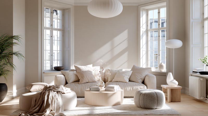
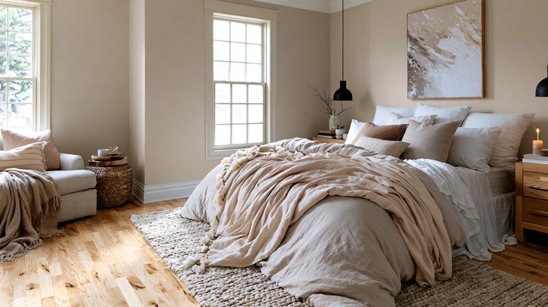
The best light colors for small rooms are soft whites and off-whites with an LRV above 80, pale neutral grays, and warm creams with subtle undertones that read comfortably under both natural and artificial light.
According to Fixr.com’s 2024 Paint and Color Trends Report, 81 percent of design experts recommend warm neutrals for interiors when visual spaciousness is a goal. Soft whites and warm off-whites topped that category.
Soft Whites vs. Bright Whites: Which LRV Range Works Best
Bright whites like Benjamin Moore Chantilly Lace (LRV 90.04) and Sherwin-Williams High Reflective White (LRV 93) perform best in rooms with strong natural light. They reflect aggressively and need something to reflect off. In low-light or north-facing rooms, that same brightness can read cold and slightly blue-gray.
Soft whites land in the LRV 80-88 range. Benjamin Moore White Dove (LRV 83.16), Sherwin-Williams Alabaster (LRV 82), and Sherwin-Williams Pure White (LRV 84) all sit here.
These softer whites carry warm undertones that compensate for cool or limited light. They feel airy without the clinical edge of a true bright white.
| White | Brand | LRV | Undertone | Best Light Condition |
|---|---|---|---|---|
| Chantilly Lace | Benjamin Moore | 90.04 | Neutral/cool | South- or west-facing rooms |
| Pure White | Sherwin-Williams | 84 | Slight yellow | Any exposure |
| Alabaster | Sherwin-Williams | 82 | Warm cream | North- or east-facing rooms |
| White Dove | Benjamin Moore | 83.16 | Warm yellow | Low-light rooms |
The choice between these depends entirely on the room’s orientation and the undertones of fixed elements like flooring and cabinetry.
Off-Whites and Cream Tones for Warm-Light Rooms
Rooms dominated by warm artificial light (2700K-3000K bulbs) benefit from off-whites in the LRV 70-82 range.
These tones absorb the warmth from the light source and reflect it back as a comfortable, lived-in glow. A true bright white in the same room often reads slightly yellow under incandescent or warm LED light, which neutralizes the crisp effect designers are usually going for.
Farrow & Ball Wimborne White is a popular choice here. Its slightly creamy character handles warm light without tipping into obvious yellow, and it holds well in rooms with low ceilings where stark whites can feel oppressive.
—
What Are the Best Neutral Colors for Small Rooms?
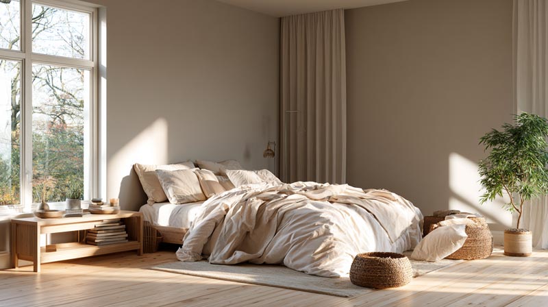
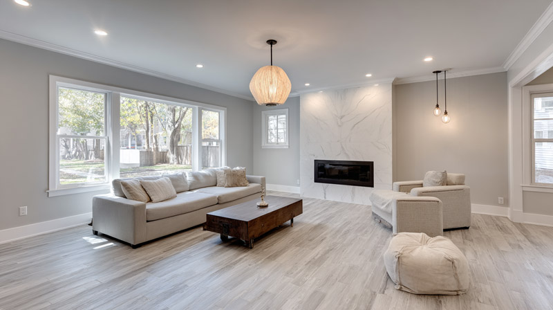
The best neutral colors for small rooms sit in the LRV 65-78 range, with warm or balanced undertones that shift comfortably between natural and artificial light without reading gray or muddy on the walls.
Fixr.com’s 2024 survey of 71 design experts found that 46 percent identified earthy, warm neutral tones as the top color choice for residential interiors that year, citing their ability to feel both spacious and livable at the same time.
Greige and Warm Taupe Tones
Greige sits at the intersection of gray and beige. Done right, it reads neutral under most light conditions without committing to either a warm or cool direction. That flexibility makes it reliable across different room exposures.
Sherwin-Williams Agreeable Gray (LRV 60) is the most commonly specified greige in residential interiors. It is worth noting that its LRV sits at the lower edge of the recommended range for small rooms, which means lighting matters. In well-lit rooms it opens up fine. In darker rooms it can start to feel slightly heavy.
Benjamin Moore Pale Oak lands at LRV 67 and carries a warmer, more beige direction. It performs better in lower-light conditions because its warmth compensates for the reduced reflection.
Warm Grays vs. Cool Grays in Small Spaces
Warm grays carry beige or greige undertones. They adapt to warm light well and feel softer in evening lighting. In small rooms, they read cozy rather than cold.
Cool grays carry blue or purple undertones. They can feel open and modern in rooms with good natural light, but in north-facing or artificially lit small rooms, they shift toward a blue-gray that feels closed in rather than airy.
The practical rule: if the room gets good natural daylight, cool gray works. If the room relies heavily on lamps or overhead fixtures, go warm gray or greige. Color temperature of the bulbs matters too. Cool white LEDs (4000K+) amplify blue undertones. Warm bulbs (2700K-3000K) bring out the beige.
—
Do Dark Colors Work in Small Rooms?
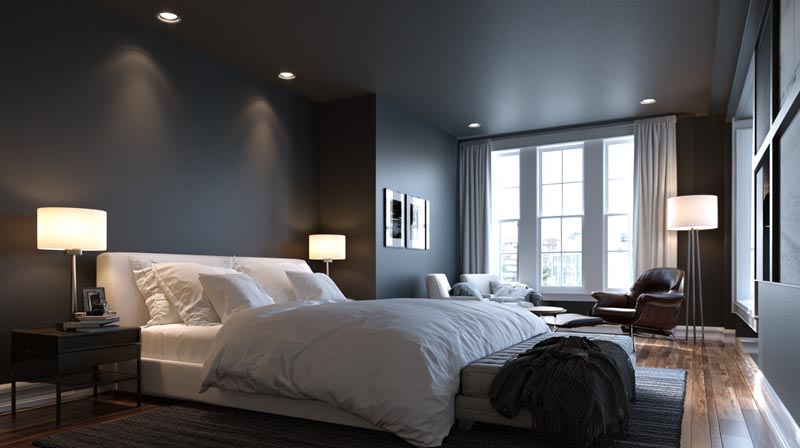
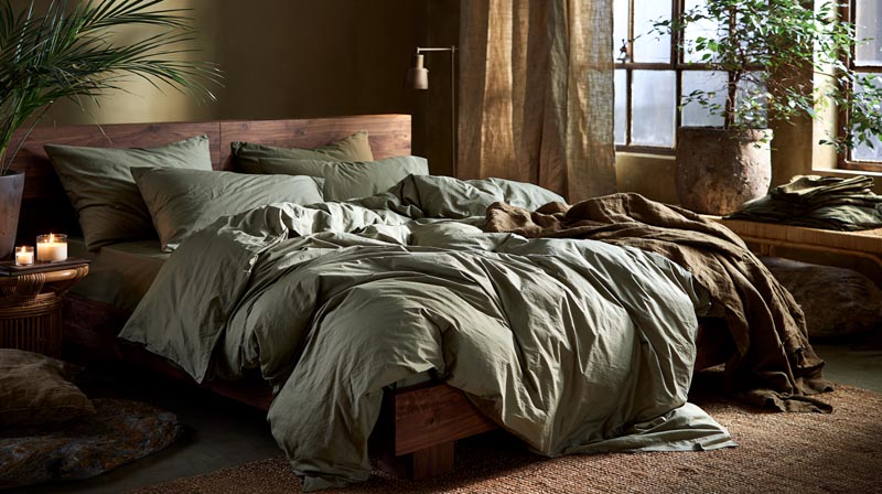
Dark colors work in small rooms under specific conditions: controlled lighting above 200 lux, ceiling height of at least 8 feet, and minimal furniture that competes with the wall color. Without those conditions, dark walls in tight spaces feel oppressive rather than cozy.
A published study in PLOS ONE (NIH/PubMed, 2018) confirmed that brighter surfaces appear farther away than the same surface painted dark. That is the core visual mechanic behind the conventional advice to avoid dark colors in small rooms. But the same research also showed that surrounding surface luminance (the ceiling and floor) modifies how far away a wall appears, which explains why dark rooms with light ceilings can still feel proportionally open.
When Dark Colors Create Depth Instead of Claustrophobia
The “enveloping effect” is real. When all four walls and the ceiling read at a similar dark value, the eye stops registering individual boundaries. The room reads as one unified volume rather than a box.
This works best in:
- Powder rooms (small footprint, tall ceiling, high drama)
- Home offices and studies (focused purpose, controlled lighting)
- Bedrooms with adequate ceiling height and well-placed task lighting
Farrow & Ball Hague Blue in small studies and Railings in powder rooms are two of the most commonly cited examples by designers. Both work because the room purpose supports the enclosed, intimate feeling the dark color creates.
When Dark Colors Hurt Small Room Perception
Dark paint goes wrong fast in rooms with low ceilings under 8 feet, north-facing windows, or minimal artificial lighting. The combination of low LRV walls and poor light creates shadow stacking, where corners and edges appear to converge.
The light requirement is non-negotiable. The WELL Building Standard recommends ambient lighting of 215-300 lux for most residential tasks. Without meeting that baseline, dark finishes read flat and oppressive rather than rich and dimensional.
—
What Are the Best Blue and Green Tones for Small Rooms?
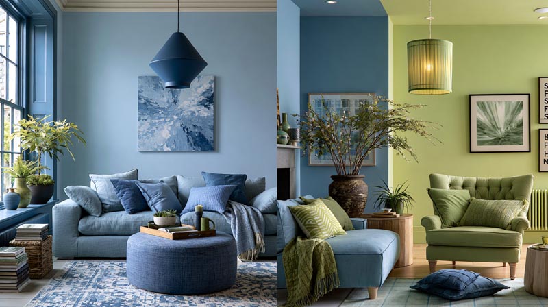
Muted, desaturated blue and green tones are among the most effective colors for visually expanding small rooms because cool hues recede, pushing perceived wall boundaries outward. The key word is “muted.” Saturated blues and greens do the opposite, drawing attention to the walls rather than away from them.
Fixr.com’s 2024 report noted that 36 percent of design experts identified shades of green as the most popular interior color choice, while 29 percent chose shades of blue, reflecting a broad shift toward cool, nature-adjacent tones in residential spaces.
Soft Greens: Sage, Mint, and Muted Olive
Sage green is the standout. Sherwin-Williams Rainwashed (SW 6211) and Sherwin-Williams Evergreen Fog sit in the gray-green range that reads neutral in most light conditions while still carrying the recession effect of cool hues.
Mint reads fresher and lighter but requires careful handling. It can tip into dated aqua territory if the saturation is too high. The target is a mint with an LRV above 70 and low enough chroma that it looks like a soft white with a green tint rather than a statement green.
Muted olive works in rooms with strong natural light and warm-toned floors. It has a lower LRV than sage or mint, typically in the 40-55 range, which means it needs better light to avoid feeling dark.
Cool Blues and Blue-Grays for Visual Depth
Benjamin Moore Sea Salt and Sherwin-Williams Upward (the brand’s 2024 Color of the Year) both sit in the soft blue-gray range with high LRV values that work across room sizes.
The distinction between color theory and practical application matters here: blue-grays in the LRV 70-80 range behave more like sophisticated neutrals than statement colors. They read almost white in bright rooms and pull toward a soft blue-gray in lower light. That adaptability is exactly what makes them reliable for small rooms.
Farrow & Ball Mizzle is a good reference point for a blue-green that straddles both families. It reads differently at different times of day, which keeps a small room from feeling static.
—
What Role Does Ceiling Color Play in a Small Room?
Ceiling color directly controls the perceived height of a small room. A ceiling one shade lighter than the walls reads as higher. A ceiling that matches the walls exactly removes the visual boundary between wall and ceiling, expanding the total perceived volume of the space.
The “fifth wall” concept in color-drenched small rooms works on this principle. When all surfaces read as part of the same continuous plane, the eye stops measuring the room and starts experiencing it as an atmosphere.
White Ceilings vs. Tinted Ceilings: The LRV Impact
Standard white ceiling paint sits at LRV 90-93. That creates a significant contrast with walls painted in the LRV 65-78 neutral range. High contrast between ceiling and walls emphasizes the horizontal boundary, which in a room with a low ceiling actually makes the space feel more compressed, not more open.
Tinting the ceiling one or two shades lighter than the wall color softens that boundary. The ceiling still reads as lighter, preserving the vertical lift effect, but the transition from wall to ceiling is gradual rather than abrupt. Benjamin Moore Ceiling White and Farrow & Ball All White both offer slightly tinted bases that designers use for this purpose.
Color-Drenched Ceilings in Small Rooms
Painting the ceiling the same color as the walls is not a mistake in a small room. It is a specific technique with a specific result: the room reads as a volume rather than a box.
This approach works best with colors in the LRV 60-75 range. Colors much lighter than that lose the wrapping effect because the ceiling reads white anyway. Colors much darker create the oppressive effect discussed in the dark-color section above.
Farrow & Ball Railings and Hague Blue are both used this way in powder rooms and small studies. The key is adequate lighting to prevent the space from feeling cave-like despite the saturated color overhead.
—
How Does Paint Finish Affect Color in Small Rooms?
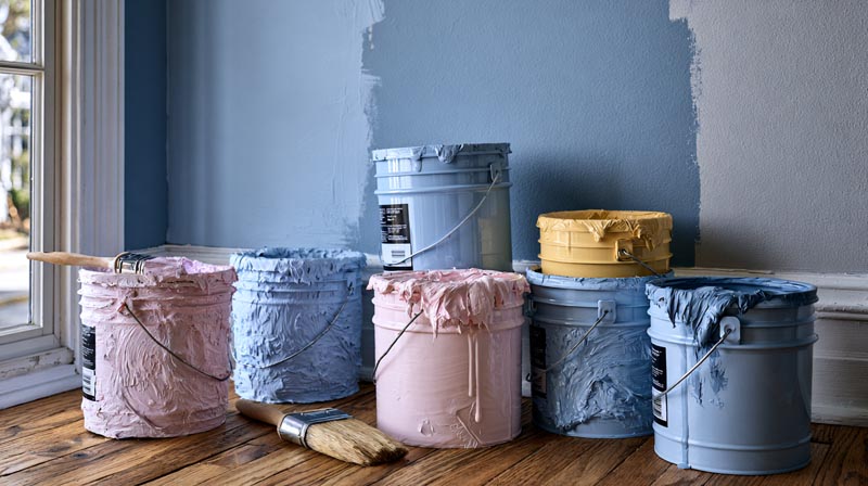
Paint finish changes how a color performs in a small room more than most homeowners expect. The same LRV value reads differently at matte versus eggshell versus satin, because sheen level changes how much light the surface returns to the eye and from what angles.
Eggshell finish reflects 10 to 25 percent of light. Matte reflects only 3 to 10 percent and actually absorbs light rather than bouncing it (Angi, 2024). In a small room where every lumen of natural light matters, that difference is visible on the walls.
Matte Finish in Small Rooms
Matte hides imperfections. It absorbs rather than reflects, which eliminates the roller marks and drywall texture that eggshell can amplify. In a small room where imperfections are close to the viewer, that is a legitimate advantage.
The tradeoff is light performance. Matte deadens color slightly, making it read flatter and slightly darker than the chip suggests. If a small room already has limited light, matte can push a well-chosen pale color back toward feeling dull.
Eggshell and Satin for Wall Performance
Eggshell is the standard recommendation for small room walls. It adds subtle depth and warmth to colors, reflects enough light to support the room’s brightness, and remains durable and washable.
Satin reflects more light still, at 25-35 percent, and works well in small hallways and bathrooms where moisture and cleaning matter. On large wall surfaces in a small room, satin can start to show reflection patterns from lighting, which creates visual noise. That is usually fine in bathrooms. Less ideal in bedrooms.
Semi-Gloss on Trim in Small Rooms
Semi-gloss on trim, baseboards, and window frames does something specific in a small room. It separates visual planes. The contrast in sheen between wall and trim creates a defined edge that the eye reads as dimensional depth rather than a flat surface. A room with eggshell walls and semi-gloss trim feels more articulated and intentional than one with uniform finish throughout.
Benjamin Moore Regal Select in Eggshell is a consistent designer recommendation for small room walls. Farrow & Ball Modern Emulsion delivers a similar performance with slightly more depth in the matte-to-eggshell range, which suits the brand’s more saturated color palette.
How Do Accent Walls Affect Small Room Color Strategy?
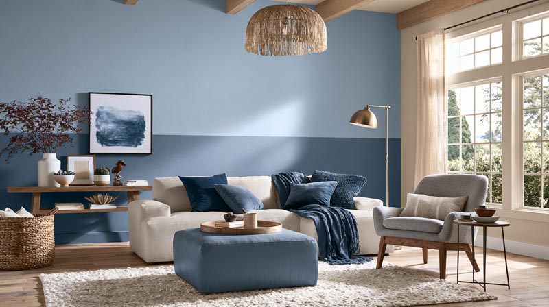
Accent walls work in small rooms when they add perceived depth, not contrast for its own sake. Placement determines whether the technique expands visual space or collapses it.
Homes and Gardens noted in 2024 that accent walls have evolved away from flat paint toward texture and dimension, but the core placement rules remain constant regardless of material.
Where to Place an Accent Wall in a Small Room
Far wall (facing the entry): draws the eye forward, creates a sense of depth, makes the room feel longer than it is.
Side walls: the most common mistake. A darker or contrasting side wall visually narrows the room by drawing attention to its shortest dimension.
Ceiling as accent: a darker or contrasting ceiling in a room with good height adds visual drama without shrinking floor area perception.
The far wall placement is especially effective in a narrow bedroom or hallway. A navy accent on the wall directly opposite the door reads as a focal point that pulls the eye through the space rather than stopping it at the sides.
When to Skip the Accent Wall Entirely
Full-room color almost always outperforms a single accent wall in truly compact spaces. When all four walls read as the same continuous surface, the eye stops registering the room’s edges.
Farrow & Ball color curator Joa Studholme put it directly: a single color on walls, ceiling, and woodwork makes a room feel bigger because no contrast means no perceived boundary.
The accent wall makes sense when a room has one wall worth highlighting architecturally. Without that anchor, it usually just adds visual noise to a space that needs quiet cohesion.
Color Contrast Ratio Between Accent and Surrounding Walls
High contrast shortens perceived depth. The wider the LRV gap between accent and surrounding walls, the more the room feels segmented rather than continuous.
Keep the contrast moderate. Navy against warm white works. Black against the same warm white reads too harsh in most small rooms, cutting the visual flow between surfaces.
—
What Colors Work Best in Small Rooms With Low Natural Light?
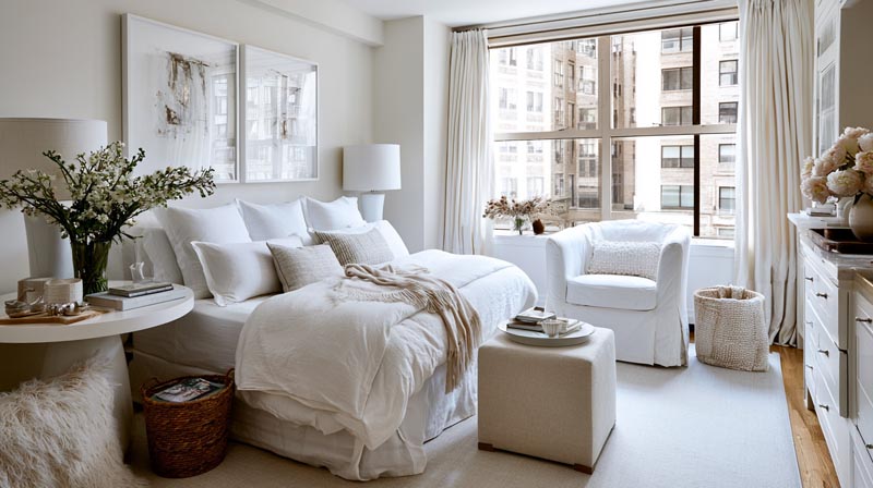
North-facing and windowless small rooms need warm whites and pale warm neutrals, not standard bright whites. Pure whites with cool undertones shift toward blue-gray under limited natural light and make the room feel colder and smaller rather than open.
A real-world example: designers working with north-facing apartments consistently report that Sherwin-Williams Agreeable Gray, while reliable in well-lit rooms, can read too cool and dark in rooms without direct sunlight, and recommend warming up by one or two shades to compensate.
Why Bright White Fails in Low-Light Rooms
Bright whites like Benjamin Moore Chantilly Lace (LRV 90) rely on light to activate. In a north-facing room, the available light is blue-shifted. That blue cast reflects off a bright white and the wall reads gray-blue rather than clean white.
The fix is warm undertones, not higher LRV. Benjamin Moore White Dove (LRV 83, warm yellow undertone) consistently outperforms Chantilly Lace in low-light rooms because its warmth compensates for the cool light quality.
Warm Whites and Pale Neutrals That Compensate for Limited Light
Best options for north-facing and low-light small rooms:
- Benjamin Moore White Dove: warm yellow undertone, LRV 83, soft and forgiving
- Sherwin-Williams Alabaster: creamy off-white, LRV 82, handles warm artificial light well
- Farrow & Ball String: a pale, warm greige that reads almost white in low light without going cold
- Benjamin Moore Pale Oak: LRV 67, works when the room needs warmth more than brightness
The color temperature of artificial lighting matters too. Warm LED bulbs at 2700K pull yellow undertones forward and make these warm whites glow. Cool LEDs at 4000K will still push even warm whites toward gray in a room with no natural daylight.
How Artificial Light Color Temperature Changes Wall Color
K (warm white): amplifies yellow, orange, and beige undertones. Makes warm whites feel cozy. Can muddy cool grays.
K (soft white): balanced, close to halogen. Handles most undertones without distortion.
K (cool white/neutral): brings out blue and gray undertones. Works well for bright whites and cool grays. Unflattering on warm creams in low-light rooms.
| Bulb Temperature | Undertones Amplified | Best Paint Direction |
|---|---|---|
| 2700K | Yellow, orange, beige | Warm whites, soft neutrals |
| 3000K | Balanced | Most colors work |
| 4000K | Blue, gray | Cool whites, blue-grays |
—
How Do Color and Furniture Tone Interact in Small Rooms?
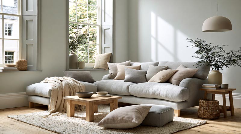
Wall color does not exist alone. It reads against floor tone, furniture color, and ceiling color simultaneously. A pale wall color that works beautifully against light oak flooring can feel completely wrong against dark walnut.
Real Homes reported in 2024 that monochromatic color schemes, where walls, furniture, and soft furnishings stay within one color family, consistently make small rooms feel more ordered and spacious by removing visual competition between elements.
Tonal Layering: Matching Wall and Furniture Value
Tonal layering means keeping the LRV range of walls and major furniture pieces within roughly 15-20 points of each other. High contrast between wall and furniture stops the eye at every piece and makes a small room feel cluttered.
A greige wall at LRV 65 paired with a natural linen sofa and light oak floors reads as one continuous composition. The same greige wall with a dark charcoal sofa and black shelving reads as three competing elements competing for attention in a tight space.
Floor and Wall Contrast in Small Rooms
High contrast between floor and wall (dark floor, bright wall): creates a strong horizontal boundary that visually lowers ceiling height and emphasizes floor area, making the room feel smaller.
Low contrast (similar value floor and wall): blurs the floor-wall boundary, removing the hard edge that defines the room’s footprint, and makes the space feel more expansive.
This is why making a small room look bigger consistently comes back to reducing contrast at major transition points, not just choosing light wall colors.
Monochromatic Approach vs. High Color Contrast in Small Rooms
According to designers cited by Real Homes (2024), monochromatic schemes work by amplifying the perception of space and coherence through tonal variation rather than color contrast.
The practical application: pick one color family for the walls. Stay in that family for upholstery, rugs, and curtains, varying only the tone (lighter, darker, more muted). Reserve strong contrast for one or two small accent pieces.
Decorilla’s design team notes that a monochromatic small bedroom painted in deep navy can still feel airy when layered with sky blue and steel gray accents, because the tonal movement within one color family reads as depth rather than clutter.
—
What Color Mistakes Make Small Rooms Feel Smaller?
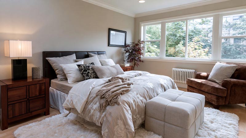
Most small room color failures come down to 3 errors: too many competing tones, choosing color without testing it on the actual wall, and ignoring undertones in relation to the room’s fixed elements.
Bob Vila’s design experts note that starting with wall color before selecting furniture and fabrics is one of the most common mistakes. Paint offers thousands of options. Furniture and textiles are far more limited. Choose the harder-to-source items first, then match the paint.
Too Many Distinct Color Tones
More than 3 distinct color values in a small room creates visual fragmentation. Each tonal shift registers as a separate element competing for the eye’s attention.
The result is a room that feels busy and cramped regardless of how light the individual colors are. A small room with pale walls, a mid-tone rug, dark furniture, bright white trim, and a colorful accent wall can feel more enclosed than a room painted entirely in a medium tone, because the eye is tracking 5 separate values at once.
Ignoring Undertones Against Fixed Elements
The undertone trap: a white that looks clean on the chip reads pink against cool gray flooring. A greige that looks warm and neutral in one room picks up green from adjacent tile in another.
Havenly’s design team identifies undertone mismatches as one of the most consistent color palette errors they see. Without understanding which colors have warm versus cool undertones, the result is a room that feels flat or slightly off without anyone being able to pinpoint why.
Choosing Paint Color Without Testing It on the Wall
Paint stores use lighting that bears almost no resemblance to residential light. A color chip under fluorescent store lighting and the same color on your north-facing bedroom wall at 6pm are two entirely different things.
Always test at minimum a 12-inch square on the actual wall. Observe it at different times of day and under both natural and artificial light. This single step eliminates most expensive paint re-dos.
—
How to Test Paint Colors Before Committing in a Small Room?
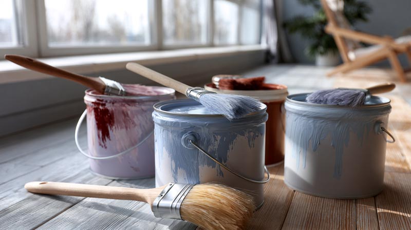
The only reliable way to test a paint color is to get actual paint on the actual wall, in a large enough sample to read accurately, and observe it across different light conditions before committing.
Paint chip comparisons under store lighting and color visualization apps both fail regularly because they cannot account for the specific light behavior of your room’s particular orientation, window size, and artificial lighting setup.
The Large Swatch Method
A standard paint chip is roughly 1 by 2 inches. That is too small to read accurately against a wall surface and surrounding architecture.
A 12-inch square minimum is the benchmark most designers use. At that size, the color behaves as a surface rather than a chip. Surrounding colors, reflections from floors and ceilings, and the effect of room lighting all become visible in a way the chip cannot show.
Benjamin Moore recommends moving the swatch to different walls in the same room and observing it from multiple angles, specifically to see how color shifts in darker corners versus near windows.
Peel-and-Stick Paint Samples: Samplize and Alternatives
Samplize offers peel-and-stick samples made with 2 coats of actual paint from Benjamin Moore, Sherwin-Williams, Farrow & Ball, and PPG. At roughly $5.95 per 9×14-inch sample, they are repositionable, reusable, and far faster than buying multiple small paint cans.
The repositionable format solves a real problem: you can test the same color on the north wall, south wall, and in the corner of the same room simultaneously, which is the only way to see how a single color behaves across the full range of light conditions in one space.
Reading LRV on a Paint Data Sheet
Every major paint brand publishes LRV data on product data sheets, accessible through their websites. For Benjamin Moore and Sherwin-Williams, the LRV appears on the individual color page alongside undertone information.
Key thresholds to know:
- LRV 80+: bright, high-reflectance, needs good light to avoid reading stark
- LRV 65-79: the reliable small room neutral range, flexible across light conditions
- LRV 50-64: works in well-lit rooms, can feel heavy in low-light spaces
- LRV below 50: requires controlled lighting and deliberate design intent
Test ceiling and trim color swatches alongside wall swatches simultaneously, not separately. The way a wall color reads changes based on what it sits next to. A warm white wall next to a cool white ceiling will show its warmth more strongly than the same wall next to a matching warm white ceiling.
Understanding how light in interior design interacts with paint color is the practical foundation for any small room color decision. The right color chosen without understanding the light conditions of the space is still the wrong color.
FAQ on The Best Colors For Small Rooms
What color makes a small room look bigger?
Soft whites, pale blue-grays, and muted greens with a Light Reflectance Value above 65 consistently make small rooms feel larger. Cool hues visually recede, pushing walls back. Low saturation matters as much as lightness.
Should small rooms always be painted white?
No. White works well but is not the only option. Muted neutrals, soft sage greens, and pale greiges in the LRV 65-80 range perform equally well. The right undertone for your light conditions matters more than defaulting to white.
Do dark colors work in small rooms?
Yes, under specific conditions. Rooms with ceiling heights above 8 feet, controlled lighting above 200 lux, and minimal furniture can carry deep navy, charcoal, or forest green. Color drenching all surfaces in one dark tone removes visual boundaries effectively.
What is the best neutral color for a small bedroom?
Warm greiges and soft off-whites perform best. Benjamin Moore Pale Oak, Sherwin-Williams Agreeable Gray, and Farrow & Ball Wimborne White are reliable choices. Pick based on your room’s light direction and the undertones of your flooring and furniture.
Does paint finish affect how big a small room feels?
Yes. Eggshell finish reflects 10 to 25 percent of light and adds subtle depth to wall color. Matte absorbs light, which can make pale colors read flatter and slightly darker. Eggshell is the standard recommendation for small room walls.
What paint colors work in north-facing small rooms?
Warm whites and pale warm neutrals work better than bright cool whites. Benjamin Moore White Dove, Sherwin-Williams Alabaster, and Farrow & Ball String compensate for blue-shifted natural light. Avoid pure bright whites, which read cold and gray without direct sunlight.
Should the ceiling be the same color as the walls in a small room?
Painting the ceiling the same color removes the visual boundary between wall and ceiling, making the room feel larger as one continuous volume. One shade lighter than the walls also works. A stark white ceiling against mid-tone walls can actually emphasize a low ceiling.
What is the best blue or green for a small room?
Muted, desaturated options outperform saturated ones. Sherwin-Williams Rainwashed, Benjamin Moore Sea Salt, and Farrow & Ball Mizzle are proven choices. Saturation threshold is key: the color should read like a soft neutral with a tint, not a statement hue.
How do I test paint colors before painting a small room?
Use large swatches of at least 12 inches, not small chips. Peel-and-stick samples from Samplize use real paint from Benjamin Moore, Sherwin-Williams, and Farrow & Ball. Observe them at different times of day, on multiple walls, under both natural and artificial light.
Does furniture color affect how a wall color reads in a small room?
Significantly. High contrast between wall and furniture makes a small room feel busier and more enclosed. Keeping wall color and major furniture tones within a similar value range creates tonal layering that makes the space read as one cohesive composition rather than competing elements.
Conclusion
This conclusion is for an article presenting the best colors for small rooms, and the core takeaway is straightforward: color perception is driven by LRV, undertones, finish, and light, not just personal preference.
Soft whites, warm neutrals, muted sage greens, and pale blue-grays consistently outperform saturated or mismatched choices in compact spaces.
Paint finish, ceiling color, and tonal layering with furniture all shift how a wall color reads on the day. Test large swatches. Check the color temperature of your bulbs.
Getting the paint color scheme right in a small room takes one careful decision, not a renovation. Start with LRV, match the undertone to your light, and commit.

- Kitchen Color Schemes by Cabinet Color: What Pairs Well - October 19, 2026
- Curtain Colors for Every Wall Color: Safe vs Bold Picks - October 18, 2026
- Interior Design Styles: Find Your Primary and Secondary - October 14, 2026