Curtain Colors
What Color Curtains Go With A Gray Couch
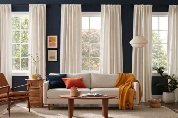
White, cream, beige and lighter gray curtains keep a gray couch room calm. If the window should add contrast instead, navy, emerald, mustard, terracotta, blush and sage all work.
Which one is right depends on the couch. Gray comes in warm and cool undertones, and a charcoal couch wants different curtains than a pale dove gray.
Even retailers disagree on cool grays. Russells pairs them with pale blue, while Roomdsign warms them with cream or beige.
North-facing light pushes any gray cooler, so the same couch can need a warmer curtain in one room than in another.
If the walls are the bigger question, our guide to curtain colors for every wall color sets the wall-based picks side by side.
Which curtain colors go with a gray couch?

Start with white, cream, beige or a lighter gray, since those are the safest. Navy, emerald, burgundy, mustard, terracotta, blush and sage add contrast and still sit fine next to the gray.
Gray has no strong hue of its own, so almost any color sits next to it. What you’re really picking is the effect: airy, warm, deep or soft.
| Curtain color | Effect | Best couch shade | Undertone fit |
|---|---|---|---|
| White, cream | Airy, bright | Light to charcoal | Either (white crisper, cream softer) |
| Beige, light gray | Soft, tone on tone | Medium to charcoal | Beige warms a cool gray |
| Navy, emerald, burgundy | Deep, formal | Light to medium | Either |
| Mustard, terracotta | Warm, energetic | Light to medium | Cool gray |
| Blush, sage | Gentle, calm | Light to medium | Blush for cool gray, sage for warm |
If it’s your first purchase and you’re still figuring the room out, cream or white linen is the lowest-risk pick.
When the rug, walls or art already carry color, pick from the top two rows of the table. When the room is mostly neutral, the lower three rows are where to look.
IKEA’s curtain guidance follows the same logic. It pairs a neutral sofa with one strong panel in mustard yellow, petrol blue or emerald green as the focal point.
How couch undertone and shade change the right curtain color

Undertone sets the temperature of the pairing. Shade depth sets the contrast, so the darker the gray, the lighter the curtains. A cool gray couch takes warm or blue-matched curtains, and a warm gray gets soft neutrals.
Warm gray and cool gray couches

Russells, a curtain retailer, sorts grays into warm (red to purple) and cool (blue base). Green-based grays are the tricky ones, it says, because they can read either way.
Light shifts the reading too. Sherwin-Williams notes that incandescent bulbs give off yellow light while fluorescent bulbs give off a cool, blue light, so one couch looks warmer under a lamp than under a cool-white ceiling light.
Advice on cool gray splits in two.
Russells goes the matching route and pairs cool greys with pale blue, a similar-toned partner, for a calm, subdued room.
Roomdsign goes the other way. It pairs gray furniture with cream or beige, because the added warmth stops the gray from reading cold.
One is chasing calm and the other is chasing warmth, so pick based on what your room is missing.
Look at the couch under the lamps you actually use in the evening, because that’s when the curtains are drawn. A room that feels cold needs warm curtains. If it feels heavy instead, matching the cool gray is the better move.
Once the rug and walls enter the decision, a broader look at which colors suit grey in general helps.
Light gray, medium gray and charcoal couches

Lighter couches take more contrast and darker ones take less.
A light gray couch can handle navy, emerald, mustard or soft pastels such as blush and sage, because it doesn’t compete with any of them. Medium gray is the forgiving middle, where warm and cool curtains both work. Charcoal is pickier, and white, cream or beige curtains keep the room from going heavy.
IKEA lists anthracite, navy blue and emerald green as the dark, dramatic colors that make a light grey sofa stand out.
Charcoal also takes a warm jolt. Mustard or orange curtains are the usual contrast, and a guide to pairings for charcoal gray covers the rest of the palette.
When neutral curtains are the better pick

Neutral curtains win when the rug, art or walls already carry color, or when the couch is the focal point of the room. In practice that means white, cream, beige or gray.
- White is crisp and airy, and it makes the gray couch stand out. Good for minimalist and Scandinavian rooms.
- Cream softens a cool gray and keeps a bright room from feeling stark.
- Beige is the warmest of the lot, and beige linen adds a soft, natural texture.
- Gray curtains go a shade lighter than the couch for tone on tone. Charcoal is the bolder version.
White got an official nod recently. The Pantone Color Institute named Cloud Dancer (11-4201) its 2026 Color of the Year in December 2025, the first white chosen since the program started in 1999. Pantone describes it as a white carrying both warm and cool undertones.
That matters for curtains because white is not one color. Hold a white swatch against the couch before buying, since a blue-leaning white beside a warm gray reads cold.
Gray on gray is the one neutral that goes flat. Roomdsign points out that a plain gray curtain can turn the whole space monotonous, so add a pattern or a visible weave.
Bold and earthy curtain colors that work with gray

Navy, emerald, teal, burgundy, mustard, terracotta, rust, blush, sage and dusty blue all hold up against a gray couch. Gray works as a neutral base, so one strong color can carry the room.
Navy, emerald, teal and burgundy make up the deep end. Blue and gray is a classic pairing, and a guide to what else pairs with navy shows how to build the rest of the room around it.
IKEA’s guide says strong warm shades such as copper and terracotta balance the coolness of gray and navy, which is why mustard, terracotta and rust work as the warm option.
Blush, sage and dusty blue are softer. The contrast is gentle, and blush offsets the chill of a cool gray.
Sage is the easiest of these to layer with plants and wood, and this breakdown of colors that sit well with sage green helps with the supporting pieces.
On the plus side, bold curtains turn the window wall into a focal point and give a plain gray room a clear color story. The pillows can stay quiet.
The downsides are mostly about commitment.
- Curtains cover a large area, so a wrong color is costly to swap
- Dark fabric absorbs light and closes in a small or dim room
- They compete with a patterned rug or loud pillows
- They look different in daylight and in lamp light
Neutral curtains reverse every line above. Safer, easier to pair, less memorable.
Should curtains match the couch or contrast with it?

Both work, so decide on purpose. A match gives a calm, tailored room, while contrast is what turns the curtains into the focal point.
Monochromatic and analogous schemes

A monochromatic scheme stays inside the grays. Madura suggests gray curtains in a shade lighter than the sofa, which adds sophistication while staying harmonious.
Russells shows the idea with the Pegasus Liberty fabric range, which includes Dove, Mineral, Larkspur and Cinder as neutrals that sit tone on tone with greys.
An analogous scheme borrows neighbors on the color wheel instead. Pale blue is the classic partner, similar in tone to grey and subdued in effect, and the logic behind it is laid out in this primer on color theory for interiors.
Complementary contrast and the 60-30-10 split

Complementary contrast uses one accent hue opposite the gray’s lean on the color wheel. A bluish gray takes orange-family curtains such as terracotta or rust, and a warm gray takes blue or green.
The 60-30-10 rule keeps that contrast from overloading the room. It’s a designer rule of thumb for splitting color by share, so treat it as a starting split, not a law.
- Walls, floor and the large rug take up about 60%.
- The gray couch is the 30%.
- The remaining 10% goes to accents, curtains included when they are bold.
Bold curtains cover a lot of surface, so they use up most of the accent share. Keep the pillows and rug quiet.
Contrast also comes from value and texture, not only hue, and how contrast works in a room is worth a read before committing to a strong curtain color.
Fabric, texture and pattern choices for gray couch curtains
Linen and cotton suit bright rooms, while velvet is better in dim or north-facing ones. Sheers handle daytime light. And on a solid gray couch, the curtains are the easiest place to add pattern.
Fabric and light control
| Fabric | Light | Warmth | Best for |
|---|---|---|---|
| Linen | Filters softly | Moderate | Bright living rooms |
| Velvet | Blocks most light | High | North-facing or formal rooms |
| Cotton | Moderate blockage | Decent | Everyday, casual rooms |
| Sheer | Diffuses, little privacy | Low | Daytime layering |
Linwood Fabric, a British fabric house, says velvet suits north-facing rooms because its weight offsets the cooler, lower light.
Lining sets the level of control. Quince lists its room-darkening velvet at about 80% light blocking and its true blackout velvet at 100%.
Sheers under heavier panels cover both ends, with diffused light by day and full cover at night.
Texture counts as much as fiber on a plain gray couch, and how texture works in a room shows why a slubby linen weave reads differently from smooth cotton.
Mixing weights on one rod is where this tends to go wrong. A Madura guide notes that a light linen panel and a heavy velvet panel do not fall the same way.
When patterned curtains work
Patterned curtains work best against a solid couch and a solid rug.
Exciting Windows, a window-treatment retailer, calls patterned drapery the safest move when the upholstery and rugs are solid, and a solid drape the safer move when the sofa is patterned.
- Stripes look clean and modern, and gray-and-white versions add rhythm without adding a new color.
- Geometric and floral prints need a bit more care. Pick a geometric one that repeats a color from the rug or pillows, and keep the rug plain next to a floral or organic print.
Scale matters more than style. When two patterns share a room, designers vary the size, so a large-print rug calls for a mid-size or smaller print on the drapes.
ZigZagZurich suggests a rule of three, one large, one medium and one small pattern, to keep the count in check. A primer on how pattern scale and repeat behave helps before ordering a print.
How wall color, light direction and room size shift the choice

Light direction moves the temperature of a curtain color. Wall color decides how much contrast is left, and room size caps how dark the fabric can go.
Paint makers publish direction guidance and curtain makers mostly do not, but fabric reads light the same way a wall does.
| Window faces | Light quality | Curtain move |
|---|---|---|
| North | Cool, flat | Warm neutral, or deep velvet |
| South | Warm, direct | Cool tones stay crisp |
| West | Muted morning, amber afternoon | Cooler tones balance the sun |
| East | Bright morning, cooler evening | Match the hours you use the room |
North-facing rooms split the experts. Farrow & Ball’s Charlotte Cosby advises leaning in with saturated tones, while experts quoted by Livingetc favor warming yellow, red or orange undertones to counter the chill.
For a gray couch the two routes map cleanly. Deep velvet in navy or emerald leans in, and cream, terracotta or mustard counters.
West-facing rooms are less contested. Benjamin Moore recommends cooler blue tones to balance the amber afternoon cast, which makes navy and dusty blue easy calls.
Wall color matters too. Sherwin-Williams prints a Light Reflectance Value on the back of every chip, scaled from 0 (absorbs all light) to 100 (reflects all light), and a color can only reflect the light a room already has.
Curtains follow the same logic. A light fabric bounces daylight around a dim room, and a dark one absorbs it.
Benjamin Moore describes Revere Pewter, a popular warm gray wall color, as a greige that reads warm or cool depending on the light. If the walls are gray too, a separate guide covers what color curtains suit gray walls.
Room size is more straightforward. Small or dim rooms take light fabric, and large bright rooms carry charcoal or navy without strain.
For a tight living room, the advice on which shades make a room look bigger applies to curtains just as well.
Style narrows it further. Crisp white or cream linen suits minimalist and Scandinavian rooms, and formal rooms look right in velvet in jewel colors. Boho and eclectic rooms are the ones that take earthy tones and pattern.
When do these curtain pairings fail?
Most of these failures are avoidable.
- Navy or charcoal in a small room absorbs light and closes in the space. Go lighter, or layer a sheer.
- A cool gray couch with blue curtains under north light or LED bulbs reads cold. Add cream or beige, or switch to warm bulbs.
- Brentano Fabrics warns that curtains the same color as the walls create a flat, monotonous effect. Step one shade lighter or darker.
- A printed curtain over a printed rug fights for attention, so make one of them solid.
- Athena Calderone (Livingetc) warns that a yellow chosen in a showroom can read as a different shade at home and clash with the yellow in an accent rug.
Every one of these gets caught the same way, by seeing the fabric in the actual room first.
How to test a curtain color before you buy
Tape swatches where the curtains will hang and judge them at three times of day. A photo on a screen settles nothing.
- Order swatches of two or three finalists.
- Tape each one to the wall or window frame where the curtain will hang.
- Photograph them in morning, midday and evening light.
- Check them again after dark with the lamps on.
- Hold each one against the couch, the rug and the pillows.
- Tape one to the window glass to see how the light comes through.
- Keep the swatch that still works at every hour.
Calderone’s method is the same: fix the swatch where the curtains will hang and photograph it through the day. furn.com offers up to 10 free swatches per order, one per design, so a short list costs nothing.
Blinds Online adds that golden afternoon sun can make a cool white look creamier and warmer, and evening lighting changes the tone again depending on your bulbs.
If the swatches are still in the post, a color scheme generator for rooms can sketch a palette to compare them against.
Once the color is settled, a curtain size calculator gives panel width and length, so the order is right the first time.
Common Questions About Curtain Colors for a Gray Couch
Do black curtains work with a gray couch?
Yes, in a room with enough daylight. Black adds depth and graphic contrast, and Madura lists it with anthracite and navy as dark shades that suit more spacious living rooms. In a dim room, black can close the space in.
What curtain length and rod height work in a living room with a gray couch?
Floor length, with the rod set 4 to 6 inches above the window frame and 3 to 6 inches past each side, according to Russells.
If the couch sits directly in front of the window, Bob Vila advises stopping the hem just above it instead of at the floor.
What curtains go with a gray couch and cream or beige walls?

Go one step off the walls. White or a deeper cream keeps the room quiet, and blue, green or navy adds contrast.
Warm walls already supply the warmth, so cooler curtains add contrast without making the room read all beige.
Does blackout lining change how a curtain color looks?
Slightly. Deconovo notes that light or foam backings reflect daylight and can brighten the face fabric, while strong backlight reduces perceived color depth.
A sheer layer hung behind the curtain diffuses the sun before it hits the fabric.
Carrying the Curtain Color Into Pillows and Rugs
Echo the curtain color in one other place and keep the rest of the room neutral. One echo links the window wall to the gray couch without making the palette look matched.
With bold curtains, the echo stays small: one pillow in the same hue, with the rug kept quiet. With neutral curtains, the rug or the pillows can carry the brighter color.
The rug is the largest echo and suits neutral curtains. Pillows come next, one or two at most, and the throw and art stay neutral. That order runs from the largest surface to the smallest and from the costliest swap to the cheapest, so any mismatch lands on a pillow, not the rug.
The downside is flexibility. Once pillows repeat the curtain color, changing them seasonally breaks the echo.
For pairings built around the couch itself, throw pillow ideas that suit a grey couch are the natural next step.
More Curtain Color Guides
- What color curtains go with white walls
- What color curtains go with beige walls
- What color curtains go with blue walls
- What color curtains go with brown furniture
- All curtain colors by wall color

- Kitchen Color Schemes by Cabinet Color: What Pairs Well - October 19, 2026
- Curtain Colors for Every Wall Color: Safe vs Bold Picks - October 18, 2026
- Interior Design Styles: Find Your Primary and Secondary - October 14, 2026