Curtain Colors
What Color Curtains Go With Beige Walls
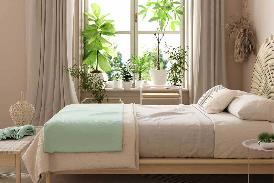
Beige walls leave the curtain choice more open than people expect, and most colors will work on them. Where it goes wrong is the beige itself. Its undertone and the direction the window faces change how a curtain reads, sometimes a lot.
Sherwin-Williams’ room orientation guide describes north light as cool and south light as warm, so one beige wall can need different curtains in different rooms. Curtains also carry the contrast and mood that a neutral wall leaves open.
Beige is one of several wall colors compared side by side in our curtain color guide, which helps if other rooms in the house are painted differently.
Best Curtain Colors for Beige Walls

Every color in the table below works on beige to some degree. The real difference is how much contrast it adds and whether it pulls warm or cool next to the wall.
| Curtain color | Best with | Effect on the room | Best room |
|---|---|---|---|
| White and ivory | Any beige (ivory for warm, white for cool) | Lighter, airier | Living room, bedroom |
| Gray and charcoal | Warm beige or greige | Cooler, more modern | Living room, home office |
| Navy and dark green | Warm beige | Depth, strong contrast | Bedroom, dining area |
| Terracotta, rust and brown | Warm beige | Earthy, tonal warmth | Living and dining room |
| Black | Light beige | Graphic, high contrast | Modern living room |
White and ivory

Ivory suits a warm beige, and a crisp white suits a cool one. Madura points to off-white and ecru for lightening a window without breaking the flow of the wall.
The upside is that it opens the window and lets daylight through, and it leaves the sofa, rug and art free to carry the color. It fits pretty much any room.
Pure white is the problem case. Direct Fabrics says it reads stark against a yellow-leaning beige. The room also stays quiet, which is fine if that’s what you wanted and a little dull if it isn’t.
Gray and charcoal

Gray cools a beige room down without leaving neutral territory. It works best when the beige leans warm and the gray is soft, or when the wall is greige and charcoal adds some weight. Hunker calls charcoal a gentler dark option than black.
It goes wrong with a blue-leaning gray against a yellow beige, since the beige looks yellower next to it.
Navy and deep blue

Navy gives beige the strongest cool contrast of the common choices. Hunker uses dark blue curtains in a beige bedroom as the single pop of color, and the result is depth and a clear frame around the window.
Weight is the catch. In a small or north-facing room, navy soaks up light and makes the window look smaller.
Green

Green behaves differently depending on how dark it is. Sage and pale green sit close to the wall in brightness, so the room stays calm. Dark green adds contrast without getting too bright, per Hunker.
Earthy greens also echo plants, wood and woven rugs. Sage nearly disappears on a greenish beige though, so hold a swatch up before ordering.
Terracotta, rust and brown

Warm earth tones make a beige room tonal. Hunker shows terra cotta, burnt orange and dark brown on beige walls in dining rooms and bedrooms. Together they push the space toward an earthy color palette, which is the easiest direction when the wall already leans warm.
The warmth does deepen a warm beige, and it can crowd a small room. Direct Fabrics also warns against red and pink on warm undertones.
Black
Black is the boldest contrast and fits the fewest rooms. Madura recommends strong contrast on beige for modern and industrial living rooms, and black gives a crisp graphic frame around the window.
In small, north-facing or low-light rooms it gets heavy fast. Charcoal is the safer dark there.
How Does Beige Undertone Change the Right Curtain Color?

A curtain looks planned when it either echoes the wall’s lean or opposes it on purpose. It looks accidental when it does neither. Warm beige leans yellow or pink. Cool beige leans green or gray.
Warm, cool and greige beiges

On a warm beige, ivory, rust and brown sit comfortably, and navy or sage add contrast. Cool beige is where Direct Fabrics pairs true white with cool wall shades. Greige, the gray and beige blend, takes tone-on-tone curtains well, per Hunker.
Paint brands blur these lines. Sherwin-Williams Accessible Beige reads warm with gray and slight green undertones, and the green shows most in south-facing rooms or beside light pink and terracotta tones.
If that is your wall, a palette of colors built around Accessible Beige is a good starting sheet before you order fabric.
Benjamin Moore describes Revere Pewter as a light gray with warm undertones and a bridge between warm and cool tones. Curtains from either family work against it, and the colors that suit Revere Pewter walls show how wide that range runs.
How to check your beige’s undertone

- Hold a pure white sheet or paint chip against the wall in daylight.
- Name the lean you see: yellow, pink, green or gray.
- Look again after dark under the room’s own bulbs, because undertones shift with the light source.
- Hold the curtain swatch beside the wall and judge whether the two warm each other or fight.
Match the undertone or oppose it?

Published advice disagrees here.
Direct Fabrics recommends the opposite undertone for the greatest contrast, and it warns against red or pink on warm walls and green or blue on cool ones. Hunker goes the other way. It pairs warm beige with terra cotta, brown and cream and treats the result as harmony.
The split comes down to the goal. Direct Fabrics is after contrast, while Hunker seems to care more about calm.
So decide what you want first. For contrast, oppose the lean. For calm, match it, and keep the curtain one step lighter or darker than the wall so it doesn’t vanish.
How Window Direction Changes Curtain Color on Beige Walls

North light is cool and the dimmest of the lot, so beige reads grayer there and warm curtains bring some balance back. South rooms go the other way. The light is warm and steady, the beige turns creamier, and cooler curtains settle it down.
Sherwin-Williams’ room orientation guide describes north and south rooms along these lines, and the table below combines that with the undertone rules above.
| Wall beige | North room (cool light) | South room (warm light) |
|---|---|---|
| Warm beige | Stay warm: ivory, rust, brown | Add cool contrast: sage, soft blue, navy |
| Cool beige | Add warmth: creamy white, camel, terracotta | Crisp white or soft gray holds |
| Greige | Warm cream or camel lifts the gray cast | Soft gray or sage keeps the balance |
The cool beige row has a small conflict in it. Cool-wall advice favors true white, while Sherwin-Williams warns against cool undertones in north rooms, so a creamy white ends up as the compromise.
East and west rooms
East rooms run warm in the morning and cool toward evening. West rooms do the reverse.
Sherwin-Williams advises choosing for the hours the room is used most, or mixing cool and warm tones so neither time of day wins. A neutral curtain keeps an all-day bedroom balanced.
Small and low-light rooms
In a small room, ivory, ecru or a beige a shade lighter than the wall keep the wall line continuous (Madura). The same idea runs through the wider set of colors that work in small rooms.
Sherwin-Williams tells north rooms to favor higher-LRV colors, and says a dark accent in a north room should still carry a warm undertone. With little natural light, the choice follows the bulbs. Warm bulbs make a room behave like a south room, and white or cool bulbs make it behave like a north room.
Evening and artificial light
Check the curtain swatch again at night. Warm bulbs push beige toward cream, while cool ones tend to send it gray.
If you’re leaning toward a deep color, the role of light in interior design is worth reading up on first.
Should Curtains Be Lighter, Darker or the Same Shade as Beige Walls?
Lighter and tonal choices are the safer ones on beige. Lighter curtains open the room, and a near-match keeps it calm. Darker ones frame the window and add depth, but they need some light to work with.
Tonal curtains

Beige on beige gives a monochromatic look, but Roomdsign’s tests found that a near-identical shade turns monotonous. Hunker calls the all-beige palette hard to pull off.
A slightly different tone fixes it. Cream, greige, or a light brown or tan all do the job.
Lighter or darker than the wall
Lighter than the wall means white, ivory or ecru. These reflect daylight and keep the window quiet, which suits small and low-light rooms best.
Darker means navy, dark green, brown or charcoal. They frame the window and add depth, as long as there’s enough natural light to carry them.
Value contrast, the gap between light and dark, does most of the work here, and the principles of contrast in interior design apply directly.
Wall brightness and curtain contrast
Light reflectance value (LRV) rates how much light a paint reflects, from 0 for none to 100 for all, according to Sherwin-Williams. A lower number means a deeper wall.
Sherwin-Williams Accessible Beige sits at LRV 58 and Balanced Beige at LRV 46. Benjamin Moore Revere Pewter comes in at LRV 55.51.
White curtains read with more contrast on Balanced Beige than on Accessible Beige, because the gap is 12 points wider.
LRV shifts by a point or two across measuring methods, so read the number on the manufacturer’s chip.
Proportion and the color wheel
The 60-30-10 rule gives beige walls the 60. Floor-to-ceiling curtains behave like part of the 30, and slim panels sit in the 10.
On the color wheel, beige is a desaturated yellow-orange, so blues sit opposite it. That is why navy, soft blue and lilac read as built-in contrast on warm walls, and Hunker notes that warm walls temper a lilac drape’s cool shade.
A fuller breakdown of color theory for interiors explains why complementary pairs hold together.
Curtain Colors for a Beige Living Room, Bedroom, Kitchen and Home Office
What the room is used for decides most of this. Some rooms can take a bold choice and some really can’t.
Living room

Large windows and a sofa give the living room two color sources, so it tolerates the boldest curtain in the house.
In an open plan, Madura suggests darker curtains over the seating area for intimacy and lighter ones over the dining area to keep it bright. In a closed room, one color across every window keeps the wall line clean.
For a warmer result, the colors that make a living room feel cozy double as a palette check for the curtain, rug and sofa together.
Bedroom

Light at night matters more than most people assume. One night in 100 lux of room light, against under 3 lux, raised heart rate during sleep and insulin resistance the next morning in a 20-person Northwestern Medicine study (PNAS, 2022).
That makes lining the first bedroom decision, whatever the color. Hunker’s advice to go dark and moody in the bedroom fits, because a deep panel and a blackout layer work together.
Deep shades suit the room since daylight matters less here, and full-width coverage beats a thicker fabric with gaps. If you’d rather go softer, soft tones keep the room restful.
For the rest of the palette, see the colors that calm a bedroom.
Kitchen
Kitchen windows take steam and grease, plus the occasional splash, so fabric matters more than color.
Sill length or cafe style stays clear of the sink, and ZIPCushions calls floor-length panels a grease catcher and a fire risk near a burner. Cotton blends and polyester blends wash easily and keep their shape.
For color, pick a tone already in the cabinets or tile so the window doesn’t compete.
Home office
Sherwin-Williams treats a home office as a room that wants white or cool lighting, and says to choose colors for it the way you would for a north-facing room.
Warm ivory offsets that cool light. Light-filtering sheers soften screen glare without darkening the room, per Madura.
Skip heavy dark panels here unless the afternoon sun is strong.
How Fabric and Texture Change the Way a Curtain Color Reads

The same dye reads differently depending on the weave. Linen softens it and velvet deepens it. Lining matters too, since it controls how long the color lasts and what people see from the street.
| Fabric | How the color reads | Watch for |
|---|---|---|
| Linen | Matte, soft, slightly uneven | Wrinkling |
| Velvet | Deeper, shifts with light and pile | Panels hung in mixed pile directions |
| Voile and sheers | Lighter, tinted by the sheer’s own color | Little privacy with lights on |
| Lined drapes | Opaque, full color | Lining color faces the street |
Linen and cotton
Matte weaves don’t shine, so the color reads quietly. Apartment Therapy’s executive home director recommends classic linen or a lightly textured weave against flat-finish walls.
The texture gives the eye something to read when the wall has none, which is how texture works in a room more broadly.
Real linen wrinkles, and a linen-look polyester holds a crisp line with less care.
Velvet
Velvet is the one curtain fabric that changes color depending on how you hang it. With the pile running up it looks deeper and richer, and running down it looks lighter and shinier.
Linwood Fabric advises running the pile downward on curtains, while other fabric makers prefer pile up for a deeper color. Either way, every panel in a set should run the same way. Order a sample first, because the pile responds to your own light.
Voile and sheer panels
Madura sorts sheers by color. White, ecru, ivory and natural linen pass the most light, while light gray and pale blue filter more and tint it. Dark sheers absorb light instead of diffusing it.
A sheer by day and a heavier drape by night gives one window two colors. Alone, a sheer does not protect privacy once the lights are on.
Lining, fade and what shows from outside
Standard lining shields the dye from UV, and The Mill Shop notes that sun fades fabric colors fastest at south-facing windows. Blackout lining blocks all light and often dampens sound.
Dark fabrics show fading more, and Beautiful Homes by Asian Paints says a deep navy or charcoal can visibly lighten over time.
The lining side faces the window, so ivory or a color-matched lining is the safe choice.
Matching Curtains to the Sofa, Rug, Trim and Curtain Rod
An exact match isn’t the goal. Curtains agree with a room when they pick up one color from somewhere else in it and sit a visible step away from the trim. The rod’s metal should turn up elsewhere in the room too.
Sofa
Carry one color from the sofa into the curtain, or keep the curtain neutral and let the sofa lead. Decor Snob lists the rug, the couch and the throw pillows as sources for the curtain color.
Which furniture colors suit beige walls in the first place is a separate decision, and a guide to furniture colors for beige walls covers it.
Rug and pillows
Pull one accent color from the rug into the curtain, then repeat it in two or three small items such as pillows or art. Let one piece lead. Social Life magazine pairs a bold sofa with a quieter rug.
Madura gives the same advice for bright curtains, which is to repeat the color in cushions or the carpet. That repetition is the idea behind unity across a room’s elements.
Trim
Hold the swatch against the trim as well as the wall. Ivory beside bright white trim reads yellow, and beside creamy trim it reads clean.
Curtain rod and finials
Black Enterprise’s coverage of curtain fitting calls hardware important and lists wood, antiqued metals and resin as options.
Match the rod’s metal to one or two others in the room, such as lamp bases, cabinet pulls or frames.
When Do Curtain Color Pairings Fail on Beige Walls?
Problems usually show up after the curtains are already hung.
| Symptom | Cause | Fix |
|---|---|---|
| Wall looks pinker or grayer once panels hang | Curtain shifts how the paint reads | Judge the swatch against the wall in place |
| Panels do not match each other | Different dye lots | Order every panel in one order |
| Color looked right in the store or on screen | Light differs from the room’s light | Sample the fabric in your own daylight |
When the curtain changes the wall
Juanita Brown of The Curtain Exchange says curtains alter how paint looks on any wall except white, and that taupe and warmer colors can turn pink depending on the lighting.
She advises bringing a wall paint sample to the fabric, the same way you would bring a sofa swatch.
A color scheme generator for rooms can screen out clashes on screen first, but the swatch settles it.
Dye lots
Two Pages Curtains notes that color depends on dye lots and that made-to-order drapes cannot be returned because the color is wrong. That’s an expensive way to find out.
Where this advice stops
Every pairing rule here predicts a result, and none replaces seeing the fabric in the room.
Selected Wallpapers makes the same point about velvet, saying to judge color and sheen in your own daylight, beside your floor and existing upholstery.
Curtain Colors for Beige Walls FAQ
Do patterned curtains work on beige walls?
Yes, when the pattern picks up a color the room already holds. Hunker shows a sunny pattern that complements the warm undertones of beige walls.
Keep it to one patterned piece per room. Social Life magazine gives the rug a simpler role when the curtains already carry a pattern.
Are pastel curtains like lilac or light blue a good match for beige walls?
Mostly yes. Hunker notes that warm beige tempers the cool shade of lilac drapes, and Direct Fabrics pairs light blue with beige for a calm look.
Pale pink is the risk. Direct Fabrics warns against pink on warm undertones.
Which curtain color suits beige walls with dark wood floors?
Pick a curtain lighter than the floor, so the window does not sink into it. Ivory and cream do that, while brown or rust repeats the wood’s warmth.
Social Life magazine treats flooring, main furniture and wall color as anchors to relate to, not match exactly.
Should curtains match the bedding in a beige bedroom?
Not exactly. Repeat one color between curtain and bedding, and let one piece carry the bold shade.
Apartment Therapy’s home director says the drama can sit in pillows or a rug, so curtains don’t have to supply it.
Testing a Curtain Color Before You Buy Full Panels
A fabric swatch hung against the wall itself, checked in daylight and again after dark, settles what undertone and window direction can only predict.
Start with daylight against the wall, since undertone shows clearest there. After dark, look again under the room’s own bulbs, because artificial light shifts it. Checking beside the sofa, rug and trim comes last, and it only matters once the wall test passes.
The cost is a shipping wait before you order. A repainted wall or new bulbs resets the test, and all of this holds as of October 2026.
Once a swatch passes, a curtain size calculator turns the window measurements into panel width and length.
More Curtain Color Guides
- What color curtains go with white walls
- What color curtains go with brown furniture
- What color curtains go with green walls
- What color curtains go with gray walls
- All curtain colors by wall color

- Kitchen Color Schemes by Cabinet Color: What Pairs Well - October 19, 2026
- Curtain Colors for Every Wall Color: Safe vs Bold Picks - October 18, 2026
- Interior Design Styles: Find Your Primary and Secondary - October 14, 2026