Curtain Colors
What Color Curtains Go With Purple Walls
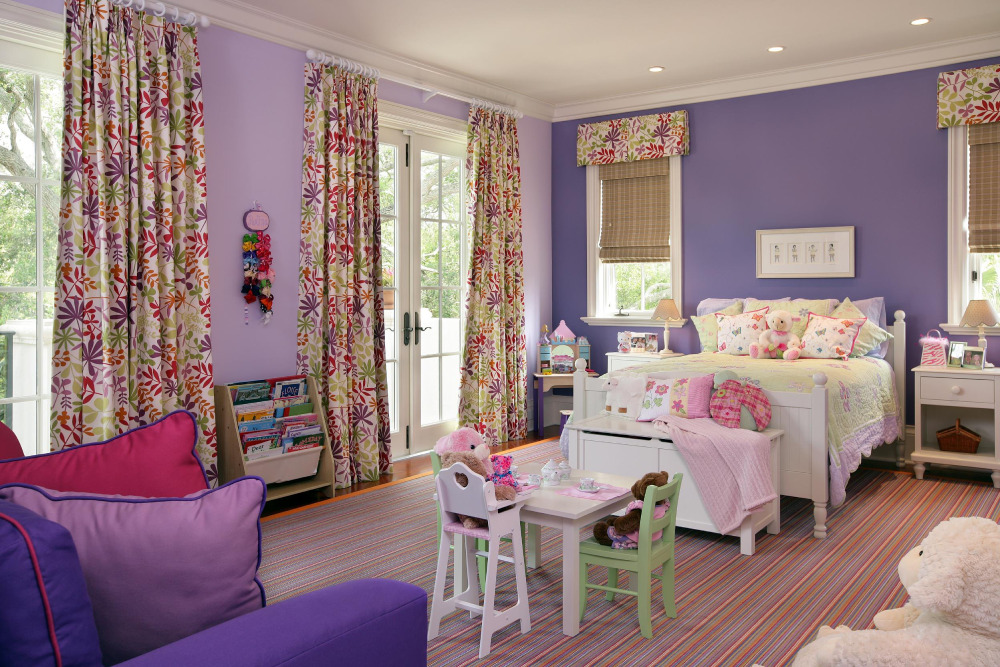
Purple changes its mind depending on the room. A lavender wall that looks soft in one living room can look flat and gray in the next one over, and the curtains get dragged along with it.
Cream, white, light gray, gold, sage green and navy are the safest curtain colors for purple walls. The right one depends on how deep the purple is and whether it leans blue or red.
Benjamin Moore’s lighting guide describes north light as cool and blue-toned, which dulls colors with gray, blue or lavender undertones. Put cool gray curtains on a lavender wall in a north-facing room and that loss shows first. Warm neutrals and deeper tones hold up better there.
Purple is one of the wall colors in our curtain color chart, which puts the safe and contrast picks for each wall side by side.
Best curtain colors for purple walls

Here’s a rough match-up of curtain colors against wall types, with the usual trouble spot for each.
| Curtain color | Best on | Effect | Watch for |
|---|---|---|---|
| Cream or white | Any shade, best on dark plum | Soft, lets the wall lead | Stark white feels cold on blue-violet |
| Light gray or charcoal | Lilac, lavender, blue-leaning violet | Modern and calm | Needs a warm accent nearby |
| Gold or yellow | Plum, aubergine, red-leaning purple | Warm, rich contrast | Bright yellow on pale lilac shouts |
| Sage or dark green | Plum, aubergine, mid purple | Fresh contrast | Neon greens fight the wall |
| Navy or teal | Lilac, lavender, mid purple | Cool, deep, relaxed | Navy vanishes on very dark purple |
Furniture and rugs bring their own tones into the room, and this guide to colors that go well with purple covers those.
Neutral curtains

Joa Studholme, color curator at Farrow & Ball, advises tempering purple with softer neutrals (Homes & Gardens).
Cream is the easy one. It adds warmth and works on every purple from lilac to aubergine. Light gray reads more modern, and Hunker rates it a safe, trend-proof partner for muted purple. Charcoal gives lilac and lavender walls extra depth. Black is edgy, and only convincing on deep walls.
White is the cleanest option, but on a blue-violet wall it needs something warm nearby, like a wood rod or a cream throw. Without that, the room turns cold.
Green, yellow and gold curtains

Contrast does the work here.
Benjamin Moore’s Helen Shaw points to green as a high-contrast partner because it sits across the color wheel from purple (Homes & Gardens). Sage green looks good on deep plum or smoky aubergine, a pairing Hillarys uses in its bedroom styling. Gold suits warm purples, and Make My Blinds says it gives the room a rich feel.
Keep yellow soft. A saturated yellow on a pale lilac wall pulls every eye to the window.
Blue and pink curtains

Baby blue lightens the mood and navy deepens it. Make My Blinds describes navy pencil pleat curtains on purple bedroom walls as relaxing yet dramatic.
Blush and dusty rose sit next to purple on the wheel, so they soften it. Hillarys treats pink and purple as a natural match.
Both families are low-risk, since neither fights the wall and you get depth without a hard contrast.
How does the purple shade and undertone change the curtain choice?
Pale walls can carry heavier, deeper curtains. Dark walls need the reverse, something lighter or metallic. Undertone then decides which neutrals sit well, with cool grays and silver going to blue-leaning purples and cream, taupe and gold going to red-leaning ones.
Light purple walls

Farrow & Ball’s Calluna, a soft lilac, has a light reflectance value (LRV) of about 57 to 58 on the 0 to 100 scale, where 0 is black and 100 is white (paint listings differ slightly).
A wall that reflects that much light can carry deeper curtains without closing the room in. Roomdsign makes the same call, suggesting a darker curtain when the wall is the lighter of the two.
Farrow & Ball’s own description pairs Calluna with Great White, or with the darker Brassica and Pelt.
Dark purple walls

Dark walls need lighter curtains or a metallic. Otherwise fabric and wall merge into one block after sunset.
Pelt, Farrow & Ball’s deep purple, is much bluer than Brinjal and can read almost black in darker rooms, according to the brand’s description. That leaves a short list of safe options.
- Cream or ivory
- Gold, or anything brass-toned
- Silver gray
- Sage green, for a bit of color
How much lighter is a contrast call. A small gap looks muddy and a clear one looks planned. This piece on how contrast works in interior design goes deeper.
Wayfair adds a related tip for dark purple rooms: balance the walls with lighter purple furnishings, and use patterned pillows, art or rugs so the space does not feel one-note.
Blue-leaning versus red-leaning purple

Hold a fabric swatch against the wall in daylight and see whether the purple pulls blue or red.
| Undertone | Example walls | Curtains that suit |
|---|---|---|
| Blue-leaning | Pelt, lavender | Cool gray, silver, navy, crisp white |
| Red-leaning | Brinjal, plum | Cream, taupe, gold, olive |
| Grayed | Calluna, dusty mauve | Great White, soft gray, deeper plum |
Farrow & Ball notes that Calluna carries a touch of black. That keeps it lilac rather than pink.
Which color scheme should the curtains follow?
Complementary (yellow, gold), split-complementary (yellow-green, yellow-orange), analogous (blue, pink) and monochromatic (more purple) schemes all work with purple walls. The scheme picks the curtain color before fabric or style comes into it.
The wheel logic behind all of them is laid out in this explainer on color theory for interiors.
Complementary and split-complementary
A complementary scheme means yellow and gold, the high-contrast pair on a traditional paint wheel. Split-complementary softens that with yellow-green and yellow-orange, which gives you two curtain options instead of one.
Wheels disagree on the exact opposite. A traditional paint wheel puts yellow across from violet, while an RGB wheel puts yellow-green there.
Advice splits accordingly. Make My Blinds points to gold, Benjamin Moore’s Helen Shaw to green.
Analogous curtains
Analogous schemes use the colors next to purple on the wheel, meaning blue-violet, blue and pink. Contrast stays low, so the room reads calm.
Pick a curtain a step lighter or darker than the wall. Same value, and it disappears.
Monochromatic purple curtains

Purple curtains on purple walls work when the values differ.
HomeLane warns that walls, rug and curtains in the exact same shade feel stifling rather than stylish.
Farrow & Ball’s tonal approach layers Calluna with the darker Pelt and Brassica, so each purple gets its own job.
Proportion with the 60-30-10 rule
Ben Thomson of Promain, writing in Ideal Home, describes the 60-30-10 rule as 60% dominant color, 30% secondary and 10% accent. Martin Waller of Andrew Martin adds that walls dominate an interior more than any other element, so they take the 60.
In a purple room that means the walls are the 60. Curtains, upholstery and rug make up the 30 in a secondary color, and cushions, trim and small objects carry the 10 in the boldest color you own.
Bold curtain colors like gold or yellow usually work better in the 10% slot, with a neutral taking the 30%.
A color scheme generator for the room lets you test the split before you order fabric.
Which curtain fabric works best on purple walls?
Velvet suits dark purple. Linen and cotton do better on lilac and lavender, and sheers take the edge off a saturated wall in any shade. Blackout lining belongs in bedrooms, where light control matters more than how the fabric looks.
Weave and pile shift light, so fabric changes how the same color reads. That is the core of how texture works in interior design, and it applies to curtains as much as to sofas.
Velvet
Velvet deepens whatever color it carries. It suits dark plum, aubergine and deep violet, where HomeLane’s deep velvet-on-purple look gives a jewel-box effect.
The catch is that the pile absorbs light, so a dim room loses more brightness than it would with cotton.
Linen, cotton and sheer
Lighter weaves keep a purple room open. They suit lilac and lavender walls, where heavy fabric would crowd the color.
Half Price Drapes shows the range, with light-filtering lavender curtains in a modern living room and sheer lilac in a bohemian bedroom that lets daylight through.
Linen brings texture and cotton gives crisper lines. Sheers make the most sense when the wall is already saturated.
Blackout lining and opacity
Blackout is a function, not a color. Add it in bedrooms and choose a lighter face color on dark purple walls, because lining makes fabric hang heavier and darker.
How natural light changes purple walls and curtain colors
Natural light shifts the wall and the curtain at the same time, so a pair that works at noon can fail at dusk. North light pulls purple cool and flat, south light warms it, and east and west rooms swing between the two across the day.
| Window direction | Light quality | Effect on purple walls | Curtain move |
|---|---|---|---|
| North | Cool, indirect, steady | Blue and lavender tones go duller | Cream, gold or warm gray |
| South | Warm, strong at midday | Purple looks richer, pale lilac can wash out | Deeper curtains hold up |
| East | Warm and bright early, cool by late afternoon | Purple warms in the morning, cools after | Mid-tone neutrals |
| West | Muted in late afternoon, warmer toward sunset | Red-leaning purples deepen in the evening | Sage or blue to cool the glow |
The north and south rows lean on Benjamin Moore’s lighting guide. North light is cool and blue-toned and dulls colors with gray, blue or lavender undertones, while south light is warm and can turn intense at midday.
Light works as a design element in its own right. This piece on how light shapes a room breaks it down.
Daylight swings through the day
One wall can read three different ways between breakfast and dinner.
East-facing rooms are bright and warm in the morning, then fade to cool blue by late afternoon, per Benjamin Moore. A cream curtain looks golden at 8 a.m. and flat at 5 p.m.
Judge the pair at the hour you use the room most.
Light after dark
Benjamin Moore points out that people plan color in daylight and forget the lamps. Warm bulbs push purple toward its warm side and make red-leaning walls richer. Cool daylight bulbs amplify cool undertones and flatten blue-violet.
Closed curtains also cover a full window’s worth of the room at night, so the fabric color becomes much louder under lamps than it was by day.
Which curtain colors suit a purple bedroom, living room, dining room or nursery?
Bedrooms do best with calm blues, or neutrals backed by blackout lining. Living rooms can handle contrast. Dining rooms go bolder, and nurseries stay soft with pastels or cream.
Bedroom
Sleep numbers make a decent argument for blue curtains in a purple bedroom, with a caveat.
In a 2013 Travelodge survey of 2,000 British homes, people with purple bedrooms averaged 5 hours 56 minutes of sleep, against 7 hours 52 minutes for blue bedrooms (as reported by Ideal Home).
It is a self-reported survey, so it shows an association, not a cause. The wall is already painted, but the curtains are still a choice, which makes blue fabric and blackout lining the practical levers.
For calmer tones beyond blue, this list of calming bedroom colors covers the rest.
Living room
Living rooms carry contrast best.
Homes & Gardens notes that purple living rooms often work best in deep shades matched with a contrasting color such as yellow. It also calls rich brown wood a natural partner for purple. With wood furniture, warm curtain tones like cream, gold or olive sit comfortably beside it. With a neutral sofa, the curtain can carry the contrast instead.
Dining room and nursery
Make My Blinds suggests bright curtains against purple walls for a modern dining room built for entertaining. Dinner happens under lamps, so test the pair in evening light before anything else.
For a nursery, lilac or lavender walls with white or cream curtains and a blackout lining keep the room soft. Blush works when it needs a little color.
Which curtain colors do not work with purple walls?
Bright red, bright orange, pollen yellow, garish green and hot pink fail most often. Saturation causes the failure more than hue does.
| Combination | Why it fails | Safer swap |
|---|---|---|
| Bright red or orange | Clashes, reads jarring | Maroon or burnt orange on deep purple |
| Pollen yellow | Fights the wall | Butter yellow or gold |
| Garish green or hot pink | Overwhelms the purple | Sage or dark green, blush |
| Cool gray on lavender, north-facing room | Cool light dulls both | Cream or warm gray |
The pollen yellow warning comes from designer Caroline Borgman, quoted by Homes & Gardens. The garish green and bright pink warnings come from the same Homes & Gardens piece, which steers toward olive greens and dusky pinks instead.
Where sources disagree on red and orange
Homes & Gardens advises against bright red and orange outside playrooms, and quotes designer Artem Kropovinsky saying they create a jarring space.
Roomdsign’s list of 14 best curtain colors includes orange and maroon.
The gap closes on depth. Roomdsign notes that maroon carries subtle purple undertones, and Hunker rates burnt orange a dramatic partner for purple.
Bright versions on a mid purple clash. Deep, muted versions on a deep purple read as planned.
When a plain neutral is the better call
Cream curtains fail least. If the undertone is hard to read, or the light changes a lot across the day, they are the cheaper and safer pick.
A bold pairing earns its risk only after it has passed a test in your own light.
How to test a curtain color before buying
Tape swatches to the wall at curtain height and look at them across the day, then again with the lamps on. Most wrong choices show up before any fabric gets cut.
- Look up the paint’s name, undertone and LRV on the brand’s color page, or read it off the can.
- Order swatches of two or three finalists, not ten.
- Tape them to the wall beside the window at curtain height, not on a table.
- Check morning, midday and evening, then again with the lamps on.
- Hold each swatch next to the sofa, rug or bedding it will sit with.
- Leave them up for a few days before deciding.
Crown Paints advises sampling on at least two walls, and checking with heavy curtains both open and closed. It names the usual mistake too: picking a favorite and ordering the same day.
Paint-store lighting is unforgiving and differs from home lighting, so a swatch judged in a showroom tells you little.
Before you order fabric, run the window through a curtain size calculator so panel width and drop match the glass.
FAQ About Curtain Colors for Purple Walls
Do patterned curtains work with purple walls?
Yes, when the pattern borrows its colors from the room. Pick a print on a cream, gray or sage ground and limit it to two or three colors that already appear in the rug or bedding.
What curtain length looks best in a purple room?
Floor length. Hang the panels so the hem floats just above the floor, and mount the rod above the window frame. Curtain Studio, a New Zealand curtain retailer, puts the rod 10 to 15 cm (100 to 150 mm) above the frame, which makes the window and room read taller.
Which curtain rod finish suits purple walls?
Match the finish to the undertone. Brass, gold and natural wood suit red-leaning purples like plum and aubergine, while black or silver suits blue-leaning purples such as lavender and violet.
Should curtains match the trim and baseboards?
No. Trim is usually white, and curtains can be any color that suits the wall. Graham & Brown pairs purple paint with white trim on doors, skirting and window frames, so white curtains simply blend into that frame.
Should curtains match the throw pillows or bedding?
Echo them, don’t match them. Repeat the curtain color in one or two small pieces so it looks planned. For ideas on pairing cushions with other colors, see these throw pillow combinations.
Can I layer sheer curtains under heavier drapes on purple walls?
Yes. A white or cream sheer behind a deeper panel softens daylight when the drapes are open. The heavier layer carries the color, so choose it first.
The Lowest-Risk Curtain Color for Purple Walls
Cream curtains in a mid-weight fabric carry the least risk on purple walls, because cream reads acceptably in both cool north light and warm south light. It also leaves the wall as the main color.
The price of that safety is contrast. Gold, sage and navy lift the room in a way cream does not.
If you want one of those bolder options, start with the wall’s undertone, then look at window direction and lamp light, and leave room use and lining for last.
Undertone sets which neutrals and accents sit well, and light then changes how that undertone reads. Lining comes last because it is the easiest detail to change.
This position was checked in October 2026. A swatch that turns yellow against the wall under evening lamps overrides it, and a warm white or light gray replaces the cream.
More Curtain Color Guides
- What color curtains go with gray walls
- What color curtains go with white walls
- What color curtains go with light blue walls
- What color curtains go with a gray couch
- All curtain colors by wall color

- Kitchen Color Schemes by Cabinet Color: What Pairs Well - October 19, 2026
- Curtain Colors for Every Wall Color: Safe vs Bold Picks - October 18, 2026
- Interior Design Styles: Find Your Primary and Secondary - October 14, 2026