Color Combinations
Paint Colors That Go With Wood Floors

Most people pick the wall color first and only notice the floor looks off once the second coat is dry. Reading the floor’s undertone first, then its depth, avoids that.
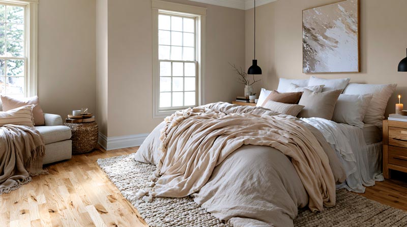
Red-toned boards do best with muted, cooler walls, and brown ones take warm neutrals without much fuss. Light boards are the flexible ones, since soft whites work and so do deep contrast colors.
Designers screen room by room, because the same paint reads differently on reddish-brown walnut than it does on orange-leaning honey oak or gray-stained boards.
Finish moves the undertone too. Oil-based polyurethane goes on amber and keeps darkening, according to Woodworkers Journal, so an older floor reads warmer than its species suggests.
Our decorating color combinations guide lines up wood tones and floors with the wall colors that suit them.
Our guide to home color combinations lines up wood tones and floors with the wall colors that suit them.
How to Identify the Undertone of Wood Floors
Put a white sheet of paper on the floor in daylight and see what tint the wood throws onto it. That tint is the undertone, and it decides which wall colors settle in next to the boards and which ones fight them.
Improovy’s wall-color guide recommends the same paper test. It works best beside a window with the lamps off.
A red or red-brown tint usually points to one of these:
- Cherry, red oak or walnut (Paneltown groups walnut and red oak as reddish-brown)
- Honey oak and maple read orange or yellow, which is how Julie Blanner describes them
- Whitewashed and gray-stained boards land on gray or neutral
Hunker’s guide adds a rule of thumb. Most light floors carry warm yellow and orange undertones (whitewashed ones excepted), and dark floors tend to run cool.
Finish shifts the reading over time. Oil-based polyurethane goes on amber and keeps darkening, while water-based polyurethane stays clear, according to Woodworkers Journal.
An older oil-finished floor can therefore read warmer than its species suggests. Oak covers a huge range, from pink-leaning red oak to yellow-leaning boards, so the paint colors that suit oak floors change from house to house.
Should Wall Paint Match the Floor Undertone or Oppose It?

The guides agree on red floors and split on orange ones. Red calls for muted, cooler walls, while orange gets “go opposite” from some sources and “go warm” from others.
Sherwin-Williams advises balancing red-toned floors with muted, cooler colors. Improovy says most designers paint opposite the floor’s undertone, and Jenna Kate at Home suggests blue for floors with a warm orange or cool gray cast.
Julie Blanner argues the reverse for orange oak woodwork. Cool tones make the wood look more orange, and a warm wall makes it feel more cohesive and less orange.
Put side by side, the sources suggest the dividing line is the saturation of the wood, not its hue. A muted cool wall sits back against deep red. A clean cool wall beside honey oak sharpens the orange it was supposed to cancel.
Matching the undertone
Warm walls go with warm floors and cool walls with cool ones, which is the default in Sherwin-Williams’ flooring guide. Creams, warm greiges and muted greens on golden or brown boards read as one continuous scheme.
The upside is a cohesive room, honey and orange tones that don’t get any louder, and low risk on warm brown floors. The downside is that floor and wall can blur together at similar depth. Less contrast also means a room can feel flat unless a rug or some art breaks it up.
Opposing the undertone
The color wheel supplies the opposite. Orange pairs with blue, red with green, yellow with violet. How those pairs behave across a whole room is covered in color theory in interior design.
It works when the floor is saturated red or strongly orange and the wall is muted rather than bright. A clean opposite can backfire and make the floor louder, as Julie Blanner’s orange oak example shows.
An opposing wall also raises contrast, so it helps to understand how contrast works in interior design before committing to a bold pairing.
Using the 60-30-10 split
The 60-30-10 rule divides a room into a dominant color, a secondary one and an accent, as Bob Vila’s guide describes it. Country and Town House notes that the dominant color usually goes on the walls.
In practice the walls take the 60. The floor, large furniture and rugs share the 30, and art, pillows and accessories make up the 10.
A wood floor is a big surface, so it usually claims the secondary share unless a large rug covers it.
Wall Paint Colors by Floor Tone and Depth
Dark floors take light walls, and light floors take deeper ones. Red and orange floors are a separate case and do best with muted shades.
Sherwin-Williams’ flooring guide treats the first two as the classic contrast pairings. It also says a light wall on a light floor works when the paint differs from the floor and shares its type of undertone.
Depth is easy to check, because the major paint brands publish an LRV for each color.
Light wood floors

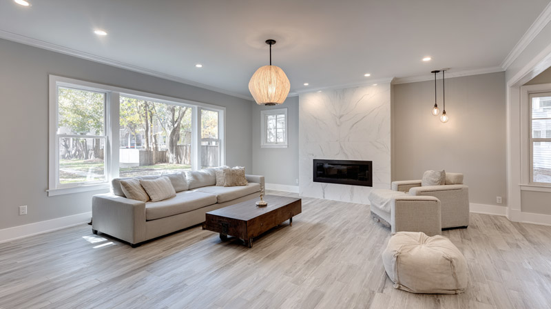
Improovy and Real Wood Floors both start with a cooler or neutral off-white. Soft gray shows up on their lists too.
For more drama, Sherwin-Williams says charcoal, indigo or forest green work against light floors because the light bounces upward and balances the depth.
Medium oak and brown floors

Improovy warns against wall colors that run too warm here, especially when the medium floor has clay or terracotta undertones. Greige, muted green and calm neutrals sit better. Jenna Kate at Home calls the greige family a dependable pick because its tones stay neutral.
Warm brown floors take warmer walls. The same blogger says there is little to overthink unless the floor reads glaringly orange or red.
Dark wood floors
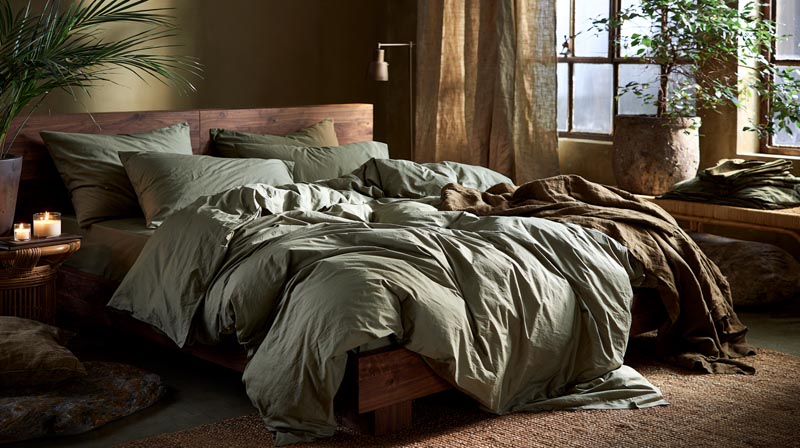
Dark floors give you two routes. Go light for a classic, bright room, or go dark for a moodier one.
Going light usually means crisp white or a light neutral, with a soft, subtle green as the alternative. Going dark works with forest green and tone-on-tone browns, and also black or charcoal.
Hunker’s gallery covers the dark route, while Improovy and Real Wood Floors cover the light one. For a room-by-room view, start with this breakdown of which walls go with dark wood floors.
Red and orange-toned floors

Red-toned floors need walls that don’t feed the red. Hunker advises against warm or yellow-leaning paints on cherry, since they bring out its redness. Improovy points to cool whites and light blues, with cooler grays in the mix.
Orange oak is the contested case, covered in the match-or-oppose discussion above. More shade-by-shade options sit in this list of paint colors for cherry wood floors.
Gray and whitewashed floors

Improovy recommends warmer-leaning off-white or neutral walls to offset the colder look of gray floors, and it warns against gray walls on gray floors.
Paneltown lists light blue, off-white and green-gray for lighter gray floors.
Named Paint Colors Worth Sampling Against Wood Floors

Alabaster is the warm white in this group. Agreeable Gray and Revere Pewter are the greiges, Sea Salt is a cool green-gray, and Hale Navy handles deep contrast.
| Paint | Reads as | LRV | Use note |
|---|---|---|---|
| Sherwin-Williams Alabaster (SW 7008) | Warm, creamy white | 82 | Samplize lists it for dark floors |
| Sherwin-Williams Agreeable Gray (SW 7029) | Warm greige, slight green | 60 | Check against gray floors for undertone clash |
| Benjamin Moore Revere Pewter (HC-172) | Greige between warm and cool | 55.05 | Deeper, so it needs good light |
| Sherwin-Williams Sea Salt (SW 6204) | Cool green-gray | 63 | Samplize lists it for dark floors |
| Benjamin Moore Hale Navy (HC-154) | Deep navy | 8.36 | Contrast option for light floors in bright rooms |
LRVs come from the Sherwin-Williams and Benjamin Moore color pages, as of October 2026.
Samplize’s dark-floor collection also lists Sherwin-Williams Naval, a slightly darker relative of Hale Navy.
Sherwin-Williams color expert Sue Wadden, quoted by Setting for Four, describes Agreeable Gray as slightly green but warmer than most grays. That green is why gray floors can clash with it.
Which whites and accents sit beside it decides whether the green stays hidden, so check the colors that pair well with Agreeable Gray.
Benjamin Moore calls Revere Pewter a bridge between warm and cool tones, which suits floors that fall somewhere between the two.
Trim and accent choices are worked through in pairings that suit Revere Pewter.
How Room Light and LRV Change the Pairing
Wall paint reads cooler in north light and warmer in south light, and its LRV pushes it brighter or flatter on top of that. Sherwin-Williams says the amount of sunlight a room gets changes how wall and floor colors interact.
North light is cool and slightly blue. A warm neutral balances it, while cool gray, blue or green can double the chill (Kylie M Interiors). South light is warm and yellow-toned, and gray or cooler colors take the edge off.
East is warm in the morning and cooler by late afternoon, and west runs the reverse (Sherwin-Williams).
Bulbs count as much as windows. Sherwin-Williams tells readers with dim rooms to choose colors as for a south-facing room under warm bulbs, and as for a north-facing room under cool ones.
The Department of Energy treats the low Kelvin range as warm and recommends it for living spaces. It also ranks color rendition above color temperature in importance.
For the wider picture of daylight and fixtures, see how light works in interior design.
The LRV guidance conflicts. Welsh Design Studio tells readers to choose a high LRV for dim rooms, while The Color Concierge says a clean high-LRV white turns dingy in low light and a warmer white with a lower LRV lights the same room better.
What reconciles them is that LRV measures how light or dark a color is, not how it will look in a room. Undertone, saturation and light direction change the result.
For reference, the LRV scale runs from 0 (black) to 100 (white), per Benjamin Moore. What counts as light depends on who you ask. Kylie M Interiors puts the light band at LRV 55 to 72, and Welsh Design Studio puts it at 70 to 85.
For dim rooms, Welsh Design Studio says to go above LRV 60, yet Chantilly Lace at LRV 90 can read dingy in low light (The Color Concierge).
On bulbs, the U.S. Department of Energy recommends 2700 to 3600 K for general indoor lighting. A CRI of 80 or higher is acceptable for most homes, it adds.
Does Room Size Change Which Wall Color Works?
Yes, mostly through lightness. A small room with dark floors wants walls lighter than the floor, while a large room has space to carry deeper colors.
Floors to Your Home states the small-room rule plainly: when walls and floor must differ, make the walls the lighter of the two. The same guide warns that a dark stained floor in a dim room with dark walls leaves the space feeling closed in.
Lighter, cooler walls recede, which is why the colors that make a room look bigger tend to be pale and cool (Teknos).
Not every source says light always wins. OneRoof’s design guide says bright whites and deep darks both read as larger, while medium-value shades make a room look smaller.
Read together, the rule is about contrast with the floor, not brightness alone. Walls close in value to the boards shrink the room, and a clear step between wall and floor reads as depth.
A ceiling lighter than the walls opens the room, and CertaPro Painters says it can even give a faux vaulted look. A warm ceiling shade lowers a tall room and makes it cozier (Teknos). For small rooms, Teknos also recommends layering the deepest tone near the floor and the lightest at the ceiling.
Open floor plans work the other way. One continuous floor invites one continuous wall color, which is what the colors that suit an open floor plan have in common.
Floors to Your Home recommends keeping a room’s walls one color, and CertaPro Painters says an unbroken field of color reads bigger.
Sheen, Trim and Accent Colors Next to Wood Floors

Eggshell or matte suits most walls beside wood floors, and satin or semi-gloss suits the trim. Benjamin Moore’s sheen guide names eggshell its top choice for living rooms, dining rooms and bedrooms.
The same white reads brighter in semi-gloss on trim than in matte on walls (Jenna Kate at Home). Glossier finishes also pick up bumps and brush strokes. Brands differ too, so Sherwin-Williams’ semi-gloss is less shiny than Benjamin Moore’s.
Baseboards are the strip where wall paint meets the floor, and sources split on how to treat them.
| Baseboard choice | What it does | Source |
|---|---|---|
| White or off-white | Reads as a separate frame | Roomdsign |
| Same color as the wall | Blends in, so the floor line stays clean | Homes and Gardens designer |
| Wood tone close to the floor | Extends the floor upward | Roomdsign |
The Color Concierge advises keeping all trim in one sheen. If the trim is already white, paint colors that go with white trim narrow the wall choice further.
An accent wall can match the sheen of the other walls or go flatter, per The Color Concierge.
For deeper picks than the floor-matched neutrals above, accent wall colors for a living room cover a wider range.
How to Test Paint Colors Against Your Floor Before Committing

Paint or stick up large samples, check them next to the boards on two walls and at four times of day, and judge only once they are dry. That shows how each color reads against your actual floor in your actual light.
Narrowing the shortlist first saves time, and a room color scheme generator can preview combinations before any samples are ordered.
- Sample in the brand and sheen you plan to buy, as Jenna Kate at Home advises.
- Brush two coats onto white foam core board, the method Benjamin Moore’s sampling guide describes.
- Let the boards cure for 24 hours (Ring’s End, a Benjamin Moore dealer) and wait until they are fully dry, since wet paint reads lighter (Dutch Boy, quoted by Bob Vila).
- Stand the boards at floor level against the baseboard, then at eye level. Living Etc says to try samples against flooring and other decor.
- Place samples on two walls, one bright and one dim (Berger Paints).
- Check morning, afternoon, evening and night under the room’s own bulbs.
Samplize’s peel-and-stick sheets come in 9 by 15 inches, and each is rolled with two coats of manufacturer paint. They stick on, peel off and move between walls.
Sources disagree on where to paint. Benjamin Moore describes both brushing samples directly on the wall and painting foam core boards, several dealers favor movable boards, and Berger Paints argues for painting the wall itself because texture changes how paint looks.
Samplize’s own pitch is that its sheets reproduce wall texture, which is the gap between the two camps.
The usual mistakes are judging wet paint and sampling one wall only. Comparing a matte sample to a satin order is another one.
When Matching Paint to Wood Floors Does Not Work
Paint can’t fix a floor that is itself the problem. Glaringly orange boards, very grainy floors and floors that are still changing color will all outlast a good wall choice.
Orange or red floors that paint only masks
Yaiza Armbruster of Atelier Armbruster, quoted by Brick Underground, blames red oak and aging polyurethane for the orange. Sanding and a neutral finish such as Bona Natural tones it down, she says, but never reaches a true white oak look.
Brick Underground also advises against warm yellow bulbs, which emphasize the orange.
Grainy floors and bold paint
Livingetc notes that super grainy wood makes pairing harder and suggests a muted tone over a bold one.
Floors that are still changing
Dr. Alex Wiedenhoeft of the U.S. Forest Products Laboratory writes in Wood Floor Business that oak and hickory can lighten in direct sun, and that virtually all unprotected woods fade toward silvery-gray. Shaw Floors says pine and cherry may darken while walnut and oak may lighten.
A wall color picked for today’s floor can sit differently in a few years. Sources disagree on how deep the change goes. AHF Products says most color change reaches only 0.010 inch into the surface, so a refinish resets it. Wiedenhoeft says the change can run deeper, so sanding and refinishing may not be adequate.
A large area rug is the cheapest fix. Sherwin-Williams lists rugs among the transition pieces that can visually separate walls and floors that are too similar. Cool-toned wood toners or stain dyes pull out warm oranges, yellows and reds, according to Brick Underground. A sand-and-refinish sits at the expensive end, and Angi’s cost guide puts traditional sanding at $3 to $8 per square foot.
Rug size changes how much floor shows, so a Rug Size Calculator helps before buying.
For a strongly orange floor, a rug or a refinish often beats a third repaint.
Paint Colors for Wood Floors FAQ
Do white walls work with every wood floor?

Almost always. Urban Floor lists white, ivory, cream, tan and taupe as safe on any floor hue.
The real decision is a warm white or a cool one, and the floor’s undertone settles it.
Can one wall color run through rooms with different floors?
Often, yes. CertaPro Painters still says to sample the color in every room, because each room’s light shifts how it reads.
Do the same wall colors work with laminate and wood-look tile?
Yes. Hunker applies the same wall-color logic to hardwood, laminate and wood-look tile.
Read the undertone from the surface you see, not from the species printed on the box.
Which accent wall colors suit wood floors?

Deep, muted shades hold up best. Roomdsign names charcoal as a strong accent against cherry floors.
Hunker pairs rusty terra cotta with dark wood floors for a look that reads both neutral and dramatic.
Which Comes First, the Floor or the Walls?
Settle the floor first, then choose paint colors for wood floors that have reached their final tone. A wall color picked against boards that are about to be sanded gets judged against the wrong undertone.
Settle the floor finish and tone, sample two or three wall colors against the finished boards, and buy paint only once the samples hold up in dim and bright light.
A refinished floor has not stopped moving, because finish chemistry and sunlight both keep shifting wood tone after the job. Re-check the samples against the floor once the finish has cured.
The cost is schedule, since paint waits until the floor work is finished.
When the color holds, a room paint calculator turns the room’s dimensions into a paint quantity.

- Kitchen Color Schemes by Cabinet Color: What Pairs Well - October 19, 2026
- Curtain Colors for Every Wall Color: Safe vs Bold Picks - October 18, 2026
- Interior Design Styles: Find Your Primary and Secondary - October 14, 2026