Color Combinations
Colors That Go With Beige for a Great Interior Design

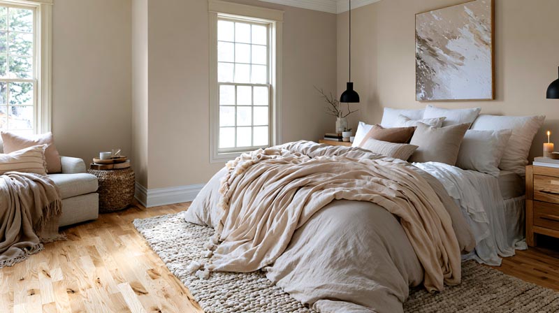
Beige looks neutral until something sits next to it. A trim white that seemed fine on the chip makes the wall look yellow, or a gray rug turns the whole room chilly. White, gray, brown, sage green, navy, terracotta and black all work with it, as long as you pick the right version of each.
Benjamin Moore lists Edgecomb Gray HC-173 at an LRV of 63.09 and Revere Pewter HC-172 at 55.05 (Benjamin Moore, 2026). Those are two popular beige-greiges, and brightness barely separates them, so undertone does the matching.
A yellow beige takes a different white than a pink one does. The green-gray ones go their own way with blues and accents. That holds for beige walls, sofas and cabinets alike.
To see how beige compares with the partners other colors take, browse our color pairing chart.
To see how beige compares with the partners other colors take, browse our room color combinations guide.
Which colors go best with beige?

The table runs from quietest to boldest, starting with white and ending at black.
The shade you pick within each row matters more than the row itself. A yellow beige and a pink beige don’t take the same white.
| Partner color | Mood | Contrast | Suits |
|---|---|---|---|
| White and cream | Bright, clean | Low | Yellow or pink beiges |
| Gray and greige | Calm, soft | Low | Any beige, if the gray runs warm |
| Brown | Earthy, grounded | Low to medium | Yellow beiges |
| Sage and olive | Fresh, natural | Medium | Warm and green-gray beiges |
| Terracotta and rust | Warm, rustic | Medium | Yellow and pink beiges |
| Navy and teal | Crisp, tailored | High | Warm yellow beiges |
| Black | Dramatic, graphic | Very high | Light beiges, in small doses |
Low-contrast pairings read calm and high-contrast ones add edge. It’s the same logic behind contrast in interior design generally.
Two partners are plenty, really. Put one on a large surface and save the other for small accents.
How does the undertone of beige decide which colors match?
Every beige leans somewhere, usually yellow or pink and sometimes toward a green-gray. Partner colors that echo the lean look cohesive, and ones that fight it look off.
Check the undertone before you buy trim paint or a rug.
Yellow, pink and green undertones
Hold the chip against a sheet of plain white paper, then look at the most saturated strip on the chip card. That strip shows the pigment the beige is built from.
Green-gray beiges are muted and the most forgiving, so sage, olive and warm gray all work. Yellow ones are sunnier and want navy, deep blue or cream. Pink undertones, soft and slightly rosy, get along with dusty rose, warm white and brown.
Paint names make this concrete. Sherwin-Williams files Accessible Beige SW 7036 (hex D1C7B8) under its Neutral family, and reviewers usually call it a warm greige that leans beige. So colors that pair with Accessible Beige tend to be warm whites, navy and soft greens.
Benjamin Moore describes Revere Pewter HC-172 as a bridge between warm and cool tones. White Dove OC-17 and Chelsea Gray HC-168 sit among its coordinating colors, and the wider set of colors that sit well with Revere Pewter follows the same warm white plus gray logic.
LRV and contrast
LRV, short for light reflectance value, runs from 0 for black to 100 for white and measures how much light a paint bounces back. It’s handy because it shows how much contrast a partner color will create against your beige before you buy anything.
Going by the paint makers’ color pages (October 2026), Edgecomb Gray HC-173 from Benjamin Moore has an LRV of 63.09. Accessible Beige SW 7036 from Sherwin-Williams sits at 57.67, and Revere Pewter HC-172 from Benjamin Moore at 55.05.
That puts three popular beige-greiges from two brands within about 8 points of each other, so brightness tells you very little. Undertone does the sorting.
Choose on undertone first, then use LRV to size the gap to your trim and accents.
Whites, grays and beige on beige
Low-contrast pairings are the safest, as long as the undertones agree.
White and cream

Benjamin Moore lists White Dove OC-17 at an LRV of 83.16, roughly 25 points above Accessible Beige.
That gap is enough for trim to read as trim without a hard edge. Cream goes warmer along the same lines, and a cleaner white such as Chantilly Lace OC-65 gives a sharper line.
The usual mistake is a stark, cool white. Next to a warm beige it can make the wall look yellow and tired, and I’d skip it.
Gray and greige
Homes & Gardens reported that designers now name beige as the color replacing gray, which is why the two share rooms more often.
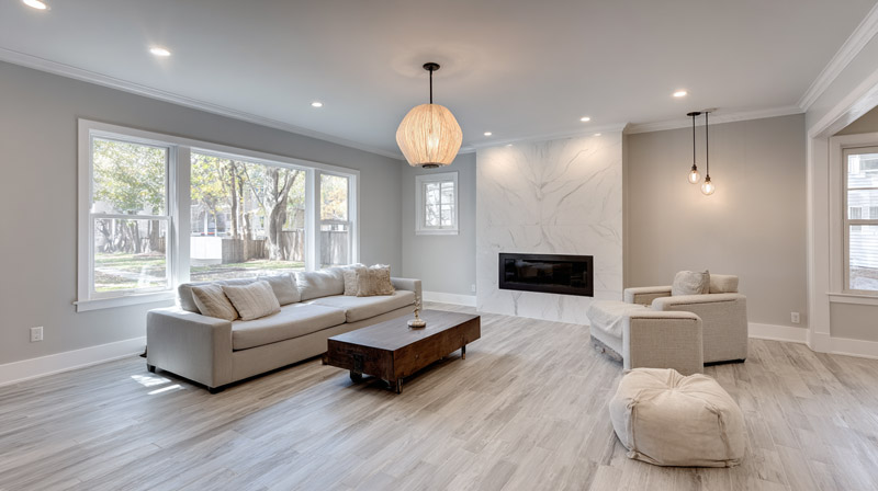
A warm gray or greige blends in and softens the shift from wall to furniture. A cool gray does the opposite on a yellow beige, sharpening it, and in a dim room it can turn chilly.
Beige on beige
A room in beige tones only works when value and texture change from one surface to the next.
Scandinavian interiors lean on this approach. Apartment Therapy shows a Scandi-inspired apartment with a beige armchair against beige walls, kept lively by colorful bookshelves.
Step the values apart by a few points and add layered texture with linen and wool, plus some wood, so the surfaces don’t merge into one flat block.
Blues and greens with beige
Navy gives the hardest cool contrast against warm beige, while sage and olive stay close to it in value.
Navy and teal

Benjamin Moore puts Hale Navy HC-154 at an LRV of 8.36. Against Accessible Beige that is a drop of about 49 points, the widest gap in this article short of black.
Navy also sits roughly opposite a yellow-orange beige on the color wheel, and basic color theory explains why complementary hues sharpen each other. If I had to pick one partner for a yellow-leaning beige, this would be it.
One wall or one sofa is enough. Navy on all four walls of a small room closes it in.
Farrow & Ball Hague Blue is a deep blue alternative. Teal is the playful choice, and Apartment Therapy suggests it for younger rooms.
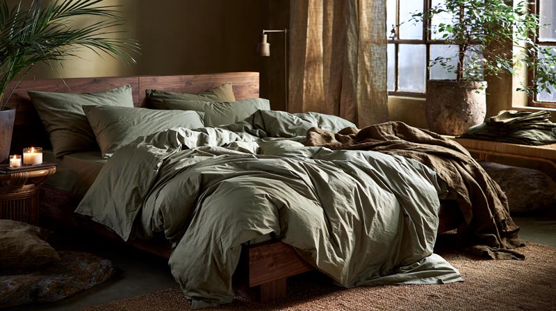
Sage, olive and forest green

Sage is the quiet one.
Olive goes warmer, with an earthy edge that suits wood and leather. Forest green is the deep option, and according to Livingetc, beige keeps it from feeling somber.
Sherwin-Williams files Sea Salt SW 6204 in its Green family, and it reads as a soft gray-green on most walls. It’s the easiest green to hang next to a greige.
For a lighter touch, pairings built around sage green show how cushions and curtains can carry the color without painting anything.
Apartment Therapy shows the dark version: a compact powder room with deep green walls, where a beige mirror frame and cabinet doors stop the space from feeling too heavy.
Earth tones and warm accents that sit well with beige

Terracotta, rust, brown, mustard, gold, dusty rose and burgundy all sit on the warm side of beige, so they add depth without changing the temperature of the room.
Terracotta and rust make the strongest earth accent, best on cushions and pottery or on a single wall.
Brown comes in several depths, from caramel leather to dark walnut, and Apartment Therapy builds a light beige room up from a mix of them.
Mustard is bright, so keep it small.
Gold works in frames and lamps, plus artwork, as in Hunker’s warm beige room with gold accents. Dusty rose is soft and quiet, a good fit for bedrooms. Burgundy is deep and does best on curtains and rugs.
Warm accents are easiest to manage when they come from one earthy family. An earthy color palette keeps terracotta, brown and ochre at the same temperature.
Mid-century modern rooms often pair walnut with mustard on a neutral base, and the mid-century modern color palette shows how far that combination stretches.
Wabi-sabi rooms keep to muted earth tones and rough finishes, so terracotta and brown arrive as clay and wood rather than as paint.
Too many warm accents on a yellow beige make the room one-note. One cool note, a blue or a green, fixes it.
Does black work with beige, and how do you stop a beige room looking dull?
In small doses, yes. And a dull beige room usually doesn’t need a redecoration, just one move that adds contrast.
Sherwin-Williams lists Iron Ore SW 7069 at an LRV of 5.55 (October 2026), close to the bottom of the 0 to 100 scale. A single iron-toned door or cabinet, or even a frame, is enough to anchor a light beige room.
Using black with beige

Black sharpens edges, so furniture reads clearly against the wall, and it makes beige look warmer by comparison. It works in tiny quantities such as hardware and frames, with maybe a lamp base.
The downsides are real. In a small or dim room black gets heavy. One black piece on its own looks accidental, so repeat it two or three times. And large black surfaces turn a warm scheme stark.
Joss & Main shows the reverse: a bedroom where black is the main shade, which turns the white and beige bedding into the highlight.
For a first try, keep black to hardware and frames. Pairings worked out around colors that go with black show which woods and fabrics sit well beside it.
Fixes for a flat beige room
A flat beige room lacks value contrast, not color.
- A deep green, navy or terracotta piece gives the eye somewhere to land first
- Nubby wool or rough linen against smooth walls shifts the texture
Trim helps too, either a clean white or a darker line that outlines the room.
Apartment Therapy shows a beige duvet with orange and blush textiles against bold green walls. The result is muted, but the backdrop gives it plenty of contrast.
A metal finish can do the same job as color. Gold reads warm on beige, and the wider set of colors that go with gold shows what else to bring in around it.
Colors that suit beige in each room
Living rooms can take the deepest contrast and bedrooms the softest. Kitchens depend more on metal finishes, and bathrooms on green and white.
Living room

Decide which one is the beige, the walls or the sofa, then let the other carry the contrast.
With beige walls, navy, olive or dark leather furniture works, plus one warm accent. With a beige sofa, Livingetc names rust, pink, red, gray, black and yellow as partners. And if it’s beige everywhere, bring contrast through art and one dark wood piece.
When the walls are the beige, what color furniture goes with beige walls is the first decision, because it fixes the contrast level of the whole room.
When the sofa is the beige, throw pillows for a beige couch are the cheapest way to test an accent.
Bedroom
Wren Kitchens’ beige bedroom ideas run from soft to sharp. Blush pink makes a romantic room and lavender a quiet one. Muted teal leans coastal, and charcoal gets you a modern look.
Bedding is the easiest place to change the partner color, since the walls can stay beige.
Kitchen

Beige cabinets take metal and stone well. The WC Supply, a cabinet supplier, pairs Sherwin-Williams beige cabinet colors with brushed brass or matte black hardware and white quartz or marble counters.
Going warm means brushed brass, oak flooring and beige-toned quartz. For contrast, think matte black hardware against white quartz or marble, with walnut underfoot.
Darker beige cabinets look best with lighter counters or upper cabinets.
Bathroom
Brass and sage green do the most work here. Real Homes calls brass and beige a match for a vintage or luxe scheme, and TileBar lists muted green, dusty blue and warm metallics as accents for beige tile.
Homes & Gardens adds that white lifts the muddier tones of beige, while a soft sage green gives the room freshness.
How light direction and bulb temperature change beige and its partners
Beige reacts to light faster than most colors, because a faint warm undertone is what defines it. A north-facing room pulls it and its partners cooler and grayer, a south-facing room warms them, and the bulbs in the room shift the result again.
| Window direction | Light quality | Effect on a beige scheme |
|---|---|---|
| North | Cool, indirect | Beige drifts gray, and gray or blue partners go dull |
| South | Warm, strong at midday | Beige and partners read warmer |
| East | Bright and warm early, cooler late | The scheme shifts across the day |
| West | Cooler early, strong in the afternoon | Evening glow warms the beige |
The table follows Farrow & Ball and Benjamin Moore guidance and assumes the northern hemisphere. South of the equator, north and south swap.
How light moves through a room is a design topic of its own, covered in light in interior design.
The sources don’t fully agree on north light. Sherwin-Williams advises warm undertones and higher-LRV colors to lift a north-facing room, while Farrow & Ball suggests going with the cool light and using darker walls, such as Railings or Down Pipe, for a cocooning feel.
For a beige scheme, the lighter route suits small rooms and single windows. The darker route suits a north room with large windows.
The Energy Saver site of the US Department of Energy classes 2700 to 3000 K as warm and 3600 to 5500 K as cool, and recommends 2700 to 3600 K for most indoor lighting.
Farrow & Ball notes that halogen and incandescent bulbs give off a yellow light that warms wall colors, while LED lighting gives off a bluer light and bulbs that emit white light come closest to daylight, so colors read most true. The ambient lighting that sets the room’s general glow therefore decides which of those effects your beige scheme gets.
Sherwin-Williams offers a shortcut. With warm bulbs, choose colors as you would for a south-facing room, and with white or cool bulbs, choose as for a north-facing one.
The same Energy Saver page rates color rendering above color temperature, so check how well a bulb renders color as well as its Kelvin number.
Balancing beige, partner colors and materials
Give beige 60 percent of the room, a partner color 30 percent and an accent 10 percent, then let materials carry the texture.
The 60-30-10 rule with beige
Country & Town House quotes Molly Freshwater of Secret Linen Store, who sets the feature color at 60 percent, the secondary color at 30 and the accent at 10.
For a beige room, the 60 is beige on the walls, the largest furniture and the rug. The 30 is a partner such as navy, sage or brown on curtains, chairs and bedding. The last 10 goes to an accent like terracotta, mustard or black on cushions and art.
In kitchens the same source puts the dominant color on cabinets and worktops, the secondary color on appliances and the accent on the splashback.
The ratio is a guide, not a law. If beige is the quiet 60, the 30 does most of the talking, so pick that color first.
Wood, metal and fabric
- Walnut and dark oak for contrast
- Pale oak and ash keep a room soft and low-contrast
- Brass warms things up, black iron sharpens them, and brushed nickel cools them down
- Linen and wool for texture, boucle if you like it
Walnut gives the deepest wood contrast against beige, and colors that go with walnut wood are worth checking before you pick a rug or a paint.
Japandi rooms rely on a similar mix of beige, pale wood and a single dark accent. The blend of Japanese and Scandinavian interior design shows how little color that scheme needs.
When do beige color pairings not work?
Pairings tend to go wrong in a few predictable places.
- Tile, flooring and counters can’t be repainted, so a wrong undertone stays put. TileBar says warm beige tile needs a warm white or cream, not a blue-based white
- Bright white struggles in north light, since Benjamin Moore UK notes that cool north light dulls colors with gray, blue or lavender undertones, which includes most brilliant whites
- Dark partners absorb light in small rooms. A mid-tone beige with navy, olive or black closes in fast, so lighten the partner or keep it to one piece
- Then there’s accent overload. Homes & Gardens quotes Andrea Childs, editor of Country Homes & Interiors, who finds two or three accent colors workable with beige, and past that the room competes with itself
In small rooms, checking the best colors for small rooms alongside your partner color catches most of these problems.
The fixes are cheap. Swapping the white or lightening the partner usually does it, and dropping an accent covers the rest.
Common Questions About Colors That Go With Beige
What is the difference between beige, taupe and greige?
Taupe is the darkest and most muted of the group, a brown and gray blend with a pink or purple lean. Beige runs lighter and sandier. Greige is a beige-gray hybrid that can run warm or cool.
Do red, purple or orange work with beige?
Yes, as accents, provided the shade is muted or earthy.
Rust or burgundy for red, soft lavender for purple, terracotta or burnt orange for orange. Keep them to cushions, curtains or art.
Is beige still in style for interiors?
Yes. Blinds Direct reports a wider move toward warmer neutral palettes and away from cooler grays.
Lucy Searle, editor in chief of Homes & Gardens, says beige gives a scheme longevity and leaves room to layer in stronger colors later.
Which curtain colors suit beige walls?
Cream, white or a slightly deeper beige keep the room calm, while navy, sage or rust add contrast.
For more options, see these curtain colors for beige walls, and match the fabric’s undertone to the wall first.
How do you choose a rug color for a beige sofa?
Pick a rug deeper than the sofa so the room has a base, or one patterned in a partner color such as navy, sage or rust.
A plain beige rug disappears into the sofa, so add pattern or texture. More ideas sit in these rugs that go with a beige couch.
Testing a Beige Pairing Before You Commit
Colors that go with beige need one sample per candidate and a full day of watching it, because the same pairing reads differently from morning to evening.
Benjamin Moore recommends checking samples under the home’s own natural and artificial light, using peel-and-stick, oversized swatch or brush-on options.
- Hold the chip against plain white paper to check the undertone.
- Put samples on two walls and look at them at three times of day.
- Hold the partner fabric or trim chip right beside the sample.
It does cost time, about a day per round plus a few sample pots, which still beats repainting a wall.
Once the pairing holds in every light, size the order with a room paint calculator. Confirm LRV values on the manufacturer’s page when ordering, since paint makers update their color data (verified October 2026).

- Kitchen Color Schemes by Cabinet Color: What Pairs Well - October 19, 2026
- Curtain Colors for Every Wall Color: Safe vs Bold Picks - October 18, 2026
- Interior Design Styles: Find Your Primary and Secondary - October 14, 2026