Imagine a tapestry of colors, where burgundy stands proud, an aristocrat in the kingdom of shades. It beckons, demanding companions worthy of its depth and character. But which colors go with burgundy to elevate its natural elegance to sublime heights?
Here lies the quintessence of color pairing, a subtle art that transforms spaces and wardrobes with an understanding of color theory and a dash of creativity.
The article ahead unfolds the secrets within the color wheel combinations, guiding your journey through hue and saturation, where burgundy is not just a color but a narrative.
You’ll glean insights into crafting a burgundy color palette that whispers opulence in interior realms and speaks confidence in sartorial selections.
From the warm and cool tones that forge an alliance with this rich, velvety color, to the neutral colors that provide a canvas for its statement, each paragraph is a masterstroke that decodes the language of colors.
Journey through a spectrum where burgundy and navy blue perform a timeless duet, and maroon pairings bring forth a symphony of aesthetics. You’ll learn, you’ll envision, and by the article’s end, you’ll master the artistry of merlot hues.
Colors That Go With Burgundy
| Color That Goes With Burgundy | Visual Contrast/Aesthetic | Ideal Usage/Setting | Complementary Industries | Considerations |
|---|---|---|---|---|
| Navy Blue | Moderate contrast | Formal attire, business settings | Finance, Law, Corporate | Can be conservative; pair with bright accents sparingly |
| Gold | High contrast | Evening wear, elegant decor | Jewelry, Luxury Goods | May overwhelm; use as an accent color |
| Cream or Beige | Low contrast | Casual and comfy interiors | Real Estate, Hospitality | Safe choice; adds softness and light to burgundy |
| Forest Green | Moderate contrast | Outdoor settings, natural themes | Travel, Environment | Earthy feel; connects with nature |
| Gray | Variable contrast | Professional and sleek designs | Technology, Automotive | Versatile; select the right shade to balance burgundy |
The Teal Color and Burgundy
 Image source: MP Studio Interiors
If you’re looking for a more daring color scheme, try the teal-burgundy combo. Since it is blue at the core, teal is among the cooler colors that go with burgundy as the focal point. Thus, is it certainly an interesting and fancy interior design solution.
Combining Pink and Burgundy
 Image source: Forbes Design Consultants
The richness of the color burgundy and the softness of the pink hue form a classic color combination. Together, they look whimsical and dreamy. To achieve such an ambiance, you can use pink wall paint and burgundy pillows, for example. Also, pink drapes are a very popular choice nowadays.
If you’re preferring something less romantic, include the deeper shades of burgundy instead. A purple burgundy sofa is an elegant contrast to the warm tones of a pink backdrop. Then, pick one more neutral tone from the color wheel to round up the scene.
Pairing Peach and Burgundy Pieces
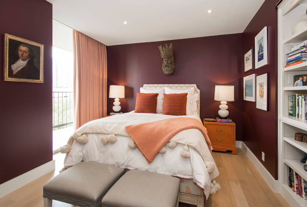 Image source: Key Residential
When using deep burgundy elements, you need a softer hue to balance them out. For such occasions, peach is one of the warmer colors that go with burgundy. That combo produces a welcoming color palette that’s perfect for a guest room.
Then, select a soft ivory or off-white base before adding darker shades of burgundy. If you’re trying to highlight a piece of furniture, apply the striking gold-burgundy interaction. Those colors create an inviting space that will impress all visitors.
The Black Burgundy Color Combination
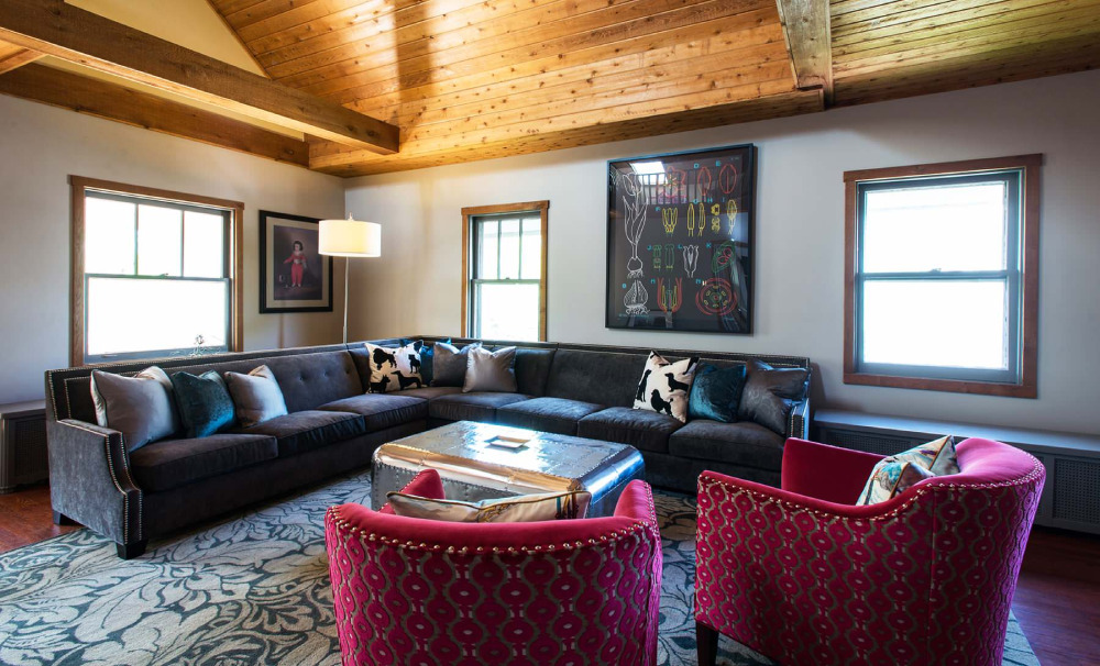 Image source: Amanda Miller
Black adds a touch of high class to any setup, and also works great against a warmer counterpart. As a result, black fits the bill among the neutral colors that go with burgundy. So, even if they are not complementary colors by default, they do look elegant together.
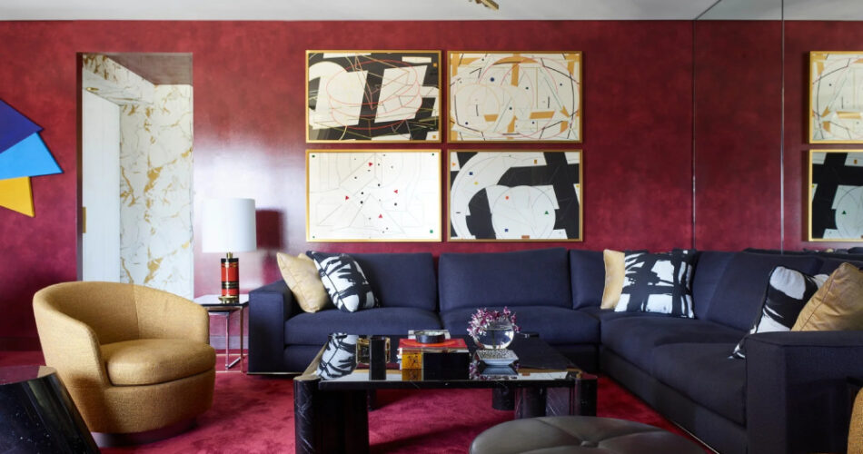
Using Navy Blue and Burgundy
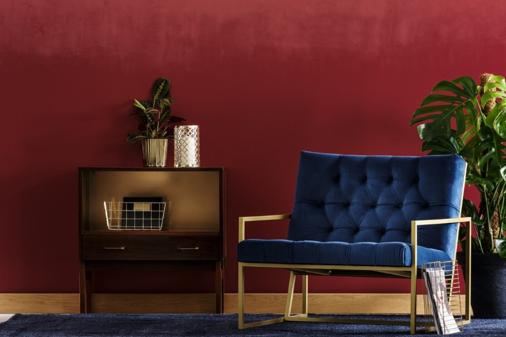 Image source: Sight Unseen
Burgundy is a rich color comprising fancy ultramarine blue undertones as well. Thus, it’s a great pair for any shade that looks cool under natural light. Navy blue is one such tint that’s equal parts classy and chic. Yet, you can use it as a neutral color before sprinkling the rich burgundy elements.
In such a setup, navy blue will act as a contrasting color to the dark red hues of burgundy. Though such color schemes are risky, they tend to look sophisticated as well. For example, space them out correctly across the room to accentuate their vibrancy. To that end, it’s best to use soft and cream wall paint. Next, include oriental rugs for a more traditional setup.
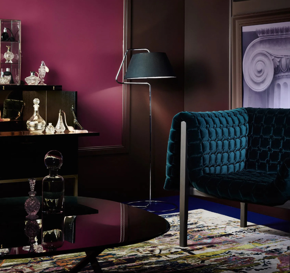 Image source: Insplosion
On a similar note, you create a vintage theme with this color combo as well. Like in the art deco period, use navy blue herringbone tiles with burgundy on the walls. Otherwise, glossy wood floors work great with the same color theory.
The Brown Color and Burgundy
 Image source: Swift Decor
Warm brown and burgundy are an earthy pair that looks cozy and snuggly. As such, it’s reminiscent of an early autumn day, creating a calming notion. To produce that ambiance, include velvet drapes and chestnut-colored furniture.
Similarly, you can use burgundy accent chairs next to a dark brown sofa. Burgundy throw pillows also fit into that picture. Next, you can round things up by adding another warm color via the light fixtures.
Combining Burgundy With Gold
 Image source: Pepe Calderin Design- Modern Interior Design
For an ornate yet regal look, the burgundy and gold color pair nicely together. The result is a timeless and elegant soft clashing of two rich hues. However, be careful not to oversaturate the space. To that end, stick to adding a modern vibe with just a handful of subtle gold hints.
Can Burgundy and Bronze Work Together?
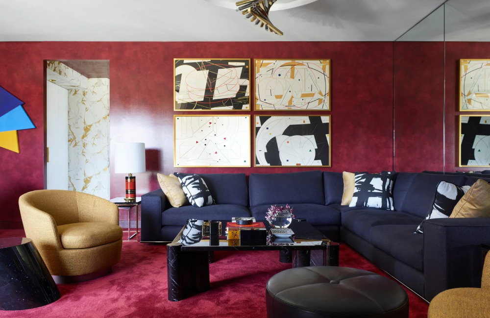 Image source: LuxeDeco
Those aiming to make a fashion statement with their interior decor should consider the bronze burgundy combo. Those colors match in intensity, meaning you’ll have to break them apart using soft furnishings in neutral colors. Then, install bronze accents via various accessories like vases and sculptures.
The Burgundy and Purple Combination
 Image source: Joss & Main
Since burgundy offers purple undertones by default, it makes for a radiant match with the purple color itself. When next to each other, the purple-burgundy result screams elegance and looks homely.
For a more luxurious outcome, introduce the burgundy color via several pieces within the room. For example, install a large burgundy rug and use matching throw pillows. Then, you can use purple as the wall paint of your choice.
The Charcoal Color and Burgundy
 Image source: FORBES + MASTERS
Charcoal is a trendy substitute for black, and might be the better fit for a room without much direct sunlight. Hence, while the black-burgundy combo is an elegant solution, charcoal is a close second. Both are deep hues that exist far away on the color spectrum but do end up working in practice.
You can produce this scheme even in a loft-style space. To that end, use a clear-coat solution to darken any red brick wall closer to the burgundy hue. That way, you’ll apply a strong, masculine outcome that you can further enrich with bright undertones.
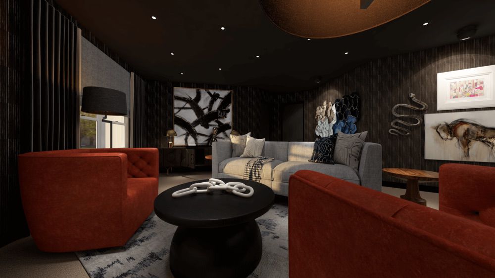 Image source: NILE JOHNSON
Using charcoal cement flooring is another classy approach. However, it might lead to an overly cold setup. To counter that tendency, install a heavy burgundy rug to warm up the ambiance. Then, use iron light fixtures to complete the presentation.
Blush Pink and Burgundy
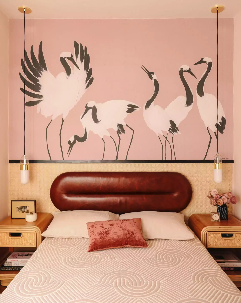 Image source: ANNE SAGE
This is a feminine and soft combination perfect for a cozy and inviting space. Since burgundy is a dominant color, the softness of blush pink is a natural pair for it. Then, use any of the lighter colors that go with burgundy to highlight their interplay.
The Red and Burgundy Combination
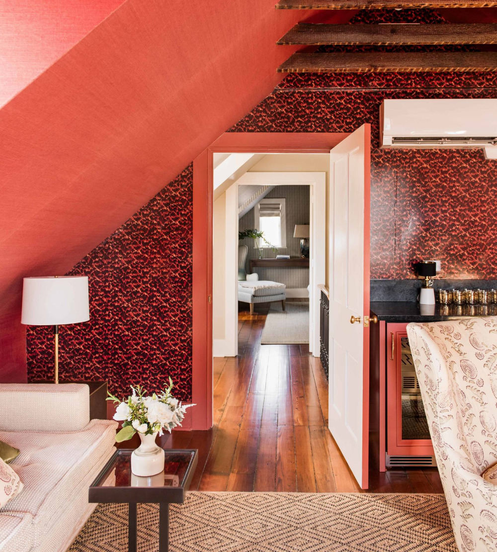 Image source: B. BERRY INTERIORS
For a more energetic layout, you can try pairing lighter shades of red with the strong burgundy color. Though those two colors are similar, they can fill up any home decor nicely if applied in moderation. Hence, avoid adding deep red tones so as to not overpower the burgundy base.
Using Burgundy and Orange at the Same Time
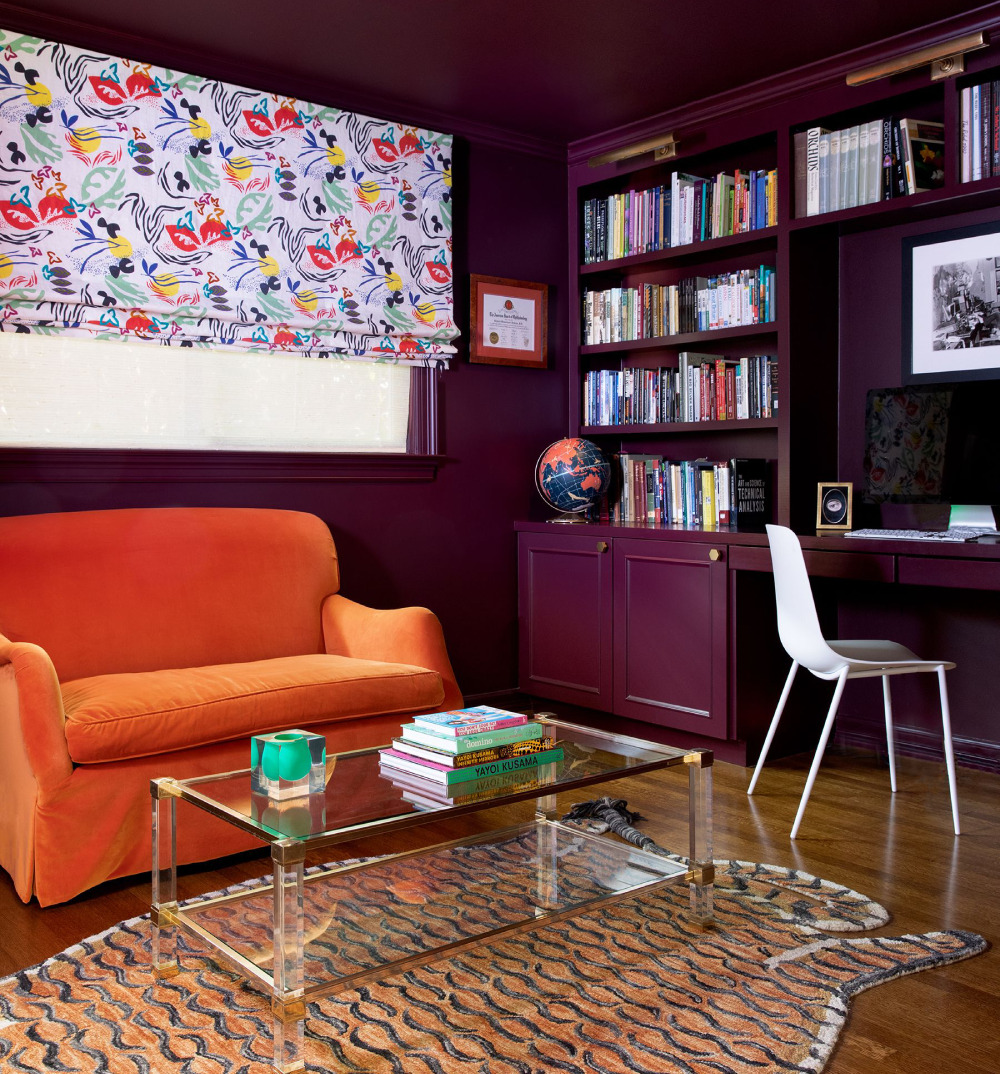 Image source: MARY PATTON
The mustard yellow-burgundy combo is a shortcut to a modern and unique look. For the best outcome, apply this scheme in your kitchen or living room areas. Then, start by using burgundy wall paint before adding bright mustard yellow or orange elements.
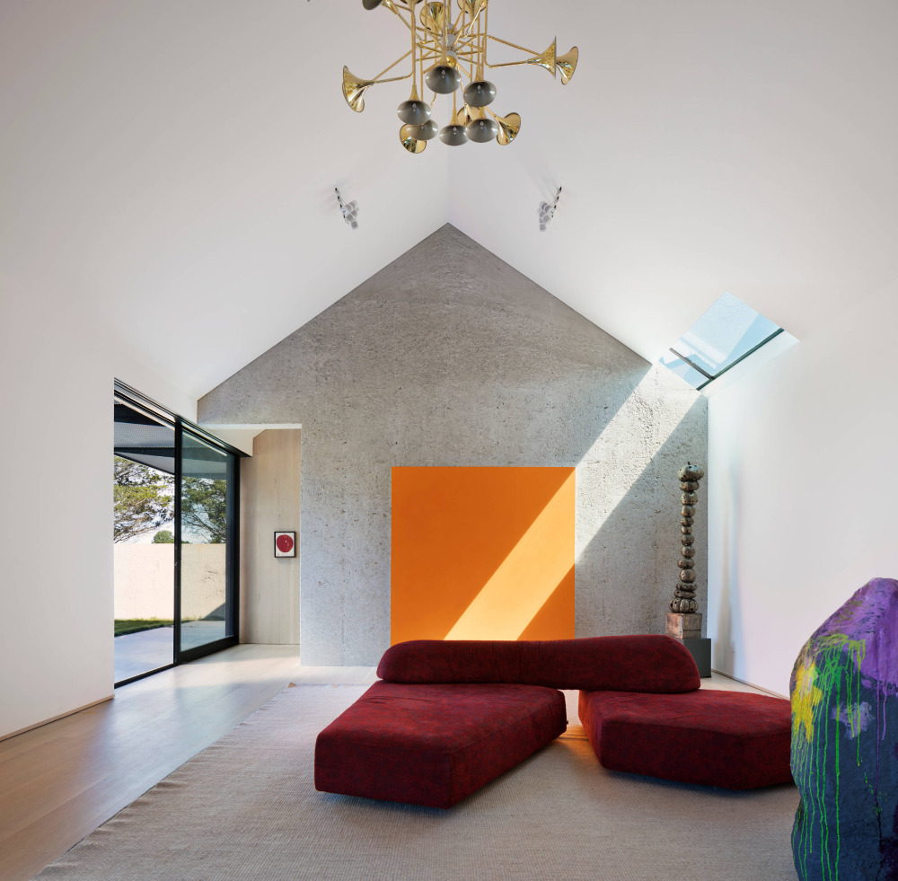 Image source: Oza Sabbeth Architects
That way, you’ll free up the spotlight for the yellow color, which is always fun to witness. However, that accent color calls for a softer hue to balance it out. To that end, pick a light base that goes well with burgundy, too.
Adding Brown Tones Next to a Burgundy Backdrop
 Image source: B Fein Interiors LLC
For an inviting and warm-looking space, use brown and orange tones with burgundy elements. To avoid a stark contrast, pick lighter shades of the brown hue and move from there. Next, add rich burgundy accessories for an overall elite look.
Cool Gray and the Burgundy Color
 Image source: Marcelle Guilbeau, Interior Designer
The gray wall paint is one of those classic choices that fit any room of your house. At the same time, it is a great match for the innate warmth of the burgundy color. Hence, you can freely use rich burgundy pieces in any room painted in a gray or dark gray hue.
On that note, several shades of gray tend to top the list of most versatile neutral bases. For example, the gunmetal and smoke variants. However, you can easily end up with grim scenery if you overuse that color scheme. Therefore, add some much-needed zest to the setup with the burgundy color.
The Burgundy and Turquoise Combination
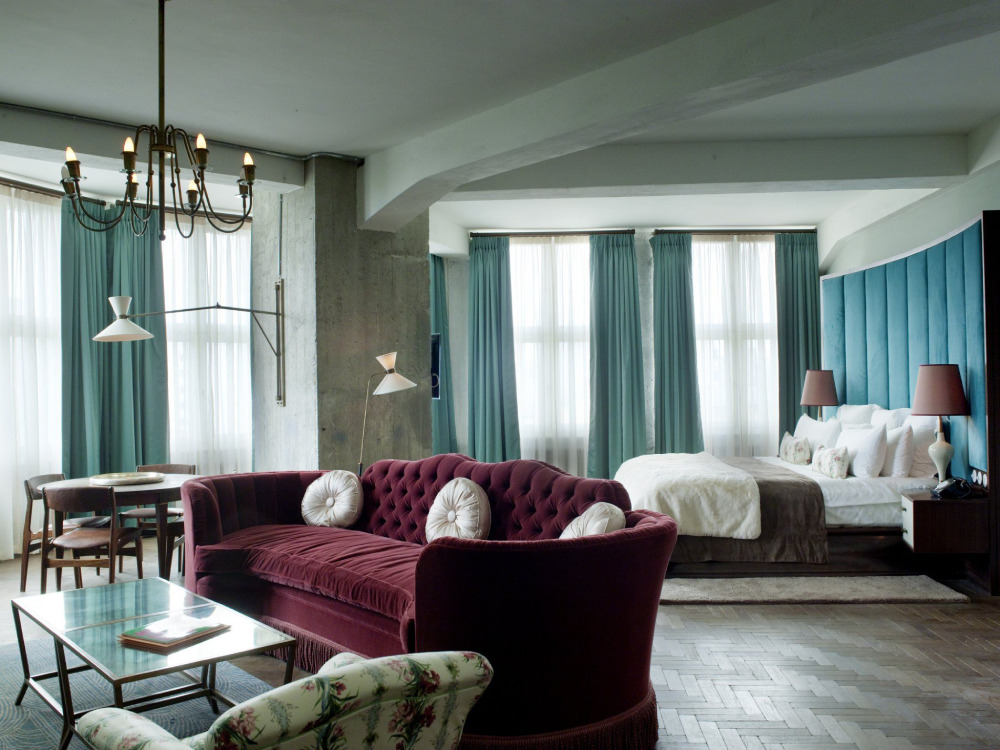 Image source: Soho House Berlin
For a suave light-and-dark interplay, include the cool turquoise shade and the deep burgundy hues. They result in a stylish and balanced decor that’s quite trendy at the moment. In that scenario, turquoise plays the part of the lighter shade to great effect. Plus, you can choose a softer variant for a slick green-burgundy color combination.
FAQ On Colors That Go With Burgundy
What Colors Complement Burgundy in Interior Design?
Complemented by earthy neutrals, burgundy thrives in interior spaces. Think soft taupes, crisp whites, or even a subdued charcoal. They allow burgundy to dominate gently, providing a grounded backdrop that’s both timeless and sophisticated.
Can Burgundy and Navy Blue Be Paired in Fashion?
Indeed, a match made for elegance. Burgundy and navy blue together spell classic chic. It’s a sharp combination that speaks of refined taste in fashion, often a sought-after duo for those who prefer a subtle yet impactful wardrobe statement.
How Do Burgundy and Gold Work Together?
In both design and attire, burgundy and gold are the epitome of luxury. Gold adds a regal touch that uplifts the richness of burgundy. It’s a combination that carries a certain opulence, turning any space or garment into a centerpiece.
What Are Some Complementary Colors for Burgundy in Color Theory?
Draw from the color wheel; sage green, dusty blue, and muted gold are harmonious. They’re on the opposite spectrum, offering a pleasing contrast that balances the intensity of burgundy with serene whispers of complementary charm.
How Does One Incorporate Burgundy in Seasonal Decor?
Burgundy finds its stride in autumnal themes. It pairs with rust, burnt orange, and golden yellow, echoing the changing leaves. In winter, it cozies up with deep greens and rich browns, a warm embrace during the cooler months.
What Accent Colors Can I Use with Burgundy for Wedding Themes?
For weddings, consider blush pinks, creamy ivories, and soft silvers as companions. These accent colors provide a romantic contrast that enhances the dramatic flair of burgundy—a true celebration of love and style.
In Terms of Color Psychology, What Does Burgundy Represent?
Burgundy, brimming with depth, symbolizes power and ambition. It’s a color that carries weight and depth, often chosen by those who wish to project confidence and a sense of grounding presence.
What Colors Go with Burgundy Clothes to Achieve a Professional Look?
Pair with dark neutrals for a professional ensemble. Charcoal, black, and navy offer a solid foundation that lets burgundy stand out without overshadowing. These pairings ensure a look that’s powerful and assertive without being overbearing.
How Do You Match Burgundy in a Monochromatic Color Scheme?
Embrace varying depths of burgundy itself. Layer different shades and textures, from merlot to a lighter garnet, keeping within the family creates a rich, cohesive, and incredibly modern aesthetic.
Is It Possible to Pair Pastel Colors with Burgundy?
Surprisingly versatile, burgundy can indeed complement pastels. A soft rose or a muted lavender brings out an unexpected softness in burgundy. This pairing is less conventional but can result in a beautifully delicate balance when executed with a light hand.
Conclusion
Embarking on a quest to find colors that go with burgundy unveils a spectrum of possibilities, as rich and inviting as the hue itself. The journey across complementary shades, neutral backdrops, and unexpected pastels has come to an end, leaving behind a palette drenched in sophistication and brimming with harmony.
In the alcoves of creativity, burgundy has danced with gold, flirted with navy, and stood strong alongside earth tones. It has shown its versatility, bending gracefully to seasonal whims, showcasing a chameleon-like ability to adapt from autumnal warmth to winter coziness.
- Reflect on burgundy’s alliance with neutral colors: a silent strength in simplicity.
- Revel in the lush contrast provided by teaming burgundy with complementary colors.
- Admire the softness pastels can coax from the deep red we’ve come to cherish.
Finally, the essence of burgundy—a color that does not shout but rather whispers tales of elegance—will continue to inspire choices in both interior design and personal style. With these insights, burgundy is not merely a part of the design but is the very heart of it.