Color Combinations
Colors That Go With Dark Green: Nice Interior Ideas

Warm white, cream, blush pink, terracotta, mustard and navy are the best colors that go with dark green in interior design, with brass and walnut as the supporting finishes. Which one actually works depends on the green’s undertone and the light in the room. The word green on the tin tells you very little.
Dark green sits near the bottom of the light reflectance value (LRV) scale. Benjamin Moore lists Hunter Green 2041-10 at 6.39 out of 100 (as of 2026), so it absorbs almost all the light that reaches it.
Sherwin-Williams sorts greens into blue, yellow, gray and warm olive undertones (as of 2026). That’s why the usual advice to add warm partners to a cool dark green works for some shades and falls apart for others.
Once dark green is settled, our complete color combination guide helps with the rest of the palette.
Once dark green is settled, our guide to color pairings by shade, wood tone and room helps with the rest of the palette.
Which Neutrals Go With Dark Green?

Start with warm white or cream, which almost never go wrong. Greige, light gray, charcoal and black work too, though each pushes the room somewhere different.
Lightness decides most of it. LRV scores a paint from 0 (black) to 100 (white), and as of October 2026 Benjamin Moore lists Hunter Green 2041-10 at 6.39. That’s close to black.
Sherwin-Williams recommends an LRV of about 60 or higher for paint in north-facing rooms, where the light runs cool. Its green color guide gives the same number for green walls meant to make a room look bigger, as long as there’s plenty of natural light. Those figures were written for walls, but they work as a yardstick for the neutral beside a dark green as well. The further above 60 you go, the more the green reads as a deliberate anchor and the less it looks like a heavy block.
Whites and Creams

A bright, blue-leaning white looks stark against paint at LRV 6. Pick a soft white with a trace of cream or green instead and it lifts the green without a hard edge.
Farrow & Ball pairs Studio Green No.93, its darkest green, with Off-White No.3, a white whose underlying green gives it a chalky softness (Farrow & Ball product page).
Cream does the same job with more warmth, and it sits best against yellow-leaning and olive greens. Honestly, it’s the one I’d test first.
Greige, Gray and Charcoal
Greige is the warm middle ground, and it stops the room turning cold. Light gray is the modern pick, though I’d keep it on the warm side wherever daylight is weak.
Charcoal gives tonal depth with almost no contrast, so beside dark green it’s a low-contrast scheme by design. Put a cream rug or some pale upholstery nearby, or the corner goes flat.
Black With Dark Green
Black hardware, window frames, picture frames and a coffee table all work against green walls. The black adds sharp edges while the green stays the main color.
It struggles when black furniture, dark floors and green walls turn up together with no light surface to break them up.
How much contrast a room can carry depends on light and layout as much as color, and the wider rules for handling contrast in a room apply here too.
Trim and Ceiling Colors
Trim is where a dark green room gets its edge.
Farrow & Ball’s own Studio Green schemes go in a few directions (Farrow & Ball product page).
- Old White No.4 on the trim with Light Gray No.17 as the accent gives soft contrast.
- For something warmer, Radicchio No.96, a muted wine red, goes on the trim and Bone No.15 becomes the accent.
- Or stay tonal with Railings No.31, a deep blue-black, on the trim and the gray-green Card Room Green No.79 as the accent.
Accent Colors That Pair With Dark Green
Blush pink, terracotta, mustard, navy, burgundy and coral all work as accents on dark green, and they don’t behave alike. How much warmth the room already has should decide which one you pick.
Pink and Rose Tones

Pink is the easiest accent for dark green.
Green’s opposite on the color wheel is red, and pink is red with the intensity turned down. That’s why blush, dusty rose and soft pink read as a gentle complement instead of a clash.
- Blush on walls or bedding for a quiet scheme
- Dusty rose in velvet or curtains if you want it richer
Keep the pink pale or dusty. Hot pink against deep green gets loud fast.
Terracotta, Orange and Mustard

Terracotta, an earthy red-orange, grounds the green in rugs, tiles and ceramics.
Burnt orange is the stronger version. I’d keep it to cushions, a throw or one piece of art.
Mustard behaves differently, because it sits on the yellow side of green and reads as a warm neighbor instead of a contrast. Velvet and boucle pick it up well.
Navy and Blue

Blue goes with dark green, and navy is the easiest version. The two sit next to each other on the color wheel and are close in lightness, so the pairing comes out quiet and tonal.
The catch is depth. Two dark colors together need a light layer, such as white walls, a cream rug or pale upholstery, or the room turns into one dim block.
Burgundy and Coral
Wine reds are the complementary scheme at its calmest. Burgundy is deep, so it matches the green in weight instead of fighting it.
Coral goes the other way. It’s bright and warm, so it works in small hits (a cushion or a vase, maybe one print) against a large dark green surface.
Which Color Schemes Work Around Dark Green?
Most dark green rooms end up as complementary, analogous, split-complementary or monochromatic schemes. Triadic palettes work as well but take more balancing.
The color wheel maps these relationships, and the wider color theory behind interior design explains why each one behaves as it does.
Complementary Schemes
Sherwin-Williams defines complementary colors as the pair sitting directly across from each other on the wheel, and says they create contrast where analogous colors flow together.
For dark green the opposite is red. In a room that means muted reds rather than saturated ones.
Wine or burgundy adds depth, while brick or terracotta adds warmth. Dusty rose is the softer way in.
Analogous Schemes
Blue-green, teal, olive and yellow-green sit beside dark green on the wheel, which makes them its analogous colors. Because they share a base hue, the room feels calm and low in contrast.
The risk is flatness. Vary the lightness (a pale sage next to the dark green, say) and mix surfaces so the scheme does not blur into one tone.
Split-Complementary and Triadic Palettes
A split-complementary scheme takes dark green plus the two colors flanking red, which are red-orange and red-violet (Sherwin-Williams defines split-complementary colors as the two adjacent to the complementary color). In a room that reads as terracotta and plum or mauve, with less intensity than a straight complementary pair.
Triadic palettes use three colors spaced evenly around the wheel. On the traditional red-yellow-blue wheel, green’s partners are orange and violet, so you end up with dark green, burnt orange and plum.
Split-complementary is forgiving. Triadic only works if one color dominates and the other two stay small.
Monochromatic Schemes
A monochromatic scheme stacks dark green walls with mid-tone green textiles and pale green accents. It only works when the textures differ, because the flat repeat of a single hue shows up quickly.
How to Match Pairings to the Undertone of Your Dark Green
Hold the paint chip against a plain white card and see whether the green drifts toward blue, yellow or gray. Then choose partners to suit that drift, not the word green on the label.
| Undertone | Example shade | Neutral that suits | Accent that suits |
|---|---|---|---|
| Blue-leaning | Hunt Club SW 6468 (Sherwin-Williams) | Warm white, soft greige | Terracotta, coral, brass |
| Warm olive | Renwick Olive SW 2815 (Sherwin-Williams) | Cream, tan | Rust, aged brass |
| Near-black | Studio Green No.93 (Farrow & Ball) | Off-White, Old White, Light Gray | Radicchio, Bone |
The Studio Green row comes from Farrow & Ball’s own schemes, and the other two rows are recommendations built on each green’s undertone.
Reading the Undertone
A common rule says dark green is a cool color, so warm partners balance it. That holds for blue-leaning greens and fails for yellow-leaning ones.
Sherwin-Williams sorts greens into blue, yellow, gray and warm olive undertones in its green color guide (as of October 2026). Its Hunt Club SW 6468 carries a hue angle of 160.5, past the midpoint between pure green (120) and cyan (180), so it leans blue.
Hunt Club’s LRV is 6.49, a tenth of a point from Benjamin Moore’s Hunter Green at 6.39. Lightness can’t separate the two brands, so undertone makes the call.
Hunter, Forest, Emerald and Bottle Green Compared
Hunter green is the default dark green, deep and balanced. Forest green runs leafier and a little warmer, so it’s friendly to wood.
Emerald is the brightest and bluest of the lot, suited to gold and blush. Bottle green is glassy and blue-leaning, which is why brass and cream suit it.
Names are loose across brands, so match by chip, not by name. Emerald shifts the palette the most, which is why emerald green has its own set of partner colors.
Olive-leaning greens go the other way. They read warmer and earthier, and the partners that suit olive green lean on cream, tan and rust.
Wood, Metal and Fabric Finishes for Dark Green
Brass, warm woods and tan leather pair best with dark green, and velvet, boucle and linen soften it. Black or nickel hardware gives a cooler, more graphic result.
Metals

Brass and gold warm up blue-leaning and near-black greens. Black is sharp and modern, and strongest against cream. Nickel and silver run cooler, which suits blue-leaning greens in bright rooms.
Brass is the most common choice, and the warm yellow in the metal offsets the cool in the green. Keep it to fixtures, frames and hardware instead of every surface.
Woods and Leather
Wood is the easiest material to get right with dark green.
Walnut gives the deepest contrast, dark and warm and close in weight to the green. Oak is lighter and brightens the room, and pale oak is the lightest option.
Tan and cognac leather are the classic upholstery partners. Brown tones sit between the green and the neutrals, which is why the combination reads as natural.
Stone and Textiles
Marble and white stone give dark green cabinets or tile a bright counterweight. Matte green against polished, veined stone is a common combination in kitchens and bathrooms.
Fabric does the softening. Velvet gives sheen and depth, while boucle adds bulk and linen a dry, light surface. If you want the reasoning, how surface texture changes a room explains why those differences matter on a matte green wall.
Furniture Colors for Dark Green Walls and Sofas

Against dark green walls, go for cream, tan, camel, light wood and pale upholstery. Dark furniture disappears into the wall.
With a dark green sofa, light walls, natural wood tables and a pale rug do the work. The sofa is the anchor, so the rug does most of the lifting, and a rug chosen to suit a green couch in cream, jute or a soft pattern keeps the seating area light.
How Light Changes Dark Green and Its Partners
North-facing light pushes dark green toward blue and gray, and south-facing light pulls it warmer. Bulb color then shifts the undertone again after dark, so a palette that looks right at noon can read differently at 8 pm.
Orientation sets the baseline, and how light shapes a room in the wider sense covers windows, reflection and layering.
North-Facing Rooms
Sherwin-Williams describes north-facing rooms as the ones with the least light and a cool cast (as of October 2026). The two big paint brands then split on what to do about it.
Sherwin-Williams says even a bold dark color should carry warm undertones to offset the cool light. Farrow & Ball takes the opposite view and says to stop fighting the cool light and go darker, with wall colors such as Railings or Down Pipe, for a cocooning feel.
The disagreement decides the undertone for dark green. A yellow-leaning or warm olive green follows the Sherwin-Williams route, while a near-black or blue-leaning green follows Farrow & Ball’s.
Either way, a north-facing dark green is a mood choice, not a brightness choice. Sherwin-Williams points north-facing rooms toward higher LRV colors, and dark green sits at the opposite end of that scale.
South, East and West Rooms
The other three orientations are kinder, but each needs a different read.
South-facing rooms get steady warm light all day, which makes cool-toned colors read more neutral (Sherwin-Williams). East-facing rooms are warm in the morning and cooler toward evening, and west-facing ones flip that, cooler in the morning and warmer and brighter in the afternoon.
Sherwin-Williams and Farrow & Ball agree on one rule for east and west rooms, which is to choose by the hours the room is used. A west-facing living room used after work shows dark green in warm light, while a west-facing home office used at 9 am shows it in cool light.
Bulb Color Temperature and Kelvin
On the kelvin scale, these are the bulb figures that matter for a dark green room (as of October 2026).
- 2700K is warm white, the standard color of incandescent bulbs (ENERGY STAR), and the usual pick for living rooms, bedrooms and dining rooms (Energy Trust of Oregon)
- 3500K is a cooler white for kitchens and work spaces (Energy Trust of Oregon)
- 5000K is bright-day light for reading and desk lamps (Energy Trust of Oregon)
- 6500K sits at the top of the ENERGY STAR bulb scale
Farrow & Ball says halogen and incandescent bulbs give yellow light that warms wall colors, while cool white bulbs cast a bluer tone. On dark green, cool bulbs push a blue-leaning shade toward teal, and warm bulbs pull a yellow-leaning one toward olive.
Sherwin-Williams ties bulbs to orientation. With warm lighting, choose colors as you would for a south-facing room, and with white or cool lighting, as for a north-facing one. Put together with the kelvin scale, a north-facing room lit at 2700K behaves like a south-facing room after dark, and the same room at 5000K stays north.
Labels are not standardized. Westinghouse and the UK retailer Lampwise draw the cool white range differently, so rely on the kelvin number printed on the Lighting Facts label.
Layered Lighting for Dark Rooms
One ceiling fixture leaves the corners of a dark green room dim.
Start with ambient lighting as the base layer. Task lamps for reading and work go on top of that, and accent lights finish it off on art and shelves. Keep every bulb in the room at the same kelvin number, or the green changes from lamp to lamp.
How Much of Each Color to Use With Dark Green
The usual split is 60 percent dark green, 30 percent a lighter neutral and 10 percent one accent. Treat it as a starting guide, not a law.
Bob Vila’s explainer calls it a dominant, secondary and accent color formula and says it is meant to be bent. Ideal Home quotes designer Martin Waller of Andrew Martin on where the 60 begins, which is the walls, because they dominate a room more than any other element.
- Assign the 60 to dark green, on the walls or the largest furniture piece
- Give the 30 to the lightest neutral, carried by the rug, curtains and upholstery
- Hand the 10 to one accent hue plus one metal, in cushions, art and hardware
- Check the 10 against the undertone of the green before buying anything
Dark Green as the 60
Dark green is heavy, so the 30 has to do more work than it would beside a pale wall color.
Give the 30 to the lightest surface in the room, and make it visible from the doorway. Cream cushions alone do not count.
Wall area sets the 60, so measure it first, and a calculator for room paint quantities turns those measurements into a number you can buy.
Dark Green as the 10
In a neutral room, walls in warm white take the 60, wood and textiles take the 30, and the green shows up as a sofa, a door or a cabinet.
That makes the green the accent, so it can be darker and more saturated than any wall color would allow.
When the Rule Does Not Apply
Rooms with dark green on the walls, trim and ceiling have no 60. The green is 100, and contrast comes from furniture, art and light.
Bob Vila also suggests swapping the accent color for an accent pattern, which suits a green room that is already heavy. To test a split with your own hues before committing, generate a room color scheme from the three picks.
Dark Green Pairings by Room
Each room puts a different load on the same green. Living rooms can take the full palette and bedrooms need a quieter one, while kitchens lean on stone and cabinetry and bathrooms come down to finish and lighting.
Living Room

The living room has room for the boldest use of dark green.
Paint the wall that anchors the seating, usually the fireplace or shelving wall, and leave the rest light.
Shelving in green turns books and ceramics into a backdrop display, and gold frames on a green wall give art a built-in mat. Pale objects stand out, dark ones vanish.
Bedroom
Keep the bedroom to three colors.
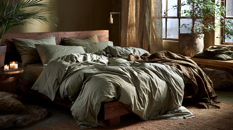
If the green only goes behind the bed, the headboard wall carries the color, the bedding stays pale and the bedside lamps hold the warm bulbs.
Green on all four walls changes the brief. The room needs lamps on both sides of the bed and a light rug, or it reads as a cave at night.
Kitchen

A full run of dark green cabinetry is the main event, so walls and counters stay light.
If you don’t want every cabinet covered, a dark green kitchen island brings the color in and sits well against pale perimeter units.
White stone brightens the base, and green cabinets with white countertops is the cleanest version of that pairing.
Pick one metal for the hardware and repeat it on the tap.
Bathroom
Farrow & Ball names Modern Emulsion, a matt finish with 7% sheen and added mould resistance, as its best option for steamy rooms such as kitchens and bathrooms (Farrow & Ball product page).
Sherwin-Williams recommends white or cool lighting for spaces that need more light, such as bathrooms and home offices. Cool bulbs shift a dark green, so check the color under the actual fixture.
Dark green tile with white fixtures works well, and wood shelving warms the room.
When Dark Green Pairings Fail
Dark green pairings go wrong in fairly predictable places: saturated red beside the green, cool gray in north light, too many dark tones, a small dim room, and textiles that miss the wall’s undertone. Each has a fix.
Saturated Red Beside the Green
Red and green are complements, and at full saturation and equal size they read as a holiday scheme.
The fix is to lower the red’s saturation and its share of the room.
Cool Gray in North Light
Farrow & Ball says northern light brings out the cooler tones in a color, so lighter colors with a blue or gray base go cold. Sherwin-Williams advises avoiding cool undertones in north-facing rooms.
Farrow & Ball’s fix is yellow-based colors (Yellow Ground, New White and White Tie) to bounce light around the room.
Too Many Dark Tones
- Dark green walls
- Navy or charcoal upholstery
- Dark brown floors
- Black metal on top
Stacked together with no light surface, they read as one dim block. Add a light surface at least as large as the largest dark one, and hang a mirror to reflect the light, as Farrow & Ball suggests for north-facing rooms.
A Small, Dim Room
Dark green absorbs light and removes the visual edge of a small room. If the goal is a bigger-looking space, colors that make a room look bigger sit at the other end of the scale.
If the room stays dark green, add light, and work out the lumens with an LED light requirement calculator.
Textiles That Miss the Undertone
A yellow-leaning olive cushion on a blue-leaning green wall looks dirty, not layered.
Choose textiles from the same undertone family as the wall.
FAQ About Colors That Go With Dark Green
Can dark green work as a neutral?
In practice, yes. Dark green is a chromatic color, but its depth lets it act as a backdrop that takes almost any accent, metal or wood without competing.
Does purple go with dark green?
Deep, muted purple does. Plum, aubergine and mauve in velvet or bedding balance the green, and bright violet fights it.
Which paint finish suits dark green walls?
A matt or flat finish suits walls best, because gloss shows roller marks and throws back window glare on a dark surface.
Eggshell or satin belongs on trim and cabinetry, where wipeability matters more.
What curtain color goes with dark green walls?
Cream and warm white curtains keep dark green walls from closing in, and linen does the same with more texture. A drape one shade lighter than the wall gives a tonal option, and curtain colors that suit green walls covers more choices.
Testing a Dark Green Palette in Your Own Room
Test colors that go with dark green in the room itself, on large samples, under the room’s own light, before any paint or furniture is bought.
Sherwin-Williams gives away up to 10 free chips at 2 by 3 inches and sells 8 by 8 inch peel-and-stick samples at $3.95 each, or $3.50 each for four or more (verified October 2026). A chip that small cannot show how a green sits beside a neutral.
Test in this order, because wall color is the hardest decision to reverse.
- Green and lightest neutral, side by side
- Accent hue against both
- Metal, wood and fabric last
The trade-off is money and patience. Four large samples cost $14, and each needs watching in morning and evening light. Prices and sizes change, so recheck them before ordering.
Once the walls are settled, the rug is the next large purchase, and rug colors that suit green walls narrows the choice.

- Kitchen Color Schemes by Cabinet Color: What Pairs Well - October 19, 2026
- Curtain Colors for Every Wall Color: Safe vs Bold Picks - October 18, 2026
- Interior Design Styles: Find Your Primary and Secondary - October 14, 2026