Color Combinations
Colors that go with grey: The best color combinations to use
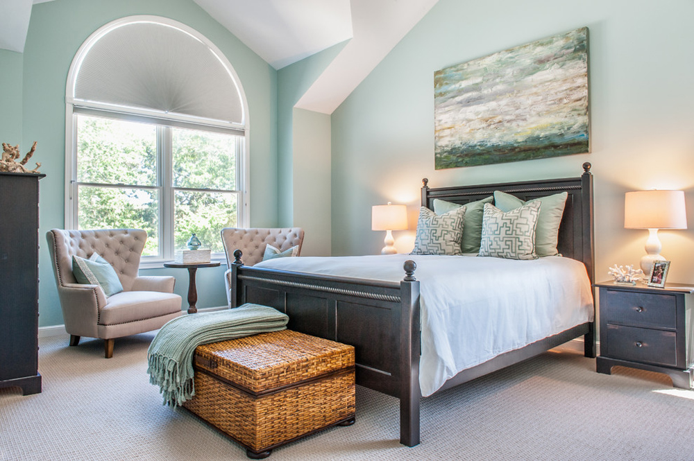
White, black, navy, sage green, mustard yellow, blush pink, beige, natural wood and gold all go with grey. Which one works in a given room comes down to the grey’s undertone.
A neutral grey has no hue, but paint greys do. Sherwin-Williams’ color data, as of October 2026, lists Agreeable Gray at a hue of 37.5 and a saturation of 0.08. That’s a small warm lean, and it’s what gives the greige its character.
Designers mostly treat grey as a base. Room light and light reflectance value then adjust the match, so a partner that suits one grey can fail on another.
Once grey is settled, our overview of how colors work together helps with the rest of the palette.
Once grey is settled, our handbook for combining colors at home helps with the rest of the palette.
Which colors go with grey?
White, black, navy, sage green, mustard yellow and blush pink all work, and so do beige, natural wood and gold. The grey’s undertone and the light in the room decide which of them looks right.
The designers Real Homes interviewed keep coming back to green and navy, with gold close behind. Randi Baldwin of Relaxing Decor names gold as her favorite match for light grey.
| Partner color | Look it creates | Grey it suits | Typical use |
|---|---|---|---|
| White | Clean, timeless | Any grey, with the white’s warmth matched to it | Trim, ceilings, walls |
| Black | Drama and definition | Light and mid greys, plus off-white beside charcoal | Frames, hardware, furniture |
| Beige and greige | Soft, layered warmth | Warm greys | Walls, sofas, rugs |
| Natural wood | Warm, grounded | Warm greys, or blonde wood with light grey | Floors, tables, shelving |
| Navy | Elegant, formal | Light to mid greys | Accent wall, curtains |
| Sage or emerald green | Fresh to grounded | Light to dark greys | Curtains, sofa, plants |
| Teal | Vibrant | Brighter on dark grey, deeper on pale grey | Cushions, chairs, art |
| Mustard yellow | Bold, retro | Mid to light greys | Blinds, cushions |
| Blush pink | Warm, serene | Soft greys | Blinds, bedding |
Wood and white forgive almost anything, and navy isn’t far behind. Yellow and teal are fussier about the exact shade.
If you’re still at the paint-chip stage, a tool that generates a room’s color scheme will show several of these partners against the same grey.
Warm grey and cool grey take different partners
Warm greys lean toward yellow or beige, sometimes brown, and they get along with cream, terracotta, olive and gold. Cool greys pull blue, green or violet, which is why navy, crisp white, silver and teal suit them.
Dessie Sliekers, a designer quoted in Pro Builder (2018), looks at what the room already holds before choosing. If the upholstery or flooring is brown or taupe, or the accents run red, orange and yellow, she goes warm. Blue or purple details push her toward a cool grey.
All of this is basic color theory applied to interiors. Undertones that match feel harmonious, and ones that fight each other make a room feel tense.
Warm greys and their partners
- Cream and warm white work for trim and ceilings, as long as they sit at the same temperature as the wall
- Terracotta and olive make earthy accents because they lean on the grey’s yellow or brown base
- Brass, gold and copper deepen a warm grey instead of chilling it
- Oak and walnut echo its base tone
Revere Pewter is the usual starting point. Benjamin Moore describes it as a bridge between warm and cool tones, and Benjamin Moore UK says it eases a move away from a beige scheme without replacing the furniture.
A longer list sits in a dedicated guide to the partners that suit Revere Pewter.
Cool greys and their partners
Cool greys suit rooms that already carry blue, violet or silver. Navy and cobalt are the obvious partners. Crisp white works too, and so do silver and teal.
Undertone labels shift between markets. Benjamin Moore UK lists Stonington Gray as its most popular cool grey, while Benjamin Moore US describes the same color as a silvery gray with relatively neutral undertones (as of October 2026).
So check the chip, not the label.
How to read a grey’s undertone
Hold the chip next to pure white paper and the lean toward blue, green, violet, yellow or brown shows up. Then compare it with the flooring, upholstery and countertops that won’t change, since those set the room’s temperature.
Benjamin Moore UK adds that undertones become more apparent once the full room is painted, so the chip should sit beside the furniture and textiles it will live with.
How room light and LRV change the way grey pairs
Room light changes how warm or cool a grey looks, and LRV sets how much contrast a partner color gets against it. Check both before settling on a pair.
Room orientation
South-facing rooms get warm daylight all day, which is why Dunn-Edwards and Graham & Brown’s Paula Taylor both favor cool greys there. For west-facing rooms Dunn-Edwards recommends warmer greys. East light runs slightly bluer, and Dunn-Edwards says green-greys and blue-greys work in it, with turquoise and cobalt accents. North light is steady and bluish, and most sources steer toward warm greys.
The Dunn-Edwards advice comes from Sara McLean, quoted in Pro Builder (2018). She says a cool grey in a north-facing room only makes it feel chilly.
Annie Sloan, quoted by Ideal Home, disagrees in part. She notes that blue-toned greys are popular in north-facing Swedish rooms.
Where this lands is somewhere in between. A cool grey can hold up in north light if warm wood, textiles and bulbs offset it. If you don’t have those, go warm.
South light has its own failure. An expert quoted by Ideal Home warns that a warm grey in warm golden light turns beige.
Light reflectance value and contrast
On Benjamin Moore’s scale, 0 is absolute black and 100 is pure white, and a paint’s position on it is its light reflectance value (LRV).
The number is fixed for a given paint, but the light hitting it is not. The same grey reads differently from room to room.
- Revere Pewter (Benjamin Moore HC-172) comes in at LRV 55.05
- Repose Gray (Sherwin-Williams SW 7015) is LRV 58.22
- Stonington Gray (Benjamin Moore HC-170) sits at LRV 59.36
- Agreeable Gray (Sherwin-Williams SW 7029) has the highest, LRV 60.386
These are manufacturer color-page values as of October 2026. All four fall within about 5.3 points of each other.
Their undertones do not line up. Revere Pewter sits between warm and cool, Agreeable Gray is a warm greige, Repose Gray reads more neutral than Agreeable Gray, and Stonington Gray is cool in the UK listing and neutral in the US one.
Lightness does not predict undertone. Pick the partner from the undertone first, then use LRV to judge the pairing.
Judging how much contrast the pairing carries comes down to the gap between the two LRVs. A charcoal wall needs a much lighter partner, while a pale grey near LRV 60 takes a mid-tone one.
Artificial light
Bulbs matter as much as windows. A warm bulb pulls a grey toward yellow, and a daylight-white bulb sharpens its cool side.
Window size and surface finish also shape the way light behaves in an interior, so judge a grey under the bulbs you will actually run in the evening.
Neutral colors that go with grey
White, black, beige or greige, and natural wood all go with grey, provided their undertones line up. They’re the lowest-risk partners, since none of them competes with the grey for attention.
- Hillarys calls grey and white a timeless duo. A warm grey wants a warm white, while a cool grey takes a crisp one.
- Black adds drama and definition, per Hillarys, and Furn says it suits industrial rooms. Graham & Brown pairs black with off-white to lift a deep charcoal.
- Earthy beige and greige sit well against a lighter grey wall, per Graham & Brown.
- Blinds Direct pairs grey and white with blonde wood, and darker brown flooring, per Sliekers, calls for a warm grey.
The grey-and-white mix suits Scandinavian palettes, which Furn describes as a natural home for the pairing.
Greige sits halfway between grey and beige. Sherwin-Williams’ Agreeable Gray is the standard example, and it has its own list of coordinating colors for Agreeable Gray.
The common mistake is mixing temperatures. A cool grey sofa against warm beige walls looks like two unrelated decisions.
Blue, green, teal and purple with grey
Blue, green and teal work with the widest range of greys once the shade is matched to the grey’s depth. Purple shows up more often as an undertone than as a partner.
Aaron Styles tells Real Homes that navy gives grey an elegant, sophisticated look. Furn pairs navy and cobalt with grey for bold contrast.
Pale duck egg blue gives a calm look that suits coastal-style rooms. Graham & Brown (2026) adds that chalky blue against a light, cool-toned grey keeps the scheme from going flat.
A grey with a blue undertone next to a blue-green partner forms an analogous palette. It reads calm because the hues sit side by side.
Hillarys says sage green adds a fresh, nature-inspired feel while grey supplies the sophistication. Graham & Brown (2026) credits emerald green with a grounding effect that works beside any neutral, grey included. Real or faux plants work with warm and cool greys alike, per Real Homes.
Teal depends on how deep the grey is. Blinds Direct recommends a brighter, more vibrant teal on dark grey, and a darker, richer one on pale grey.
Purple is the narrow case. Graham & Brown (2026) says lilac-toned greys create a cool environment, and north light, which Ideal Home’s expert describes as bluish, pushes them colder still.
Yellow, orange, pink and red with grey
Yellow, orange, pink and red work with grey as accents rather than main colors, and each needs the right shade: butter or mustard for yellow, muted rust for orange, blush or dusty rose for pink, and burgundy for red. The grey stays the quiet base.
| Warm color | Shade that works | Where it sits |
|---|---|---|
| Yellow | Butter for soft, mustard for bold | Cushions, linens, tabletop |
| Orange | Muted rust | Living rooms with ash grey |
| Pink | Blush or dusty rose | Bedding, art, drapery |
| Red | Burgundy | Armchairs, velvet, one wall |
Pantone made the grey-and-yellow pairing official in December 2020, when it named PANTONE 17-5104 Ultimate Gray and PANTONE 13-0647 Illuminating its dual Colors of the Year for 2021.
Pantone’s own guidance treats the grey as the firm foundation and puts the yellow in linens, pillows and tabletop pieces.
A Glacier Media home column (2021) sends soft-look schemes toward butter yellow and blush pink, and statement schemes toward jewel tones. Yellow also has plenty of partners beyond grey, collected in a guide to colors that sit well with yellow.
Nerolac Paints suggests a muted orange in a rust shade to lift an ash-grey living room with bare brick walls.
Jessica Welling Interiors proposes charcoal walls with dusty rose bedding. The reverse works too, with pale grey walls and blush in art, cushions and drapery.
Burgundy is the red that suits grey best. Nerolac pairs it with cement grey for a stark, bold scheme, while designer Jennifer Davis tells Homes & Gardens it adds richness as an accent without overpowering the room.
Burgundy carries undertones of its own, from brown to rosy plum, according to Jane Lockhart in Livingetc. So it follows the same undertone rule as the grey, and its other partners are covered in a guide to colors that work with burgundy.
How do metals, wood and fabrics change a grey palette?
Brass and bronze warm a grey scheme and black sharpens it, while wood, stone and textiles add the texture grey lacks on its own. Paint sheen then decides how much of that surface catches the light.
Marilyn LaVergne favors brushed or satin brass for warm elegance, and Elizabeth Sims says it gleams against greige without looking gaudy. Kara Piepmeyer lists dark bronze alongside brass and black as a finish greige handles well. Artem Kropovinsky takes the opposite route and pairs matte black hardware with white countertops for contrast.
Gold-toned pulls follow the same logic as brass, and there is a dedicated look at grey cabinets with gold hardware.
Marble and wood give gray cabinets a warmer, color-contrasting effect, Kropovinsky tells Homes & Gardens.
Wool, linen, rattan and wicker bring warmth to a grey interior, per the Glacier Media column (2021). Layering texture across a room’s fabrics and surfaces does the work a second paint color would otherwise do.
Sherwin-Williams’ sheen advice, as of October 2026, goes room by room:
- Bedrooms get eggshell or satin for a soft, calming feel
- Living rooms can take satin or eggshell, which balances elegance and practicality
- Kitchens do best in semi-gloss because it cleans easily
- In bathrooms, satin or semi-gloss withstands moisture
Semi-gloss also suits trim and moldings, so it reads crisper against a flatter grey wall.
How to build a grey color scheme with the 60-30-10 split
The 60-30-10 split puts a dominant color on 60% of the room, a secondary on 30% and an accent on the last 10%. Grey can fill any of those slots.
| Role of grey | Example split | Source |
|---|---|---|
| Dominant, 60 | Light grey 60, charcoal 30, blue 10 | Setting for Four |
| Dominant, 60 | Grey 60, white 30, pink 10 | Levi’s 4 Floors |
| Secondary, 30 | White 60, grey 30, pink 10 | Welsh Design Studio |
Pink is the accent in 2 of these 3 examples, and blue in the third.
- Start with the walls for the 60. Martin Waller of Andrew Martin says they dominate an interior more than any other component.
- For the 30, choose a slightly stronger shade of the dominant grey or a harmonious color, per Ideal Home’s experts.
- Keep the 10 sparing. In a bedroom, Molly Freshwater of Secret Linen Store puts it on cushions and trims.
The accent is where emphasis in the room comes from, which is why Levi’s 4 Floors says to use it sparingly.
A monochromatic version uses two greys on one backdrop, and Nerolac pairs one shiny with one matte. Kylie M Interiors goes the accent route instead, using warm accents in red, orange or yellow to offset the chill of grey.
The roles can also flip. Pantone framed Ultimate Gray and Illuminating as two independent colors that support each other.
To carry a scheme through a whole home, rotate which color is primary, secondary and accent from room to room. That rotation builds unity across the home without repeating one room.
Colors that go with grey in each room
Each room brings a different partner forward: patterned fabrics in the living room, soft blues in the bedroom, white or wood in the kitchen, white and teal in the bathroom, and a clear accent in the home office.
Livingetc describes a small living room where mid-grey walls act as a neutral backdrop for colorful, patterned fabrics, with pale curtains helping to reflect natural light.
For the bedroom, Furn suggests light grey bedding with light blue cushions and a crisp white throw for an open, tranquil feel. A wider range of restful walls sits in the guide to calming bedroom colors.
In the kitchen, LaVergne says white or ivory stone countertops give subtle contrast with greige cabinets. Wood is the warmer alternative, and it has its own breakdown of grey cabinets over wood countertops.
Farrow & Ball calls grey bathrooms a true classic, especially with traditional white fixtures. It recommends its Modern Emulsion for walls and ceilings because the paint resists mould.
Ideal Home’s roundup adds teal for a statement and white for a spa-like feel. Designer Marion Falchi warns that white or light greys can appear a bit cold.
A home office gets a different argument. Graham & Brown (2026) ties grey to safety, security and intelligence, which suits a work room. Freshwater’s formula puts the dominant color on the walls, the secondary on furniture and the accent on pictures and desktop accessories.
When grey pairings fail and how to fix them
Grey pairings tend to go wrong when the room feels cold, the palette goes flat, the grey looks dated, a small room closes in, or the walls match grey floors. Each one has a documented fix.
| Failure | Cause | Fix |
|---|---|---|
| Cold room | Grey reads cold, especially in large kitchens | Cream, warm coffee or beige partners |
| Flat palette | One grey, no cusp tone | Grey-green or grey-brown, plus light and dark greys |
| Dated look | Dominant cabinet grey out of fashion | Greige cabinet tone |
| Closed-in room | Deep grey with nothing to reflect light | Mid-grey with pale curtains |
| Grey on grey floors | Wall paint matches the floor | Warmer wall color |
Patricia Knight tells Homes & Gardens that gray can feel quite cold in larger rooms like a kitchen. English Blinds names rich cream, light warm coffee and beige as warmers that do not crowd the room, and a fuller palette sits in the guide to cozy living room colors.
For flatness, an Ideal Home designer recommends a grey on the cusp of two shades, such as Fired Earth’s Oak Apple. Dani Burroughs of Snug adds interest by balancing light and dark grey tones.
Homes & Gardens says greige hues refresh grey cabinets that have started to look dated.
Dark grey is not always the problem. Ideal Home notes charcoal works well under an overly high ceiling, where it makes the room feel cosier.
Color consultant Maria Killam (2025) says that when wall paint matches grey floors, the first move is a warmer wall color. Options are listed in a guide to paint colors that suit gray floors.
Common Questions About Colors That Go With Grey
Which sofa color works with grey walls?
Tan leather, cream, navy and a deeper grey all work. Match the sofa’s warmth to the wall’s undertone, as in Real Homes’ light grey room with tan leather sofas, and a separate guide covers sofa colors that suit grey walls.
Which curtain colors suit grey walls?
White, cream, sage green and navy curtains suit grey walls. Hillarys layers sage green curtains with voile for a relaxed look, and a dedicated guide lists curtain colors for grey walls by shade.
What colors work with charcoal grey?
Off-white, sage green, blush pink and brass hold up against charcoal. Blinds Direct shows a charcoal wall with a sage green sofa. Keep the partners lighter than the wall so the charcoal stays the darkest thing in the room.
Does grey make a room look smaller?
No, not by itself. Light reflectance decides: a pale grey bounces daylight and opens a room, while charcoal in a small, dim space absorbs it.
Limit the deepest grey to one wall and give it a lighter partner.
Is grey still in style?
Yes, mostly in warmer versions. Pro Builder’s 2026 roundup cites Houzz’s 2026 Fall Design Trends report, which shows clients asking for warm neutral palettes instead of the whites and grays of past years.
Warm greys and greige fit that shift better than cool greys.
Testing a Grey Pairing Before You Paint
Whatever pairing you land on, test it in the room itself with a painted sample hung beside the actual floor, sofa and curtains. Benjamin Moore’s own color pages carry a screen-color warning and point buyers to free color chips from a local store (as of October 2026).
Order matters here. Fixed finishes cannot change, so the grey gets matched to them first.
- Put the grey sample beside the floor and upholstery, then set the partner colors next to the grey.
- Look at all of it through a full day, with the evening bulbs on.
Sampling does cost time. It adds days before the first coat, though that beats repainting the whole room.
Once the pairing holds up under that test, calculating how much paint the room needs turns the choice into an order.

- Shoji White vs Alabaster: Which Soft White Wins? - October 25, 2026
- Color Combinations for 32 Colors and 10 Wood Tones - October 22, 2026
- Kitchen Color Schemes by Cabinet Color: What Pairs Well - October 19, 2026