Interior Design Basics
The Role of Line in Interior Design

Line in interior design is a basic design element that directs the eye through a room and shapes how tall, wide and calm the space feels.
Four types cover almost every room: horizontal, vertical, diagonal and curved. Each comes from an actual edge, such as a table or door frame, or from an implied path, such as a row of pendant lights.
The popular rule that horizontal lines widen a room is weaker than it sounds. In a 2011 i-Perception study, Thompson and Mikellidou found that a square filled with horizontal stripes had to be 5.8% broader than a vertically striped one to look equal in width, the opposite of what the rule predicts.
What Is Line in Interior Design?
Line in interior design is a basic design element that directs the eye through a room, using an edge, a row of objects or a direction to set proportion, movement and mood.
It sits alongside form, shape, color, texture, pattern and space as one of the elements a room is built from. Most rooms use all of them at once, but line is the one that decides where the eye goes first.
What line controls in a room:
- Direction: where the eye travels
- Movement: fast or slow, calm or restless
- Proportion: how tall, wide or long the room reads
- Mood: formal, relaxed, playful
How does line differ from shape and form?
A line is one-dimensional, a path with direction and length. A shape is a flat area enclosed by lines, and the three-dimensional volume of a sofa or a table is its form.
The edge of a bookcase is a line. The outline it makes against the wall is a shape. The bookcase itself, with depth, is a form.
Lines also show up where nothing is drawn. A ceiling beam, a tile joint and the top edge of a row of framed prints all count.
Types of Line in Interior Design and What Each One Does

Four types cover almost every room: horizontal, vertical, diagonal and curved.
Some guides list 6 or 7 types by adding straight, zigzag and circular lines. Those are subtypes, not separate families. Horizontal, vertical and diagonal lines are all straight, a zigzag is a diagonal that repeats, and a circle is a curve that closes.
| Line type | Visual effect | Typical sources |
|---|---|---|
| Horizontal | Stability, calm, width | Sofas, shelving, wainscoting, plank floors |
| Vertical | Height, formality | Tall curtains, bookcases, board and batten, doorways |
| Diagonal | Energy, movement | Staircases, chevron tile, angled furniture legs |
| Curved | Softness, flow | Arches, round tables, curved sofas |
Horizontal lines
Horizontal lines run parallel to the floor, so the eye reads them as resting. They calm a room.
- Low, wide sofas
- Long console tables
- Window sills and picture rails
Too many of them and a room goes flat. That is the usual fix a designer reaches for: one vertical element to break the run.
Vertical lines
People overestimate vertical distances. In the classic vertical-horizontal illusion, a vertical line looks 5 to 10% longer than a horizontal one of equal length, and for large real-world objects the exaggeration reaches 15 to 25% (Vision, 2025).
That bias is why tall bookcases, full-length curtains and slim doorways read as height. Vertical lines also carry formality, which is why they dominate entryways and dining rooms.
Diagonal lines
Diagonals move.
Stair stringers, chevron tile and angled chair legs all pull the eye along a slope instead of across a plane. A little goes a long way, and a room with three competing diagonals looks unsettled rather than lively.
Best used as: an accent, in one or two places.
Curved lines
In an fMRI study of interior rooms, participants rated curvilinear spaces as more beautiful than rectilinear ones, though contour did not change their approach-avoidance decisions (Vartanian et al., PNAS, 2013).
So curves win on appeal, not necessarily on whether people want to walk into the room. They soften a boxy space, and an arch or a round table does the job without changing the layout.
The limit is quantity. A room made only of curves loses the structure that straight lines provide.
Actual Lines vs Implied Lines

An actual line is a physical edge or mark. An implied line is one the eye completes between separate objects.
Actual lines: the edge of a table, a door frame, a wall seam, the trim where wall meets ceiling.
Implied lines: a row of pendant lights, three frames hung with aligned tops, the path from a sofa to a window.
Implied lines work because of the Gestalt principle of continuity. The eye follows a smooth path and links objects that sit along it, even with gaps between them.
That makes alignment the whole game. Pendants hung at one height read as a single horizontal line, and pendants hung unevenly read as clutter.
Implied lines are also the easiest way to steer attention toward the focal point of the room. A run of matching cushions, a rug edge or a shelf line can all point at the fireplace or a window.
Most rooms rely on implied lines more than owners realize, since furniture arrangement creates them by default.
How Do Lines Change Room Proportions?

Vertical lines lift the eye and make a room read taller. Horizontal lines carry it sideways and make a room read wider, though the evidence for the second claim is weaker than the design advice suggests.
Lines change how the height, width and depth of a room relate to each other, which is the core of scale and proportion in a room.
Raising a low ceiling
- Full-height paneling or board and batten
- Curtain rods mounted near the ceiling, not the window frame
- Tall, narrow bookcases
- Vertical stripes on one wall
For curtains, work out the panel length and drop for a floor-to-ceiling hang with a curtain size calculator before you buy fabric.
Ceiling height matters beyond appearance. In Meyers-Levy and Zhu’s experiments (Journal of Consumer Research, 2007), people in a 10-foot room processed information more abstractly than people in an 8-foot room, and only when the ceiling height was reasonably noticeable.
Widening a narrow room
Horizontal emphasis does the work. A long low sofa, a picture rail, a horizontal wainscot.
Flooring direction counts too. Planks running along the length emphasize length, and planks laid across the room pull the eye toward the side walls.
Where the effect weakens
The claim that horizontal lines widen and vertical lines lengthen has research on both sides, and none of it tests room walls.
Helmholtz’s original illusion says the opposite of the folk rule: a square filled with horizontal stripes looks taller and narrower. Thompson and Mikellidou (i-Perception, 2011) confirmed it, finding a horizontally striped square had to be 5.8% broader to match a vertically striped one.
Then Koutsoumpis and colleagues (Perception, 2021) tested striped dresses and found horizontal stripes made the wearer look wider, with an effect size of Cohen’s d = 0.63. Two credible studies, two directions, because the outcome depends on the object, its size and the contrast of the stripes.
Practical rule: treat vertical-equals-taller as the safer bet, and test horizontal-equals-wider with a paint sample or a taped mockup on the wall before committing.
Where Do Lines Come From in a Room?

Lines come from 6 sources: architecture, furniture silhouettes, wall treatments, window treatments, lighting and flooring.
Some are fixed and some are chosen. The fixed ones set the terms, and every other line in the room has to answer them.
Architecture
Fixed lines: door and window frames, ceiling beams, stair stringers, crown molding, coffered ceilings.
What they do: a coffered ceiling adds a grid of straight lines overhead, and crown molding draws a horizontal boundary where wall meets ceiling. Doorways and stairs bring verticals and diagonals you cannot remove.
Furniture silhouettes
Furniture supplies the lines an owner actually chooses. Two chairs from the early 1930s show the range.
The Barcelona chair by Mies van der Rohe (1929) sits on two flat chrome-plated steel bars per side, which cross in a curve, according to MoMA. It is a straight-line, disciplined design with one deliberate curve.
Alvar Aalto’s Paimio chair (1932) goes the other way, with two closed loops of laminated birch forming the arms, legs and floor runners, and a seat of bent plywood (MoMA). The Minneapolis Institute of Art notes that Aalto chose wood over Bauhaus metal furniture for its psychological qualities.
Walls, windows, lighting and floors
- Shiplap: horizontal
- Board and batten: vertical
- Wainscoting: a horizontal division of the wall
- Pendant rows and sconce pairs: implied lines at one height
- Herringbone and chevron flooring: diagonal
Curtain panels are the cheapest vertical line a renter can add, and the right window treatments also hide a window that breaks the room’s rhythm.
Plank direction is the line people forget. It runs the full length of the floor, so it outweighs most furniture.
Which Lines Define Each Interior Design Style?

Every established style has a dominant line, and that line is a large part of why the style is recognizable.
| Style | Dominant line | Signature feature |
|---|---|---|
| Scandinavian | Horizontal, straight | Low sofas, plain plank floors |
| Art Deco | Vertical, angular | Stepped setbacks, zigzags |
| Mid-century modern | Angled, tapered | Splayed legs, molded seats |
| Prairie style | Horizontal | Low roofs, ribbon windows |
| Art Nouveau | Curved, flowing | Sinuous organic ornament |
Styles led by straight lines
Scandinavian: Scandinavian rooms lean on straight, mostly horizontal lines, with curves kept to a lamp or a chair back.
Prairie style: Frank Lloyd Wright’s houses from 1899 to 1910 used low-pitched roofs, deep overhangs and long rows of casement windows to stress the horizontal, per the Frank Lloyd Wright Foundation.
Art Deco: the Pennsylvania Historical and Museum Commission describes 1925 to 1940 Art Deco buildings as sleek and linear, with setbacks forming a stepped outline and chevron and zigzag ornament.
The same idea carries indoors in Art Deco interiors. Vertical emphasis is the rule, with one documented exception.
The Art Deco Society of Los Angeles lists Streamline Moderne as a third variation of the style, inspired by the aerodynamic shapes of trains, cars and ships. It swaps the vertical thrust for long, curved horizontals.
Styles that mix or lead with curves
Art Nouveau built its look on the sensuous curve, according to The Art Story, and Art Deco replaced it with angles.
Mid-century modern pairs angled, tapered legs with organic curves. Japandi does the reverse, keeping minimal straight lines and adding a few soft curves.
How to Combine Different Lines in One Room
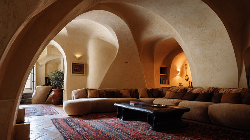
Choose one dominant line, add a supporting line that answers it, and limit accent lines to one or two objects.
Dominant line: the direction with the most visible length, which sets the mood of the room.
Supporting line: a second direction at lower volume, used to correct proportion. Vertical curtains in a low, horizontal room are the standard case.
Accent line: a single contrasting line, usually curved or diagonal, that draws the eye once.
A single dominant direction is what makes a room read as unified. Two directions of equal weight split it.
Running a line audit
- Photograph the room from the main entrance at eye level.
- Name the dominant line by the direction with the most visible length.
- Count the competing directions in that single view.
- Check the height and width effect. Does the ceiling read low, or the room narrow?
- Add or remove one accent line to correct it.
- Photograph again and check the sight line to the focal point.
Softening a straight-line room
One or two curves are enough. A round coffee table, an arched mirror or a curved-back armchair adds contrast without breaking the direction of the room.
Rule of thumb, not a measured threshold: if a single sight line holds more than 3 competing line types, remove one before adding anything.
When Lines Work Against a Room

Lines backfire when directions compete, when one type is pushed too far, or when the room’s shape already exaggerates the effect.
Competing directions: striped wallpaper, planks and paneling pulling three ways. Fix: let one set the room and calm the others with solid paint or a plain rug.
Too many line types in view: Fix: cut back to a dominant line and one accent.
Verticals in a tall, narrow room: more of them exaggerate the tunnel. In rooms with high ceilings, add a horizontal such as a picture rail or a low bench to break the height.
Horizontals in a low, wide room: wall-to-wall runs make it feel compressed. Fix: one tall bookcase or floor lamp resets the balance.
Rooms you cannot alter: in a rental, use implied lines instead. A rug edge, a row of frames and a run of matching cushions all steer the eye without touching the walls.
Princeton lab work by McMains and Kastner found that ungrouped elements in a scene compete more for neural response than grouped ones (Journal of Cognitive Neuroscience, 2010; Journal of Neuroscience, 2011).
The displays were abstract, not rooms, so read this as support for aligning lines, not as a design threshold.
Stripes and geometric prints are the usual culprit, so pick one pattern that carries the direction and keep the rest plain.
Layered styles such as Art Deco rely on repeated lines by design, so count competing directions, not the total number of lines.
Line in Interior Design FAQ
Do lines work differently in a living room, a bedroom and a kitchen?
Yes, because each room has a different job. Living rooms usually use horizontal seating lines with a few verticals for height, bedrooms lean on horizontals and curves for calm, and kitchens inherit strong cabinet lines that decide the rest.
Is line only relevant to modern and minimalist design?
No. Minimalist rooms make lines obvious, but every style has a dominant line, from the verticals of Art Deco to the curves of Art Nouveau. Ornate rooms just hide the structure under more detail.
What are the 7 elements of interior design?
The commonly cited seven are line, form, shape, color, texture, pattern and space. Some sources list six by merging shape and form, so check which set a reference uses before comparing.
Does line thickness change the effect?
Yes. A thick line carries more visual weight and commands attention, and a thin line reads as light and precise.
A chunky black window frame and a slim brass rail can both be vertical, but they set very different tones.
Can you create lines with paint or color alone?
Yes. A painted stripe, a contrasting trim color or a color-blocked wall creates a clear line without any new material. Contrast decides how strong it reads, so a dark line on a pale wall is far more visible than a tone-on-tone one.
Which Line to Change First When a Room Feels Off

Start with the competing line, the one direction that fights the dominant line of the room. Removing a line costs less than adding one, and it clears the sight line before anything new lands on it.
The order that saves money:
- Neutralize the competing line
- Add one supporting vertical or horizontal
- Place a single accent curve
The measured effects of line on perceived size are modest, so corrections belong in paint, textiles and furniture, not structural work. Once a fix needs demolition, the gain no longer justifies the cost.
The trade-off is giving up a feature you may like, such as a striped rug or a paneled wall.
If the fix is a repainted wall, calculate the paint quantity for the wall before buying.

- Shoji White vs Alabaster: Which Soft White Wins? - October 25, 2026
- Color Combinations for 32 Colors and 10 Wood Tones - October 22, 2026
- Kitchen Color Schemes by Cabinet Color: What Pairs Well - October 19, 2026


