Color Combinations
Colors That Go with Walnut Wood for a Warm, Rich Look
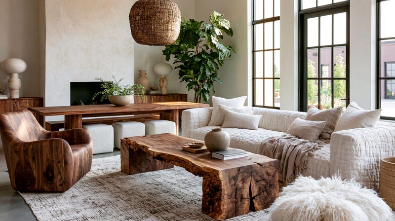
Walnut wood looks rich on its own. Pair it with the wrong color and suddenly the whole room feels off, and most people can’t explain why.
The answer is almost always undertones. Walnut carries red, purple, and gray beneath its chocolate-brown surface, which means color compatibility isn’t just about matching brown. It’s about understanding what the wood is actually doing in your space.
This guide covers the specific colors that go with walnut wood across every category: neutrals, greens, blues, warm earth tones, and complete room palettes. You’ll also learn which finishes shift the rules entirely, and which colors to avoid no matter how good they look on a paint chip.
Fixed surfaces set the starting point; our room color combinations guide covers the colors you layer on top.
What Makes Walnut Wood a Distinct Color Base?
Walnut wood is a chocolate-to-espresso brown with red, purple, and gray undertones that shift depending on the light source and finish applied. This tonal range is what makes it both versatile and tricky to pair.
Unlike oak or maple, walnut carries cool undertones beneath its warm surface. That dual nature is the reason a color pairing that looks perfect in a showroom can feel off once you get it home.
Hardwood accounts for around 60% of the global wood furniture market in 2024, with walnut consistently listed among the premium species driving high-end residential demand (IMARC Group, 2024). That’s partly grain, partly status, and partly the way walnut reads as grounded and modern at once.
How Walnut’s Undertones Shift Under Different Lighting
Warm incandescent light pulls out the red-brown tones. Walnut looks richer, almost mahogany-adjacent.
Cool LED or north-facing daylight does the opposite. It brings out the gray and purple undertones, making walnut read more like a cool, contemporary wood. This matters when choosing wall colors.
Test your paint sample under both lighting conditions before committing. A warm white that reads beautifully under natural morning light can turn yellow under evening LEDs against a dark walnut piece.
Walnut Grain Pattern and Its Effect on Color Perception
Straight-grain walnut reads calm and uniform. Colors next to it feel balanced and less busy.
Figured or crotch-grain walnut is visually active on its own. Busy wall colors compete with it. Solid, quieter tones work better alongside high-figure pieces.
The role of color in interior design is directly tied to how surrounding surfaces absorb or reflect light. Walnut’s medium-dark LRV (light reflectance value) absorbs more light than oak or maple, which means lighter wall colors don’t just complement it aesthetically but actually help balance the room’s overall brightness.
How Wood Finish Changes the Pairing Rules
| Finish Type | Visual Effect | Best Color Pairings |
|---|---|---|
| Oiled Walnut | Deepens the wood’s chocolate-brown tones while creating a soft matte finish. | Earthy neutrals, muted sage, terracotta, and other warm natural hues. |
| Lacquered Walnut | Enhances warmth, adds a subtle sheen, and highlights the wood grain. | Crisp whites, deep navy, forest green, and other high-contrast colors. |
| Gray-Stained Walnut | Significantly cools the wood’s natural tone, giving it a more contemporary appearance. | Dusty blues, slate, cool greige, and other cool-toned neutrals. |
| Raw/Unfinished Walnut | Creates a lighter, ash-toned appearance with minimal color enhancement. | Warm off-whites, linen, taupe, and other soft neutral shades. |
Always test color against the actual finished piece, not a raw wood sample. The finish changes everything.
—
What Neutral Colors Work With Walnut Wood?
Warm neutrals are the most reliable category for walnut wood pairings. They support walnut’s warmth without fighting it, and they give a room enough breathing room to let the grain do the work.
A survey of 71 top interior design experts found that 48% selected warm white as the most popular interior paint color for 2024, with 41% endorsing warm neutrals as the dominant palette overall (Fixr.com, 2024). That lines up with what works best against dark walnut.
Warm Whites and Off-Whites
Benjamin Moore White Dove OC-17 is the most consistent performer alongside walnut. It has just enough warmth to pull out the red-brown undertones without going yellow.
Sherwin-Williams Alabaster SW 7008 works similarly. Both read as clean and bright in person while staying soft enough not to create a hard contrast edge next to dark wood.
- Stark cool whites (like Pure White or Chantilly Lace) tend to make walnut look muddy by comparison
- Cream and linen tones land closer to the walnut grain’s own warmth and blend better in lower-light rooms
- Off-white trim alongside walnut floors pulls the eye downward, which can make ceilings feel lower in rooms under 9 feet
Greige and Warm Beige Tones
Greige is the bridge color between warm and neutral. The right greige pulls the gray out of walnut’s undertone range and creates a cohesive, layered look rather than a contrast-driven one.
Accessible Beige (Sherwin-Williams SW 7036) and Edgecomb Gray (Benjamin Moore HC-173) both work. They have enough warmth to stay in walnut’s temperature range without competing.
What doesn’t work: cool grays. Repose Gray and similar blue-gray neutrals clash with walnut’s warmth and create a visual disconnect that makes the wood look dull.
Charcoal and Deep Neutrals
Charcoal walls with walnut furniture create the most dramatic neutral pairing available. The high contrast sharpens the walnut grain and makes it look more intentional.
This combination works especially well in mid-century modern settings, where dark wood and graphic contrast are part of the design language. Keep textiles light (cream, natural linen) to prevent the room from feeling heavy.
—
What Green Shades Pair Well With Walnut Wood?
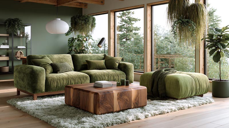
Green is the most complementary color category for walnut. Both share organic origins, and the pairing consistently produces interiors that feel grounded and intentional rather than styled.
46% of interior design experts named earthy tones as the most popular palette for 2024, with deep olive green ranking second only to warm white as the top individual color choice (Fixr.com, 2024). Walnut sits naturally inside that earthy palette.
Olive and Muted Sage Greens
Sage green: The soft, gray-leaning version (Sherwin-Williams Sage SW 2860, Benjamin Moore Pale Avocado) picks up the gray undertones in walnut and creates a tone-on-tone organic look.
Olive green: Warmer and earthier than sage. Dutch Boy’s Ironside and Benjamin Moore’s Tate Olive both perform well. They echo walnut’s brown base without copying it.
Muted moss: Sits between sage and olive. Works especially well with oiled walnut finishes, which share the same low-sheen, matte quality.
Farrow and Ball Mizzle No.266 is worth mentioning specifically. It’s a complex, slightly gray-green that handles walnut’s dual warm-cool nature better than most greens at the same saturation level.
Forest Green and Deep Hunter Green
Deep forest green against walnut is high-contrast and moody. It works well in dining rooms and home offices where the goal is richness rather than airiness.
This pairing is a regular feature in Scandinavian-influenced interiors, where dark greens and natural wood tones are used together to mimic the visual logic of Nordic forests. The result feels deliberate and calm rather than dramatic.
- Pair deep green walls with walnut floors and brass pendant lighting for a complete palette
- Use natural linen curtains to soften the contrast and prevent the room from reading as heavy
What Green Shades to Avoid
Bright or lime greens don’t work. They sit in a different temperature range from walnut and the pairing looks accidental rather than designed.
Cool mint and seafoam greens have the same problem. Their blue-leaning undertones clash with walnut’s warmth. The result is a room that feels unresolved.
—
What Blue and Teal Colors Complement Walnut Wood?
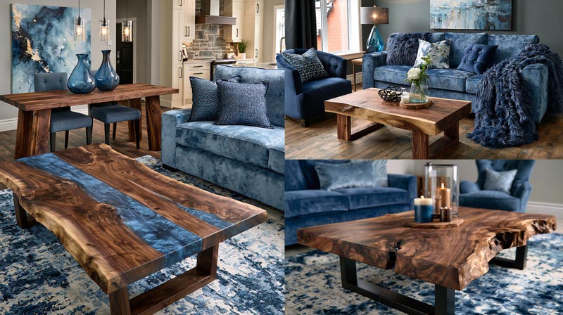
Blue is walnut’s most unexpected successful pairing. The cool temperature of blue creates a strong visual contrast with walnut’s warmth, and when the shade is right, that contrast reads as sophisticated rather than mismatched.
Navy and Deep Indigo
Navy blue is arguably the strongest single color pairing for walnut furniture.
Benjamin Moore Hale Navy HC-154 is the most cited designer recommendation for this combination. The depth of navy creates enough contrast to make walnut grain visible and sharp, particularly on dining tables and cabinetry.
- Navy walls with walnut floors: works best when ceiling height is above 9 feet
- Navy cabinetry with walnut countertops: a kitchen combination that has grown steadily since 2022
- Navy accent chairs with walnut table: the easiest entry point for this pairing without full commitment
Design studio Time & Place Interiors describes navy as functioning like a neutral in many rooms, providing depth and flexibility alongside wood tones and warm metals (Livingetc, 2025).
Dusty Blue and Teal
Dusty and slate blue create a softer version of the navy pairing. They let walnut’s warmth show more clearly because the contrast is gentler.
Farrow and Ball Inchyra Blue No.289 sits exactly in this range. It’s a blue-green that bridges the gap between cool and warm without fully committing to either. Against oiled walnut, it produces one of the more interesting pairings available.
Teal works similarly. Its green component connects back to walnut’s organic quality while the blue component provides contrast. This is a combination that appears frequently in contemporary interior design alongside natural wood finishes and raw textures.
Blue Shades That Don’t Work With Walnut
Icy or baby blue tones create a cold disconnect. The high lightness value of pale blue pushes walnut into looking darker and heavier than it is.
Cool periwinkle and violet-blue shades carry enough purple to pull out walnut’s latent purple undertones in an unflattering way. The room ends up feeling muddy.
—
What Warm Colors Go With Walnut Wood?
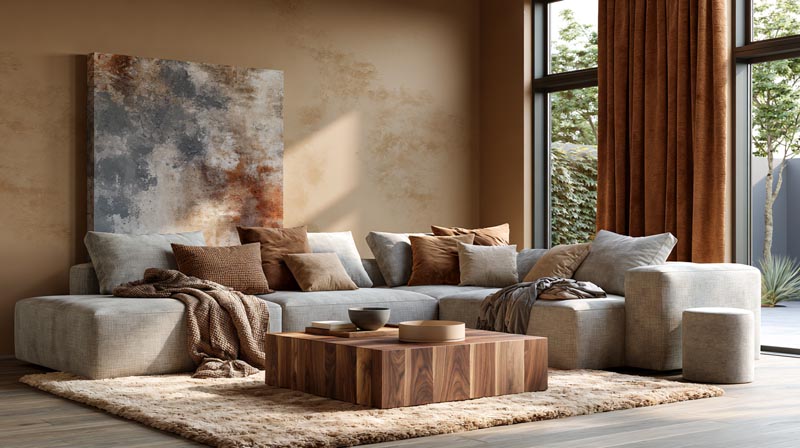
Warm colors are walnut’s analogous palette. They amplify rather than contrast, so the key is saturation control. Used at full strength on walls, warm colors can overwhelm. Used in textiles and accents, they make walnut furniture feel richer.
Earth tones are confirmed as the dominant design direction for 2025 and 2026, with designers and homeowners trading cool grays for terracotta, rust, ochre, and warm browns across residential projects globally (Spacejoy, 2025).
Terracotta and Rust
Terracotta pairs with walnut the way clay pots pair with wooden shelves. The pairing looks inevitable because both materials come from the same analogous color family.
The combination works best in Mediterranean-influenced spaces, where terracotta tiles, walnut furniture, and natural linen textiles form the core palette. West Elm, CB2, and Blu Dot all included terracotta prominently in their 2024 collections, confirming it as a mainstream rather than niche choice (Maine Home + Design, 2024).
Rust is a slightly grayer, more muted version of terracotta. It sits closer to walnut’s own brown-red range and integrates more quietly, making it a better accent color than a wall color.
Mustard Yellow and Ochre
Mustard yellow as a wall color competes with walnut’s warmth and can make a room feel heavy and saturated. As a textile color, it’s excellent.
A mustard throw, cushion, or accent chair alongside walnut furniture adds the warm contrast the room needs without overwhelming it. The same logic applies to ochre. Both tones are earthy enough to stay within walnut’s natural color range.
Avoid bright canary yellows. They pull attention away from walnut grain entirely and the pairing reads as unintentional.
Burnt Orange as Accent
Burnt orange works as an accent, not a primary color. Think ceramics, textiles, and artwork rather than walls.
The warm, muted version of orange (closer to amber than traffic-cone) echoes the red undertones in walnut without amplifying them to an uncomfortable degree. This is one of those colors that looks better in small doses than it reads on a paint chip.
—
What Colors to Avoid With Walnut Wood?
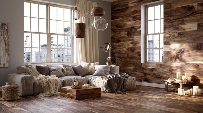
Knowing what doesn’t work saves as much time as knowing what does. Several commonly available paint colors create specific visual problems when placed next to walnut.
74% of homeowners find it challenging to choose a paint color even when working within established trends (Behr survey, cited by Two Brothers Painting, 2024). Most of the worst outcomes come from temperature mismatches, not personal taste failures.
Cool Pastels
Lavender, mint, and powder pink all carry cool undertones that directly conflict with walnut’s warmth. The contrast isn’t sharp enough to look intentional. It reads as an unresolved mismatch.
This is one of those cases where the individual colors are fine on their own but become problems in combination. Cool pastels belong with lighter, cooler wood species like ash, maple, or whitewashed oak.
Stark Black Walls
Black as a wall color is different from black as an accent. Black walls absorb too much light in rooms with walnut floors or furniture, making the wood’s grain disappear into the dark background.
Matte black hardware, fixtures, and accent frames work well with walnut. That’s a specific, high-contrast accent use. Painting an entire room black with walnut is a different equation entirely, and usually a losing one unless the space receives very strong natural light.
Cool Gray Walls
This is the most common mistake made with walnut. Repose Gray, Agreeable Gray, and similar blue-gray neutrals look contemporary on their own. Against walnut, they make the wood look dull and the room look like it can’t decide between warm and cool.
The problem is undertone conflict. Walnut’s warmth and cool gray’s blue base create visual noise. If you want a gray next to walnut, choose a warm gray with clear brown or yellow undertones rather than a blue-leaning one. Color theory is clear on this: undertone harmony matters more than hue similarity when pairing colors with wood.
Overly Saturated Warm Tones
Bright orange, fire-engine red, and highly saturated terracotta at full strength all pull walnut’s red undertones to the surface in an exaggerated way. The wood ends up looking orange rather than brown.
Muted is the operative word for warm colors near walnut. The more grayed-down or earthed the warm tone, the better it works.
—
How Do Wall Colors Interact With Walnut Wood Flooring Specifically?
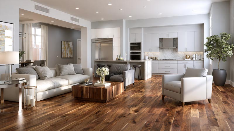
Walnut flooring behaves differently from walnut furniture when it comes to color pairing. Floor coverage is total, not partial. The color relationship between walls and floor is continuous rather than contained, which changes the visual rules.
Solid wood furniture represents over 55% of the global wood furniture market, with walnut among the top premium species in high-end residential applications (Global Growth Insights, 2024). Much of that walnut goes into flooring, where the color pairing decisions carry more weight than furniture alone.
Wall Color Proportions With Walnut Floors
Dark walnut floors already anchor the room visually. Walls need to either contrast (lighter) or create depth (also dark, intentionally).
| Wall Choice | Visual Effect | Works Best In |
|---|---|---|
| Light warm white | Lifts the room, maximizes contrast | Smaller rooms, north-facing spaces |
| Warm off-white/cream | Softer contrast, cohesive warm palette | Living rooms, open-plan areas |
| Deep forest green | High drama, immersive | Dining rooms, home offices |
| Charcoal gray | Maximum contrast, sharp grain visibility | Large rooms with strong natural light |
Pulling Undertones From Walnut Flooring Into Wall Color
The most effective approach is to identify the dominant undertone in your specific walnut floor and match it in the wall color at a much lighter or darker value.
If your walnut has visible red-brown tones, a warm terracotta accent wall or earthy beige will feel connected. If your walnut reads more gray-purple, a dusty blue or cool sage will create a more coherent palette.
This is the same principle that applies when considering wall colors for dark wood floors more broadly. The undertone match creates harmony. The value contrast creates visual interest. Both are needed simultaneously.
Trim and Baseboards Alongside Walnut Floors
White trim next to walnut floors creates a clean break. It works in almost every scenario and prevents the floor from bleeding into the wall color visually.
Off-white or linen-toned trim is a softer alternative that integrates better with warm wall colors. Avoid gray-white trim against walnut. The cool undertone in the trim will conflict with the floor’s warmth in the same way cool gray walls do.
Dark trim (charcoal or near-black) next to walnut flooring is a more advanced choice. It works in rooms with strong color contrast throughout and creates a graphic, defined look. Misjudged, it makes the room feel boxed in.
What Metal Finishes and Accent Colors Work With Walnut?
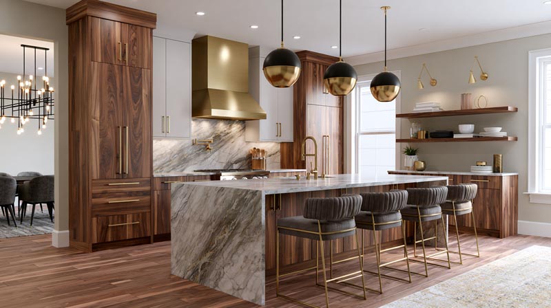
Metal finish selection is one of the most underestimated decisions in a walnut-based room. Get it right and the whole palette locks together. Get it wrong and even the best wall color feels disconnected from the wood.
Brass, satin brass, matte black, and vintage bronze are the 3 dominant hardware finishes for 2024, with brass maintaining its position for the fourth consecutive year as the top warm-metal choice for both kitchens and living spaces (Stone Harbor Hardware, 2024).
Brass and Unlacquered Brass
Brass is the most compatible metal finish with walnut. Full stop.
Both share warm undertones, and brass picks up the red-brown tones in walnut’s grain without creating a jarring contrast. Unlacquered brass develops a natural patina over 3-4 years, shifting from polished yellow to a warm matte brown that reads almost as an extension of walnut itself (Elyse Living Interiors, 2025).
- Satin brass: consistent warmth, no maintenance, works in contemporary and transitional spaces
- Aged brass: adds character, better in rooms with rustic or organic modern elements
- Polished brass: highest contrast, use in rooms where the hardware is the design statement
Matte Black as High-Contrast Accent
Matte black sharpens walnut. The high contrast between black hardware and walnut grain makes the wood’s natural pattern more visible and defined.
Light fixtures, cabinet pulls, furniture legs, and window frames in matte black all work well alongside walnut surfaces. This combination is especially strong in modern interior settings where clean lines and deliberate contrast are central to the design approach.
What doesn’t work: matte black as a dominant element in the same room as walnut. Black walls or black-dominant upholstery alongside walnut floors absorbs too much light and the room reads as heavy rather than considered.
Metals to Avoid With Walnut
Chrome and polished nickel create a cold disconnect alongside walnut’s warmth. Their blue-silver undertones sit in direct conflict with walnut’s red-brown base.
Brushed nickel is the safer cooler metal option because its muted surface reduces the conflict. But even brushed nickel works better in rooms where walnut is one element among several rather than the dominant material.
Copper and bronze are the most overlooked options. Both share walnut’s warm-red undertone range and create a cohesive, layered palette without competing. Bromleighs hardware research confirms copper has moved from niche to mainstream in high-end residential applications since 2023 (Bromleighs, 2026).
Textile Accent Colors That Complete a Walnut Palette
Walnut-based rooms benefit from textiles that anchor the organic color theme without repeating it.
- Burnt orange and rust: accent cushions and throws, not upholstery
- Natural linen: curtains and bedding, softens high-contrast rooms
- Deep navy: rugs and upholstery, creates intentional contrast
- Cream and off-white: reliable base textile color for any walnut palette
—
How Does Walnut Wood Finish Affect Color Pairing?
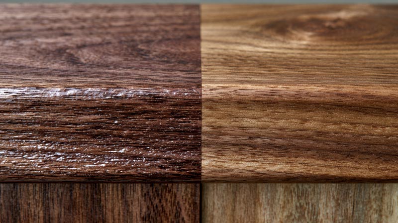
The same walnut plank with two different finishes produces two different color pairing requirements. Finish affects tone, sheen, and undertone visibility, all of which change how surrounding colors interact with the wood.
Walnut is confirmed among the top premium hardwoods driving high-end residential design in 2024 and 2026, with darker wood tones replacing lighter, gray-washed finishes that dominated from 2017 to 2022 (RTA Cabinet Store, 2026). The finish choice determines whether that dark tone reads modern or heavy.
Oiled Walnut
Oil finish deepens the chocolate tones and produces a matte, natural surface that absorbs rather than reflects light.
This version of walnut sits closest to its raw natural state. It pairs best with earthy, muted colors at low saturation: sage green, warm off-white, terracotta, and natural linen. High-gloss or brightly saturated colors feel like they belong to a different room entirely when placed next to an oiled walnut surface.
Lacquered Walnut
Lacquer adds a surface sheen that lifts the color temperature and increases contrast visibility. The grain becomes sharper and the overall tone reads warmer and slightly more formal.
Lacquered walnut pairs with:
- Crisp warm whites (White Dove, Chantilly Lace)
- Deep navy and forest green
- Charcoal with light linen textiles
The added sheen means lacquered walnut reflects nearby color more actively than oiled walnut. Test paint samples against the specific lacquered piece before committing, not just against a raw wood swatch.
Gray-Stained and Light-Stained Walnut
Gray staining is where walnut’s pairing rules shift most dramatically. A gray-stained walnut reads almost like a different species, and most warm-color recommendations no longer apply.
| Stain Type | Resulting Tone | Compatible Colors |
|---|---|---|
| Gray-stained | Cool ash-gray | Dusty blue, slate, cool greige, white |
| Light/blonde stain | Honey-tan | Warm white, sage, soft terracotta |
| Ebonized walnut | Near-black | White, cream, muted green, brass accents only |
Identify the stain type before selecting wall colors. A gray-stained walnut floor treated with warm terracotta walls produces the same undertone conflict as cool gray walls against natural walnut.
—
What Are the Best Full Room Color Palettes Built Around Walnut Wood?
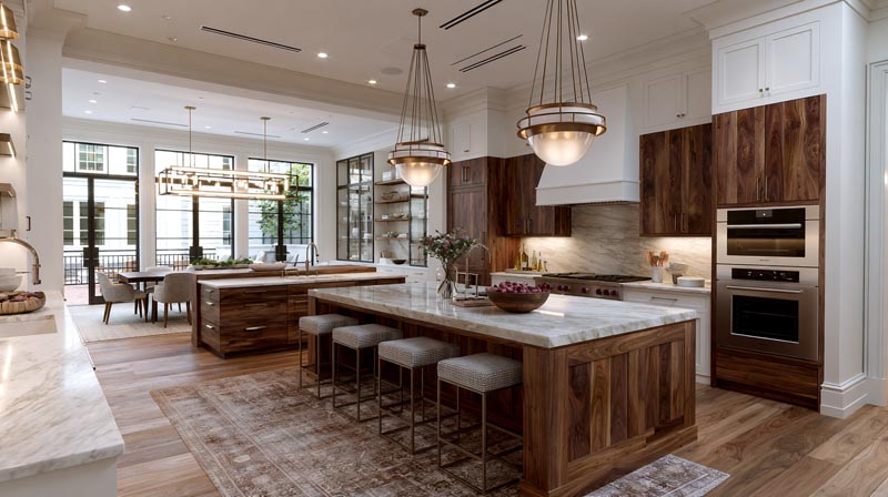
Individual color recommendations are useful. Complete palettes are more useful. A room works when all the elements, walls, textiles, metals, and fixed finishes, share a coherent color logic rather than a collection of individually correct choices.
American homeowners spent a median of $24,000 on home renovations in 2023, up 60% from 2020, with kitchens leading as the most renovated room (Houzz, 2024). Color and material decisions account for a significant share of those choices, which makes getting the full palette right from the start more valuable than iterating after the fact.
Warm and Organic Palette
This is the most versatile walnut palette. It works across Scandinavian-influenced spaces, organic modern rooms, and casual contemporary interiors.
Core combination: walnut + warm white walls + brass hardware + forest green accents
- Walls: Benjamin Moore White Dove OC-17 or Sherwin-Williams Alabaster SW 7008
- Hardware: satin or aged brass throughout
- Accent color: forest green in textiles and plants
- Textiles: natural linen curtains, cream upholstery
IKEA’s STOCKHOLM and VEJMON series are built around exactly this palette logic, pairing walnut-veneer surfaces with warm neutral surroundings and brass accent details.
High-Contrast Dark Palette
Walnut + navy + matte black + cream. This combination produces the most dramatic result of any walnut palette and works especially well in dining rooms and home offices.
Navy walls create the contrast that makes walnut grain appear sharp and defined. Matte black fixtures and hardware add structure. Cream or natural linen textiles prevent the room from reading as oppressively dark.
Fixr.com’s 2024 survey found that 29% of design experts selected shades of blue as the most popular color palette, second only to green. Navy specifically sits at the top of that blue category for pairing with dark wood (Fixr.com, 2024).
Earth Tone Palette
Walnut + terracotta + sage + natural linen. This is the palette most associated with Mediterranean-influenced and biophilic design approaches.
The three colors (terracotta, sage, linen) all share walnut’s earthy, low-saturation quality. Nothing competes. The room feels grounded and cohesive rather than styled. This palette works especially well in rustic and Mediterranean interior settings where natural materials are the primary design language.
Apply this palette with terracotta as an accent wall color rather than a dominant wall color. Full-room terracotta next to walnut can tip from warm to heavy quickly.
Contemporary Neutral Palette
Walnut + charcoal + dusty blue + copper. This is the most urban of the four palettes, built for contemporary apartments and high-contrast modern interiors.
| Element | Color/Finish | Purpose |
|---|---|---|
| Walls | Charcoal (warm-gray based) | High contrast, grain definition |
| Accent wall | Dusty slate blue | Breaks charcoal monotony |
| Hardware/fixtures | Copper or bronze | Warm metal bridges wood and wall |
| Textiles | Cream and deep navy | Softens and completes the palette |
This palette requires the most deliberate execution. The charcoal and dusty blue need to be warm-leaning versions of both colors or the room turns cold. Copper hardware is what holds the warmth in place against the darker wall tones.
Understanding how color in interior design functions as a system rather than a set of individual choices makes the difference between a palette that feels resolved and one that feels assembled. Walnut is a strong anchor material. Every color decision around it should support that anchor rather than compete with it.
FAQ on Colors That Go With Walnut Wood
What wall color goes best with walnut wood?
Warm white is the most reliable choice. Benjamin Moore White Dove OC-17 and Sherwin-Williams Alabaster SW 7008 both complement walnut’s red-brown undertones without pulling yellow. Avoid cool whites, which make walnut look muddy.
Does gray go with walnut wood?
Warm gray works. Cool gray does not. Blue-leaning grays like Repose Gray conflict with walnut’s warmth and create visual noise. Choose a gray with clear brown or yellow undertones instead.
What colors go with walnut wood floors?
Light warm whites and off-whites lift the room and contrast cleanly against dark walnut flooring. Forest green and navy also work well for a moodier result. Avoid cool pastels and blue-gray neutrals entirely.
Is green a good color with walnut wood?
Yes. Sage green, olive, and forest green all pair naturally with walnut. Farrow and Ball Mizzle No.266 and Sherwin-Williams Sage SW 2860 are consistent designer picks. Avoid bright or lime greens entirely.
Does navy blue go with walnut furniture?
Navy is one of walnut’s strongest pairings. The cool depth of navy contrasts with walnut’s warm grain and makes the wood pattern sharper and more defined. Benjamin Moore Hale Navy HC-154 is the most-cited match.
What accent colors work with walnut wood?
Burnt orange, rust, mustard yellow, and deep navy all work as accent colors in textiles and accessories. Brass and copper hardware are the best metal accents. Keep warm accent tones muted rather than saturated.
What colors should you avoid with walnut wood?
Cool pastels, lavender, mint, and powder pink all conflict with walnut’s warmth. Cool gray walls are the most common mistake. Overly saturated warm tones like bright orange can make walnut read orange rather than brown.
Does terracotta go with walnut wood?
Yes, particularly as an accent wall or in textiles. Terracotta shares walnut’s earthy, red-brown undertone range. Use muted versions of the color rather than full-strength terracotta, which can overwhelm the wood’s natural warmth.
What metal finish goes best with walnut wood?
Brass is the most compatible metal finish with walnut. Satin brass, aged brass, and unlacquered brass all share walnut’s warm undertones. Matte black works well as a high-contrast accent hardware finish alongside walnut surfaces.
Does walnut wood go with white walls?
Warm white walls work well. Stark cool whites create too much contrast and flatten walnut’s grain. Off-white and cream tones integrate more softly. Always test the white under both natural light and artificial light before committing.
Conclusion
This conclusion is for an article presenting colors that go with walnut wood, and the core takeaway is simple: undertone harmony drives every successful pairing.
Warm whites, sage green, navy blue, and earthy tones like terracotta all work because they respect walnut’s dual warm-cool nature rather than fight it.
Finish matters as much as color. Oiled walnut, lacquered walnut, and gray-stained walnut each require a different approach to wall color, metal accents, and textiles.
Get the full palette right, from wall color through hardware finish to textile accent, and walnut becomes one of the most versatile wood tones in residential design.
Start with your finish. Build outward from there.

- Kitchen Color Schemes by Cabinet Color: What Pairs Well - October 19, 2026
- Curtain Colors for Every Wall Color: Safe vs Bold Picks - October 18, 2026
- Interior Design Styles: Find Your Primary and Secondary - October 14, 2026