Color Combinations
Paint Colors That Go with White Trim
White trim looks clean and simple until you pick the wrong wall color and the whole room feels off.
The problem is almost never the wall color itself. It’s the undertone mismatch between the wall and the trim, and most paint guides skip over that entirely.
This guide covers every major wall color family that works with white trim, from warm neutrals and greige tones to deep navy blues, sage greens, and near-black darks. You’ll find specific Benjamin Moore and Sherwin-Williams pairings, finish recommendations, room-by-room breakdowns, and a practical method for testing paint colors that go with white trim before committing to a full room.
Wood, floors and other fixed surfaces are one part of our color pairing chart, which also covers walls, textiles and rooms.
What Makes a Paint Color Work With White Trim?
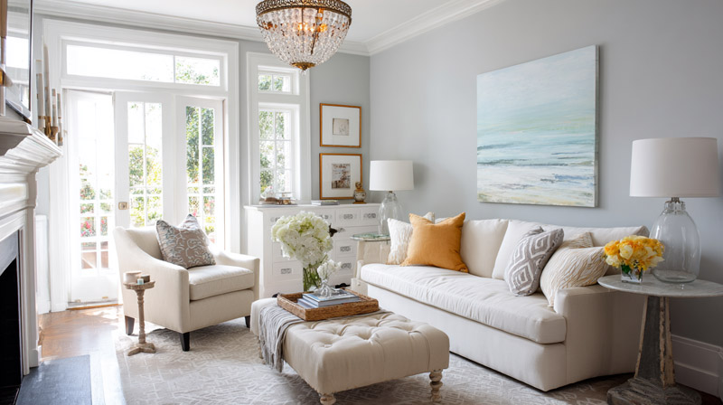
White trim acts as a fixed neutral anchor in any room. It reflects back the undertones of your wall color, making the relationship between the two more visible than you’d expect from paint swatches alone.
The single biggest factor is undertone matching. Warm white trim (one with yellow, red, or orange undertones) will clash against a cool wall color. Cool white trim (blue, green, or violet undertones) will look off next to warm terracotta or golden greige. Match the temperature, and the pairing holds together.
Sherwin-Williams color experts confirm that the best strategy is to align the undertone of your trim with the wall color family. Warm walls need warm trim whites. Cool walls need cool trim whites.
How Paint Undertones Affect White Trim Pairings
Most people pick a wall color and forget that white trim isn’t a neutral. It has a color too.
Benjamin Moore’s color guidance breaks white trim into 2 clear categories:
- Warm whites: red, orange, and yellow undertones (White Dove OC-17, Alabaster SW 7008, Greek Villa SW 7551)
- Cool whites: blue, green, and violet undertones (Chantilly Lace OC-65, Extra White SW 7006, Decorator’s White OC-149)
Put a cool white trim like Chantilly Lace next to a warm beige wall and the trim will read slightly purple. Reversed, a warm white trim against a cool gray wall will look yellow. Neither effect is subtle once you’re living in the room.
What Light Reflectance Value Means for Trim and Wall Contrast
LRV (Light Reflectance Value) measures how much light a color bounces back, on a scale from 0 (black) to 100 (pure white). Most white trim sits between LRV 85 and LRV 92.
Key difference: The gap between your wall color’s LRV and your trim’s LRV determines how much definition the trim creates.
- Large LRV gap (30+ points): high contrast, trim reads as a strong frame
- Medium gap (15-30 points): soft contrast, trim visible but not dominant
- Small gap (under 15 points): low contrast, trim blends into the wall
Chantilly Lace OC-65, Benjamin Moore’s brightest white at LRV 90, creates sharp definition against mid-tone walls. Use it when you want architectural trim to register clearly.
Paint Finish and How It Changes Color Perception
Semi-gloss is the standard finish for white trim. It creates a subtle sheen that visually separates the trim from matte or eggshell walls, adding definition without requiring a different color.
When the same white paint is used in semi-gloss on trim and eggshell on walls, they read as 2 different colors because sheen changes how light reflects. This is useful when you want contrast without painting a different wall color. Understanding color in interior design means knowing that finish is part of the color decision, not an afterthought.
High-gloss trim in older homes with ornate millwork or crown molding pushes the architectural detail forward. It catches light differently at each angle, giving trim presence in the room even when the wall and trim colors are close in value.
The Warm vs. Cool White Trim Decision Table
| Trim Paint Color | Undertone | Best Wall Color Pairings | Pairings to Avoid |
|---|---|---|---|
| White Dove OC-17 | Warm white with soft yellow-gray undertones | Warm beige, greige, sage green, and soft taupe | Cool gray, icy blue, and blue-violet tones |
| Chantilly Lace OC-65 | Neutral to cool white | Navy, cool gray, soft blue, and crisp neutrals | Warm terracotta, golden beige, and yellow-toned walls |
| Alabaster SW 7008 | Warm white with subtle creamy undertones | Warm neutrals, olive green, rust, and earthy shades | Bright cool blues, icy grays, and stark pure white walls |
| Extra White SW 7006 | Cool white with slight blue undertones | Cool blue-gray, charcoal, navy, and modern monochromatic palettes | Warm greige, golden beige, and other strongly warm-toned colors |
—
Which Neutral Colors Go With White Trim?
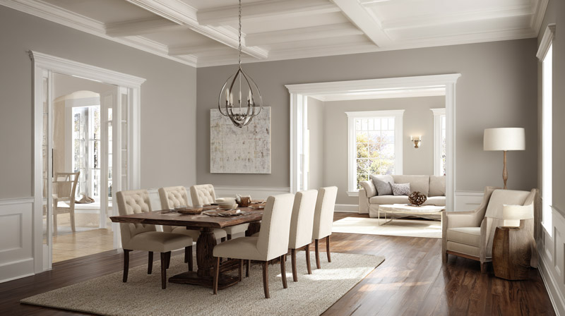
Greige, warm gray, soft beige, and off-white wall colors paired with white trim produce the most widely used interior color schemes in residential design. The combination works because the low-saturation wall color lets the white trim define the space without competing with it.
Fixr.com’s 2024 Paint and Color Trends Report (surveying 71 design experts) found that 41% of professionals consider warm neutrals the most popular interior color palette, with warm white selected as the top individual color by 48% of respondents.
Warm Neutrals vs. Cool Neutrals With White Trim
The choice between warm and cool neutrals comes down to the trim white you already have and the light in the room.
Warm neutrals (greige, beige, cream):
- Agreeable Gray SW 7029: greige with faint violet undertone, works with warm and neutral white trims
- Accessible Beige SW 7036: warm beige, pairs best with warm-white trims like White Dove or Alabaster
- Sherwin-Williams recommends these for south- and west-facing rooms where warm light amplifies the undertone
Cool neutrals (gray, blue-gray):
- Repose Gray SW 7015: slight taupe-green undertone, pairs cleanly with Extra White SW 7006 or Chantilly Lace OC-65
- Cool-gray walls with warm white trim create undertone conflict, reading as dirty or purple-tinged in low light
Sherwin-Williams new construction data shows transitional grays remain the top request among homeowners who want something between beige and gray, with Repose Gray and Worldly Gray SW 7043 holding steady as the most specified neutrals.
Off-White Walls With White Trim: How to Avoid a Washed-Out Look
Off-white walls against white trim is the trickiest neutral pairing. Too close in LRV value and the trim disappears.
Rule: The wall LRV must sit at least 15 points below the trim LRV for visible definition. A wall color like Benjamin Moore Swiss Coffee OC-45 (LRV ~84) against Chantilly Lace trim (LRV 90) gives a 6-point gap. That is not enough for the trim to register as intentional.
The fix is picking a wall color with LRV around 70-78 rather than 82-86. This keeps the look soft and tonal while giving the trim enough contrast to frame windows, doors, and baseboards clearly.
—
Which Blue and Green Paint Colors Go With White Trim?
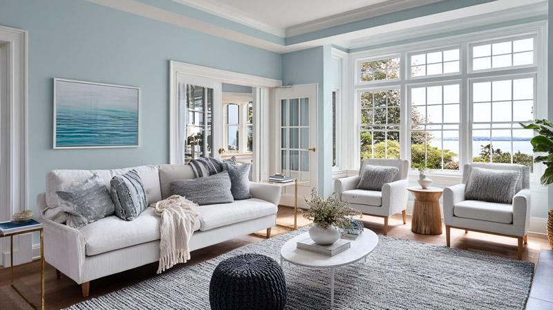
Blues and greens are the 2 most designer-recommended wall color families for white trim pairings. Both create clear contrast against white trim without the commitment of a dark or saturated wall, making them suitable for full-room applications in living rooms, bedrooms, and kitchens.
Blue dominated the 2024 Color of the Year announcements across major paint brands. Sherwin-Williams selected Upward, a pale coastal blue. Benjamin Moore chose Blue Nova (BM 825), a blue-violet. Sue Wadden, Director of Color Marketing at Sherwin-Williams, stated that the coastal chic trend is set to replace farmhouse as the dominant residential style, and blue is the primary color supporting that shift.
Navy Blue With White Trim
Navy is the strongest high-contrast pairing available with white trim. The LRV gap between navy walls and white trim is typically 60-70 points, making the trim sharp and intentional.
Top navy options: Hale Navy HC-154 (Benjamin Moore), Naval SW 6244 (Sherwin-Williams), Drawing Room Blue (Farrow and Ball).
Hale Navy is the most-specified navy for traditional and transitional interiors because its undertone is neutral enough to work with both warm and cool white trims. Naval leans slightly purple in low light, which is why it pairs better with crisp cool white trims like Chantilly Lace than with warm creams.
These pairings are a natural fit for coastal interior design and traditional interior design styles, both of which rely on clear wall-to-trim contrast as a defining detail.
Sage and Olive Green With White Trim
Sage green became the dominant green tone from 2021 onward and shows no sign of slowing. It pairs with warm white trims because its gray-green base is in the same temperature family as off-white.
Specific pairings:
- Rainwashed SW 6211 (Sherwin-Williams) plus White Dove OC-17 trim: low-saturation coastal green with a soft warm frame
- Evergreens SW (Sherwin-Williams) plus Alabaster SW 7008 trim: deeper sage with a cream-toned anchor
- Farrow and Ball Mizzle (No.266) plus All White (No.2005) trim: desaturated olive-green for a warmer, more heritage look
Deep olive and forest green shades need a brighter white trim rather than a cream to avoid making the room feel dark. Jones Paint and Glass color specialists confirm that deep forest green on walls requires enough LRV contrast in the trim to prevent the room from reading as too heavy.
—
Which Warm Colors Go With White Trim?
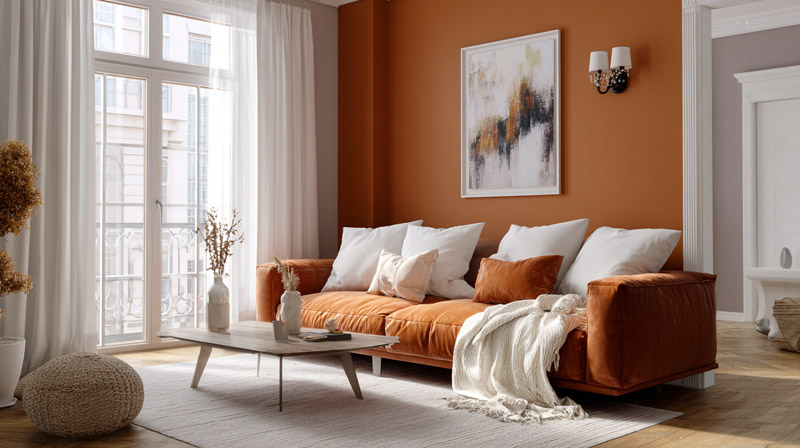
Terracotta, blush, mustard, rust, and warm clay tones all work with white trim when the trim’s undertone is matched correctly. The most common mistake here is pairing warm wall colors with a bright cool white trim, which creates an undertone clash that makes both the wall and the trim look wrong.
Fixr.com’s 2024 data shows earthy tones were selected by 46% of design experts as the most popular interior color palette, just behind warm neutrals. Terracotta, burnt orange, and warm clay are at the center of that trend.
Terracotta and Clay Walls With White Trim
Terracotta walls need warm white trim. Full stop.
Pairing terracotta with a cool bright white like Extra White SW 7006 makes the wall color read as orange rather than earthy. The cool undertone in the trim turns warm wall colors toward their most saturated, most chromatic version, which is rarely what the room needs.
Best trim whites for warm walls:
- White Dove OC-17: warm yellow-gray undertone, softens the contrast
- Alabaster SW 7008: creamy, sits in the same warm family as terra cotta
- Greek Villa SW 7551: the warmest of the widely used trim whites, works with deep rust and burnt orange
Blush and Dusty Rose With White Trim
Blush walls against bright white trim is one of the few warm-color pairings where cooler, brighter trim actually works. The contrast makes blush look intentional rather than beige-adjacent.
Benjamin Moore Fruit Shake and Sherwin-Williams Demure both read as statement colors rather than neutrals when framed by a high-LRV trim like Chantilly Lace OC-65. The key is that blush has enough saturation to hold its own against bright white without being washed out by the contrast.
Blush is a strong choice for Bohemian interior design and sits well within softer farmhouse interior design palettes when kept in the dusty, desaturated range.
Mustard and Ochre With White Trim
High-saturation mustard walls almost never work with pure bright white trim. The combination is too loud.
Muted mustard or ochre (think a 40-50% desaturated version of yellow) paired with an antique white or warm cream trim is a different story. The reduced saturation in the wall lets the warm trim white hold its ground without the combination feeling like it’s competing.
Practical pair: Sherwin-Williams Antique White SW 6119 on trim with a muted ochre like Behr’s Pale Honey or Benjamin Moore’s Golden Straw HC-16.
—
Which Dark and Moody Colors Go With White Trim?
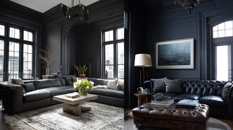
Dark wall colors create the highest possible contrast with white trim, turning standard architectural millwork into a defining design feature. The LRV gap between near-black walls and white trim often exceeds 80 points, making every baseboard, door casing, and crown molding visible as a deliberate design element.
According to Sherwin-Williams, white trim against dark walls makes the wall color “pop” more dramatically than against any other trim color. Pulte Interiors 2024 design trend data confirms that bold blacks and deep moody colors saw significant uptick in residential specification, with deep greens and navy blues listed as the dominant saturated wall choices in new construction.
Charcoal and Near-Black Walls
Near-black walls are the most dramatic white trim pairing available. They work best in rooms with strong natural light or deliberately designed artificial light because without it, the room reads as oppressive.
Top near-black options with white trim:
- Tricorn Black SW 6258: true neutral black, the most widely used dark wall color in current new construction according to HGTV Magazine
- Wrought Iron HC-114 (Benjamin Moore): warm dark with slight green-gray undertone, pairs with warm white trims like White Dove
- Black Fox SW 6008: dark brown-black that works especially well in offices and libraries with warm wood details
Tricorn Black on walls against crisp white semi-gloss trim is a high-contrast pairing used frequently in contemporary interior design, and also appears in updated transitional interior design where bold wall color contrasts with traditional white millwork.
Deep Plum and Burgundy With White Trim
Deep plum and eggplant are the trickiest dark wall colors to pair with white trim because their purple-red undertone can clash with any white that pulls slightly pink or orange.
Trim choice matters more here than with any other dark color. Decorator’s White OC-149 (cool gray-white) or Chantilly Lace OC-65 (neutral-cool) give the cleanest result. Warm creams like Alabaster or Greek Villa will fight the purple in the wall and look muddy at the transition line.
One practical ceiling note: when walls go dark and trim stays white, the ceiling color becomes more visible than usual. A ceiling in the same white as the trim keeps the room from feeling chopped up.
Room Conditions Where Dark Walls Stop Working
Dark walls with white trim are not universally viable. 3 conditions reduce their effectiveness:
- Rooms under 120 square feet with one or no windows: the contrast ratio amplifies the cave effect
- North-facing rooms with no direct light: cool light plus dark walls turns the space flat and lifeless
- Rooms with low (below 8-foot) ceilings: the contrast at the ceiling-wall line shrinks the perceived height
—
Which Paint Colors Go With White Trim in a Living Room?
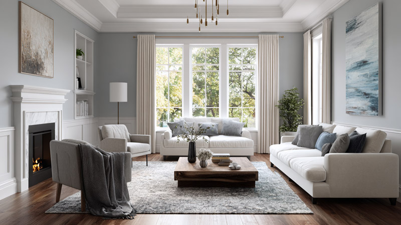
Mid-tone blues, warm greige, and soft greens are the 3 most broadly successful wall color families for living rooms with white trim. Living rooms combine the highest variation in light conditions of any room in the house, multiple furniture undertones, and the need to feel welcoming across different times of day.
Fixr.com’s expert survey confirms that 81% of design professionals recommend warm neutrals when preparing a home for sale, with the living room as the primary focus. For lived-in rooms, mid-tone blues and greens are the most commonly specified by designers in new construction projects according to Sherwin-Williams sales trend data.
Open Floor Plan Color Strategy With White Trim
Open floor plans change the wall-to-trim calculation because the trim is the only constant across multiple spaces. The wall color changes; the trim does not.
Sherwin-Williams recommends keeping trim style and color consistent throughout open-plan spaces to maintain cohesion when wall colors shift between zones. This makes the white trim color selection even more important as it has to work with 2-3 different wall colors across the same sightline.
Most functional approach for open plans:
- Choose a single trim white first (before any wall color)
- Select wall colors that all share the same temperature as the trim undertone
- Keep LRV differences between adjacent rooms within 15-20 points to avoid jarring transitions
Exploring open floor plan ideas alongside your trim and wall color decisions is worth doing before committing to a palette. The layout directly affects which colors work across zones.
Living Room Color Pairings by Furniture Undertone
| Furniture Undertone | Best Wall Colors with White Trim | Recommended Trim White |
|---|---|---|
| Warm Wood, Leather, or Brass | Warm greige, soft sage, muted mustard, or warm beige | White Dove OC-17 or Alabaster SW 7008 |
| Gray Upholstery, Chrome, or Cool Stone | Cool gray, navy, slate blue, or crisp white | Chantilly Lace OC-65 or Extra White SW 7006 |
| Mixed Warm and Cool Finishes | Greige, soft green, or balanced neutral tones that unify both undertones | Pure White SW 7005 |
Agreeable Gray SW 7029 is the default safe choice for living rooms with mixed furniture undertones. Its balanced greige base and faint violet undertone keep it from committing too hard to either warm or cool, which makes it readable against a wide range of trim whites.
—
Which Paint Colors Go With White Trim in a Bedroom?
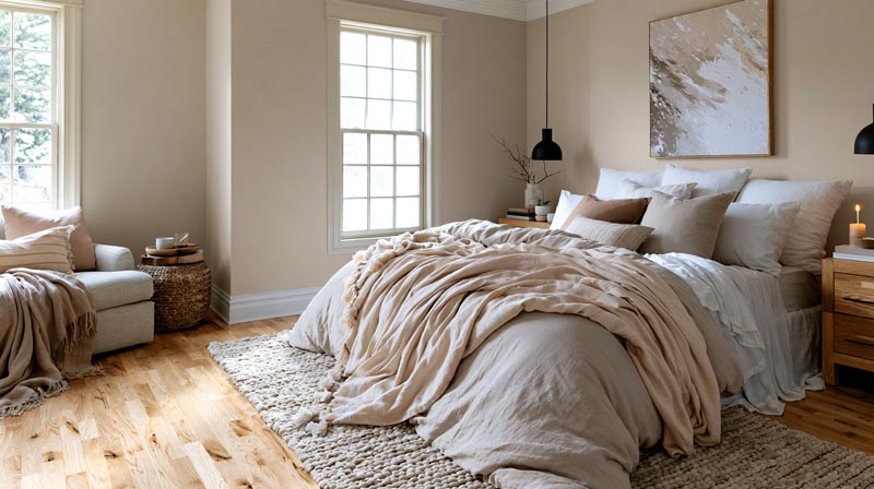
Soft blues, muted greens, warm lavender, and blush are the 4 most effective wall color families for bedrooms with white trim. Bedrooms prioritize lower visual stimulation, which shifts the selection criteria away from contrast and toward color temperature and LRV value.
Cedreo’s 2025 Interior Design Trend Report notes that dark moody hues in bedrooms, particularly inky navy blues and forest greens, continued to rise in popularity. When used behind the bed as an accent wall with white trim on the remaining 3 walls, they create a focal point without making the full room feel dark.
Low-LRV Blues and Greens for Calm Bedroom Environments
The bedroom is where paint choice has the most direct effect on how a room feels rather than looks. Low-stimulation colors with LRV values in the 50-70 range sit far enough below white trim to create definition without the high-contrast tension of a dark wall.
Designer-specified bedroom colors with white trim:
- Rainwashed SW 6211: soft blue-green, LRV 63, pairs with White Dove trim in bathrooms and bedrooms
- Sea Salt SW 6204: gray-blue-green chameleon shade, works in both natural and artificial light
- Pale Oak OC-20 (Benjamin Moore): warm off-white with pink undertone, produces a tone-on-tone effect with warm white trim
The Accent Wall Behind the Bed Strategy
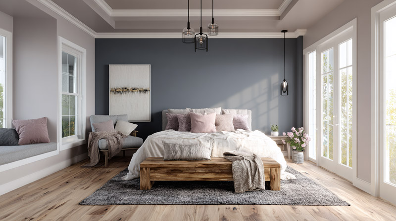
Dark paint on the wall behind the bed with white trim on all other walls is the most practical way to introduce a moody color into a bedroom without losing the room’s sense of openness.
What makes this work: The white trim on the 3 non-accent walls reflects light and keeps the room bright. The dark accent wall creates a visual anchor behind the bed that defines the sleeping area. The contrast between white trim and dark paint is concentrated to one wall, so the ratio of bright to dark stays comfortable.
Hale Navy HC-154 and Wrought Iron HC-114 are the 2 most used colors for this application. Both have enough depth to read as intentional rather than a leftover decision, and both hold their color well in the mixed-light conditions of a typical bedroom. This is a key element of emphasis in interior design, where one surface draws the eye and defines the room’s focal point.
Undertone Conflicts to Avoid in Bedrooms
Bedroom lighting is almost exclusively artificial after dark. Artificial light, especially warm LED and incandescent sources, amplifies warm undertones and suppresses cool ones. This shifts which color pairings work in the evening compared to daytime.
Avoid: Cool gray walls with warm white trim in bedrooms used primarily in the evening. The warm artificial light turns the trim yellow and simultaneously makes the cool gray wall look lavender. The result is a room that looks fine at noon and strange at night.
The fix is to either match temperature across wall and trim, or to choose a transitional gray with neutral undertones (Repose Gray SW 7015) that reads similarly under both light sources. Understanding how light in interior design interacts with color temperature is what separates good paint decisions from ones you regret six months after moving in.
Which Paint Colors Go With White Trim in a Kitchen?
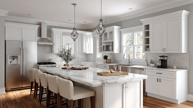
Kitchens with white trim and white cabinets put all of the visual weight on the wall color, because the wall becomes the only surface that introduces contrast into the room.
According to Cabinet Door Store’s analysis of Houzz 2023 data, white remains the most popular kitchen cabinet color despite a notable shift toward warmer, softer whites over stark bright ones. That shift matters for trim decisions: the move from pure bright white cabinets toward cream-toned whites like Benjamin Moore Simply White or White Dove changes which wall colors work against them.
Deep Greens and Navy on Kitchen Walls With White Trim
Forest green and navy on kitchen walls create the highest-contrast kitchen pairing with white cabinets and white trim. Both colors direct attention to the cabinetry and millwork without requiring decorative hardware to carry the room.
Best wall-to-trim pairings for kitchens:
- Benjamin Moore Salamander (deep forest green) against Simply White OC-117 cabinets and white trim
- Sherwin-Williams Naval SW 6244 walls with Extra White SW 7006 trim and white shaker cabinets
- Farrow and Ball Hague Blue against All White trim for a British kitchen aesthetic
Jennifer Walter of Folding Chair Design notes that English-kitchen-style deep blues, yellows, and even cranberry palettes are gaining traction as homeowners move away from the all-white kitchen look entirely.
How Hardware Undertone Shifts the Trim Choice
Stainless steel and brass hardware pull the room’s temperature in opposite directions. This affects which white trim reads cleanest.
Brass hardware: warms the room, use a warm white trim like White Dove or Alabaster to keep the palette cohesive.
Stainless steel hardware: reads as cool, pairs better with crisp neutral-cool trims like Chantilly Lace OC-65 or Decorator’s White OC-149.
Matte black hardware: works with any white trim because black is neutral. The wall color matters more than the trim choice when black hardware is in the room.
Kitchen Wall Color When White Cabinets Are Already White Trim
When both the cabinets and the trim are white, the LRV gap between wall and surface must be at least 25-30 points or the wall disappears entirely. This limits how light a wall color can go.
A wall LRV of 60-72 is the practical range. That covers mid-tone sage greens, soft dusty blues, warm terracottas, and greige tones with visible depth. Going lighter than LRV 72 in a kitchen already saturated with white surfaces produces a room that reads as all-white with a vague color undertone, not a deliberate color scheme. A useful reference point for how color interacts with all-white kitchen environments is covered in detail in guides to kitchen color ideas with white cabinets.
—
How Does Natural Light Affect Paint Colors With White Trim?
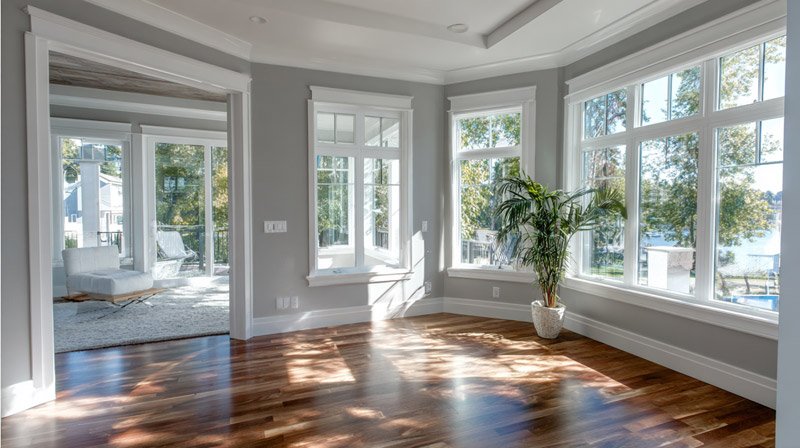
Light direction changes the undertone of both wall and trim colors, sometimes shifting a warm paint into a cool one or turning a neutral gray faintly purple. The same wall-and-trim pairing that looks intentional in one room can look muddy or mismatched in another, purely because of window orientation.
Paintzen’s interior paint guide notes that north-facing rooms receive cool, indirect light that enhances gray, blue, green, and lavender undertones, making stark white trim look cold and clinical rather than crisp. South-facing rooms get warm, direct sunlight that amplifies warm undertones in both wall and trim colors.
North-Facing Rooms: What Changes
Cool, bluish indirect light is consistent in north-facing rooms throughout the day. It suppresses warm undertones and amplifies cool ones.
Impact on white trim: cool white trims like Extra White SW 7006 read as slightly gray or icy. Warm white trims like Greek Villa SW 7551 or White Dove OC-17 hold their warmth better under north light.
Impact on wall colors: a gray wall shifts toward lavender-blue. A green wall shifts toward cool olive or teal. Warm greige reads as flat and beige-gray.
Benjamin Moore color expert Helen Shaw recommends whites with yellow or red undertones specifically for north-facing rooms, because those undertones counteract the cool cast of northern light rather than reinforcing it. Understanding this is part of how color theory in interior design applies to real room conditions.
South, East, and West: A Quick Reference
| Room Direction | Natural Light | Recommended Trim White | How Wall Colors Typically Appear |
|---|---|---|---|
| North-Facing | Cool, indirect, and consistent | Warm white (e.g., White Dove, Greek Villa) | Cool colors appear cooler, while warm colors can look more muted. |
| South-Facing | Warm, bright, and consistent | Cool or neutral white (e.g., Chantilly Lace) | Warm colors become richer and more saturated, while cool colors appear balanced. |
| East-Facing | Warm morning light, cooler afternoon light | Neutral white (e.g., Pure White SW 7005) | Colors shift noticeably throughout the day, appearing warmer in the morning and cooler later. |
| West-Facing | Cool morning light, warm evening light | Neutral white or cool white | Yellow and warm undertones become more pronounced in the afternoon and evening. |
The Practical Testing Window
Testing paint samples only at one time of day is the most common mistake homeowners make when choosing wall colors with white trim.
Three Bears Home Staging advises viewing paint samples at morning, midday, and evening to capture how the color shifts across the room’s full light range. A color like Sherwin-Williams Sea Salt SW 6204 can look minty blue in morning east light, gray-green by noon, and flat gray under evening artificial light, all in the same room.
Move sample boards adjacent to the actual white trim to check the undertone relationship in each light condition. A pairing that looks correct at noon may show an undertone clash at 7pm under warm LED bulbs.
—
What Paint Finishes Work Best on White Trim Alongside Wall Colors?
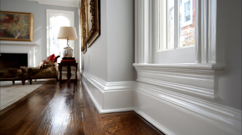
Finish selection determines how much the trim registers visually. The color and the finish work together. Getting the color right but using the wrong finish produces trim that either disappears into the wall or looks streaky and overwrought.
Clare Paint’s designer guidance and Benjamin Moore’s finish specifications both confirm the same standard: semi-gloss on trim, eggshell on walls is the most widely used pairing in residential interiors because the sheen difference creates definition even when the color gap between wall and trim is small.
Why Semi-Gloss Is the Default for White Trim
Semi-gloss is more durable, easier to clean, and creates visual separation from matte or eggshell walls through its reflective surface. It works for baseboards, door casings, crown molding, and window frames.
Culver’s Painting confirms: semi-gloss on trim resists scuffs and marks from high-traffic contact that flat and eggshell finishes cannot withstand.
One useful side effect: the same white paint looks slightly brighter and whiter in semi-gloss than eggshell because higher sheen increases light reflection. White Dove OC-17 on walls in eggshell and on trim in semi-gloss reads as two different whites, producing natural contrast without needing two different colors.
When to Use High-Gloss on Trim
High-gloss trim amplifies architectural detail. Every curve of a crown molding profile and every edge of a panel door catches light at a different angle.
Benjamin Moore’s Advance Interior High Gloss cures to a furniture-grade surface that makes traditional millwork in older homes register as intentional rather than dated. The tradeoff is unforgiving surface preparation requirements: any sanding marks, patches, or imperfections are visible under high gloss.
High-gloss trim is a strong fit for traditional interior design and luxury interior design contexts where the trim itself is a design feature rather than just a border between wall and floor.
Matching Wall and Trim Sheen: When It Works
Painting walls and trim in the same sheen flattens the contrast between them. This is occasionally intentional, not a mistake.
Where matching sheens work:
- Minimalist interiors where the goal is surface continuity over definition
- Rooms with ornate trim where a matte-on-matte finish softens the detail rather than spotlighting it
Where it fails: older homes with worn or imperfectly installed trim, where same-sheen painting highlights every gap and uneven edge instead of hiding them under a reflective surface that draws the eye upward.
—
How Do You Test Paint Colors Against White Trim Before Committing?
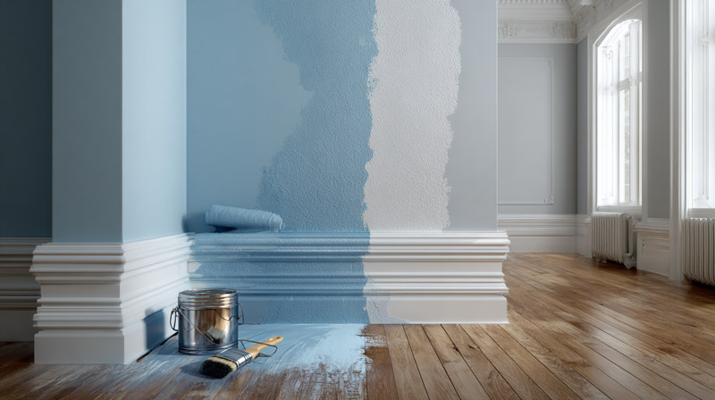
Testing a wall color against existing white trim is not optional. Color shifts between a paint chip and a painted room are significant enough to produce an entirely different result than what you chose in the store.
Five professional painters and designers consulted by Family Handyman (2024) agreed that painting directly on the wall or on foam board adjacent to the actual trim gives the most accurate read of undertone, contrast, and sheen interaction. Paint chips and digital tools are starting points only.
The Sample Board Method
Foam board painted with 2 coats of your wall color is the standard professional testing method. It lets you move the sample to different walls, different light conditions, and place it directly against the trim without committing to a full wall application.
Minimum board size: 12 x 16 inches. Anything smaller distorts how the color reads at scale. Two coats are required. One coat will show the white primer underneath and make the color read lighter than it actually is.
Ring’s End recommends limiting tests to 2-4 colors maximum. More than that and the comparison becomes too complex to make a clear judgment. Sample elimination before testing is part of the process, not a shortcut.
Viewing Conditions That Matter
Same sample, different results. The viewing conditions during testing determine how reliably the final painted room matches your expectations.
Place the board: directly adjacent to the white trim, not on a blank wall section away from any trim edge.
Time of day: morning natural light, midday natural light, and evening under the room’s actual artificial lighting. If those 3 conditions produce consistent results, the pairing will work. If the undertone shifts dramatically from one condition to another, the color is likely too reactive for that room.
Miss Mustard Seed’s testing guide notes that moving sample boards around the room, specifically into darker corners, near the floor, and near light sources, reveals how the color will behave across the full spatial range of the room, not just the most flattering spot near a window. Using a room paint calculator before buying sample quantities also helps avoid running short on your final color after testing narrows the choice.
Digital Tools: What They Can and Cannot Do
The Sherwin-Williams ColorSnap Visualizer and Benjamin Moore Color Portfolio app let you upload a photo of your room and digitally apply wall colors.
Both tools are useful for quickly eliminating colors that clearly won’t work. Neither accurately renders undertone behavior, LRV contrast against actual trim, or finish sheen interaction. The Color Concierge notes that colors appearing online or in apps can look completely wrong once applied outdoors or in actual room conditions.
Use digital tools to narrow 20 options to 4-5 finalists. Then test those finalists physically on foam board against the actual trim before buying full quantities.
FAQ on Paint Colors That Go With White Trim
What paint colors go best with white trim?
Warm neutrals, navy blue, sage green, and soft greige are the most reliable choices. Specific picks include Agreeable Gray SW 7029, Hale Navy HC-154, and Rainwashed SW 6211. Match the wall color’s temperature to the undertone of your trim white for the cleanest result.
Does gray go with white trim?
Yes, but the undertone has to match. Cool grays like Repose Gray SW 7015 work best with cool white trims like Chantilly Lace OC-65. Pairing a cool gray wall with a warm white trim creates an undertone conflict that reads as dirty or purple-tinged in low light.
What is the most popular wall color with white trim?
Agreeable Gray SW 7029 is the most widely used. Fixr.com’s 2024 survey of 71 design experts found that warm neutrals were selected by 41% of professionals as the top interior palette, with greige tones leading that category.
Can you use dark colors with white trim?
Yes. Dark walls create the highest contrast with white trim, making architectural millwork more visible. Navy blue, charcoal, and deep forest green all work well. Tricorn Black SW 6258 and Wrought Iron HC-114 are 2 of the most commonly specified dark wall colors against white semi-gloss trim.
What white trim color works with warm wall colors?
Use a warm white trim. White Dove OC-17, Alabaster SW 7008, and Greek Villa SW 7551 all carry yellow or cream undertones that align with warm terracotta, greige, and mustard walls. Cool white trims like Extra White will make warm wall colors read as overly orange.
Does blue paint go with white trim?
Blue is one of the strongest pairings with white trim. Navy blue creates high contrast, while soft sage-blues and coastal blues produce a softer effect. Sherwin-Williams named Upward as its 2024 Color of the Year specifically for its clean pairing with white trim in coastal-style interiors.
What wall color goes with white trim in a bedroom?
Soft blues, muted greens, and warm lavender work best. Sea Salt SW 6204 and Rainwashed SW 6211 are designer-recommended options. Keep the LRV gap between wall and trim at 15-30 points for definition without the high-contrast energy that makes bedrooms feel alert rather than restful.
What finish should white trim be painted in?
Semi-gloss is the standard. It creates visible separation from matte or eggshell walls, resists scuffs on baseboards and casings, and makes the same white paint appear slightly brighter than on walls. Eggshell on walls paired with semi-gloss trim is the most designer-recommended finish combination.
Does green paint look good with white trim?
Yes. Sage green, olive, and forest green all pair well with white trim. Warm greens work best with warm white trims like White Dove. Deep forest greens need a brighter, higher-LRV trim to maintain enough contrast and prevent the room from reading as heavy or closed in.
How do I test paint colors against white trim before painting?
Paint foam board with 2 coats of your chosen wall color and hold it directly against the actual trim. View the sample at morning, midday, and evening under the room’s artificial light. The Sherwin-Williams ColorSnap Visualizer and Benjamin Moore Color Portfolio app help narrow options but cannot replace physical testing.
Conclusion
This conclusion is for an article presenting paint colors that go with white trim, and the core takeaway is straightforward: undertone matching decides whether a wall-and-trim pairing works or fights itself.
Warm white trims like Alabaster SW 7008 need warm wall colors. Cool trims like Chantilly Lace OC-65 need cool wall colors. Get that wrong and no amount of careful color selection fixes it.
Whether you’re working with navy blue, soft sage green, deep charcoal, or a warm greige, the light reflectance value gap between wall and trim determines how much the millwork reads as a deliberate design element.
Test on foam board. Check at multiple times of day. And always hold the sample directly against the actual trim before buying a full gallon.

- Shoji White vs Alabaster: Which Soft White Wins? - October 25, 2026
- Color Combinations for 32 Colors and 10 Wood Tones - October 22, 2026
- Kitchen Color Schemes by Cabinet Color: What Pairs Well - October 19, 2026