Color Combinations
Colors That Go with Honey Oak Cabinets
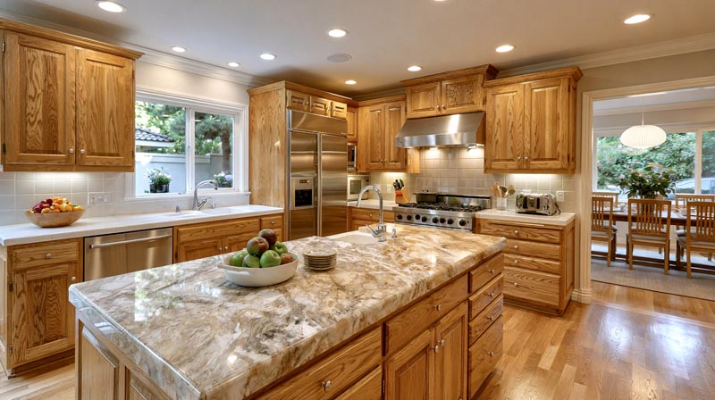
Honey oak cabinets are back, and this time they work.
After years of being written off as a relic of 1990s kitchens, warm wood tones are leading cabinet color trends again. The National Kitchen and Bath Association’s 2025 report confirms it.
But getting the colors that go with honey oak cabinets right requires more than good instincts. The wood’s golden undertones react differently to every wall color, countertop material, and hardware finish placed alongside it.
This guide covers wall colors, backsplash options, countertop pairings, flooring, hardware finishes, and complete color schemes by style, so you can build a kitchen palette that works from floor to ceiling.
Fixed surfaces set the starting point; our full list of color pairings covers the colors you layer on top.
What Color Is Honey Oak?
Honey oak is a warm, golden-yellow wood finish with visible orange and brown undertones running through a medium-to-prominent grain pattern. It sits firmly in the warm color temperature range, which makes undertone matching the most important factor when choosing any paint, countertop, or flooring alongside it.
The finish varies from matte to semi-gloss depending on the sealer or stain applied. That surface sheen affects how much surrounding colors reflect back onto the wood.
Honey Oak Undertones and Color Temperature
Core undertones: golden yellow, amber, orange, and light brown.
These undertones don’t disappear with clever pairing choices. They stay present and react to every color placed next to them. A cool gray wall, for instance, will pull the orange in honey oak forward and make the combination look unintentionally clashing.
Research on wood tone trends from the National Kitchen and Bath Association (2025) found green leading cabinet color preferences at 76%, with brown at 56%. Both of these work with honey oak because they share its warm tonal base.
How Lighting Changes Honey Oak’s Appearance
Incandescent bulbs and warm LEDs (2700K-3000K) deepen the orange tones in honey oak noticeably. The wood can read almost amber under this light.
Natural north-facing light shifts honey oak toward a cooler, flatter appearance. This changes which wall colors work. A creamy white that looks perfect under warm artificial light may shift gray in a north-facing room.
Key difference: daylight LED bulbs at 5000K show the wood closer to its actual grain color, making color testing under multiple light sources a necessary step before committing to a wall color.
Honey Oak Grain and Finish Variation
The grain pattern in oak is more prominent than in maple or birch, which adds visual texture to any space. This texture is a design asset. It means smooth, matte surfaces nearby create contrast in interior design that keeps the room from feeling flat.
Cabinet finish also matters. A semi-gloss sealer reflects nearby colors back into the wood. A matte or satin finish is more neutral. Most original honey oak kitchen installations from the 1990s and early 2000s used a semi-gloss, which intensifies the orange reading under warm light.
—
What Wall Colors Work Best With Honey Oak Cabinets?
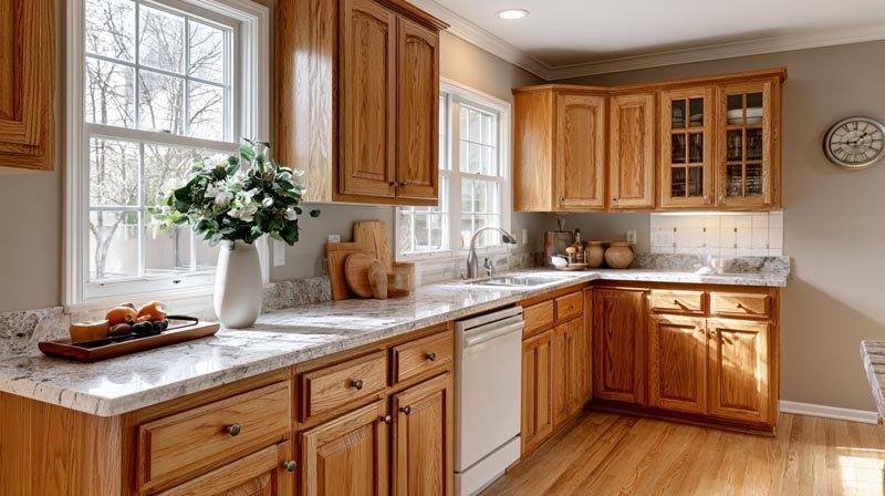
The best wall colors for honey oak cabinets share its warm base temperature. Warm whites, sage greens, muted olives, soft terracottas, and navy blue all work. Cool grays, lavenders, and stark whites with blue or purple undertones do not.
Statista data from 2023 shows that 46% of American homeowners chose white or off-white for kitchen cabinets. The wall color principle applies in reverse here: when the cabinets are honey oak, the walls need to do what white cabinets usually do, which is anchor the room without fighting the wood’s warmth.
Warm Neutrals
Warm whites and creamy off-whites are the most forgiving wall color group for honey oak. They reduce contrast between wall and cabinet without creating a color clash.
- Benjamin Moore Navajo White OC-95: yellow-beige undertone that echoes the golden base of honey oak
- Sherwin-Williams Accessible Beige SW 7036: warm greige that bridges the wood and the room without pulling too cool
- Avoid Benjamin Moore Chantilly Lace or Sherwin-Williams Pure White, both of which carry cool undertones that fight the wood’s warmth
These creamy tones work because they share the warm color temperature of the wood. The color theory principle at work here is tonal harmony: matching color temperature across surfaces reduces visual tension.
Green and Earthy Tones
Sage green is the most popular pairing choice for honey oak right now. It works because muted green sits opposite orange-yellow on the color wheel, creating gentle contrast without clashing.
Sherwin-Williams Svelte Sage SW 6164 is a reliable pick. It has enough gray in it to feel contemporary without pulling cool enough to fight the wood’s warmth.
Deep olive and muted forest green also work. Both carry yellow undertones that share common ground with honey oak’s golden base. Farrow and Ball Mizzle No.266 is a gray-green that sits comfortably in this category.
Bold Contrast Colors
Navy blue is one of the few bold colors that pairs cleanly with honey oak. It creates strong contrast while its deep, warm-leaning base avoids the cool tonal conflict that lighter blues trigger.
Benjamin Moore Newburyport Blue HC-155 handles this pairing well. It’s dark enough to contrast the warm wood without reading as cold against it.
Deep teal is another option. Andre Kazimierski of Improovy notes that dark teal on shaker-style cabinets paired with brass fixtures creates a focal point in contemporary kitchens. Applied to walls instead, the same logic holds against honey oak cabinetry.
| Wall Color Category | Color Temperature | Best Undertone Match | Example |
|---|---|---|---|
| Warm white / cream | Warm | Yellow-beige | BM Navajo White OC-95 |
| Sage / muted green | Warm-neutral | Yellow-gray | SW Svelte Sage SW 6164 |
| Olive / earthy green | Warm | Yellow-green | Farrow & Ball Mizzle |
| Navy blue | Neutral-deep | Blue-neutral | BM Newburyport Blue HC-155 |
—
What Paint Colors Clash With Honey Oak Cabinets?
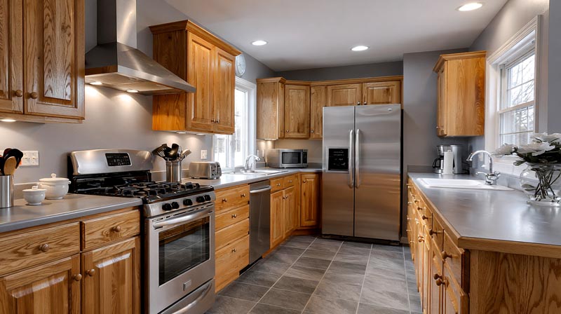
Cool grays, stark whites, and any color with blue, purple, or lavender undertones will clash with honey oak. The conflict is a color temperature mismatch: honey oak reads warm, and cool-toned walls pull in the opposite direction.
The result isn’t subtle. The orange in honey oak will look more intense and more dated when placed against a cool background, not less.
Why Cool Grays Fail
Gray became the dominant wall color choice through the 2010s, but cool gray with blue or purple undertones is the single most common color mistake made with honey oak cabinets.
Sherwin-Williams Agreeable Gray SW 7029 is a borderline case. It has warm beige undertones and works in most honey oak kitchens. Benjamin Moore Gray Owl OC-52, however, pulls distinctly blue-gray and creates a visible undertone conflict against the wood’s orange base.
The test: hold your paint chip directly against the honey oak cabinet door in the actual room lighting. If the paint looks more blue or more purple next to the wood, it will not work on the walls.
Stark White and Lavender Conflicts
Pure bright white walls make honey oak look yellow-orange by comparison. The high-contrast pairing draws attention to the orange tones in the wood rather than neutralizing them.
- Avoid: Sherwin-Williams Bright White, Benjamin Moore Ultra White, any white with a cool blue base
- Avoid: Lavender and mauve tones, which sit at the opposite end of the warm spectrum
- Avoid: Cool light blue, which creates a similar conflict to cool gray
The pattern across all these failures is the same: cool undertones amplify the orange in honey oak rather than balancing it.
—
What Cabinet Paint Colors Pair With Honey Oak if Mixing Materials?
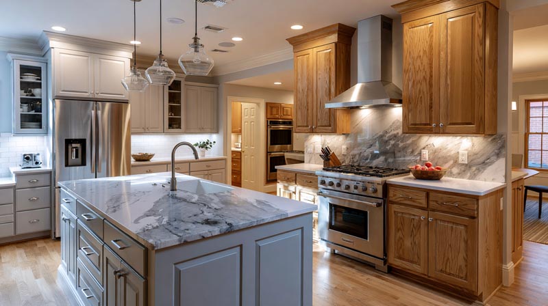
Two-tone kitchen design, where honey oak upper cabinets are paired with painted lower cabinets or a painted island, is one of the most effective ways to update a honey oak kitchen without replacing everything.
Houzz data from 2024 shows 35% of renovating homeowners chose semi-custom cabinets (up from 31% in 2023), and two-tone combinations were a leading reason for that upgrade. The desire to mix a wood tone with a painted surface is a clear driver of this shift.
Deep Green Painted Lower Cabinets
Painting lower cabinets in a deep forest green or warm olive while keeping honey oak uppers creates a grounded, organic modern look. The green and the golden wood share yellow undertones, keeping the palette cohesive.
Farrow and Ball Mizzle No.266 works here. So does Sherwin-Williams Foxhall Green, which was one of the leading cabinet color picks for 2024 according to multiple design sources.
The earthy color palette that results from this combination fits what the NKBA’s 2025 report identifies as the dominant kitchen design direction: organic, nature-connected spaces.
Navy Blue Island With Honey Oak Perimeter
A navy blue island against honey oak perimeter cabinets creates contrast without fighting the wood’s warmth. Navy provides a focal point in the kitchen while the honey oak reads as the warm, grounding material throughout.
Benjamin Moore Newburyport Blue HC-155 handles this pairing well.
Brushed brass or unlacquered brass hardware on the island ties both materials together by picking up the golden tones in the oak. This is a finish choice that works across both cabinet colors simultaneously.
Warm White Painted Cabinets
This is the most transitional option. Painting lower or upper cabinets in a warm cream white while keeping some honey oak creates a look that reads as a deliberate mix rather than an unfinished renovation.
- The white must carry warm, not cool, undertones
- Benjamin Moore White Dove OC-17 works in this context
- Avoid painting all cabinets white and keeping one set as honey oak. The contrast reads as incomplete rather than intentional
—
What Countertop Colors Go With Honey Oak Cabinets?
Countertop color sits directly adjacent to honey oak cabinets, making it one of the highest-impact material decisions in the kitchen. The countertop needs to either harmonize with the wood’s warmth, provide clean contrast, or add complementary texture.
Houzz 2024 kitchen data shows durability is a top consideration for 47% of homeowners choosing cabinet materials, while look and feel leads at 80%. The same logic applies to countertops: the visual relationship with existing materials comes first.
White and Cream Countertops
Best choice: Calacatta-style quartz with warm gold or beige veining.
Silestone Calacatta Gold and Cambria Brittanicca Warm both have enough warm veining to connect visually to honey oak’s golden undertone without looking yellow or matchy. The white base provides contrast while the veining keeps the palette warm.
Stark white quartz with cool gray veining (like some Carrara lookalikes) brings the same cool-undertone problem as gray paint. The countertop will look colder and the oak will look more orange.
Dark Countertops for Contrast
Black granite and dark soapstone create high visual contrast against honey oak. This works because the contrast is value-based (light versus dark) rather than temperature-based (warm versus cool), so there’s no undertone conflict.
A wood kitchen cabinet with black countertop pairing is well-established as a modern combination. Black grounds the warmth of the wood rather than fighting it.
Butcher Block as a Tonal Extension
Butcher block countertops extend the warm wood tone of honey oak across the work surface. The two wood tones don’t need to match exactly. They just need to share the same warm color family.
This works especially well on a kitchen island, where the butcher block reads as an intentional material choice rather than a budget substitution. It reinforces the wooden interior design direction without adding visual competition.
| Countertop Type | Undertone | Visual Effect | Best Use |
|---|---|---|---|
| Calacatta quartz (warm veining) | Warm gold-beige | Cohesive, elevated | Full kitchen |
| Black granite / soapstone | Neutral-dark | High contrast, grounding | Perimeter or island |
| Butcher block | Warm wood | Tonal extension | Island surface |
| Concrete (warm gray) | Cool-gray | Risky, test first | Modern kitchens only |
—
What Backsplash Colors Work With Honey Oak Cabinets?
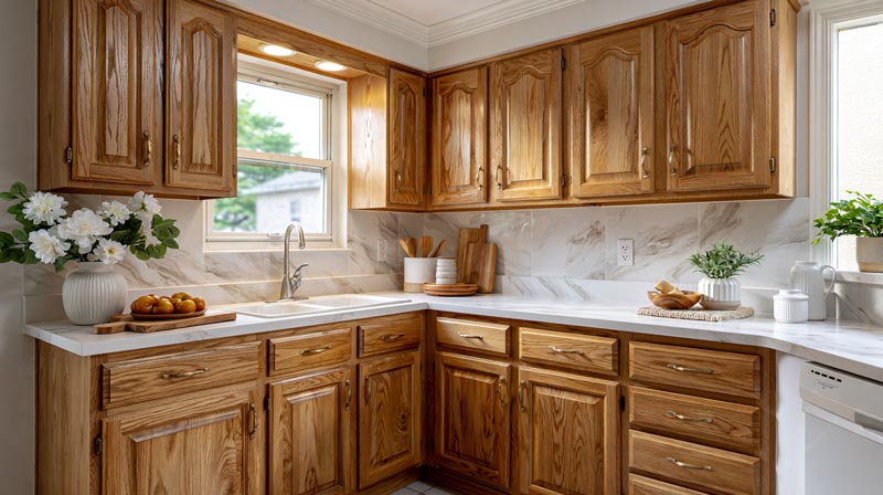
The backsplash sits between the countertop and upper cabinets, making it the visual bridge between the two largest material surfaces in the kitchen. It reads simultaneously against both honey oak and the countertop, so both relationships need to work.
Statista data from 2024 shows ceramic or porcelain tile is the most popular backsplash material at 54%, followed by engineered quartz at 11%. Both material categories contain warm and cool options, so the color and undertone of the specific tile matters more than the material category.
Cream Subway Tile
Cream or off-white subway tile is the most reliable backsplash choice for honey oak. It provides visual breathing room between the warm cabinets and countertop without introducing a cool temperature conflict.
Critical detail: grout color matters as much as tile color. Warm beige grout keeps the whole surface in the warm palette. Bright white or cool gray grout on cream tile will pull the backsplash colder than the tile alone suggests.
Terracotta and Handmade Tile
Terracotta tile or hand-painted Talavera tile doubles down on the warm, earthy color palette that honey oak anchors. This works well in rustic, farmhouse, and organic modern kitchens.
The orange-clay base of terracotta directly echoes honey oak’s own orange undertone. The result feels cohesive rather than matchy because texture variation between the smooth cabinet doors and the handmade tile surface adds visual texture contrast.
Deep Green or Navy Zellige Tile
Zellige tile in deep forest green or navy creates contrast while staying within a warm-friendly color palette.
- Forest green zellige: earthy, handmade feel, works with warm brass fixtures
- Navy zellige: bolder contrast, pairs best with dark countertops and brass or matte black hardware
- Both options benefit from a warm-toned grout rather than stark white
The irregular, reflective surface of zellige tile adds the kind of visual pattern that keeps a honey oak kitchen from reading as flat or dated.
—
What Flooring Colors Complement Honey Oak Cabinets?
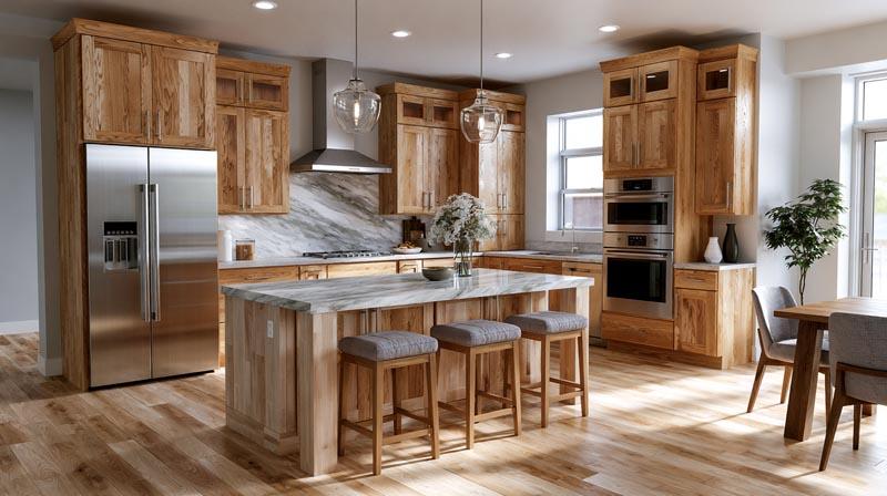
Floor color establishes how grounded or cohesive the full kitchen color scheme feels. The floor reads against both the cabinets and the wall simultaneously, so it functions as the anchor for the entire palette.
Houzz 2024 data shows that among homeowners renovating kitchens, look and feel is the leading consideration for flooring decisions. Getting the floor-to-cabinet relationship right is a primary driver of whether the space reads as intentional or unresolved.
Light and Matching Blonde Wood
Light blonde hardwood or engineered wood flooring that matches honey oak’s tonal value keeps the room feeling warm and continuous. The key is matching tonal value (light versus medium versus dark), not the exact grain pattern or color.
Avoid: using the exact same honey oak stain on both floors and cabinets. When two surfaces share identical color and grain, the effect reads as flat rather than layered. A slightly lighter or slightly more neutral wood floor gives the cabinets something to stand apart from.
Dark Walnut and Espresso Floors
Dark floors under honey oak cabinets create strong vertical contrast. The eye reads the dark floor and light cabinet as two distinct planes, which adds depth to the space.
This is a color scheme direction consistent with rustic color palette combinations and works equally well in transitional kitchens. The contrast grounds the warmth of the cabinets rather than competing with it.
Warm Gray Luxury Vinyl Plank
Warm gray LVP is a practical middle ground. It provides a transitional bridge between the warm wood cabinets and a more modern design direction without introducing the undertone conflict of a cool gray floor.
Test before installing: hold a flooring sample against the cabinet and against the chosen wall color simultaneously. A floor that works against one but not both will create a disjointed color scheme.
Large-format warm beige porcelain tile is an alternative in the same tonal range, offering easier maintenance and a more polished finish than wood-look options.
What Hardware Finishes Work With Honey Oak Cabinets?
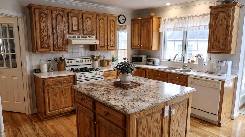
Hardware finish is the fastest and cheapest way to shift how honey oak cabinets read in a room. The right finish can make a 1990s kitchen look deliberate and current. The wrong one makes it look unresolved.
Stone Harbor Hardware notes that 3 finishes dominated door and cabinet hardware through 2024: vintage bronze, matte black, and satin brass. All three work with honey oak, but for different reasons and different design directions.
Brushed Brass and Unlacquered Brass
Brushed brass is the most natural tonal match for honey oak. Both materials share a warm golden base, so the hardware reads as part of the cabinet rather than sitting against it.
Unlacquered brass goes one step further. It develops a natural patina over time, pulling toward amber and brown tones that echo honey oak’s own undertones. This finish works best in traditional and organic modern kitchens where lived-in character is part of the design intent.
Key difference: brushed brass stays consistent in tone; unlacquered brass shifts and ages. Choose based on whether you want the hardware to stay predictable or develop over time.
Matte Black for Modern Contrast
Matte black hardware creates sharp contrast against honey oak’s warm, golden surface. The pairing works because the contrast is value-based (dark versus light) rather than temperature-based, so there’s no undertone conflict.
- Works best on shaker-style door profiles where the hardware profile is clean
- Pairs well with dark countertops (black granite, soapstone) to anchor the contrast throughout the kitchen
- Has the added practical benefit of hiding fingerprints, a noted advantage in high-use kitchens
Oil-Rubbed Bronze as a Traditional Pairing
Oil-rubbed bronze sits between brass and black on the warmth scale. It has enough brown and amber in it to harmonize with honey oak’s undertones, but darker than brass so it reads as contrast rather than match.
Best fit: traditional and rustic kitchens where the finish echoes dark wood stains, iron accents, or stone surfaces elsewhere in the space.
This finish is less current than brass or matte black in 2024-2025 design cycles, but it still works better with honey oak than satin nickel or chrome, both of which pull cool against the warm wood.
Why Satin Nickel and Chrome Are Risky
Cool metal finishes work in small doses but not as the primary hardware choice. A single chrome faucet against honey oak is manageable. Chrome cabinet pulls across 20 cabinet doors are a color temperature conflict at scale.
Jenna Kate at Home confirms that the main finish trends for kitchen faucets through 2024-2025 remained matte black and satin brass. Chrome and polished nickel held on as secondary choices, not primary ones. With warm wood tones, keeping cool metals to fixture-only (faucets, appliance handles) and using warm-toned hardware on cabinets is a practical split.
| Hardware Finish | Tonal Relationship | Design Direction |
|---|---|---|
| Unlacquered brass | Warm match | Traditional, organic modern |
| Brushed brass | Warm match | Transitional, contemporary |
| Matte black | Value contrast | Modern, industrial |
| Oil-rubbed bronze | Warm contrast | Traditional, rustic |
| Satin nickel / chrome | Cool conflict | Fixtures only, not cabinet hardware |
—
What Accent Colors Work in Rooms With Honey Oak Cabinets?
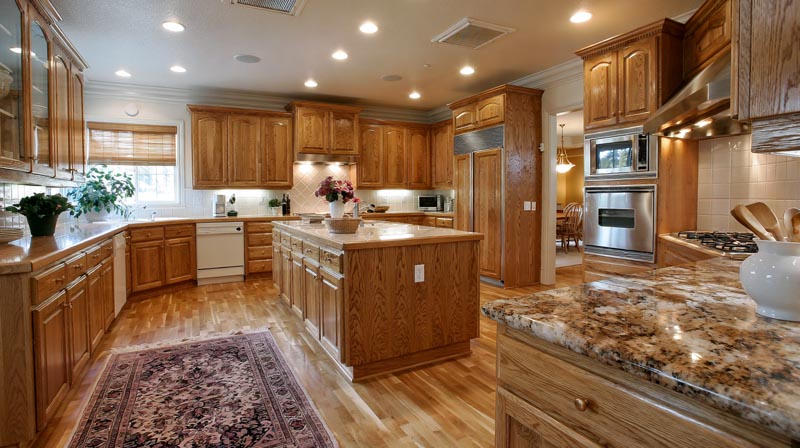
Accent colors in rugs, textiles, and decor operate differently from fixed surface colors. They can be swapped, layered, and adjusted. But they still need to respect the warm base that honey oak establishes in the room.
Research into color psychology shows that warm tones (reds, oranges, yellows) and their earth-adjacent relatives (rust, terracotta, amber) directly reinforce the emotional warmth of a space. This is especially relevant in kitchens where warmth correlates with appetite and social comfort.
Rust, Amber, and Burnt Orange Textiles
Rust and burnt orange accents are the most cohesive textile choice for honey oak rooms. Both share orange as a base, so they extend the wood’s warmth into soft furnishings without introducing a competing color direction.
Jute rugs, amber linen curtains, and burnt orange throw cushions all sit comfortably in this palette. None of these are attention-grabbing on their own. They work by deepening the warm tone that the honey oak establishes.
Avoid: bright orange, which reads as a pattern color rather than a warm accent and draws too much attention away from the wood’s natural character.
Deep Teal and Forest Green Accents
Muted teal and forest green in soft furnishings create contrast against honey oak without fighting it. These colors work as accents because their muted, earthy quality keeps them within the same organic palette as the wood.
- Deep teal cushions or a teal runner rug
- Forest green pendant lamp shades or linen curtains
- Both pair best with natural fiber textures (jute, wool, linen) rather than synthetic materials
Rug Color as the Palette Anchor
Rug color connects the cabinet tone to the flooring and functions as the warmth anchor for the whole room. A warm-toned jute rug is the most natural choice, bridging honey oak cabinets and wood or tile flooring.
A cool gray wool rug introduces the same undertone conflict at floor level as cool gray paint does on walls. The rug needs to stay within the warm side of the color wheel, or read as dark enough (navy, charcoal) that the contrast is value-based rather than temperature-based.
For further guidance on the relationship between rug color and warm wood tones, the principles behind rugs that pair with warm brown surfaces apply directly to honey oak rooms.
—
How Does Lighting Affect Color Choices With Honey Oak Cabinets?
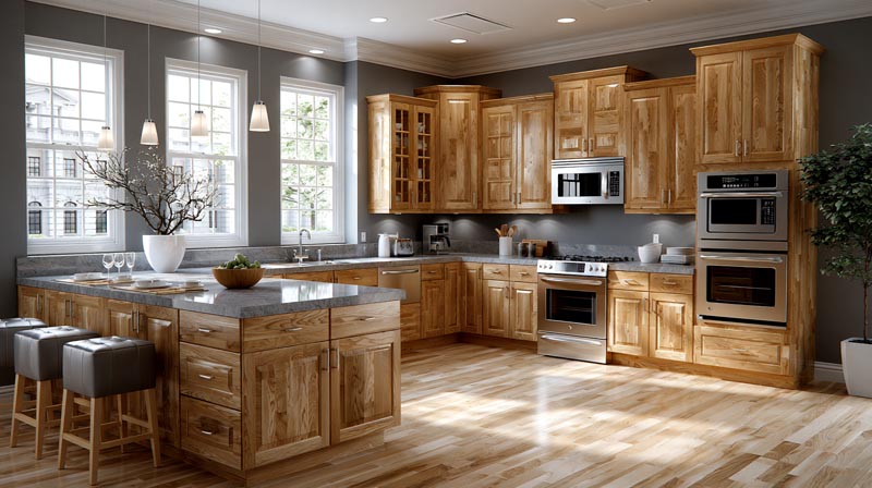
Lighting changes every color in this article. A wall color that works under natural daylight may look entirely different under incandescent bulbs. The interaction between light source and honey oak’s orange undertones is significant enough to test paint colors under your actual kitchen lighting before committing.
CRI (Color Rendering Index) is the most important lighting specification to check when selecting bulbs for a honey oak kitchen. Lighting specialists recommend CRI 90 or above for kitchens where accurate color perception matters, which covers both food preparation and evaluating how your color scheme actually looks day-to-day.
How Warm Bulbs Affect Honey Oak
Incandescent bulbs and warm LEDs in the 2700K-3000K range deepen the orange and amber tones in honey oak noticeably. Under this light, the wood reads warmer and more golden than it appears in natural daylight.
Practical result: a creamy wall color that looks balanced under natural light may appear too yellow under 2700K bulbs. Testing paint samples at night under your actual installed lighting is a separate and necessary step from testing in daylight.
The role of light in interior design goes beyond fixture placement. The color temperature of every bulb in the room shapes how the complete color scheme reads to the eye.
North-Facing Rooms and Honey Oak
Natural north-facing light has a cool, flat quality throughout the day. Under this light, honey oak loses some of its warm golden reading and can appear more neutral or even slightly brown.
This changes the wall color equation. A creamy off-white that reads warm in a south-facing kitchen may look appropriately neutral in a north-facing one. Cooler whites that would clash in a sun-drenched kitchen become more workable with north light because the light itself reduces the wood’s apparent warmth.
Rule of thumb: in north-facing kitchens, warm whites can be slightly cooler in undertone than in south or west-facing rooms. Test regardless.
Daylight Bulbs and Color Testing
Daylight LED bulbs at 5000K show surfaces closest to their true neutral color. This makes them the most useful light source for testing paint samples and material swatches against honey oak.
Sunme Lighting guidelines confirm that LEDs with a CRI of 90 or above are the standard for kitchen lighting where accurate color perception is needed. Using 5000K bulbs at 90+ CRI for swatch testing gives the most reliable read on how colors will behave before any paint goes on the walls.
| Light Source | Effect on Honey Oak | Impact on Color Testing |
|---|---|---|
| Incandescent / 2700K warm LED | Deepens orange, looks amber | Warm wall colors may read too yellow |
| 3000K–3500K neutral warm | Natural warm wood tone | Reliable for most kitchens |
| 5000K daylight LED | Shows true grain and neutral tone | Best for swatch testing |
| North natural daylight | Flatter, slightly cooler | Allows slightly cooler wall undertones |
—
What Color Schemes by Style Work With Honey Oak Cabinets?
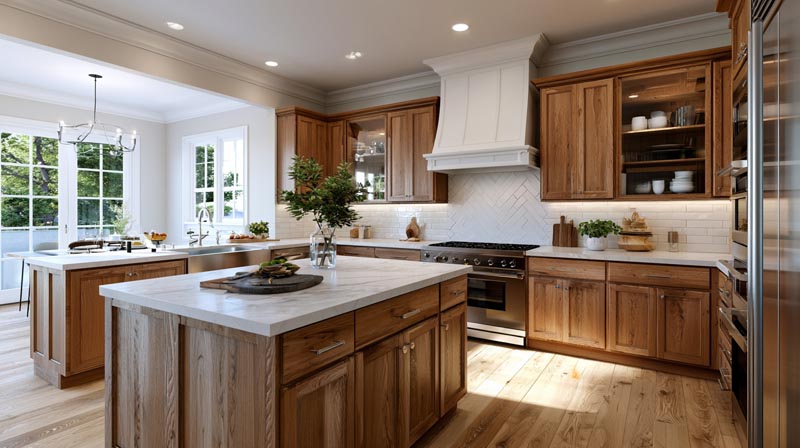
Honey oak works in 4 distinct interior design style directions. Each one uses the wood’s warmth differently and pairs it with different supporting colors, finishes, and materials.
Statista data from 2023/2024 shows 26% of homeowners chose transitional style after kitchen renovation, making it the most popular single post-renovation kitchen style. Transitional works well with honey oak because it allows warm wood tones to coexist with updated finishes and neutrals.
Traditional Color Scheme
The traditional palette leans into honey oak’s warmth rather than working against it.
- Walls: cream or warm ivory (Benjamin Moore Navajo White OC-95)
- Hardware: oil-rubbed bronze or unlacquered brass
- Countertops: cream or beige quartz with warm veining
- Accents: terracotta, deep red, forest green textiles
This palette is cohesive because every element shares a warm base temperature. The result is a kitchen that reads as intentional rather than outdated. Traditional kitchen design principles support this approach by prioritizing tonal harmony over contrast.
Transitional Color Scheme
Transitional design pairs honey oak with cleaner, more updated finishes while keeping the overall palette warm.
Wall color: warm white with yellow-beige undertone. Hardware: brushed brass. Countertops: Calacatta quartz with warm gold veining. Accents: sage green in soft furnishings or a painted island.
This is the most flexible direction for honey oak kitchens because it doesn’t require a full stylistic commitment. The warm wood reads as a natural element while updated finishes (brushed brass, quartz) move the kitchen forward from its original 1990s context.
Rustic and Farmhouse Color Scheme
Rustic design doubles down on honey oak’s natural, earthy quality rather than softening it.
Deep olive walls, matte black hardware, butcher block countertops, and terracotta or handmade tile backsplash. This palette works because it treats honey oak as the natural material anchor, not the element to update away from.
The rustic kitchen design approach connects honey oak’s warmth to a broader earthy material story that includes exposed wood beams, stone, and handmade tile. Each material reinforces the others.
Organic Modern Color Scheme
Organic modern is the most current direction for honey oak in 2024-2025. Designers at Studio Steidley describe this style as combining earth-toned colors with natural finishes and unlacquered brass, which maps directly onto honey oak’s tonal profile.
Walls: warm clay or soft terracotta. Hardware: unlacquered brass. Countertops: warm-veined quartz or soapstone. Flooring: large-format warm beige porcelain or warm oak engineered wood. Accents: jute, natural linen, and forest green plants.
The earthy color palette for this direction is covered in detail through resources on earthy color palettes for interior design, which show how terracotta, clay, and warm neutrals layer together around natural wood tones.
| Style | Wall Color | Hardware | Key Accent |
|---|---|---|---|
| Traditional | Warm ivory / cream | Oil-rubbed bronze | Terracotta textiles |
| Transitional | Warm white (yellow-beige base) | Brushed brass | Sage green accents |
| Rustic / Farmhouse | Deep olive | Matte black | Butcher block, handmade tile |
| Organic Modern | Warm clay / terracotta | Unlacquered brass | Jute, linen, forest green |
FAQ on Colors That Go With Honey Oak Cabinets
What wall color goes best with honey oak cabinets?
Warm whites, creamy off-whites, sage green, and muted olive tones work best. Benjamin Moore Navajo White OC-95 and Sherwin-Williams Svelte Sage SW 6164 are reliable picks. All share warm undertones that match honey oak’s golden base.
Do gray walls work with honey oak cabinets?
Warm gray works. Cool gray does not. Sherwin-Williams Agreeable Gray SW 7029 has enough beige in it to hold alongside honey oak. Benjamin Moore Gray Owl OC-52 pulls too blue and creates an undertone conflict against the wood’s orange base.
What countertop color goes with honey oak cabinets?
Calacatta quartz with warm gold veining, black granite, and butcher block all work well. Silestone Calacatta Gold is a strong match. Avoid countertops with cool gray veining, as they introduce the same temperature conflict as cool wall paint.
What backsplash works with honey oak cabinets?
Cream subway tile, terracotta tile, and deep green zellige are the top 3 options. Use warm beige grout rather than bright white grout. Grout color shifts the whole backsplash tone and can introduce coolness even on warm tile.
What hardware finish works with honey oak cabinets?
Brushed brass and unlacquered brass are the closest tonal match. Matte black creates clean value contrast without any undertone conflict. Oil-rubbed bronze suits traditional kitchens. Avoid satin nickel and chrome as primary cabinet hardware choices.
What flooring goes with honey oak cabinets?
Light blonde hardwood, dark walnut floors, and warm gray luxury vinyl plank all complement honey oak. Match tonal value rather than exact grain color. Avoid using the identical honey oak stain on both floors and cabinets, as it reads flat.
Can you mix honey oak cabinets with painted cabinets?
Yes. Deep green lower cabinets paired with honey oak uppers is a strong two-tone combination. A navy blue island against honey oak perimeter cabinets also works well. Both pairings share a warm base temperature that keeps the palette cohesive.
What paint colors clash with honey oak cabinets?
Cool gray, lavender, mauve, and stark white with blue undertones all clash. These colors amplify the orange in honey oak rather than balancing it. The conflict is a color temperature mismatch: cool walls fight the wood’s warm base.
What accent colors work with honey oak cabinets?
Rust, burnt orange, amber, and deep teal work as accent colors in textiles and decor. Warm-toned jute rugs anchor the palette at floor level. Avoid cool gray accents, which introduce the same undertone conflict as cool wall paint.
How does lighting affect color choices with honey oak cabinets?
Warm bulbs (2700K-3000K) deepen the orange tones in honey oak significantly. North-facing rooms shift the wood cooler. Test paint samples under your actual kitchen lighting. For accurate color reads, use daylight LED bulbs at 5000K with 90+ CRI.
Conclusion
This conclusion is for an article presenting the full color pairing picture for honey oak cabinets, from wall paint and countertop selection to hardware finish and accent color choices.
The core principle runs through every section: warm undertones first. Sage green, creamy off-white, navy blue, brushed brass, and terracotta all share a tonal base that works with honey oak’s golden warmth.
Cool grays, stark whites, and chrome hardware fight it.
Lighting matters just as much as paint color. Test swatches under your actual bulbs before committing.
Whether you are working toward a transitional kitchen color scheme, a rustic farmhouse palette, or an organic modern direction, honey oak gives you a warm, grounded starting point that more color combinations support than most homeowners expect.

- Kitchen Color Schemes by Cabinet Color: What Pairs Well - October 19, 2026
- Curtain Colors for Every Wall Color: Safe vs Bold Picks - October 18, 2026
- Interior Design Styles: Find Your Primary and Secondary - October 14, 2026