The wrong wall color can make a clean bathroom feel dingy, small, or cold before you’ve even touched a fixture.
Choosing the best colors for bathroom walls is trickier than picking paint for any other room. Moisture, artificial light, tile undertones, and limited square footage all change how a color performs on the wall versus how it looked on the chip.
This guide covers the top bathroom wall colors, how Light Reflectance Value affects your choice, which finishes hold up to humidity, and how to test a color before committing. You’ll also find data on which shades increase home resale value, backed by Zillow’s Paint Color Analysis.
What Are the Best Colors for Bathroom Walls?
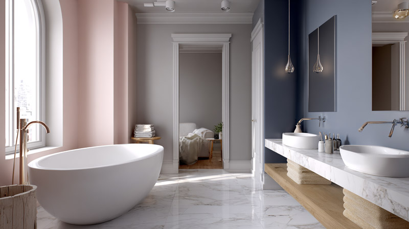
The best colors for bathroom walls are white, soft gray, sage green, navy blue, pale blue, warm beige, blush pink, and charcoal. Each one performs differently depending on room size, fixture finish, tile undertone, and light source.
Bathrooms respond to color differently than any other room in a home. Small square footage, artificial lighting, and moisture all change how a paint shade reads on the wall.
The single most useful metric when choosing a bathroom wall color is Light Reflectance Value (LRV), a scale from 0 to 100 that measures how much light a color reflects. White sits near 92. Navy sits near 8. Everything in between has trade-offs.
Bathroom remodels remain one of the most popular renovation projects in the U.S., with 37% of homeowners tackling this space in 2024, according to Clever Real Estate. A fresh coat of paint is typically the first and least expensive change they make. The most-used hues among those who painted: white (42%), beige (35%), and light gray (32%).
| Wall Color | Typical LRV Range | Best Suited For | Main Consideration |
|---|---|---|---|
| White | 82–92 | Bathrooms of any size and lighting condition | Easily shows water spots, scuffs, and everyday marks. |
| Soft Gray | 50–70 | Most bathroom styles and sizes | May develop a subtle purple cast under cool LED lighting. |
| Sage Green | 40–58 | Mid-size bathrooms with plenty of natural light | Can feel less cohesive with cool-toned chrome fixtures unless balanced with warm accents. |
| Navy Blue | 4–12 | Large bathrooms with abundant natural or artificial light | Makes small bathrooms feel more enclosed if not balanced with lighter finishes. |
| Warm Beige | 60–75 | Bathrooms with warm or neutral lighting | Can appear dull or muddy under cool, daylight-style LED bulbs. |
Warm and cool tones behave differently under artificial light. Warm tones (beige, blush, off-white) read best under 2700K to 3000K bulbs. Cool tones (gray, pale blue, sage) need at least 3500K to 4000K light to stay crisp and not shift green or purple.
How Does Bathroom Size Affect Color Choice?
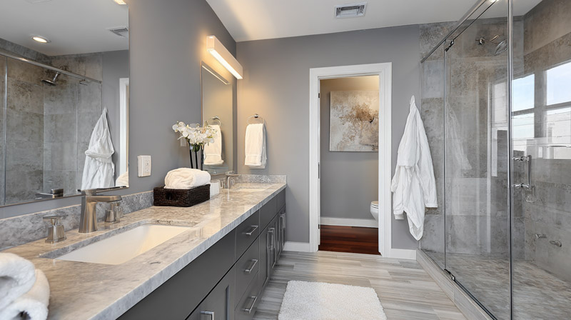
Bathroom dimensions directly limit which colors are viable. A color that looks calm and grounded in a 90-square-foot primary bathroom can make a 35-square-foot powder room feel like a closet.
Light colors make walls appear to recede. Studies suggest light paint colors can make a room feel up to 25% larger, according to research on small-space perception cited by Attract Painting. Colors with an LRV above 60 are the practical threshold for bathrooms with limited natural light.
Best Colors for Small Bathrooms
High-LRV colors work best when square footage is under 50 square feet.
- White (LRV 82-92): the most reliable choice for tight layouts
- Off-white with warm undertones (LRV 78-85): softer than pure white, still opens the space
- Pale blue (LRV 65-75): adds character without closing in the walls
- Soft gray above LRV 65: keeps things neutral while adding some edge
Avoid any color below LRV 40 in a small bathroom unless the room has a window and strong natural light from a south-facing exposure.
Best Colors for Large Bathrooms
Bathrooms above 60 square feet can absorb deeper tones without visual compression. Navy, charcoal, and dark sage become workable.
Navy LRV sits between 4 and 12. In a large primary bathroom with good overhead lighting, it reads as rich and grounded. In a windowless 40-square-foot bath, it reads as oppressive.
Farrow & Ball’s Hague Blue (No. 30) is the reference point most designers use when testing deep navy in larger bathrooms. It has enough green in its undertone to keep it from going cold.
How Does Bathroom Lighting Change Wall Color Perception?
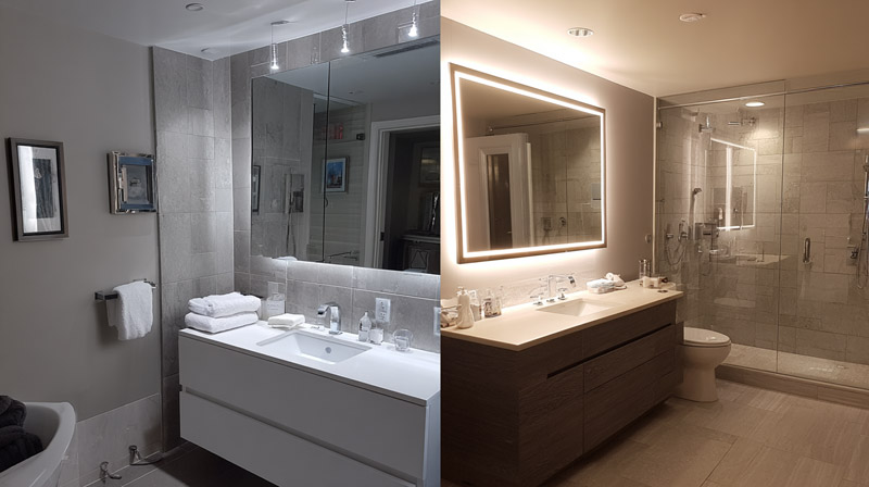
Paint colors do not look the same at 7am under a north-facing window as they do at 9pm under an LED vanity strip. The same wall can read three different ways in one day.
Color temperature in Kelvin is the key variable. Warm bulbs (2700K to 3000K) push warm undertones forward and flatten cool ones. Cool bulbs (4000K to 5000K) do the opposite. Most bathroom vanity fixtures default to 3000K, which sits in the middle but still leans warm enough to shift a cool gray toward purple.
| Light Source | Color Temperature | Effect on Warm Wall Colors | Effect on Cool Wall Colors |
|---|---|---|---|
| Incandescent | 2700K | Enhances warmth, making colors appear richer and more inviting | Can make cool colors look muted or slightly greenish |
| Warm LED | 3000K | Produces warm, natural-looking color with good accuracy | May give cool tones a subtle gray or purple cast |
| Neutral LED | 3500–4000K | Slightly softens warm colors without dramatically changing them | Delivers crisp, balanced, and accurate cool tones |
| Daylight LED | 5000K | Can make warm colors appear cooler or slightly washed out | Renders cool colors with high accuracy, clarity, and contrast |
North-facing bathrooms get indirect, cool daylight. Warm undertones compensate well. Repose Gray (SW 7015) tends to read lavender in north-facing rooms because its cool undertone gets amplified by the light, a well-documented issue on Sherwin-Williams design forums.
South-facing bathrooms have warmer, more direct light. Cooler tones stay balanced here and rarely shift. This is where pale blue and sage green work most reliably without needing adjustment.
Test paint swatches under your specific bathroom lighting conditions, not in the store and not on paper samples held near a window. The swatch should go directly on the bathroom wall and be evaluated at three points: morning, afternoon, and evening artificial light.
Why White Remains the Top Bathroom Wall Color
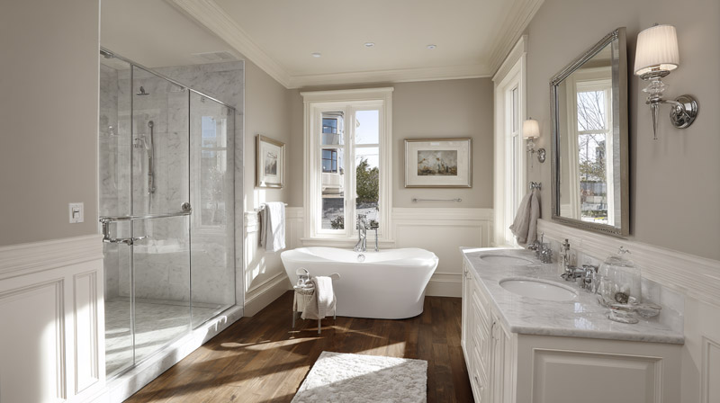
White dominates bathroom color choices for a reason. Among homeowners who painted in 2024, it was the most-used hue at 42%, according to Clever Real Estate. No other color comes close in bathrooms specifically.
The LRV of white ranges from 82 to 92 depending on the specific formula, making it the highest-reflectance category available. In a bathroom with limited square footage or one window, that reflectance matters.
Pure White vs. Warm White vs. Off-White
Pure white (LRV 88-92) has no discernible undertone. It reads clean under any light source but can feel clinical without warm textures to offset it.
Warm white (LRV 82-88) carries yellow, cream, or greige undertones. It softens under warm LED and incandescent light. Benjamin Moore Chantilly Lace (OC-65) sits in this range and reads as crisp without going stark.
Off-white sits between white and beige. Sherwin-Williams Alabaster (SW 7008) is the most referenced off-white for bathrooms, with an LRV of 82 and a warm undertone that softens well under 2700K to 3000K vanity lighting.
Trade-offs of White Bathroom Walls
White shows water stains, toothpaste splatter, and wall scuffs faster than any mid-tone color. Satin or semi-gloss finish is mandatory. Flat white on bathroom walls is a cleaning problem within six months.
Benjamin Moore Aura Bath & Spa is the benchmark product for white bathroom walls. Its mold-resistant, matte-adjacent formula handles bathroom humidity better than standard interior paint lines, and it holds up to repeated wiping without burnishing.
What Makes Soft Gray a Reliable Bathroom Wall Color?
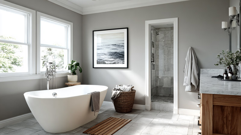
Soft gray sits in the sweet spot between neutral and interesting. It does not compete with fixtures, tile, or hardware, but it also does not disappear the way white sometimes does in larger bathrooms.
Gray’s LRV range is wide: 50 to 70 depending on depth. Colors above LRV 65 open small spaces. Colors below LRV 55 start to absorb light and need compensation from overhead or vanity fixtures.
Cool Gray vs. Warm Greige
Cool gray pairs with chrome and polished nickel fixtures cleanly. Sherwin-Williams Repose Gray (SW 7015) is the most-referenced cool gray for bathrooms. Its LRV of 60 makes it workable in rooms with decent light, though its purple undertone is visible under cool LED.
Warm greige (gray-beige blend) pairs with brass, unlacquered bronze, and matte black fixtures. Benjamin Moore Pale Oak (OC-20) is the go-to in this category. Its LRV of 68 keeps it bright enough for most bathroom sizes, and its warm undertone avoids the purple shift problem entirely.
The Undertone Problem Most People Miss
Gray undertones are not obvious on a paint chip. They reveal themselves on the wall.
- Repose Gray: purple-blue undertone, visible under cool LED
- Agreeable Gray: beige undertone, reads warm in most light
- Mindful Gray: green undertone, can shift olive under warm light
Check the gray swatch next to your dominant tile and fixture colors before committing. A chrome faucet and cool-toned tile will amplify a gray’s purple undertone. A warm tile and brass faucet will pull the same gray toward green.
Why Sage Green and Soft Greens Work Well in Bathrooms
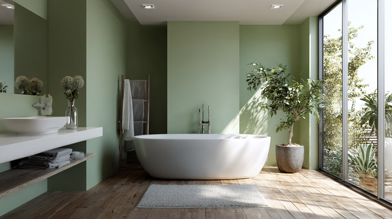
Green has become one of the most consistent bathroom color choices since 2022. Gen Z homeowners chose green at nearly twice the rate of millennials in 2024 (29% vs. 15%), according to Clever Real Estate. The shift ties directly to biophilic design principles and a broader move toward nature-connected interiors.
Sage green’s LRV typically falls between 40 and 58. That range works in bathrooms with at least one window or strong overhead lighting. Without natural light, sage can read olive or flat.
Why Green Works in Bathrooms Specifically
Research from the University of Essex on color-environment interaction shows green tones reduce perceived stress and associate with cleanliness, two responses that are directly relevant to bathroom use.
Biophilic design principles, which connect interior spaces to natural environments, have driven green’s rise as a bathroom color since 2021. The bathroom is a natural fit because the connection to water, plants, and natural texture reinforces the room’s function as a restorative space. For more on how biophilic principles apply across interior spaces, the underlying design logic helps explain why green reads so differently in bathrooms than in kitchens or living rooms.
Fixture Pairing Rules for Sage Green
Brass and matte black work well. Their warm and dark tones contrast cleanly against sage’s muted green without creating visual noise.
Chrome clashes with warm sage greens. The cool silver of chrome pulls the undertone toward gray-green and flattens the color. If your fixtures are chrome, lean toward a cooler, more blue-green sage rather than a warm olive-leaning one.
Specific picks: Farrow & Ball Mizzle (No. 266) for a complex, warm sage; Benjamin Moore Saybrook Sage (HC-114) for a cleaner, mid-tone green that works across a wider range of fixture finishes.
When Navy and Deep Blues Are the Right Bathroom Color
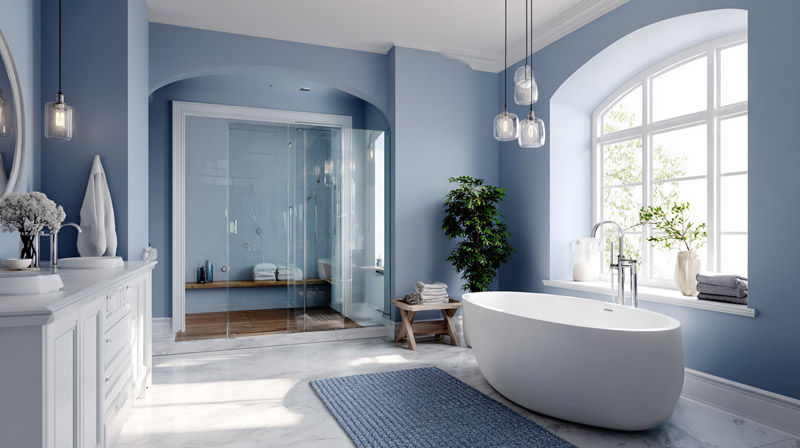
Navy and deep blue are not universally safe choices. They are the right choice in specific conditions, and the wrong choice in others.
Zillow’s 2021 Paint Color Analysis found that light blue bathrooms added a 1.6% premium to home sale prices, worth nearly $5,000 on a $290,000 home. That data applies to pale, not saturated blues. Deep navy operates differently.
Conditions Where Navy Works
Navy needs 3 specific conditions to succeed in a bathroom.
- Room size above 55-60 square feet
- At least one window with natural light, or strong overhead fixtures
- White trim and light tile to create enough contrast that the walls don’t close in
Farrow & Ball Hague Blue (No. 30) is the benchmark navy for bathrooms. Its slight green undertone prevents it from going cold. Benjamin Moore Newburyport Blue (HC-155) is a lighter alternative that sits closer to a classic navy without Hague Blue’s complexity.
Where Navy Fails
Navy LRV sits between 4 and 12. That is near the bottom of the reflectance scale. In a bathroom below 45 square feet or without a window, navy absorbs almost all available light and makes the room feel enclosed.
Small dark bathrooms also amplify humidity visually. Dark walls make condensation and steam more visible, which makes the space feel less clean even when it is not. This is a practical problem that purely aesthetic color guides do not address, but it shows up fast in daily use.
Deep saturated blues like icy or very cool-toned navies have been losing ground in 2025, according to Denver-based interior designer Nadia Watts, who noted they can feel too cold in bathroom spaces. Warmer-toned navies with blue-green or slightly teal undertones are holding better.
How Warm Neutrals Like Beige and Blush Perform on Bathroom Walls
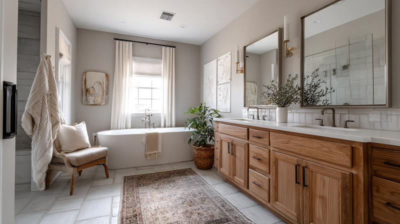
Warm neutrals are making a serious comeback. After years of cool gray dominance, beige returned as a trending paint color for both walls and cabinets in 2024, according to Porch Daydreamer’s color trend analysis.
Warm beige LRV sits between 60 and 75, giving it strong reflectance with a softer visual temperature than white. Blush pink typically lands between LRV 55 and 68, adding character without the high contrast that bolder colors create.
Warm Beige in Bathrooms
Sherwin-Williams Accessible Beige (SW 7036) is the most widely referenced warm beige for bathrooms. Its LRV of 62 and greige undertone keep it from going too yellow or too brown under most light sources.
Warm beige works across traditional and contemporary bathroom styles, making it one of the more versatile picks in the neutral category. It reads particularly well with natural stone countertops, wood vanities, and unlacquered brass fixtures. Those 3 elements together create the earthy interior palette that has driven bathroom renovation choices since 2022.
Blush Pink Without the Risk
Blush concerns most homeowners because they picture the saturated pinks of outdated 1980s bathrooms. Modern blush is different.
Benjamin Moore Pink Bliss (2093-70) has a dusty, muted quality that reads closer to a warm white in lower light. Its undertone leans peach, not coral, which keeps it flexible across fixture finishes.
- Pairs best with: brushed brass, warm white trim, natural linen
- Avoid pairing with: chrome, cool gray tile, matte black
- Light requirement: warm-temperature bulbs at 2700K to 3000K
Zillow’s 2023 Paint Color Analysis found that terracotta brown bathrooms (a warm, earthy cousin of blush-adjacent neutrals) added up to $1,624 to home sale prices. The underlying driver is the same: warm undertones read as inviting and current to buyers.
What Finish Type Is Correct for Bathroom Wall Paint?
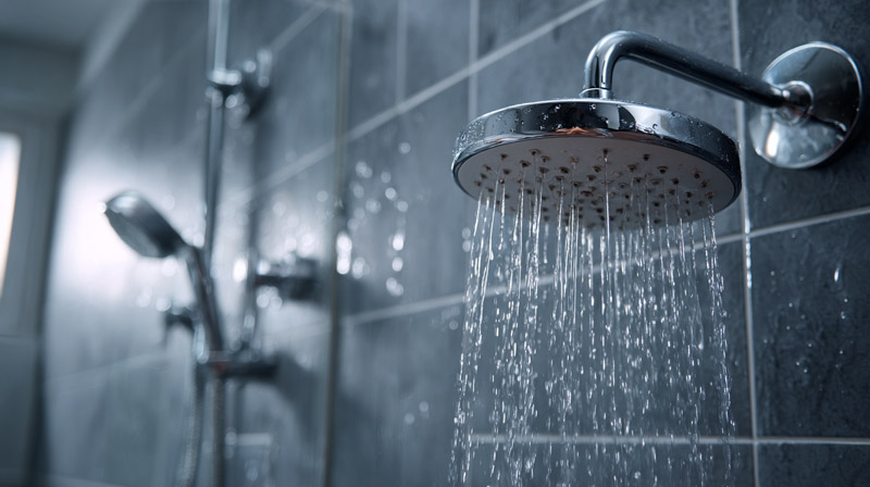
Paint finish is not a secondary decision. In a bathroom, the wrong sheen causes peeling, mold growth, and walls that show every water stain within months.
Bathrooms reach up to 100% humidity after a hot shower, according to the EPA, which sets recommended indoor humidity at 30 to 50%. That gap is why finish selection matters as much as color.
Satin vs. Semi-Gloss: Which One Is Correct
Satin is the standard recommendation for most bathroom walls. It offers a soft, subtle sheen, resists moisture, and cleans well without burnishing. LRV reads 3 to 5 points higher in satin vs. flat, which is a real difference in small bathrooms.
Semi-gloss is harder, more moisture-resistant, and easier to wipe clean. It suits shower-adjacent walls and poorly ventilated bathrooms. The downside is that it amplifies surface imperfections and reads shinier than most people expect from a wall finish.
| Paint Finish | Moisture Resistance | Best Application | Considerations |
|---|---|---|---|
| Satin | Good | Most bathroom walls with adequate ventilation | Easier to clean than matte but less durable in areas exposed to frequent water spray. |
| Semi-Gloss | Excellent | Shower surrounds, high-humidity bathrooms, and poorly ventilated spaces | Highly moisture-resistant but reflects more light, making wall imperfections more noticeable. |
| Flat or Matte | Poor | Powder rooms or low-moisture bathrooms only | Absorbs moisture more readily, is harder to clean, and is more susceptible to mildew in humid environments. |
The Matte Exception
Flat and matte finishes are not suitable for shower-adjacent bathroom walls. Standard matte absorbs moisture and provides a surface where mold takes hold fast.
Benjamin Moore Aura Bath & Spa is the one exception. It is a specialty matte formula built specifically for bathroom moisture conditions, with a mold-resistant compound in the resin. It is the only matte-finish product that performs reliably on all four bathroom walls, including near a shower with good ventilation.
For dark colors like charcoal or navy, semi-gloss dramatically deepens the visual richness of the tone. The same charcoal in satin vs. semi-gloss reads as two noticeably different shades on the wall.
How Fixture and Tile Color Constrain Wall Color Options
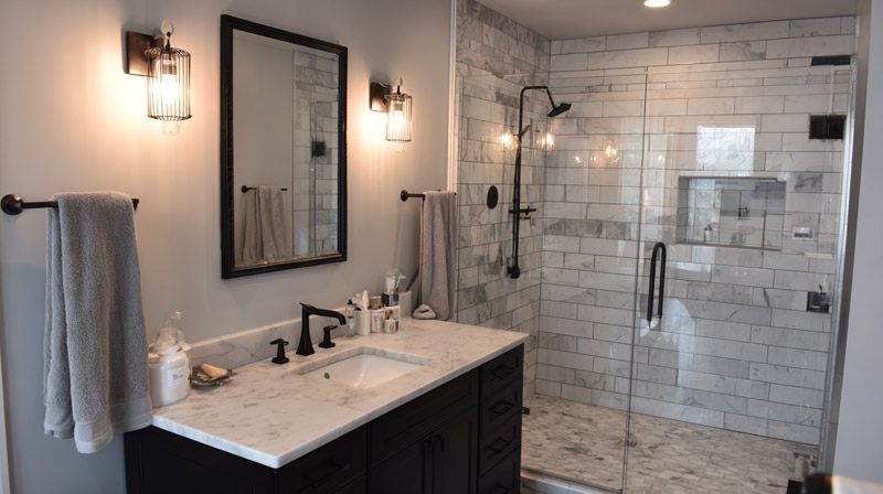
Wall color is not chosen in isolation. Tile, fixture metal finish, and vanity color are fixed elements that set the boundaries of what works on the walls.
Bathrooms are the hardest room to repaint successfully because of this constraint. Clever Real Estate’s 2024 renovation data found bathroom remodels are the most common major project homeowners undertake (37%), but coordination errors are among the top sources of renovation regret.
How Tile Undertone Limits Wall Color
Every tile has an undertone: cool (blue, gray, green), warm (yellow, red, brown), or neutral. The wall color must sit within the same undertone family, or the contrast creates visual discord that no amount of accessories can fix.
White subway tile is the most flexible backdrop. Its neutral undertone works cleanly with 7 of the 8 top bathroom wall colors: white, gray, sage, navy, pale blue, beige, and blush. Charcoal is the exception since it fights the brightness of white tile in smaller spaces.
Beige or cream tile is more restrictive. Cool-toned grays and blues visually clash against warm cream tile because the undertone gap creates tension rather than contrast. The wall color needs to match the tile’s warmth, not fight it.
Fixture Metal Finish as the Second Constraint
Metal finish undertone must align with wall color undertone. Edward Martin’s 2024 tile and fixture coordination guide confirms this rule: warm tiles pair with brass, bronze, or copper; cool tiles pair with chrome, stainless, or matte black.
- Brass and unlacquered bronze: pair with warm beige, sage green, blush, off-white
- Matte black: pairs with sage green, navy, charcoal, warm white
- Chrome and polished nickel: pair with cool gray, pale blue, white
Using chrome fixtures with a warm beige wall is the most common color coordination mistake in bathroom repaints. The cool metal reads as foreign against the warm wall, and neither element can be adjusted without a full replacement.
Which Bathroom Wall Colors Increase Perceived Resale Value?
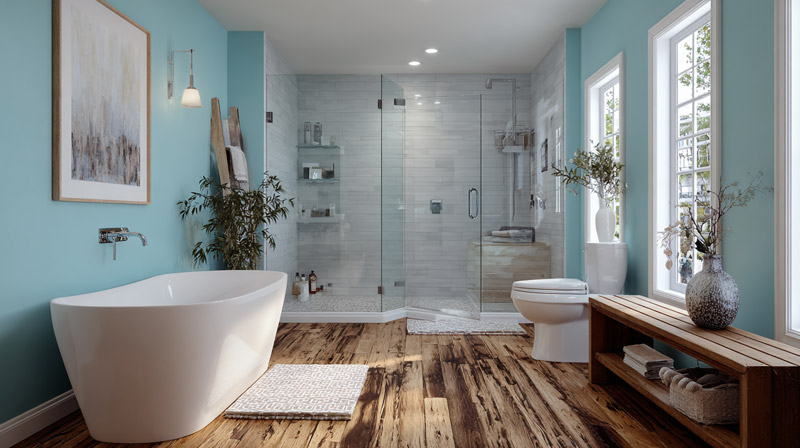
Paint color has a measurable impact on buyer behavior. Zillow’s Paint Color Analysis, which surveyed over 4,200 recent and prospective homebuyers, found specific bathroom colors consistently increase offer prices.
Light blue bathrooms added a 1.6% premium to home sale prices, worth nearly $5,000 on a $290,000 home, according to Zillow’s 2021 study. The 2023 update found terracotta brown bathrooms added up to $1,624, while dark gray outperformed white in every room studied, including bathrooms.
Colors That Support Resale Value
Zillow’s research shows 3 color categories perform reliably well in bathrooms for resale:
- Light blue and pale blue (1.6% offer price increase, Zillow 2021)
- Warm earth tones including terracotta brown (up to $1,624 added value, Zillow 2023)
- Dark gray and charcoal (outperformed white in direct buyer comparisons, Zillow 2023)
High-LRV neutrals consistently outperform bold or highly saturated choices in buyer surveys. The reason is buyer psychology: neutral colors allow buyers to project their own taste onto the space, while strong colors narrow the perceived audience.
Colors That Reduce Resale Appeal
Bright yellow, orange, and bright red consistently lower buyer interest in bathroom settings, according to Zillow’s color research. These colors reduce the likelihood of a buyer wanting to tour the property in the first place, not just the offer price.
Rental vs. owner-occupied bathrooms follow slightly different rules. Tenants respond more strongly to neutral palettes, preferring whites, light grays, and soft blues. Homeowners repainting for themselves have more latitude with deeper tones, particularly in primary bathrooms where personalization is expected.
The safest resale choice remains pale blue or warm light gray. Both have data behind them and broad buyer appeal across age groups and design preferences.
How to Test Bathroom Wall Colors Before Committing
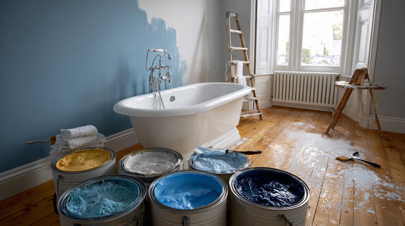
Paint chips and paper samples are unreliable. The color you see in a store under fluorescent retail lighting is not the color you will get on your bathroom wall under your specific fixture and natural light conditions.
Among the 83% of homeowners who hire professionals for bathroom renovations (Houzz 2024), even professionals recommend testing before full application. Color surprises after full paint jobs are one of the top renovation complaints, and the fix requires a full repaint.
The Physical Swatch Method
Paint a 12×12 inch swatch directly on the wall. Not on cardboard. Not taped to the wall on paper.
The wall’s texture, existing primer, and surface color all change how new paint reads. A swatch on paper evaluated near a window will look 15 to 20% lighter than the same color applied over bathroom drywall under vanity lighting.
Evaluate the swatch at 3 specific times:
- Morning: natural light entering the room at its most direct angle
- Midday: overhead artificial light without natural light override
- Evening: full artificial light only, which is the most honest test
Digital Tools That Help
Sherwin-Williams ColorSnap Visualizer and Benjamin Moore’s Personal Color Viewer both allow photo upload and color overlay. They are useful for narrowing from 10 options to 3, but not reliable for final decisions. The digital rendering cannot account for sheen, texture, or your specific light sources.
Wait 24 hours after applying the physical swatch before judging. Wet paint reads 10 to 15% darker than dry paint in most formulas. Deciding on day one based on the wet color is how people end up with a much lighter wall than they expected.
Hold the dried swatch simultaneously next to your dominant tile color, your fixture metal finish, and any existing cabinetry or vanity. All 3 comparisons at once, not one at a time. Color coordination errors become obvious this way in seconds. If you want to get more precise about undertone matching before committing to a full swatch test, a basic understanding of color theory helps explain why certain pairings work and others create visual tension regardless of how appealing they look on a chip.
FAQ on The Best Colors For Bathroom Walls
What is the most popular bathroom wall color?
White remains the top choice. Among homeowners who painted in 2024, 42% used white, according to Clever Real Estate. Soft gray and warm beige follow closely. All three offer high Light Reflectance Value, making them reliable across bathroom sizes and light conditions.
What color makes a small bathroom look bigger?
Colors with an LRV above 70 work best in tight spaces. Pale blue, off-white, and soft gray visually push walls back. Studies suggest light paint colors can make a room feel up to 25% larger. Avoid anything below LRV 40 without a south-facing window.
Is gray still a good color for bathrooms in 2025?
Yes, but warm gray outperforms cool gray right now. Cool-toned grays risk reading purple under LED lighting. Warm greige options like Benjamin Moore Pale Oak hold better across light conditions and pair cleanly with brass and matte black fixtures.
What bathroom paint color adds the most resale value?
Light blue leads the data. Zillow’s Paint Color Analysis found light blue bathrooms added nearly $5,000 to home sale prices on average. Warm earth tones added up to $1,624. Bright yellow, orange, and red consistently reduce buyer interest and offer prices.
What paint finish should I use on bathroom walls?
Satin finish is the standard recommendation for most bathroom walls. It resists moisture, cleans easily, and reflects slightly more light than flat paint. Semi-gloss suits shower-adjacent walls or poorly ventilated bathrooms. Flat paint is not suitable for bathroom walls that face direct moisture.
Does bathroom lighting affect wall paint color?
Significantly. Warm bulbs at 2700K push warm undertones forward and flatten cool ones. Cool gray walls can shift purple under standard LED vanity strips. Always test a physical swatch under your specific bathroom lighting, not in a store or near a window.
What colors work best for a bathroom with no natural light?
Warm whites and warm beiges perform best. They read as inviting rather than cold under artificial light. Pair them with warm-temperature bulbs at 2700K to 3000K. Cool tones like pale blue or gray tend to look flat and slightly grim without any natural light to balance them.
Can I use dark colors in a bathroom?
Yes, in the right conditions. Navy and charcoal work in bathrooms above 55 square feet with adequate lighting and white trim for contrast. Navy LRV sits between 4 and 12, so it absorbs almost all light in small or windowless bathrooms. Size and light levels determine whether dark tones succeed.
What wall color goes with white bathroom tile?
White subway tile is the most flexible backdrop. It pairs cleanly with soft gray, sage green, pale blue, navy, beige, and blush. White tile’s neutral undertone works with both warm and cool wall colors. Charcoal is the one color that tends to fight rather than complement bright white tile in small spaces.
How do I test a bathroom paint color before committing?
Paint a 12×12 inch swatch directly on the wall. Evaluate it at morning, midday, and evening under your actual light sources. Wait 24 hours before judging since wet paint reads 10 to 15% darker than dry. Digital tools like the Sherwin-Williams ColorSnap Visualizer help narrow options but cannot replace a physical test.
Conclusion
This conclusion is for an article presenting the best colors for bathroom walls, and the core takeaway is straightforward: color selection only works when LRV, fixture undertones, and paint finish are treated as a single system.
White, soft gray, sage green, and pale blue consistently perform across bathroom sizes and lighting conditions. Warm beige and blush pink hold up well under warm-temperature bulbs. Navy and charcoal require space and light to succeed.
Satin finish is the right default for most walls. Semi-gloss handles high-moisture zones. Flat paint belongs in powder rooms only.
Test a physical swatch on the wall. Check it under morning light, artificial light, and evening conditions before committing. The color temperature of your bulbs will change everything.

- Exploring the Rich History of Interior Design - September 30, 2026
- IKEA Shoe Storage Ideas for Compact Areas - September 23, 2026
- What is Interior Design? A Beginner’s Guide - September 19, 2026