Color Combinations
Colors That Go with Mahogany Wood
Mahogany wood has one of the most demanding color profiles in interior design. Get the wall color wrong and the whole room looks off, even if you can’t immediately say why.
The right colors that go with mahogany wood depend almost entirely on understanding its warm reddish-brown base, its orange and purple undertones, and how finish type shifts those tones under different lighting conditions.
This guide covers the complete mahogany color palette, from neutral pairings and green combinations to the colors you should avoid, with specific paint references from Benjamin Moore, Sherwin-Williams, and Farrow and Ball throughout.
Wood, floors and other fixed surfaces are one part of our complete color combination guide, which also covers walls, textiles and rooms.
What Colors Does Mahogany Wood Actually Have?
Mahogany’s base tone is a deep reddish-brown with warm orange and faint purple undertones. That combination is what makes color pairing either work beautifully or fall completely flat. Get it wrong and the whole room looks off without anyone being able to say exactly why.
Different mahogany species each bring their own tonal character to a space. African mahogany (Khaya spp.) leans toward a deeper, slightly purple-red tone. Honduran mahogany sits in classic warm reddish-brown territory. Philippine mahogany (Shorea spp.) reads lighter, with yellowish or pinkish tones that take paint pairings in a different direction.
Light source changes everything. That same mahogany dresser can look golden-brown in morning sunlight and shift to something close to deep burgundy under evening incandescent light. Cool artificial lighting pulls out the purple undertones especially hard. Worth knowing before you commit to a paint color based purely on a weekend sample test.
| Mahogany Type | Dominant Tone | Undertone Character |
|---|---|---|
| Light / Honey Mahogany | Warm golden-brown | Orange, pinkish hints |
| Medium Mahogany | Classic reddish-brown | Warm red-orange |
| Dark / African Mahogany | Deep reddish-brown | Purple, burgundy-adjacent |
| Ebonized / Dark Stain | Near-chocolate brown | Subdued red, near-neutral |
Finish type also shifts the pairing equation. A high-gloss finish reflects room color back intensely, which means the wall color reads differently in the room than on a paint chip. A matte or satin finish absorbs more light and reveals the wood grain, making the reddish-brown undertone more visible and dominant.
Freshly milled mahogany starts lighter, sometimes almost pinkish. With age and UV exposure, it deepens to that rich reddish-brown most people associate with the wood. Older pieces, especially antiques, can read close to deep burgundy. That aging shift matters when you’re pairing colors, since a new mahogany dining table and a 30-year-old mahogany bookcase may not respond to the same wall palette the same way.
Why Undertone Identification Comes First
The undertone determines which colors create harmony and which create visual tension. Mahogany’s warm red-orange base pulls toward complementary greens and rich blues on the color wheel, and it needs color temperature alignment to feel settled in a room.
Warm-toned mahogany (orange-dominant) pairs cleanly with warm whites, cream, and earthy tones. Purple-dominant mahogany (common in African species) gives more latitude with muted blues and cooler greens.
A simple test: hold a pure white card next to your mahogany piece. If the wood looks orange, it’s warm-dominant. If it reads more red-violet, the purple undertone is active. That result should guide every color choice in the room.
—
What Neutral Colors Go With Mahogany Wood?
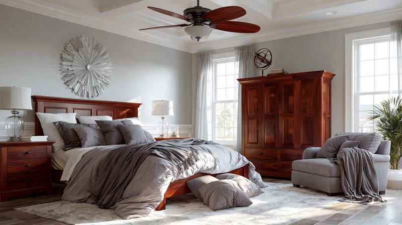
Neutral colors are the most reliable pairings for mahogany wood furniture and cabinetry. They work because they don’t compete with mahogany’s warm reddish-brown tone. They let the wood read as the focal point while giving the room a clean, settled feel.
A Fixr.com survey of 71 interior design and home staging experts found that 81% recommend warm neutrals for interiors when preparing a home for sale. Neutral wall colors are also the go-to recommendation for making rooms feel larger, with 61% of pros citing warm neutrals and 60% citing whites as the best options for expanding the perceived size of a space (Fixr, 2024).
Warm Whites and Creams With Mahogany
Warm whites work. Cool whites do not. This is the single most important rule for this category.
Benjamin Moore White Dove and Sherwin-Williams Alabaster are the two most field-tested warm whites for rooms with dark wood furniture. Both carry enough yellow-cream warmth to align with mahogany’s orange-dominant base rather than fighting it.
- Pure white (cool, blue-based) makes mahogany look orange and dated
- Warm whites like White Dove create a soft, luminous contrast without color temperature conflict
- Cream and ivory tones work similarly but add more visual weight to smaller rooms
Sherwin-Williams Alabaster was one of the most consistently recommended warm whites from professional painters and designers through 2024-2025, specifically noted for its ability to hold warmth without reading yellow under artificial light.
Beige, Greige, and Taupe With Mahogany
Benjamin Moore Edgecomb Gray (HC-173) and Manchester Tan (HC-81) are two of the most recommended transitional neutrals for rooms with mahogany wood. Both sit in the warm beige-greige range with just enough warmth to echo mahogany’s undertone without going full-earth-tone.
Warm beige: Shares the orange undertone of mahogany, creates a tonal, cohesive room palette.
Greige (warm gray-beige): Adds a modern quality while keeping color temperature alignment. Works especially well with medium and light mahogany finishes.
Soft taupe: Bridges the gap between mahogany furniture and more contemporary room palettes. More neutral than beige but less stark than gray.
The 2025 and 2026 color-of-the-year picks from Sherwin-Williams (Grounded, Clove, Universal Khaki) and Behr (Even Better Beige, Oxford Street) all sit comfortably in this warm neutral range, which confirms that this palette direction has staying power beyond any single trend cycle.
Black and Charcoal With Mahogany
Black grounds a mahogany room and creates dramatic contrast. It works best as an accent, not a dominant wall color. Sherwin-Williams Iron Ore is a soft near-black with brown undertones that reads warmer than Tricorn Black and sits more naturally against mahogany’s reddish-brown base.
Charcoal gives similar contrast with slightly more room flexibility. Deep charcoal-brown blends like Benjamin Moore Silhouette (AF-655) or Sherwin-Williams Black Fox (a dark brown-gray) pair with mahogany without the stark severity of a pure black wall.
Use black and charcoal on a single accent wall, on trim, or in cabinetry rather than all four walls. Mahogany is already a visually heavy material. All-charcoal walls push the room into darkness rather than drama.
—
What Green Colors Go With Mahogany Wood?
Green is the most naturally aligned color family for mahogany. On the color wheel, green sits opposite the red-orange range where mahogany lives, making them complementary. That’s not a design opinion. It’s basic color theory: complementary pairing creates contrast that the eye reads as balanced rather than chaotic.
Interior design professionals confirmed this direction: Fixr’s 2024 survey found that 46% of design experts cite earthy tones as the most popular color palette, with nature-inspired greens including sage and olive as leading choices within that category (Fixr, 2024).
Sage Green With Mahogany
Sage green is the most forgiving entry point into green-mahogany pairings. Its muted, gray-green quality softens the contrast without creating tension.
Sherwin-Williams Evergreen Fog (SW 9130) and Stardew (SW 9138) are two of the most recommended sage greens for rooms with warm wood tones. Evergreen Fog was Sherwin-Williams’ Color of the Year for 2023 and remained in high demand through 2024-2025 specifically because it reads as a near-neutral in rooms with strong wood presence.
- Works across mahogany furniture types, from light to dark finishes
- Reads calmer in bedrooms, more grounded in dining rooms
- Pairs cleanly with brass and gold hardware accents
Olive Green With Mahogany
Olive gives mahogany rooms an earthy, organic quality that sage cannot. Where sage reads soft, olive reads grounded. The yellow base in olive green connects to the warm undertone in mahogany, making the pairing feel intentional rather than accidental.
Sherwin-Williams Ripe Olive and Benjamin Moore’s October Mist (their 2022 Color of the Year, still in high demand as of 2025) are strong options in this range. Both hold warmth under different lighting conditions, which matters in mahogany rooms where light shifts can make a wall color look significantly different throughout the day.
Deep Forest Green With Mahogany
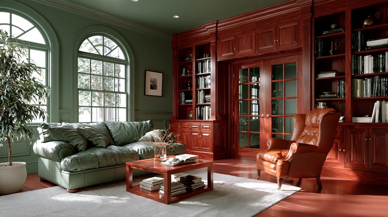
Forest green delivers the highest contrast within the green family. It works best in rooms that already have a formal or library-style character, where mahogany’s traditional quality is meant to be amplified, not softened.
Farrow and Ball Mizzle is a complex green with gray undertones that pulls back from the intensity of a pure forest green while still reading dark and rich. It is one of the most specified greens for traditional interiors with mahogany paneling or bookcases. A 2025 Luxe Interiors + Design survey of top designers found deep green described as “timeless with other true neutrals” and “a forever classic look” when paired with warm brass hardware and natural wood.
One caution: in rooms with limited natural light, full forest green walls with dark mahogany furniture create a very enclosed feel. Compensate with lighter ceiling paint and additional artificial light sources.
—
What Blue Colors Go With Mahogany Wood?
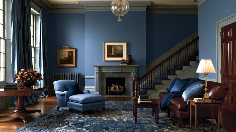
Blue is the second major complementary color family for mahogany wood. The pairing has a long track record in traditional interior design, particularly in formal rooms, libraries, and dining rooms where mahogany furniture has historically been dominant.
Blue’s sustained popularity in professional design work supports this direction. Benjamin Moore named Blue Nova as their 2024 Color of the Year. Sherwin-Williams chose Upward (SW 6239) for the same year. Multiple major paint brands selected blue shades simultaneously, which reflects genuine demand rather than a single brand’s projection (Homes and Gardens, 2024).
Navy and Deep Blues With Mahogany
Navy blue and mahogany is one of the most established formal pairings in residential interior design. The depth of navy creates strong contrast against mahogany’s warm reddish-brown without creating color temperature conflict, because navy carries its own warmth.
Best options in this range:
- Benjamin Moore Hale Navy: warm navy with slight green undertone, less severe than pure navy
- Farrow and Ball Stiffkey Blue: deep blue with complex greenish-gray depth
- Sherwin-Williams Naval: rich, saturated navy that holds warmth under incandescent light
Navy works best in dining rooms, home libraries, and offices with mahogany desks or cabinetry. It creates a high-contrast, formal room palette that references traditional English and colonial interior styles, both of which historically used mahogany as a primary wood.
Muted and Dusty Blues With Mahogany
Dusty blue and slate blue are the casual counterparts to navy. They deliver the blue-mahogany color wheel relationship with lower contrast and a lighter room atmosphere. This range works better in bedrooms and living rooms where navy would feel too heavy.
| Blue Tone | Character | Best Room Use With Mahogany |
|---|---|---|
| Navy / Deep Blue | High contrast, formal | Dining rooms, libraries, offices |
| Slate / Steel Blue | Medium contrast, balanced | Living rooms, studies |
| Dusty / French Blue | Soft contrast, relaxed | Bedrooms, guest rooms |
| Icy / Bright Blue | Color temperature clash | Avoid with mahogany |
A key distinction: cool blues with strong blue-white character (think electric blue, icy blue, or pastel powder blue) conflict with mahogany’s warm undertone. The color temperature mismatch creates visual tension that no amount of styling can fully resolve. Stick to muted, dusty, or gray-influenced blues when going lighter in this color family.
—
What Earthy and Terracotta Colors Go With Mahogany Wood?
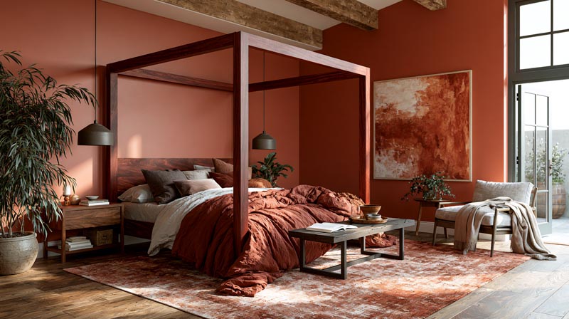
Earthy tones and terracotta share mahogany’s red-orange base. The result is an analogous color pairing: tones pulled from the same part of the color wheel, creating a warm, cohesive room palette that feels grounded rather than contrasted.
Analogous palettes work because the eye reads them as naturally related, the way colors in a landscape tend to harmonize. For mahogany wood, this means the room reads warm, rich, and intentional rather than bold or dramatic.
Terracotta and Rust With Mahogany
Sherwin-Williams Cavern Clay and Benjamin Moore Earthen Jug are two of the most referenced terracotta options for rooms with mahogany wood. Both connect directly to mahogany’s warm reddish-orange base.
- Terracotta walls amplify the room’s warmth and work best with good natural light
- Rust tones add depth and work well in maximalist or jewel-tone room palettes
- Burnt sienna sits slightly darker, closer to mahogany’s own tone, for minimal color contrast
This pairing direction aligns with broader 2024-2025 design trends. Fixr’s 2024 survey of 71 design experts confirmed earthy reds, terracotta, and sienna as among the most unexpected yet popular interior color choices, specifically noted for how they “add richness to every room” and respond to light in ways that feel alive rather than static.
Caramel and Warm Tan With Mahogany
Caramel and warm tan sit in the lower-contrast end of the earthy palette. They share enough warmth to feel aligned with mahogany without the full visual intensity of terracotta or rust.
This is the safer choice for rooms where the mahogany furniture is already dominant and you want the walls to support rather than compete. Sherwin-Williams Universal Khaki (their 2026 Color of the Year) sits right in this range, described as a warm sandy neutral that bridges beige and taupe with subtle warmth. It pairs cleanly with mahogany furniture in living rooms and bedrooms without any visual strain.
One honest caveat: earthy analogous palettes can overwhelm a room that lacks natural light. In north-facing rooms or basements, the combined warmth of mahogany and terracotta-adjacent walls can feel heavy. That’s where warm neutrals or muted greens become the more practical choice, even if they’re less dramatic.
—
What Colors to Avoid With Mahogany Wood?
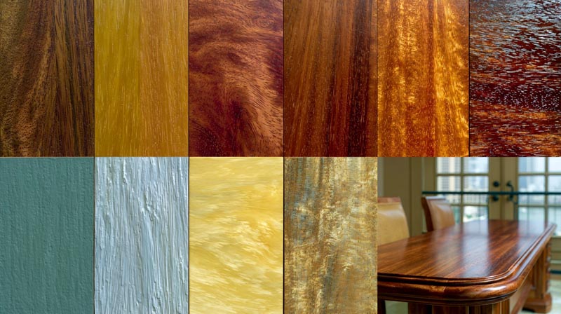
Color temperature mismatch is the core reason most pairings with mahogany fail. Mahogany is a warm-toned wood. Colors built on a cool base pull against it rather than aligning with it, and the result is a room that looks unsettled without any obvious single reason why.
This is not a minor stylistic preference. Color in interior design works through temperature relationships as much as through individual hue choice. A color that reads beautifully in one room can look wrong in another purely because of what it sits next to.
Cool Grays and Stark Whites
Cool grays are the most common mistake in mahogany rooms. They show up on a paint chip looking sophisticated, then clash with the warm undertone of the wood once on the wall. The issue is undertone conflict: most popular gray paint colors carry a blue or green undertone, which directly opposes mahogany’s red-orange base. The result reads as muddy and dissonant.
Stark whites with blue or cool undertones create a similar problem. They make mahogany look orange rather than warm brown, which is why professional painters consistently steer clients toward warm whites (Benjamin Moore White Dove, Sherwin-Williams Alabaster) over pure whites near dark wood.
Bright and Cool Blues
Deep navy and muted blue work with mahogany. Bright cool blues do not. The distinction is color saturation and temperature together.
- Electric blue and royal blue compete with mahogany’s visual weight without creating complementary contrast
- Icy blue and powder blue introduce a cool-dominant tone the room’s warm wood cannot absorb
- Periwinkle sits at the edge of the problem zone, activating mahogany’s purple undertone in an uncontrolled way
Lavender and Cool Purples
Mahogany already carries a faint purple undertone, especially in African mahogany species. Lavender and cool purple wall colors activate that undertone strongly. The visual effect is that the wood starts reading purple-red rather than warm reddish-brown, which shifts the entire room palette in a direction that rarely looks intentional.
Warm burgundy works with mahogany. Cool lavender does not. The difference is temperature, not hue family.
Bright Primary Colors
Bright red, primary yellow, and electric green all compete with mahogany rather than complement it. These colors have enough visual weight to fight the wood for room dominance. The result is a space that feels unresolved, where neither the wall nor the furniture reads as the clear anchor.
Muted or earthy versions of the same hues are different. Dusty rose, ochre, and olive green all work. It is the saturation level combined with cool undertones that creates problems, not the broad color family itself.
—
How Do Wall Colors With Mahogany Wood Change by Room Type?
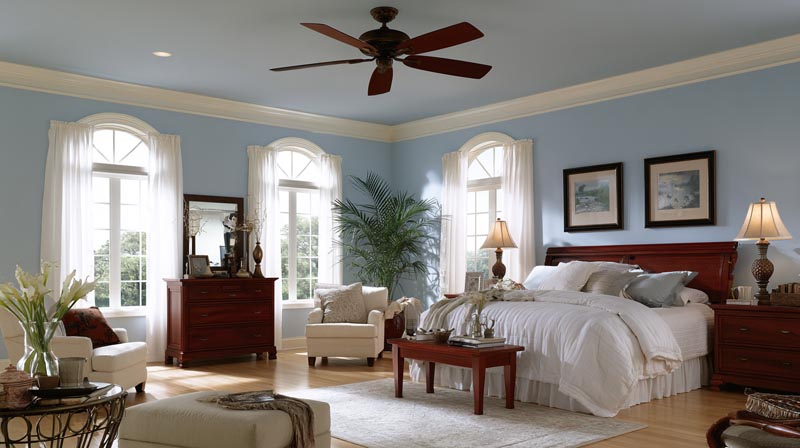
The same mahogany furniture reads differently across room types. Scale, natural light, ceiling height, and how much of the room the wood occupies all affect how a paint color performs. A wall color that grounds a dining room can make a bedroom feel oppressive, and a bedroom-appropriate muted blue may look too casual in a formal living room.
Light in interior design is one of the most significant variables in how wall colors perform next to mahogany. The same paint color can look like two completely different shades depending on whether the room faces north or south, and how much artificial light supplements natural daylight.
Living Room Colors With Mahogany Furniture
Living rooms offer the widest range of color options for mahogany pairings. The space is larger, lighting is usually more varied, and the mahogany presence tends to be concentrated in a few key pieces rather than dominant across the whole room.
Recommended direction: Deep forest green, rich navy, warm neutrals, or muted earthy tones all work depending on the overall room style and light conditions. Jewel tones, including deep teal and rich burgundy, also hold up in larger living rooms where the walls have enough surface area to carry the color without overwhelming the mahogany pieces.
Bedroom Colors With Mahogany Furniture
Mahogany bedroom furniture, particularly dark mahogany beds and armoires, is visually heavy. The right wall color reduces that weight rather than adding to it.
- Sage green and muted greens: Soften the room and reduce mahogany’s visual dominance
- Warm off-whites and soft cream: Create a light, airy contrast that lets the wood breathe
- Dusty blue and French blue: Provide enough contrast without the formality of navy
- Avoid: Terracotta and deep jewel tones in small, low-light bedrooms
Lime Painting research from 2025 confirms this direction: homeowners with dark wood furniture in bedrooms gravitate toward “saturated yet calming tones such as dusty plum, sage, and deep navy” that create a restorative atmosphere without increasing the room’s visual heaviness.
Dining Room Colors With Mahogany Wood
Dining rooms support the most dramatic color choices when mahogany is present. The room is used primarily in the evening, under warm artificial light, which shifts how both the wood and the wall color read. Colors that look intense in daylight soften considerably under warm incandescent or candlelight conditions.
Deep forest green and mahogany in a dining room is a historically validated pairing. Farrow and Ball Mizzle, Benjamin Moore Pinelands, and deep Farrow and Ball greens have all been cited by designers in Luxe Interiors surveys as go-to choices for formal dining rooms with mahogany furniture or paneling.
Navy also works in dining rooms at full saturation. Benjamin Moore Hale Navy and Farrow and Ball Stiffkey Blue on all four walls of a mahogany dining room creates a formal, jewel-box atmosphere that reads as intentional and considered rather than dark or oppressive, provided ceiling height is adequate and lighting is warm.
What Accent Colors Work With Mahogany Wood?
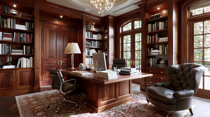
Accent colors in a mahogany room carry more visual weight than they do in a neutral wood room. Because mahogany already has a strong warm reddish-brown tone, the accent layer needs to either echo that warmth or deliberately contrast it. There is not much middle ground.
The 60-30-10 rule gives a useful structure here. In a mahogany-dominant room, the wood itself counts as part of the 30% secondary layer. The wall color is your 60%. That leaves only 10% for accent colors, which means accent choices need to be deliberate rather than decorative scatter.
Brass and Gold Accents With Mahogany
Brass and gold are the most naturally aligned metal finishes for mahogany wood. The warm yellow tone of brass shares mahogany’s color temperature, which makes the combination read as cohesive rather than assembled.
Gold and brass accents were confirmed as a leading interior design trend through 2025 and into 2026 by multiple sources including Q Interiors, Designer Furniture Gallery, and Willis Furniture, all citing their ability to “work seamlessly with natural textures like wood and stone.” Brushed brass in particular, with its matte warmth, pairs more cleanly with mahogany than polished gold, which can compete with the wood’s natural richness.
- Hardware, cabinet pulls, and door handles in brushed brass
- Pendant and sconce lighting with brass or antique bronze frames
- Mirrors and picture frames in matte gold
Chrome and nickel finishes are the ones to avoid. Both carry a cool silver-blue tone that conflicts with mahogany’s warm base in the same way that cool gray walls do.
Deep Teal as an Accent
Deep teal works as a high-impact accent in small doses against mahogany. It sits at the intersection of blue and green on the color wheel, combining complementary qualities from both color families that pair well with mahogany’s reddish-brown base.
The key phrase there is “small doses.” Teal as a full wall color can overwhelm a room with significant mahogany presence. As an accent, applied through throw pillows, a single armchair, or a decorative vase grouping, it adds depth and personality without fighting the wood for dominance.
Cream and Ivory Soft Furnishings
Cream is the lowest-contrast, highest-reliability accent choice for mahogany rooms. It sits close enough to warm white to feel neutral but carries enough warmth to avoid the cool-undertone problem that stark white creates.
Practical applications:
- Upholstery: Cream linen or cotton fabric on chairs and sofas provides warm contrast without competing with the wood
- Bedding: Ivory and cream textiles in mahogany bedrooms reduce the visual heaviness of dark furniture
- Rugs: Cream or ivory area rugs ground the room and reflect light upward, which helps in rooms where mahogany floors and furniture create a dark floor-heavy scheme
Dusty Rose and Blush as Unexpected Accents
Blush and dusty rose are less obvious but genuinely effective accent colors for mahogany wood. The soft pink tone shares the red family with mahogany without competing in saturation.
This pairing reads as quietly warm rather than bold. It works best in bedrooms and sitting rooms where the mahogany furniture is medium-toned rather than very dark. In dark mahogany rooms, blush can read too faint to register as intentional. Pair with brass hardware and warm cream walls for the combination to land correctly.
—
How Does Mahogany Wood Finish Affect Color Pairing?
The finish on mahogany wood changes how color reads in the room more than most people account for. Two pieces of mahogany furniture with identical stain color can respond to the same wall paint in noticeably different ways purely because of finish type.
Satin finishes are widely cited as the most versatile choice for mahogany in interior settings. A satin finish “enhances depth without glare,” making it ideal for living rooms where the wood needs to hold its warmth under varied lighting conditions (Sonusgear/Alibaba mahogany colour buying guide, 2026).
High-Gloss Mahogany Finish
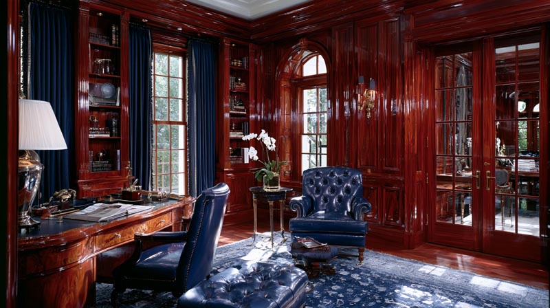
High-gloss finish on mahogany creates a polished, reflective surface that amplifies whatever color surrounds it. This is the most demanding finish for color pairing.
A bold wall color next to high-gloss mahogany reads twice as intense, because the gloss reflects the wall back into the room. Navy walls with high-gloss mahogany paneling creates a much more dramatic effect than navy walls with matte mahogany. Account for this when choosing paint colors: go one shade lighter or more muted than you would for a matte finish room.
| Finish Type | Color Pairing Effect | Best Wall Color Approach |
|---|---|---|
| High-gloss | Amplifies wall color intensity | Choose muted or lighter tones |
| Satin | Balanced, versatile reflection | Widest range of pairings |
| Matte | Emphasizes wood grain and reddish undertone | Warmer pairings perform better |
| Ebonized / Dark stain | Suppresses warmth, reads near-neutral | Higher-contrast colors work |
Matte and Satin Mahogany Finishes
Matte finish absorbs light rather than reflecting it, which makes the wood’s reddish-brown undertone more visible and dominant. Rooms with matte mahogany furniture read warmer overall.
Warm pairings work cleanly here. Earthy tones, warm neutrals, and green palettes all respond well because they align with the warmth the matte finish projects. Cool colors need more care: a cool-leaning gray or blue that looks fine next to satin mahogany may read as more conflicted next to matte mahogany where the warm undertone is stronger.
Satin sits between the two extremes. It is the finish that offers the most flexibility across the full range of compatible color families, which is why it appears in most professional recommendations for mahogany interior pieces in living rooms.
Red-Stained vs. Dark-Stained Mahogany
Red-stained mahogany pushes the warm undertone further toward the red end of the spectrum. Cool pairings become harder to manage. Green and warm neutral wall colors become the safest and most reliable choices.
Dark-stained or ebonized mahogany suppresses the warm red undertone significantly. It reads closer to dark espresso or near-black, which gives more flexibility. Higher-contrast wall colors including certain cool grays and even some blue tones can work with ebonized mahogany in a way they cannot with natural or red-stained finishes.
Testing paint colors against the specific stain and finish in your room, rather than against a generic mahogany reference, is the only reliable way to confirm a pairing works. Hold a large paint sample (at least A4 size) against the actual piece in the actual lighting conditions of the room for a full day before committing.
—
What Color Palettes Work for Full Mahogany Wood Rooms?
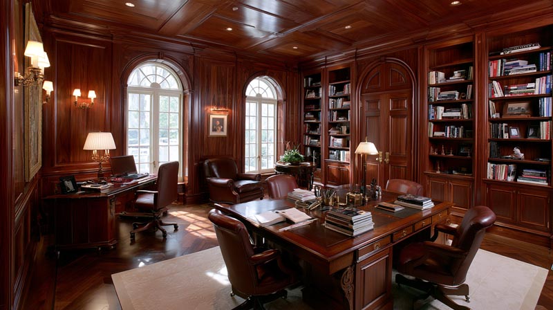
Rooms where mahogany is not just a few furniture pieces but a dominant material, covering paneling, floors, built-ins, or multiple large pieces simultaneously, require a coordinated palette approach rather than individual color pairing decisions.
The challenge in these rooms is preventing what designers call a “cave effect.” Mahogany floors, mahogany paneled walls, and mahogany furniture together create significant visual weight. The ceiling and any unpaneled wall surfaces become the primary tools for controlling room atmosphere.
Ceiling and Trim Strategy in Mahogany-Dominant Rooms
Keep the ceiling light. This is the single most important rule for full mahogany rooms.
A white or warm off-white ceiling creates a visual break that prevents the room from feeling enclosed. Farrow and Ball recommend using a lighter variation of the wall color on the ceiling in wood-heavy rooms, rather than a pure white, to avoid a stark contrast that can make the ceiling feel like a lid rather than an extension of the space.
- Ceiling: warm white or the wall color at 50% strength
- Trim and molding: warm white (Benjamin Moore White Dove or Sherwin-Williams Alabaster work well)
- Single dominant wall color across all four walls rather than accent-wall approaches
Multiple wall colors in a full mahogany room increase visual complexity in a space that is already visually heavy. One consistent color is the more stable choice.
Separating Mahogany Paneling From Mahogany Floors
When both the walls and floors are mahogany, without any visual separation, the room reads as a single undifferentiated dark mass. The floor covering is the most practical tool for creating that separation.
Rug color as a separator: A light-toned area rug, in cream, warm ivory, soft sage, or pale gold, inserted between dark mahogany floors and mahogany paneled walls breaks the visual continuity. It grounds the seating area, reflects light upward, and gives the eye a clear resting point. The right rug color choice in these rooms is as critical to the overall palette as the wall paint selection.
Three Specific Palettes for Full Mahogany Rooms
These are complete room color palettes confirmed to work in rooms where mahogany is the dominant material.
| Palette Name | Wall Color | Ceiling / Trim | Accent Layer |
|---|---|---|---|
| Classic Library | Farrow & Ball Mizzle or deep forest green | Warm white | Brass hardware, cream upholstery |
| Warm Neutral | Sherwin-Williams Accessible Beige or Cavern Clay | Alabaster | Ivory textiles, antique bronze accents |
| Navy Formal | Benjamin Moore Hale Navy | White Dove | Brass fixtures, light cream rug |
Mirrors are a practical addition in full mahogany rooms regardless of palette. They reflect light back into the space and expand the perceived room size without changing the color scheme. Large-format mirrors on non-paneled walls are particularly effective in rooms where mahogany paneling covers 2-3 walls.
The focal point of a full mahogany room should be clearly established before the color palette is finalized. In a library-style room with floor-to-ceiling mahogany built-ins, a single contrasting wall color behind the primary seating area creates the visual anchor the room needs. Without it, the eye has nowhere to rest and the room feels overwhelming regardless of how well the individual color choices work.
Understanding how contrast in interior design functions at the room level, not just at the individual color-pairing level, is what separates a full mahogany room that feels considered from one that simply feels dark.
FAQ on Colors That Go With Mahogany Wood
What wall color goes best with mahogany wood furniture?
Warm whites, sage green, and navy blue are the most reliable choices. Benjamin Moore White Dove and Sherwin-Williams Alabaster work well as warm neutrals. Deep forest green and muted earthy tones also pair cleanly with mahogany’s reddish-brown base.
Does gray go with mahogany wood?
Cool gray conflicts with mahogany. Most popular gray paint colors carry blue or green undertones that clash with mahogany’s warm reddish-brown base. Warm gray with red or brown undertones, like Sherwin-Williams Repose Gray, is a safer option.
What paint colors go with mahogany wood floors?
Warm neutrals, soft greens, and muted blues work well above mahogany floors. Sherwin-Williams Accessible Beige and Benjamin Moore Edgecomb Gray are widely recommended. Avoid cool whites and stark grays, which make mahogany flooring read as orange rather than warm brown.
Does white go with mahogany wood?
Warm white works. Cool or pure white does not. Benjamin Moore White Dove and Sherwin-Williams Alabaster both carry enough warmth to align with mahogany’s orange undertone. Pure bright whites with blue or cool bases make mahogany look dated and overly orange.
What accent colors work with mahogany furniture?
Brass and gold hardware, cream textiles, and deep teal used sparingly are the strongest accent choices. Dusty rose works in lower-contrast settings. Chrome and silver finishes conflict with mahogany’s warm undertone and should be avoided in mahogany-dominant rooms.
What colors go with dark mahogany wood specifically?
Dark mahogany needs higher contrast to avoid looking heavy. Navy blue, deep forest green, and warm off-white all work well. Light ceiling paint is non-negotiable in dark mahogany rooms. Warm cream area rugs help separate dark mahogany floors from dark furniture.
Is green a good color with mahogany wood?
Green is one of the best color families for mahogany. It sits opposite red-orange on the color wheel, making it a complementary pairing. Sage green, olive, and forest green all work at different contrast levels. Farrow and Ball Mizzle is a widely used option.
What colors should you avoid with mahogany wood?
Cool gray, bright cool blue, lavender, and stark white all conflict with mahogany’s warm undertone. Color temperature mismatch is the core problem. Any color with a strong blue or cool base will create visual tension rather than harmony against mahogany’s reddish-brown tones.
Does blue go with mahogany wood?
Deep navy and muted dusty blues work well. Benjamin Moore Hale Navy and Farrow and Ball Stiffkey Blue are strong choices. Avoid icy, bright, or electric blue shades. Those carry a cool dominant tone that conflicts with mahogany’s warm reddish-brown base and orange undertone.
What colors go with mahogany wood cabinets in a kitchen?
Warm cream, soft sage green, and warm beige walls work best with mahogany kitchen cabinets. Brass hardware completes the palette. Sherwin-Williams Cavern Clay works well as an earthy accent wall option. Avoid cool gray walls, which make mahogany cabinetry look dull and mismatched.
Conclusion
This conclusion is for an article presenting the full range of mahogany wood color combinations that actually work, from sage green and navy blue to warm neutrals and earthy terracotta palettes.
The common thread across every successful pairing is color temperature alignment. Mahogany’s warm reddish-brown tone needs colors that share or deliberately contrast its warmth, never colors that simply ignore it.
Finish type, room function, and natural light all shift which specific shades perform best. A matte mahogany dining set and a high-gloss mahogany floor panel are not the same design problem.
Use specific paint references, test large samples in real lighting conditions, and treat the wood itself as the anchor of your room color palette rather than an afterthought.

- Kitchen Color Schemes by Cabinet Color: What Pairs Well - October 19, 2026
- Curtain Colors for Every Wall Color: Safe vs Bold Picks - October 18, 2026
- Interior Design Styles: Find Your Primary and Secondary - October 14, 2026