Color Combinations
Colors That Go with Oak Cabinets: Top Designer Picks
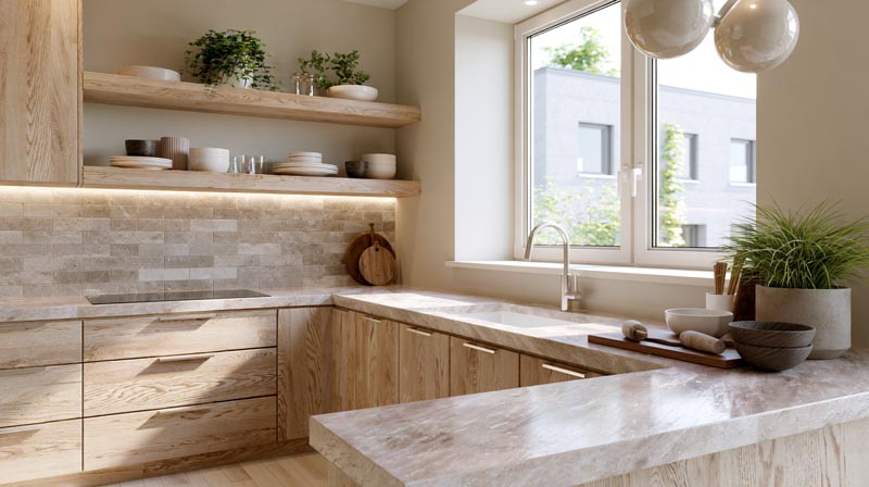
Oak cabinets are back, and this time they look nothing like your parents’ kitchen.
Figuring out which colors go with oak cabinets is trickier than most people expect. The wood’s warm, golden undertones react differently to every wall color, countertop finish, and hardware choice you put next to it.
Get it right and the kitchen feels rich, deliberate, and current. Get it wrong and even beautiful quarter-sawn grain reads dated.
This guide covers every color decision in an oak cabinet kitchen, from wall paint and countertops to backsplash tile, hardware finishes, and trim color, so you can build a kitchen color palette that actually works with the wood instead of fighting it.
For the wall, fabric and accent colors that build on this, see our primer on pairing colors in a room.
What Colors Go With Oak Cabinets?
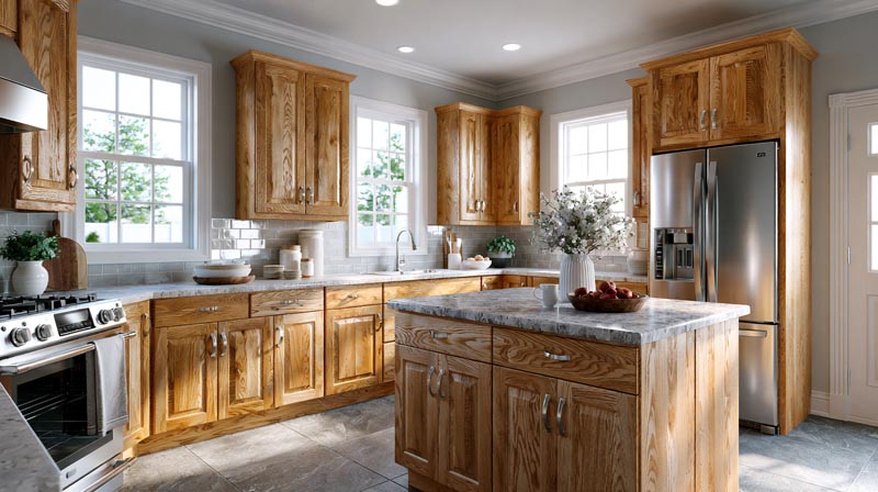
Oak cabinets carry warm, golden-to-honey undertones that influence every color decision in the room. The wood grain reads yellow, orange, or amber depending on the stain depth and the light source.
Colors that work fall into 3 groups: neutrals that complement the warmth, cool tones that contrast it, and earthy tones that extend it. Colors that clash are cool-toned, blue-based, or carry purple undertones.
The Houzz 2024 Kitchen Trends Study found that wood-tone cabinets accounted for 25% of all cabinet choices among renovating homeowners, up from previous years. Natural oak finishes are making a genuine comeback.
This article covers 10 specific color directions for oak cabinet kitchens, from wall paint and countertops to backsplash, hardware, and trim.
| Color Category | How It Works With Oak | Best Use |
|---|---|---|
| Warm white / cream | Matches oak’s warm undertone | Walls, upper cabinets, trim |
| Greige / warm gray | Bridges warm and neutral | Walls, countertops |
| Olive / sage green | Earthy connection, shared warmth | Walls, island, accent |
| Navy / slate blue | Contrast pairing that grounds warmth | Island, lower cabinets |
| Black / dark charcoal | High contrast, adds weight | Hardware, countertops |
| Terracotta / rust | Amplifies oak’s orange tones | Backsplash, accent wall |
—
What Wall Color Works Best With Oak Cabinets in a Kitchen?
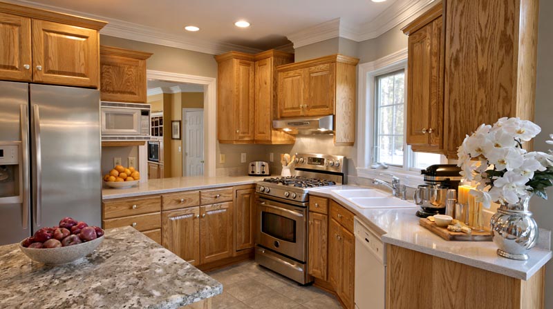
Warm-toned wall colors work best because they align with oak’s yellow-to-orange undertones. Cool walls, especially those with blue or purple undertones, pull against the wood and create visual tension.
The safest zone sits between warm white and greige. Both read as neutral but carry enough warmth to read as intentional next to oak rather than accidental.
Warm White vs. Cool White
Warm white is the stronger choice for oak cabinet kitchens. Paint colors like Benjamin Moore White Dove, Sherwin-Williams Alabaster, and Benjamin Moore Chantilly Lace all have enough warmth to sit comfortably alongside golden oak grain.
Cool whites are the problem. Anything with a blue or stark bright base pulls the orange from oak and makes the wood look dated rather than warm.
- White Dove (Benjamin Moore): Soft warm white, low contrast, blends naturally with light to medium oak stains
- Alabaster (Sherwin-Williams): Off-white with a creamy base, reads slightly warmer than White Dove
- Chantilly Lace (Benjamin Moore): Cleaner white with minimal undertone, works best with lighter honey oak
Avoid Sherwin-Williams Passive and Benjamin Moore Stonington Gray if your cabinets have orange undertones. Both emphasize rather than soften the warm tones in the wood.
Greige and Its Variations
Greige sits between gray and beige and handles oak cabinets better than either color does on its own. Pure cool gray clashes; pure beige can read as too matchy. Greige splits the difference.
Sherwin-Williams Agreeable Gray is the most widely used greige for oak kitchens. It carries a warm beige base with just enough gray to read modern. Sherwin-Williams Accessible Beige is a slightly warmer alternative.
| Paint Color | Brand | Undertone | Best With |
|---|---|---|---|
| Agreeable Gray | Sherwin-Williams | Warm beige-gray | Honey oak, light stains |
| Accessible Beige | Sherwin-Williams | Warm tan | Medium to dark oak |
| Muslin | Benjamin Moore | Yellow-beige | Golden oak, natural stains |
| Edgecomb Gray | Benjamin Moore | Light greige | Light oak, two-tone kitchens |
One thing to watch: avoid green-toned beiges. Colors like Benjamin Moore Pale Oak have enough green in them that they can read flat or muddy next to warm oak grain.
Lighting matters more than most people expect. A greige wall in a north-facing kitchen reads cooler and grayer. Add warm lighting or brass hardware to compensate.
—
Does Gray Go With Oak Cabinets?
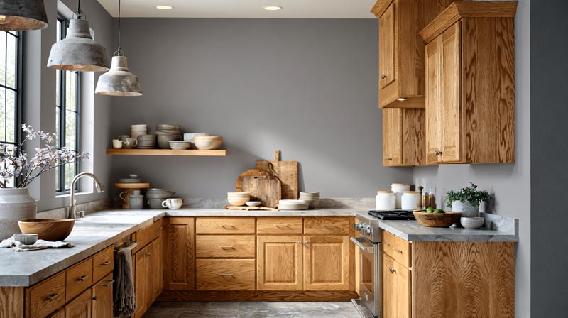
Gray can work with oak cabinets, but only the right type. Cool gray fails; warm gray or greige-leaning gray succeeds. The difference comes down to undertones.
Cool grays carry blue, purple, or green undertones. When placed next to oak’s warm golden tones, cool gray pulls the orange to the surface and makes the wood look more dated, not less. Sherwin-Williams Repose Gray is one of the most commonly used grays, but it has a slight purple undertone that clashes with warm oak.
When Gray Works With Oak
Gray works when it leans toward greige or carries a warm beige base. Think Sherwin-Williams Mindful Gray, which reads green-gray and has enough warmth to avoid the clash. Warm grays that sit in the taupe-brown-gray range complement oak rather than fight it.
- Sherwin-Williams Mindful Gray: green-gray base, avoids purple undertones
- Sherwin-Williams Worldly Gray: slightly greener, reads earthy next to oak
- Benjamin Moore Revere Pewter: warm gray with beige, one of the most reliable choices
Countertop material also affects how gray reads next to oak. A warm white quartz countertop bridges gray walls and oak cabinets better than a cool blue-gray stone does.
When Gray Clashes With Oak
Houzz data shows only 10% of homeowners chose gray cabinets in each of the last 3 years, reflecting a broad shift away from cool gray in kitchens. The same principle applies to walls.
Avoid these with oak:
- Sherwin-Williams Passive (blue-gray undertone)
- Benjamin Moore Stonington Gray (cool blue base)
- Any gray with a purple undertone, which amplifies orange in the wood
Test before committing. A gray paint chip that looks neutral on a white card will show its undertone immediately when placed next to oak cabinetry in natural daylight.
—
Does Green Go With Oak Cabinets?
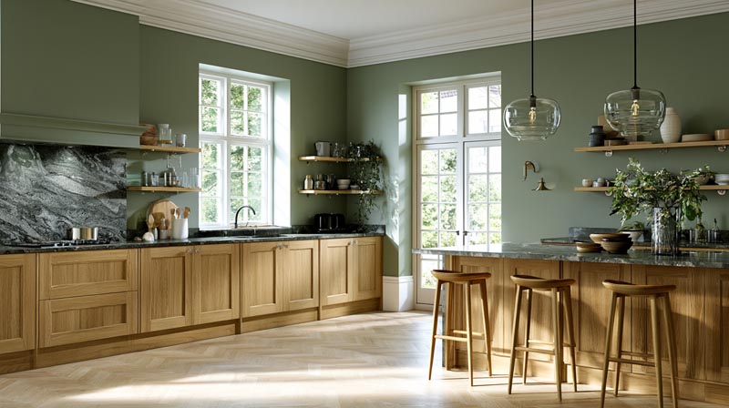
Green is one of the strongest color pairings for oak cabinets. Olive, sage, and forest green all share oak’s earthy base, creating a connection that feels intentional rather than forced.
The National Kitchen and Bath Association’s 2025 Kitchen Trends Report shows green leading cabinet and wall color preferences for the second consecutive year at 76%. The green-and-wood pairing is now a dominant direction in kitchen design.
Olive Green
Olive green is the most compatible green family for oak because it carries brown and yellow undertones that mirror the warmth in the wood.
Benjamin Moore Tate Olive and Sherwin-Williams Ripe Olive both work on walls next to oak. The brownish cast in these colors reads as a natural extension of the wood palette rather than a competing tone.
This works especially well in farmhouse and transitional kitchens, where the mix of natural materials is expected. Pair olive walls with brass hardware and butcher block countertops for a cohesive earthy look.
Sage Green
Sage green functions almost as a neutral next to oak. It has enough gray in it to read sophisticated, and enough warmth to avoid clashing with the yellow tones in the wood grain.
Sherwin-Williams Evergreen Fog (2022 Color of the Year) and Benjamin Moore Saybrook Sage are 2 of the most consistent performers. Both carry a gray-green base that stays balanced under different lighting conditions.
Benjamin Moore October Mist works for lighter oak stains where a warmer, more silvery green is needed. Sherwin-Williams Clary Sage is a better pick for medium to dark oak because its yellow-gray base has more depth.
Forest Green
Forest green is the boldest option. Used on an accent wall or island, it creates a high-contrast pairing that makes oak cabinets look deliberately chosen rather than dated.
Sherwin-Williams Foxhall Green and Benjamin Moore Hunter Green work well here. Both are deep enough to provide real contrast without pulling blue or cool tones that would conflict with oak’s warmth.
Keep surrounding surfaces light when using forest green. White quartz countertops and warm white walls prevent the space from reading too heavy.
—
Does Blue Go With Oak Cabinets?
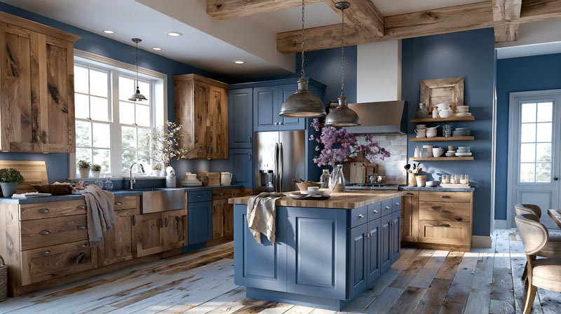
Blue works with oak cabinets when the shade is muted, deep, or carries warm undertones. Bright, icy, or cool-spectrum blues create visual tension by pulling against oak’s yellow-orange warmth.
Blue remains the second most popular color in kitchen design at 63% (National Kitchen and Bath Association, 2025). But not every blue behaves the same way next to warm wood.
Navy Blue
Navy is the most reliable blue for oak pairings. Deep, saturated navy absorbs the contrast between cool and warm tones rather than highlighting it.
Navy works best as an island color or on lower cabinets, not as a wall color in a small kitchen. It grounds the space without overwhelming it. Farrow and Ball Hague Blue and Benjamin Moore Hale Navy are strong options.
Brass hardware bridges navy and oak effectively. The warm metal tone pulls warmth from both surfaces and ties the palette together.
Muted and Dusty Blues
Slate blue, denim blue, and powder blue all work as wall colors next to oak when they lean slightly gray or warm.
- Avoid: sky blue, cobalt, and anything with a cool bright base
- Use: dusty slate tones, muted denim, and gray-blues that sit closer to greige
Benjamin Moore Hale Navy on a kitchen island paired with oak perimeter cabinets has become a consistent choice among kitchen designers, particularly in Charleston and coastal markets where contrast pairings are popular.
—
Does Black Go With Oak Cabinets?
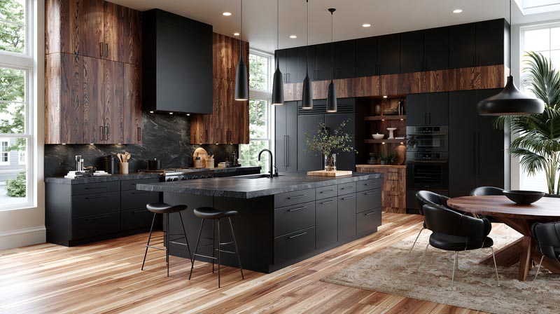
Black and oak is a high-contrast pairing that reads modern and intentional. The combination works because black has no competing undertone. It contrasts without clashing.
Black kitchen elements are a rising trend: Deep, moody shades like charcoal and matte black saw significant growth in 2024 and 2025, particularly as hardware and accent surfaces (Dean Cabinetry, 2025).
Black Hardware With Oak
Matte black hardware is the most common application. Pulls, knobs, and faucet fixtures in matte black create a sharp contrast that makes oak cabinets read current rather than dated.
This is a low-cost, high-impact change. Swapping dated brass or chrome hardware for matte black completely reframes the visual weight of existing oak cabinetry.
Finish matters: matte black reads contemporary. Gloss or lacquer black reads more formal. Either works, but matte is more forgiving in kitchens with imperfect surfaces.
Black Accents and Surfaces
Black countertops with oak cabinets create a dramatic kitchen with strong visual structure. Honed black granite, matte black quartz, and soapstone all work.
A black accent wall or painted island is a bolder move. When the oak is light honey and the black surface is matte, the contrast is clean. When oak runs dark amber, a black island can read heavy unless balanced with lighter wall color and natural light.
Ikea has used oak-and-black combinations across multiple product lines, including the Axstad series, reflecting the pairing’s broad consumer appeal.
—
What Neutral Colors Pair With Oak Cabinets?
Warm neutrals are the most forgiving color group for oak cabinet kitchens. Cream, warm beige, tan, and camel all extend oak’s natural warmth without competing with it.
According to a 2023 Statista survey, 46% of American homeowners choose or would choose white as their kitchen cabinet color. When paired with oak, the white must lean warm to avoid the undertone clash described above.
Cream and Warm Beige
Cream is the most harmonious neutral for oak. It shares the yellow base of the wood and creates a soft, unified palette.
Benjamin Moore Pale Butter, Sherwin-Williams Creamy, and Benjamin Moore White Heron all function as warm creams that sit comfortably next to honey oak. The result is a monochromatic warm palette that reads sophisticated rather than busy.
One caveat: cream-on-cream can flatten a kitchen if there is no contrast element. Add contrast through dark hardware, a stone countertop, or a deeper backsplash tile to give the palette definition.
Tan and Camel Tones
Tan and camel push further into warm territory than cream does, working particularly well with medium to dark oak stains where a lighter wall would feel too stark.
Sherwin-Williams Caramel and Benjamin Moore Carrington Beige are two mid-depth warm tones that blend naturally with amber and golden oak grain.
These tones read rustic in farmhouse kitchens and transitional in more contemporary settings, depending on the hardware and countertop choices. Pair with white quartz for a clean contrast or with butcher block for a fully warm, natural palette.
Avoid flat, muted tan shades with gray or green undertones. Anything that leans cool in the beige-tan range will create the same clash as cool gray does against warm oak.
What Earthy and Terracotta Tones Go With Oak Cabinets?
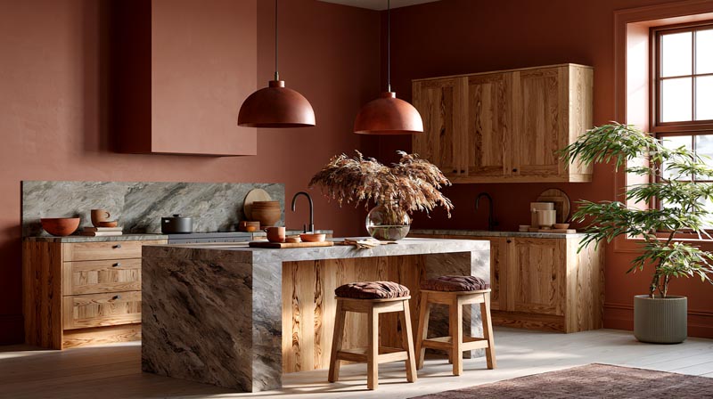
Terracotta, rust, and burnt orange sit in the same warm color family as oak. They share yellow-orange undertones, which means they read as intentional extensions of the wood palette rather than accidental clashes.
Earthy tones are a growing category in kitchen design. The 2024 Houzz Kitchen Trends Study found beige is now the third most popular backsplash color, with terracotta and earthy oranges rising alongside it. The shift toward natural, organic interiors is pulling these tones into mainstream use.
Terracotta and Rust Walls or Accents
Terracotta on a kitchen accent wall with oak perimeter cabinets creates a warm, Mediterranean-inspired palette. The two tones share enough DNA that the combination reads cohesive, not loud.
Used as an accent, not a dominant surface, terracotta stays approachable. A single wall behind open shelving or a range niche works better than four terracotta walls in a compact kitchen.
- Sherwin-Williams Cavern Clay: terracotta with enough brown to avoid reading bright orange
- Benjamin Moore Pueblo: deep rust-brown, better suited to dark oak stains
- Behr Terra Cotta: warmer and more saturated, works with light honey oak
Barcelona-based kitchen brand DeVOL has used terracotta tile and warm oak pairing extensively in their showroom and project photography, validating the combination at a high design level.
How to Balance Earthy Tones Without Going Heavy
Keep 2 out of 3 surfaces light when working with earthy accent colors. Oak cabinets plus terracotta walls plus a dark stone countertop becomes too dense. Oak cabinets plus terracotta backsplash tile plus white quartz countertops is balanced.
White or warm cream ceiling color is the most reliable way to prevent an earthy kitchen from reading dark. It creates visual lift without introducing a competing color.
—
What Color Countertops Go With Oak Cabinets?
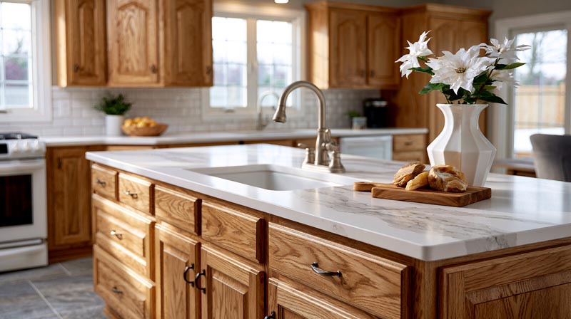
The countertop is the single biggest lever for updating an oak cabinet kitchen without touching the cabinets. A new countertop shifts the entire color reading of the room. White, black, and warm stone are the 3 strongest directions.
Engineered quartz remains the most popular countertop material, with natural stone options like quartzite and granite gaining ground in higher-end renovations (Houzz, 2024).
Light Countertops
White quartz with oak cabinets is the most widely specified pairing. The light surface makes oak grain the visual focal point, and the contrast reads modern without being harsh.
Best light countertop options for oak:
- White quartz with gray veining: Carrara-style slabs like MSI Calacatta Laza add movement without competing with oak grain
- Warm white quartzite: Taj Mahal quartzite carries gold and taupe veining that mirrors oak’s warmth
- Limestone in soft beige: Matte surface, earthy tone, reads natural and rustic
Avoid cool blue-gray quartz options like Caesarstone Sleek Concrete next to warm oak. The cold undertone of the stone pulls the orange from the wood to the surface.
Dark Countertops
Black and dark gray countertops create the sharpest contrast with oak, making warm wood tones pop rather than flatten. This is the fastest way to make existing oak cabinets read current.
| Dark Countertop Material | Finish | Best With |
|---|---|---|
| Black soapstone | Honed, matte | Honey oak, light stains |
| Nero Marquina marble | Polished, white veins | Medium to dark oak |
| Dark gray quartz (e.g., Caesarstone Piatra Grey) | Polished or honed | Any oak stain depth |
| Black granite | High-gloss polish | Golden oak, dramatic kitchens |
Matte and honed finishes handle the contrast better than high-gloss black in warmer, rustic-leaning kitchens. High-gloss black works in contemporary settings where the rest of the kitchen is also clean-lined.
Wood Countertops
Butcher block countertops next to oak cabinets create a fully warm, tonal palette. The wood-on-wood combination reads intentional when the countertop species and tone differ enough from the cabinet finish.
Walnut butcher block next to honey oak works because the contrast between the darker, richer countertop and the lighter cabinet creates definition. Matching tones, like light maple countertop next to light oak cabinets, can blend too much and lose structure.
This approach is popular in farmhouse kitchen design and modern organic kitchens where natural materials are layered intentionally. Always use a food-safe sealer and expect annual maintenance to keep butcher block countertops in good condition.
—
What Backsplash Colors Work With Oak Cabinets?
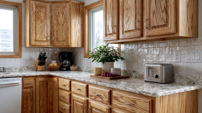
The backsplash sits between countertop and upper cabinet, making it the mediating surface in the kitchen color palette. With oak cabinetry, it either reinforces warmth or introduces contrast. Both approaches work. Choosing one direction and committing is better than splitting the difference.
Houzz 2024 research confirms ceramic and porcelain tile remain the top backsplash material at 54%, with zellige handmade tiles rising fast among designers and higher-budget renovations.
White Subway Tile
White subway tile is the most consistent backsplash performer next to oak cabinets. It reflects light, creates clean contrast, and does not compete with the wood grain.
Warm white subway tile outperforms bright white next to oak. Tiles with a slightly cream or off-white glaze read cohesive next to golden wood tones. Stark bright white can feel clinical and pull the orange tones from the cabinet surface.
Grout color matters here. Warm beige or cream grout with white tile creates a soft, unified surface. Cool gray grout with white tile sharpens the contrast and reads slightly more contemporary. Both work, but the choice should match the rest of the color palette’s temperature.
Terracotta and Hand-Painted Tile
Terracotta tile as a backsplash extends oak’s warmth naturally. Saltillo-style tiles, Moroccan-inspired patterns, and hand-painted Spanish tiles all work because they share the same warm, earthy base as the wood.
This is a high-commitment choice. Terracotta backsplash tile tends to anchor the whole kitchen palette around warm, rustic tones. Pair it with white quartz countertops and warm white walls to keep the combination from feeling heavy.
Zellige and Natural Stone
Zellige tile next to oak is the most current pairing in higher-end kitchen design. The handmade Moroccan clay tile carries slight color variation and texture that softens the flatness of smooth painted surfaces, and it works particularly well against natural wood grain.
Warm white and cream zellige are the safest choices with oak. Sage green or terracotta zellige work for homeowners who want to introduce color through the backsplash rather than the walls.
Travertine and limestone backsplash tiles in beige and warm ivory also pair naturally with oak. The organic, slightly imperfect surface of natural stone mirrors the grain variation in the wood and creates a layered, natural look that is aligned with the broader biophilic design direction in kitchen interiors.
—
What Paint Colors Work With Stained Oak Cabinets?
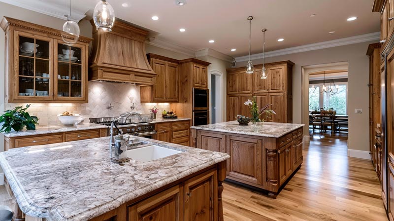
The stain depth of oak cabinets determines which wall colors work. Light honey oak and dark amber oak follow different color rules because the underlying warmth level differs significantly.
Natural wood finishes accounted for 25% of kitchen cabinet choices among renovating homeowners in 2024 (Houzz), reflecting the comeback of stained wood over painted finishes. These stained kitchens require a different color approach than painted cabinet kitchens.
Light Oak Stain Pairings
Light honey oak stains carry a golden-yellow base with moderate warmth. They tolerate a slightly wider range of wall colors than darker, more orange-saturated stains do.
Best wall colors for light honey oak:
- Benjamin Moore Muslin: warm yellow-beige, blends naturally with golden undertones
- Sherwin-Williams Oyster Bar: warm off-white with neutral warmth, no competing undertone
- Benjamin Moore Pleasant Valley: muted cool blue, one of the few blues that works because it reads gray-blue rather than bright or icy
- Sherwin-Williams Agreeable Gray: greige base, the most reliable all-purpose neutral
Light oak stains are the most flexible. They handle neutral, green, and even muted cool-blue walls when the undertone of the wall color leans warm or gray rather than bright or cold.
Dark Oak Stain Pairings
Dark, amber-heavy oak stains are more demanding. The intensity of the orange-brown tone narrows the workable wall color range considerably.
Darker oak reads best against walls that either fully embrace the warmth or provide enough contrast to visually separate the wall from the cabinet. The worst pairing: a mid-tone warm beige wall next to dark amber oak, where the colors blend together without definition.
| Wall Color Direction | Works With Dark Oak | Avoid |
|---|---|---|
| Warm white / cream | Yes, creates clean contrast | Bright stark white |
| Deep forest green | Yes, bold contrast | Yellow-green, lime |
| Navy blue | Yes, high contrast, grounding | Bright blue, icy blue |
| Mid-tone warm beige | Only if clearly lighter than the cabinet tone | Similar-value beige |
One approach that works consistently for dark oak: paint the upper wall zone a warm white and let the wood provide all the color below countertop height. This breaks up the visual weight of heavy wood tones without introducing a competing color.
—
What Hardware and Accent Colors Complement Oak Cabinets?
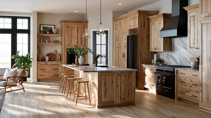
Hardware finish is the most cost-effective color decision in a kitchen with oak cabinets. A full hardware swap costs a fraction of new countertops or paint but changes the visual temperature of the entire space. Matte black is the top hardware finish for updating oak, followed by unlacquered brass and aged bronze.
Showplace Cabinetry’s 2026 trend report confirms warm neutrals and natural wood finishes pair best with brushed brass or matte black hardware, two of the fastest-growing hardware categories in kitchen design.
Brass and Unlacquered Brass
Brass is the most complementary metal finish for oak because both materials share warm undertones. Yellow-toned brass mirrors the gold in the wood grain, pulling the two together rather than creating contrast.
Unlacquered brass develops a patina over time, deepening from bright gold toward a richer, slightly darker tone. This aging process works with oak: the patina reads as a natural material aging alongside the wood rather than a finish going out of style.
Brushed brass is a softer alternative. Less reflective than polished brass, it reads more contemporary and is less likely to feel decorative rather than intentional.
Matte Black Hardware
Matte black is the most reliable all-purpose hardware update for oak cabinet kitchens. It introduces contrast without competing warmth, and it works across virtually every stain depth and kitchen style.
- Works with honey oak, golden oak, and amber stains equally
- Compatible with white quartz, butcher block, and dark countertops
- Reads contemporary in any cabinet door style
The one caveat: fully exposed hinges in matte black on oak cabinets can read harsh if the hinge is large and visible. This applies particularly to older-style kitchens where the hinge is mounted to the cabinet face rather than concealed inside the door.
Trim Color and Its Role
Trim color (baseboards, crown molding, window frames) ties the oak cabinet palette to the rest of the room. It is the connective tissue between wall color and cabinet color.
Warm white trim is the most consistent choice. Benjamin Moore White Dove and Sherwin-Williams Alabaster in a semi-gloss finish read clean against oak cabinets without introducing the cool, sharp brightness of pure white trim. Using color theory principles here matters: trim that shares the warm undertone of the cabinet finish keeps the palette harmonious from floor to ceiling.
Avoid cool bright white trim (like Benjamin Moore Chantilly Lace) in kitchens where the oak stain runs warm or orange-heavy. The stark white pulls cool against the warm wood and creates an unintentional contrast at the boundary between the cabinet and the ceiling.
FAQ on Colors That Go With Oak Cabinets
What wall color looks best with oak cabinets?
Warm whites and greige tones work best. Sherwin-Williams Agreeable Gray and Benjamin Moore White Dove are reliable choices. Both carry warm undertones that complement oak’s golden grain without pulling out its orange tones.
Does gray go with oak cabinets?
Warm gray works. Cool gray with blue or purple undertones clashes with oak’s warmth and makes the wood look more orange. Stick to greige-leaning grays like Sherwin-Williams Mindful Gray or Benjamin Moore Revere Pewter.
What countertop color goes with oak cabinets?
White quartz is the most popular pairing. It creates clean contrast and makes the wood grain the focal point. Dark countertops like black soapstone or honed granite also work well for a high-contrast kitchen.
Does green go with oak cabinets?
Yes. Sage, olive, and forest green all share oak’s earthy base. The National Kitchen and Bath Association’s 2025 report shows green leading kitchen color preferences at 76%. Benjamin Moore Saybrook Sage and Sherwin-Williams Evergreen Fog are strong choices.
What backsplash goes with oak cabinets?
White subway tile is the safest option. Warm white zellige tile is the more current choice. Terracotta and travertine backsplash tiles also work well, extending the warm wood tones naturally without introducing competing colors.
What hardware finish works best with oak cabinets?
Matte black is the top choice for a modern update. Unlacquered brass and aged bronze also complement oak because they share warm undertones with the wood. Avoid cold chrome or brushed nickel, which can read flat against warm grain.
Does navy blue go with oak cabinets?
Yes. Deep navy absorbs the contrast between cool and warm tones rather than highlighting it. It works best on a kitchen island or lower cabinets, paired with brass hardware to bridge the warm wood and cool blue.
What color goes with honey oak cabinets specifically?
Honey oak pairs well with warm whites, greige, sage green, and muted dusty blues. Avoid cool grays and bright whites. Benjamin Moore Muslin and Sherwin-Williams Oyster Bar are two wall paint colors that work consistently with golden oak undertones.
Does black go with oak cabinets?
Yes. Black has no competing undertone, so it contrasts without clashing. Matte black hardware is the easiest application. Black countertops make oak grain pop. A black island against oak perimeter cabinets is a strong, deliberate color pairing.
What trim color works with oak cabinets?
Warm white trim ties the palette together without introducing cool contrast. Benjamin Moore White Dove and Sherwin-Williams Alabaster in semi-gloss are the most consistent choices. Avoid stark bright whites, which pull cool against warm oak stain tones.
Conclusion
This conclusion is for an article presenting the full range of colors that go with oak cabinets, from wall paint and countertops to backsplash tile, hardware, and trim.
Oak’s warm, golden undertones are not a limitation. They are a starting point.
Warm neutrals, earthy greens, navy blue, and matte black all work within the oak cabinet color palette when chosen with undertone in mind. The wood grain does most of the heavy lifting.
Small decisions carry more weight than most people expect. A countertop swap, a hardware update, or the right kitchen color scheme can completely reframe existing stained oak cabinetry.
Start with one surface, test your choices in real light, and build the palette from there.

- Kitchen Color Schemes by Cabinet Color: What Pairs Well - October 19, 2026
- Curtain Colors for Every Wall Color: Safe vs Bold Picks - October 18, 2026
- Interior Design Styles: Find Your Primary and Secondary - October 14, 2026