Home Decor
Soft and Subtle: Peach Interior Design Ideas
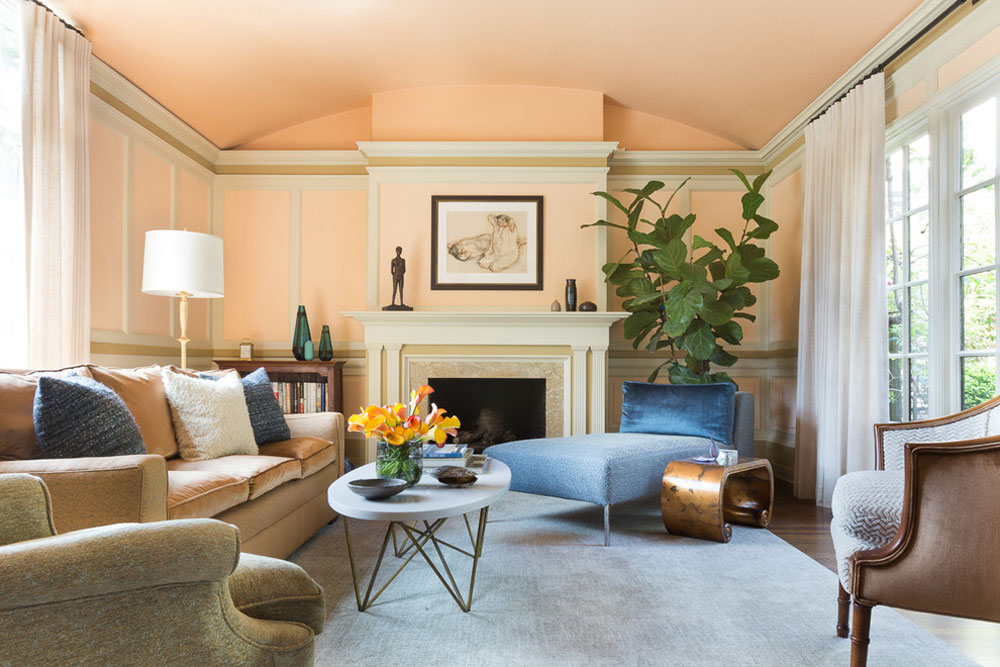
Sherwin-Williams sells two peaches that sit more than 21 points apart on light reflectance value (LRV). Sumptuous Peach (SW 6345) is listed at 53.54 and Nearly Peach (SW 6336) at 75.07 (Sherwin-Williams, 2026). Same family name, very different amount of light bouncing around the room.
Peach interior design means using pale pink-orange tones where beige or gray would fall flat. It goes on walls and cabinets, or just into textiles, either as the base color or as a smaller layer.
The name tells you little. Undertone matters more, since it leans pink, orange or yellow and decides how the peach sits beside floors and trim. Room light then shifts it again.
What Counts as Peach in Interior Design?

In a room, peach takes the place of beige or gray. It is a light, warm tint of orange, softer than coral and lighter than terracotta, and it leans pink or yellow depending on the pigment.
Maine Home Design places it as closer in color to the flesh of a white peach than to the classic yellow fruit.
Peach, coral, apricot, salmon and blush compared
- Blush peach is rosier and softer, per Nerolac’s paint guide.
- Coral peach leans slightly red (Nerolac).
- Apricot tips toward yellow and is the sunniest of the lot.
- Blinds Direct uses salmon for the same pinky-orange family.
- Terracotta is the deeper, earthier neighbor. Farrow & Ball’s Faded Terracotta, from its Kelly Wearstler collection, is really a deep shade of peach according to Maine Home Design, though Farrow & Ball itself describes it as a soft, pale orange.
Names overlap from brand to brand, so the label tells you less than the undertone does.
Pink, orange and yellow undertones
Every peach leans one way, and that lean decides how it sits next to your floor, trim and furniture.
- Benjamin Moore describes Peach Nectar 2168-60 as a pale peach with a drop of pink.
- The Paint Shed notes that Dulux Soft Peach carries more orange than Dulux Peach Blossom or Soft Coral.
- Tikkurila says some peaches pack pinkish pigment while others are enriched with yellow.
Pantone’s 13-1023 Peach Fuzz, its 2024 Color of the Year (announced December 2023), is described as a hue nestled between pink and orange.
Pantone pitched it for painted walls, and for decor and pattern accents too.
How Do You Choose a Peach Paint Color?
Start with what cannot change in the room (the floor and trim, plus cabinets) and pick the undertone that agrees with it. Then check the LRV against the room’s light, and sample before you buy.
Homestyler’s advice is to test swatches against your actual trim in natural light, and Hunker’s is to stay mindful of undertones above everything else.
Trim is the first comparison to run. The Paint Shed says clean white around peach gives it a bright edge, so look at the paint colors that work against white trim before settling on a wall shade.
Peach is not one LRV. As of October 2026, Sherwin-Williams lists Nearly Peach (SW 6336) at 75.07 and Sumptuous Peach (SW 6345) at 53.54, a gap of about 21.5 points between two chips sharing a family name.
| Shade and code | Character | LRV |
|---|---|---|
| Sherwin-Williams Nearly Peach, SW 6336 | Pale, low-saturation peach filed under White and Pastel | 75.07 |
| Sherwin-Williams Sumptuous Peach, SW 6345 | Mid-depth peach filed under Orange | 53.54 |
| Sherwin-Williams Certain Peach, SW 6625 | Light, warm peach filed under Orange | 58.11 |
| Farrow & Ball Setting Plaster, No. 231 | Dusty pink softened by yellow pigment | 56 to 77 (estimates only) |
Farrow & Ball does not publish LRVs, a point Kaitlin Madden’s review makes outright. Third-party listings put Setting Plaster anywhere from 56 to 77.
Even the name splits sources. Farrow & Ball calls it a pink, while paint databases file it as beige.
A few other ranges are worth sampling. Tikkurila Bast G405 is a subtle peach with warm undertones, suited to dining rooms and living spaces. Tikkurila Tvt F333 is a peachy white, handy if you normally paint walls white. Nippon Paint Being Peach (NP YO 1219 T) is shown by Nippon with cream accents for an airy look, and Dulux Soft Peach is a pale orange that reads warmer than Peach Blossom.
Treat Pantone 13-1023 as a reference chip. Ask the paint counter for the closest match and sample it instead of trusting the name.
How Does Light Change the Way Peach Looks on a Wall?
North light is cooler and bluish, so it makes peach read darker. South light is warm and golden, so it pushes peach toward gold, and east or west rooms swing between the two across the day.
Benjamin Moore defines LRV as the percentage of light a surface reflects, from 0 for absolute black to 100 for pure white. Peach chips land across a wide band of that scale, so the number matters more than the name.
How light shapes a space is a design principle on its own, and the role of light in interior design is worth reading alongside this section.
North- and south-facing rooms
In a north-facing room, Tash Bradley, Lick’s director of interior design, says the light is cooler and bluish, which makes colors appear darker (Homes & Gardens). Homebuilding recommends a mid-to-high LRV with a warm undertone, and peach already has one.
The thresholds disagree, though. Welsh Design Studio sets the line at an LRV above 60 for rooms with limited light, while Composite Paint wants 70 or higher on north-facing walls.
COAT founder Rob Abrahams takes a third view in Livingetc. North rooms are the most stable, so colors change least there, and he steers them toward warm colors with lower LRVs and a low sheen. That cuts against the brightness rules above, because it treats a north room’s consistency as something to work with.
Run the Sherwin-Williams examples through the two LRV lines. Nearly Peach at 75.07 clears 60 and 70, while Sumptuous Peach at 53.54 clears neither, so a mid-depth peach on a north wall needs brightness from elsewhere, such as a white ceiling and trim, unless you follow Abrahams’s lower-LRV approach.
South-facing rooms are the opposite problem. The Paint Shed says warm southern light intensifies peach and makes it look more golden, and its answer is a softer or more muted peach with pink or coral undertones.
East- and west-facing rooms
These rooms change through the day. Nerolac and The Paint Shed both tell buyers to paint two coats on a card and move it around the room at different times.
West rooms get cooler morning light and intense golden afternoon light, per Bradley in Homes & Gardens.
Artificial light and bulb temperature
Artificial light alters undertones significantly, Homestyler warns, so a swatch that looked right at noon needs a second look at night.
Bricknbolt recommends warm bulbs for peach walls, since soft yellow light matches the color’s own warmth.
Which Colors Go With Peach?

Cream, warm white and warm gray soften peach, navy and green sharpen it, and brass or deep brown add weight. A pairing holds up when its undertone agrees with the peach.
For swatch-level options beyond these, this rundown of pairings that work with peach goes further.
Complementary partners sit opposite peach on the color wheel, which puts blue and teal-leaning shades across from it. Analogous partners (corals, oranges, golds) sit beside it, and basic color theory for interiors explains why both approaches hold together.
Neutrals that soften peach

- Cream
- Warm white on ceilings and trim
- Light gray
- Taupe
Asian Paints pairs peach with cream for a soft, cosy base, light gray for a modern calm and taupe for matching warmth. Nippon adds beige and warm gray as balancing neutrals for a muted peach.
Colors that contrast with peach

- HomeLane says navy sharpens peach instead of simply matching it, and Hunker shows peach walls with a burnt orange velvet sofa working against navy decor.
- Dulux pairs Soft Peach with Muted Sage for an organic look, while Asian Paints pairs light peach with olive for an earthy one.
- Bricknbolt suggests teal walls with peach cabinets and backsplash in a kitchen. Nippon sets Peach Cocktail (NP YO 2401 P) beside mint green.
Deep tones and metals
Deep tones add the contrast a pale peach lacks.
HomeLane pairs peach walls with maroon skirting and a maroon velvet headboard, while Hunker shows peach bedding over a burgundy vintage rug.
Kaitlin Madden’s Setting Plaster review lists Farrow & Ball’s Mahogany as a coordinating brown-red and calls Iron Ore, an off-black, the shade that gives the pink some gravitas.
Brass and gold lamps, mirrors and frames bring out the warmth of peach walls, per Bricknbolt.
How Much Peach Should a Room Carry?
Peach works as the 60 percent wall color when the shade is pale, and as the 30 or 10 percent layer when it is stronger. The 60-30-10 rule is the frame for that decision.
The rule gives 60 percent of the room to a dominant color, 30 percent to a secondary one and 10 percent to an accent, and Homes & Gardens notes that walls come first because there is more wall than anything else in a scheme.
Country & Town House applies it to a living room as dominant color on walls or furniture, secondary on upholstery and accents on cushions and trims. Bricknbolt’s living room advice follows the same split, with a white or beige base and peach arriving through furniture and decor.
Full peach walls
Tikkurila says a couple of coats of matt peach emulsion transform a lifeless room, and Blinds Direct says softer shades give bedrooms and living areas a calm, cosy feel.
The catch is reputation. Peach paint carries an old-fashioned image, as Tikkurila itself admits, so the undertone has to be right. A full repaint is also the costliest way to change course, since Homestyler credits the accent approach with using less paint.
One peach accent wall
Nerolac advises painting the wall behind the bed two steps deeper than the surrounding peach, which keeps the accent inside one family. Squarerooms shows a variant that paints only the lower or upper half of the walls, which divides the room.
Behind the bed is the usual position, so compare accent wall colors that suit a bedroom before committing to the deeper step.
Homestyler points out the upside: less paint, greater impact and an easy repaint. The deeper step also adds contrast without leaving the family.
Downsides exist. You have two shades to sample instead of one, and the wall looks random unless the color returns elsewhere in the room, a point Tidbits & Twine makes about 60-30-10.
Peach in accessories only
Blinds Direct says using peach in textiles or decorative pieces keeps it playful yet balanced. Squarerooms adds that peach accents in a white minimalist home bring warmth without overwhelming the simplicity.
| Pros | Cons |
|---|---|
| Lowest commitment | One cushion reads as a stray color |
| Suits white minimalist rooms | Needs repeating across 2 or 3 pieces |
| Textiles swap with the season | A smaller dose of warmth than painted walls |
Cushions are the cheapest test, and ways to combine throw pillows help you pair peach with two or three other colors without overdoing it.
Which Rooms Suit Peach Best?
Peach works in bedrooms, living rooms, guest rooms and kitchens, according to Nippon Paint. Bathrooms are where the sources split.
Living room
Asian Paints steers living rooms toward Rosy Peach (9962), Peach Bellini (9936) and Daisy Peach (9964) for a warm, welcoming feel. Those are catalog suggestions, not tested picks.
Bedroom

For the soft end, Asian Paints lists Hint Of (9909), Rosy Peach (9962) and Sunshine Peach (9934) as peach tones for bedrooms.
The same catalog page goes stronger with Posh Peach (9918), Peach Pie (9910) and Peach Bellini (9936), which are noticeably more saturated.
Then there is the saturated end. Elizabeth Benedict of Elizabeth Home Decor & Design put a saturated peachy hue, Benjamin Moore’s Hugs & Kisses, on a five-year-old’s walls after the child rejected pink (Boston Globe, 2018). She layered patterns of different scales on top.
Peach sits at the restful end of bedroom palettes, but it is worth setting it beside other calming bedroom colors before you commit.
Kitchen and entryway
Homebuilding’s painted cabinet roundup shows lighter peach on cabinets and walls with a brighter orange island (image credit Olive & Barr). Centris, in January 2024, paired peach with gray, steel and silver. Nippon Paint suggests a delicate peach with white for hallways and guest rooms.
If the cabinets are white already, color schemes for kitchens with white cabinets show where a peach wall fits.
Bathroom
Squarerooms shows a peach limewash bathroom by OFTHEBOX Interior Design, where the matte, textured finish gives the room a soft, warm glow.
On the other side, Helen Shaw, a director at Benjamin Moore, lists vibrant reds and peachy orange among the bathroom colors to discount, and Drench reports that peach is one of the least searched colors on its site (RealHomes).
The disagreement stands. One side offers a built example, the other a brand director’s caution and a search-volume note.
Home office and nursery

Blinds Direct reads brighter peach tones as the energising choice for kitchens and home offices.
For nurseries, Fleetwood Paints sells Peekaboo, a peachy pink with subtle yellow undertones that it recommends for nurseries and playrooms. Crisp white or subtle taupe makes it more grown-up for a teenager’s room.
Which Materials and Finishes Suit Peach?
Low-sheen paint, textured finishes such as limewash and grasscloth, warm woods and brass suit peach. Sources split on matte versus eggshell.
Paint sheen
Everyone agrees on one thing, which is no high gloss. Homestyler warns that glossy peach walls raise glare and show imperfections.
After that the sources split. Sherwin-Williams steers bedrooms toward eggshell or satin, living rooms toward satin or eggshell and bathrooms toward satin or semi-gloss. In a designer roundup that also quotes Marie Cloud of Indigo Pruitt Design Studio, another designer calls eggshell dated and prefers matte as a forgiving finish. Cloud herself cautions that matte may not be durable enough for high-traffic areas and that semi-gloss highlights imperfections.
| Finish | Where sources place it | Trade-off |
|---|---|---|
| Matte | The other designer’s pick for walls, forgiving of imperfections | May not be durable enough for high-traffic areas (Cloud) |
| Eggshell or satin | Sherwin-Williams for bedrooms and living rooms | Called dated by the other designer |
| Semi-gloss | Sherwin-Williams for bathroom walls, with satin | Highlights wall imperfections (Cloud) |
In dry rooms, matte or eggshell is the safer call for peach. Move to satin where moisture or hands reach the wall.
Limewash and grasscloth
Textured finishes make peach shift across the wall instead of sitting flat. Interior Company notes that limewash dries with subtle variations in color and texture.
Oneflare calls peach slightly neutral yet bright enough to be fun, and a good match for limewash’s chalky look. The Paint Shed points to limewash for anyone after a fresh plaster effect.
Grasscloth is the other route. New York designer Emily Butler used it instead of paint for peach dining room walls, with rattan chairs and shiny brass (Maine Home Design).
Limewash and grasscloth are two of many textured wall ideas, so compare the options before ordering anything.
Textiles, woods and metals
Homestyler pairs peach with off-white textiles in interesting weaves to avoid a flat look, and The Paint Shed recommends soft, tactile fabrics.
Harder materials work too. Nerolac sets ash or oak cabinetry against soft peach walls for a fresh, modern feel. The Paint Shed adds that dark wood gives peach richness and keeps the palette from feeling overly delicate.
Homestyler says brass reads classic against muted peach and matte black reads contemporary against dusty peach. Nerolac keeps its metallic finish for accent walls or panels, used sparingly for a soft shimmer.
Layering finishes like this is the practical side of texture in interior design.
How to Sample and Apply Peach Paint
Sample on boards in two full coats, judge them across a full day against the room’s fixed elements, and only then buy a full tin.
Before ordering pots, try the peach and its partners in a room color scheme generator so the samples you buy already belong together.
- Read the undertone and LRV on each chip, then cut the list to two or three shades.
- Order sample pots in the sheen you plan to use. Behr’s 8 oz samples combine paint and primer.
- Paint two full coats on foam board or poster board instead of the wall (Ringsend’s sampling guide, Stow & Tellu), and let them dry completely before judging (Berger Paints).
- Move the boards through the room across the day, one in direct sun and one in indirect light (Behr).
- Hold them against the trim, floor, cabinets and upholstery, the elements the peach has to agree with (Stow & Tellu).
- Prepare the walls by repairing, cleaning, filling, sanding and priming, then keep a wet edge while rolling (Fleetwood Paints’ application notes).
As of October 2026, Sherwin-Williams puts a gallon at about 350 to 400 square feet of coverage and a quart at about 100 square feet, enough for an accent wall. A room paint calculator turns your wall measurements into a can count.
When Does Peach Not Work?
Peach fails in rooms with little light, where its undertone fights the floor or trim, and in small rooms when the shade is saturated. Each failure is avoidable, and some rooms are better served without peach paint at all.
Rooms with little light
Blinds Direct advises lighter, muted peaches where natural light is scarce, because a deeper shade makes the room feel dark and heavy.
The fix is simple enough. Drop to a lighter shade, or move the peach into textiles.
Undertones that fight the room
Homestyler says a peach that leans too orange or too pink can ruin the effect, and it singles out overly warm undertones as the ones that look dated.
Berger Paints makes a related point, that the mass tone and the undertone have to work together or even a good shade looks wrong. Marie Cloud of Indigo Pruitt Design Studio goes further and calls ignoring undertones the biggest paint mistake the designers cited.
Small rooms
Homestyler recommends soft, muted peaches with gray or cream undertones for compact spaces, and warns that a very saturated peach overwhelms them. Its fallback is a single feature wall.
COAT’s Rob Abrahams argues the other way in Livingetc. A small room does not need a high LRV by default, and low-LRV, low-sheen color reads as cocooning rather than claustrophobic. The disagreement is about how much light the room already has, not about peach.
For options beyond peach, see the best colors for small rooms.
Stark white against peach
The Paint Shed says clean white trim and ceilings let peach shine. Homestyler says to avoid stark white because it intensifies peach’s saturation and creates a harsh contrast.
Neither side offers a test, so put the white and the peach on the same board and look.
When to skip wall paint altogether
If the room matches two of these problems (little light, a clashing undertone in the fixed elements, a small footprint), keep peach out of the paint. Use a peachy white on the walls, or carry the peach in textiles.
Peach Interior Design FAQ
Is peach a neutral color?
Not strictly, but soft peach behaves like one. Blinds Direct groups it with the new neutrals alongside lavender, mint green and rose, and Oneflare calls it slightly neutral yet bright enough to be fun.
It still carries a pink, orange or yellow undertone, so it needs the same testing as any other color.
Can peach go with black or charcoal?
Yes. Homestyler says charcoal keeps peach from reading pastel, and it describes chalky peach with charcoal frames as a sharp, gallery-like look.
Housing.com also lists peach with white and gray or black as a sophisticated bedroom palette.
What peach works best over gray flooring?
A pink-leaning one. Homestyler pairs pink-tinted peach with cooler companions such as soft gray and stone, and saves orange-leaning peach for warm woods and brass.
For the wall side of that decision, compare a longer list of paint colors that suit gray floors.
Which interior styles suit peach?
Scandinavian and contemporary rooms lead the sources. Megafurniture adds peach accents to a white, gray and beige base with navy or charcoal for contrast, and Homestyler pairs matte peach walls with soft gray fabrics.
A neutral base and clean lines define Scandinavian interior design, so one peach accent stands out without overpowering. Dulux suggests natural wood, wicker and linen for softer peaches.
How many coats of peach paint do walls need?
Two is the working number. Tikkurila says a couple of coats of matt peach emulsion transform a lifeless room.
Fleetwood Paints recommends a primer first for the best result.
Does peach affect mood?
Designers and paint brands say it does, but the claims are opinion, not measured research. Pantone describes its Peach Fuzz pick as evoking tenderness and a sense of caring (Pantone Color Institute, 2023).
That is positioning language. Treat it as a design intention, not a finding.
What to Keep Neutral Around Peach
Peach interior design lasts longest when floors, trim, ceilings and large furniture stay neutral, with the peach carried by paint, textiles and accessories. Fixed elements cost the most to change, so the peach layer should be the cheapest one to swap.
Neutral floors, trim and the sofa come first. Peach textiles and accessories come second, and peach paint comes last, after a board test, because it is the only peach layer that needs a full repaint to reverse.
The trade-off is impact. A neutral base lets peach carry less of the room than a full peach scheme would.
As of October 2026, Pantone has moved from Peach Fuzz (2024) to Mocha Mousse (2025) to the white Cloud Dancer, 11-4201 (2026). A peach layer should be built to swap.

- Kitchen Color Schemes by Cabinet Color: What Pairs Well - October 19, 2026
- Curtain Colors for Every Wall Color: Safe vs Bold Picks - October 18, 2026
- Interior Design Styles: Find Your Primary and Secondary - October 14, 2026