Color Combinations
Shoji White vs White Duck: Which Neutral Wins?
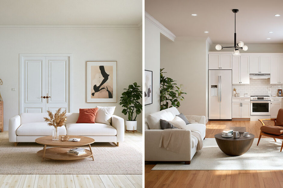
Put a Shoji White chip next to a White Duck chip and you may have to flip them over to check which is which. Sherwin-Williams lists them at LRV 74.345 and 74.005, with hex codes one unit apart on red and blue (Sherwin-Williams, 2026). What separates them is undertone, not brightness, and even that gap is small.
White Duck is the usual pick for dim, north-facing rooms. Shoji White earns its place in sunny ones, when you want things a little creamier.
The Sherwin-Williams color data lists no undertone rating for either paint, and reviewers contradict each other on which one carries a faint green. Room light settles the pick more reliably than the color name does.
Are Shoji White and White Duck the same color?
No. They’re two separate Sherwin-Williams paints, SW 7042 and SW 7010, but the official numbers sit almost on top of each other.
Both round to an LRV of 74, and their hex codes differ by one unit on two color channels (Sherwin-Williams color data, as of October 2026).
| Spec | Shoji White | White Duck |
|---|---|---|
| Sherwin-Williams code | SW 7042 | SW 7010 |
| Strip 254 position | C4 | C5 |
| LRV | 74.345 | 74.005 |
| Hex | #E6DFD3 | #E5DFD2 |
| RGB | 230, 223, 211 | 229, 223, 210 |
Codes, collection and strip position
Both belong to the White & Pastel family in Sherwin-Williams’ Designer Color Collection, and both are rated for interior and exterior use.
They also share color strip 254, which runs from the light end to the deep end, according to Pontata. Greek Villa anchors the light end and Oyster White the deep end. Shoji White (C4) and White Duck (C5) sit right next to each other in between.
LRV, hex and RGB
Sherwin-Williams lists 74.345 for Shoji White and 74.005 for White Duck. That’s a gap of 0.34 points on a 100-point scale.
LRV is the share of light a dried paint film reflects, from 0 for black to 100 for pure white. Equal LRV means equal depth. For scale, Greek Villa at the light end of the same strip is listed at 84.223.
So brightness is off the table. If one looks lighter on your wall, blame the light and the surroundings, not reflectance.
Delta E between the two
Delta E measures how far apart two colors look, and CIEDE2000 is the formula the CIE currently recommends for it. Under 1, the difference usually can’t be perceived at all. Past 2, it usually can. In the 1 to 2 range you’d only catch it by inspecting the two side by side. Those bands come from MetricGate’s CIEDE2000 documentation (2026).
Running CIEDE2000 on the two official hex values returns 0.78. Pontata reports 0.6.
Both land under 1. But a 2023 pilot study by Jan and Peter Morovič (Color and Imaging Conference) suggested a threshold in the region of 0.5 to 0.8 for smooth color transitions, based on a few stimuli.
It was a small, uncontrolled online experiment, so read it as a caution and nothing more. If you use both colors in one room, a 0.78 gap can show where they touch, such as a wall meeting a ceiling.
Screens can’t settle a gap this small. Pontata’s comparison page warns that calibration, brightness and viewing angle all change how its simulations render.
Shoji White and White Duck undertones: where reviewers disagree
The Sherwin-Williams color data for both paints lists hue, saturation and LRV, but no undertone rating. Reviewers split on which color is cooler.
Most call White Duck the cooler one and place a faint green in Shoji White. A few say the reverse.
| Source | Shoji White | White Duck |
|---|---|---|
| Heather’s Nest | Greige with very mild green | Slightly cooler, no green |
| Brick and Batten | The warmer of the two | Slight gray undertones, less warmth |
| The Color Concierge | Warmer taupe, less muted | Soft, barely-there green |
| Kylie’s Interiors | Can appear a touch pink | More likely to carry a subtle green |
| Atlane and High | Touch of red, reads pink | No red |
Everyone agrees both sit on a cream base. Among the reviews checked, only The Color Concierge puts green in both colors.
The hue data adds a little. Sherwin-Williams lists a hue angle of 37.9 degrees for Shoji White and 41.1 for White Duck, with saturation at 0.08 for both.
On that wheel 0 is red, 60 is yellow and 120 is green. Shoji White tilts a hair toward red and White Duck a hair toward yellow, which fits Atlane and High seeing pink in Shoji White and not in White Duck.
Neither value is anywhere near green. That fits the reviewers who call the green faint and light-dependent.
Each reviewer judged from a different room, bulb and photo. Treat the cooler-or-warmer question as unsettled and let room light decide.
How room light changes Shoji White and White Duck
Cool light pulls both colors toward greige and brings out their faint green or gray notes, while warm light pushes both toward cream. Equal LRV means the difference between them is a shift in tone, not in brightness.
North-facing and low-light rooms
Sherwin-Williams describes north light as cool and bluish all day.
Under it, Shoji White’s gray-green notes deepen and it can read as a light taupe (The Design Confidential). Jenna Kate at Home adds that the green shows up beside gray tile and blue decor.
White Duck gets the recommendation for north-facing, low-light and darker rooms from The Color Concierge, and Brick and Batten notes its gray undertones read greige in shade.
For dim rooms, reviewers lean toward White Duck. There’s one catch, though: The Color Concierge credits it with a faint green of its own.
South-facing and west-facing rooms
Warm light brings the cream base forward in both colors.
Sherwin-Williams’ own lighting guide calls south light warm orange-yellow all day. West light is warm orange-red but only after noon, and east light is warm yellow before noon.
The Design Confidential says warm southern light lets Shoji White’s cream base take over. The Color Concierge shows White Duck warm, creamy and muted beside west-facing windows. By those two accounts, strong warm light is where the two read closest.
Evening and artificial light
After dark, the bulb decides which tone wins.
Incandescent bulbs intensify warm colors and dull cooler ones, so both paints lean cream. Fluorescent light does the opposite, amplifying blues and greens and muting warm colors, which pushes whichever paint you read as green-leaning further that way.
Rooms rarely run on a single source. The ambient lighting in a living room often mixes ceiling fixtures, lamps and daylight, so a swatch judged at noon can mislead at 8 p.m.
Sherwin-Williams’ guide doesn’t cover LED, so check both colors under the bulbs you actually own.
Which one works better on walls, cabinets and exteriors?
Both work on all of them. Sherwin-Williams rates each color for interior and exterior use, so the choice comes down to room light, how much green or pink you’ll tolerate, and, on cabinets, a real split among reviewers.
Shoji White’s best trait is its balance of greige and cream, which moves through open layouts without a visible break (The Design Confidential). In warm light the cream base takes over. People have used it on trim, walls, cabinets and exteriors (Postcards from the Ridge).
The downsides are mostly about context. It shows a faint green in low light and beside gray tile or blue decor, and Atlane and High says it can read pink when red decor is nearby. Jenna Kate at Home also reports a muddy look in shadowy corners.
White Duck is cooler and more neutral by most accounts, and The Color Concierge recommends it for north-facing and low-light rooms. Atlane and High finds no red or pink undertone in it, though Heather’s Nest says it can rarely flash a faint pink.
It has a green problem of its own. The Color Concierge and Kylie’s Interiors both pick up a faint green, and Brick and Batten says it gives up some of Shoji White’s warmth.
Walls and whole-house palettes
Walls are where the two are most interchangeable, and where light decides the pick.
Because both sit in the neutral greige-cream zone, either one can anchor a whole-house color palette without clashing from room to room.
Cabinets and exteriors
On cabinets, Jenna Kate at Home says Shoji White isn’t a particularly popular cabinet color, though it can look good in a kitchen with warm wood and brass. For more color she suggests Accessible Beige, a deeper warm greige.
Pontata shows real kitchens in both colors, and The Color Concierge’s author says White Duck was the first color she used in her own kitchen. Durability depends on the product and sheen more than the color name.
Outside, Atlane and High calls Shoji White a good exterior trim color because LRV 74 doesn’t wash out. Pontata advises testing either color on the exterior in direct sun, porch shade and evening light.
Brick and Batten’s designers pair Shoji White with stone cladding, and the firm says it has used White Duck across many home styles.
Roof, brick and shutter colors shape the result, so test the exterior color combinations around the house before you commit to either white.
A decision rule by room condition
The reviews above boil down to a short rule.
| Room condition | Better fit | Basis |
|---|---|---|
| Dim or north-facing room | White Duck | The Color Concierge, Jenna Kate at Home |
| Warm south or west light, creamier look wanted | Shoji White | The Design Confidential |
| Green cast is the worry | White Duck | Most reviewers (The Color Concierge and Kylie’s Interiors disagree) |
| Red decor nearby | White Duck | Atlane and High |
| One color through an open layout | Either | Equal LRV, same strip |
Trim and accent colors that pair with each
Pure White and Extra White are the trim picks that recur across the reviews checked. Accent colors run from deeper warm greiges to soft blacks.
| Trim color | LRV | Reviewer verdict |
|---|---|---|
| Pure White | 83.957 | Top pick for both walls (Jenna Kate at Home, The Color Concierge, Atlane and High) |
| Extra White | 85.861 | Crisper-contrast trim option (The Color Concierge) |
| Alabaster | 82.215 | Split: suggested for Shoji White (Hey There Home), rejected for White Duck (The Color Concierge) |
LRVs come from the Sherwin-Williams color pages, as of October 2026.
Off-white walls follow the usual advice on the best trim color for white walls, with one adjustment. The trim has to read clearly lighter than the wall.
Both walls sit at LRV 74, and all three whites in the table are listed between 82 and 86, so each clears that bar.
The Alabaster split looks like a contrast preference. Hey There Home treats it as a soft tonal trim for Shoji White, while The Color Concierge says it leaves White Duck with too little edge.
For companions, Hey There Home steps down tone on tone from Shoji White with Accessible Beige, Alpaca and Amazing Gray, and Atlane and High likes White Duck beside darker greiges.
Dark contrast works too. Urbane Bronze, Iron Ore and Krypton show up with Shoji White, while The Color Concierge pairs White Duck with Iron Ore, a soft muted black.
Wood floors, dark wood tones, black metal and green plants appear in reviewed rooms for both colors.
When neither color fits, and what to try instead
Skip both when you want crisp white with minimal warmth, and look at a brighter or deeper neighbor when the pair reads wrong in your room.
Cases where Shoji White and White Duck underperform
Hey There Home advises skipping Shoji White if you want a bright white with minimal warmth, and points to Pure White or High Reflective White instead.
Intense sun is another weak spot. The Color Concierge says White Duck reads much more white than creamy in sunny regions such as Colorado, Florida and California.
Using the same color on trim as on the walls gets mixed reviews. Atlane and High suggests semi-gloss White Duck trim for a gentle edge, but The Color Concierge calls it too dark and creamy to contrast with most walls.
Undertone clashes matter too. Purple-undertone paints fight with White Duck (Atlane and High), and so do warmer trims (The Color Concierge).
These limits come from reviewers, not from Sherwin-Williams data. A sample in your own room is the check.
Brighter and similar-depth alternatives
Four neighbors are worth a sample, depending on which way the pair misses.
| Color | Depth | Note |
|---|---|---|
| Greek Villa | Lighter than both | Suggested for trim and ceilings (The Color Concierge), though it gives White Duck too little contrast |
| Natural Choice | LRV 72.947 | Cooler and darker than White Duck (The Color Concierge) |
| Oyster White | Deeper than both | Much warmer than Greek Villa (The Color Concierge) |
| High Reflective White | LRV 92.667 | Brightest option, listed for interior use only (Sherwin-Williams) |
Natural Choice has a documented conflict. Reviewers list its LRV as 72 (The Color Concierge), 73 (Composite Paint) and 74 (Heather’s Nest), while Sherwin-Williams lists 72.947.
Alabaster is the usual step up when the pair feels too muted. Heather’s Nest describes the same creamy quality as Shoji White at a lighter depth, and Hey There Home notes it can read yellow.
A side-by-side look at Shoji White and Alabaster shows what the brighter option changes on a wall.
How to test both colors in your own room
Test in stages. Chips come first, then Peel & Stick Samples, then a painted quart if the choice is still open (Sherwin-Williams sampling guidance, as of October 2026).
- Order color chips of both paints and the trim white you plan to use, then hold them against the flooring and cabinets that stay.
- Stick Peel & Stick Samples of each on the wall where the paint will go, side by side, and a second pair on a different wall.
- Watch them over a few days, in morning, afternoon and evening light, with your own bulbs switched on after dark.
- Move a sample next to gray tile, blue or red decor and any warm wood, since those pairings trigger most reviewer complaints.
- If the choice is still open, brush or roll a Color to Go quart sample of each onto a larger area and let it dry.
- Judge the dried patches from the doorway you use most, then pick the one you stop comparing.
Color to Go samples are sold in store only, according to Sherwin-Williams, so plan a trip for that stage.
Small chips can’t show a full wall, which is why the larger samples come later. Once one color wins, a room paint calculator converts wall dimensions into gallons.
Shoji White vs White Duck FAQ
Is Shoji White a true white?
No. It’s a warm off-white with a greige lean, and reviewers class it as a light neutral rather than a white.
For a crisp white, Hey There Home points to Pure White or High Reflective White.
Does Shoji White look yellow?
Rarely. Kylie’s Interiors says its cream base carries yellow that gray tones down, and Hey There Home says it doesn’t typically read strongly yellow.
Does White Duck look yellow?
Not in most rooms. The Color Concierge says it doesn’t look yellow in place, while Atlane and High lists yellow among its undertones, as with most creamy warm whites.
Both reviews credit a muted secondary tone for keeping it creamy without skewing yellow.
Can you use both colors in the same house?
Yes. They sit in neighboring slots on one Sherwin-Williams strip, so they read as one color family.
If you want one clean tone, keep them apart where they meet directly, such as wall to ceiling in a single room.
Choosing Between Two Samples That Look the Same
When the Shoji White and White Duck samples look identical on the wall, the choice moves from the paint to the room. Match the color to the finishes that can’t be repainted, and either one will work.
Start with flooring, countertops and tile. Then think about which direction the light comes from, and pick the trim white last.
Fixed finishes can’t change. Light can be adjusted with curtains and bulbs, and trim is the easiest coat to redo.
Sherwin-Williams color data and reviews checked in October 2026 support this advice, and a revised LRV or hex listing would reopen the comparison.
With the wall color settled, a room color scheme generator tests sofa, rug and curtain colors against it.

- What Color Cabinets Go With Taj Mahal Quartzite? [Guide] - November 10, 2026
- Japandi Bedroom Essentials for a Calm, Restful Retreat - November 7, 2026
- Bedroom Curtains Ideas to Block Light and Add Style - November 4, 2026