Kitchen Color Schemes
What Color Cabinets Go With Taj Mahal Quartzite? [Guide]
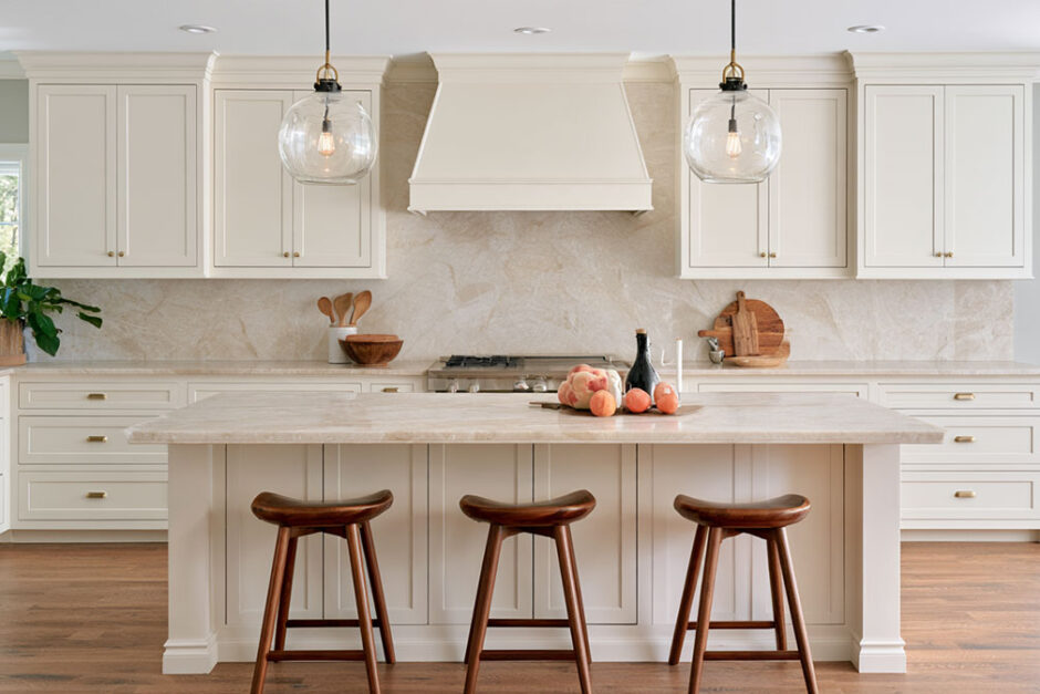
Warm white, cream and greige work best with Taj Mahal quartzite, along with natural wood. Navy and sage green are the contrast options, and charcoal is there for anyone willing to go dark. I ranked them by how well each cabinet undertone agrees with the stone.
The stone comes out of Brazil, cream underneath, with veining in taupe and caramel and soft gold here and there. Most of it ends up on kitchen countertops and islands.
A lot of pages file it under white. Color consultant Maria Killam calls it a warm, mid-toned stone, which explains a problem you see often. A near-neutral white like Benjamin Moore Chantilly Lace (LRV 90.04) makes the slab look dingy, while Sherwin-Williams Alabaster (LRV 82) sits beside it cleanly.
What Colors Are in Taj Mahal Quartzite?
Cream, mostly. The base runs from cream to ivory and sometimes drifts toward pale beige. The veins are taupe and caramel with some soft gold, plus the occasional light gray streak. The undertone is warm and yellow-beige, and the depth lands somewhere between light and mid-tone depending on how heavy the veining runs.
That makes it a warm stone, not a white one, and every cabinet decision follows from that. Treat it like a white countertop and the paint you pick will fight it.
MSI Surfaces describes wispy gold veins over a soft white backdrop. Killam is blunter, calling it the warm alternative to white quartz and treating it as a mid-toned stone. Both descriptions hold up, depending on the slab.
It’s Brazilian quartzite, so slab lots vary from block to block. Kylie M Interiors notes that Taj Mahal carries a range of warm tones, which means two kitchens with “the same” countertop can need different cabinet paint.
Undertone is the part of how color theory works in a room that settles this pairing. Warm stone wants warm or warm-neutral cabinets, or a deep color strong enough to contrast on purpose.
Best Cabinet Colors for Taj Mahal Quartzite, Ranked
Warm white comes first, then cream, greige, natural wood, navy, green and black.
Undertone fit decided the order. Contrast came next, and then how forgiving each color is when slabs differ.
| Rank | Cabinet color | Undertone fit | Look it creates | Risk |
|---|---|---|---|---|
| 1 | Warm white | Matches the cream base | Bright, classic | Low |
| 2 | Cream / off-white | Matches base and veins | Soft, tonal | Can look flat |
| 3 | Greige / warm beige | Picks up taupe veins | Quiet, layered | Medium |
| 4 | Natural wood | Echoes caramel veins | Warm, organic | Low with oak |
| 5 | Navy / deep blue | Cool contrast | Tailored, coastal | Medium |
| 6 | Sage or gray-green | Muted, earthy | Relaxed, traditional | Medium |
| 7 | Black / charcoal | Hard contrast | Sharp, modern | Higher |
Wood is gaining on white fast. In the 2026 U.S. Houzz Kitchen Trends Study, 29% of renovating homeowners chose wood cabinets, just ahead of white at 28%.
Both of those sit comfortably beside Taj Mahal, so the stone happens to suit the current palette well.
Style matters too. A bright modern kitchen can take a warm white perimeter with a black or walnut island. Warm traditional kitchens do well with cream or greige throughout, old world ones with stained wood and brass, and coastal ones with white uppers and a navy island.
Splitting the perimeter and island is the easiest way to get color without risking the whole room. Plenty of two-tone cabinet layouts keep the lighter color near the stone’s largest surfaces and push the darker one to the island.
Warm White, Cream and Greige Cabinets
Pick a white with an LRV in the low-to-mid 80s and a warm undertone. Those land closest to the stone’s cream base.
Light Reflectance Value (LRV) runs from 0 for black to 100 for pure white. The figures below come from Benjamin Moore and Sherwin-Williams color pages.
| Paint | Code | LRV | Undertone | Fit with Taj Mahal |
|---|---|---|---|---|
| Sherwin-Williams Alabaster | SW 7008 | 82 | Creamy warm | Strong |
| Benjamin Moore White Dove | OC-17 | 83.16 | Soft warm | Strong |
| Benjamin Moore Simply White | OC-117 | 89.52 | Slight warmth | Good on gray-veined slabs |
| Benjamin Moore Chantilly Lace | OC-65 | 90.04 | Near neutral | Risky |
| Sherwin-Williams Accessible Beige | SW 7036 | 58 | Warm beige, some gray | Test first |
| Benjamin Moore Revere Pewter | HC-172 | 55.05 | Warm gray | Good on taupe-veined slabs |
Warm Whites That Match the Base
Alabaster and White Dove are the safest whites for this stone.
Their LRVs sit within about a point of each other, and both carry enough warmth to look like part of the countertop instead of competing with it. Which one you take depends on how creamy you want the cabinets, and that’s basically the White Dove versus Alabaster debate.
Simply White is the brighter step up. It works when the slab leans more gray than gold.
Chantilly Lace is where things go wrong. With an LRV over 90 and almost no warmth, it makes the cream base next to it look dingy or yellow. I’d skip it here.
Cream cabinets go the other direction. A true off-white beside the stone gives a soft, tonal kitchen. A monochromatic scheme like that needs some texture, say wood floors and aged brass or a zellige backsplash, so it doesn’t turn into one beige blur.
Greige and Beige That Pick Up the Veins
Greige works by matching the veins instead of the background.
Benjamin Moore positions Revere Pewter as a bridge between warm and cool tones, which suits slabs with taupe and gray veining. Accessible Beige is warmer and more yellow-leaning, so it can sync with gold veining or look muddy beside it.
Both sit between 55 and 58 LRV, roughly the same depth as heavier Taj Mahal veining. That’s the appeal and the danger.
Maria Killam names the most common mistake with this stone, which is matching cabinets, countertop and backsplash in the same soft warm neutral. With a mid-tone slab, greige cabinets need some contrast from the backsplash or the island so the kitchen keeps its shape.
Do Wood Cabinets Go With Taj Mahal Quartzite?
Yes. Wood is the most natural partner for this stone because it repeats the caramel tones already running through the veins.
Among renovating homeowners, medium tones lead at 15%, followed by light wood at 11% and dark wood at just 3%, per the same 2026 Houzz study.
Marble Systems singles out rift sawn white oak as a favorite pairing. The tight, straight grain stays calm next to the movement in the slab, and it’s light enough to keep the room bright.
Walnut is dark and warm, and I’d save it for an island. Its chocolate depth gives the cream stone something solid to sit against, and its natural palette of compatible colors already includes the beiges and golds in the countertop.
Cherry is trickier. Its red undertone pulls against beige, so the slab needs strong gold veining to hold its own, and the rest of the room has to follow a color scheme built around cherry, not around the stone.
Wood also works well on the island alone. Among renovating homeowners who chose a contrasting island countertop, 39% picked wood, up 12 points in a year.
Wood pulls the caramel and gold veins forward, hides wear better than painted white, and leaves no paint undertone to get wrong. It fits old world, transitional and Japandi-leaning kitchens.
The downsides are real, though. Orange-toned oak and pickled 1980s finishes clash with the cream base, and too much wood next to beige stone can feel heavy. Stain color also varies by species and lot, so sample doors are a must.
Navy, Green and Black Cabinets With Taj Mahal
Dark cabinets work with Taj Mahal when they’re deep enough to read as deliberate contrast, not a near-match that fights the veins.
The cream stone should stay the lightest thing in the kitchen. The whole pairing depends on that gap.
Blue and Navy
Benjamin Moore Hale Navy HC-154 has an LRV of 8.36, per Benjamin Moore. Next to a stone in the cream range, that’s about as much contrast as a painted cabinet can give.
Navy is the cool partner for a warm stone. Blue sits opposite the gold veining on the color wheel, so each one makes the other look richer.
Farrow & Ball Hague Blue No. 30 is the moodier choice. It has a green cast that shifts with the light, so it reads earthier next to taupe veins than Hale Navy does.
Most people stop at the island. A white perimeter with a blue island puts the navy where it frames the slab without darkening the whole room.
Green
Sage and gray-green are soft and earthy, and they pick up the muted tones in the veining. A greige-green is the quietest version, close to a warm neutral. Deep forest or olive can work on an island but gets heavy across full runs.
Kylie M Interiors shows one tested version, with Sherwin-Williams Felted Wool (SW 9171) on the cabinets and peninsula, Taj Mahal countertops and gold hardware. Felted Wool sits at an LRV of 28 in Sherwin-Williams’ own data, a true mid-tone.
Sage behaves like a neutral more than a color here. Its usual companion colors are warm whites and wood, both already in a Taj Mahal kitchen.
Black and Charcoal
Black is the sharpest pairing and the least forgiving.
Baasar Stone recommends charcoal black or dark gray cabinets for slabs that lean gray or white. That matches the logic of this ranking, since black suits cooler Taj Mahal slabs better than gold-heavy ones.
Matte black doors show fingerprints and dust. A full black kitchen shrinks the room visually, and gold veins can look yellow against pure black.
Black is also a niche choice overall. The 2026 U.S. Houzz Kitchen Trends Study found black cabinets in fewer than 5% of remodeled kitchens, and black and gray were the least common lower-cabinet colors in two-tone kitchens.
Charcoal softens those problems. It keeps the contrast and loses the harshness.
How to Match Cabinet Paint to Your Specific Slab
Match paint to the slab you’re actually buying, not to a photo of Taj Mahal or a 2-inch chip.
Start by reading the dominant vein color, then pick the cabinet family that agrees with it.
| Slab type | What you see | Cabinet direction |
|---|---|---|
| Gold-led | Caramel and gold veins, creamy base | Alabaster, White Dove, oak, cherry, sage |
| Taupe-led | Brown-gray veins, beige base | Revere Pewter, greige, walnut |
| Gray-led | Light gray streaks, paler base | Simply White, navy, charcoal |
After that, the testing goes in this order.
- Photograph the full slab at the yard. Note which vein color covers the most area, and which part of the slab will land on the island versus the perimeter.
- Get large samples. Peel-and-stick sheets or a painted board at least 12 by 12 inches work, since small chips exaggerate undertone.
- Hold the samples vertically against the stone. Cabinet doors sit upright, so test the paint at that angle, right where the door meets the counter edge.
- Look at the samples in daylight at different times of day, then again at night under the bulbs you’ll actually install.
- Match the bulbs to the stone. Warm white LEDs labeled 2700K to 3000K keep the cream base reading as cream, and cooler 4000K-plus bulbs pull it toward gray.
- Settle the cabinets before the backsplash and hardware. Slab first, cabinets second, everything else after.
Room orientation changes the result. North-facing kitchens get cooler, bluer daylight that grays out warm whites, so a creamier paint like White Dove often reads cleaner there than it does in a south-facing room.
The way light shapes a room’s colors matters more with natural stone than with quartz, because the slab changes with the light too.
How the Finish Changes the Color
Polished finishes deepen the color and sharpen the veins, so gold reads more gold. Honed is matte and lighter with softer veining, and the stone reads closer to beige. Leathered sits somewhere between the two and hides fingerprints better.
Test cabinet paint against a sample in the finish you ordered. A paint that matched a polished sample can look too yellow beside a honed counter.
Once the cabinet color is set, a color scheme tool helps pull wall, trim and backsplash shades from the same palette.
Cabinet Colors That Clash With Taj Mahal Quartzite
The colors that fail share one trait, an undertone that argues with the warm beige in the stone.
- Whites with a cool blue or gray tint make the cream base look dirty
- Flat, cool gray cabinets turn the gold veins brassy
- Pink- or violet-leaning grays clash with the yellow-beige and look muddy
- Yellow-heavy creams push the whole kitchen toward 1990s beige
- Orange oak and dated stains compete with the caramel veins instead of echoing them
Mid-tone beiges are risky in a different way. They don’t clash, they disappear, because they land at the same depth as the stone.
The fix is a deliberate step in contrast, either lighter than the slab on the perimeter or much darker on the island.
When Taj Mahal Is the Wrong Countertop
Sometimes the stone is the problem, not the paint.
Maria Killam’s position is that she would still pick a plain white quartz and paint the cabinets a versatile warm neutral, because the countertop stays low maintenance and the cabinets can change color later. That makes sense for anyone who repaints often or wants a bold color that might date.
Taj Mahal is a poor fit if you’re keeping existing cabinets in a cool gray or pickled finish, or if you want saturated colors that change every few years. A kitchen with only cool north light and 4000K-plus fixtures is a problem too.
Existing cabinets are the most common case. If repainting is off the table, there are ways to cover kitchen cabinets without painting them, though a warm white paint job is usually the cheaper path to making Taj Mahal work.
Taj Mahal Quartzite Cabinet Colors FAQ
Is Taj Mahal the same as Perla Venata?
Close, but not identical. Many suppliers, including MSI Surfaces, list Perla Venata as another name for Taj Mahal, while Maria Killam treats them as two very similar stones and says Perla Venata is lighter and less veiny.
For cabinet color, treat them the same, with a warm base and soft gold and taupe veining. Just expect Perla Venata to run a little lighter.
Which hardware finish goes best with Taj Mahal?
Brushed gold or unlacquered brass is the safest pick because it repeats the gold in the veining.
Pewter suits greige or gray-green cabinets, and polished chrome tends to look cold beside the cream base.
What backsplash works with Taj Mahal countertops?
Keep it quieter than the slab. White or cream zellige and a simple warm-white subway tile both hold up, and so does running the same Taj Mahal up the wall as a slab backsplash.
Compare tile to the cabinets too, not just the counter. Busy patterned tile fights the veining.
How do I pick a wall color for a Taj Mahal kitchen?
Pull it from the cabinets, not the stone. With white cabinets, a soft warm white or pale greige wall works. With darker cabinets, a lighter warm neutral keeps the room open.
A guide to the best colors for kitchen walls helps narrow the shortlist before sampling.
Can I keep my honey oak cabinets with Taj Mahal?
Sometimes. Honey oak shares warmth with the stone, but its orange cast can compete with the caramel veins, so pick a slab with more gray than gold.
The colors that work with honey oak lean toward creams and muted greens, which also suit Taj Mahal.
The First Change to Make Around Taj Mahal Quartzite
With the slab already chosen, the perimeter cabinet color is the first change to make around Taj Mahal quartzite, because it covers the most surface next to the stone.
Start with a warm white matched to the cream base, and get 2700K to 3000K bulbs in before final paint approval. The island, in wood or a deep contrast, gets decided last.
That order follows the trend data too. The 2026 Houzz study ranks wood first both for cabinets overall and for contrasting island countertops, so a warm white perimeter with a white oak island lines up with both shifts at once.
The trade-off is less drama on day one. A navy or charcoal island stays an option later without repainting the perimeter, and this ranking reflects paint specifications and trend figures checked in October 2026.
Once the shade is final, a paint calculator estimates how much the cabinet boxes and doors will need.

- What Color Cabinets Go With Taj Mahal Quartzite? [Guide] - November 10, 2026
- Japandi Bedroom Essentials for a Calm, Restful Retreat - November 7, 2026
- Bedroom Curtains Ideas to Block Light and Add Style - November 4, 2026


