Color Combinations
Color Combinations for 32 Colors and 10 Wood Tones
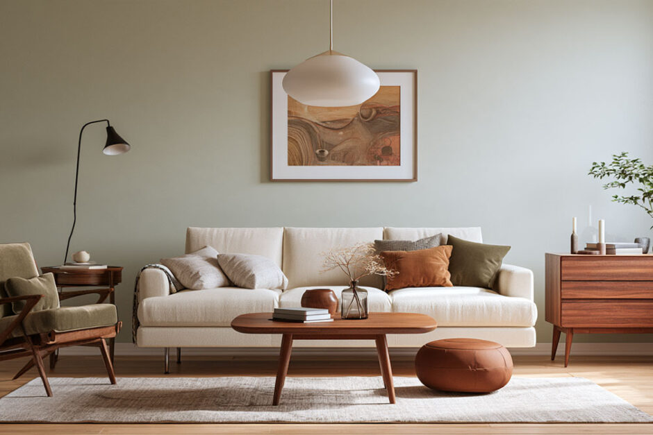
Color combinations in interior design work when four checks agree: a harmony scheme, a 60-30-10 split, matching undertones and the room’s light.
The checks matter more than the hues themselves, because one pairing can pass in a north-facing bedroom and fail in a south-facing kitchen. Peer-reviewed work shows how often instinct misjudges a pairing. In Oberfeld and Hecht’s 2011 Human Factors study, experts and non-experts alike assumed the lightness contrast between ceiling and walls changes perceived height, but each surface’s lightness adds up on its own.
Light ceilings and light walls both raise the apparent height of a room. The tables below give the quick answer for 32 common colors and 10 wood tones: the safe partners, the bolder ones, and the mistake to avoid.
Each row links to a full guide with paint names, light reflectance values and room-by-room advice.
Colors That Go With Each Color
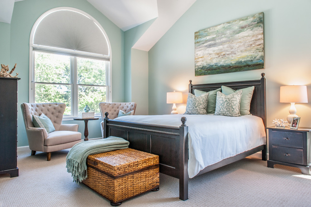
“Safe” partners keep the room calm and low in contrast. “Bold” partners add contrast or a second color worth noticing. Both work; it depends on how much attention you want the pairing to get.
Neutrals
| Color | Safe partners | Bold partners | Watch out for |
|---|---|---|---|
| White | Gray, greige, sage, navy | Black, terracotta, mustard in small doses | Match the white’s warm or cool undertone to its partner |
| Black | Warm white, grays, beige, natural wood | Brass, gold, copper | Some blacks lean warm and some lean blue |
| Grey | White, beige, greige, natural wood | Navy, sage, mustard, blush, gold | Pick partners by the grey’s warm or cool lean |
| Charcoal gray | White, cream, navy | Sage, emerald, mustard, burnt orange, blush | Charcoals differ a lot in how much light they reflect |
| Kendall Charcoal | Warm whites, lighter pewter, greige | Navy, sage | It has so little color that the partners do the talking |
| Beige | White, cream, warm gray, brown | Sage, olive, navy, terracotta, black | A cool gray beside beige makes the room feel chilly |
| Tan | Cream, warm white | Navy, sage, olive, terracotta, rust | Keep charcoal and black to small accents |
| Taupe | White, cream | Navy, charcoal, sage, emerald, terracotta, mustard, blush | The undertone swings from warm brown to cool gray |
| Brown | Cream, white, gray | Navy, teal, sage, olive, terracotta, mustard | Warm and cool browns take different partners |
Blues
| Color | Safe partners | Bold partners | Watch out for |
|---|---|---|---|
| Light blue | White, cream, beige, gray | Terracotta, mustard, coral | Cool gray and icy white make a gray-blue room flat |
| Navy blue | White, cream, gray, greige | Rust, orange, mustard, blush | Navies range widely in depth, which changes the contrast |
| Royal blue | White, cream, gray, beige | Burnt orange, coral, mustard, gold | It is saturated, so the partners set the mood |
| Teal | White, cream, gray, navy, sage | Coral, terracotta, burnt orange, blush, brass | It sits between blue and green and shifts with the light |
| Turquoise | White, cream, navy, emerald | Coral, terracotta, brass | It carries both warm and cool undertones |
Greens
| Color | Safe partners | Bold partners | Watch out for |
|---|---|---|---|
| Green | Off-white, warm white, stone | Blush, navy, plum, brass, burnt orange | Sage, olive and emerald each want different partners |
| Sage green | White, cream, beige, taupe, gray | Terracotta | Sages vary a lot in depth, so check the white beside yours |
| Olive green | Warm white, cream, beige, greige | Terracotta, plum, brass, walnut | Cool, blue-leaning grays |
| Mint green | White, light gray, beige, natural wood | Navy, blush, charcoal, terracotta, coral | Partners that are too close in lightness flatten it |
| Emerald green | Cream, white, beige, gray | Blush pink, navy, gold, brass | Its blue undertone puts it closer to teal than to olive |
| Dark green | Warm white, cream | Blush, terracotta, mustard, navy, brass | It reflects little light, so the partner has to brighten the room |
Warm Colors
| Color | Safe partners | Bold partners | Watch out for |
|---|---|---|---|
| Yellow | Gray, white, cream | Navy, terracotta, burgundy, olive | Mustard and lemon need different partners |
| Orange | Cream, warm white | Olive, navy, teal, charcoal | A deep orange wants a light partner |
| Burnt orange | Cream, charcoal, sage | Navy, teal | It usually arrives as one big piece, so plan around it |
| Coral | Warm white, soft gray | Teal, navy, sage | Coral leans pink, orange or red |
| Peach | Cream, warm white, warm gray | Navy, sage, olive, teal, terracotta | Yellow-, pink- and coral-leaning peaches differ |
| Light pink | Cream, greige | Sage, navy, terracotta, burgundy, brass | Warm and cool pinks take different partners |
| Mauve | Cream, warm white | Sage, navy, charcoal, terracotta | It behaves like a soft neutral |
| Purple | White, pale gray | Sage, brass, rich brown, soft blue | Red-leaning and blue-leaning purples differ |
| Burgundy | Warm cream, beige | Dusty rose, forest or emerald green, navy | Stark white reads cold beside it |
| Maroon | Cream, gray | Gold, navy, forest green, teal, blush | Blue-leaning grays fight its brown base |
Metallics
| Color | Safe partners | Bold partners | Watch out for |
|---|---|---|---|
| Gold | Gray, blush | Navy, emerald, black | Dark colors give gold something to push against |
| Rose gold | White, cream, soft gray, blush | Navy, teal, emerald, charcoal | It is a metal, so the room around it changes how it reads |
Colors That Go With Wood Tones
Wood is a color too. Its undertone, orange in pine and golden oak, red in cherry and mahogany, cream or yellow in maple, decides which wall and accent colors flatter it and which make it look orange.
| Wood | Colors that work | Watch out for |
|---|---|---|
| Knotty pine | Orange pine: sage, emerald, country blue, navy, cream. Bleached pine: icy blue, gray, cool white | The undertone shifts as the wood ages |
| Pine | Sage, terracotta, deep navy | The wrong wall color makes pine look orange |
| Maple | Gray, charcoal, blue, navy, green | Maple ranges from white to yellowish or pinkish |
| Golden oak | Cool shades, gray-based greige, olive, sage | Yellow-leaning beige, pale yellow and peach |
| Oak cabinets | Warm white, greige, olive, sage, navy, black | Cool tones push oak toward orange |
| Honey oak cabinets | Warm white, sage, olive, navy | Golden undertones react to every surface |
| Walnut | Oiled: earthy neutrals, sage, terracotta. Lacquered: crisp white, navy, forest green | Walnut carries red, purple and gray undertones |
| Mahogany | Warm neutrals, forest green | Orange and purple undertones shift with the finish |
| Cherry floors | Warm whites and greige, or muted green, blue-gray, navy | Cherry darkens, so judge the color against the aged floor |
| Gray cabinets | Greige, warm white, sage, soft blue | Warm and cool grays take different counters and metals |
Color Harmony Schemes and the Combinations They Produce
A color combination works when its colors share a logic, and six harmony schemes supply it: monochromatic, analogous, complementary, split-complementary, triadic and tetradic.
Each scheme is a rule about position on the color wheel. Newton’s 1704 Opticks joined the ends of the visible spectrum into a closed circle of seven hues (National Museum of Health and Medicine).
The wheel tells you which hues relate. How color theory plays out in a finished room depends on the proportion, undertone and light covered below.
| Scheme | Wheel position | Contrast | Example pairing |
|---|---|---|---|
| Monochromatic | One hue | Low | Pale to deep sage |
| Analogous | Neighboring hues | Low to medium | Blue, blue-green, green |
| Complementary | Opposite hues | High | Navy and burnt orange |
| Split-complementary | One hue plus the two beside its opposite | Medium to high | Blue with yellow-orange and red-orange |
| Triadic and tetradic | Three evenly spaced hues, or two opposite pairs | High | Red, yellow and blue |
Monochromatic and Analogous Schemes
Low contrast is the safe route. It is also the easiest one to make dull.
A monochromatic room layers one hue across light, mid and dark values. An analogous room spreads two or three neighbors, such as blue sliding into green.
Where it fails: flat rooms that read as a single block.
- Step the value from light to dark across walls, textiles and furniture
- Add texture, since matte paint, linen and wood grain do the work hue cannot
- Keep one small accent outside the scheme
Complementary and Split-Complementary Schemes
Johannes Itten counted seven kinds of color contrast in The Art of Color, and complementary contrast is one of them.
Equal areas of opposite hues fight each other. One color leads and the other stays small, which is how contrast works in a room.
Full strength: navy against burnt orange gives the sharpest pairing a wall palette can carry, and it tires the eye fast.
Muted: dusty versions of the same two hues keep the tension and drop the glare.
Split-complementary: one hue plus the two neighbors of its opposite softens the clash and still leaves a clear lead color.
Triadic and Tetradic Schemes
Triadic schemes use three evenly spaced hues. Red, yellow and blue is the textbook case, and it reads vibrant (Decorating Den).
Tetradic schemes use two complementary pairs, so four hues compete at once. That gives the most ways to clash.
Both work only with one dominant hue and muted versions of the rest. Otherwise the room looks like a swatch card.
How Does the 60-30-10 Rule Split a Room Between Colors?
The 60-30-10 rule gives a dominant color 60 percent of the room, a secondary color 30 percent and an accent color 10 percent.
- 60 percent, dominant: walls, flooring and the largest furniture
- 30 percent, secondary: sofa, curtains, rug or an accent chair
- 10 percent, accent: cushions, art, vases and small objects
The accent share is where most rooms go wrong. Anam Clarke of The Designers’ Studio in Dubai says people execute the 60 and the 30 well, then forget the 10 (Gulf News).
Concentrated on one object or one wall, the 10 percent becomes the focal point of the room. Because it is small, it is also the cheapest share to change later.
Neutral dominant: the room reads calm, and the bold color earns attention through the 30 and 10 shares.
Bold dominant: the room reads saturated from the doorway, so the neutrals have to carry the rest.
The rule is a convention, not a measured standard. Bob Vila’s explainer treats it as a guideline to bend, for example by letting a wood tone fill the secondary share and repeating it in fabric.
Undertone, Value and Saturation Decide Whether Colors Match
Two colors match when their undertones agree, their values leave room for contrast and their saturation is chosen on purpose.
A scheme that is correct on the wheel still clashes when one color leans yellow and the other leans blue.
Reading Warm and Cool Undertones
Undertone is the faint hue underneath a neutral’s surface color, and it decides whether the color reads warm or cool.
Cool whites carry blue or gray undertones and glow in sun-filled rooms (Chairish).
Warm whites carry beige or cream undertones and feel cozier.
Mixed temperatures hold together when the balance is deliberate. A warm pink wall with cool green furniture works. A cool gray wall beside a yellow-beige sofa looks off.
The usual failure is ignoring undertone in flooring and furniture, because neither can be repainted. Hold the chip against the floor first and judge it there, not against the white page.
Balancing Value and Saturation Across Two Colors
Albert Munsell’s system describes every color with three independent qualities: hue is the name, value is the amount of light, and chroma is the strength (Munsell Color).
Designers call chroma saturation. The two controls move separately, so a pair can match in hue and still fail on value.
- Same value, same saturation: both colors compete and neither leads
- Different value, one muted: the muted color supports and the bright one leads
Pick the lead color first. Then pull its partner down in saturation or up in lightness.
How Light Direction and LRV Change a Color Combination
Light changes a color combination in two ways. Window direction and bulb temperature shift how undertones read, and a paint’s light reflectance value (LRV) sets how much of that light the wall returns. The chip never changes.
The room around it does.
Window Direction and Bulb Temperature
North-facing rooms: consistent, muted light through the day, per Benjamin Moore’s guidance for northern exposure. Warm undertones balance the cooler cast.
South-facing rooms: in the northern hemisphere, warmer and yellower light that lets cool colors hold their own.
Bulbs: Energy Trust of Oregon puts lighting on a 2200K to 6500K scale and points to about 2700K for living rooms, bedrooms and dining rooms, around 3500K for kitchens and work areas, and 5000K for reading and desk lamps.
Bulb choice moves an undertone as far as window direction does, so how light behaves in a room belongs in the color decision from the start.
What LRV Measures
LRV runs from 0 for absolute black to 100 for pure white, and it states the percentage of light a surface reflects (Benjamin Moore).
Labs measure it with a spectrophotometer under consistent lighting, as Dexter Langkilde explains in Homebuilding. The number measures lightness only, not saturation or intensity.
Two colors with the same LRV can behave differently in the same light (The Color Concierge). Read the number against the room, never alone.
Where the Advice on Low-Light Rooms Splits
High LRV: Homes & Gardens guidance for dark and low-light rooms pairs a high-LRV color with stronger artificial lighting.
Warm undertone first: The Color Concierge argues the reverse for weak light. A lower-LRV color with yellow undertones, such as Benjamin Moore Simply White or Sherwin-Williams Alabaster, lights up the room.
The gap comes down to what each side counts. One measures how much light returns, the other judges how the cast reads under cool light.
Benjamin Moore’s northern-exposure guidance cuts through the argument: buy a sample and watch it through the day and evening, in natural and artificial light.
Which Color Combinations Suit Each Room?
Designers keep returning to the same pairings by room: blue with terracotta for living rooms, blue-green for bedrooms, dark green with white for kitchens, blue-gray with marble for bathrooms, and dark blue with warm wood for home offices.
| Room | Pairing | Why it works | Where it fails |
|---|---|---|---|
| Living room | Blue and terracotta | Earthy warmth on a cool base | Equal shares split the room in two |
| Bedroom | Blue-green with soft pink or warm white | Low contrast, restful | Heavy saturation stops it relaxing |
| Kitchen | Dark green with white or light gray | Clean balance, fits most styles | Low-LRV green absorbs light in a small kitchen |
| Bathroom | Blue-gray with marble and white | Quiet, cool, clean | Goes cold under cool-white bulbs |
| Home office | Dark blue with warm wood and metal accents | Focus with some warmth | Dark walls need strong task lighting |
The pairings come from designer roundups at Homes & Gardens, Apartment Therapy and Decorating Den, plus Blinds Direct’s customer favorites by room.
The last column carries the real advice. A pairing suits a room only when the room’s light and size let it.
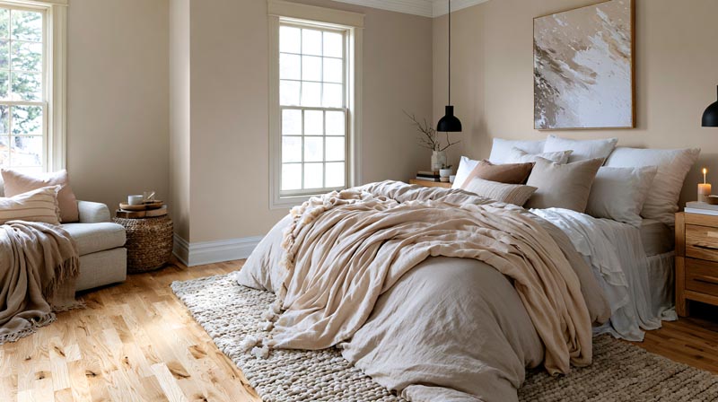
Homes & Gardens asked designers for their bedroom staples, and blue, blue-green, soft pink and taupe came up again and again. Which of those relaxes a room best is the subject of this breakdown of the best colors for bedroom walls.
For kitchens, our kitchen color schemes guide pairs cabinet colors with countertops and hardware, and the curtain color guide covers windows in every room.
Dark and Moody Schemes
Navy with dark brown has an elegant effect, according to Decorating Den’s designers.
Navy also takes warm partners such as terracotta and brown, and the page on colors that go with navy blue lists more of them.
Where it fails: small rooms. Tom’s Guide notes that charcoal, black and navy absorb light and shrink a small space, and it recommends one feature wall instead of full coverage.
- Paint one wall dark and keep the rest light
- Repeat the dark color in one textile so it reads as chosen
Room-by-Room Wall Color Guides
Some rooms set their own rules: small rooms need light, bathrooms need colors that cope with moisture and artificial light, and bedrooms favor calm.
- Best colors for small rooms: Light reflectance, undertone and finish in compact spaces.
- Best colors for bedroom walls: Calm wall colors for rest and sleep.
- Best colors for bathroom walls: Wall colors that cope with moisture, tile and artificial light.
How to Coordinate Paint With Wood, Metal, Fabric and Flooring
Start with the wood. Its undertone is the one color in the room that cannot change, so the wall palette follows it.
Wood Tones and Flooring
Sherwin-Williams’ blog calls matching paint to hardwood undertones tricky and sends readers to free chips and peel-and-stick samples to check the match.
For a wider range of options, see the guide to paint colors that go with wood floors, and the wood-tone table near the top of this page.
Dark finishes: mahogany, walnut and cherry stand out against pale green, pale blue and other light hues (AOL Lifestyle guide).
Medium tones: keep the wall soft and light, so the gap in value does the work.
Wood and wall at the same value give low contrast. That suits a room meant to fade into the background and nothing else.
Metal and Fabric
- Metal: brass and gold lean warm, nickel and chrome lean cool, black iron stays neutral. Follow the palette’s temperature.
- Fabric: rugs and curtains carry the 30 percent share, cushions and throws carry the 10.
Cushions are where the accent color gets tested first, and a guide to throw pillow combinations shows how to build a set without echoing the sofa.
Paint Sheen
A flatter coating makes a color look darker, and the same color in a higher sheen often reads lighter beside its flat counterpart, says Amanda Lowery of Sherwin-Williams (Interior Design Society).
| Sheen | Color reads | Suits | Watch for |
|---|---|---|---|
| Flat or matte | Darkest, richest | Bedroom walls, ceilings | Hides flaws, wears faster |
| Satin or eggshell | Soft glow | Bedrooms, bathrooms | More glare than matte |
| Semi-gloss | Lighter | Trim, bathrooms | Shows prep flaws |
| High gloss | Lightest, high glare | Cabinets, doors | Highlights every flaw |
Sheen shifts how a combination reads without touching the colors on the chip. Sample the sheen you plan to buy.
Floors, Walls and Fixed Surfaces

Floors, brick, stone and trim are the parts of a room you are least likely to change, so they make the best starting point. Read their undertone first, then choose walls and furniture that agree with it or contrast with it on purpose.
- Paint colors that go with wood floors: Read the floor’s undertone first, then its depth.
- Paint colors that go with oak floors: Red, honey and white oak each need a different strategy.
- What color walls go with oak floors: Why red oak and white oak behave differently with paint.
- What color walls go with light wood floors: Undertone matching for honey oak, ash, maple and birch.
- What color furniture goes with light wood floors: Warm, cool and neutral light floors and the furniture that suits each.
- What color furniture goes with dark wood floors: Contrast, undertone and room scale over walnut, espresso and ebony.
- Paint colors that go with gray floors: Cool, warm, charcoal and bleached gray floors.
- Paint colors that go with gray carpet: Wall colors for cool and warm gray carpet, room by room.
- Colors that go with red brick: Matching paint to the orange, brown, pink or burgundy cast of the brick.
- Paint colors that go with a stone fireplace: Fieldstone, limestone, river rock and slate, each with its own direction.
- Paint colors that go with white trim: Pairing wall colors with White Dove, Chantilly Lace and Alabaster trim.
- Paint colors that go with gray furniture: Wall colors for cool and warm gray furniture.
- What color walls go with gray furniture: Warm white, navy, sage and greige walls around gray pieces.
- What color walls go with brown furniture: Espresso, honey, mahogany, driftwood and walnut furniture.
Rugs, Throw Pillows and Bedding

Textiles are the easiest place to try a color combination, because they are cheap to change. Pull the accent from the sofa or the wall and repeat it in two or three places.
- Rugs that go with brown couches: Cream, tan, grey, navy, olive and rust under brown leather or fabric.
- Rugs that go with blue couches: Rug colors for navy, royal, light blue, denim and teal sofas.
- Rugs that go with black couches: Safe neutrals and deeper alternatives under a black sofa.
- Rugs that go with a beige couch: Tonal, cool and colorful rugs for beige sofas.
- Rugs that go with a green couch: Rugs for emerald, forest, sage and olive sofas.
- Rugs that go with grey floors: Warm, cool and high-contrast rugs over grey flooring.
- What color rug goes with dark wood floors: Rug colors by floor undertone, room light and furniture weight.
- What color rug goes with brown furniture: Cream, rust, sage and navy rugs beside brown pieces.
- Throw pillow combinations: Sizes, counts and how to mix two or three colors.
- Throw pillows for a grey couch: Navy, mustard, sage, blush and warm neutrals on grey.
- Throw pillows for a beige couch: Pillow colors by the beige’s warm or cool lean.
- Throw pillows for a dark brown couch: Cream, rust, mustard, teal and sage, with fabric picks.
- Throw pillows for a black leather couch: Colors and textures that stand out against black.
- What color sofa goes with gray walls: Sofa colors matched to the gray’s undertone.
- What color bedding goes with blue walls: Whites and colors for steel, dusty and navy blue walls.
- What color bedding goes with gray walls: Bedding for cool, warm and neutral grays.
- What color bedding goes with dark wood furniture: Bedding for walnut, espresso, mahogany and ebony.
Color Palettes by Style

A style is partly a palette. These guides break each one down into a base, accents and the materials that carry them.
- Earthy color palette: Clay, sand, espresso and green, with the 2026 colors of the year.
- Scandinavian color palette: Pale bases, muted accents and natural wood for low northern light.
- Mediterranean color palette: Whitewash, sea blue, terracotta, ochre and olive, region by region.
- Mid-century modern color palette: Warm neutrals and wood with a few saturated accents.
- Art Deco color palette: Black, navy and jewel tones with metallic accents.
- Popular Art Deco paint colors: Seven Deco pairings, from emerald and gold to black and warm white.
- Industrial color palette: Charcoals, concrete grays and warm metals, with paint LRVs.
- Peach interior design: Using pale pink-orange tones on walls, cabinets and textiles.
- Red interior design: Crimson, brick and burgundy, and the rooms each one suits.
How to Test a Color Combination Before Painting
Test a combination in four moves: preview it on screen, put 8-inch samples on the wall, live with them for a few days, then judge them next to the fixed materials.
Shortlist on Screen
A generator built for room color schemes narrows the field to two or three combinations before any paint is bought.
Adobe Color applies harmony rules (analogous, monochromatic, triad, complementary, split complementary) to a base color and extracts a palette from an uploaded photo.
Sherwin-Williams’ ColorSnap Visualizer previews its colors on a photo of your room or through an AR mode called Instant Paint, and its Day and Night Lighting feature shows scenes in different light.
Screens only shortlist. The same app orders chips and peel-and-stick samples, which is the next step.
Choosing a Sample Size
Prices are Sherwin-Williams US listings, checked in October 2026.
| Option | Size | Price | Best for |
|---|---|---|---|
| Color chip | 2 x 3 inches | Free, up to 10 | Narrowing the shortlist |
| Peel and stick | 8 x 8 inches | $3.95 | Comparing colors on the wall |
| Color to Go | Quart | Paid, check your store | Painting a test area on the real surface |
The Testing Sequence
Sherwin-Williams’ color guide suggests comparing larger samples over a few days and moving to a quart sample when two favorites still tie.
- Pick two or three combinations from the screen shortlist.
- Put samples on at least two walls, so each color meets different light.
- Place them beside the floor, the sofa and the largest wood piece.
- Leave them up for a few days and look at morning, evening and lamp light.
- Hold a cushion or throw in the accent color against the pair.
- Drop any combination that looks off in one spot, then decide.
Where testing fails: one sample in one spot. A corner shadow or a patch of window glare misleads, which is why step 2 asks for two walls.
Once one combination wins, a paint calculator turns wall measurements into the quantity for the dominant color.
When Color Combination Rules Stop Working
The rules stop working when a room needs more than three colors, when rooms open into each other, and when the 60 percent cannot be repainted.
More than three colors: Dulux creative director Marianne Shillingford calls the three-color rule one to outgrow, with the warning that extra colors need thought or the room turns busy (Ideal Home).
The same piece names 70-20-10 as the alternate split. Wallshoppe adds two workarounds: use a color family for the dominant and secondary shares, or run more than one accent.
Maximalist rooms break the percentages and still hold together by balancing visual weight, which is the idea behind balance in interior design.
Open Floor Plans
Sources split here. Sherwin-Williams reports that many designers paint an open-concept space one color for flow, with one trim color tying everything together.
Behr and Clare argue against painting everything the same shade. Behr recommends a palette of three to five related colors: one white or light color, one or two neutrals, and one or two supporting colors.
The divide comes down to sightlines and floors. Fewer breaks favor one color, more breaks favor a related palette.
On where to stop and start a color, Behr points to corners and transition areas.
Rented or fixed rooms: when walls and floors cannot change, textiles and art carry the 30 and 10 shares, and the 60 stays whatever it is.
Common Questions About Color Combinations
Which colors make a small room look bigger?
Light colors do, and the wall that carries them matters. Perceived width rises with side-wall lightness and perceived depth with rear-wall lightness (von Castell, Hecht and Oberfeld, University of Mainz). Start with a lighter rear wall, then pick shades from our guide to the best colors for small rooms.
What colors go with gray walls?
Colors that share the gray’s undertone go with it best. Cool grays pair with blue, green and cool whites, according to Tom’s Guide, while warm grays pair with cream, beige and wood tones. Navy, sage, mustard, blush and gold work as accents.
The guide to colors that go with grey lists specific partners.
Is there a color that goes with everything?
Soft neutrals come closest: warm white, cream, greige and natural wood appear among the safe partners for almost every color in the tables above. Even then, match the neutral’s undertone to the main color, since a yellow-leaning cream can look dirty beside a cool gray.
What color should trim and ceilings be?
White is the standard trim color, and one trim color across connected rooms ties different wall colors together (Sherwin-Williams open-concept guide). Ceilings follow the same logic: a light white, or a paler version of the wall color.
Do black and white count as a color combination?
Yes, as a neutral pairing. Both are technically the absence of color, and Decorating Den calls the combination a minimalist staple with stark contrast. A gray-green softens it without dulling the room.
Should color trends decide the palette?
No. A trend color belongs in the 10 percent accent share, where changing it costs a cushion cover instead of a repaint. Pantone Color Institute names a Color of the Year annually, but walls and floors cost far more to change than cushions.
More Color Guides

- What Color Cabinets Go With Taj Mahal Quartzite? [Guide] - November 10, 2026
- Japandi Bedroom Essentials for a Calm, Restful Retreat - November 7, 2026
- Bedroom Curtains Ideas to Block Light and Add Style - November 4, 2026