Kitchen Decor
Kitchen Color Schemes by Cabinet Color: What Pairs Well
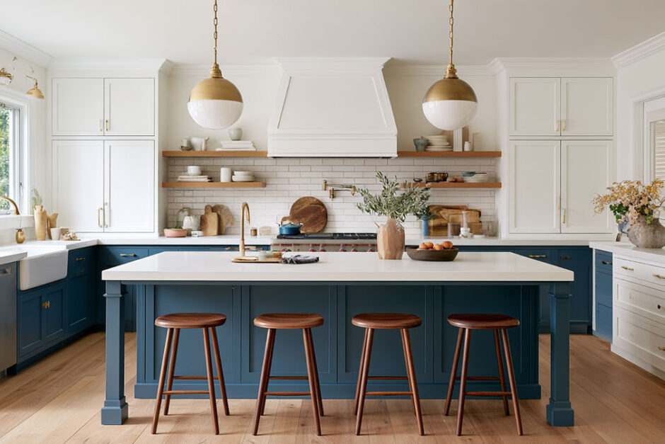
Kitchen color schemes are palettes that coordinate cabinets, walls, backsplash, countertops, flooring and hardware so the room reads as one space.
Each follows a color wheel relationship (monochromatic, analogous, complementary, triadic or neutral) and a proportion, most often a 60-30-10 split between dominant, secondary and accent colors. Neutral walls still lead real renovations.
Houzz’s 2026 U.S. Kitchen Trends Study found off-white the most popular wall color at 29%, ahead of white at 21%, gray at 10% and blue at 7%. Undertone, window direction and paint reflectance decide how a chosen palette reads once it is on the wall.
The two tables below are the quick version. The first shows every cabinet-and-material combination we have a full guide for. The second sums up the safest picks for each cabinet color, drawn from those guides.
Kitchen Color Schemes by Cabinet Color
| Cabinet color | Countertops | Hardware | Backsplash | Floors and appliances | Island |
|---|---|---|---|---|---|
| Green | black, white, grey, brown, granite, wood, butcher block | gold, black | brick | – | dark green island, green island with white cabinets |
| Grey | quartz, wood, butcher block, brown | black, gold | subway tile | stainless steel appliances | – |
| Blue | black, granite, wood, butcher block | brass | – | dark floors | blue island with white cabinets |
| White | brown, brown granite, grey, butcher block | – | red brick | stainless steel, black appliances | black island |
| Wood | full scheme guide | black | – | – | – |
| Cherry | full scheme guide | – | – | – | – |
What Goes With Each Cabinet Color
| Cabinet color | Countertops that work | Hardware | Watch out for |
|---|---|---|---|
| Green | Sage and olive: maple or white oak, warm white, Kashmir White granite. Forest and emerald: walnut, light grey stone, Black Pearl granite | Brushed or satin brass; black on sage and gray-green | Deep green with black counters in a dim room reads as one dark mass |
| Grey | Warm greige: white oak, maple, cream quartz, brown granite. Cool grey: white quartz with grey veining, walnut, cherry | Black on light to mid greys; satin brass or champagne bronze | Blue-grey beside brown stone; black pulls vanish on charcoal |
| Blue | Navy: maple, white oak, black stone, Kashmir White or Santa Cecilia granite. Pale blue: Absolute Black, white oak | Brass in satin, brushed or unlacquered finishes | Navy with walnut or dark floors needs strong daylight |
| White | Warm white: brown granite, butcher block, cream-veined stone. Cool white: grey quartz, grey granite | Repeat black or brass in at least two places | A warm white beside a cool grey counter |
| Wood | Oak: cream quartz. Maple: white or grey quartz. Walnut: creamy white counters | Black on maple, white oak and ash; brass or black on walnut | Black hardware blends into walnut and espresso stains |
Each row is a summary. The full guides cover specific paint colors, light reflectance values and how daylight changes each pairing.
Green Kitchen Cabinets
 Green splits into two families, and they pair differently. Sage, olive and gray-green take pale woods such as maple and white oak, warm whites, light granites like Kashmir White and brushed or satin brass. Forest, hunter and emerald take walnut, light grey stone and darker granites like Black Pearl, and they need good light to keep from reading as one dark mass.
- Green cabinets with black countertops: Which greens hold their color against black stone, and when deep greens need a pale backsplash.
- Green cabinets with white countertops: Matching the white to the green, from warm white beside sage to crisp white beside emerald.
- Green cabinets with grey countertops: Which grey to try first for grey-green, sage, olive and forest cabinets.
- Green cabinets with brown countertops: Butcher block, brown granite and brown quartz, matched to the depth of the green.
- Green cabinets with granite countertops: Five granites, from Kashmir White to Black Pearl, and the greens each one suits.
- Green cabinets with wood countertops: Pale maple and oak for sage and olive, walnut for deep forest green.
- Green cabinets with butcher block countertops: Which wood species flatter sage, olive, hunter and gray-green paint.
- Green cabinets with gold hardware: Brushed, satin, unlacquered or polished brass, and how each finish ages.
- Green cabinets with black hardware: Why black pulls read best on gray-greens and mid sages, with paint LRVs.
- Green cabinets with a brick backsplash: White or gray brick for sage, red clay brick for olive and forest green.
Grey Kitchen Cabinets
 With grey cabinets, the undertone decides almost everything. Warm greiges such as Repose Gray and Revere Pewter sit well beside white oak, maple, cream quartz and brown granite. Cool and blue-leaning greys suit white quartz with grey veining, walnut and cherry, and they can clash with brown stone. Black hardware reads crisply on light to mid greys and disappears on charcoal, where satin brass or champagne bronze does a better job.
- Grey cabinets with quartz countertops: The quartz color and pattern to pick for light grey, charcoal, greige and blue-grey doors.
- Grey cabinets with wood countertops: Walnut and cherry for cool greys, white oak and maple for greige.
- Grey cabinets with butcher block countertops: Wood species, hardness and where a butcher block top works best.
- Grey cabinets with brown countertops: Why warm greys work beside brown stone and wood, and blue-greys usually clash.
- Grey cabinets with black hardware: Which grey paints give black pulls a sharp outline, and why charcoal does not.
- Grey cabinets with gold hardware: Matching brushed gold, satin brass and champagne bronze to five popular greys.
- Grey cabinets with a subway tile backsplash: Choosing the tile white and grout color for cool greys, greiges and charcoal.
- Grey cabinets with stainless steel appliances: Which greys soften cool steel and when black stainless is the better match.
Blue Kitchen Cabinets
 Navy and gray-blue are the safest blues for a full kitchen. They hold up beside black stone, take light woods such as maple and white oak, and suit brass in almost any finish. Warm granites such as Santa Cecilia add contrast to navy, while pale blue works best against a plain dark counter like Absolute Black. Deep blues need daylight. Paired with walnut or dark floors in a dim room, navy can read close to black.
- Blue cabinets with black countertops: Navy, gray-blue, teal and pale blue against black stone.
- Blue cabinets with granite countertops: Kashmir White, Steel Gray, Absolute Black, Santa Cecilia and Blue Pearl beside blue paint.
- Blue cabinets with wood countertops: Light wood for navy, warmer and darker wood for lighter blues.
- Blue cabinets with butcher block countertops: Navy, gray-blue, teal and powder blue matched to maple, oak and walnut.
- Blue cabinets with brass hardware: Brass finishes for navy and blue-green paints, and how unlacquered brass ages.
- Blue cabinets with dark floors: When navy and slate work over walnut or espresso boards, and when to go lighter.
White Kitchen Cabinets
 White cabinets look simple, but the white has a temperature. Warm whites such as White Dove and Alabaster calm brown granite, butcher block and cream-veined stone. Crisp, cool whites such as Chantilly Lace suit grey quartz and grey granite, and they give stainless or black appliances the sharpest contrast. The mismatch to avoid is a warm white beside a cool grey counter, which looks slightly dirty even when both colors are fine on their own.
- White cabinets and brown countertops: Granite, quartz, butcher block, soapstone and laminate compared on look, upkeep and price.
- White cabinets with brown granite countertops: Five brown granites and the cabinet white that calms each one.
- White cabinets with grey countertops: Grey quartz, granite, marble and laminate, and why the white and grey must share a temperature.
- White cabinets with butcher block countertops: Examples of white kitchens warmed by a wood work surface.
- White cabinets with a red brick backsplash: Exposed brick, thin veneer or faux panels behind white doors.
- White cabinets with stainless steel appliances: Four cabinet whites and when each one suits stainless steel.
- White cabinets and black appliances: Why black needs to repeat in two other places, and which whites soften it.
- Kitchen color schemes with white cabinets: Five complete schemes, from tonal all-white to a navy island.
Wood and Cherry Cabinets
 Wood cabinets have already made the biggest color decision, so the rest of the scheme follows the wood’s undertone: orange or pink in oak, cream in maple, red in cherry, brown in walnut. Agree with that cast for a calm kitchen, or contrast it on purpose with sage, navy or deep green.
- Kitchen color schemes with wood cabinets: Wall, counter and hardware colors for oak, maple, cherry, walnut and hickory.
- Kitchen color schemes with cherry cabinets: Colors that calm the red in cherry, or push it forward on purpose.
- Wood cabinets with black hardware: Maple, white oak, hickory, cherry and walnut ranked by how much black pulls stand out.
Start From the Floor or the Appliances
 Floors and appliances are the parts of a kitchen you are least likely to replace, so they are often the right place to start. Dark wood floors favor light cabinets and walls, grey floors rule colors in or out by their undertone, and black or stainless appliances look planned when their finish repeats elsewhere in the room.
- Kitchen color schemes with dark floors: Cabinet colors that work over dark wood, ranked by contrast.
- Kitchen color schemes with grey floors: How the undertone of a grey floor rules cabinet colors in or out.
- Kitchen color schemes with black appliances: White, gray, navy, green and wood cabinets beside black appliances.
- White kitchen floor ideas: White floor options and how they change a kitchen.
Two-Tone Kitchens and Islands
 An island is the easiest place to add a strong color while keeping the rest of the kitchen light. Blue is the main cabinet color in only a small share of kitchens, yet it is one of the most popular choices for a contrasting island. Green islands work the same way when the perimeter white matches the green’s undertone.
- White cabinets and a blue island: Navy, mid blue, blue-green and blue-gray islands against a white perimeter.
- White cabinets with a green island: Matching the white to a sage, gray-green, olive, forest or emerald island.
- White cabinets and a black island: Which blacks and whites pair well, and the aisle space a dark island needs.
- Dark green kitchen island ideas: Five dark green paints for an island and the rooms each one suits.
Backsplash and Walls
 Once cabinets and counters are set, the backsplash and walls balance the light. Dark counters need a bright wall behind them, and busy stone needs a plain one.
- What backsplash goes with black granite: Backsplash colors ranked for black granite, and when patterned tile works.
- Best colors for kitchen walls: Wall colors, LRV and paint finishes for any style of kitchen.
- What caulk to use for a backsplash: Silicone, siliconized acrylic, hybrid and polyurethane, and where each one belongs.
- How to hide outlets in a backsplash: Four ways to hide outlets without breaking electrical code.
More Kitchen Guides
Layout, island and cabinet projects that go hand in hand with a new color scheme:
- Kitchen island with seating on two sides: Knee space, island depth and seat count for each layout.
- Kitchen island with a wine fridge: Which wine fridges can go inside an island, and the depth they need.
- How to decorate a large kitchen island: Groupings that fill a 7-foot island without cluttering the work surface.
- How to make a kitchen island with IKEA cabinets: Building an island from IKEA SEKTION base cabinets.
- Kitchen cabinet crown molding ideas: Crown, risers and friezes for the gap above upper cabinets.
- How to cover kitchen cabinets without painting: Vinyl wrap, contact paper and other no-paint cabinet makeovers.
- How to restain kitchen cabinets without stripping: Changing the stain color while keeping the existing finish.
What Are the Main Types of Kitchen Color Schemes?
A kitchen color scheme is a set of colors assigned to the cabinets, walls, backsplash, countertops, flooring, hardware and appliances so the room reads as one space. Five types cover most kitchens: monochromatic, analogous, complementary, triadic and neutral.
- Monochromatic: one hue in several tints and shades, such as pale sage walls, mid-green cabinets and a deep olive island.
- Analogous: neighbors on the wheel, such as blue cabinets, blue-green tile and a soft green wall. Calmer than contrast, richer than a single hue.
- Complementary: opposites, such as navy cabinets with copper or terracotta accents.
- Triadic: three roughly evenly spaced hues, kept muted in a kitchen (sage, terracotta, dusty blue).
- Neutral: white, greige, beige, gray and wood tones, with no strong hue.
These wheel relationships come straight from interior design color theory, which goes deeper on harmony and contrast. Split-complementary is a sixth option: one dominant color plus the two hues beside its opposite. It keeps strong contrast with less tension than a straight complementary pair. Neutral does most of the work in real kitchens. White, greige and wood sit under nearly every other type, so the colored schemes read as additions to a neutral base.
How to Split Colors Across a Kitchen With the 60-30-10 Rule
Use one dominant color for about 60% of the room, a secondary color for 30% and an accent for 10%. The ratio keeps a scheme from turning into three equal colors competing for attention. Sources disagree on which surfaces count toward each share. Naked Kitchens puts the floor, ceiling and worktops in the 60%, while designer Tiffany White, quoted in The Kitchn, counts most walls plus large pieces like the island or hood.
| Share | Naked Kitchens | Designer Tiffany White (The Kitchn) |
|---|---|---|
| 60% | Flooring, ceiling, worktops | Most walls, island, hood |
| 30% | Cabinets, painted walls, large appliances | Drapes, stools, an accent wall |
| 10% | Splashbacks, tiled sections, small accessories | Cooking appliances, artwork |
The Naked Kitchens worked example is easy to copy. White and neutral surfaces take the 60%, blue cabinets take the 30%, and bronze handles and pendant lights take the 10%. Nobody measures square footage with this rule. If the accent starts to read as a second 30%, the scheme has too many bold surfaces. Test a trio in an online room color scheme generator before buying paint, then check the result against the fixed surfaces. Where to spend the neutral: SA Homeowner advises keeping the expensive items (countertops, cabinets and floors) neutral and putting bolder hues on things that are cheap to swap.
Assigning Colors to Cabinets, Walls, Backsplash, Countertops, Floors and Hardware
Work from the least changeable surface to the most. Countertops, flooring and appliances go first, paintable surfaces second, and swappable hardware and accessories last. NKBA’s 2026 Kitchen Trends Report, built on 634 industry professionals, finds bold color placed most often on backsplashes (60%), wallpaper (60%), islands (57%) and accessories (55%).
Cabinets and Two-Tone Pairings
Cabinets carry the largest block of paintable color, so they usually take the 30% or the 60%. In Houzz’s 2026 U.S. Kitchen Trends Study, two-tone kitchens mostly pair white uppers with wood lowers, with blue next in line for the lower run.
- Light uppers, darker lowers
- Island in a contrasting color
- Wood-toned lowers under painted uppers
If white uppers are already settled, color schemes built around white cabinets cover the wall and countertop options that follow.
Walls and Ceiling
Walls pick up the undertone of whatever stays fixed. Walls: a quiet neutral behind bold cabinets, a color behind neutral ones. Ceiling: the lightest value in the scheme. Naked Kitchens counts it in the neutral 60%.
Backsplash and Countertops
Slab backsplashes now account for 28% of renovated-kitchen backsplashes, up from 24% a year earlier, per Houzz’s 2026 study. Tile still leads at 72%. A slab in quartz or quartzite reads as an extension of the countertop color. Tile reads as a separate accent, which is where the 10% usually lives.
- Grout matched to the tile keeps the wall quiet
- Contrast grout draws a visible grid
Countertops carry fixed undertones, so judge the backsplash against the countertop sample, not against the wall paint.
Flooring and Wood Tones
Same wood everywhere: cabinets and floor in one tone merge into a single heavy block. Two similar mid-tones: they read as a near miss rather than a deliberate contrast. Builder’s designer guidance says wood cabinets do not need to match the hardwood floor. Offset them by a clear step lighter or darker, or keep wood on one surface only.
Hardware and Appliances
Hardware is the cheapest place to add the 10%. Brass handles on blue cabinets are a common pairing (see how blue kitchen cabinets look with brass hardware). Stainless steel appliances read as a cool neutral, so hardware does not have to match them. Repeat the metal of the pendants or faucet instead.
How Undertones and Natural Light Change a Kitchen Palette
The same paint reads warmer, cooler, lighter or darker depending on its undertone and the light hitting it, so the name on the chip settles very little.
Undertones and How to Read Them
An undertone is the faint warm, cool or neutral cast beneath a color. It only shows next to other materials, and white has one too.
- Warm: beige, brown or red cast
- Cool: blue, green or purple cast
- Neutral: no strong lean either way
Hold each paint sample against the countertop and floor first. A cool gray floor beside a yellow-cream cabinet is the classic clash.
Light Direction and LRV
Light reflectance value (LRV) runs from 0 for black to 100 for white. Sherwin-Williams advises an LRV of 60 or higher in north-facing rooms to offset their blue light.
| Window direction | How color reads | Palette move |
|---|---|---|
| North | Cooler, darker, indirect | Warm undertone, LRV 60 or higher |
| South | Brightest, most direct | Handles deeper or cooler colors |
| East | Warm morning, cooler afternoon | Sample at both times |
| West | Cool morning, golden afternoon | Sample at both times |
The direction breakdown follows designer Jenna Sue’s paint color guide. Failure case: dark shades have lower LRVs, and Sherwin-Williams notes they may not work in a room with little natural light. Bulbs shift paint too. Behr notes that a 2700K soft white bulb casts a peach tone that warms whites and neutrals, and the role of light in interior design goes well beyond paint.
Small Kitchens Versus Large Kitchens
Small kitchens reward light colors. Large kitchens can take more. Small, narrow or low-light: a neutral scheme opens the space, per Naked Kitchens, though that is a rule of thumb and not a ban on color. Large with plenty of daylight: stronger colors hold up, according to SA Homeowner. Lighter schemes reflect the most light, which is why colors that open up a small room lean pale.
Which Paint Finish Works on Kitchen Walls and Cabinets?
Eggshell or satin suits most kitchen walls, while satin or semi-gloss suits cabinets. Walls have to hide flaws, and cabinets have to survive scrubbing. Sherwin-Williams: recommends semi-gloss for kitchens because it cleans easily and withstands moisture. Benjamin Moore: pictures neutral kitchen walls in eggshell and treats semi-gloss as the cabinet finish. The two brands split on walls because the trade-off is real. Higher sheen cleans better but shows every wall flaw. Cabinets: Benjamin Moore says its Advance Interior Semi-Gloss cures to a smooth, furniture-like finish and calls it one of the best finishes for kitchen cabinets.
- Semi-gloss on walls shows every drywall flaw
- Flat or matte on walls can burnish when scrubbed, per Benjamin Moore
Sheen and LRV are separate properties, as Ideal Home points out. Sample each color in its final finish, because sheen changes how it reads under the kitchen lights.
Kitchen Color Schemes by Style, With Paint Colors That Match
Five palettes cover most style briefs: warm white with wood, navy and white, sage and warm white, black and white, and greige. Each pairs with a style, a named paint and one condition that trips it up.
| Palette | Style fit | Paint examples | Undertone and main risk |
|---|---|---|---|
| Warm white with wood | Scandinavian, modern | Strong White No. 2001 (Farrow and Ball) | Warm neutral; goes flat without wood or texture |
| Navy and white | Traditional, transitional | Hale Navy HC-154, Simply White OC-117 (Benjamin Moore) | Cool navy; looks harsh beside yellow-cream cabinets |
| Sage and warm white | Farmhouse | Evergreen Fog SW 9130, Alabaster SW 7008 (Sherwin-Williams) | Gray-green; pushes cream cabinets toward yellow |
| Black and white | Modern | Tricorn Black SW 6258 (Sherwin-Williams) | Neutral black; overpowers a small kitchen |
| Greige | Transitional | Accessible Beige SW 7036 (Sherwin-Williams) | Warm with a gray base; can read cream or tan |
Astro Design’s award-winning Scandinavian kitchen in Ottawa used Farrow and Ball Strong White on the walls, ceiling and trim, with white oak flooring, oak and maple cabinetry and matte black knobs.
- Alabaster: creamy, with a yellow undertone
- Simply White: brighter, with a clean yellow undertone
Pale Scandinavian palettes stay light and let wood carry the warmth, as in these Scandinavian color palette ideas. Navy kitchens need more than a white partner. A guide to which colors pair with navy blue covers walls, accents and metals. Check the maker’s number: Benjamin Moore lists Hale Navy at an LRV of 8.36, while some third-party sample sites show a lower figure. Plan the lighting around the paint maker’s own chip.
Kitchen Color Trends in 2026: Homeowners Versus Designers
Homeowners installing kitchens and designers forecasting them point at different colors. Houzz’s 2026 study puts wood ahead of white on cabinets, while NKBA’s professionals name neutrals first, then greens and blues. Key figures:
- Wood cabinets: 29% of renovated kitchens (Houzz 2026, fielded July 2025)
- White cabinets: 28% (Houzz 2026)
- Neutrals named most popular: 96% of respondents (NKBA 2026)
- Greens at 86% and blues at 78% (NKBA 2026)
The two sets of numbers do not compete directly. NKBA’s three percentages add up to well over 100, so each one measures how often a color family was named, not its share of installed kitchens. Houzz counts finished kitchens, so its 29% and 28% are shares of real cabinet choices. Who answered matters too: Houzz surveyed homeowners, while NKBA heard mostly from designers. With wood now ahead, color schemes for wood cabinets deserve the attention white-cabinet palettes usually get. NKBA’s roundup of 2026 paint colors of the year describes a move toward warm, nature-inspired shades, with greens in the lead and browns, creamy neutrals and pale yellows in support. Pantone chose Cloud Dancer, a soft white. An earthy color palette for interior design shows how those browns and greens combine. Practical read: a neutral or wood base with one green or blue on the island or lower cabinets matches both surveys. Both 2026 reports rest on 2025 fieldwork. NKBA’s 2027 Kitchen Trends Report, published in October 2026, keeps neutrals on top at 96%, with greens at 83% and blues at 75%, each slightly down on the year before.
When a Kitchen Color Scheme Does Not Work
A scheme fails when its rules meet a condition they were not built for. Four conditions come up most often.
- Too bright a white: Airtasker calls white the most popular scheme, yet Sherwin-Williams warns that a very bright white feels sterile instead of inviting. Step down to a warm white.
- Black in a small kitchen: SA Homeowner calls black a very strong color to use sparingly in small rooms. Limit it to the island or one cabinet run.
- Mixed bulb temperatures: Kichler advises one color temperature throughout a room for a clean, even look. Replace odd bulbs before repainting.
- Single-hue kitchens: with no accent to carry the 10%, the room goes flat. Homes and Gardens says intense solid color needs texture such as raw wood, battered metal or linen.
Open layouts add a fifth case. KraftMaid advises pulling the dominant color of the adjoining room into the kitchen scheme, so one palette carries across the whole open space. None of these cases means dropping the scheme. Each has a fix inside it.
How to Test a Kitchen Color Scheme Before Painting
Test in the room itself, working from fixed surfaces to paint. Designer Jenna Sue’s rule is to choose paint last.
- Photograph the fixed surfaces. Countertop, floor and appliances, in the kitchen’s own light.
- Set the 60%. Hold neutral candidates against the countertop sample and drop any with a clashing undertone.
- Pick the 30%. Check its LRV against the window direction before ordering anything.
- Choose the 10%. Place a hardware or backsplash sample beside the 30% color.
- Order samples. Behr recommends 8 oz paint samples, and Jenna Sue uses peel-and-stick samples to skip painted test patches.
- Place all three colors together. KraftMaid advises seeing your choices side by side in your kitchen before committing.
- Check across a full day. Morning, afternoon, evening and under the kitchen’s artificial lights.
- Order the paint. Commit only after the samples hold up at every time of day.
A paint calculator sizes the order once the scheme is settled.
Common Questions About Kitchen Color Schemes
What wall color goes with white cabinets?
Greige, soft gray, muted sage or a creamy white all work. Pick the one that matches the warm or cool lean of the cabinet white, then check it beside the countertop. White cabinets leave the wall free to carry the color.
What color countertops go with white cabinets?
It depends on the white. Warm whites suit brown granite, butcher block and cream-veined stone, while cool whites suit grey quartz and grey granite. Our guides to brown countertops and grey countertops with white cabinets compare the materials.
Which colors go with oak cabinets?
Warm creams, beiges and soft whites. A Benjamin Moore color marketer quoted by Homes and Gardens says cooler greens increase the contrast and make the yellow or orange undertones in oak more apparent. The picks named there include White Dove OC-17, Pristine OC-75 and Manchester Tan HC-81.
What wall colors go with maple or cherry cabinets?
Maple suits warm gray, muted green and soft blue. With cherry, warm whites and greige blend with the wood, while sage, olive and navy push its red forward. See color schemes for wood cabinets and cherry cabinets.
What color cabinets go with black appliances?
White and warm white give the clearest contrast. Navy, deep green, natural wood and gray also work, as long as the black repeats in a couple of other places such as hardware or a faucet. See kitchen color schemes with black appliances.
What color cabinets go with dark wood floors?
Light cabinets work best: white for the most contrast, off-white or cream for a softer edge. Navy and sage can work too, but they need strong daylight. Our guide to kitchen color schemes with dark floors ranks the options.
Do kitchen colors affect resale value?
Yes. In Zillow’s 2025 paint color study of more than 4,200 buyers, olive green cabinets drew $1,597 more in offers, while a daisy yellow kitchen drew $3,915 less.
Do kitchen colors change appetite?
The evidence is mixed. A University of Georgia dining summary reports cookies on a blue background were chosen less often than on red, while a Chowhound review calls other studies inconclusive. Treat appetite as a weak reason to pick a hue.
More Color Guides
- Curtain colors for every wall color
- Colors that go with grey
- Earthy color palette for interior design
- Color theory in interior design

- Kitchen Color Schemes by Cabinet Color: What Pairs Well - October 19, 2026
- Curtain Colors for Every Wall Color: Safe vs Bold Picks - October 18, 2026
- Interior Design Styles: Find Your Primary and Secondary - October 14, 2026


