Curtain Colors
Curtain Colors for Every Wall Color: Safe vs Bold Picks
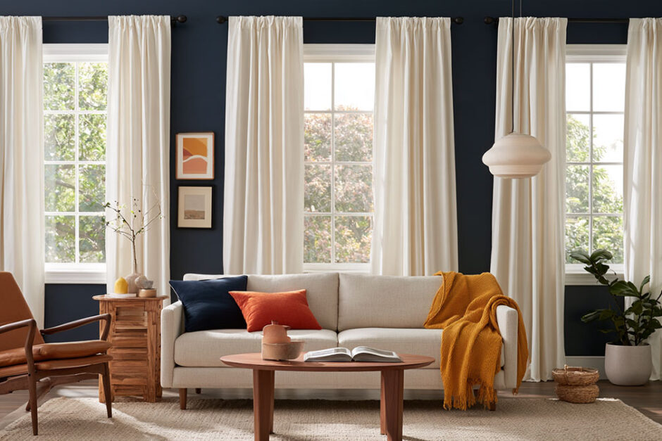
The safest curtain colors for almost any wall are white, cream and soft neutrals, as long as they are visibly lighter or darker than the paint. For more personality, pick a curtain that contrasts with the wall: navy or mustard against gray, terracotta against green, gold against purple.
Curtain colors work best when chosen in a fixed order: wall undertone, window direction, room use and fabric lightfastness. Each choice changes more than the look, because color decides how a panel handles daylight, glare, heat and sun damage.
The table below gives proven picks for each common wall color, and each row links to a full guide covering undertones, lighting, fabric and the pairings that fail.
Best Curtain Colors by Wall Color at a Glance
| Wall color | Safe curtain colors | Contrast curtain colors | Watch out for | Full guide |
|---|---|---|---|---|
| Purple walls | Cream, white, light gray | Gold, sage or dark green, navy, teal | Navy disappears on very dark purple; stark white looks cold on blue-violet | Purple walls |
| Light blue walls | White, ivory, beige, light gray | Navy, soft yellow, soft pink, coral | Saturated accents overpower a pale wall; navy closes in a small room | Light blue walls |
| Blue walls | White, cream, beige, gray | Lighter or darker blue, orange, rust, mustard | A curtain as light or as dark as the wall disappears into it | Blue walls |
| Green walls | Cream, white, beige, gray | Navy, dusty pink, terracotta, earthy brown | Sage, olive, mint and emerald each need their own pairing; a warm green curtain clashes with a cool green wall | Green walls |
| Yellow walls | Cream, gray, taupe; white on pale and butter yellows | Navy, light blue, lavender, olive | Stark white on bright lemon; saturated yellow on yellow; cool gray beside warm yellow | Yellow walls |
| Cool white walls | Crisp white, light gray | Navy, blue, deep green | Yellow-leaning creams look dirty against a cool white | White walls |
| Warm white walls | Cream, oatmeal, ivory | Blush, soft yellow, terracotta, burgundy | Icy blue-grays look cold against a warm white | White walls |
| Gray walls | White, cream, tonal charcoal | Navy, pale blue (on blue-leaning grays), blush, terracotta, mustard, sage | Crisp white looks stark on warm grays; check the undertone first | Gray walls |
| Beige walls | Ivory, cream, taupe, light gray | Navy, dark green, terracotta, rust, black | An exact beige match goes flat; undertone and window direction change how a curtain reads | Beige walls |
“Safe” colors keep the wall as the main color in the room, and “contrast” colors turn the window into a focal point. The table combines the pairings in our individual guides with those published by Bargain Blinds, Asian Paints and Zigzag Zurich.
Gray walls cause the most mistakes because the undertone hides. A gray with a blue bias takes a pale blue panel well, and the guide to curtain colors that suit gray walls goes through more pairings.
White walls give the most freedom. Navy gives a crisp, nautical look and soft gray a quieter one, according to Asian Paints, and more options for curtains on white walls are covered separately.
Curtain Color Guides by Wall Color
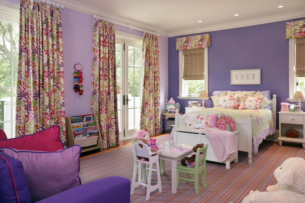
What color curtains go with purple walls?
Lilac, lavender and plum need different curtains. The guide splits them by depth and by whether the purple leans blue or red.
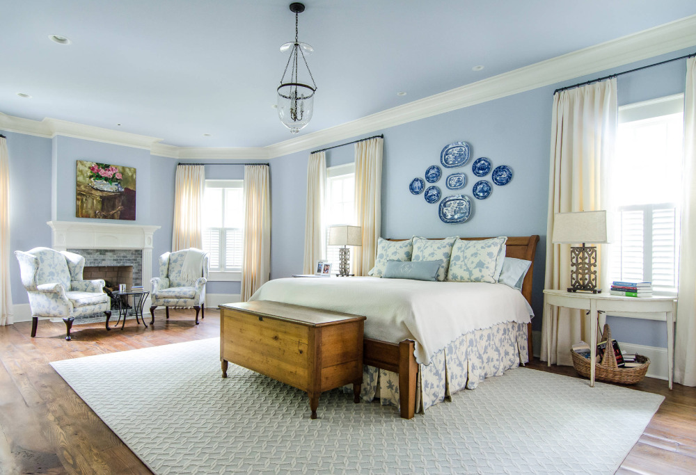
What color curtains go with light blue walls?
Neutral and accent picks for pale blue, plus how gray-leaning and aqua-leaning blues change under north and south light.

What color curtains go with blue walls?
From navy to pale blue: why lightness matters more than hue, and which warm colors give the strongest contrast.

What color curtains go with green walls?
Separate picks for sage, olive, mint and deep greens, ranked from safe neutrals to bold contrasts.

What color curtains go with yellow walls?
Butter, lemon, golden and mustard yellows, and the curtain colors that keep each one from feeling loud.

What color curtains go with white walls?
How to read the undertone of a white wall and choose between tonal, low-contrast and high-contrast curtains.

What color curtains go with gray walls?
Light and dark grays, warm and cool undertones, and when to echo the gray or oppose it.
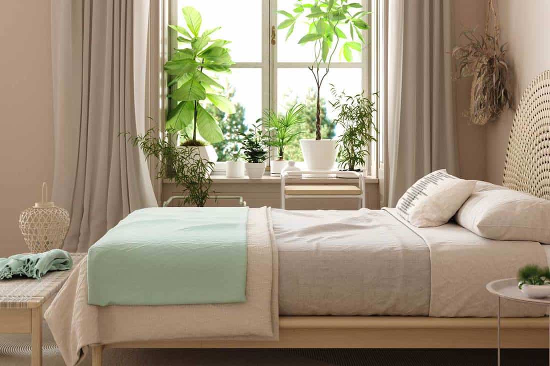
What color curtains go with beige walls?
Warm, cool and greige beiges, and how window direction shifts the right curtain color.
Curtain Colors for Your Furniture
Furniture and rugs often settle the curtain color before the wall does.
| Furniture | Safe curtain colors | Contrast curtain colors | Watch out for | Full guide |
|---|---|---|---|---|
| A gray couch | White, cream, beige, lighter gray | Navy, emerald, mustard, terracotta, blush, sage | A charcoal couch and a pale dove-gray couch need different curtains | Gray couch |
| Brown furniture | Warm browns: cream, olive. Cool browns: taupe, light gray | Warm browns: rust. Cool browns: slate blue, dusty blue | A blue-based gray can look cold beside orange-toned wood | Brown furniture |
A gray sofa takes neutrals (ivory, beige, taupe, cream) or color (blue, green, yellow, red), per 1stDibs sellers. Homes & Gardens treats the area rug as a starting point: pull one accent from it and repeat it in the curtains.
- Bold or dark flooring calls for softer neutral curtains (Zigzag Zurich)
- Warm woods suit warm neutrals and earth tones, while cool gray woods suit blue-gray
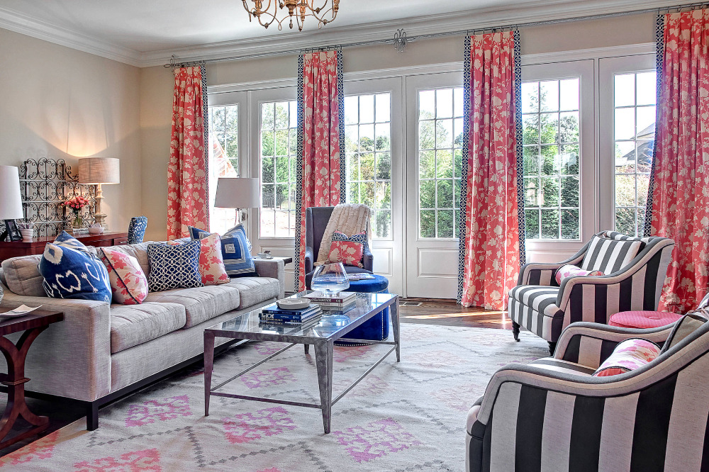
What color curtains go with a gray couch?
Matching or contrasting a gray sofa, with picks for warm and cool grays and for light, mid and charcoal shades.

What color curtains go with brown furniture?
Wood and leather, warm and cool browns, and whether curtains should match, blend or contrast.
Which Curtain Color Families Exist, and How Do Undertones Change Them?
Curtain colors fall into 6 families: neutrals, warm tones, cool tones, earth tones, jewel tones and pastels.
- Neutrals: white, ivory, cream, beige, taupe, gray, charcoal
- Warm tones: red, orange, gold, terracotta
- Cool tones: blue, green, violet, slate
- Earth tones: sand, clay, olive, rust, brown
- Jewel tones: emerald, sapphire, ruby, amethyst
- Pastels: pale blue, blush, mint, lilac
A family only gives the hue. It says nothing about how light or intense the shade is.
The Munsell Color System, from the Munsell Color Company, describes any color by hue, value and chroma: the color name, its lightness on a 0 to 10 scale, and its intensity.
Jewel tones sit high in chroma. Pastels sit high in value and low in chroma, which is why they read soft.
Undertone is the faint warm or cool bias inside a color. A white leans yellow, pink or blue, a gray leans warm or cool, and almost no neutral is free of one.
To read it, hold the swatch against a plain bright white sheet. Warm biases look creamy, yellow or pink, and cool ones look gray, blue or green.
Two neutrals with clashing undertones look dirty together. A yellow-leaning cream curtain on a cool gray wall is a typical case.
Most curtain pairings follow 1 of 4 color wheel schemes: monochromatic, analogous, complementary, or a neutral base with a single accent. The color theory behind whole-room schemes explains why each one holds together.
Navy over a pale blue wall is monochromatic, sage over teal is analogous, and burnt orange against blue is complementary.
Earth tones are the easiest family to live with because they borrow from wood, stone and plants. A full earthy color palette for the room carries the same logic over to walls and upholstery.
Should Curtains Match the Walls?
Close, but not identical. Curtains one or two shades lighter or darker than the wall read as the same color to the eye, according to Bargain Blinds, and they still show some depth.
Sources split on exact matching. Zigzag Zurich and Bargain Blinds say a wall-colored curtain makes a room feel larger, while Brentano Fabrics warns that an exact match goes flat.
The disagreement is about the word exact. A tonal shift keeps the calm of a match and adds the depth an exact match lacks.
Matching and Tonal Curtains
Tonal curtains are the low-risk choice.
- Same hue as the wall, 1 to 2 shades off in lightness
- A texture or sheen that differs from the wall finish, so the panels do not vanish
- Best in small rooms and beside a weak view, where blending keeps the eye moving
KwikHang makes the same point about views: a sheer or neutral panel that blends with the wall pulls attention away from an ugly one.
Exact matching fails on saturated walls. Mustard on mustard turns one side of the room into a single slab of color.
Contrasting Curtains
Homes & Gardens puts it simply: the starker the contrast between wall and curtain, the more the curtains stand out and pull the eye to the window.
Low contrast: the curtains recede and the window, the view or the furniture takes the lead.
High contrast: the curtains become the feature, so the rest of the room has to stay quiet.
The 60-30-10 proportion keeps contrast in check. Walls and large furniture carry about 60 percent of the color, secondary pieces 30 and accents 10, so a bold curtain belongs in the 10 and a quiet one in the 30.
Pattern against pattern is the usual failure. Bargain Blinds suggests a solid curtain in a complementary color against patterned wallpaper.
How Do Light and Dark Curtain Colors Change a Room?
Light curtain colors brighten a room and make it feel larger. Dark ones absorb daylight and make it feel smaller and more enclosed.
Black, deep navy and brown absorb much more daylight than pale shades, and a yellow panel throws a warmer light than a green one, according to Homes & Gardens.
The closest lab evidence comes from room perception work. In virtual reality tests, light walls and light ceilings each made a room look taller, and the lightness contrast between them did not decide it (Oberfeld and Hecht, Human Factors, 2011).
Experts and nonexperts in the same study assumed contrast mattered, and both were wrong. The rooms had no curtains, so the carry-over to floor-length panels is an inference.
Light curtain colors, pros:
- Reflect daylight and brighten the room
- Make walls read taller and larger
- Pair with most wall colors
Light curtain colors, cons:
- Thin fabric shows silhouettes at night
- Cool whites look stark in strong daylight
Dark curtain colors, pros:
- Add drama and a cozy, hotel-suite feel
- Pull the eye when set against light walls
Dark curtain colors, cons:
- Absorb daylight in rooms that already get little
- Can make a small room feel enclosed
Sheer, Light-Filtering and Blackout Opacity
- Sheer: diffuses daylight and keeps the room bright, with little privacy after dark
- Light-filtering: softens glare and keeps most of the color visible
- Blackout: blocks light with a coating or lining, which changes how the face color reads from inside (Ideal Home)
Opacity decides how much daylight passes through. Color decides how the panel treats the light that lands on it.
Pale panels in thin fabric show silhouettes after dark. KwikHang recommends a liner for white curtains when privacy matters.
Small Rooms, Dark Rooms and Low Ceilings
Small rooms want curtains close to the wall tone.
Blending panel and wall removes the visual edge, so the room reads as one larger surface (Bargain Blinds). Pale shades hung high do the same for a low ceiling, since lighter surfaces read taller in the Oberfeld and Hecht tests.
Dark rooms are where the advice splits. Livingetc warns that darker colors can make a room feel like it is closing in, while Simply Windows lists deep navy, emerald and plum among bedroom picks that feel rich and relaxing in a lined, soft fabric.
Both hold. A dark panel in a small north-facing room with one window swallows the little daylight there is, and the same shade in a large bedroom with lamps feels cozy.
Lamps change the picture at night, and the guide on how light shapes a room covers daylight and artificial light together.
Which Curtain Colors Work Best in Each Room?
Bedrooms take calm shades, living rooms take the widest range, and work rooms take restrained colors that stay quiet in daily light.
Colors by Room
- Bedroom: soft neutrals, muted blue or gentle green, with deeper navy or emerald when the room is large and the fabric is lined (Simply Windows)
- Living room: start from the walls, then the rug and sofa (Ideal Home), and spend the bold color here
- Dining room: room for deeper, moodier tones, since the space is used mostly in the evening
- Home office: restrained colors, with the caveat below
Home offices split the advice. Wayfair pairs energizing colors with work spaces, while NICETOWN says restrained colors suit them best.
Screen glare is the practical tiebreaker. A saturated panel beside a monitor competes with the screen.
Nursery panels work best in pale, soft shades with a blackout lining for naps. Kitchen panels need light, washable fabric in colors that tolerate splashes and strong daylight.
What the Mood Claims Actually Rest On
Andrew Elliot’s 2015 review in Frontiers in Psychology calls research on color and psychological functioning nascent and urges patience and prudence about real-world application.
Alex Holcombe’s 2019 commentary in Meta-Psychology adds a catch: most studies test one or two hues, so findings tied to one tested red or blue do not transfer to every red or blue. A navy panel and a baby blue panel are not the same experiment.
Retail copy still leans on the old rules. Budget Blinds says warm colors energize and cool ones calm, and that lighter shades soothe while darker ones stimulate.
- Treat the mood rules as design convention, not measured effect
- Judge the swatch in the actual room, because lighting changes how any color reads
For sleep, the lining matters more than the hue. If calm is the goal, the wall color carries more of it, and the guide to the best colors for bedroom walls covers that side.
How Does Sun Exposure Affect Curtain Colors?
Sun exposure changes 3 things: how a color reads (cool north light against warm south light), how fast the fabric fades, and how much heat passes the window. South and west windows demand the highest fade grade and a light backing, while north windows tolerate lower grades.
Window Direction and Color
Window direction decides the light a color is seen in. The directions below assume the northern hemisphere.
North-facing: cool, indirect light all day, balanced by warm creams, oatmeal and soft gold (Simply Windows).
South-facing: bright, warm light, where blue-gray and sage stay fresh (Simply Windows).
Consumer Reports notes that east- and west-facing windows have the greater potential for heat gain, since the sun sits low there at sunrise and sunset.
Fade Resistance and the Blue Wool Scale
The lab test behind most lightfastness grades is ISO 105-B02:2014, still the current edition. It tests fabric under a xenon arc lamp that stands in for daylight and grades the fading against blue wool references.
Curtain makers adapt the exposure to match sun through ordinary window glass, according to Ludvig Svensson. Fade then depends on fiber, dye method and room orientation, so no single color rule predicts it.
Key figures (Kothea specification guide):
- 8 blue wool references, from 1 (fades fastest) to 8 (most resistant)
- Each grade is about 2 times as resistant as the one below it
- South-facing rooms: grade 6 or above
- North-facing rooms in the UK: grade 4 or 5 is typically adequate
Specifiers do not agree on one floor. De Ploeg uses grade 5 as its standard and aims for 6, so a grade 5 curtain fabric meets that house standard and still falls short of Kothea’s south-facing rule.
Check which scale the label uses. ISO 105-B02 allows 2 sets of blue wool references (European 1 to 8, American L2 to L9), and their results may not be identical.
AATCC TM16.3-2020 adds a limit of its own: the test options do not imply an accelerated test for a specific application, and the link between lab exposure and real use is for buyer and maker to agree. A grade is a comparison, not a lifespan.
A lining also protects the face fabric from fading, according to Selected Wallpapers, which makes it the second lever in a south window.
Heat Gain and Lining Color
For heat, the backing matters more than the face color.
The U.S. Department of Energy’s Energy Saver guide to window coverings says medium-colored draperies with white-plastic backings can reduce heat gain by 33%. The same page says it is difficult to generalize about drapery performance, so the face shade alone does not earn that figure.
Secondary sources restate the figure with different adjectives: medium-colored (Consumer Reports), lighter-colored (Tucson Electric Power) and medium-weight (Akron Life). Only the white backing appears in all of them.
- Close draperies on windows that get direct sun on summer days (U.S. Department of Energy)
- A dark face fabric on a white or reflective backing keeps the dark look indoors and still reflects heat (Deconovo)
- Seal the sides and top for the full effect (Consumer Reports)
How Do Fabric and Pattern Change the Same Curtain Color?
The same dye reads differently on different constructions: linen softens it, velvet deepens it, silk adds sheen and shadow, and cotton stays close to the swatch.
| Fabric | Effect on color | Watch for |
|---|---|---|
| Linen | Softer, slightly muted, visible weave | Shade differences between rolls |
| Velvet | Deeper, richer color | Lighter or darker by pile direction |
| Silk | Sheen that shifts with the light | Strong highlights in folds |
| Cotton | Flat, close to the swatch | Little depth in pale shades |
Pile direction comes from The Workroom’s velvet notes, and roll variation from Gotain’s linen product page.
Hang every panel with the pile running the same way. Reversed panels read as two different shades.
Weight changes color too. A fuller, heavier panel throws deeper fold shadow, so it reads darker than the flat swatch.
Designers quoted by Livingetc recommend wools and velvets for living rooms and bedrooms that need warmth and fewer drafts.
A textured weave does more for a single-color scheme than a second hue does. For the wider picture, see how texture works in interior design.
Pattern follows the same logic.
- Geometric patterns hit hardest against a dark wall (Bargain Blinds)
- Floral patterns read softer
- A large repeat gets cut off on a narrow window
Bargain Blinds also suggests a pattern that carries the wall color, which adds variety without a clash. For mixing prints beyond curtains, this guide to pattern in interior design covers the rest.
How Do You Test a Curtain Color Before You Buy It?
Order swatches of 2 or 3 shades, tape them to the window, and look at them in morning, midday and evening light. Judge each one against the wall, floor and largest piece of furniture, then read the lightfastness grade before deciding.
- Shortlist 2 or 3 shades from one color family.
- Order a swatch of each. Many retailers send them free and others charge a small fee (Tuiss Blinds Online).
- Tape each swatch to the window glass and check how the light comes through it.
- Look at it in morning sun, at midday, and in the evening with the lamps on.
- Hold it against the wall, the flooring and the biggest piece of furniture.
- Fold or hang the swatch instead of laying it flat.
- Read the lightfastness grade and compare it with the window direction.
Dunelm says darker shades and bolder patterns are where mistakes show up most once the fabric hangs.
Where testing misleads:
- Screens show color a little differently, per High Cotton Textile, and pinks in particular shift through the day
- Small swatches hide fold depth and pattern repeat
- A swatch cannot show fade, only the grade can
A room color scheme generator can narrow a wide shortlist before the swatches arrive. Treat it as a filter, not a verdict.
Getting the Size Right
The right color can still look wrong if the panels are too short or too narrow. Curtains should be wider than the window so the fabric falls into folds instead of hanging flat, and long enough to reach the floor. Mount the rod above the window frame rather than on it; about 6 to 8 inches above the trim works for most windows.
Once one color wins, a curtain size calculator gives the panel width and drop to order. If you are still deciding between curtains, blinds and shades, start with our guide to window treatments and how they work in interior design.
Curtain Colors FAQ
Is There a Curtain Color That Goes With Every Wall?
White, cream and ivory come closest, and they appear among the safe picks for every wall color in our guides. The catch is the undertone: a warm cream suits warm walls, and a crisp white suits cool ones.
Which Curtain Colors Are Trending in 2026?
Warm, softer shades lead as of October 2026. Pantone named Cloud Dancer (11-4201), a soft white, its 2026 Color of the Year, designers cited by The Spruce expect olive green, chocolate brown, muted deep red and off-white, and Hunker lists cool millennial gray as out.
Can an HOA Dictate Curtain Colors?
Yes, many do, usually for the side facing the street. Rules range from white only to any color as long as every window matches, according to Budget Blinds guidance for HOA homes.
A white or neutral lining keeps the street side compliant while the room side stays any color. Read the recorded covenants before ordering.
Are Black Curtains a Good Idea?
Yes, in a room that can carry them. Victoria Robinson of Hillarys tells Livingetc that dark curtains suit rooms where you want drama or a cocoon-like feel, especially bigger ones, and darker curtains against lighter walls pull the eye to the window.
If the sofa or rug is already dark, lighter accents keep the room from feeling heavy. For bedrooms, IKEA suggests balancing black panels with lighter bedding and walls.
Is It Okay to Mix Two Curtain Colors in One Room?
Yes. The safest version layers a lighter sheer behind a heavier drape in one color family, such as a white sheer with ecru drapery, according to Madura.
Two-tone curtains, with a contrasting band along the drop, tie into the current patchwork and color-blocking trend, according to Livingetc. A soft contrast, such as an ecru sheer with a navy or terracotta drape, stays calm.
More Color Guides
- Colors that go with grey
- Throw pillow combinations
- What color bedding goes with blue walls
- Rugs that go with brown couches

- Curtain Colors for Every Wall Color: Safe vs Bold Picks - October 18, 2026
- Exploring the Rich History of Interior Design - September 30, 2026
- IKEA Shoe Storage Ideas for Compact Areas - September 23, 2026
