Interior Design Basics
Form in Interior Design: Why Shape Is Not the Same

Form in interior design is a design element that gives an object or room volume, mass and visual weight, measured on 3 axes: height, width and depth.
Shape is the flat outline of the same object, so a round rug has shape and a drum-shaped ottoman has form.
Designers sort form into 2 types, geometric (regular, angular) and organic (irregular, curved), and either type can be open or closed.
Some design blogs get the open and closed split wrong. Humanities LibreTexts defines a closed form as a volume that is not pierced or perforated, and an open form as one that empty space moves through, which is why a wire chair reads lighter than a block sofa of the same size.
What Is Form in Interior Design, and How Does It Differ From Shape?
Form is a design element that gives an object or room volume, mass and presence, measured on 3 axes: height, width and depth.
It is one of the 7 elements of design, next to line, space, texture, color, light and pattern. The elements are the raw parts, and the principles of interior design (balance, rhythm, emphasis and the rest) decide how those parts get arranged.
Where form shows up in a room:
- Architecture: walls, ceilings, arches, alcoves, the room’s own outline
- Furniture: sofas, tables, chairs, storage units
- Lighting: pendants, floor lamps, shades
- Accessories: vases, sculpture, mirrors with depth
Form Versus Shape
Shape is a flat outline. Form is that outline with volume behind it, which is why you can walk around a form and not around a shape.
| Attribute | Shape | Form |
|---|---|---|
| Dimensions | 2 (length, width) | 3 (height, width, depth) |
| Seen from | One angle, as a silhouette | Every angle, changing as you move |
| Room example | A round rug | A drum-shaped ottoman |
Light is what separates the two in practice. Shadow reveals volume, so a form under directional light shows depth that flat overhead lighting hides.
Geometric, Organic, Open and Closed: What Types of Form Exist?

Form comes in 2 main types, geometric and organic, and either type can be open or closed.
The first pair describes the outline. The second describes whether space passes through the object.
Geometric Form
Geometric form is regular, angular and mathematically definable. It reads as ordered and manufactured.
- Cubes and rectangular blocks
- Cylinders
- Spheres and hemispheres
- Pyramids and stepped volumes
Strengths: clean edges, easy to align with walls, simple to fit into a floor plan.
Weak point: a room built only from boxes feels hard and static, because nothing softens the corners.
Organic Form
Vartanian and colleagues (PNAS, 2013) scanned participants while they judged room interiors, and curvilinear rooms were rated more beautiful than rectilinear ones.
Organic form is irregular and curved, taken from pebbles, leaves, shells and bodies. Isamu Noguchi’s coffee table with a curved wooden base is the textbook piece: a freeform sculptural base holding a flat glass top.
- Pro: softens angular rooms and slows the eye
- Pro: reads as relaxed and natural
- Con: curves waste floor area against walls
- Con: too many competing curves look busy
Open Form and Closed Form
A closed form is solid. An open form lets space move through it.
| Attribute | Closed form | Open form |
|---|---|---|
| Space | Surrounds it, never passes through | Surrounds and passes through |
| Visual weight | Heavy, solid, permanent | Lighter, mass reduced by openings |
| Room example | Upholstered block sofa | Wire chair, open-frame shelf |
Humanities LibreTexts defines a closed form as a volume that is not pierced or perforated, and an open form as one that empty space moves through. Sophia’s art tutorials say the same thing: closed forms appear heavy and permanent, open forms have projections and recesses.
Some interior design blogs get this wrong. The Vogue Fashion Institute page on the topic defines open form as objects visible to the naked eye, which describes nothing about the volume itself.
How Does Visual Weight Change the Way a Form Reads in a Room?
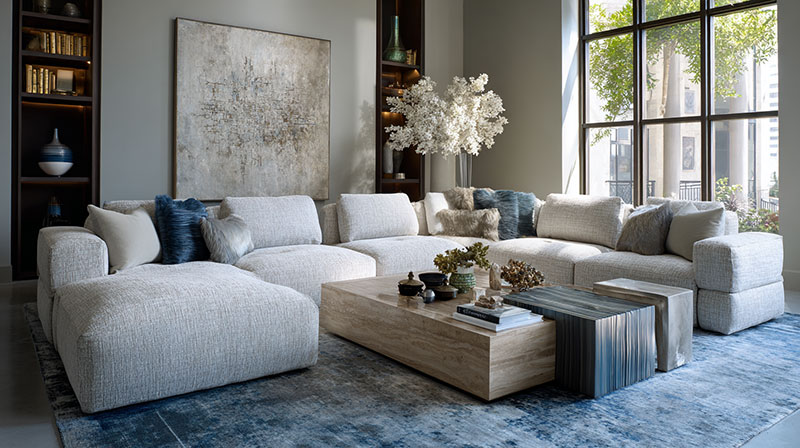
Visual weight is the pull a form has on the eye. It comes from size, color, value, density and how closed the structure is, not from what the object weighs on a scale.
Smashing Magazine’s design principles series (2014) lists size, color, value, position, texture, shape, orientation and density as the inputs. It notes that large beats small, dark beats light, and dense beats sparse. The series was written for screens, and the same logic transfers to a room because the eye works the same way.
Reads heavier:
- Large, closed, low to the ground
- Dark in value or saturated in color
- Dense material, such as solid walnut or stone
Reads lighter:
- Open frame with visible legs
- Pale value
- Glass, wire or slim metal
Physical weight does not matter. A pale open-frame chair and a dark closed credenza can occupy the same floor area and carry very different pull.
That is the working idea behind balance in interior design: you distribute visual weight across the room, and matching pieces is optional. One heavy form on the left can be answered by two lighter forms on the right.
Empty space beside a form lowers its pull too. Smashing Magazine treats white space as carrying no visual weight, which is why a lone sculptural chair with clear floor around it reads lighter than the same chair jammed into a group.
Failure mode: a heavy form pushed to one end of the room tips the whole layout. The fixes are cheap. Move it toward the center, lighten its neighbors, or add a counterweight on the opposite side.
How Do Proportion and Scale Work Together With Form?
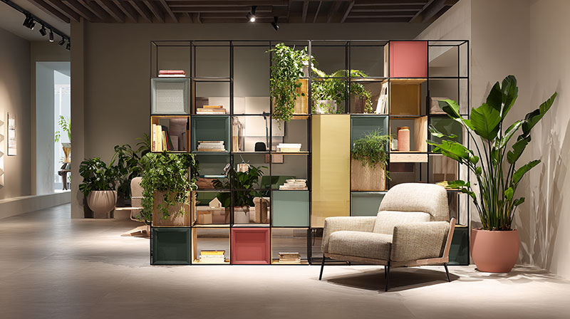
Scale compares a form to its surroundings, while proportion compares the parts of a form to one another.
Both are measurable, so they catch a bad purchase before the piece arrives. The wider rules of scale and proportion apply here, but form adds a third axis, depth, that flat plans hide.
Scale: Form Against the Room
Too large: the form blocks circulation and shrinks the room.
Too small: the form floats and the room feels unfinished.
Right: clear paths on all sides, and the form reads as part of the room, not a guest in it.
Rugs are the easiest place to test scale, and a rug size calculator gives the dimensions before anything is bought.
Proportion: Parts Against the Whole
The golden ratio, 1:1.618, is the usual reference. A golden rectangle has one side 1.618 times the other.
Worked example: a 2.1 m sofa divided by 1.618 gives a coffee table about 1.3 m wide.
Treat that as a starting point, not a verdict. A piece can hit the ratio and still fail on use, because seat depth, reach and clearance decide whether a form works.
How Does Form Interact With Line, Texture, Color and Light?
A form never shows up alone. Line, texture, color and light decide how much of its volume the eye actually reads.
Line: the outline of the form. Curved edges soften it, straight edges sharpen it.
Texture: gloss catches highlights and shows curvature, while matte absorbs light and flattens the same surface.
Color: a sofa in the wall’s own tone merges with it, and a contrasting tone separates it.
Light: side light carves depth, front light erases it.
Negative space: the gap around a form draws its edge, and crowding fuses neighbors into one mass.
How lines run through a room changes how its forms read. Verticals stretch a form, horizontals widen it.
Where light sits in the room matters as much as the fixture. A sconce that grazes a curved wall shows the curve, and a single overhead source flattens it.
Tonal matching is a design choice in some rooms and a mistake in most. If a form disappears into its background, it was not given an edge.
Which Forms Define Which Design Styles?
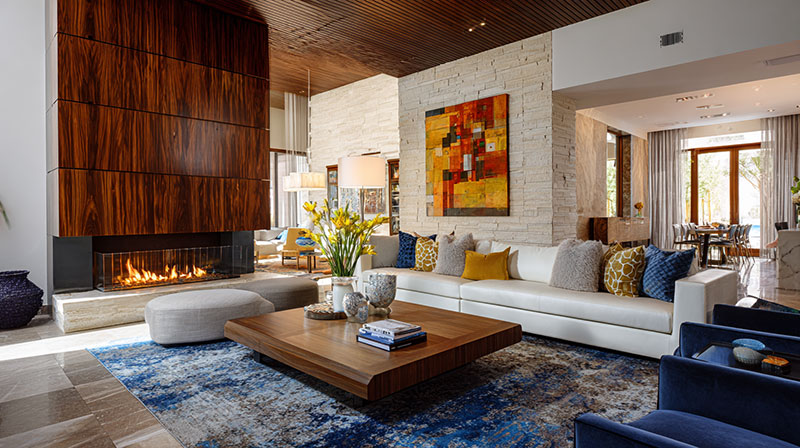
Each style leans on a dominant form: Bauhaus on geometric, Scandinavian design on simple rounded shapes, mid-century modern on a mix of both.
| Style | Dominant form | Reference piece |
|---|---|---|
| Bauhaus | Geometric, reduced to structure | Wassily chair, Marcel Breuer, 1925 |
| Mid-century modern | Organic and geometric mixed | Tulip chair, Eero Saarinen, 1956 |
| Scandinavian design | Rounded, functional | Egg chair, Arne Jacobsen, 1958 |
| Art Deco | Symmetrical, stepped geometric | Waterfall-front cabinets |
| Wabi-sabi | Irregular, imperfect, natural | Hand-thrown ceramics |
Breuer built the Wassily from bent tubular steel, taking the idea from his bicycle handlebars, according to MoMA’s collection notes. MoMA also describes the result as a club chair stripped to its outline, which makes it a clean open form.
The chair only picked up the name Wassily decades later, when an Italian manufacturer reissued it (Centre Pompidou).
Saarinen’s Tulip went the other way. One pedestal replaced four legs, and in his own words he wanted to “clear up the slum of legs” (MoMA).
Blending is normal, and how mid-century modern interiors mix both types shows why: the style never picked a side.
Wabi-sabi sits at the opposite pole from Bauhaus. Where Bauhaus removes irregularity, wabi-sabi keeps it.
How to Combine Forms in a Room
Combine forms by choosing one dominant form, adding one contrast, and repeating a single shape for rhythm.
The order below works from the room outward.
- Read the room’s own form first: ceiling line, alcoves, window shapes, corners.
- Pick one dominant form to lead. This is the piece the eye should land on first.
- Add a second form type as contrast, geometric against organic or the reverse.
- Repeat one shape 2 or 3 times at different scales, such as a round mirror, a round lamp base and a round bowl.
- Squint at the room. If one side looks heavier, swap a closed form for an open one.
- Test placement before buying: tape the footprint on the floor, or build a quick 3D model in SketchUp.
Step 2 is the job of a focal point. Two dominant forms compete, and the eye gets no place to rest.
A boxy console under a round mirror is contrast at its simplest, and it takes one purchase to fix a flat room.
Arne Jacobsen used the same logic at scale. Homes & Antiques notes that the curved Egg chair sat inside a hard-edged, rectangular hotel, and Dezeen (2024) dates the chair to 1958.
What goes wrong:
- Several statement pieces in one room, each demanding the lead
- Repeated forms with no contrast, so the room reads as one note
- Curves added as decoration only, on a layout that stays fully rectilinear
When Should Form Not Lead the Design?

Form should not lead when a piece is used hard, moved often, or fitted into a fixed layout. In those cases function picks the category, and form picks the piece within it.
Two Readings of “Form Follows Function”
Louis Sullivan wrote “form ever follows function” in Lippincott’s Magazine in March 1896, in an essay on tall office buildings. Frank Lloyd Wright, who worked under him, restated it as “form and function are one.”
The two versions give different advice. Sullivan puts function first and lets form fall out of it, while Wright treats them as a single decision.
Saarinen’s one-piece pedestal is closer to the Wright reading. It solved a problem and set the form in the same move.
Cases Where Form Should Step Back
Daily seating: test it seated, for long enough to notice. A sculptural chair that fails on comfort is a sculpture.
Tight circulation: closed and curved forms take more floor than their silhouettes suggest.
Rentals and moves: an oversized custom form that fits this room may not fit the next one.
Strong existing architecture: a room with arches or angled ceilings already has a dominant form, so the furniture stays quiet.
Clearances belong to space planning, and they win against any form that blocks them.
Common Questions About Form
Is abstract form a third type of form?
Some sources list it that way, but it is not a separate category. Abstract form is a stylized or exaggerated version of a geometric or organic form, such as a sculptural vase that suggests a pebble without copying one.
Do curved forms change how a room feels compared with angular ones?
Yes. Curved forms read as relaxed and angular forms read as precise. Rooms that mix both hold attention better than rooms built from one type.
Which forms suit a small room?
Open forms on raised legs suit a small room best. They let floor and light pass underneath, and rounded corners keep walking paths clear.
How does form in architecture differ from form in a room’s furnishings?
Architectural form is the building’s fixed volume: walls, ceilings, arches, window openings. Furnishings are the movable forms placed inside it, so the room’s own form sets the limits for every piece you add.
Does form still matter in a minimalist room?
More than in most rooms. With color, pattern and decoration stripped back, the silhouette and volume of each piece carry the design.
Choosing the One Piece That Carries the Form
The first piece with strong form should be the seating anchor of the main zone, usually the sofa or a lounge chair. That purchase fixes the room’s dominant volume, and every later piece answers it.
Spend in this order:
- Seating anchor
- One contrasting piece
- Repeated accessory shapes
Accessories such as a round tray or a ceramic vase cost the least and follow the anchor’s lead, so they can wait.
Leading with one strong form costs flexibility. A bold closed form on the first buy limits the next 3 purchases, so an organic form on an open base is the safer first choice when the layout may change.
Once the volumes are set, surface texture is the next layer to tune, because finish changes how each one reads.

- Shoji White vs Alabaster: Which Soft White Wins? - October 25, 2026
- Color Combinations for 32 Colors and 10 Wood Tones - October 22, 2026
- Kitchen Color Schemes by Cabinet Color: What Pairs Well - October 19, 2026


