Color Combinations
Paint Colors That Go with Oak Floors
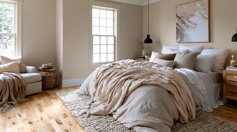
The wrong wall color doesn’t just look off next to oak floors. It makes the entire room feel unresolved, and no amount of furniture rearranging fixes it.
Choosing paint colors that go with oak floors starts with one thing most people skip: identifying your floor’s undertone. Red oak, honey oak, and white oak each carry different undertones, and each needs a different color strategy.
Get it right and the floor looks intentional. Get it wrong and even expensive paint reads muddy.
This guide covers specific paint color pairings for every oak floor type, every major room, and every interior design style, including which colors to avoid and how paint finish affects the final result.
Our color combination guide lines up wood tones and floors with the wall colors that suit them.
What Undertones Do Oak Floors Have?
Oak floors carry 3 dominant undertone types: yellow/honey, orange/amber, and pink/red, each requiring a different wall color strategy. Identifying your floor’s undertone before picking paint is the single most important step in this process.
Red oak and white oak read completely differently in a room. Red oak has a natural pink or reddish cast, while white oak lands closer to beige-gray with cooler, more neutral tones (Floor Specialists, 2024).
Most undertone mistakes happen at night. A sample that looks calm at noon can shift peachy or orange under warm bulbs. This is the “undertone swing” problem that catches most homeowners off guard (Pavich Flooring, 2026).
Quick Visual Undertone Test
Hold a white piece of paper next to your floor in natural midday light. If the floor looks warm and pink beside it, you have red oak undertones. If it reads golden or amber, you’re in honey oak territory. Beige-gray means white oak.
Oil-modified polyurethane finishes tend to amber over time, which can push either species toward orange faster than water-based systems. The finish shifts the visible undertone more than most people expect.
| Oak Type | Primary Undertone | Lighting Behavior |
|---|---|---|
| Red Oak | Pink, reddish, or salmon | Shifts warmer and appears more orange under incandescent lighting. |
| Honey/Golden Oak | Yellow, amber, or orange | Looks warm in all lighting conditions and appears most intense in dimly lit rooms. |
| White Oak | Beige, gray, or brown | The most color-stable option, remaining relatively neutral in both daylight and evening lighting. |
Red oak holds 35.8% of the hardwood flooring market share in 2024, making it by far the most common species in US homes (IMARC Group, 2024). Chances are if your floors were installed between 1980 and 2005, they’re red oak.
White oak has surged in popularity in recent years due to its neutral tones and compatibility with modern design palettes. But the vast majority of existing homes still have red or honey oak underfoot.
—
What Paint Colors Go With Honey Oak Floors?
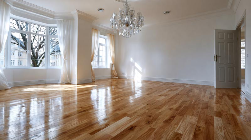
Honey oak floors carry a strong yellow-to-amber undertone. The goal is to work with that warmth, not fight it. Colors that try to go cool against honey oak almost always read off or muddy in practice.
Best White and Off-White Paints for Honey Oak
Warm whites are the safest starting point. Benjamin Moore White Dove (OC-17) pairs consistently well because its subtle cream base absorbs rather than clashes with the yellow in the floor (Jillian Lare, 2023).
Sherwin-Williams Alabaster works for the same reason. It has just enough warmth to read clean without amplifying the orange.
Off-whites that work with honey oak floors:
- Benjamin Moore White Dove (OC-17) – LRV 83.16, subtle cream base
- Sherwin-Williams Alabaster (SW 7008) – warm creamy white, LRV 82
- Benjamin Moore Swiss Coffee (OC-45) – slightly deeper, still warm
- Sherwin-Williams Polar Bear (SW 7564) – very light yellow-gray
Stark, cool whites like Benjamin Moore Chantilly Lace are worth avoiding here. Against honey oak, a blue-white creates an odd visual tension that makes the floor look dirtier than it is.
Best Green and Earthy Tones for Honey Oak
Sage green and blue-green neutrals do something interesting with honey oak. They create a counterbalance that makes the warmth in the floor feel intentional rather than dated.
Sherwin-Williams Sea Salt (SW 6204) is a go-to in this category. It reads as a soft blue-green gray that cools the orange in honey oak without going cold. Designer Jane Lockhart has publicly recommended this alongside Benjamin Moore’s Sea Salt CSP-95 as top non-white choices for honey oak floors (TikTok, 2024).
Sage/green options by effect:
- Sherwin-Williams Sea Salt: blue-green gray, works in all room sizes
- Sherwin-Williams Rainwashed: stronger green-blue, modernizes honey oak well
- Sherwin-Williams Evergreen Fog: deeper sage-green, best as accent in well-lit rooms
Paint Colors to Avoid With Honey Oak
Cool grays are the most common mistake. Colors like Sherwin-Williams Repose Gray have just enough gray to make warm floors look dingy. The undertones fight each other and neither wins.
Avoid with honey oak: cool blue-whites, stark whites, lavender-based grays, and any greige with a strong gray base. These read muddy against yellow-amber floors in most lighting conditions.
—
What Paint Colors Go With Red Oak Floors?
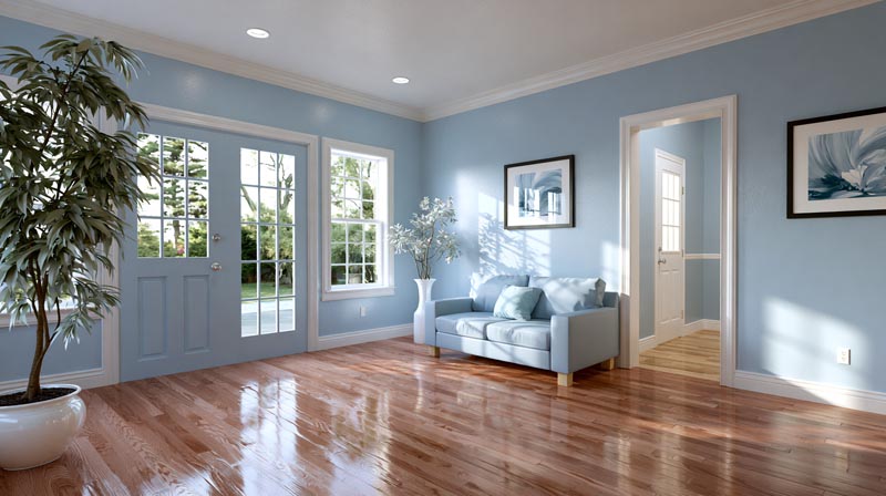
Red oak’s pink-to-salmon undertone narrows the color field. The two strategies that work are: neutralize with warm greiges, or lean into contrast with dusty blues and soft teals. Anything in between tends to look unresolved.
Neutrals That Work With Red Oak
Sherwin-Williams notes three colors that consistently read well against red floors: Sea Salt (SW 6204), Nonchalant White (SW 6161), and Panda White (SW 6147). Each brings a subtle coolness that softens the pink in the floor without creating harsh contrast (Sherwin-Williams Color Guidance, 2024).
Benjamin Moore Revere Pewter and Accessible Beige (SW 7036) also sit in this zone. They’re warm enough not to clash but contain just enough gray to stop the pink undertone from dominating the room.
| Paint Color | Brand | Why It Works |
|---|---|---|
| Sea Salt (SW 6204) | Sherwin-Williams | A soft blue-green gray that balances the pink undertones of red oak without making the room feel cold. |
| Nonchalant White (SW 6161) | Sherwin-Williams | A warm white that complements pink undertones instead of clashing with them. |
| Revere Pewter (HC-172) | Benjamin Moore | A versatile warm greige that creates a neutral transition between oak flooring and wall color. |
| Accessible Beige (SW 7036) | Sherwin-Williams | A warm beige-gray that pairs naturally with the warmth of oak while maintaining a balanced look. |
Blue and Teal Options for Red Oak Floors
This is where red oak gets interesting. Cool blues and dusty teals sit opposite warm orange-pink on the color wheel, which means they don’t fight the floor. They balance it.
Sherwin-Williams Comfort Gray (SW 6205) is technically a soft blue-green with a gray undertone. It looks coastal and calm next to red oak and consistently ranks as a top recommendation from color consultants (Jenna Kate at Home, 2023).
Benjamin Moore Stonington Gray and Benjamin Moore Gray Owl both work here too, with Gray Owl pulling double duty as a blue-green gray that adds depth without going dark.
Cool grays with no green or blue base, like pure warm greiges, tend to produce the “dirty floor” effect against red oak. The pink in the floor and the warm gray in the wall amplify each other in an unflattering way.
—
What Paint Colors Go With White Oak Floors?
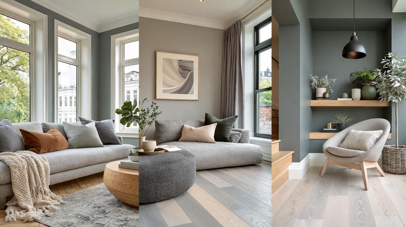
White oak opens up the widest color range of any oak type. Its beige-gray base stays neutral across lighting conditions, which means it accepts both warm and cool palettes without the undertone conflicts that red and honey oak create.
Cool Neutrals and Grays for White Oak
True grays work here in a way they simply do not with red or honey oak. Sherwin-Williams Repose Gray (SW 7015) reads beautifully with white oak because both lean into the same cool-neutral direction.
Farrow and Ball Elephant’s Breath is another one that often comes up in white oak projects. It’s a warm-tinted gray that bridges the gap between cool and warm without committing to either. Pairs cleanly with the beige-gray of white oak and works across most furniture finishes.
Cool neutral picks for white oak:
- Sherwin-Williams Repose Gray (SW 7015)
- Farrow and Ball Elephant’s Breath
- Sherwin-Williams Skyline Steel (SW 1010)
- Benjamin Moore Smoke – LRV 56, a blue-gray that contrasts well
Dark and Moody Paint Colors for White Oak
White oak is the only oak that genuinely supports dark wall colors without looking heavy. The neutral base of the floor stops the room from going gloomy.
Navy, charcoal, and deep green all read well against white oak. Sherwin-Williams In the Navy (LRV 4) creates bold contrast. Farrow and Ball Teresa’s Green is a softer eucalyptus-sage that designers recommend specifically for walls with oak flooring (Apartment Therapy, 2024).
One note: dark walls with white oak work best in rooms with strong natural light or well-designed artificial lighting. In a dim basement or north-facing room, they can still read flat.
—
What Paint Colors Work in Living Rooms With Oak Floors?
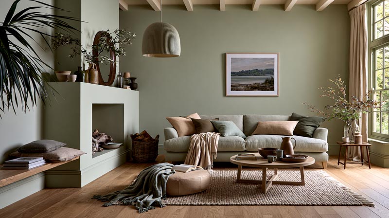
Living rooms present the biggest color challenge because they typically contain the most variables: shifting natural light through windows, multiple furniture tones, and the widest viewing angles in the home.
Specialty floor covering stores represent about 41% of overall wood floor sales, partly because buyers want in-person color matching help before committing to a living room palette (FCNews, 2024). The decision is genuinely tricky.
Natural light volume changes everything. A warm paint color that reads cozy in a south-facing living room looks muddy in a north-facing one. Always test samples in both morning and evening light before committing.
Soft sage green, warm taupe, and creamy off-whites are the three categories that perform consistently well across oak floor types in living room settings. Each provides enough contrast to define the room without fighting the floor’s undertone.
Key considerations by floor type:
- Honey oak living rooms: warm greiges like Benjamin Moore Pale Oak or Sherwin-Williams Accessible Beige work well as the primary wall color
- Red oak living rooms: dusty blue-greens like Sea Salt or soft greens like Sherwin-Williams Comfort Gray provide balanced contrast
- White oak living rooms: wider range applies – both warm whites and true cool grays succeed
Ceiling height also shifts the priority. In rooms with lower ceilings, a lighter LRV wall color (above 60) keeps the space from feeling compressed. Rooms with high ceilings can handle deeper tones without losing airiness. Understanding how light interacts with interior surfaces before finalizing a color is worth the time investment.
Lululemon’s retail design team applied a similar principle in their stores, identifying that inconsistent surface color relationships across floors and walls affected brand perception at the room level. The lesson for residential spaces is the same: the floor-to-wall relationship shapes how the entire room reads, not just individual walls.
—
What Paint Colors Work in Kitchens With Oak Floors?
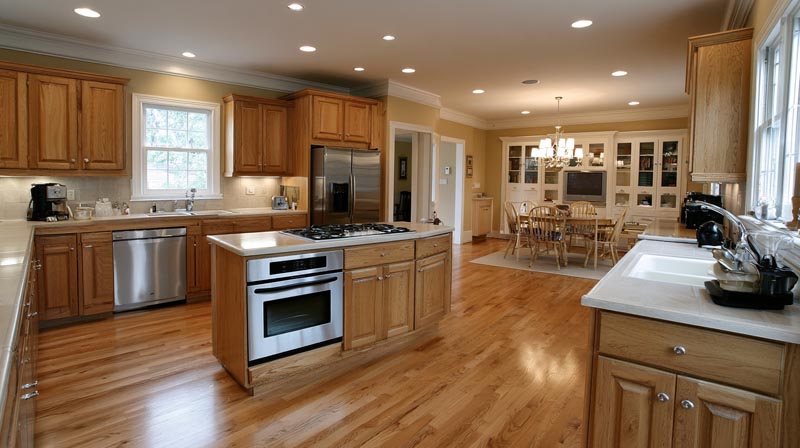
Kitchens add a layer of complexity that living rooms don’t: cabinets. If your kitchen has oak cabinets above oak floors, the wood-on-wood effect becomes the primary problem to solve, and the wall color is your main tool.
Breaking Up Wood-on-Wood in Oak Kitchens
When oak floors and oak cabinets share the same space, the wall color needs to provide visual separation. A warm neutral wall that closely matches both reads as one flat, indistinct surface.
A crisp but warm white works well as a separator. Sherwin-Williams Alabaster or Benjamin Moore White Dove both provide enough contrast against the floor and cabinets to define the three surfaces without introducing a jarring color shift.
Deeper blues and greens solve the problem more decisively. A navy or forest green wall against honey oak floors and cabinets creates clear definition between surfaces. Benjamin Moore Hale Navy (HC-154) and Black Forest Green (HC-187) are two color consultant picks specifically for honey oak kitchens (Jane Lockhart Design, 2024).
Backsplash Tile and Wall Paint Interaction
The tile backsplash often overrides the wall paint decision in kitchens. If the backsplash has warm cream or beige tones, the wall color needs to work with those before it works with the floor.
Color priority order in kitchens:
- Countertop and backsplash call the biggest shots
- Cabinet color comes second
- Wall paint coordinates with all of the above
- Floor undertone is last in the hierarchy
This matters because most people try to pair their wall color directly to the floor and then wonder why the backsplash clashes. The floor is actually the most flexible element in a kitchen color scheme. Understanding how color relationships work across multiple surfaces simultaneously prevents the most common kitchen color mistakes.
Finish note: Kitchen walls benefit from an eggshell finish rather than matte. The slight sheen holds up to cleaning and doesn’t absorb grease and moisture the way flat paint does.
—
What Paint Colors Work in Bedrooms With Oak Floors?
Bedrooms call for lower-contrast palettes. The room is viewed mostly in the evening under artificial light, and the goal is usually comfort over visual drama. This changes which colors perform well compared to living rooms and kitchens.
Warm and Restful Palettes for Honey Oak Bedrooms
Soft blush, warm terracotta, and muted warm whites are the three categories that produce the most restful bedrooms with honey oak floors. They don’t fight the warmth in the floor, which keeps the room feeling settled rather than conflicted.
Benjamin Moore Pale Oak is a standby in this category. It works as a wall color in honey oak bedrooms because its warm greige base absorbs the yellow undertone of the floor rather than amplifying it. Sherwin-Williams Behr Pale Straw sits in the same color neighborhood.
Matte finish is almost always the right call for bedroom walls. It absorbs light rather than reflecting it back, which keeps evening lighting softer. An eggshell in a bedroom with honey oak floors can make the orange undertone of the floor appear brighter at night than it looks in the daytime.
Cool and Calm Palettes for White Oak Bedrooms
Cool lavenders and pale blues work in white oak bedrooms in a way they simply cannot in red or honey oak rooms. The neutral undertone of white oak doesn’t clash with cooler hues.
Benjamin Moore Smoke (LRV 56) is an option worth testing as a bedroom accent wall color against white oak. It reads as a calm blue-gray that produces a cohesive, restful palette when paired with warm white trim and light linen furnishings.
The rug acts as a critical buffer in bedroom color schemes. A medium-toned area rug between the floor and furniture line breaks the direct visual relationship between floor undertone and wall color. It gives you more room to experiment with wall color without risking an undertone conflict.
For a practical reference on how these wall and floor color relationships apply beyond just bedrooms, the broader palette guide covers additional room-by-room examples.
How Does Paint Finish Affect Color Pairing With Oak Floors?
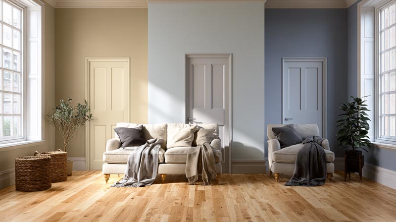
Paint finish changes how color reads next to oak floors. Higher sheen reflects light between the floor and wall, which causes undertones to bounce and amplify in ways a swatch never reveals.
Matte and satin finishes are the most popular and practical options for walls in rooms with hardwood floors, according to Floorecki research on 2023-2024 sheen trends. They allow the floor’s wood grain and natural color to read clearly without visual interference from wall reflection.
Matte and Eggshell for Living Areas and Bedrooms
Eggshell is the standard recommendation for most interior walls paired with oak floors. It has a soft, low-reflection surface that minimizes color distortion between wall and floor (Soho Painters, 2024).
Key difference by finish:
- Matte: absorbs light, hides imperfections, reduces undertone conflict with warm floors
- Eggshell: low sheen, wipeable, the default choice for living rooms and bedrooms
In a room with red oak floors, a semi-gloss or high-gloss wall finish amplifies the pink undertone. The reflected light picks up color from both surfaces and bounces it back across the room, making the pink read stronger than it actually is.
Satin Finish for Kitchens and High-Traffic Rooms
Satin works well in kitchens, hallways, and bathrooms where the wall needs to hold up to moisture and cleaning. Its slightly harder film surface handles repeated wiping without degrading (Family Handyman, 2024).
The tradeoff: satin reflects more light than eggshell. In a kitchen with honey oak floors, a satin finish can push warm paint colors slightly more orange under incandescent or warm LED bulbs. Testing a sample on the wall in evening light solves this before committing.
| Finish | Best Room | Effect With Oak Floors |
|---|---|---|
| Matte | Bedrooms, formal living rooms | Softens undertone contrast and is the most forgiving finish for walls paired with oak floors. |
| Eggshell | Living rooms, dining rooms | Provides subtle sheen with balanced color accuracy and minimal light reflection. |
| Satin | Kitchens, hallways | Offers greater durability but reflects more light, making oak floors appear shinier at night. |
| Semi-gloss | Trim and doors only | Best reserved for trim, as it can create excessive contrast and emphasize the warmth of oak when used on walls. |
Trim sheen should always be one step above wall sheen. Eggshell walls work best with satin trim. Satin walls work best with semi-gloss trim. This contrast creates definition between surfaces without visual competition.
—
What Paint Colors to Avoid With Oak Floors?
Certain color and undertone combinations consistently fail next to oak floors. Most of these mistakes come from testing paint on a chip rather than sampling it on the actual wall next to the floor.
The number one client complaint in rooms with red oak floors is: “the paint looked gray in the store but reads pink in my house.” This happens when a cool gray with a subtle warm undertone sits next to the pink in red oak and both amplify each other (Kylie M Interiors, 2024).
Cool Grays With Red and Honey Oak
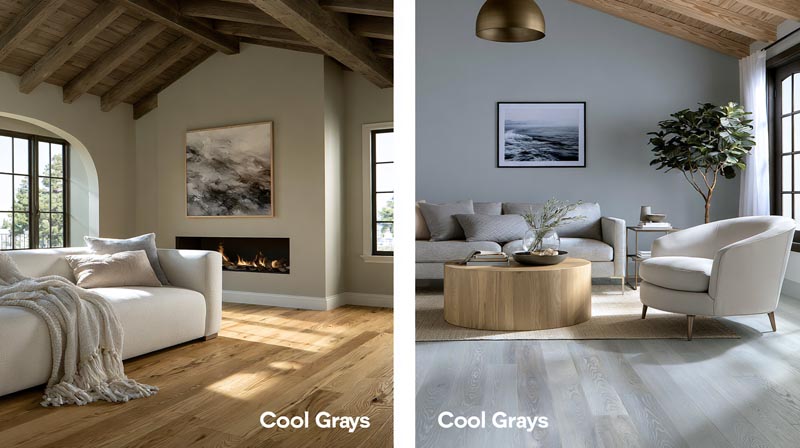
Sherwin-Williams Repose Gray is one of the most popular gray paints in the US. It is also one of the most frequently mismatched colors in oak floor rooms. Against honey oak, its cool-gray base reads “dirty.” Against red oak, it amplifies the pink undertone rather than neutralizing it (Improovy, 2023).
The “dirty floor” effect occurs when a cool-toned gray wall and a warm-toned floor sit beside each other with no undertone bridge. Neither looks right, and neither is obviously the problem.
Pure cool grays (those without any warm, green, or blue underpinning) are the category to avoid across all oak types. Warm grays with a slight green or beige base work. Pure cool grays without any warmth do not.
Colors That Intensify Orange Undertones
Lavender and purple-tinted neutrals make orange-amber floors look more orange. The purple-orange combination reads as discordant and dated.
Warm whites with a strong yellow base do the same thing in honey oak rooms. They echo the yellow in the floor, making the whole room read as one warm, flat surface with no visual contrast. There is a meaningful difference between a warm white that complements the floor and one that merges with it.
Three specific categories to avoid:
- Cool blue-white paints like Benjamin Moore Chantilly Lace against red or honey oak
- Greige colors with a strong gray base rather than a warm beige base
- Yellow-leaning warm whites that match the oak’s undertone too closely
Saturated Colors That Compete With Wood Grain
Highly saturated wall colors fight the natural variation in oak grain. Oak’s open grain pattern creates its own visual movement and texture across the floor.
A saturated cobalt blue or deep burgundy can overpower that grain entirely, leaving the floor looking flat and the wall looking loud. Muted, dusty versions of any bold color work far better alongside oak floors than their saturated counterparts.
—
How Do Wood Stain and Refinish Options Change Paint Color Compatibility?
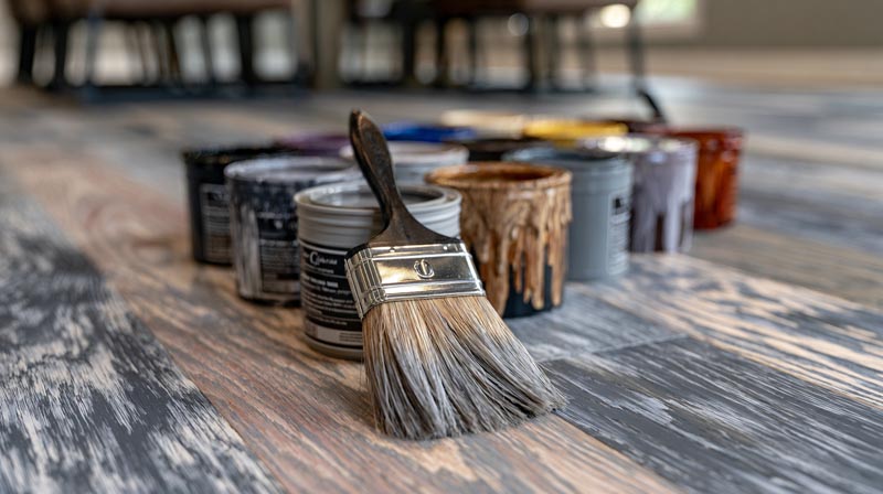
If you have the option to refinish your oak floors before painting, the stain choice you make expands or changes the entire paint color palette available to you. Refinishing oak floors costs $3 to $5 per square foot on average, with dark stains and whitewash finishes adding roughly $1 to $2 per square foot to that total (Angi, 2026).
That investment often makes more design sense than repainting multiple times trying to solve an undertone problem.
Gray-Washing and Whitewashing Oak Floors
Gray-washed hardwood finishes have surged in demand for their modern, versatile look that pairs with both bright and muted wall color schemes (Ron’s Hardwood Floors, 2024).
A gray-wash stain on red oak neutralizes the pink undertone completely. Once done, the floor accepts cool grays, whites, and even blue-toned wall colors that were impossible before.
Whitewash finishes work similarly for honey oak. They replace the amber-yellow undertone with a soft, bleached tone that reads more like white oak than honey oak. Wall color options expand significantly, particularly into cool whites and pale pastels.
Ebonizing and Dark Staining Oak
Dark staining oak (espresso, ebony, Jacobean) is the most dramatic undertone reset available. Once oak floors go dark, the species’ original undertone becomes largely invisible.
Dark-stained oak pairs cleanly with lighter, cooler wall palettes that would clash badly with the original floor. Crisp whites, pale cool grays, and even soft blues all become viable options. This is why ebonizing is increasingly popular with homeowners renovating homes that originally had honey oak (California Flooring and Design, 2024).
The tradeoff is permanence. Going from light to dark is straightforward. Going from dark back to light requires full sanding and is labor-intensive. Worth knowing before committing to an ebony or espresso stain.
Working With Existing Floors vs. Refinishing
Refinishing makes sense when the floor’s undertone is the primary obstacle to the color scheme you want. It does not make sense as a reaction to paint not looking right after a bad color selection.
Refinish first if: you want cool, modern palettes but have red or honey oak
Work with existing floors if: warm palettes are acceptable and the undertone problem can be solved with the right wall color
—
How Do Trim and Ceiling Colors Interact With Oak Floors and Wall Paint?
Wall paint alone does not determine whether a room’s color scheme works. Trim and ceiling colors complete the system. Getting trim wrong is the most common reason a good wall color still looks off next to oak floors.
Warm White Trim vs. Bright White Trim
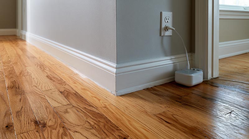
Bright white trim (Benjamin Moore Chantilly Lace, Sherwin-Williams Extra White) creates a hard, cool edge between wall and floor in warm oak rooms. Against honey or red oak, that sharpness can make the floor’s warmth look more orange by contrast.
Warm white trim (Benjamin Moore White Dove, Sherwin-Williams Alabaster) sits closer to the floor’s undertone and softens the transition. Interior designers consistently recommend White Dove as the trim color for honey oak homes because its cream base bridges the gap between floor and wall (Jillian Lare, 2023).
Quick rule: if your wall color has a warm undertone, use warm white trim. If your wall color is cool (dusty blue, sage green), you have more flexibility to use either warm or cool white trim.
Ceiling Color With Oak Floors
White ceilings are standard for most oak floor rooms. The question is which white. A flat bright white ceiling above warm honey oak walls and floors can look disconnected, making the ceiling feel like a different room.
Using the same warm white on the ceiling as the trim (White Dove or Alabaster) creates cohesion. The three surfaces read as one system: floor warm, walls colored, trim and ceiling warm white.
Painted ceilings (non-white) only work well in oak floor rooms when the ceiling color shares an undertone with the wall and floor. A dusty sage ceiling against white oak floors and sage walls is consistent. A warm terracotta ceiling against honey oak is also consistent. A cool lavender ceiling against honey oak floors is not.
| Oak Type | Trim Recommendation | Ceiling Recommendation |
|---|---|---|
| Honey/Golden Oak | Warm white, such as White Dove or Alabaster | Match the trim color in a flat finish for a cohesive appearance. |
| Red Oak | Warm white or warm greige trim | Use a warm white ceiling and avoid cool or blue-white shades that can accentuate pink undertones. |
| White Oak | Warm or cool white trim both work well | Most white ceiling colors are compatible, including cool whites, thanks to white oak’s neutral undertones. |
Painting the trim white in a home with honey oak floors is also one of the fastest and cheapest ways to modernize the space. Sherwin-Williams Extra White on trim creates immediate contrast that makes the oak floor look intentional rather than dated (Improovy, 2023).
—
What Are the Best Paint Color Palettes for Oak Floors by Design Style?
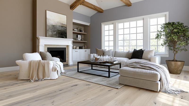
Design style narrows paint color selection considerably. Each style has a different relationship with oak’s warmth, which affects which undertones and color temperatures work within it.
Understanding the range of interior design styles and their characteristic color palettes helps clarify which direction fits both your floor type and your overall aesthetic goal.
Modern Farmhouse Paint Palettes for Oak Floors
Modern farmhouse interior design pairs naturally with honey and red oak floors because both share warm, organic tones. White walls with warm undertones are the signature palette here.
Sherwin-Williams Snowbound is a go-to in this style, used consistently across modern farmhouse projects with white oak and honey oak floors (Home Bunch, 2024). It reads as a soft, barely-there white that doesn’t clash with warm floors.
Modern farmhouse color anchors with oak floors:
- Warm whites: Snowbound, White Dove, Alabaster
- Soft black accents on trim, windows, and hardware
- Muted greens: sage, olive, Evergreen Fog as accent walls
Mid-Century Modern Paint Palettes for Oak Floors
Mid-century modern interior design takes an approach most people get wrong. Rather than fighting oak’s warmth with cool grays, mid-century embraces warm tones and earthy color.
Mustard, olive, and burnt orange work with oak floors in mid-century rooms rather than against them. These colors sit in the same warm family as the floor and create a cohesive, period-appropriate palette. See how the mid-century modern color palette approaches warm floors and walls as complementary elements rather than competing ones.
Terracotta, warm rust, and muted avocado green are the three colors most associated with this style’s relationship to oak floors. All three absorb the floor’s warmth rather than fighting it.
Scandinavian and Minimalist Palettes for Oak Floors
Scandinavian interior design is the one style where white oak clearly outperforms red and honey oak. Its neutral beige-gray base aligns with the pale, clean palettes this style uses.
Cool whites, pale grays, and raw linen tones are the standard Scandinavian color range. Against white oak, these read clean and cohesive. Against honey oak, the same colors can look cold or at odds with the floor’s warmth.
For Scandinavian minimalist design, keeping the wall color close to white (LRV 75 and above) and using the floor as the sole warm element in the room is the most reliable approach. Adding warm wood furniture and textiles further reinforces this balance. The key characteristics of Scandinavian design consistently prioritize restraint in color, which is why undertone control matters so much in rooms built around this style.
FAQ on Paint Colors That Go With Oak Floors
What paint colors go best with oak floors?
Warm whites, soft greiges, dusty blues, and sage greens consistently perform well across oak floor types.
The right choice depends on your specific floor undertone. Honey oak pairs with warm neutrals. Red oak works with blue-greens. White oak accepts the widest range.
Do gray walls go with oak floors?
Sometimes. Warm grays with a green or beige base work. Cool grays without any warm undertone typically clash with red and honey oak, producing the “dirty floor” effect most homeowners want to avoid.
What color walls go with honey oak floors?
Warm off-whites like Benjamin Moore White Dove, soft greiges like Sherwin-Williams Accessible Beige, and blue-green neutrals like Sea Salt all work well with honey oak’s yellow-amber undertone.
What colors go with red oak floors?
Dusty blue-greens, warm greiges, and soft sage greens balance red oak’s pink undertone. Sherwin-Williams Sea Salt and Benjamin Moore Revere Pewter are two reliable starting points for red oak rooms.
What paint colors work with white oak floors?
White oak accepts the widest color range of any oak type. Cool whites, true grays, navy, deep green, and warm neutrals all pair cleanly with white oak’s beige-gray base across lighting conditions.
Should you avoid cool gray paint with oak floors?
Yes, in most cases. Pure cool grays amplify warm undertones in red and honey oak rather than neutralizing them. Choose grays with a warm, green, or slight blue base instead of flat cool-gray formulas.
What is the best white paint color for oak floors?
Benjamin Moore White Dove and Sherwin-Williams Alabaster are the two most recommended warm whites for oak floor rooms. Both have subtle cream bases that bridge the gap between wall and warm wood undertone.
Does paint finish matter when pairing with oak floors?
Yes. Matte and eggshell finishes minimize undertone conflict between wall and floor. High-sheen finishes like satin or semi-gloss reflect light between surfaces and can amplify the orange or pink in warm oak floors.
What paint colors should you avoid with oak floors?
Avoid stark cool whites, pure cool grays, lavender-tinted neutrals, and warm yellows that match the floor too closely. Each either clashes with oak’s undertone or creates a flat, indistinct room with no visual contrast.
What wall color goes with oak floors in a living room?
Soft sage green, warm taupe, and creamy off-whites perform consistently well. Natural light volume matters. Test samples in both morning and evening light before committing, as oak undertones shift noticeably under different lighting conditions.
Conclusion
This conclusion is for an article presenting paint colors that go with oak floors as a decision rooted in undertone, not guesswork.
Red oak, honey oak, and white oak each carry different undertones, and each responds differently to wall color, paint finish, and trim selection.
Warm whites like Sherwin-Williams Alabaster and blue-green neutrals like Sea Salt solve most color coordination problems without refinishing. For more flexibility, a gray-wash or dark stain opens up cooler palettes that the original floor tone would reject.
Design style matters too. Mid-century modern, Scandinavian, and modern farmhouse interiors each call for a different approach to wall color and wood floor pairing.
Test samples on the actual wall. Check them at night. The floor always has the final word.

- Shoji White vs Alabaster: Which Soft White Wins? - October 25, 2026
- Color Combinations for 32 Colors and 10 Wood Tones - October 22, 2026
- Kitchen Color Schemes by Cabinet Color: What Pairs Well - October 19, 2026