

Gray walls are out. Warm, grounded interiors are in, and they are not going anywhere soon.
An earthy color palette for interior design pulls from nature, clay, stone, bark, and dried grasses, to create spaces that feel genuinely comfortable rather than styled for a showroom.
According to Fixr’s 2024 Color Trends Report, 46% of interior design professionals named earthy tones as one of the most popular color palettes of the year.
This guide covers everything from core colors like terracotta, ochre, and olive green, to how lighting, materials, and room function change what works and what does not.
What Is an Earthy Color Palette
An earthy color palette is a collection of warm, nature-derived hues that pull directly from the ground, clay, stone, bark, and dried vegetation. Browns, terracottas, ochres, warm beiges, olive greens, and dusty mauves all qualify.
These are not simply neutrals. That distinction matters.
Neutrals cover a wide range, including cool grays and icy whites. Earthy tones are a specific subset: they carry warm undertones rooted in yellow, red, or orange. A cool greige sits outside the earthy family. A warm sand beige does not.
Earthy vs. Neutral: The Key Difference
Undertone is everything. Earthy colors have warmth baked in. Neutrals can run cool or warm depending on the base pigment.
- Earthy: Terracotta, burnt sienna, ochre, olive, warm beige, clay pink
- Neutral but not earthy: Cool gray, blue-white, icy taupe, silver
- Overlap zone: Warm greige, mushroom, dusty rose (earthy if warm-based)
Think of it as a filter applied to color temperature. If a color reads warm and grounded, it likely belongs in the earthy family.
According to Fixr’s 2024 Color Trends Report, 46% of interior design experts named earthy tones as one of the most popular color palettes, ranking above warm neutrals at 41%.
Where Earthy Tones Sit on the Color Scale
Earthy colors are mostly mid-range in value, not very light and not very dark.
They tend toward medium saturation. High enough to read as intentional color, low enough to feel calming rather than loud. That balance is what makes them work across a full room without overpowering.
Understanding how color works in interior design makes it easier to see why this middle-ground saturation is so flexible across different room types and lighting conditions.
Core Colors in an Earthy Palette

Not every brown or beige qualifies. The earthy palette has specific players, each with a distinct role in a space.
Pantone named Mocha Mousse as its Color of the Year for 2025, a warm cocoa brown, which reflects exactly where the design world is landing. Sherwin-Williams named a light terracotta, Redend Point SW 9081, as its Color of the Year back in 2023, and earthy tones have only gained ground since.
Warm Browns and Tans
The grounding layer. Raw umber, walnut brown, and warm tan form the base of most earthy schemes. They work best on floors, large furniture, and wood elements.
These tones anchor a space without competing with accent colors. Benjamin Moore’s Pale Oak OC-20 and Sherwin-Williams’ Accessible Beige SW 7036 are good reference points for the lighter end of this range.
Terracotta and Clay Tones

Terracotta is the most recognizable earthy color, and it earns its status. It pulls warm red-orange from baked clay and reads differently depending on finish and light.
Fixr’s 2025 report found 22% of design pros selected Truffle by STAINMASTER (a deep brown) as their favorite color, with similar earthy reds ranking close behind. Terracotta, clay pink, and rust have been consistent performers across both 2024 and 2025 trend forecasts.
Farrow and Ball’s Red Earth No. 64 and Benjamin Moore’s Pueblo tan are two well-known terracotta references across different saturation levels. Both sit comfortably in the earthy family.
Earthy Greens
Olive green and moss green are the earthy palette’s quiet stars. They read as neutral in low-light rooms but add clear color in bright conditions.
According to Fixr’s 2025 survey, 48% of interior design professionals cited dark earthy greens as a top color set to dominate interiors. Sage and deep olive are outperforming cooler greens because they carry warm yellow undertones that tie them to the broader earthy family.
| Green Tone | Undertone | Best Use |
|---|---|---|
| Olive green | Warm yellow-green | Accent walls, cabinetry |
| Moss green | Warm brown-green | Living room, bedroom |
| Sage green | Gray-green, slightly warm | Bedrooms, bathrooms |
| Forest green | Cool blue-green | Not truly earthy; use carefully |
Cool-based greens like forest green or hunter green drift outside the earthy family unless balanced with warm brown elements nearby.
Muted Reds and Dusty Pinks
Clay pink and dusty rose are consistently underused in earthy schemes. Most people default to terracotta and miss these softer options entirely.
Clay pink sits between beige and blush, warm enough to belong in an earthy palette without reading as feminine decor.
Dusty rose works as a secondary tone layered over warm beige walls, particularly in bedrooms where lower saturation is needed. Pair it with raw umber or walnut to keep it grounded.
How Earthy Colors Work Together
Getting an earthy palette right is less about picking the right individual colors and more about understanding how they relate to each other.
The 60-30-10 rule applies cleanly here. A warm beige or sand as the dominant 60%, a mid-tone earthy like terracotta or olive as the 30% secondary, and a deeper accent like burnt sienna or walnut brown at 10%. That structure prevents the scheme from going muddy.
Tonal vs. Contrast Combinations

Two approaches work with earthy palettes. Pick one and commit.
Tonal earthy scheme: Similar values across all tones, a sandy beige wall, warm linen sofa, light oak floor. Calm and cohesive but needs texture to avoid flatness.
Contrast earthy scheme: Deep terracotta or burnt sienna against a warm off-white. More visual interest, more commitment. Gideon Mendelson, founder of Mendelson Group, noted in a 2025 Homes and Gardens feature that terracotta and mustard paired with natural stone and wood is a combination that reads as grounded rather than trend-dependent.
Undertone Mixing Rules
This is where most earthy schemes fall apart. Mix undertones wrong and the whole palette goes off.
- Warm ochre + cool gray-green = clash
- Warm terracotta + warm olive = harmony
- Dusty rose + warm beige = works
- Cool sage + warm rust = tricky, needs a bridge tone
The fix is always a bridge tone. A warm cream or linen sits between conflicting earthy colors and resolves the tension without eliminating either hue.
Understanding color theory in interior design helps identify which undertones clash and why, which saves a lot of expensive repainting later on.
When to Add Black or Charcoal
A small amount of black or deep charcoal grounds an earthy palette without cooling it down.
Best placements: Window frames, cabinet hardware, light fixtures. Not walls. Black on walls in an earthy scheme pulls the room cool and fights the warmth of everything else.
Off-whites and creams work better as connectors between earthy tones than true white. Farrow and Ball’s Pointing or Benjamin Moore’s White Dove both carry enough warmth to hold an earthy scheme together at its edges.
Earthy Palette by Room

Earthy tones shift in behavior depending on room function, natural light, and scale. A terracotta that works beautifully in a large living room can feel oppressive in a small bathroom.
Applying the right earthy tones for each room is a core part of space planning in interior design, where color choices directly affect how large or intimate a room feels.
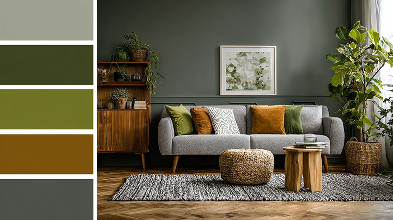
Living Room
The living room is where earthy palettes perform best. Scale is larger, layering opportunities are higher, and warm tones create exactly the kind of comfortable, inviting atmosphere most people want in a shared space.
Base color: Warm linen or sand beige on walls.
Secondary: Terracotta or olive through upholstery or a large rug.
Accent: Burnt sienna or walnut in a throw, cushion, or wood furniture piece.
A terracotta accent wall in a living room reads well when the remaining three walls stay in a warm neutral. Going full terracotta on all four walls in a standard-size room almost always results in a space that feels smaller and heavier than intended.
Bedroom
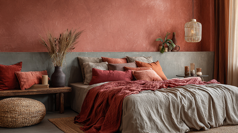
Bedroom earthy palettes need to drop in saturation. The goal is rest, not visual stimulation.
Clay pink, warm greige, dusty rose, and muted sage are the right earthy picks here. Deep terracotta and rich ochre work only as accents through throw pillows or a single piece of furniture. For a rustic bedroom approach, raw wood combined with warm beige walls and woven linen bedding covers the earthy palette without a single drop of paint.
Lighting matters significantly in bedrooms. A warm-toned bulb (2700K) makes earthy beiges and clay pinks feel intentional. A daylight bulb at the same wattage makes the same colors look gray and flat.
Kitchen
Earthy tones in kitchens work best in fixed elements: cabinetry, tile, and countertop material. Walls in kitchens change with grease, steam, and light variation throughout the day, so keeping the earthy color in more durable surfaces is practical.
| Element | Earthy Color Option | Pairing |
|---|---|---|
| Lower cabinets | Deep ochre or olive green | Warm white upper cabinets |
| Backsplash tile | Terracotta or sandstone | Warm cream grout |
| Countertop | Travertine or warm quartz | Walnut wood accents |
| Wall color | Warm beige or linen | Any earthy cabinet tone |
For specific guidance on kitchen color schemes with wood cabinets, the earthy palette is a natural match, especially when the wood carries warm yellow or orange undertones.
Bathroom
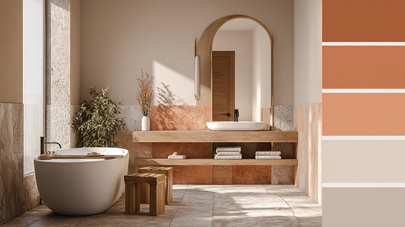
Bathrooms benefit from the lightest end of the earthy palette. Stone tones, warm taupes, and travertine-adjacent palettes keep the space feeling fresh while staying grounded.
Deep terracotta in a small bathroom is a common mistake. The room becomes a box of warm color with no breathing room. A better approach: warm white or pale sand on the walls, with terracotta or sandstone introduced through tile on the floor or a single tiled niche wall only.
Materials and Textures That Support Earthy Palettes

Color alone does not make an earthy interior. The materials surrounding those colors either reinforce the palette or fight it.
A terracotta wall against glossy white laminate furniture reads as a contradiction. The same terracotta wall next to raw oak shelving and a jute rug reads as completely intentional.
Natural Stone and Clay
Travertine, sandstone, and slate carry built-in earthy color. They do not need to match the wall color exactly because they bring their own warm variation.
Unglazed ceramic and terracotta tiles are the most direct material expression of the earthy palette. Glazed tiles in terracotta shades exist, but they read as imitations. Unglazed surfaces have the matte, slightly uneven finish that makes the color feel authentic rather than decorative.
The global home decor market reached USD 230.7 billion in 2024, with natural materials consistently cited as a top driver of purchasing decisions across residential segments (Global Market Insights, 2024).
Wood Tones
Not all wood works equally with earthy palettes.
- Raw oak and light ash: Warm enough to support earthy walls without competing
- Walnut: Deep brown that adds contrast and grounding
- Reclaimed pine: Warm, slightly gray, good for Wabi-Sabi and Japandi-adjacent earthy schemes
- Cherry wood: Red-orange tone that pulls toward the warmer end of earthy
Avoid cool-toned woods like whitewashed oak or ash with gray stain. They pull the palette away from warm and earthy toward something that reads more Scandinavian than organic.
Reclaimed wood adds an extra layer of authenticity to earthy interiors. The weathering and color variation in reclaimed pieces create natural tonal interest without needing to introduce additional colors.
Soft Furnishings
Texture in soft furnishings is what separates a flat earthy scheme from a layered one. Texture in interior design adds depth and tactile interest that color alone cannot achieve.
Linen and cotton: Natural fibers in cream, warm sand, or dusty rose. Matte finish essential.
Bouclé: Works well in warm white, cream, or camel. A boucle sofa against terracotta walls is one of the more reliable earthy combinations right now.
Jute and sisal rugs: Direct plant-based texture that reinforces the organic quality of earthy color. A jute rug on a warm oak floor is almost always the right move in an earthy living room or dining space.
Rattan and cane furniture bring a lighter, more open texture that prevents earthy rooms from feeling too heavy. These materials read as earthy without adding significant visual weight, which helps in smaller rooms where terracotta walls already push the boundaries of what the space can hold.
Lighting and Its Effect on Earthy Tones

Earthy colors are among the most lighting-sensitive on the spectrum. The same terracotta swatch looks completely different in a north-facing room versus a south-facing one, and at 9 AM versus 7 PM.
This is a significant part of how light works in interior design. Warm and cool light sources interact with pigment in ways that shift the perceived color substantially.
Natural Light by Room Orientation
North-facing rooms receive indirect, cooler light throughout the day. Earthy tones, especially mid-range browns and taupes, can go gray and flat in these conditions.
Fix for north-facing rooms: Choose earthy tones with stronger warm undertones. Push toward ochre and terracotta rather than beige and greige. The warm pigment compensates for the cool ambient light and keeps the color reading correctly.
South-facing rooms get the most intense natural light. Earthy colors deepen and saturate. Lighter sand beiges can read almost golden in south light at midday, which is genuinely beautiful but can be surprising if you only sampled the color under artificial light at a paint store.
Artificial Lighting Temperature
Bulb temperature changes earthy tones significantly.
| Bulb Temperature | Effect on Earthy Tones | Best For |
|---|---|---|
| 2700K (warm white) | Deepens and enriches warm tones | Living rooms, bedrooms |
| 3000K (soft white) | Slight warmth, more balanced | Kitchens, bathrooms |
| 4000K (cool white) | Flattens earthy tones, pulls gray | Avoid in earthy rooms |
| 5000K+ (daylight) | Makes warm tones look muddy or brown-gray | Not recommended |
Ambient lighting at 2700K to 3000K is the standard recommendation for any room featuring an earthy palette. Layer in accent lighting to highlight specific materials like stone and wood, where the warmth of the light enhances the natural grain and texture.
Testing Paint Samples Correctly
Sampling earthy paint colors on a white card and holding it to the wall is the most common mistake people make. The white card changes everything. The surrounding color bleeds into how you read the sample.
Paint directly on the wall. Use a large patch, at least A3 size. View it at different times of day, morning, midday, early evening, and after dark under your actual fixtures. That process takes two to three days but prevents expensive mistakes that require full repainting.
Evening light is where earthy tones often surprise people most. Terracotta under a warm 2700K lamp at 8 PM reads significantly richer and more orange than the same wall in daylight. Whether that result is desirable or not depends entirely on how the room is used, but it should never be a surprise.
Earthy Palette Combinations with Non-Earthy Colors

Earthy tones do not have to live in isolation. Pairing them with colors outside the earthy family often produces the most interesting results, as long as the bridge between the two families is handled correctly.
The guiding rule: the non-earthy color needs to be either dark enough or muted enough to sit comfortably next to warm, grounded tones without pulling the room cool.
Earthy with White and Off-White
Not all whites work here. Cool, bright whites clash directly with warm earthy tones, making both colors look wrong.
Warm whites with yellow, pink, or red undertones work. Farrow and Ball’s Pointing, Benjamin Moore’s White Dove, and Sherwin-Williams’ Alabaster are the standard references. Each carries enough warmth to connect with terracotta, ochre, or warm beige without fighting them.
Cool whites (blue or gray undertone) belong in Scandinavian-influenced or minimalist interiors, not earthy ones.
Earthy with Navy and Deep Teal
Navy is one of the more reliable non-earthy partners for warm earth tones. Havenly’s design data and editorial coverage from 2024-2025 consistently show terracotta-and-navy as a high-performing combination, with navy acting as a cool grounding agent that adds contrast without cooling the earthy warmth.
How it works in practice:
- Navy as a secondary tone through upholstery or a single wall
- Terracotta or burnt orange as the dominant earthy presence
- Warm cream or ivory as the connector between the two
Deep teal follows similar logic but has a slightly more complex undertone. It works better with olive green earthy schemes than with red-based terracottas, where the blue in teal can start to clash.
Earthy with Dusty Lavender and Blush
Dusty lavender and clay pink sit close enough to the earthy family that pairing them is less about contrast and more about tonal layering.
Both need to be desaturated. Bright lavender reads as cool and modern, not earthy. Dusty lavender with a gray or brown base connects naturally to warm beige and sand. Pair it through soft furnishings rather than walls, especially in bedrooms where a clay pink wall already anchors the warm palette.
For guidance on colors that go with mauve, dusty tones in this family consistently pair well with warm neutrals and earthy browns.
Colors to Avoid
Some color combinations reliably fail with earthy palettes. Knowing them saves time.
| Color | Why It Clashes | Better Alternative |
|---|---|---|
| Cool gray | Pulls earthy tones blue and flat | Warm greige or mushroom |
| Icy blue | Fights warm red and orange undertones | Dusty teal or navy |
| Bright white | Cool undertone exposes warmth incorrectly | Warm off-white or cream |
| Neon or saturated brights | Saturation gap too large; earthy tones recede | Jewel tones (muted versions) |
Colors that go with brown covers this pairing logic in depth, which is useful when the earthy scheme is brown-dominant and you need a secondary palette to build around it.
Earthy with Black
Black earns its place in earthy schemes when used in small, deliberate amounts.
Best placements: window frames, cabinet handles, lamp bases, picture frames.
A little black prevents earthy rooms from feeling too soft or undirected. Interior designer Christiane Lemieux has noted in editorial coverage that the current shift toward warm earthy tones was partly a reaction to years of cooler, harder interiors. A touch of black reconnects the palette to that crispness without abandoning the warmth.
Avoid black walls in earthy rooms. The contrast is too stark and the warm palette loses its coherence around it.
Common Mistakes with Earthy Color Palettes
Earthy palettes look easy. They are not.
The warmth and organic quality that makes them appealing is also what makes them easy to get wrong. A few consistent errors show up across client projects and the pattern is clear enough to document.
Going Too Brown
An all-brown earthy room has no contrast and no life. The eye has nothing to land on.
Havenly’s design editorial from 2025 notes that contrast is one of the most commonly overlooked elements in earthy color schemes, with designers recommending a deliberate mix of light and dark earthy tones rather than a single mid-range brown throughout.
Fix: keep one earthy tone significantly lighter and one significantly darker than the rest. That value range creates the depth a tonal scheme needs to feel intentional rather than muddy.
Mixing Undertones Incorrectly
This is the most common technical mistake. It happens when someone chooses earthy colors they like individually without checking their undertones against each other.
Warm ochre (yellow base) next to a cool sage (blue-gray base) reads as a conflict. The colors belong to different temperature families even though both could be described as earthy.
Test before committing: hold paint samples together in natural light. If one makes the other look wrong, the undertones are likely clashing.
Overdoing Terracotta in Small Spaces
Terracotta is one of the more saturated colors in the earthy family. It commands space. In a small bathroom or narrow hallway, full terracotta walls create a warm, enveloping feeling that can quickly shift into oppressive.
DeCasa Collections design guidance from 2025 lists overuse of a single earth tone as a top mistake, specifically recommending variety across earthy hues rather than relying on one dominant color to carry the entire scheme.
In small rooms: introduce terracotta through tile, a single niche wall, or soft furnishings instead of all four walls.
Ignoring Fixed Elements
Fixed elements are the colors already in the room that cannot be changed without major work: flooring, countertops, existing tile, and sometimes ceiling materials.
Choosing an earthy wall color without checking it against the floor tone is one of the fastest ways to create a scheme that does not cohere. A warm honey-oak floor and a cool green-gray wall fight each other. An earthy olive or warm beige wall with the same floor connects naturally.
Always start the palette selection process from the fixed elements. Build the earthy palette around what cannot move, not around what can.
Ignoring Ceiling and Trim in an Earthy Scheme
Ceilings painted bright white in a room with warm earthy walls create a sharp, flat break at the top of every wall. The warmth stops abruptly and the ceiling reads as disconnected from the rest of the scheme.
Better approach: use a pale, warm tint of the wall color on the ceiling, or go with a warm off-white that matches the undertone of the walls. Trim in the same warm off-white (rather than standard bright white) keeps the scheme reading as one cohesive palette.
The harmony principle in interior design addresses exactly this: every surface, including ceiling and trim, contributes to the overall color reading of a room and should be treated as part of the palette rather than an afterthought.
Earthy Color Palette Trends in Current Interior Design
Earthy tones have moved from periodic trend to consistent presence. The data from 2023 through 2025 shows this is not a passing moment.
Fixr’s 2024 Color Trends Report found 71% of design professionals saying natural materials are dominating furniture trends, with earthy color palettes following directly from that shift in material preference.
The Shift Away from Gray
Gray dominated residential interiors for roughly a decade. That era ended around 2022-2023.
Interior designer Christiane Lemieux described the current earthy shift as a direct reaction: “The new warmer, earthy colors are in reaction to the years of white and marble we have had.” The Fixr 2025 report echoed this, with 49% of design professionals citing warm neutrals as the top color trend for 2025, and earthy greens cited by 48%.
The gray-to-warm shift is visible across all major paint brands. Benjamin Moore, Sherwin-Williams, and Farrow and Ball have collectively moved their Color of the Year selections toward warm, organic tones since 2022.
Biophilic Design Driving Earthy Adoption
The global biophilic design market was forecast to reach $3.14 billion by 2028, growing at a 10.2% compound annual growth rate (Global Market Insights, 2023).
Earthy palettes are one of the most accessible expressions of biophilic interior design. Forest greens, terracottas, and warm ochres directly reference the natural color language that biophilic design principles draw from.
Search interest for “biophilic design” grew steadily across 2022-2024, with a sharp uptick in 2023, according to trend monitoring sources. That rising interest has pulled earthy, nature-linked color palettes into mainstream residential projects that would not have used them five years earlier.
Japandi and Wabi-Sabi Influence
Both design philosophies use earthy color as a foundation, not a feature.
Japandi’s 2025 evolution moved beyond its original cool-white palette. FUJIOH’s 2025 design trend analysis notes that the classic Japandi palette of whites and soft grays expanded to include taupe, clay, warm browns, and earthy terracotta, applied through accent walls, textiles, and ceramics. This shift brought Japandi directly into earthy palette territory.
Wabi-Sabi goes further. Clay and sand wall finishes, unglazed ceramics, and raw wood create an earthy interior through material rather than paint. The color emerges from the surface itself.
Both approaches align with Zen interior design principles, where grounded, nature-derived color reduces visual noise and supports a sense of calm. The earthy palette is a practical tool in that context, not simply an aesthetic choice.
Where the Palette Is Heading in 2026
The earthy family is not retreating, but it is getting more specific.
House Digest’s late-2025 design forecasting identifies a move from the forest-inspired earthy tones that dominated 2025 toward a desert-inspired palette: dusty browns, ochres, terracottas, and warm sandy beiges with more saturation and less gray influence.
Interior designer Phoenix Grey described the shift as moving toward “richer desaturated colors” that give spaces a lived-in quality. The Japandi world is following a parallel track, with Hackrea’s 2026 Japandi forecast naming “warm greiges,” olive smoke, and deep rust as the dominant earthy directions for that aesthetic.
The practical outcome for anyone working on an earthy interior now: lean toward warmer, slightly more saturated earth tones rather than the muted gray-influenced versions that peaked in 2024-2025. The palette is shifting in a sunnier, more grounded direction.
Bohemian interiors offer one of the most layered approaches to earthy color, where terracotta, ochre, dusty rose, and olive green are built up through textiles, rugs, and ceramics rather than paint. Bohemian interior design has always used earthy tones as its foundation, which is part of why the style has aged better than trend-driven aesthetics that relied on cooler, more neutral palettes.
For those building an earthy palette within a rustic framework, the two approaches share more DNA than most people realize. Rustic interior design uses raw wood, stone, and warm terra tones as its building blocks, which overlap almost completely with the earthy palette’s core material language.
FAQ on Earthy Color Palette For Interior Design
What colors are considered earthy tones?
Earthy tones include terracotta, ochre, burnt sienna, raw umber, warm beige, olive green, moss, dusty rose, and clay pink.
They share warm undertones rooted in yellow, red, or orange, separating them from cool-based neutrals like gray or icy white.
What is the most popular earthy color for interiors right now?
Terracotta and warm brown lead current trends. Pantone named Mocha Mousse its 2025 Color of the Year, and Fixr’s 2025 report found 22% of designers selecting a deep earthy brown as their top pick.
Do earthy tones make a room look smaller?
Darker earthy tones like deep terracotta or burnt sienna can reduce perceived space, especially in small rooms.
Lighter earthy options, warm sand, pale clay, or soft ochre, keep walls feeling open while maintaining the grounded, organic color scheme effect.
What colors go well with an earthy palette?
Warm off-whites, deep navy, dusty lavender, and muted teal all pair cleanly with earthy tones.
Avoid cool gray and icy blue. They fight the warm undertones in colors that go with olive green and similar earthy hues.
How do I use earthy tones without making a room feel dark?
Use lighter earthy tones, warm beige or sand, as your dominant 60% color. Bring in deeper tones like walnut brown or rust only as accents at the 10% level.
Good lighting at 2700K to 3000K also keeps warm tones from reading heavy.
Can earthy colors work in a modern interior?
Yes. Contemporary interior design pairs clean lines with warm earth tones regularly.
Olive green cabinetry, travertine surfaces, and warm beige walls all sit comfortably in modern spaces without pulling the design toward rustic or traditional.
What is the best earthy color for a bedroom?
Low-saturation options work best for rest: clay pink, warm greige, dusty rose, and muted sage.
Deep terracotta and rich ochre read better as accents through throw pillows or a single furniture piece than as full wall colors.
What natural materials support an earthy color palette?
Travertine, raw oak, walnut, jute, unglazed ceramic, linen, rattan, and bouclé all reinforce earthy interiors.
The key is matte finishes. Glossy surfaces push earthy rooms toward something shinier and more commercial than the palette intends.
How does lighting affect earthy paint colors?
North-facing rooms cool earthy tones down, making beiges go flat. South-facing rooms deepen and saturate them.
Bulb temperature matters too. Daylight bulbs at 5000K make warm earth tones look muddy. Stick to 2700K warm white bulbs.
Are earthy tones a passing trend or a long-term shift?
Long-term shift. Earthy palettes have grown steadily since 2022, driven by biophilic design, the Japandi and Wabi-Sabi movements, and a broad rejection of the gray-dominant interiors that preceded them.
The palette is evolving, not fading.
Conclusion
This conclusion is for an article presenting the full picture of how an earthy color palette for interior design works across rooms, materials, lighting, and style directions.
Getting it right comes down to undertones, contrast, and material choices. Warm beige, terracotta, olive green, raw umber, and dusty rose each play a specific role. None of them work in isolation.
The shift from cool gray interiors toward warm, grounded tones is not slowing. Japandi, Wabi-Sabi, and biophilic design have all pushed organic color palettes into long-term relevance.
Test your paint samples in real light. Check your undertones. Build from your fixed elements outward.
Done correctly, a warm earthy scheme is one of the most livable color directions you can choose.

- Colors That Go with Oak Cabinets: Top Designer Picks - July 25, 2026
- What Color Walls Go with Light Wood Floors - July 23, 2026
- Colors That Go with Mahogany Wood - July 21, 2026


