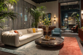
Color is the fastest way to change how a room feels. And right now, the choices matter more than ever.
Contemporary color schemes have moved well past gray walls and white trim. Today’s palettes layer warm neutrals, earthy mid-tones, and deep anchor colors in ways that are both specific and intentional.
Choosing the wrong combination costs time and money. Choosing the right one changes how a space reads entirely.
This guide covers the color families, palette structures, finish types, lighting principles, and application methods that define current residential design practice. By the end, you will know exactly how to build, test, and install a palette that performs.
What Are Contemporary Color Schemes?
Contemporary color schemes are palettes in active use in current design practice. They are not tied to a specific decade or historical movement. They change as culture, material availability, and collective taste shift.
The term “contemporary” is often confused with “modern.” Modern interior design refers to a specific mid-20th-century style with fixed characteristics. Contemporary simply means now. What qualifies as contemporary in 2025 would not have qualified in 2010.
Key characteristics of contemporary color schemes:
- Restraint over maximalism (though color drenching is a current exception)
- Functional mood-setting, not purely decorative
- Strong relationship between palette and material finish
- Preference for tonal variation over sharp color contrast
According to research published in the European Journal of Theoretical and Applied Sciences (2023), color choices in interior spaces affect both psychological and physiological well-being, not just visual appeal.
Understanding color theory in interior design gives context for why these palette structures work. The principles behind contemporary schemes are not arbitrary. They connect to how the human eye reads depth, contrast, and saturation in a built space.
Contemporary color schemes also apply differently depending on the design approach. Contemporary interior design broadly uses restrained palettes with strong material pairings, while adjacent styles like transitional interior design blend contemporary palettes with more traditional proportions.
What Color Families Define Contemporary Palettes Today?
Contemporary palettes in 2024-2025 are built around 3 main hue groups: warm neutrals as the base layer, earthy mid-tones as the secondary layer, and deep saturated anchors as grounding tones.
A Fixr survey of 71 top interior design professionals (2024) found that 46% identified earthy tones as the most popular current palette, with warm white selected by 48% as the most popular single interior paint color.
Warm Neutrals as the Dominant Base

Cool grays peaked in popularity around 2020 and have been declining since. What replaced them is greige: warm gray with red or orange undertones.
The shift is well-documented. A 2023 survey by 1st Dibs found that light gray received just 5% of votes when designers were asked about the most on-trend hues. Warm neutrals now sit at the center of most contemporary schemes.
Specific paints driving this shift:
- Benjamin Moore Pale Oak (OC-20): warm beige-greige with a soft undertone that reads differently in north- vs. south-facing rooms
- Farrow and Ball Elephant’s Breath: warm mid-gray with a distinctly organic quality
- Sherwin-Williams Agreeable Gray: the most-used transitional greige in the US, balancing warm and cool tones
A key technical factor: Light Reflectance Value (LRV). Warm whites typically carry an LRV of 70-80. This matters because high-LRV colors shift noticeably under artificial light, and most contemporary schemes are designed for layered lighting environments, not just daylight.
Earthy Mid-Tones as Secondary Color
Terracotta, sage green, ochre, and dusty rose now function as the secondary 30% layer in most contemporary schemes. These are not accent colors. They carry enough visual weight to anchor furniture groupings and define zones in open-plan spaces.
Deep olive green and chocolate brown are cited by RMCAD (2025) as 2 of the most popular earth tones in current use. They work particularly well in living rooms and home offices where warmth and focus matter simultaneously.
For a deeper look at how the earthy color palette for interior design is structured and applied, the palette logic extends well beyond paint choices into textiles and hard materials.
Deep Anchor Tones

Deep, saturated colors are not used as full-room paint in most contemporary schemes. They function as anchors: applied to cabinetry, joinery, a single feature wall, or built-in furniture to create visual weight.
| Deep Anchor Color | Common Application | Best Pairing |
|---|---|---|
| Farrow and Ball Hague Blue | Kitchen cabinetry, library joinery | Warm white walls, brass hardware |
| Sherwin-Williams Caviar | Interior doors, island cabinets | Greige walls, natural wood floors |
| Benjamin Moore Black Pepper | Feature wall, built-ins | Off-white ceilings, warm linen |
| Farrow and Ball Elephant’s Breath | Full room, open-plan walls | Charcoal trim, terracotta accents |
Designers Autumn Oser and Andre Golsorkhi of Haldon House note that in 2025, clients are choosing deep chocolatey browns, vibrant burgundies, and shadowy olive greens to create depth, pairing these anchors with saturated materials like walnut wood and rich plasters (Homes and Gardens, 2024).
What Are the Most Used Contemporary Color Schemes?
Contemporary design practice uses 7 distinct palette structures. Each has a defined role, a specific hue logic, and a different spatial application. They are not interchangeable.
A Fixr survey of 67 design experts (October 2024) found that 55% named color drenching the top color trend for 2025, while warm neutrals (49%) and dark earthy greens (48%) continued their rise as the two most consistent palette types across project types.
| Scheme Type | Structure | Best Application |
|---|---|---|
| Monochromatic tonal | Single hue, 3-5 value steps | Bedrooms, compact spaces |
| Warm neutral + deep anchor | Greige base + charcoal or navy | Living rooms, open-plan kitchens |
| Earthy triadic | Terracotta, sage, ochre | Dining rooms, family rooms |
| Soft contrast complementary | Dusty rose + muted olive | Bedrooms, sitting rooms |
| Biophilic | Green spectrum + raw wood + stone | Home offices, wellness spaces |
| Japandi | Off-white, warm gray, black, timber | Minimalist living rooms, bathrooms |
| Tonal black and white + warm accent | Neutral base with single saturated pop | Contemporary kitchens, hallways |
How Each Scheme Functions in a Room
Not every scheme works in every space. The choice depends on room orientation, ceiling height, fixed material finishes, and the primary function of the space.
Monochromatic tonal schemes perform best in rooms with one strong light source. The value variation between light and dark tones of the same hue creates depth without visual noise.
Biophilic schemes require material layering to read correctly. A sage green wall with white trim and no natural texture reads flat. The same sage green with raw linen, unfinished oak, and stone tile reads as a complete biophilic palette.
Japandi is the most constrained of the 7. It uses a maximum of 4 colors, no pattern competition, and relies on material contrast (matte vs. natural grain) rather than color contrast. It connects to the broader principles of Wabi-sabi in its acceptance of natural imperfection as a design element.
For anyone working within Scandinavian interior design, the Japandi and monochromatic tonal schemes share structural logic. Both use limited hue counts with fine tonal variation and a strong preference for natural materials over synthetic ones.
How Do Warm Neutrals Work as a Contemporary Base?
Warm neutrals are the base layer in the majority of current residential schemes. They function as a backdrop that supports furniture, textiles, and hard material choices without competing for visual attention.
A survey of 81 top staging professionals found that 81% recommend warm neutrals for interiors when preparing a home for sale (Fixr, 2024). That number reflects not just trend alignment but the commercial reality that warm neutral palettes photograph well and read as universally inviting.
LRV and Undertone Identification
Two technical factors determine whether a warm neutral performs well in a given space: LRV and undertone direction.
LRV (Light Reflectance Value) measures how much light a paint reflects on a scale of 0-100. Most contemporary warm neutrals sit between 55-75 LRV. Below 55, a neutral starts to read as a mid-tone. Above 75, it approaches white.
Undertone direction matters more than the swatch. Benjamin Moore Pale Oak has a warm pink-beige undertone. Under cool north-facing light, it reads as a clean greige. Under warm tungsten lighting at night, it shifts noticeably warmer.
Took me a while to convince clients that testing paint samples at night under their actual artificial lighting was not optional. A swatch in a paint store tells you almost nothing about how a color performs at 8pm in a room with 2700K bulbs.
Common Warm Neutral Pairings
With wood tones: warm neutrals pair cleanly with medium and light oak, unfinished ash, and raw linen. They conflict with orange-toned pine, which amplifies their warmth to an uncomfortable degree.
With hardware: matte black and unlacquered brass both work against a warm neutral base. Brushed nickel tends to read cold against greige walls and creates visual disconnection.
With flooring: the most common mistake is pairing warm neutral walls with cool-toned gray flooring. The temperature clash reads as unresolved from every angle in the room.
For specific paint-to-floor pairings, the guidance on paint colors that go with oak floors covers the undertone logic in practical terms. Similarly, what color walls go with dark wood floors addresses the higher-contrast version of the same pairing challenge.
What Role Do Deep, Saturated Tones Play in Contemporary Schemes?
Deep tones are structural tools. They create visual weight, define zones, and anchor open-plan layouts that would otherwise read as undefined. They are not used as wall color across full rooms in most contemporary applications.
Fixr’s 2025 color report found that deep jewel tones were named a rising trend by 34% of experts, alongside rich earthy reds (24%) and black walls (12%), all pointing toward a continued shift toward higher-contrast palette structures.
Where Deep Anchors Are Applied
Cabinetry and joinery are the primary location. A kitchen with greige walls and Hague Blue lower cabinets uses the deep tone to ground the room while keeping the overall palette light.
Single feature walls remain a valid application when the deep tone connects to adjacent materials. A charcoal feature wall behind a bed reads well when the bedhead, rug, and throws share the same warm-dark direction. An isolated charcoal wall with no material connection reads decorative without purpose.
Interior doors are an underused location. Sherwin-Williams Black Fox on interior doors against warm white walls creates definition throughout a home without the commitment of a full dark room. Studio McGee has used this approach across multiple residential projects.
Contrast Ratio Considerations
Deep anchor tones work because of contrast ratio: the luminance difference between the anchor and the surrounding base color.
A greige wall (LRV 65) against Hague Blue cabinetry (LRV approximately 8) creates a contrast ratio that draws the eye clearly to the cabinetry. The same dark tone against a mid-gray wall (LRV 40) produces a flatter, less defined result.
This is why contrast in interior design is not simply about choosing opposite colors. It operates through luminance difference as much as hue difference.
How Are Earthy and Biophilic Palettes Structured?

Earthy and biophilic palettes are the fastest-growing palette category in residential design right now. They share a hue logic but differ in material application and design intent.
The global biophilic design market is forecast to reach $3.14 billion by 2028, growing at a compound annual growth rate of 10.2% between 2023 and 2028 (Global Market Insights, 2023). That growth is driven by documented well-being benefits, not aesthetic preference alone.
Core Hues in the Earthy Palette
The earthy palette runs across a narrow warm spectrum:
- Terracotta: fired-clay orange-red, works as wall color or tile
- Sage green: gray-green with strong yellow undertone, functions as wall or secondary tone
- Ochre: warm yellow-gold, typically used in textiles rather than paint
- Clay and sand: low-saturation warm neutrals that read as base rather than color
- Warm rust: deeper than terracotta, used as an accent or tile grout choice
Sage green specifically requires material support to read as biophilic rather than simply green. Graham and Brown named their sage-adjacent color Veridis as Color of the Year for 2024 precisely because of its balanced gray-green quality: enough green to connect to nature, enough gray to read as neutral.
Material Pairing Requirements
Color alone does not make a biophilic palette. The scheme needs material reinforcement: rattan, raw linen, unfinished or wire-brushed oak, stone tile, and handmade ceramic.
Without these materials, a sage green wall reads as a color choice. With them, it reads as part of a complete palette system.
Lighting interaction: warm artificial light (2700K-2900K) shifts earthy tones toward orange. A terracotta wall under warm tungsten reads rich and saturated. Under 4000K cool-white lighting, the same wall reads flat and slightly dirty. Earthy palettes are built for warm light sources. This connects to the broader role of light in interior design, which determines how any palette actually reads once installed.
Those interested in the broader philosophy behind this palette type will find the principles of biophilic interior design directly relevant. The palette logic is inseparable from the design approach.
Japandi as a Subset of the Earthy Palette
Japandi is a hybrid of Scandinavian and Japanese design philosophies. Its palette is earthy but severely edited.
Japandi palette structure:
- Maximum 4 colors in the entire scheme
- Off-white or warm white as the base (typically LRV 75-85)
- Warm gray or greige as secondary tone
- Black or near-black as the single deep anchor
- Natural timber as the warm accent
Where Japandi diverges from Scandinavian minimalism is in its tolerance for visual imperfection. Scandi design prefers clean lines and consistent finish. Japandi, influenced by Wabi-sabi principles, accepts handmade texture, natural variation, and weathered surfaces as intentional palette elements rather than flaws.
No pattern competition is the defining rule. A Japandi space with a patterned rug, patterned cushions, and a textured wall is not Japandi. The palette holds only when every element serves the restraint of the overall scheme.
How Does the 60-30-10 Rule Apply to Contemporary Schemes?
The 60-30-10 rule allocates 60% of a room’s color to a dominant tone, 30% to a secondary tone, and 10% to an accent. It originated in interior design and has since crossed into web design, fashion, and graphic design as a universal composition principle.
Research consistently shows that people form judgments about spaces within 90 seconds of first exposure, and a significant portion of that assessment comes down to color distribution and balance (WP Mayor, citing color research). The 60-30-10 rule is a structured way to ensure that distribution works.
How Contemporary Practice Modifies the Rule
Most contemporary designers do not apply 60-30-10 literally. The actual ratios used in practice are closer to 70-20-10 or 80-15-5 for restrained palettes. The dominant tone carries more of the room, and the secondary tone is used with more restraint than a strict reading of the rule would suggest.
The accent 10% carries the personality of the scheme. In a greige and charcoal palette, the single terracotta cushion or warm brass pendant does more compositional work than any other element in the room. Changing it changes the entire character of the space.
When the Rule Breaks Down
3 scheme types resist the 60-30-10 structure:
Monochromatic tonal schemes use one hue across all three positions. The 60%, 30%, and 10% are variations in value, not separate colors. The rule still applies, but only within a single hue family.
Japandi schemes often run closer to 80-15-5. The dominant tone is overwhelming by design. The accent is minimal and deliberate. Applying a standard 10% accent would over-color the scheme.
Color drenching deliberately breaks the rule. A single color applied to walls, ceiling, trim, and cabinetry uses 100% of one hue in the fixed elements. Variation comes from material finish rather than hue change. Alexis Readinger, founder of Preen Inc., notes that the rule should not be applied rigidly: the proportional logic matters more than the exact percentages (Apartment Therapy).
Applying the Rule to Real Surfaces

Surface assignment is where most people get the rule wrong.
- 60% (walls, large flooring, ceiling): the base tone, usually a warm neutral
- 30% (large furniture, cabinetry, rugs): the secondary tone, often a deeper or contrasting neutral
- 10% (cushions, artwork, small accessories, hardware): the accent, the only place for a saturated color
The rule fails most often when the 30% furniture is the wrong temperature relative to the 60% walls. A cool gray sofa in a warm greige room splits the palette at the largest furniture scale. The two tones read as a mistake rather than a contrast.
For understanding how color distribution connects to the broader organization of a space, the principles of balance in interior design and unity in interior design directly support the compositional logic behind proportional color allocation.
What Finishes and Textures Affect Contemporary Color Perception?
Paint finish changes how a color reads in a room. The same warm neutral in matte versus satin can look like two different colors under identical lighting conditions.
Eggshell and satin together account for roughly 60% of interior wall paint sold in the US, according to the American Coatings Association. Contemporary design specifically has pushed matte and low-sheen finishes higher, with 51% of design professionals saying most homeowners will desire a matte look over other finishes (Fixr, 2024).
Matte, Eggshell, and Satin Compared
Matte finish has no reflectivity. It hides wall imperfections well and creates the flat, velvety surface that contemporary and Japandi schemes favor. The limitation: it marks easily and requires careful cleaning.
Eggshell is the most-used residential wall finish in the US. It carries a soft pearl quality with low sheen, handles moderate cleaning, and reads consistently across lighting conditions.
Satin has a noticeable velvet sheen and works best on cabinetry, interior doors, and trim where durability and washability matter more than visual softness.
| Finish | Sheen Level | Contemporary Application |
|---|---|---|
| Matte | None | Walls in living rooms, bedrooms, Japandi schemes |
| Eggshell | Low | General wall color in family spaces |
| Satin | Medium-low | Cabinetry, interior doors, trim |
| Semi-gloss | Medium | Kitchens, bathrooms, high-contrast trim detail |
Texture as a Color Modifier
Textured wall treatments shift how a color reads by creating micro-shadows across the surface. A flat greige wall reads as a single tone. The same greige applied as limewash develops light and dark variation across the same hue.
Portola Paints Roman Clay and Bauwerk Colour lime paint are 2 products used regularly in contemporary schemes for this reason. Both create surface depth without changing the base color, which lets a warm neutral carry enough visual interest without adding a second hue.
Bouclé, raw linen, and stone tile do the same job on soft and hard surfaces. Texture adds tonal depth to monochromatic color schemes that would otherwise read as flat. This is why texture in interior design is not a decorative afterthought. It is an active part of how a color palette functions across a room.
Gloss as Intentional Contrast
Contemporary design uses gloss deliberately in 2 specific ways: high-gloss lacquered cabinetry against matte walls, and semi-gloss trim against eggshell surfaces.
The contrast of finish, not just color, creates definition. A white eggshell wall with white semi-gloss skirting boards reads as two distinct elements even though the hue is identical. Finish contrast is an underused tool in contemporary palette work.
How Do Contemporary Color Schemes Differ Across Spaces?

The same palette does not behave the same way in every room. Room function, ceiling height, natural light direction, and fixed surface materials all change how a scheme reads when installed.
Zillow research found that a well-chosen color scheme can increase a home’s sale price by as much as $5,000, depending on the market. That number reflects what professional designers already know: color decisions are consequential, not just decorative.
Living Rooms and Open-Plan Spaces
Open-plan living areas present the hardest color challenge. A single scheme must read coherently across kitchen, dining, and living zones without becoming monotonous.
The working approach: one base color across all wall surfaces, with zone definition coming from flooring material changes, lighting zones, and furniture groupings rather than wall color shifts. Farrow and Ball’s approach to their open-plan color guides recommends treating the ceiling as a fifth surface and taking the wall color lighter by one value step to maintain visual flow.
For smaller living rooms, small contemporary living room ideas work within these same palette principles but with more attention to LRV. Higher LRV base colors (above 65) open the space perceptually without changing the layout.
Contemporary Kitchen Color Behavior
Kitchens operate on a different palette logic than living spaces. The cabinet color is the dominant surface element, not the walls.
Upper cabinet color: lighter tone, often white or warm neutral, keeps the upper zone visually open.
Lower cabinet color: the primary design decision. Navy, sage, charcoal, or deep forest green here anchors the kitchen without darkening the overall room feel.
Island color: contrasting with both upper and lower cabinets. A white kitchen with a deep green island is a stable contemporary kitchen formula used widely from 2022 onward.
The countertop functions as a neutral bridge between cabinet zones. Quartz in warm white or soft gray keeps the contrast readable without adding a third competing color. For specific cabinet-to-countertop pairings, the guidance on grey kitchen cabinets with white countertops or green kitchen cabinets with white countertops covers the most-used combinations in current practice.
Bedrooms and Rest-Supporting Palettes

Bedrooms need lower saturation. Full stop.
Deep anchor colors used in living rooms carry too much visual energy for a rest environment. Contemporary bedroom schemes typically run on a tonal monochromatic base with soft contrast in textiles. The accent color, if present, appears only in cushions or artwork, never on a feature wall behind the bed.
Calming colors for bedrooms lean toward dusty rose, muted sage, soft warm white, and greige. Research published in the European Journal of Theoretical and Applied Sciences (2023) confirms that muted, low-saturation colors reduce physiological arousal compared to saturated hues in enclosed spaces. Practically, this supports what most good contemporary bedroom ideas already show: restraint in the palette creates the rest-supporting environment.
Bathrooms: Tile Color as the Palette Driver
In bathrooms, tile is the dominant color decision. Paint plays a secondary role.
Contemporary bathroom schemes build from the tile outward: tile color sets the base, grout color defines the secondary tone (warm or cool), and wall paint fills the remaining surfaces. Choosing paint before tile produces disconnected results in almost every case.
Contemporary bathroom design in 2024-2025 favors large-format tiles in warm stone tones, warm white, or matte charcoal. The grout choice matters as much as the tile: dark grout with light tiles creates a graphic grid; matching grout reads as seamless.
How Is Lighting Used to Activate Contemporary Color Schemes?
Color and light are inseparable. A palette selected in one lighting condition and installed in another reads as a different scheme entirely.
CRI (Color Rendering Index) measures how accurately a light source renders colors on a scale of 0-100. Light sources with a CRI of 90 or above are rated excellent for color accuracy and are the correct specification for any space where a designed color palette matters (LED Lighting Supply). Using a CRI 80 bulb in a room with carefully selected paint colors undercuts the entire palette decision.
Color Temperature and Palette Direction
Color temperature (measured in Kelvin) determines whether a room reads warm or cool under artificial light. This directly shifts how every paint color in the palette behaves.
- 2700K: warm amber tone, shifts all colors toward orange. Earthy and biophilic palettes designed for warm light perform best here.
- 3000K: slightly brighter warm white. The standard for contemporary residential living rooms and kitchens.
- 4000K: neutral cool white. Shifts warm neutrals toward gray and flattens earthy tones. Use only in bathrooms or home offices where task accuracy matters.
Leora Lighting (2025) confirms warm light in the 2700K-3000K range is best for relaxing residential spaces, while cooler 4000K-5000K supports focus and task accuracy. Choosing 4000K for a living room with a carefully selected earthy palette is a common and avoidable mistake.
Layered Lighting and Tonal Depth
Single overhead lighting flattens a monochromatic color scheme. Layered lighting reveals tonal depth.
Ambient, task, and accent lighting each hit surface materials at different angles. A bouclé armchair in an earthy scheme reads as one flat color under a single ceiling fixture. Under layered lighting with an accent source angled from one side, the texture creates visible light and shadow variation across the same hue.
Understanding ambient lighting as the base layer is the starting point. Accent lighting then does the work of activating the material depth that makes a contemporary palette read as designed rather than flat. The broader principles governing how light interacts with every surface choice are covered in depth through the study of light in interior design.
North-Facing vs. South-Facing Room Behavior
Room orientation changes palette selection as much as any other factor.
North-facing rooms receive cool, blue-toned natural light throughout the day. Warm neutrals with LRV above 60 balance this effectively. Cool neutrals and grays in north-facing rooms read as cold and flat regardless of the artificial lighting installed.
South-facing rooms receive warm, golden light. Almost any warm neutral performs well here. The risk is that south-facing light can over-warm a terracotta palette to the point of visual fatigue by midday.
What Digital Tools Help Build Contemporary Color Schemes?
Digital tools narrow the gap between choosing a color from a chip and understanding how it performs installed in a real room. They do not eliminate the need for physical samples. But they reduce costly mistakes.
Paint brand visualizer tools from Benjamin Moore and Sherwin-Williams see consistent professional and homeowner use. The Benjamin Moore Color Portfolio app includes a Video Visualizer feature that applies color in real-time augmented reality, giving a closer approximation of installed color than static photo tools (Benjamin Moore).
Brand-Specific Visualizers
Benjamin Moore Color Portfolio: room visualization with real paint colors, side-by-side color comparison, and augmented reality application. Best for Benjamin Moore palette work. Augmented reality mode gives the most spatially accurate preview available in a free tool.
Sherwin-Williams ColorSnap Visualizer: upload a room photo and paint surfaces using brush or smart select tools. Accurate to Sherwin-Williams colors. Useful for quick directional decisions, though image quality can degrade during active painting use (Apartment Therapy, 2024).
BEHR ColorSmart: free room visualizer with BEHR’s full color range. Less widely used by professionals but functional for homeowner use.
Brand-Independent Tools and Their Limits
Adobe Color and Coolors.co generate palette structures from color theory principles rather than from specific paint colors. They are useful for identifying complementary color pairings and triadic scheme logic. The output is HEX and RGB values, not paint-specific formulations.
The limitation applies to all digital tools equally: screen color profiles do not replicate the behavior of a painted surface under real light. A color that reads perfectly on a calibrated monitor shifts when applied to a textured wall under 2700K bulbs with a north-facing window. Digital tools provide direction, not confirmation.
Physical A4 painted boards remain the professional standard for final palette sign-off. Moving a painted board around the room at different times of day and under different light sources reveals behavior that no screen can replicate. The Color House (2025) specifically recommends painting on foam core boards and testing them across multiple lighting conditions before committing to a full room.
Using a Room Color Scheme Generator
Automated palette generators can accelerate the early stages of palette exploration. A room color scheme generator helps establish base combinations before moving into brand-specific color selection. Use these tools for directional decisions, not final specification.
How Are Contemporary Color Schemes Applied in Interior Design Projects?
The application process determines whether a well-chosen palette performs as intended. Color selection and installation are two separate skill sets. Getting the first right and mishandling the second produces poor results.
According to the Paint Quality Institute, roughly 40% of interior repaints happen sooner than planned because the wrong finish was used in the wrong room. Many of these situations also involve a color that was selected from a small chip under showroom lighting and installed in a room with different light conditions and fixed finishes.
Starting from Fixed Elements
The palette builds outward from the largest fixed surface. Always.
Fixed elements: flooring, stone countertops, existing joinery, and any tile already installed. These cannot be changed without significant cost. The wall color, cabinet color, and soft furnishings all exist in relationship to these fixed surfaces.
A common professional error: selecting a paint color independently of the flooring undertone. A warm greige wall with cool-toned gray tile flooring creates a temperature split that reads as unresolved from every vantage point in the room. The fix is to identify the undertone of the floor first, then select wall and cabinet colors that share that temperature direction.
Sample Testing Protocol
Testing at A4 scale on small chips is not sufficient for a final palette decision. The color shifts noticeably at full wall scale because adjacent surfaces change the perceived value of the color.
Professional testing sequence:
- Paint A2 or larger boards with the sample color (not directly on the wall)
- Test the board against all fixed surfaces simultaneously
- View at morning, midday, and evening under the room’s actual artificial lighting
- Compare the top 2 final candidates side by side before committing
Benjamin Moore’s own guidance recommends ordering physical color samples and testing in all lighting conditions throughout the space. The reasoning is consistent with what any experienced color specifier knows: the chip is a starting point, not a decision.
Full Scheme Sign-Off Process
A complete scheme board brings all palette elements together before any purchasing decisions are made. This is standard in professional interior design practice and reduces costly change orders after installation begins.
The board includes: painted wall color sample, cabinet color sample, flooring material swatch, countertop sample, hardware finish sample, primary textile swatch, and any tile or stone sample. Every element in the room represented at the same time, viewed under the room’s actual light source.
For anyone wanting to understand how color functions within the full set of design decisions a room requires, the role of color in interior design connects palette choice to proportion, material weight, spatial perception, and the broader principles of interior design that govern how a finished space reads as a coherent whole.
A well-executed contemporary color scheme is not the result of choosing the right paint color. It is the result of applying the right color to the right surface, in the right finish, under the right light, in relationship to every other material in the room.
FAQ on Contemporary Color Schemes
What is a contemporary color scheme?
A contemporary color scheme is a palette in active use in current design practice. It prioritizes restraint, tonal variation, and intentional contrast. Unlike “modern,” which references a specific era, contemporary simply means now. Palettes shift as culture and material trends evolve.
What colors are most popular in contemporary interiors right now?
Warm neutrals like greige and warm white dominate as base colors. Earthy mid-tones including sage green, terracotta, and ochre function as secondary layers. Deep anchors such as charcoal, Hague Blue, and forest green provide grounding contrast in cabinetry and joinery.
What is the difference between modern and contemporary color schemes?
Modern color schemes reference mid-century design: clean whites, muted earth tones, and bold geometric accents. Contemporary schemes reflect current trends and change over time. Modern is a fixed style. Contemporary is defined by whatever is in active use today.
How does the 60-30-10 rule apply to contemporary palettes?
It allocates 60% to a dominant base tone, 30% to a secondary color, and 10% to an accent. Contemporary practice often shifts this to 70-20-10 for more restrained schemes. The accent 10% carries the full personality of the palette.
What paint finish works best for contemporary color schemes?
Matte and eggshell finishes are the standard for contemporary walls. Matte creates the flat, velvety surface Japandi and minimalist schemes rely on. Satin and semi-gloss are reserved for cabinetry, trim, and interior doors where durability and contrast matter.
How do warm neutrals differ from cool neutrals in interior design?
Warm neutrals carry red, orange, or yellow undertones. Cool neutrals lean toward blue or green. Under warm artificial light at 2700K-3000K, warm neutrals perform consistently. Cool neutrals in the same conditions often shift gray or flat.
What is a biophilic color palette?
A biophilic color palette uses nature-derived hues: sage green, earthy ochre, warm terracotta, raw wood tones, and stone. It pairs these colors with natural materials like linen, unfinished oak, and ceramic. Color alone does not make a palette biophilic. Material pairing is required.
How does lighting affect contemporary paint colors?
Lighting changes how every color reads once installed. Bulbs rated at CRI 90+ render paint colors accurately. Warm 2700K-3000K temperatures suit earthy contemporary palettes. Cool 4000K light flattens warm neutrals and should be avoided in living spaces.
What are the best tools for visualizing contemporary color schemes?
The Benjamin Moore Color Portfolio app and Sherwin-Williams ColorSnap Visualizer allow room-based color testing. Adobe Color and Coolors.co generate palette structures from color theory. All digital tools have limits. Physical painted boards tested under real room lighting remain the professional standard.
How do you apply a contemporary color scheme across different rooms?
Start from fixed surfaces: flooring, stone, and existing joinery set the palette direction. Use one base color across open-plan wall surfaces. Vary the scheme through material finish, texture, and lighting rather than changing wall colors between zones.
Conclusion
This conclusion is for an article presenting contemporary color schemes as a discipline built on structure, not guesswork.
Warm neutral paint colors, earthy tonal palettes, and deep anchor tones each serve a defined role. Paint finish, lighting color temperature, and material pairing determine whether a scheme performs once installed.
The 60-30-10 rule gives you proportional logic. Biophilic and Japandi palette structures give you restraint. CRI-rated bulbs and physical sample testing give you accuracy.
None of these decisions work in isolation. Color selection, surface application, and lighting specification function as a single system.
Get the system right, and the room reads exactly as intended.

- Paint Colors That Go with Gray Floors - August 20, 2026
- What Color Bedding Goes with Dark Wood Furniture - August 18, 2026
- What Color Walls Go with Oak Floors - August 16, 2026