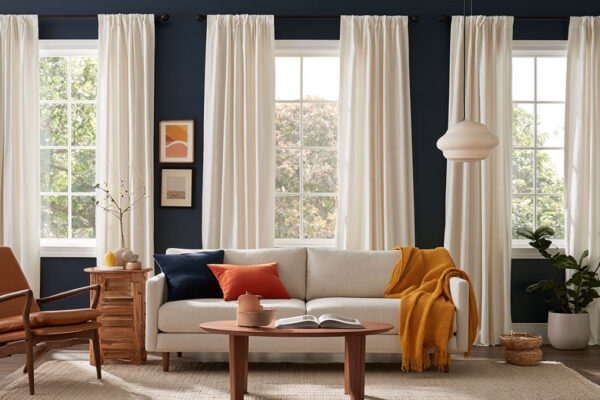
Curtain Colors
What Color Curtains Go With White Walls

Most people pick curtains for white walls by choosing a color they like and hoping the wall cooperates. It usually does, until the undertone gets involved. Whites run warm or cool, and the curtain has to agree with that cast, not with the word “white” on the paint can.
For what it’s worth, a homeowner study that Sherwin-Williams reported in 2015 found that 73% preferred Alabaster’s barely-there undertones to a plain white when choosing neutrals.
For walls painted in other colors, our curtain color guide gives the safe and contrast picks for each one.
Which curtain colors work with white walls?

Pretty much anything, since white doesn’t compete with other colors. What you’re really deciding is how much the curtains should stand out. Neutrals blend into the wall. If you’d rather warm things up, earth tones do that, and deep colors are the way to go when you want the curtains noticed.
| Color family | Examples | Effect on white walls | Watch out for |
|---|---|---|---|
| Neutral | Cream, oatmeal, light gray | Soft, low contrast | Flat if the tone sits too close to the wall |
| Earth tone | Terracotta, mocha, goldenrod | Adds warmth | Undertone that fights the wall |
| Jewel or deep tone | Navy, deep green, burgundy | Strong contrast, clear focal point | Heavy in small rooms |
| Pastel | Blush, sage, light blue | Gentle color, airy feel | Near-miss shades that read as errors |
| Black or charcoal | Black, charcoal | Graphic, high contrast | Pulls the eye, can close a room in |
Hunker calls cream curtains on white walls the ultimate neutral pairing. Terracotta brings color without feeling loud, while deep reds can look cheesy against white paint.
Deep blue velvet turns up in both Livingetc and Housing.com as the high-contrast pick. DesignCafe leans toward pastel pink if you want a softer result.
Running a few of these through an online room color scheme generator costs nothing and narrows the field before any fabric gets ordered.
How to find the undertone of your white walls

Hold a sheet of plain white paper against the wall in daylight. If the wall looks creamy or yellow next to it, the undertone is warm. Faintly blue or gray means cool.
- Find the paint name on the can, a sample card or the builder’s spec sheet.
- Read the wall against white paper in daylight and call it warm, cool or neutral.
- Hold the curtain fabric sample next to the wall in the same light.
- Look at the pair again in the evening under your normal bulbs.
- Stay in the wall’s temperature family when you choose the curtain.
Whites vary more than the names suggest. Sherwin-Williams Alabaster (SW 7008) runs warm, with a creamy yellow-beige cast, and Benjamin Moore White Dove (OC-17) is warm as well, just softened by a faint green-gray tint. Benjamin Moore Chantilly Lace (OC-65) sits close to neutral and is the crispest of the lot.
Benjamin Moore lists Chantilly Lace at a light reflectance value (LRV) of 90.04 and White Dove at 83.16. The crisp white bounces back nearly 7 points more light.
Direct-Fabrics suggests a true white curtain for cool walls and one with a beige tint for warm walls. Reversing that is the usual slip on white walls, according to Meltflex, since a stark cool white beside a warm wall turns faintly blue or gray.
Alabaster has its own set of safe pairings, laid out in a guide to shades that sit well beside Alabaster.
Should curtains match white walls or contrast with them?

Both work, as long as the choice looks deliberate. The curtains that look like a mistake are the ones that land just off the wall color.
Sources split on near matches. Russell’s Curtains and Bargain Blinds back white on white when the undertones match, while The Tested Hub says curtains only slightly off-white read as a mismatch and should be clearly darker or more saturated. Direct-Fabrics takes a middle line, saying exact matches can look flat and tones one or two steps apart look good.
The disagreement shrinks once you notice what each source is warning about, which is the near miss. Pick a true match, or a clear step away.
Tonal and white-on-white curtains

White curtains keep a white room bright and light.
Russell’s Curtains points out that white curtains stain less often than white couches, which makes them a practical way to bring soft white fabric into a home with young kids. A flat white on white does read stark, though, so a woven or textured fabric is the better call.
Low-contrast curtains

Cream or oatmeal warms the wall and mostly goes unnoticed. Light gray is the pick for cool-toned whites. Butter yellow melts into the wall rather than competing with it. Goldenrod is a bit bolder, with enough pop to break the flatness without tipping the balance (Hunker).
Low contrast suits rooms where the furniture or art should carry the color.
High-contrast curtains

Navy and charcoal give contrast without the harshness of black, according to Bargain Blinds. Russell’s Curtains adds that the more neutral the room, the more dark curtains stand out.
How far a panel can pull away from the wall is a question of how contrast shapes a room’s design, and a dark panel against white always draws the eye first.
Livingetc notes that darker colors attract the eye and can make a room feel like it is closing in. A double track helps here, since it holds heavy dark drapes for winter and a sheer layer for summer.
How does room light change which curtain color works?
Light direction and bulb color shift how both the white wall and the curtain read. A pairing that looks right in a south-facing room can look different in a north-facing one.
Benjamin Moore says the light from each direction affects a paint color’s intensity and cast, and it recommends checking samples through the day and evening in natural and artificial light.
North-facing rooms

Benjamin Moore describes north light as muted and consistent, and it notes that cool blue-gray tones are popular in these rooms. The Color Concierge, a paint consultancy, says warm color cuts through that cool light, and it warns that Chantilly Lace can look dingy in a low-light room.
A warm curtain does the same job on the window side.
Sunlit rooms and evening bulbs

Hunker notes that a goldenrod curtain washes the wall in a golden tone when the sun hits it. Warm curtains warm the wall further, so a room that already runs warm needs a cooler neutral.
ENERGY STAR’s 2020 light bulb purchasing guide states that a lower Kelvin number gives warmer, yellowish light. Warm bulbs push a white wall and a curtain toward cream after dark, and cooler bulbs push both toward blue-gray.
Designers treat this as part of the role light plays in interior design, since color only exists as the light that reaches it.
My rule is to match the curtain’s undertone to the wall, then move one step warmer when the room faces north or relies on cool bulbs. A warm white wall in north light does well with cream, oatmeal or terracotta, and cool gray works against it. A cool white wall in the same light gets balanced by a soft warm neutral. In a bright south or west room, go cooler if the wall already looks golden.
Which curtain fabric and opacity suit white walls?
Linen and sheer voile keep a white room light and airy, while velvet and lined cloth add depth and block light. Fabric changes how a color looks, because a sheer shows the wall through it and a lined panel does not.
DesignCafe says sheer, solid and translucent curtains all work as a backdrop on white walls. Woven tone-on-tone patterns such as chevron and herringbone add interest, which makes texture in a room do the work that color would otherwise do.
Linen curtains
Linen gives white walls a natural, organic texture (The Tested Hub) and filters daylight softly. Linen-polyester blends also come in sheer weights, such as Aesop by Warwick in Parchment (Russell’s Curtains).
It creases easily and reads casual rather than formal, which bothers some people more than others.
Velvet curtains
Burgundy and deep blue velvet are the dramatic end of the range on white walls. They add depth, weight and strong light blocking, and they frame the window clearly.
In a small room, deep colors read heavy.
Sheer voile curtains
| Pros | Cons |
|---|---|
| Lets natural light flow in | Little privacy after dark |
| Keeps the look soft and light | Almost no light control |
| Barely alters the wall color | Adds little contrast on its own |
Blackout and lined curtains
The U.S. Department of Energy reports that medium-colored draperies with white plastic backings can cut heat gain by 33%. That makes a lined panel the practical choice for sunny bedrooms.
The room sees only the face fabric, so the lining color does not change the pairing with the wall. You get full light control and reduced heat gain. The cost is that a drawn blackout panel shuts out the daylight that gives white walls their glow.
What curtain colors suit each room with white walls?

Match the curtain to the job the room does. The white walls stay the same everywhere, so function decides the rest.
The living room can carry the boldest panel in the house, and Brentano Fabrics says black gives white walls a graphic edge in modern or industrial settings.
For a home office, cream or soft gray in a light-filtering weave works well. Blinds.com says that kind of weave softens daylight and cuts screen glare without making the room dim.
Kitchens do better with a light, washable fabric on a rod hung inside the frame, the setup Bob Vila recommends for small kitchen and bathroom windows.
Ideal Home favors softer, muted shades in bedrooms, meaning neutrals, pastels and earthy tones. Its experts also push blackout lining for light sleepers.
Blinds Direct suggests layering a soft neutral blind under a slightly more ornate or colorful curtain. If the walls are still unpainted, a guide to calming bedroom colors settles the paint side first.
Nursery
The U.S. Consumer Product Safety Commission counted more than 200 incidents of children up to 8 years old caught in window covering cords between January 2009 and December 2021 (CPSC, 2023). A child died in 48% of them.
Choose cordless curtains or panels with no loose pull cords. CPSC also advises moving cribs, beds and furniture away from the window.
Color is the easy part here. Soft off-white or a pale pastel keeps the room calm against the walls.
How to match curtains to your design style and use patterns

Solid neutrals suit modern and minimalist rooms, cotton and linen suit farmhouse rooms, and bold prints suit boho rooms. Pattern works on white walls when it repeats a color already in the room.
| Style | Color direction | Fabric | Pattern |
|---|---|---|---|
| Modern and minimalist | White, gray, black, charcoal | Smooth solids, sheers | Solid or tone-on-tone |
| Modern farmhouse | Warm white, cream, light blue | Cotton, linen | Stripes, florals |
| Traditional | Navy, burgundy, deep green | Velvet, heavier weights | Solid or subtle |
| Boho | Terracotta, mustard, multi-color | Cotton or linen sheers | Bold prints |
Hunker ties the warmth of a white curtain to style, warm for farmhouse and cool for modern minimalist. Direct-Fabrics and Russell’s Curtains tie it to the wall instead.
Where the two collide, follow the wall’s undertone and let fabric and pattern carry the style.
Hunker points to a Studio McGee room as a minimalist-leaning farmhouse where bolder window treatments work. Florals tie into the natural theme, and stripes add color without much noise.
Russell’s Curtains recommends white or neutral sheers in cotton or linen for boho minimalism, since they soften the clean lines of the walls. That is the move behind most minimalist Bohemian living rooms.
A bold floral or leafy print feels lively against white and brings a natural note indoors (Bargain Blinds). If you’re not ready for bold, pick a print that includes one color you already like. Pattern on pattern also works when the tones tie together and the scale and weight differ (Chris Loves Julia).
How scale and repetition change a print’s mood is covered in a piece on how pattern works in a room’s design.
How to coordinate curtains with trim, furniture, rugs and accent colors

Treat the white walls as the 60 in the 60-30-10 rule, then decide whether the curtains belong to the 30 or the 10. The split stops a white room from collecting unrelated colors.
The walls are the 60%. Sofa, rug, bedding and curtains in a mid-tone or contrasting color make up the 30%, and cushions, art, trims and small accessories fill the last 10%.
Country & Town House, quoting Secret Linen Store co-founder Molly Freshwater, puts a bedroom’s secondary color on curtains and throws, with the accent on cushions and trims. Ideal Home also lists curtains among the 30% pieces.
The rule bends with the colors involved, according to Ideal Home. A wide window of bold panels outgrows the 10, so count those as the 30.
Bob Vila’s route to a cohesive room is to pick a hue that already shows up in a pillow, rug or furniture piece. If the sofa is still unbought, a guide to furniture colors that suit white walls sets that palette first.
Trim is the next test. Maison de Pax warns that the warm cast of Alabaster can make a bright white trim look blue beside it, so judge trim and white curtains together in the room.
Settling the trim first helps, and a guide to trim colors that work with white walls covers the options.
Osmoz adds one detail for the hardware. The rod finish should make sense with the wall color and the trim nearby.
When do curtain and white wall pairings go wrong?
Fit fails more often than color. Style by Emily Henderson, Bargain Blinds, Livingetc and Thoppia each name short or low-hung curtains as a leading mistake.
- Short curtains cut the wall off and make the room look stubby (Style by Emily Henderson). Floor length fixes it, with no more than 10 mm of clearance (Bargain Blinds).
- Panels pulled tight look stretched whatever the color, and Thoppia says good fabric cannot save them. Go wider, with real fullness, on a rod that runs 80 to 150 mm past each side of the frame (Bargain Blinds).
- Designer Brynn Olson tells Livingetc to avoid velvet in a small, dark room because it feels stuffy. Cotton or linen with a slight sheerness keeps the space open.
- A pattern or rod that fights the room’s style looks out of place (Livingetc), so match the hardware to both the curtain and the room.
Length and width are easier to get right with an online curtain size calculator, which turns window measurements into panel width and drop.
Small rooms raise a wider palette question, covered in a guide to colors that make a room look bigger.
Curtain Colors for White Walls FAQ
How high should I hang the curtain rod?
Above the frame, not on it. Bob Vila caps the rise at 8 inches above the window, and Osmoz suggests 6 to 12 inches above the trim, so 6 to 8 inches satisfies both.
Should curtains match the white trim?
Not exactly. Chris Loves Julia matches a Roman shade to the trim so it vanishes against the trim and adds soft texture beneath bolder curtains.
The curtains themselves can step away from the trim on purpose.
Is it worth ordering made-to-measure curtains?
Yes, when proportions matter. Amy Wilson of 247 Curtains tells Livingetc that made to measure gives the best fit.
Ready-made panels still work if the pole or track can be lowered to cover a small shortfall.
Should curtains pool on the floor?
Only as a deliberate style choice. Bargain Blinds says pooling gives an opulent or relaxed look.
Floating curtains stay within 10 mm of the floor, so they collect less dust and open easily.
Testing a Curtain Sample Against Your White Walls
Curtain colors for white walls get settled by one test, which is a single fabric sample hung beside the wall and judged at different times of day. The sample, not a swatch card or a screen, tells you which direction to buy.
Order matters, because the wall’s undertone is the one thing no fabric choice can correct. Start with one sample in the family that matches the undertone and hang it beside the wall. Look at it in morning light and again under the evening bulbs, with an afternoon check in between if you can spare it. A contrasting sample only makes sense if the first one reads flat.
The downside is a delivery wait before the full order, and the contrast option gets judged second.
This all assumes the wall color and the bulbs stay put (position checked October 2026). Repainting or relamping restarts the test.
More Curtain Color Guides
- What color curtains go with beige walls
- What color curtains go with gray walls
- What color curtains go with light blue walls
- What color curtains go with a gray couch
- All curtain colors by wall color

- Kitchen Color Schemes by Cabinet Color: What Pairs Well - October 19, 2026
- Curtain Colors for Every Wall Color: Safe vs Bold Picks - October 18, 2026
- Interior Design Styles: Find Your Primary and Secondary - October 14, 2026