Curtain Colors
What Color Curtains Go With Brown Furniture

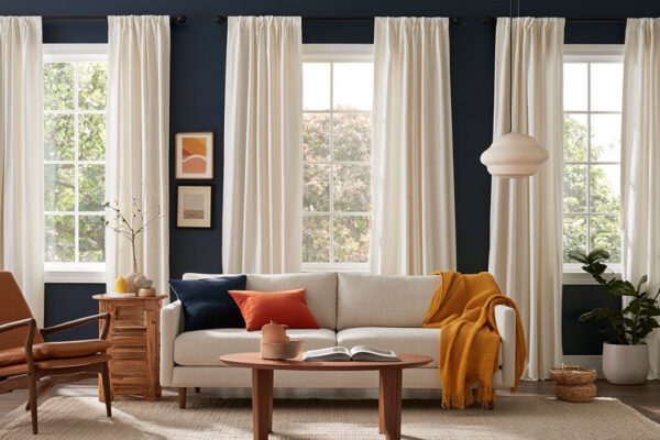
Most curtain advice for brown furniture comes down to one check: does the brown lean warm or cool? If the wood or leather runs warm, cream or olive works, and rust if you want more heat. If it runs cool, look at slate blue, taupe, light grey or dusty blue. That covers what color curtains go with brown furniture in most rooms.
Light matters nearly as much as the furniture. Sherwin-Williams’ room orientation guide says north-facing rooms receive cool light and south-facing rooms warm light, so the same panel can look quite different from one room to the next.
For curtain picks that start from the wall color instead of the furniture, see our curtain color guide.
Which curtain colors go best with brown furniture?

Cream, beige, sage green, navy, grey and terracotta are the safe bets. Tonal brown or khaki makes sense in a quiet room.
Light neutrals soften the brown. Greens and blues cool it down, while rust or mustard push the warmth the other way.
Cream, white and beige

Light neutrals are the default for a reason. They lift dark wood and let the grain show.
Hunker’s designer roundup says dark brown and wood tones look modern against crisp white or beige, while warm browns sit well with cream and light beige.
A pale curtain brightens a dim room and keeps attention on the furniture. Cream suits warm browns, and a cooler white suits grey-leaning ones. Pure white beside espresso can look stark though, so I’d lean toward ivory.
Sage green and olive

Muted greens share an earthy base with brown, so the pairing stays calm.
Sage is also easy to pair with other earthy shades, which makes pillows and rugs simple to match.
It adds color without much noise and suits warm browns and golden oak. Dark olive is the one to watch, because it makes a small room feel heavy.
Navy, teal and soft blue

Brown is a darkened orange, and blue sits opposite orange on the color wheel. That makes blue the complementary pick.
Brentano Fabrics lists slate blue and deep teal as the cool contrasts that freshen up brown furniture.
Pillows and a rug can pick up the navy, and a guide to shades that work alongside navy blue covers the rest of the palette.
Blue gives the strongest contrast against warm brown. Red-toned mahogany is the exception, since blue, violet and aqua fight it, according to Homelane’s wood color guide.
Light grey and charcoal

Grey cools warm wood without competing with it.
Amy Storm & Company paired cool grey curtains with light greige walls and a caramel leather sofa in a home office with abundant natural light, as shown in Hunker’s roundup.
| Works because | Watch for |
|---|---|
| Cool grey calms warm wood and suits modern rooms | A blue-based grey can look cold beside orange-toned wood |
| Charcoal anchors a bright room | Charcoal in a small, dim room pulls the walls closer |
Terracotta, rust and mustard

Warm accents turn the brown up instead of cooling it.
Rust and gold are the earthy tones designers pair with warm browns, and terracotta, mustard and burnt orange belong to the same family.
You get a layered, autumn-leaning room out of it, but warm on warm gets heavy fast, so keep the walls and rug light.
Tonal browns and khaki

Beige or tan curtains give brown furniture a monochrome look. Chocolate and espresso panels push the same idea darker and more dramatic.
This works best when the walls are white or cream and you want one calm block of color. Skip it if the room is already dark, or if the curtain matches the sofa shade exactly.
How do the undertone and shade of the brown change the best curtain color?

The undertone decides whether a curtain matches the furniture, and the depth of the brown decides how much contrast you get. You can share the furniture’s undertone or contrast with it on purpose, but pick one.
Mahogany, cherry, chestnut, golden oak and caramel leather all lean warm. On the cool side you get ash, driftwood, taupe upholstery and espresso that leans grey.
Brentano Fabrics recommends matching curtain undertones to the furniture’s, warm or cool, so the pieces read as one scheme.
| Shade | Warm-leaning brown | Cool-leaning brown | For contrast |
|---|---|---|---|
| Dark (espresso, mahogany) | Cream, ivory | Light grey | Crisp white |
| Medium (walnut, chestnut) | Olive, rust | Slate blue, taupe | Navy, deep teal |
| Light (oak, tan) | Cream, soft green | Dusty blue | Charcoal, navy |
Read across for the undertone, down for the shade.
Walnut is the one wood name that does not settle the question. Retail guides call it warm and golden, reddish, or cool and grey-purple, so test a swatch against the piece before relying on the colors usually paired with walnut.
Mahogany leans deep red with a warm patina, which makes it the most one-directional of the dark woods. Stay with creams and warm neutrals, and read what goes with mahogany wood before adding any blue.
Dark doesn’t always mean warm, either. In October 2025, Benjamin Moore named Silhouette AF-655, an espresso brown with charcoal undertones, its 2026 Color of the Year.
A grey-leaning espresso sofa wants cooler curtains than a red mahogany one, such as light grey or soft taupe.
A quick way to check is to hold a fabric swatch against the wood grain in daylight. If both read as the same temperature, the match works.
Should curtains match, blend or contrast with brown furniture?
Tonal curtains blend into the furniture and neutral ones step aside for it. Complementary colors do the opposite and set themselves against the wood. Which one you pick depends on whether the room needs to calm down or wake up.
- Beige, tan or brown curtains keep things tonal. That suits a quiet, low-contrast room, ideally with light walls.
- Cream, white and grey are the neutral route, and the furniture stays the focal point.
- Rust, gold and olive are analogous, earthy neighbors of brown that deepen the warmth.
- Navy, teal and soft blue are complementary and give clear separation between curtain and wood.
Brown is a darkened orange, which puts blue directly opposite it on the color wheel. That is the logic behind navy and teal, and it follows the basics of color theory for interiors.
Contrast also depends on value, not only hue. A pale curtain against dark wood separates the two even inside one color family, and how contrast works across a room applies to fabric the same way it applies to paint.
Proportion helps too. Under the 60-30-10 split, walls and large furniture take 60 percent, curtains and the rug share the 30, and pillows and art take the 10.
If the room is already busy, go tonal. If the furniture is the star, go neutral, and if the whole thing feels flat, bring in a complementary color.
How does wall color change the curtain choice?
With a strong wall color, the wall usually picks the curtain before the furniture does. A neutral wall hands that call back to the furniture.
A cool grey wall behind warm brown furniture leaves the curtain to bridge the gap. Navy and deep teal echo the wall, and so does charcoal. Rust, mustard or terracotta echo the wood.
Check the grey’s own undertone too, since a warm greige wants a curtain with a hint of warmth. A wider look at curtain colors for grey walls helps once you know it.
Green walls with brown furniture usually take beige, white, mustard or tonal brown curtains, because the green and brown already carry the color. Dark or minty greens pair differently, so see the notes on curtains for green walls.
Warm neutrals are the other common wall. Sherwin-Williams named Universal Khaki SW 6150, a warm tan, its 2026 Color of the Year.
On beige or greige walls, tonal curtains work, though an exact match flattens the room. White walls leave the curtain to carry the contrast, so deeper tones read clearly.
Brentano Fabrics warns against matching curtain and wall colors exactly, since it can look flat. Move a shade or two lighter or darker.
How do natural light and room size affect curtain color?

A north-facing window cools and dims whatever hangs in front of it, while a south-facing one warms it. Small rooms do better with lighter or warmer panels. Check which way the window faces before you settle on a shade.
| Window faces | Light quality | Curtain move |
|---|---|---|
| North | Indirect and cool, with the least light all day | Favor warm undertones such as cream or warm taupe |
| South | Warm, strong at midday | Mid-tones and cooler colors hold up |
| East | Bright and warm early, cool by late afternoon | Pick colors that read well in both |
| West | Gentle and cool in the morning, golden in the afternoon | Warm neutrals glow late in the day |
Sherwin-Williams adds that south-facing rooms get consistently warm light, so most colors work there. Benjamin Moore’s UK guide describes north light as indirect and cool.
The sources split on north-facing rooms. Sherwin-Williams steers toward lighter colors that reflect more light, while Farrow & Ball says to lean into the cool light with deep shades such as Railings or Down Pipe.
Both guides are written for paint, but the logic carries over to fabric. Beside dark brown furniture that already supplies the depth, the lighter route is the safer one.
Evening bulbs shift the color again. ENERGY STAR (2020) ties a lower Kelvin rating to warmer, yellower light and a higher rating to cooler, bluer light.
That is a large part of how light works in interior design. The same panel reads one way at noon and another at 8 pm.
Small rooms follow a simpler rule. A pale warm panel such as cream or soft beige bounces light back, while deep navy or teal suits a larger room.
The wall side of the same problem is covered in colors that suit small rooms.
How do fabric, opacity and pattern change the way the color reads?
A solid velvet and a sheer linen in the same cream are two different curtains. Fabric changes how deep a color looks and opacity changes how much of it shows. Pattern then decides how busy the result feels beside brown furniture.
Fabric and opacity

Velvet absorbs light because of the pile, so the color looks deeper and shifts with the viewing angle. Linen is lighter and softer, and unlined linen filters light instead of blocking it.
Sheer fabric diffuses harsh sun and lets most of the window show through. Lined or blackout panels read as a solid, saturated block of color and keep the room dark at night.
Velvet has one trap. Brush with the pile and the color looks lighter and shinier, while against it the same shade turns deeper and richer.
Linwood Fabric warns that panels cut with the pile in opposite directions can hang side by side as two different shades. Ask for the pile to run downward on every panel.
Layering solves the day and night problem. Hunker’s roundup suggests a sheer for daytime light and an opaque or blackout panel for privacy and sleep.
Velvet also pairs well with a rough linen rug, a contrast covered in how texture shapes a room.
Pattern

Solid is the safe default.
Solid panels keep a room with a lot of brown calm. Stripes and small repeats add some rhythm without competing, and bold geometrics work when everything else stays plain.
Kasey Hodgson of Roost Interiors tells the brave to try bold, rich-colored geometrics. In a mostly tonal brown and cream room, a bold dark khaki and cream graphic print adds a pop of pattern even when the panels are open (Hunker).
Scale matters more than the motif. A large repeat suits a wide window, and how pattern works across a room covers mixing it with a patterned rug or pillows.
How to test a curtain color before you buy
Pin two or three fabric swatches next to the furniture and watch them for a day or two, from morning light to evening. A paint chip is no substitute for the fabric itself.
- Order swatches of the actual fabric in your two or three finalists.
- Pin each one at window height, next to the furniture. Existing curtains behind a swatch skew how it reads, so cover or remove them first.
- Check each one in morning light, at midday, and after dark with your real lamps on.
- Leave the swatches up for a day or two so the color settles into your daily light.
- Drop any swatch that looks flat or shifts toward an undertone you did not expect.
Quadrille Fabrics notes that warm artificial light flatters cream, beige and gold, while cooler light pushes blues and greys forward.
Dunelm adds that darker shades and bolder patterns can look quite different once they hang at the window. Judge those at full drop, not as a small square.
Once one swatch wins, run the numbers in a calculator for panel width and drop before you order.
When do these curtain pairings fail?
Most failures come from clashing undertones or from light that misreads the color. There is also the case where brown isn’t the dominant color in the room at all. Each one has a fix.
- A cool curtain beside warm-leaning brown (or the reverse) reads accidental. Move back to a curtain that shares the furniture’s undertone.
- Grey or slate blue in a north-facing room turns duller, since Benjamin Moore’s UK guide says grey, blue and lavender undertones go that way in cool north light. A warm neutral layer helps.
- Warm accents in a south-facing room can come out bolder than expected. Sherwin-Williams warns that a very warm color turns bolder in warm light, so pick a deeper, less saturated rust or mustard.
- Rust, mustard and teal all at once compete with the wood. Hold the palette to one accent beside the furniture.
- Madura points out that a light linen panel and a heavy velvet panel fall differently on one rod, so keep every panel in the same weight.
The pairing also stops applying when brown is a small part of the room. If the walls, floor or a large rug set the palette, the curtains follow them instead.
Walls not painted yet? Settle them first, since the curtain follows the wall. Browse which wall colors suit brown furniture before you commit to fabric.
No curtain color rescues a mismatched undertone. Fix the undertone first.
Curtain Colors for Brown Furniture FAQ
Do brown leather sofas need different curtain colors than brown wood furniture?
The color rules stay the same, so judge the leather’s undertone and depth exactly as you would wood. Leather adds sheen, which is why a matte fabric such as linen or velvet balances it better than glossy satin.
Should bedroom curtains for brown furniture be a different color from living room curtains?
Not by color. A bedroom set in brown follows the same undertone and shade logic.
What changes is function. Sleep calls for a lined or blackout panel, so test the swatch with the lining behind it.
Do curtains have to match the rug and throw pillows?
No. Sharing one color or undertone with them ties the room together without turning it into a matched set.
Rugs are easier to choose once the curtain is set, and rug colors that suit brown furniture are a good place to start.
The smaller accents follow the same logic, as in these pillow ideas for a dark brown couch.
Which curtain rod finish goes with brown furniture?
Match the finish to metals already in the room, such as lamp bases or cabinet pulls. Bronze and brass suit warm-leaning brown, while black and brushed nickel suit cool-leaning brown.
Curtain Colors That Outlast a Repaint or a New Sofa
The safest curtain colors for brown furniture are warm neutrals such as cream, ivory and soft taupe. They sit beside most wall colors and most replacement pieces.
Benjamin Moore and Sherwin-Williams both named brown-family colors for 2026, Silhouette and Universal Khaki. Sherwin-Williams has since named Celery, a soft yellow-green, its 2027 Color of the Year (September 2026), and Benjamin Moore had not yet announced its 2027 pick at the time of writing. A warm neutral curtain still sits comfortably beside brown furniture whichever way wall colors move.
The limit is undertone. Cream turns yellow beside a cool grey sofa, so a cool-leaning replacement calls for a cool white or light grey panel.
The other cost is contrast, since neutral panels give up the separation that navy or terracotta delivers.
If the budget is tight, spend on lined neutral panels in a good fabric first. Accent color can live in pillows and throws, and any repaint is a reason to run a fresh swatch test.
The repaint itself is easier once the paint colors that suit brown furniture are narrowed down.
More Curtain Color Guides
- What color curtains go with beige walls
- What color curtains go with white walls
- What color curtains go with a gray couch
- What color curtains go with yellow walls
- All curtain colors by wall color

- Kitchen Color Schemes by Cabinet Color: What Pairs Well - October 19, 2026
- Curtain Colors for Every Wall Color: Safe vs Bold Picks - October 18, 2026
- Interior Design Styles: Find Your Primary and Secondary - October 14, 2026