

Color sets the mood of a room before a single piece of furniture is in place.
A rustic color palette draws from wood, earth, stone, and aged metal to build spaces that feel grounded and warm. These are not trend-driven choices. Terracotta, sage, walnut brown, and linen have appeared in human interiors for centuries because they work.
This guide covers everything you need to apply the palette with confidence: which colors belong in it, how lighting shifts them, which materials carry them best, and where the most common mistakes happen.
You will also find specific paint recommendations from Benjamin Moore, Sherwin-Williams, and Farrow and Ball, plus guidance on using rustic tones in brand and graphic design.
What Is a Rustic Color Palette?

A rustic color palette is a curated set of warm, muted, nature-derived tones drawn from wood, earth, stone, and aged metals. Every color in the group shares 2 qualities: a warm undertone and reduced saturation, which together create the visual weight and grounded feeling the style is known for.
It is not a single color or a mood board trend. It is a tonal system built around materials that exist in the natural world, raw lumber, unglazed clay, dried botanicals, and weathered iron.
The palette sits within the broader context of rustic interior design, where color and material work together rather than separately. A terracotta wall reads differently against reclaimed oak than against painted drywall. That relationship between surface and hue is what defines rustic color as a system, not just a selection of shades.
Key difference from other warm palettes: Rustic tones stay within a narrow warm-muted band. If the palette includes cool gray, saturated teal, or high-contrast black-and-white, it has moved into farmhouse or contemporary territory.
46% of interior design experts identified earthy tones as the most popular color palette for home interiors in 2024, with 41% naming warm neutrals as a close second (Fixr, 2024). That shift away from cool grays toward organic, nature-sourced color is exactly what the rustic palette has always been built around.
What Colors Make Up a Rustic Color Palette?
The rustic palette covers 5 tonal families. Each group stays within a warm, low-saturation range. No cool undertones, no high-chroma colors.
Sherwin-Williams named Redend Point SW 9081, a muted terracotta spin, as their 2023 Color of the Year. Benjamin Moore included terracotta tones in both their 2023 and 2024 color trend forecasts. Dunn-Edwards followed with Caramelized, an earthy terracotta-brown, as their 2025 Color of the Year. That is 3 consecutive years of major paint brands anchoring their forecasts in the rustic tonal range.
The table below maps each color family to its representative tones, hex ranges, and Light Reflectance Value (LRV) bands:
| Color Family | Representative Tones | Typical LRV Range |
|---|---|---|
| Warm Browns | Chestnut, walnut, raw umber | 10–35 |
| Terracotta & Earthy Oranges | Burnt sienna, adobe, clay | 25–45 |
| Muted Greens | Sage, moss, olive | 20–40 |
| Rustic Neutrals | Linen, warm white, aged parchment | 55–80 |
| Dark Accents | Charcoal, slate, wrought iron black | 4–15 |
Warm Browns and Wood Tones
Core tones: chestnut (#954535), walnut (#773F1A), raw umber (#826644).
These are the structural anchor of the rustic palette. They appear in flooring, exposed beams, and furniture before a single drop of paint is applied. When selecting wall colors, warm browns in this range act as the fixed reference point everything else is measured against.
Paint equivalents worth knowing:
- Benjamin Moore Maplewood 2162-30
- Sherwin-Williams Antique Bronze SW 2838
- Farrow and Ball Dead Salmon No. 28 (reads as a warm brown-pink in low light)
Terracotta and Earthy Oranges

50% of construction and design experts surveyed by West Fraser in 2023 named terracotta as the top color pick for that year, ahead of clay, creamy white, and deep pewter green. That level of consensus across a professional survey is uncommon.
Terracotta in the rustic context means the deep brown-red end of the spectrum, not the fiery orange end. Tones like burnt sienna (#E97451), adobe (#C2714F), and clay (#B66A50) read as grounded rather than loud. They work because they share undertones with wood and soil, which are the 2 most common raw materials in rustic interiors.
Muted Greens

Sage, moss, and olive are the 3 greens that belong inside a rustic palette. They all share one trait: the addition of gray or brown to the base green, which pulls saturation down and keeps them visually compatible with warm earth tones.
Sage (#BCB88A): The lightest and most versatile, reads almost neutral in low light.
Moss (#8A9A5B): Sits between sage and olive, works well on cabinetry and accent walls.
Olive (#6B6914): The deepest of the 3. Best used as an accent rather than a dominant wall color in rooms with limited natural light.
Rustic Neutrals
Linen, warm white, and aged parchment are the palette’s breathing room. They carry LRV values between 55 and 80, making them the tones that keep darker earthy colors from overwhelming a space.
48% of design experts identified warm white as the single most popular interior paint color for 2024, followed by deep olive green at 32% (Fixr, 2024). That pairing of warm white with an earthy green anchor is one of the most common starting points for a rustic color scheme.
Dark Accent Tones

Function: Charcoal, slate, and wrought iron black create contrast and visual stopping points in a rustic palette. Without them, an all-warm scheme can read as flat or muddy.
These tones appear most naturally in hardware, light fixtures, window frames, and fireplace surrounds. Applied as wall color, they belong in smaller rooms or as a single accent wall. A rustic interior with exposed black iron or dark walnut already carries these tones through its materials, so additional dark paint is often unnecessary.
What Are the Best Rustic Color Combinations?

3 pairings appear consistently across professionally designed rustic spaces. Each follows the same underlying rule: one dominant earth tone, one muted green or neutral mid-tone, and one light anchor color.
The 60-30-10 distribution applies directly here. 60% of the room in the lightest tone (linen, warm white, or cream), 30% in a mid-range earthy tone (terracotta, walnut brown, or sage), and 10% in a dark accent (charcoal, wrought iron). Rooms that violate this ratio tend to feel either too heavy or too washed out.
| Combination | Best For | Character |
|---|---|---|
| Terracotta + sage + cream | Living rooms, dining rooms | Warm, classic, most forgiving |
| Walnut brown + warm white + slate | Bedrooms, home offices | Higher contrast, grounded |
| Burnt sienna + olive + linen | Kitchens, transitional spaces | Low contrast, layered |
The terracotta and sage combination is the most reliable starting point. Both tones appear frequently in nature together (clay soil beneath green foliage), which is part of why the pairing feels instinctively right rather than constructed.
Pottery Barn has built a significant portion of its product catalog around exactly this earthy color combination, routinely pairing burnt sienna and sage textiles against warm linen upholstery across their rustic and organic home collections.
How Does Lighting Affect Rustic Colors?

Rustic tones are among the most lighting-sensitive colors in any palette. Their warm undertones shift visibly under different light sources, sometimes dramatically.
Veranda Magazine noted in 2024 that the rise of cool LED lighting is one reason warm, earthy tones are gaining ground in residential interiors. Homeowners are using warmer wall colors to compensate for the cooler color temperature of standard LED bulbs. That is a practical color-correction strategy, not just an aesthetic preference.
Warm vs. Cool Light Sources
Warm LED (2700K-3000K): Intensifies terracotta and brown tones significantly. A clay-colored wall under 2700K light reads richer and deeper than its chip suggests. Good for living rooms and bedrooms where warmth is the goal.
Cool daylight (5000K+): Grays out terracotta and clay tones, shifting them toward dusty pink or flat orange. Olive and sage hold better under cooler light than warm browns do.
Natural north-facing light: The cooler of the natural light directions. Deep browns absorb too much in north-facing rooms without warm artificial light to compensate.
Natural south-facing light: Sage and olive read most accurately in south-facing rooms, where the warm daylight brings out their yellow-green undertones rather than flattening them.
How to Test Paint Samples Correctly
View samples at a minimum of 3 times of day: morning, midday, and evening with artificial light on. Rustic colors shift more than most palettes across this cycle.
Apply samples in a 12-inch square minimum. The standard 2-inch chip understates how much a warm brown or terracotta tone will read on a full wall. Most people choose colors that are lighter than their sample suggests they will be, which in the rustic palette means ending up with colors that read as neutral rather than earthy.
Checking the LRV value before purchasing helps predict behavior. Rustic tones typically fall between LRV 20 and 60. Below 20, the room risks feeling dark without strong natural or warm artificial light compensation.
Where Is a Rustic Color Palette Used in Interior Design?
The rustic palette translates across every room type, but it behaves differently depending on room size, ceiling height, and primary function. Understanding where each tone performs best prevents the most common application mistakes.
71% of design professionals said natural materials are dominating furniture trends in 2024 (Fixr, 2024). That material shift drives color selection directly: reclaimed wood, terracotta tile, and linen upholstery all carry the palette’s tones without a single coat of paint.
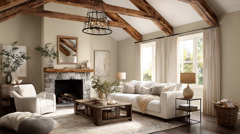
Rustic Color in Living Rooms

Living rooms are where the full rustic palette gets assembled. Walls in warm white or linen create the 60% neutral base. Terracotta or walnut brown appears in a single upholstered piece or area rug. Sage comes through textiles: throw pillows, a woven blanket, or curtain panels.
The most common mistake in rustic living rooms is applying terracotta to all 4 walls. The color intensifies dramatically at scale and under typical warm interior lighting. A terracotta accent wall against 3 linen walls reads as intentional. Four terracotta walls in a standard living room reads as overwhelming.
For a deeper look at how the rustic palette integrates with complete room layouts, rustic living room ideas covers furniture placement, textile layering, and material choices in detail.
Rustic Color in Kitchens
Kitchens carry rustic color through 4 surfaces: cabinetry, tile, walls, and hardware.
- Cabinetry: Warm wood tones (walnut, chestnut, honey oak) or painted sage and warm white
- Tile: Unglazed terracotta floor tile or a brick backsplash in earthy red-brown
- Walls: Linen or aged cream, which recede behind the more active surfaces
- Hardware: Aged bronze, brushed copper, or wrought iron black for the dark accent role
The rustic kitchen design approach leans on material contrast rather than color contrast. Rough texture against smooth, dark wood against light stone, warm metal against matte paint. Color reinforces those material differences rather than creating its own visual hierarchy.
Rustic Color in Bedrooms

Muted sage walls, walnut furniture, and cream bedding is the default rustic bedroom combination for good reason. It is the softest expression of the palette, and bedrooms benefit from low visual stimulation.
Research published in the European Journal of Theoretical and Applied Sciences (referenced in RMCAD, 2025) links color schemes in residential spaces to measurable effects on physical and emotional well-being. Muted earth tones in the rustic range, particularly sage and warm neutrals, sit in the low-stimulation zone that supports rest environments.
The rustic bedroom decor approach typically keeps wall color lighter (sage or linen) and brings darker wood tones in through furniture and flooring, rather than applying deep browns at wall scale.
What Materials Carry Rustic Colors Best?
Color in a rustic interior is rarely limited to paint. The palette’s tones exist first in raw materials, and those materials set the reference point for every color decision that follows.
The sustainable home decor market reached USD 4.5 billion in 2024 and is projected to reach USD 9.4 billion by 2034 at a 7.9% annual growth rate (Insight Ace Analytic, 2024). Reclaimed wood furniture holds the largest segment of that market. The materials that define rustic color are the same ones driving the sustainable interiors movement.
Raw and Reclaimed Wood
Primary tonal contribution: warm brown spectrum, from honey to deep walnut.
Reclaimed wood carries color variation that new timber cannot replicate. Nail holes, weathering, and aged grain shift the surface tone across a single plank. That natural inconsistency is part of what gives rustic interiors their visual depth. It also means reclaimed wood reads differently in every lighting condition, which is characteristic of the entire palette.
Reclaimed wood sourced from decommissioned barns, factory floors, or old-growth timber carries tones between LRV 15 and 40 depending on species and finish, covering the mid-dark brown range of the rustic palette.
Terracotta and Clay Tiles
Unglazed terracotta tile is one of the only building materials where the color is the material. The burnt sienna and adobe tones come from the clay itself, fired at high temperature.
Terracotta translates literally from Italian as “baked earth.” Its use in flooring and roofing spans thousands of years, from Chinese pottery (10,000 BCE) to Greek tile work (7,000 BCE) to the iconic rooftops of Siena and coastal Portugal (Crossville Studios, 2023). That historical continuity is part of why terracotta reads as organic and grounded rather than trendy.
Glazed terracotta tiles shift out of the rustic palette. The gloss finish introduces a surface quality that reads as contemporary or Mediterranean rather than rustic. The matte, unglazed surface is the one that belongs here. For more on terracotta as a surface material, terracotta tiles covers installation, maintenance, and finish options in detail.
Linen, Burlap, and Natural Textiles
Linen in its undyed state sits at approximately LRV 65–72, placing it squarely in the rustic neutral range. Burlap runs darker, between LRV 30 and 45. Together they cover the light-to-mid neutral band that anchors the palette.
These textiles matter because they carry warmth even in their natural state. Undyed linen has a yellow-cream undertone, not a cool white one. That undertone prevents it from visually conflicting with the terracotta and brown tones in the same room. Texture in interior design has a direct relationship with color perception: rough-woven linen reads darker and warmer than smooth cotton at the same LRV value.
Matte and Flat Paint Finishes
Finish matters as much as color selection in a rustic palette. High-gloss paint on terracotta or walnut brown breaks the organic character the palette depends on.
- Flat/matte: Best for rustic wall colors, absorbs light rather than reflecting it
- Eggshell: Works for trim and cabinetry, minimal sheen acceptable in rustic contexts
- Satin or semi-gloss: Moves the space out of rustic territory toward contemporary or farmhouse
Aged Metal Accents
Aged bronze, brushed copper, and wrought iron carry the dark accent role in the rustic palette through hardware and lighting rather than paint. These metals provide the 10% dark contrast the 60-30-10 rule calls for, without requiring a dedicated dark wall color.
Copper in particular bridges the terracotta and dark accent families. Its warm orange-brown surface tone sits between burnt sienna and walnut, making it compatible with both ends of the palette simultaneously. Rustic lighting fixtures in aged bronze or wrought iron are one of the most efficient ways to introduce dark accent tone without paint.
How Does a Rustic Palette Differ from Farmhouse and Boho Palettes?
These 3 styles share natural materials and wood tones, which is why they get confused. The difference is not subtle once you know where to look. It is primarily a question of color temperature, saturation level, and tonal range.
| Feature | Rustic | Farmhouse | Boho |
|---|---|---|---|
| White base tone | Warm white, linen, cream | Cooler white, near-white | Off-white, layered |
| Color temperature | Consistently warm | Warm-cool mix | Warm with vivid pops |
| Saturation | Low, muted throughout | Low to medium | Medium to high |
| Accent colors | Charcoal, slate, dark wood | Black, navy, gray-blue | Jewel tones, global hues |
Rustic vs. Farmhouse
The farmhouse palette introduces cool-toned elements that the rustic palette excludes. Gray-blue, crisp bright white, and black hardware are farmhouse staples. In a rustic palette, those same tones read as jarring because they break the warm-undertone consistency the system depends on.
The farmhouse interior design style evolved from a cleaner, more graphic aesthetic than rustic. It uses shiplap, white painted wood, and black hardware as signature elements. All 3 pull the color temperature cooler than the rustic palette allows.
Practical test: If the white in your palette has a cool or neutral undertone (think Benjamin Moore Chantilly Lace or Sherwin-Williams Extra White), you are working in farmhouse territory. If the white is warm and slightly creamy (Benjamin Moore White Dove, Sherwin-Williams Antique White), you are in rustic range.
Rustic vs. Bohemian
Bohemian design starts with a similar earthy base but expands outward into higher saturation and global pattern influences. A boho palette includes burnt orange, deep teal, saffron yellow, and burgundy alongside the earthy base tones. Rustic stays within a much narrower tonal range.
The key distinction is saturation control. Bohemian interior design uses color expressively, sometimes vibrantly. Rustic uses color restrainedly, always prioritizing the organic and muted over the bold and saturated. If any color in the palette draws immediate eye attention for its vibrancy rather than its warmth, the palette has moved into boho territory.
Shared elements (natural wood, rattan, linen textiles, terracotta) are where the 2 styles overlap. The divergence happens at the point where boho adds pattern density and saturated color, and rustic stays with plain surfaces and low contrast.
What Paint Brands and Colors Match a Rustic Palette?
Benjamin Moore, Sherwin-Williams, and Farrow and Ball cover the rustic palette across all 5 tonal families. Each brand approaches color differently. Benjamin Moore tends toward dirtied, complex undertones. Sherwin-Williams runs slightly more saturated. Farrow and Ball keeps its palette tight at around 130 to 140 curated colors, making it easier to stay within the rustic range without drifting.
Farrow and Ball introduced Naperon in 2025, described as a faded, time-worn terracotta hue, and Marmelo, a mellow burnt orange named after the marmelo quince. Both land squarely in the rustic tonal range and show the brand’s continued investment in the earthy-warm spectrum (Sarah Karon, 2025).
| Brand | Rustic Color | Tonal Family | LRV |
|---|---|---|---|
| Benjamin Moore | Pottery Clay 2092-30 | Terracotta | ~28 |
| Benjamin Moore | Stone Hearth OC-11 | Rustic neutral | ~68 |
| Sherwin-Williams | Antique White SW 6119 | Warm neutral | ~72 |
| Sherwin-Williams | Oakmoss SW 6180 | Muted green | ~21 |
| Farrow and Ball | Dead Salmon No. 28 | Warm brown-pink | ~38 |
| Farrow and Ball | Elephant’s Breath No. 229 | Warm greige | ~55 |
Using LRV to Build a Balanced Palette
LRV (Light Reflectance Value) runs from 0 (pure black) to 100 (pure white). A balanced rustic palette needs at least 1 color above LRV 60 to prevent the room from reading as heavy.
The typical rustic wall color sits between LRV 25 and 45. Pair it with trim or ceiling in a warm white above LRV 70, and the mid-tone reads as rich rather than dark.
Both Benjamin Moore’s Color Portfolio app and Sherwin-Williams’ ColorSnap tool show LRV values for every color in their systems. Checking these before finalizing a palette avoids the most common mistake: choosing 3 mid-range earth tones that all absorb light at the same rate.
Cross-Brand Color Matching
Farrow and Ball colors can be matched by Sherwin-Williams or Benjamin Moore at a local store. Most major formulas are in their systems. The match is close but not exact, since Farrow and Ball uses a mineral-based pigment mix that other brands’ standard acrylic bases cannot fully replicate (The Grit and Polish, 2025).
The workaround is sampling. Order a Farrow and Ball color card, bring it to a Sherwin-Williams counter, and request a color scan. Then sample both side by side on the actual wall before committing to a full gallon.
How Do You Build a Rustic Color Palette for a Full Room?

Start with what you cannot change. The fixed material in the room, whether that is a hardwood floor, a stone fireplace, exposed brick, or existing wood beams, is the palette anchor. Every color decision follows from that reference point, not from a paint chip chosen in isolation.
82% of staging experts recommend warm neutrals for interiors when preparing a home for sale, with warm white holding the top spot (Fixr, 2023). That consensus exists because a warm neutral base is the most versatile starting point for any room, rustic or otherwise.
Step 1: Anchor to the Fixed Material
Pull the undertone from the fixed material first.
- Honey oak floor: palette shifts toward amber, terracotta, and warm cream
- Dark walnut floor: palette shifts toward deep brown, sage, and linen
- Stone fireplace: palette shifts toward warm gray, slate, and moss
- Exposed red brick: palette shifts toward burnt sienna, cream, and olive
The floor or the dominant fixed surface is usually the darkest element in the room. Everything above it should be lighter, which is why LRV matters so much at the wall-selection stage.
Step 2: Apply the 60-30-10 Distribution
60% dominant: warm white, linen, or aged cream on walls and ceiling.
30% secondary: the earthy mid-tone (terracotta, sage, walnut brown) in upholstery, area rug, or cabinetry.
10% accent: charcoal, dark bronze, or wrought iron through hardware, light fixtures, or one decorative surface.
Rooms that reverse this ratio, applying terracotta or dark brown at 60%, consistently read as overwhelming. The rustic palette works because the neutral base gives the earthy tones space to read correctly.
Step 3: Limit Total Tones to 4
No more than 4 distinct tones per room. More than that creates visual noise that undercuts the grounded, organic quality the palette depends on.
That limit includes wood tones. A room with honey oak flooring, walnut furniture, terracotta walls, and sage curtains already has 4 tones. Adding a fifth, say, a charcoal accent wall, pushes it past the threshold. In that case, the charcoal shows up only in hardware and fixtures, not as a painted surface.
What Are Common Mistakes When Using a Rustic Color Palette?
Most rustic palette problems come down to 2 categories: over-darkening and undertone conflict. Both are fixable at the planning stage, but they are hard to correct after the paint is on the walls.
Over-Darkening the Space
Stacking warm browns without light neutral relief is the most frequent error. A walnut floor, dark wood furniture, terracotta walls, and rust-toned textiles create a room where every surface absorbs light at a similar rate.
The fix is straightforward. Introduce at least one surface above LRV 65, typically the ceiling or the largest wall, in a warm white or linen tone. That single change creates the contrast that lets the darker earth tones read correctly.
Mixing Warm and Cool Undertones
Gray-beige paint next to orange-brown wood is the most visible undertone conflict in rustic interiors. The gray undertone in popular “greige” colors like Agreeable Gray (Sherwin-Williams SW 7029) pulls cool in natural light, which conflicts directly with the warm undertones in wood and terracotta.
Quick test: hold the paint chip against the wood floor or furniture in natural light. If the paint reads cooler or grayer than the wood, the undertones are fighting. Swap to a tone with a yellow or pink undertone base instead.
Choosing the Wrong Finish
High-gloss or satin paint on rustic earth tones breaks the organic character the style depends on. Gloss reflects light in a way that reads as contemporary or manufactured rather than natural and aged.
Flat and matte finishes are correct for rustic wall colors. Eggshell works on trim. Everything above eggshell moves the room toward a different aesthetic. The paint finish choices in rustic spaces are as significant as the color selection itself.
Sampling Only on Paper
Choosing from a screen or a small chip produces the wrong result roughly half the time. Color rendering on monitors varies by screen calibration, and a 2-inch chip understates how an earth tone reads at full wall scale.
The correct process: apply a minimum 12-inch painted square directly on the wall, view it at morning light, midday light, and evening with interior lighting on. Rustic tones shift more across lighting conditions than most palettes do.
Treating Rustic as a Single Color
Rustic is not just brown. A room painted entirely in one earth tone without the full tonal system, neutrals, mid-tones, and accents, loses the layered depth that makes the palette work.
The palette is a system of relationships. Terracotta reads warm and grounded because of the cream walls beside it and the dark wood floor below it. Remove either of those, and the terracotta reads differently. That is why color in interior design is always relational, never absolute.
How Is a Rustic Color Palette Used in Graphic and Brand Design?
The rustic palette translates into brand identity for any product or company that wants to communicate craft, heritage, and natural origin. Food and beverage is the dominant category. The palette signals that a product is handmade, ingredient-forward, and rooted in a physical place.
Kraft paper packaging with earthy color overlays is one of the clearest expressions of the rustic palette in product design. VistaPrint’s 2026 packaging trend report identifies uncoated kraft stock specifically as the material choice for “a rustic feel,” used alongside muted palettes and serif or hand-drawn typography to signal artisanal quality (VistaPrint, 2025).
Food and Beverage Applications
The rustic color system works in food branding because it sets an implicit quality signal before the consumer reads a single word on the label. Warm browns and terracottas communicate wholesomeness and craft. Food Liability Insurance Program’s research confirms that brown in food branding directly signals “rustic wholesomeness” and is the primary color choice for coffee shops, chocolatiers, and artisan bakeries (FLIP, 2025).
Patagonia Provisions, the food arm of the outdoor brand, uses a muted warm palette of olive, cream, and terracotta across its product line. The color system reinforces the brand’s sourcing story without requiring text to explain it.
Typography and Color Pairing in Rustic Branding
Serif typefaces pair most naturally with the rustic palette because their structural detail mirrors the craft quality the colors signal.
Hand-lettered fonts work for smaller brands where the handcrafted character is the primary identity.
Sans-serif type in rustic branding creates a contrast that reads as modern-rustic rather than traditional rustic. That pairing belongs more to the farmhouse or contemporary-organic category.
Digital vs. Print Color Accuracy
Rustic tones shift between digital (RGB hex) and print (CMYK) rendering. The warm undertones in terracotta and walnut brown are particularly vulnerable to CMYK conversion, where the orange and yellow channels interact with the black channel in ways that can push the color cooler or muddier than the digital version.
The standard correction is to print a physical color proof before finalizing packaging or print materials. Relying on a screen rendering for final color approval on rustic-palette branding produces inconsistent results across print runs.
What Is the Psychology Behind Rustic Colors?
Rustic tones produce specific, measurable psychological responses. They are not just aesthetically warm. They activate the limbic system’s safety and belonging responses because they match the colors of the natural environments, soil, clay, wood, and dried vegetation, that humans have associated with shelter and home for thousands of years.
Research published in CogniFit (2025) states that earth tones mirror nature’s textures including clay, wood, and soil, and help regulate the limbic system, which processes emotion and memory. This is why rustic palettes appear consistently in hospitality environments designed for guest relaxation.
Warm Browns and Terracottas
Biophilic design research from AHF Contract (2024) confirms that earthy tones including warm browns and muted greens are used specifically in hospitality to create harmony and connection with the natural world, with documented effects on guest relaxation and well-being.
Terracotta and clay tones signal physiological safety. They are low-arousal colors, meaning they do not accelerate heart rate or elevate cortisol the way saturated warm colors (bright red, vivid orange) do. The muted, organic quality of the rustic palette keeps these tones in the grounding zone rather than the stimulating one.
Sage and Olive Greens
Muted greens activate what environmental psychologists call a biophilic response. The human visual system is calibrated to find green restful because of its association with safe, resource-rich environments.
The Color Institute’s 2025 color psychology research notes that earthy olive tones specifically “bring a sense of comfort” and that the calming effects of green in interior contexts are well-documented across environmental psychology studies.
Sage and olive belong in the rustic palette precisely because they are the desaturated, brown-shifted versions of green, which keeps them compatible with the warm earth tones rather than creating a visual conflict between cool and warm registers. For a deeper understanding of how these biophilic design principles work in interior spaces, the connection between natural color and human psychology is foundational.
Why Rustic Colors Work in Hospitality
Hotels, restaurants, and spas use the rustic palette for a practical reason: it reduces decision fatigue in guests.
High-stimulation color environments, those with high saturation or strong contrast, increase cognitive arousal. A guest checking into a hotel room or sitting in a restaurant already has elevated cognitive load from travel or social engagement. Warm, muted earth tones lower that load by providing a visually predictable, low-contrast environment.
Research on biophilic design in hotel lobbies published in the Journal of Hospitality and Tourism Management (2022) found that incorporating natural elements including biophilic color palettes improved guest delight and subjective well-being in measurable ways. Earthy tones in the rustic range are among the most studied expressions of biophilic color in commercial interiors.
The earthy color palette approach used across hospitality design is, in practical terms, an applied version of the same rustic tonal system used in residential interiors. The underlying psychology is identical. The warmth, low saturation, and organic origin of the tones create the same physiological response regardless of whether the space is a hotel lobby or a living room.
FAQ on Rustic Color Palette
What colors are in a rustic color palette?
A rustic palette includes warm browns, terracotta, burnt sienna, sage green, olive, and muted neutrals like linen and cream. Dark accents such as charcoal and wrought iron black round out the system. All tones stay warm and low-saturation.
What is the best wall color for a rustic interior?
Warm white or linen works best as the primary wall color. It provides a neutral base that lets wood tones and earthy accents read correctly. Benjamin Moore Antique White and Sherwin-Williams Antique White SW 6119 are reliable starting points.
Does terracotta work in every room?
Terracotta works in most rooms but behaves differently by size. In large living rooms, use it on one wall only. In smaller spaces like hallways or powder rooms, full terracotta coverage creates warmth without becoming overwhelming.
What colors go with a rustic color palette?
Sage green, cream, walnut brown, and olive pair most consistently with rustic tones. Charcoal and aged bronze work as accent colors. Avoid cool grays, bright whites, and high-saturation colors, which break the warm undertone consistency the palette depends on.
How is a rustic palette different from farmhouse colors?
Farmhouse palettes use cooler whites, gray-blue accents, and crisp black hardware. Rustic stays within a warm, muted range throughout. If your white has a cool undertone or your palette includes gray-blue, you are in farmhouse territory, not rustic.
What paint finish should I use for rustic colors?
Use flat or matte finish on rustic wall colors. Eggshell is acceptable for trim. Satin and semi-gloss reflect light in a way that conflicts with the organic, aged character of natural color schemes. Finish selection is as important as color choice.
Can a rustic color palette work in a modern home?
Yes. The combination of rustic tones with clean architectural lines is called modern rustic. Keep wall colors in the neutral-warm range, use reclaimed wood selectively, and limit pattern. The palette adapts well to contemporary spaces without losing its grounded quality.
What is the 60-30-10 rule in a rustic palette?
Apply 60% warm white or linen on walls and ceiling, 30% earthy mid-tone in upholstery or cabinetry, and 10% dark accent through hardware or fixtures. This distribution keeps the palette balanced. Reversing the ratio makes the room feel heavy and closed.
How many colors should a rustic palette have?
Limit the palette to 4 distinct tones per room, including wood tones. More than 4 creates visual noise that undercuts the calm, organic quality rustic interiors depend on. Count existing floor and furniture tones before adding wall or textile colors.
Is a rustic color palette good for branding?
Yes, particularly for food, beverage, and craft products. Warm browns, terracotta, and sage on kraft paper packaging signal artisanal quality and natural origin. The palette communicates heritage and craft before a consumer reads a single word on the label.
Conclusion
This conclusion is for an article presenting the rustic color palette as a complete tonal system, not a collection of loosely related earthy shades.
Getting it right starts with the fixed materials in the room. Walnut floors, unglazed terracotta tiles, and reclaimed wood set the reference point. Every paint choice, textile, and hardware decision follows from there.
The 60-30-10 distribution, a cap of 4 tones per room, and matte finishes throughout are the 3 rules that prevent the most common failures.
Whether you are working on a rustic living room, a kitchen with warm wood cabinetry, or a brand identity built around craft and natural origin, the underlying logic is the same. Keep the undertones warm, the saturation low, and the materials honest.

- What Color Furniture Goes with Light Wood Floors - June 22, 2026
- Paint Colors That Go with Stone Fireplace - June 18, 2026
- What Color Rug Goes with Dark Wood Floors - June 13, 2026


