Curtain Colors
What Color Curtains Go With Light Blue Walls
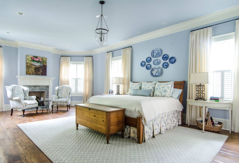
White, ivory, beige, light gray and navy are the curtain colors that hold up best on light blue walls. Soft yellow, pink and coral work as accents, as long as the wall stays pale and the curtain shade is toned down.
Undertone and window direction change the answer more than the word “blue” does. A gray-leaning blue, an aqua-leaning blue and a clean one each look different under north light and south light.
Brightness varies too. Three light blue and blue-green paints in Benjamin Moore’s catalog run from a light reflectance value (LRV) of 48.11 to 75.55 (Benjamin Moore, 2026), so one label covers walls of very different brightness. Curtain color follows that number and the undertone, not the name on the can.
Darker blues and other wall colors are covered in our curtain color guide for every wall.
Which Curtain Colors Work With Light Blue Walls?

Hunker’s designer roundup and Make My Blinds’ guide to blue walls land on nearly the same short list. Both include neutrals and a deeper blue, with orange and pink as the warm accents.
| Curtain color | Effect on the room | Works best in | Watch for |
|---|---|---|---|
| White or ivory | Bright, clean, open | Small or dim rooms | Blue-based white reads icy |
| Beige or taupe | Warm, settled | Living rooms with wood or leather | Flat if brightness matches the wall |
| Light gray | Quiet, modern | Contemporary rooms | Cold beside a gray-leaning blue |
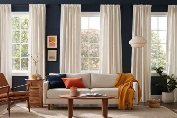
| Navy | Depth, weight | Large, well-lit rooms and bedrooms | Closes in a small room |
| Pale yellow or soft pink | Gentle warmth | Nurseries, kids’ rooms | Saturated shades overpower the wall |
| Orange or coral | Strong contrast | Living rooms, creative spaces | Overwhelms when overused |
Russell’s Curtains gives the rule behind the table. Go a few shades lighter or darker than the wall, and skip both extreme contrast and a matchy-matchy look.
Navy is the one choice that changes how big the room feels. Livingetc notes that darker curtain colors draw the eye and can make a room feel enclosed.
Walls in a mid-tone blue or navy play by different rules. The general guide to curtain colors for blue walls covers those.
Neutral Curtains: White, Ivory, Beige and Gray
Neutrals are the low-risk route on light blue, since they bring no second hue to compete with the wall. Warm ones balance the cool wall. Cool ones extend it.
White and ivory

Kendra Nash of Nash Design Group tells Livingetc that window treatments with lots of white and neutrals make a room look larger, especially against similarly light walls.
Light blue counts as one of those light tones, so the effect carries over.
White matches white trim and keeps the window looking clean. Ivory takes a little of the chill off the wall.
A blue-based white adds a second cold note, which is why a warmer ivory is the safer pick on a wall that already reads cool. I’d go with ivory nine times out of ten.
Beige and taupe

Make My Blinds calls beige (also called taupe) curtains a warm, inviting match for nearly every shade of blue.
Beige warms the room without pulling attention to the window. Taupe does the same with a slightly deeper tone. Make My Blinds also pairs cream curtains with a tanned leather sofa for added depth.
Stay at the lighter end of the range. A beige too close to the wall’s brightness looks flat.
Gray

Gray is the neutral most tied to the wall’s own undertone.
As of October 2026, Farrow & Ball’s product page describes Light Blue No. 22 as a silvery blue that turns more silver in shade. The page says it is popular on hallway walls when the rest of the house is painted in cooler, more neutral greys, and pairs it with a cool white such as Blackened in well-lit spaces.
Cool gray curtains extend the silvery calm of a gray-leaning wall. Greige adds warmth instead, as in the floor-to-ceiling drapes designer Heidi Caillier hung in a blue-walled dining room Hunker features.
Accent Curtain Colors That Add Contrast
Soft yellow, coral, peach, dusty pink and orange add contrast to light blue walls. Sage and teal add depth while staying on the cool side of the color wheel.
Blue and orange sit opposite each other on the color wheel, so warm accents read as contrast against a blue wall. Benjamin Moore’s guide to complementary colors lists that pair among its examples.
Sherwin-Williams adds the limit. Overusing complementary colors can create an overwhelming look, while analogous colors flow together for a more soothing result. The reasoning behind both comes from color theory as it applies to interiors.
Warm accents

- Make My Blinds suggests pale lemon yellow for a blue nursery
- It also pairs pale blue walls with dusty pink accents for a pastel look
- Livingetc says softer peach suits bedrooms
- Hunker shows floor-to-ceiling orange curtains in a room with light blue walls, and Livingetc says livelier tangerine and amber suit living rooms and creative workspaces
Russell’s Curtains shows why saturation matters with a yellow example. A bright yellow curtain is overpowering against royal blue walls, but can be beautiful against deep navy.
A wall as pale as light blue is closer to the royal blue case, so tone the accent down.
Cool accents

Make My Blinds lists green and teal curtains as strong accent colors for blue bedroom walls, and Hunker features a blue-gray and teal combination in a room by Jean Stoffer Design.
Greens and teals sit next to blue on the wheel, so they read as analogous.
The risk is that the curtain blurs into the wall. A sage panel at the same brightness as the paint just disappears. Go a few shades darker than the wall with sage, or pick teal, which carries more saturation.
Should Curtains Match Light Blue Walls or Contrast With Them?

Curtains should neither match light blue walls exactly nor clash with them. The workable range runs from a few shades off the wall color to a clear contrast in hue.
Russell’s Curtains states the tonal rule: go a few shades lighter or darker, which adds interest without extremes. Hunker’s roundup backs it for lighter blue walls, noting that navy curtains add depth.
Hunker also features a nursery by Chango & Co. with a light blue accent wall and light blue curtains. Matching works where the goal is softness rather than definition.
Blue curtains on blue walls feel calm and cohesive, and the wall stays the focus. Make My Blinds pairs thick navy curtains with blue bedrooms for a rich, luxurious look. The catch is that the window loses definition when curtain and wall share a brightness.
Neutral or accent-hue curtains turn the window into a defined feature, and warm hues balance the cool wall. Saturated accents can overpower a pale wall, though.
Navy is the monochromatic choice. Sage and teal count as analogous, and orange or coral as complementary.
A small, dim room takes tonal curtains best. A large, bright room can carry navy or a clear accent, which comes down to how contrast works in interior design.
To preview a pairing before ordering fabric, a color scheme generator for rooms lets you test the wall shade against curtain options.
How Does the Wall’s Undertone Change the Curtain Choice?
The undertone decides which curtain colors look planned and which look accidental. Gray-leaning blues take cool whites and grays. Aqua-leaning blues take off-whites, wood browns and orange. Clean cool blues will work with almost any warm neutral.
Sherwin-Williams defines the split on its Tinted blog (updated April 2023): warm undertones lean orange, yellow or red, and cool undertones lean blue, green or purple. Light blue sits on the cool side by definition, so the real question is which kind of cool it is.
| Wall undertone | Curtain colors that work | Curtain colors to avoid | Reason |
|---|---|---|---|
| Gray-leaning, silvery blue (Farrow & Ball Light Blue No. 22) | Cool white, cool light gray, greige for warmth | Cool mid-gray in a shaded room | The paint turns more silver in shade |
| Aqua or green-leaning blue (Benjamin Moore Palladian Blue HC-144) | Off-white, wood brown, persimmon orange | Sage or teal at the wall’s brightness | A second blue-green blurs into the wall |
| Clean, cool pale blue | White, ivory, beige, navy, soft pink | Bright saturated accents | The wall supplies no warmth, so neutrals must |
Never judge a chip alone, says Sue Wadden, Sherwin-Williams’ Director of Color Marketing. Hold it beside a pure example of the color or a color wheel, and look at the mid-to-darker chips on the same strip, where the undertone is easier to see.
Lighting changes how much of the undertone shows. Northern light emphasizes blue undertones, and southern light makes colors appear softer.
As of October 2026, Farrow & Ball’s own page offers both directions for Light Blue No. 22. It names Blackened as a cool white, and lists School House White as the complementary white, which the page describes as lacking the cool undertones of its contemporary neutrals.
Benjamin Moore’s page for Palladian Blue HC-144, which it calls a soft, airy blue-green, lists Elmira White, Persimmon, Willow Creek and Wood Grain Brown as coordinating colors. The orange and the brown in that list support warm curtain accents on aqua-leaning blues.
How North and South Light Shift Light Blue Walls and Curtain Colors
North light pushes light blue walls cooler and south light warms them, so cream and beige curtains offset a north-facing room while cooler curtains hold up in a south-facing one.
Direction changes the wall first and the curtain second, which is why the same pairing works in one room and fails in the next.
In a north-facing room, Farrow & Ball says (as of October 2026) that northern light brings out cooler tones, and it tells owners of lighter walls to avoid a blue or grey base. The same logic points curtains toward cream, ivory and beige.
South-facing rooms are easier. In fine weather, warm light fills the room from dawn to dusk, and Farrow & Ball calls these rooms among the easiest to decorate. Cooler curtains stay comfortable here.
East-facing rooms get bright morning sun that gives way to cooler, muted evening light. Farrow & Ball suggests light blues and greens for rooms used later in the day.
West light is cooler in the morning and brighter in the afternoon, so check curtain swatches at both ends of the day.
The wall also looks different at 8 a.m. and 6 p.m., and the basics of how light works in interior design explain why.
The sources agree that north light is cool. They split on what to do about it.
Benjamin Moore’s Canadian site lists cool blue-gray tones among the popular choices for north-facing rooms, while Farrow & Ball points lighter walls toward yellow-based shades there.
Farrow & Ball also offers the opposite route: lean into the cool light with a darker wall color for a cozy, cocooning feel. Offset the cool light and the room warms up. Embrace it and the room settles in. Pick the outcome first and the curtain color second.
As of October 2026, Benjamin Moore lists Light Blue 2066-70 at an LRV of 75.55, Palladian Blue HC-144 at 60.4, and Wythe Blue HC-143 at 48.11.
LRV runs from 0 (black) to 100 (white), and these three paints span 27.44 points of it.
The closer a curtain’s brightness sits to the wall’s, the less the window reads as a separate element. On a wall near LRV 75, white curtains sit close in brightness. On a wall near LRV 48, they stand apart.
How to Choose Curtain Fabric and Opacity for Each Room

Opacity decides the room fit. Bedrooms and nurseries want blackout or room-darkening panels, kitchens do better with light-filtering or semi-sheer fabric, and living rooms can take sheer or light-filtering panels.
Opacity is the first split among window treatments, and fabric weight is the second.
Bedrooms and nurseries

One night with 100 lux of room light, against 3 lux, raised heart rate during sleep and insulin resistance the next morning, according to a 2022 Northwestern Medicine study in PNAS.
Northwestern’s release advises closing the blinds and drawing the curtains before bed. That puts blackout or room-darkening lining ahead of color in a bedroom.
Blindster says blackout fabric blocks up to 99% of light, and light can still enter around the edges. Blinds.com notes that blinds cannot fit tight to the sides and leak light there, so panels should be wide enough to overlap the frame.
Blackout fabric is heavier, and per Tom’s Guide, morning light no longer wakes you. Room-darkening dims the room without taking it to total darkness.
Living rooms

Half Price Drapes says sheer fabric lets in the most daylight and works best layered over heavier panels. Livingetc recommends light linens with slight transparency for a breezy summer feel.
Room-darkening is the other option. Half Price Drapes suggests it for glare reduction in living rooms, and for dining rooms and home offices where screens need to stay visible.
Fabric supplies the texture that flat paint lacks. Russell’s Curtains says velvet in colors from gold to navy to chartreuse makes a strong statement against blue walls in the right room.
Bathrooms and kitchens
Washability beats color in these two rooms.
Half Price Drapes names kitchens and dining rooms as family spaces suited to sheer and semi-sheer fabrics, which keep daylight flowing. Sheer fabric offers little privacy, so add a liner or a second layer where that matters.
For a bathroom, choose a fabric that survives repeated washing.
The Brick notes that some room-darkening curtains are machine washable, while selected blackout panels need dry cleaning. Housing.com adds that dark colors hide dust and dirt better than light ones in heavy-traffic areas.
Patterns, Trim and Rod Finishes That Suit Light Blue Walls

Solid curtains are the safest choice on light blue walls, and a pattern works when it repeats a color already in the room.
Orna Fathers, quoted by Pepper Home (April 2025), says neutral elements help tie everything together and keep a room from feeling too busy. Sara Deane, founder of Sara Deane Interiors, advises using stripes in a color that unifies them with the other patterns in the space.
Scale and repeat matter as much as the print, which is the core of working with pattern in interior design.
The Mill Shop says vertical stripes emphasize height, and ticking and woven stripes give a more relaxed look. Large florals need a full-length drop to show the repeat, per The Mill Shop, while smaller ones suit bedrooms. Pepper Home’s designers pair subtle geometrics with stripes.
Hunker credits a lustrous metal finish (brass, in that room) and dark wood with the warmth that balances a light blue wall in one featured room.
Gold or brass rods warm a cool wall. Brushed nickel stays in the cool family, and black adds a graphic line.
Hold the curtain swatch against the trim before ordering. A cream beside cold white trim looks dingy, and an icy white beside creamy trim looks stark.
When Common Curtain Pairings Fail on Light Blue Walls
Pairings fail because of the room, not the color. Window direction, wall brightness and sun exposure break combinations that look right on a swatch.
A cool white or gray curtain in a north-facing room stacks a second cool layer on the wall, since northern light already brings out cooler tones and a curtain with a blue or grey base adds to it. Cream or ivory fixes it.
Dark or saturated fabric struggles in a sunny south-facing room. Housing.com notes that light-colored curtains are less likely to fade in direct sun, so a lighter shade lasts longer there.
White on a very bright wall has its own problem. As the wall’s LRV climbs toward 75, white curtains sit close to it in brightness and the window loses definition. Step to ivory or beige.
Bold pattern on a pale wall in a small room is the fourth trap. Designer Jennifer Jones, quoted by Pepper Home, cautions against overdoing stripes. Move the pattern to pillows and keep the curtain solid.
White gets recommended first for light blue walls. In a north-facing room it is the pairing most likely to go cold.
How to Test a Curtain Color Before Buying
Test curtain samples in the room for a full day, at the window, beside the wall and under the bulbs you actually use.
- Order fabric swatches in the exact color and fabric, not only a color chip.
- Pin them at the window and view them in morning, midday and evening light.
- Check them again at night under your own bulbs. Farrow & Ball says halogen and incandescent bulbs warm a surface, cool white bulbs cool it, and a neutral white bulb comes closest to daylight.
- Hold each swatch against the wall, the trim and the largest piece of furniture at once.
- Drop any swatch that goes flat or icy at any check.
Farrow & Ball notes that the time of day and even the time of year change how color is perceived, which is why one afternoon check is not enough.
Once the color holds up, a calculator for curtain size sets panel width and length before you order.
Curtains for Light Blue Walls FAQ
How wide and how long should curtains be?
Panels should be wider than the window and long enough to reach the floor.
Extra width lets the fabric gather into folds instead of hanging flat. Mount the rod above the frame so the drop clears it.
Do curtains need to match white trim?
No. Curtains and trim only need to avoid an undertone clash.
As of October 2026, Benjamin Moore’s coordinating palette for Light Blue 2066-70 lists two different whites, Chantilly Lace and White Heron, so more than one white sits comfortably against pale blue.
Do blackout curtains block all light?
Not completely. Blindster puts blackout fabric at up to 99%, and light can still enter around the edges.
The fabric does most of the work, and the edges decide the rest.
Which curtains suit light blue walls with a brown leather sofa?

Ivory or beige repeats the sofa’s warmth without competing with the wall.
For wood and leather pieces beyond the sofa, these curtain choices for brown furniture cover other wall colors too.
Choosing Between Two Curtain Colors That Both Work
When two curtains for light blue walls both pass the sample test, the tie-breaker is how each looks at the dimmest hour the room is used.
Evening appearance goes first. How much light needs blocking comes next, and the brightness gap from the wall goes last.
Evening wins because opacity can be added later with a lining, while color cannot be changed without replacing the panel.
The warmer finalist trades some daytime crispness for evening comfort, a trade worth making in rooms used after dark.
This order holds as of October 2026 for fixed wall paint. Repainting the wall resets the test.
In a bedroom, the bedding colors that suit blue walls are the next decision after the curtains.
More Curtain Color Guides
- What color curtains go with purple walls
- What color curtains go with white walls
- What color curtains go with gray walls
- What color curtains go with a gray couch
- All curtain colors by wall color

- Kitchen Color Schemes by Cabinet Color: What Pairs Well - October 19, 2026
- Curtain Colors for Every Wall Color: Safe vs Bold Picks - October 18, 2026
- Interior Design Styles: Find Your Primary and Secondary - October 14, 2026