Curtain Colors
What Color Curtains Go With Blue Walls

Benjamin Moore (2026) lists Hale Navy at a light reflectance value (LRV) of 8.36 and Palladian Blue at 60.4. Both count as blue walls, and they sit more than 50 points apart.
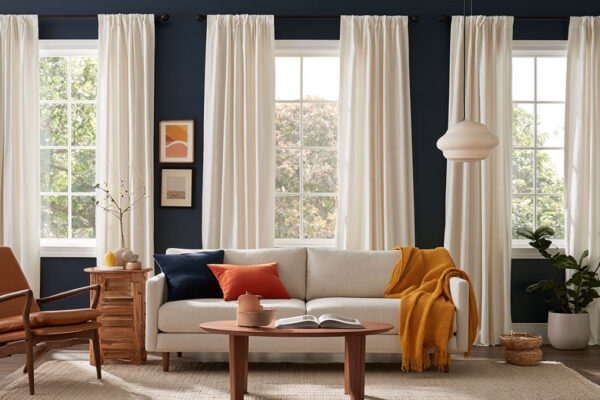
That spread is why the same curtain can frame one wall nicely and disappear against another. Most curtain advice fixates on hue, but lightness does more of the work. White, cream, beige, gray, a lighter or darker blue, and warm tones like orange, rust and mustard can all go with a blue wall, provided the curtains sit visibly apart from the wall in value.
Our curtain color chart for every wall color applies the same lightness rule to purple, green, gray and other walls.
Which Curtain Colors Go With Blue Walls?

Plenty do. Neutrals like white, cream, beige and gray tone a blue wall down. Orange, rust, mustard and gold do the opposite and set up contrast on purpose. A lighter or darker blue lands somewhere in between, adding depth without bringing in a second hue.
The color wheel explains the split. On the traditional wheel, orange sits directly opposite blue, which makes it the strongest contrast. Neighbors like teal and green blend in instead (see how color theory applies in interior design for the full logic).
| Curtain color | Scheme type | What it does to the room |
|---|---|---|
| White, cream, ivory | Neutral | Softens the wall, keeps blue as the feature |
| Beige, taupe, light brown | Warm neutral | Adds warmth against a cool wall |
| Light gray to black | Neutral | Quiet and modern, or dramatic when dark |
| Lighter or darker blue | Monochromatic | Adds depth without a second hue |
| Orange, rust, mustard, gold | Complementary | Strongest contrast, warmest mood |
Neutral Curtains

Neutral curtains keep the wall in charge.
Make My Blinds pairs navy walls with cream or white for a timeless look. The same retailer says beige and taupe suit nearly every shade of blue, and both feel warm and inviting. Gray is pickier. roomdsign.com ties it to blues with a gray undertone, so dusty blue and gray-blue, and navy as well.
Russells adds that blue is one of the few wall colors that can also carry dark gray or black curtains. If you want drama without bringing in another color, that’s the route.
Blue Curtains on Blue Walls

Blue on blue works when the curtains sit clearly apart from the wall in lightness. An identical match flattens the window.
Going lighter on a dark wall is the easier version. Medium to light blue panels on a navy wall give the dark surface a lift (roomdsign.com).
Going darker on a light wall works too. Navy panels against light blue walls read as a monochromatic scheme (roomdsign.com), and Hunker’s designer roundup uses a deeper blue the same way to add depth.
Warm Contrast Colors

Russells treats yellow as blue’s complement. That holds on the digital (RGB) color wheel, though the traditional painter’s wheel puts orange opposite blue. Either way, a shade of yellow or orange will stand out, Russells says, with one condition. Bright yellow overpowers royal blue but looks good against deep navy.
Orange gets similar treatment. Hunker shows floor-to-ceiling orange curtains against light blue walls, and Make My Blinds suggests orange panels for primary blue walls.
When you’re unsure how to complement a blue room, Hunker’s pick is burnt orange. Russells names gold velvet as a statement option on blue walls, and Housing.com recommends deep gold on navy. Mustard sits close to gold and works the same way. Rust falls between orange and brown, so it warms the wall without the brightness.
Soft and Bold Accent Colors

Make My Blinds pairs dusty pink curtains with pale blue walls and lemon yellow with a blue nursery. roomdsign.com adds sage for light blue rooms.
Bolder combinations exist too. Hunker features chartreuse curtains against cornflower blue walls, and aqua curtains on navy walls with a pink ceiling. Red and white stripes against navy appear in the same roundup.
How Does the Shade of Blue Change the Best Curtain Color?
Dark blue walls want lighter or warmer curtains, and pale ones can take something deeper. Teal and gray-blue walls pair best with warm neutrals. What settles warm versus cool is the undertone of the paint.
How to Read the Undertone of Your Blue
Every blue has a second color hiding in it, usually gray, green or violet. Hold the paint chip next to a sheet of plain white paper and it shows up.
A gray undertone blends cleanly with gray or greige curtains. A green one gets corrected by coral, rust or blush, which sit opposite it. If the blue is plain and cool with neither, it just needs warmth, and cream and beige bring that.
Navy and Dark Blue Walls

Sherwin-Williams Naval (SW 6244) has a light reflectance value (LRV) of roughly 4.5 on a scale where 0 is black and 100 is white, per the manufacturer’s color data.
Almost no light bounces off a wall that dark. The curtains carry the brightness.
Cream, ivory or light gray lift the room, and Hunker shows light gray softening a deep navy accent wall. Warmth comes from chocolate brown or beige (Make My Blinds), or from gold or mustard (Russells). For drama, dark gray or black works, which Hunker describes as sleek and moody in a Becky Shea bedroom.
Sherwin-Williams and Benjamin Moore both file their flagship navies, Naval and Hale Navy, under the neutral color family in their catalog data. Treat navy as a base color and a warm accent has room to work.
Paint, trim and furniture pairings follow the same logic, and a separate rundown of colors that go with navy blue covers them.
Light and Pale Blue Walls

A pale wall can carry more color in the curtains. Benjamin Moore describes Palladian Blue (HC-144) as a soft, airy blue-green, and its LRV of 60.4 keeps the room bright even with a saturated panel.
Ivory, sage, light gray and light brown all sit well against it. Navy adds depth. Dusty pink or pale lemon make the room softer.
roomdsign.com says ivory balances the cool tone of the wall, and white curtains work best with white trim. For a shade-by-shade walkthrough, the guide to curtain colors for light blue walls goes further.
Teal and Gray-Blue Walls

On teal, the wheel opposite is a red-orange, so rust and coral curtains contrast cleanly. Neighboring greens blend instead, though Make My Blinds still calls green and teal curtains strong accents in blue bedrooms.
Gray-blue goes the other way. roomdsign.com ties gray curtains to gray-undertone blues, and Hunker features a blue-gray and teal combination by Jean Stoffer Design as a cool-on-cool example.
Should Curtains Be Lighter or Darker Than Blue Walls?
Neither direction is wrong, but the curtains should sit visibly apart from the wall in lightness. Russells recommends going a few shades lighter or darker, which gives interest without harsh contrast or a matchy-matchy look.
On a dark wall, lighter curtains are the safe call. Hunker’s roundup says as much, and roomdsign.com suggests medium to light blue panels on navy.
On a light wall, go deeper. Navy or darker blue panels give pale walls depth (Hunker, roomdsign.com), and the same move works with warm colors.
Hunker, Russells and roomdsign.com each describe one direction or the other, so the working rule is to flip the wall’s value.
“A few shades” is vague, though, because blue walls cover a huge range. Benjamin Moore lists Hale Navy at an LRV of 8.36 and Palladian Blue at 60.4, a gap of more than 50 points between two walls that both count as blue.
A curtain that reads as clearly lighter on one of them can vanish on the other.
LRV is a paint spec, so use it for the wall and judge the fabric by eye against a paint chip of similar lightness. Value is the core of how contrast works in interior design, and here it matters more than hue.
The exact match is where this goes wrong. A navy curtain on a navy wall is the matchy-matchy look Russells warns against, and the window reads as a dark patch instead of a frame.
How Do Natural Light and Room Function Change the Choice?
Light direction changes how blue and curtain colors read. North-facing rooms cool the blue down and favor warm curtains, while south-facing ones warm it up. Room type matters separately, since each one pulls toward a different level of contrast.
North-Facing vs South-Facing Rooms
| Exposure | What happens to blue | Curtain direction |
|---|---|---|
| North-facing | Cooler light, cool undertones show | Warm: cream, beige, rust, mustard |
| South-facing | Warmer, brighter light, blue reads truer | Gray, white or tonal blue hold up |
Benjamin Moore’s color team says north-facing rooms feel cooler and bring out cooler undertones. In a south-facing room, according to Sanderson (the paint and fabric maker), colors feel warmer and brighter.
Bulbs matter too. Midday daylight runs near 5,600 K while sunrise and sunset light sits closer to 3,200 K, and Ketra, a lighting company, sells tunable white light from 1,400 K to 10,000 K. The cooler reading is the one that exposes blue undertones.
Both daylight and bulbs are part of how light works in interior design, which is why a curtain looks different at 9 a.m. and 9 p.m.
Designers do not agree on the fix. Livingetc and Homes and Gardens report many countering cool light with warm undertones, while others lean into it with cool schemes. Welsh Design Studio warns that soft blue-gray paints often read too blue in north light.
For curtains, the warm route is easier to reverse than repainting, and I’d take it.
Bedrooms and Nurseries

Bedrooms need light control first and color second, while a dining room may not need it at all.
Make My Blinds says beige curtains neutralize the boldness of navy walls. Thick navy curtains with matching bedding give a richer look, and green or teal can work as an accent. In a nursery, pale lemon or dusty pink on pale blue is the usual direction.
Bedding then repeats or contrasts the curtain color, and a guide to bedding colors that suit blue walls covers that match.
Living and Dining Rooms

In a dining room featured by Hunker, designer Heidi Caillier hangs greige floor-to-ceiling panels against blue walls with a painted mural.
Make My Blinds suggests cream curtains with a tan leather sofa in a blue living room for warmth and depth. For a navy dining room, it offers orange curtains and accents for a Moroccan feel.
Kitchens, Bathrooms and Home Offices

In kitchens, Make My Blinds pairs navy walls with wood blinds or shutters, since the natural tone suits the richness of navy.
Asian Paints recommends white sheer curtains on blue walls so daylight filters through, which suits a bathroom too. Make My Blinds frames navy bathrooms as a nautical look.
Home offices come down to glare control more than color drama, so a muted light-filtering panel does more than a bold one.
Which Fabric, Pattern and Hardware Finish Suit Blue Walls?
The weight of the fabric and the scale of the pattern change how one curtain color reads against a blue wall, and so does the rod finish. Heavy fabrics deepen dark blues. Light ones keep pale blues airy. The metal sets the warmth of the whole window.
Fabric and Opacity
| Opacity | Light that passes | Typical blue-room use |
|---|---|---|
| Sheer | Most light, least privacy | Pale walls, daytime living rooms |
| Light-filtering | A generous share of daylight | Living and dining rooms |
| Room darkening | Much less light, not total darkness | Bedrooms |
| Blackout | Rated to block up to 100% | Bedrooms, nurseries |
The tiers follow common industry usage. Hunter Douglas, for one, separates room-darkening fabrics, which darken a room without eliminating light, from true blackout. The blackout label is not uniform, though.
Bob Vila’s roundup rates its picks anywhere from 85 to 100% light blocking, and Consumer Reports found that many curtains sold as blackout or room darkening did not deliver blackout conditions. Check the rating before ordering for a bedroom.
Velvet deserves a second look before you commit. IKEA describes its SANELA dark blue cotton velvet curtains as adding depth to the blue tone and darkening the room. The same product page warns that velvet can be prone to marks and creases, and Crate and Barrel lists a weight limit for each of its curtain rod sets, so check it against the weight of lined velvet panels.
Linen and cotton hang lighter, so a saturated color reads less heavy. Livingetc’s designer roundup describes a deep olive linen panel as light and airy despite the rich color.
A painted wall is flat, so fabric is where the window gets depth. That is the logic behind how texture works in interior design.
Layering settles the light question without forcing one fabric to do everything. Livingetc quotes designer Melissa Roberts on pairing sheers with Roman shades, and Linen Chest suggests hanging sheer panels closest to the window with blackout panels in front.
Patterns
Hillarys, a UK window furnishings specialist, puts the risk of patterned curtains on scale, color and placement, not on the print itself. Curtains sit at eye level over a large area, so they pull the eye first.
An easy way in is repeating a color already in the room, such as the wall blue. Larger prints read calmer across a full curtain drop (Hillarys). When mixing prints, keep one shared color and vary the scale, like a fine stripe beside a larger motif (Selected Wallpapers).
A Livingetc stylist says striped curtains add rhythm and structure without feeling too busy. For a wider view of balancing prints, see how pattern works in interior design.
Detailed prints need a sample first so the scale shows, according to The Mill Shop.
Rods and Trim
Brass and gold draw a warm line against a cool wall. Brass varies from pale to very yellow, so check the finish against the wall under the room’s own bulb.
Matte black gives a crisp edge on light blue walls, while nickel and pewter blend into gray-blues.
Better Homes and Gardens sells one 1-inch rod at Walmart in five finishes, including brushed nickel, pewter, matte black, brass and oil-rubbed bronze. Tiebacks count as hardware too, and Crate and Barrel sells them in brushed nickel, matte black and brass to match its rods.
Pick the metal after the curtain color, and match it to the other metals in the room.
Which Curtain Colors Clash With Blue Walls?
Heavy deep red panels, solid opaque white and cool gray panels in cool light are the pairings most likely to go wrong, since they pile weight, cold or sterility onto a blue wall. Whether navy, gray, white and beige curtains count as dated is taste, and the sources split on it.
In a June 2025 Livingetc roundup, designer Manuela Hamilford calls navy curtains too safe, and Raili Clasen says solid white adds little to a room. Raymond Yang, founder of Deconovo, reports a shift away from the cool gray curtains that dominated its sales a few years earlier.
The retail guides behind most blue-wall advice (Make My Blinds, roomdsign.com, Hunker) still recommend those neutrals.
The split mostly comes down to the question being asked. Retail guides want to know what’s safe next to blue. The Livingetc designers are after what feels current, though Livingetc itself says nothing is wrong with navy curtains.
The designers’ replacements (deep olive green, terracotta, taupe, chocolate brown, dusty rose, sage, warm ivory sheers) overlap with the warm and soft colors the retail guides already list. The real disagreement is about cool neutrals and plain solids. Livingetc even files solid beige under dated, while saying textured beige still works.
| Pairing | What goes wrong | Swap |
|---|---|---|
| Solid opaque white | Reads sterile and flat | Warm ivory in a sheer fabric |
| Heavy deep red panels | Moody turns overpowering | Dusty rose or sage, light fabric |
| Cool gray panels, north-facing room | Cool stacked on cool | Taupe or terracotta |
Dark panels have their own failure. In a small or low-light room, dark heavy curtains add weight at the window. Livingetc quotes Melissa Roberts on homeowners moving away from heavy, ornate curtains, and the lighter fix is a pastel in linen or cotton.
Treat the dated list as a June 2025 snapshot, not a rule.
How Do You Test a Curtain Color Against Blue Walls Before Buying?
Hang a sample at the window, compare it with the wall in morning, midday and evening light under the room’s real bulbs, then decide.
Start on screen with a generator that builds a room color scheme, so wall, curtain and accent appear together before any fabric ships.
- Find the wall’s paint name and its LRV on the maker’s color page, then check the undertone against white paper.
- Country and Town House quotes Molly Freshwater of Secret Linen Store on the 60-30-10 rule. The main color sits on the walls, the secondary on curtains and throws, and the accent on cushions and trims (her bedroom example). Decide where the curtains fall.
- Pick 2 or 3 candidates across the lighter and darker range, plus one warm option.
- Get the room’s lightbulbs in place before buying test pots, as Sanderson advises. Benjamin Moore’s color pages also note that screen colors differ and samples should be tested.
- Hang samples at the window and check them in morning, midday and evening light, then again with lamps on.
- Hold the sample beside the sofa, the floor and an accent pillow or rug swatch to see the whole set together.
Once the color is settled, use a calculator for curtain sizes so panel width and drop are right before ordering the full set.
Common Questions About Curtain Colors for Blue Walls
How full should curtains be against blue walls?
Plan for 2 times the rod width in most rooms. IKEA’s product pages give 1.5 to 2.5 times the rod width depending on the curtain, while Deconovo rates 2 as standard, 2.5 as deluxe and 3 as ultra, with sheers reaching 3.
Should curtains hang above the window frame in a blue room?
Yes. A rod mounted above the frame lengthens the drop and makes the window look taller, which keeps a dark blue wall from feeling boxed in.
Extend the rod past the frame on both sides so the panels clear the glass when open.
Do curtains make a small blue room look bigger?
To a degree. Curtains cannot change the room’s size, but a pale tone, a high rod and panels that clear the glass change how the room reads.
Keep them lighter than a deep blue wall so the window stays the brightest spot.
Should curtains match the trim color?
No. Curtains only need to share the trim’s undertone. Warm white trim sits well with ivory or cream, and crisp white trim with cooler whites and grays.
What throw pillow and rug colors go with blue walls and curtains?
Repeat the curtain color in one pillow, then add a second color from the accent range. Keep the rug a step lighter or darker than the wall.
Solid pillows with a single patterned piece avoid a busy look.
What curtain color suits a single blue accent wall?
Choose by the wall the curtains hang against. Curtains on the blue wall follow the rules for that blue shade, while curtains on a neutral wall can echo the accent wall as a tonal or contrasting color.
Fixing Curtains That Look Wrong Against Blue Walls
Start with the cheap fixes. Swap in a warmer or cooler bulb, add a sheer layer or blackout lining, or change the rod finish and tiebacks. Replace the panels only after that.
The order follows what each change can reach. Bulbs, layers and metal shift undertone and warmth, but none of them closes a value gap, so panels at nearly the same lightness as the wall need replacing.
Warming the bulbs also warms the wall, which softens the cool calm that drew most people to blue.
This advice was verified in October 2026. Designer opinion on cool neutrals shifts with each trend cycle, while the color wheel logic and the lightness rule stay fixed.
For the rest of the room, a guide to pairing other colors with blue covers furniture and accents.
More Curtain Color Guides
- What color curtains go with light blue walls
- What color curtains go with white walls
- What color curtains go with gray walls
- What color curtains go with brown furniture
- All curtain colors by wall color

- Kitchen Color Schemes by Cabinet Color: What Pairs Well - October 19, 2026
- Curtain Colors for Every Wall Color: Safe vs Bold Picks - October 18, 2026
- Interior Design Styles: Find Your Primary and Secondary - October 14, 2026